How to Build a Stock Sell Screen with a Share Stepper in Flutter (Full Code + Preview)
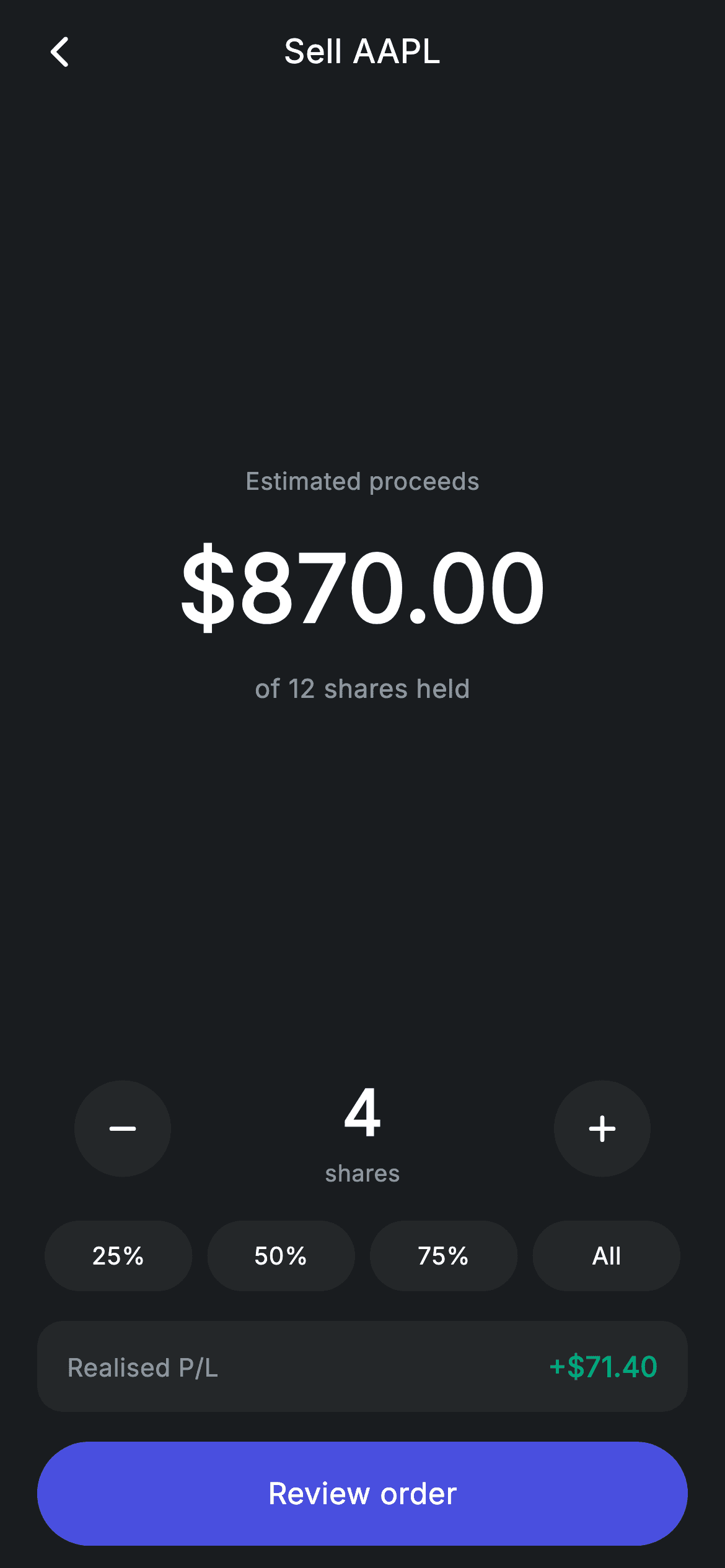
Shares are whole units, so a slider is the wrong control — you need a stepper. This tutorial builds Nova's sell-stock screen in Flutter around an integer share count: 52px plus and minus buttons either side of the number, four quick chips that jump to portions of the position, and a proceeds figure plus realised profit that both recompute from that one int. The clamp calls are the part to copy — they cap the count at the position size and floor it at one, so the arithmetic can never go negative.
Watch the Flutter UI walkthrough
A short screen recording of Stock Sell running, if you'd rather see it before you read the code. The written tutorial below covers everything in it.
Can't see the video? Watch it on YouTube.
What you'll build
- ✓An integer stepper with clamp() guards at both ends of the valid range
- ✓Two getters deriving sale proceeds and realised profit from the share count
- ✓Quick chips that round a percentage of the position to a whole number of shares
- ✓A realised P/L card that surfaces the tax-relevant number before the order is placed
Step-by-step build
Create the file
Add a new file at lib/fintech_stock_sell/fintech_stock_sell_screen.dart in your Flutter project.
Register the bundled fonts
No external packages — this is pure Flutter. It does bundle its design font (Inter), so drop the font file into fonts/ and declare it in pubspec.yaml:
flutter:
  fonts:
    - family: Inter
      fonts:
- asset: fonts/Inter-Regular.ttfBuild it, piece by piece
Here's how the screen goes together. Each block below is a real slice of the code with a plain-English explanation — paste them in order, or grab the whole file from the next section.
Position, price and cost basis as constants
import 'package:flutter/material.dart';

/// Stock sell — sell shares by portion of position (Revolut-inspired design).
///
/// Self-contained per CONVENTIONS.md: pure Flutter only, the exact design font
/// (Inter) is bundled under `fonts/`, no network/emoji images, and the screen
/// forces its own dark theme. A shares stepper drives the proceeds + realised
/// P/L live; quick chips jump to portions of the position.
class FintechStockSellScreen extends StatefulWidget {
  const FintechStockSellScreen({super.key, this.onBack, this.onReview});

  final VoidCallback? onBack;
  final VoidCallback? onReview;

  @override
  State<FintechStockSellScreen> createState() => _FintechStockSellScreenState();
}

class _FintechStockSellScreenState extends State<FintechStockSellScreen> {
  static const String _font = 'Inter';
  static const Color _bg = Color(0xFF191C1F);
  static const Color _surface = Color(0xFF242729);
  static const Color _brand = Color(0xFF494FDF);
  static const Color _teal = Color(0xFF00A87E);
  static const Color _muted = Color(0xFF8D969E);

  static const int _position = 12;
  static const double _price = 217.50;
  static const double _avgCost = 199.65;

  int _shares = 4;

  double get _proceeds => _shares * _price;
  double get _pl => _shares * (_price - _avgCost);
Three `static const` values stand in for portfolio data: `_position` (12 shares held), `_price` (217.50 current) and `_avgCost` (199.65 average purchase price). The single mutable field is `int _shares`, starting at 4. Two getters do the rest: `_proceeds => _shares * _price` and `_pl => _shares * (_price - _avgCost)`. That second formula is the one worth reading twice — realised profit on a sale is the gain per share multiplied by the shares sold, which is why the screen needs a cost basis at all and not just a current price. Note `_shares` is an `int`, not a double: this screen sells whole shares, and that choice drives the stepper and the rounding in the quick chips.
One flexible child, everything else fixed
  @override
  Widget build(BuildContext context) {
    return Theme(
      data: ThemeData.dark(useMaterial3: true),
      child: Scaffold(
        backgroundColor: _bg,
        body: SafeArea(
          child: Column(
            children: <Widget>[
              _buildAppBar(),
              Expanded(child: _buildAmount()),
              _buildStepper(),
              const SizedBox(height: 16),
              _buildQuick(),
              const SizedBox(height: 16),
              _buildPlCard(),
              const SizedBox(height: 16),
              _buildButton(),
            ],
          ),
        ),
      ),
    );
  }

  Widget _buildAppBar() {
    return Padding(
      padding: const EdgeInsets.fromLTRB(8, 4, 8, 4),
      child: Row(
        children: <Widget>[
          IconButton(
            onPressed: widget.onBack,
            icon: const Icon(Icons.arrow_back_ios_new_rounded,
                size: 20, color: Colors.white),
          ),
          const Expanded(
            child: Text(
              'Sell AAPL',
              textAlign: TextAlign.center,
              style: TextStyle(
                fontFamily: _font,
                fontSize: 18,
                fontWeight: FontWeight.w500,
                letterSpacing: 0.24,
                color: Colors.white,
              ),
            ),
          ),
          const SizedBox(width: 48),
        ],
      ),
    );
  }
The Column gives `Expanded` to `_buildAmount()` alone; the stepper, chips, P/L card and button all take their intrinsic height. On a small phone the whitespace around the big number compresses first while the controls stay full size and reachable — the same discipline as a calculator keypad, where the display shrinks before the keys do. The back bar follows the app's pattern: an `IconButton`, an `Expanded` centred title reading the ticker, and a `SizedBox(width: 48)` counterweight so 'Sell AAPL' sits at true centre rather than offset by the icon.
The proceeds display
  Widget _buildAmount() {
    return Center(
      child: Column(
        mainAxisAlignment: MainAxisAlignment.center,
        mainAxisSize: MainAxisSize.min,
        children: <Widget>[
          const Text(
            'Estimated proceeds',
            style: TextStyle(
              fontFamily: _font,
              fontSize: 13,
              letterSpacing: 0.24,
              color: _muted,
            ),
          ),
          const SizedBox(height: 12),
          FittedBox(
            fit: BoxFit.scaleDown,
            child: Text(
              '\$${_proceeds.toStringAsFixed(2)}',
              style: const TextStyle(
                fontFamily: _font,
                fontSize: 50,
                fontWeight: FontWeight.w600,
                letterSpacing: 0.24,
                color: Colors.white,
              ),
            ),
          ),
          const SizedBox(height: 8),
          Text(
            'of $_position shares held',
            style: const TextStyle(
              fontFamily: _font,
              fontSize: 14,
              letterSpacing: 0.24,
              color: _muted,
            ),
          ),
        ],
      ),
    );
  }
The block runs caption, number, context: a 13px `_muted` 'Estimated proceeds' label, then the amount at 50px `w600`, then 'of 12 shares held'. Leading with the label matters here because a large bare number is ambiguous — proceeds, position value and profit would all look identical at 50px. The amount sits in a `FittedBox(fit: BoxFit.scaleDown)`, which leaves it at full size when it fits and shrinks it only when it would not, so selling a large position never produces an overflow stripe. `toStringAsFixed(2)` fixes the cents, and the `\$` escape is needed because this string does interpolate — a raw string would break `${_proceeds...}`.
The stepper and its clamp guards
  Widget _buildStepper() {
    return Padding(
      padding: const EdgeInsets.symmetric(horizontal: 40),
      child: Row(
        mainAxisAlignment: MainAxisAlignment.spaceBetween,
        children: <Widget>[
          _stepBtn(Icons.remove_rounded,
              () => setState(() => _shares = (_shares - 1).clamp(1, _position))),
          Column(
            children: <Widget>[
              Text(
                '$_shares',
                style: const TextStyle(
                  fontFamily: _font,
                  fontSize: 34,
                  fontWeight: FontWeight.w600,
                  letterSpacing: 0.24,
                  color: Colors.white,
                ),
              ),
              const Text(
                'shares',
                style: TextStyle(
                  fontFamily: _font,
                  fontSize: 12.5,
                  letterSpacing: 0.24,
                  color: _muted,
                ),
              ),
            ],
          ),
          _stepBtn(Icons.add_rounded,
              () => setState(() => _shares = (_shares + 1).clamp(1, _position))),
        ],
      ),
    );
  }

  Widget _stepBtn(IconData icon, VoidCallback onTap) {
    return GestureDetector(
      onTap: onTap,
      child: Container(
        width: 52,
        height: 52,
        decoration: const BoxDecoration(
          color: _surface,
          shape: BoxShape.circle,
        ),
        child: Icon(icon, size: 24, color: Colors.white),
      ),
    );
  }
The stepper is a `spaceBetween` Row: minus button, the count with its caption, plus button. Both handlers end in `.clamp(1, _position)` — the minus can never take the count below one share, and the plus can never exceed the twelve actually held. Putting the guard in the state update rather than in a disabled-button check means there is exactly one place the range is enforced, and no combination of fast taps can drive `_shares` out of bounds. `_stepBtn` is a four-line helper producing a 52px `_surface` circle; at that size the touch target is comfortably above the 48px minimum without any extra padding widget.
Percentage chips that round to whole shares
  Widget _buildQuick() {
    return Padding(
      padding: const EdgeInsets.symmetric(horizontal: 20),
      child: Row(
        children: <Widget>[
          for (final double p in <double>[0.25, 0.5, 0.75, 1.0])
            Expanded(
              child: Padding(
                padding: const EdgeInsets.symmetric(horizontal: 4),
                child: GestureDetector(
                  onTap: () => setState(
                      () => _shares = (_position * p).round().clamp(1, _position)),
                  child: Container(
                    height: 38,
                    alignment: Alignment.center,
                    decoration: BoxDecoration(
                      color: _shares == (_position * p).round()
                          ? _brand
                          : _surface,
                      borderRadius: BorderRadius.circular(9999),
                    ),
                    child: Text(
                      p == 1.0 ? 'All' : '${(p * 100).round()}%',
                      style: const TextStyle(
                        fontFamily: _font,
                        fontSize: 13,
                        fontWeight: FontWeight.w500,
                        letterSpacing: 0.24,
                        color: Colors.white,
                      ),
                    ),
                  ),
                ),
              ),
            ),
        ],
      ),
    );
  }
The four chips are generated by a collection-for over `<double>[0.25, 0.5, 0.75, 1.0]`, each `Expanded` so they divide the width evenly. Tapping one sets `_shares = (_position * p).round().clamp(1, _position)` — `.round()` is essential because 25% of 12 is 3 but 25% of 11 would be 2.75, and you cannot sell a fraction of a share here. The active test compares the same way, `_shares == (_position * p).round()`, so a chip lights up whenever the stepper happens to land on its value too. Because both sides are integers this is a safe `==` comparison, unlike a percentage slider where an epsilon would be required. The 100% chip is labelled 'All', which reads better than a number when the intent is closing the position.
Realised P/L and the review CTA
  Widget _buildPlCard() {
    return Padding(
      padding: const EdgeInsets.symmetric(horizontal: 20),
      child: Container(
        padding: const EdgeInsets.symmetric(horizontal: 16, vertical: 14),
        decoration: BoxDecoration(
          color: _surface,
          borderRadius: BorderRadius.circular(14),
        ),
        child: Row(
          children: <Widget>[
            const Text(
              'Realised P/L',
              style: TextStyle(
                fontFamily: _font,
                fontSize: 13.5,
                letterSpacing: 0.24,
                color: _muted,
              ),
            ),
            const Spacer(),
            Text(
              '+\$${_pl.toStringAsFixed(2)}',
              style: const TextStyle(
                fontFamily: _font,
                fontSize: 15,
                fontWeight: FontWeight.w600,
                letterSpacing: 0.24,
                color: _teal,
              ),
            ),
          ],
        ),
      ),
    );
  }

  Widget _buildButton() {
    return Padding(
      padding: const EdgeInsets.fromLTRB(20, 0, 20, 12),
      child: SizedBox(
        width: double.infinity,
        height: 56,
        child: Material(
          color: _brand,
          borderRadius: BorderRadius.circular(9999),
          child: InkWell(
            borderRadius: BorderRadius.circular(9999),
            onTap: widget.onReview,
            child: const Center(
              child: Text(
                'Review order',
                style: TextStyle(
                  fontFamily: _font,
                  fontSize: 16,
                  fontWeight: FontWeight.w500,
                  letterSpacing: 0.24,
                  color: Colors.white,
                ),
              ),
            ),
          ),
        ),
      ),
    );
  }
`_buildPlCard` shows the profit the sale locks in — a `_muted` label, a `Spacer()`, and the figure in `_teal` at `w600`. Putting this above the button rather than on the confirmation screen is the deliberate choice: realised gain is the number with tax consequences, and it should be visible while the quantity can still be changed. The `+` in `'+\$${_pl.toStringAsFixed(2)}'` is hard-coded, which is honest for this dataset since the current price sits above the cost basis; a live version would branch on the sign and swap `_teal` for a red. The button then reads 'Review order', handing off to a confirmation step rather than executing the sale from this screen.
Full code
The complete, ready-to-paste source. Free to use in your projects — one click copies it all.
import 'package:flutter/material.dart';

/// Stock sell — sell shares by portion of position (Revolut-inspired design).
///
/// Self-contained per CONVENTIONS.md: pure Flutter only, the exact design font
/// (Inter) is bundled under `fonts/`, no network/emoji images, and the screen
/// forces its own dark theme. A shares stepper drives the proceeds + realised
/// P/L live; quick chips jump to portions of the position.
class FintechStockSellScreen extends StatefulWidget {
  const FintechStockSellScreen({super.key, this.onBack, this.onReview});

  final VoidCallback? onBack;
  final VoidCallback? onReview;

  @override
  State<FintechStockSellScreen> createState() => _FintechStockSellScreenState();
}

class _FintechStockSellScreenState extends State<FintechStockSellScreen> {
  static const String _font = 'Inter';
  static const Color _bg = Color(0xFF191C1F);
  static const Color _surface = Color(0xFF242729);
  static const Color _brand = Color(0xFF494FDF);
  static const Color _teal = Color(0xFF00A87E);
  static const Color _muted = Color(0xFF8D969E);

  static const int _position = 12;
  static const double _price = 217.50;
  static const double _avgCost = 199.65;

  int _shares = 4;

  double get _proceeds => _shares * _price;
  double get _pl => _shares * (_price - _avgCost);

  @override
  Widget build(BuildContext context) {
    return Theme(
      data: ThemeData.dark(useMaterial3: true),
      child: Scaffold(
        backgroundColor: _bg,
        body: SafeArea(
          child: Column(
            children: <Widget>[
              _buildAppBar(),
              Expanded(child: _buildAmount()),
              _buildStepper(),
              const SizedBox(height: 16),
              _buildQuick(),
              const SizedBox(height: 16),
              _buildPlCard(),
              const SizedBox(height: 16),
              _buildButton(),
            ],
          ),
        ),
      ),
    );
  }

  Widget _buildAppBar() {
    return Padding(
      padding: const EdgeInsets.fromLTRB(8, 4, 8, 4),
      child: Row(
        children: <Widget>[
          IconButton(
            onPressed: widget.onBack,
            icon: const Icon(Icons.arrow_back_ios_new_rounded,
                size: 20, color: Colors.white),
          ),
          const Expanded(
            child: Text(
              'Sell AAPL',
              textAlign: TextAlign.center,
              style: TextStyle(
                fontFamily: _font,
                fontSize: 18,
                fontWeight: FontWeight.w500,
                letterSpacing: 0.24,
                color: Colors.white,
              ),
            ),
          ),
          const SizedBox(width: 48),
        ],
      ),
    );
  }

  Widget _buildAmount() {
    return Center(
      child: Column(
        mainAxisAlignment: MainAxisAlignment.center,
        mainAxisSize: MainAxisSize.min,
        children: <Widget>[
          const Text(
            'Estimated proceeds',
            style: TextStyle(
              fontFamily: _font,
              fontSize: 13,
              letterSpacing: 0.24,
              color: _muted,
            ),
          ),
          const SizedBox(height: 12),
          FittedBox(
            fit: BoxFit.scaleDown,
            child: Text(
              '\$${_proceeds.toStringAsFixed(2)}',
              style: const TextStyle(
                fontFamily: _font,
                fontSize: 50,
                fontWeight: FontWeight.w600,
                letterSpacing: 0.24,
                color: Colors.white,
              ),
            ),
          ),
          const SizedBox(height: 8),
          Text(
            'of $_position shares held',
            style: const TextStyle(
              fontFamily: _font,
              fontSize: 14,
              letterSpacing: 0.24,
              color: _muted,
            ),
          ),
        ],
      ),
    );
  }

  Widget _buildStepper() {
    return Padding(
      padding: const EdgeInsets.symmetric(horizontal: 40),
      child: Row(
        mainAxisAlignment: MainAxisAlignment.spaceBetween,
        children: <Widget>[
          _stepBtn(Icons.remove_rounded,
              () => setState(() => _shares = (_shares - 1).clamp(1, _position))),
          Column(
            children: <Widget>[
              Text(
                '$_shares',
                style: const TextStyle(
                  fontFamily: _font,
                  fontSize: 34,
                  fontWeight: FontWeight.w600,
                  letterSpacing: 0.24,
                  color: Colors.white,
                ),
              ),
              const Text(
                'shares',
                style: TextStyle(
                  fontFamily: _font,
                  fontSize: 12.5,
                  letterSpacing: 0.24,
                  color: _muted,
                ),
              ),
            ],
          ),
          _stepBtn(Icons.add_rounded,
              () => setState(() => _shares = (_shares + 1).clamp(1, _position))),
        ],
      ),
    );
  }

  Widget _stepBtn(IconData icon, VoidCallback onTap) {
    return GestureDetector(
      onTap: onTap,
      child: Container(
        width: 52,
        height: 52,
        decoration: const BoxDecoration(
          color: _surface,
          shape: BoxShape.circle,
        ),
        child: Icon(icon, size: 24, color: Colors.white),
      ),
    );
  }

  Widget _buildQuick() {
    return Padding(
      padding: const EdgeInsets.symmetric(horizontal: 20),
      child: Row(
        children: <Widget>[
          for (final double p in <double>[0.25, 0.5, 0.75, 1.0])
            Expanded(
              child: Padding(
                padding: const EdgeInsets.symmetric(horizontal: 4),
                child: GestureDetector(
                  onTap: () => setState(
                      () => _shares = (_position * p).round().clamp(1, _position)),
                  child: Container(
                    height: 38,
                    alignment: Alignment.center,
                    decoration: BoxDecoration(
                      color: _shares == (_position * p).round()
                          ? _brand
                          : _surface,
                      borderRadius: BorderRadius.circular(9999),
                    ),
                    child: Text(
                      p == 1.0 ? 'All' : '${(p * 100).round()}%',
                      style: const TextStyle(
                        fontFamily: _font,
                        fontSize: 13,
                        fontWeight: FontWeight.w500,
                        letterSpacing: 0.24,
                        color: Colors.white,
                      ),
                    ),
                  ),
                ),
              ),
            ),
        ],
      ),
    );
  }

  Widget _buildPlCard() {
    return Padding(
      padding: const EdgeInsets.symmetric(horizontal: 20),
      child: Container(
        padding: const EdgeInsets.symmetric(horizontal: 16, vertical: 14),
        decoration: BoxDecoration(
          color: _surface,
          borderRadius: BorderRadius.circular(14),
        ),
        child: Row(
          children: <Widget>[
            const Text(
              'Realised P/L',
              style: TextStyle(
                fontFamily: _font,
                fontSize: 13.5,
                letterSpacing: 0.24,
                color: _muted,
              ),
            ),
            const Spacer(),
            Text(
              '+\$${_pl.toStringAsFixed(2)}',
              style: const TextStyle(
                fontFamily: _font,
                fontSize: 15,
                fontWeight: FontWeight.w600,
                letterSpacing: 0.24,
                color: _teal,
              ),
            ),
          ],
        ),
      ),
    );
  }

  Widget _buildButton() {
    return Padding(
      padding: const EdgeInsets.fromLTRB(20, 0, 20, 12),
      child: SizedBox(
        width: double.infinity,
        height: 56,
        child: Material(
          color: _brand,
          borderRadius: BorderRadius.circular(9999),
          child: InkWell(
            borderRadius: BorderRadius.circular(9999),
            onTap: widget.onReview,
            child: const Center(
              child: Text(
                'Review order',
                style: TextStyle(
                  fontFamily: _font,
                  fontSize: 16,
                  fontWeight: FontWeight.w500,
                  letterSpacing: 0.24,
                  color: Colors.white,
                ),
              ),
            ),
          ),
        ),
      ),
    );
  }
}
Plus bundled 1 binary asset (fonts/images). The CLI and MCP install those for you automatically.
Two faster ways to add it
Copy-paste works, but you can skip it entirely.
1. FlutterKit CLI
One command drops this screen — and its fonts — straight into your project.
$ flutterkit add fintech-stock-sell2. AI agent (MCP)
Connect FlutterKit's MCP server in Claude or Cursor and just ask your agent to install fintech-stock-sell — it fetches and writes the files for you.
FAQ
Is this stock sell screen free to use commercially?
Yes — FlutterKit is free and always will be. Copy the Dart from this page, install it with the CLI, or pull it over MCP in your AI editor, then ship it in a client project or paid app. No account, no licence key, no attribution.
Why use a stepper here instead of a slider?
Because shares are discrete. A slider produces continuous doubles and makes it fiddly to land on exactly 7 of 12 shares, while a stepper moves one whole unit per tap and never needs rounding. Use a slider when the quantity is genuinely continuous, such as a percentage of a crypto holding.
What does clamp() do in the stepper handlers?
`(_shares - 1).clamp(1, _position)` constrains the result to the range 1 to 12 inclusive, returning the nearest bound if the value falls outside it. Enforcing the range where the state is written means no tap sequence can produce a negative or oversized order, and no disabled-button logic is needed.
Does it fetch live prices or place real trades?
No. `_price`, `_avgCost` and `_position` are `static const` placeholders and there are no network calls. Pass them in as constructor parameters and both getters keep working unchanged; wire `onReview` to your own order-confirmation flow.
Which Flutter version does this need?
Flutter 3.10 or newer — the file uses Dart 3's `super.key` shorthand and collection-for loops but no `Color.withValues`, so any modern SDK compiles it. On something older, expand the constructor to `const FintechStockSellScreen({Key? key, this.onBack, this.onReview}) : super(key: key);`.


