How to Build a Stock Order Review Screen in Flutter (Full Code + Preview)
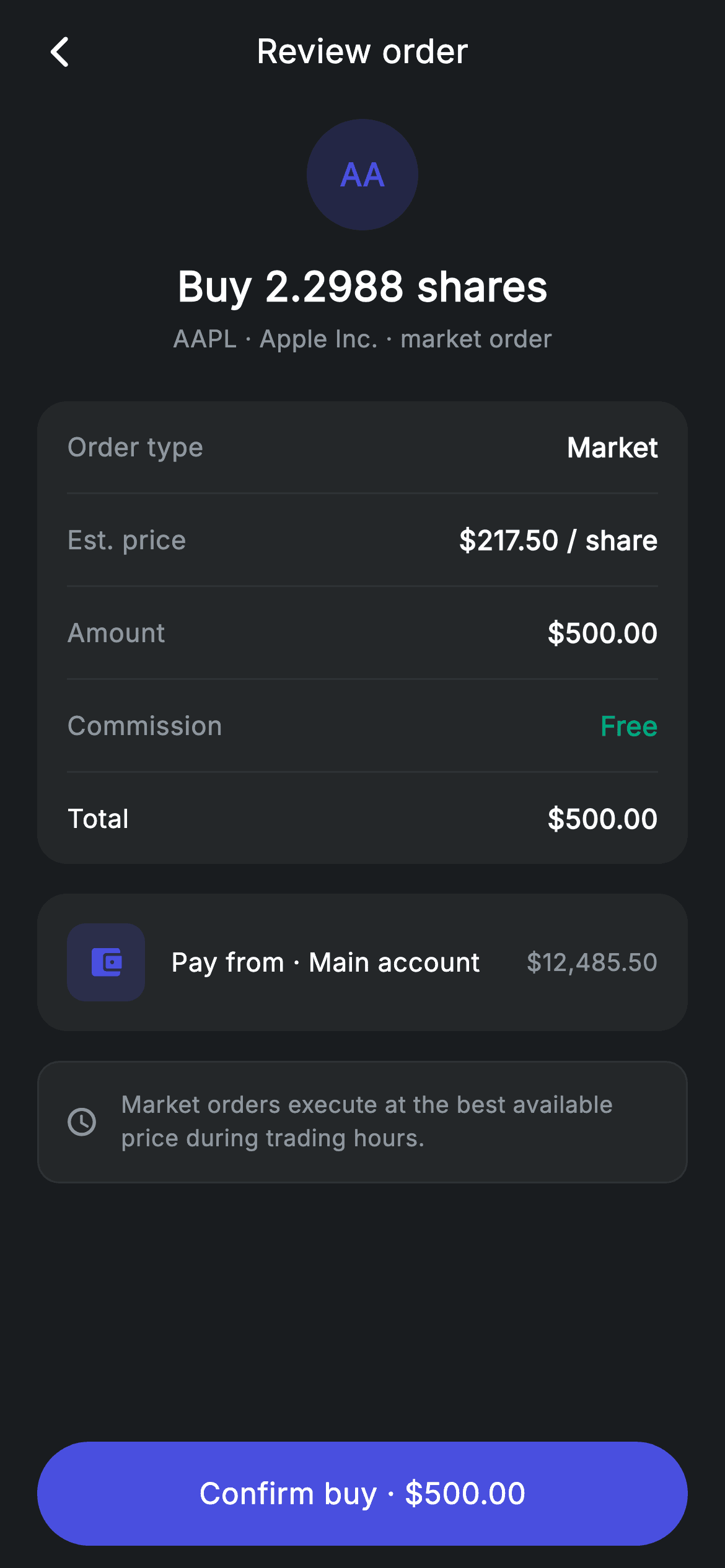
Fractional share orders produce awkward numbers, and the review screen has to make them feel deliberate. This tutorial builds a stock order confirmation in Flutter — a ticker badge over a 'Buy 2.2988 shares' headline, a five-row breakdown covering order type, estimated price, amount, commission and total, a funding-source row showing the paying account's balance, an execution note and a confirm button naming the exact spend. Pure Flutter, dark theme, no charting or finance packages.
Watch the Flutter UI walkthrough
A short screen recording of Stock Order Review running, if you'd rather see it before you read the code. The written tutorial below covers everything in it.
Can't see the video? Watch it on YouTube.
What you'll build
- ✓A centred order summary headed by a ticker badge built from two letters instead of a logo image
- ✓A five-row itemised breakdown with hairline rules that sit flush without doubling up spacing
- ✓A 'pay from' row that shows the funding account's available balance alongside its name
- ✓A pinned pill confirm button that restates the total, with its ripple clipped to the rounded shape
Step-by-step build
Create the file
Add a new file at lib/fintech_stock_order_review/fintech_stock_order_review_screen.dart in your Flutter project.
Register the bundled fonts
No external packages — this is pure Flutter. It does bundle its design font (Inter), so drop the font file into fonts/ and declare it in pubspec.yaml:
flutter:
  fonts:
    - family: Inter
      fonts:
- asset: fonts/Inter-Regular.ttfBuild it, piece by piece
Here's how the screen goes together. Each block below is a real slice of the code with a plain-English explanation — paste them in order, or grab the whole file from the next section.
The screen and its dark palette
import 'package:flutter/material.dart';

/// Stock order review — confirm a buy/sell order (Revolut-inspired design).
///
/// Self-contained per CONVENTIONS.md: pure Flutter only, the exact design font
/// (Inter) is bundled under `fonts/`, the ticker badge is painted (no emoji/
/// network), and the screen forces its own dark theme. An itemised order
/// breakdown and source row precede confirm.
class FintechStockOrderReviewScreen extends StatelessWidget {
  const FintechStockOrderReviewScreen({super.key, this.onBack, this.onConfirm});

  final VoidCallback? onBack;
  final VoidCallback? onConfirm;

  static const String _font = 'Inter';
  static const Color _bg = Color(0xFF191C1F);
  static const Color _surface = Color(0xFF242729);
  static const Color _brand = Color(0xFF494FDF);
  static const Color _teal = Color(0xFF00A87E);
  static const Color _muted = Color(0xFF8D969E);
  static const Color _hairline = Color(0xFF2E3235);
Like most confirmation screens this is stateless — the order was configured on the previous step, and nothing here can be edited. Two callbacks, `onBack` and `onConfirm`, are all the wiring it needs. The palette is the shared fintech dark set, but note what's missing compared to sibling screens: there's no `_amber` and no `_red`. This screen only ever needs indigo for identity and accent, teal for the free-commission line, and the neutral greys, so the unused tokens simply aren't declared.
Four blocks above a pinned confirm
  @override
  Widget build(BuildContext context) {
    return Theme(
      data: ThemeData.dark(useMaterial3: true),
      child: Scaffold(
        backgroundColor: _bg,
        body: SafeArea(
          child: Column(
            children: <Widget>[
              _buildAppBar(),
              Expanded(
                child: ListView(
                  physics: const BouncingScrollPhysics(),
                  padding: const EdgeInsets.fromLTRB(20, 8, 20, 24),
                  children: <Widget>[
                    _buildHeader(),
                    const SizedBox(height: 24),
                    _buildBreakdown(),
                    const SizedBox(height: 16),
                    _buildSource(),
                    const SizedBox(height: 16),
                    _buildNote(),
                  ],
                ),
              ),
              _buildConfirm(),
            ],
          ),
        ),
      ),
    );
  }

  Widget _buildAppBar() {
    return Padding(
      padding: const EdgeInsets.fromLTRB(8, 4, 8, 4),
      child: Row(
        children: <Widget>[
          IconButton(
            onPressed: onBack,
            icon: const Icon(Icons.arrow_back_ios_new_rounded,
                size: 20, color: Colors.white),
          ),
          const Expanded(
            child: Text(
              'Review order',
              textAlign: TextAlign.center,
              style: TextStyle(
                fontFamily: _font,
                fontSize: 18,
                fontWeight: FontWeight.w500,
                letterSpacing: 0.24,
                color: Colors.white,
              ),
            ),
          ),
          const SizedBox(width: 48),
        ],
      ),
    );
  }
The body arranges an app bar, an `Expanded` ListView of four blocks, and a pinned confirm button. The order of those blocks is the information hierarchy: what you're buying, what it costs, where the money comes from, then the caveat. Keeping the button outside the ListView means it stays reachable regardless of scroll position. The app bar centres 'Review order' with the same technique used across this kit — an `Expanded` centre-aligned Text, balanced by a `const SizedBox(width: 48)` that matches the leading IconButton's tap target so the title isn't pushed right.
The ticker badge and order headline
  Widget _buildHeader() {
    return Column(
      children: <Widget>[
        Container(
          width: 60,
          height: 60,
          alignment: Alignment.center,
          decoration: BoxDecoration(
            color: _brand.withValues(alpha: 0.2),
            shape: BoxShape.circle,
          ),
          child: const Text('AA',
              style: TextStyle(
                fontFamily: _font,
                fontSize: 17,
                fontWeight: FontWeight.w700,
                color: _brand,
              )),
        ),
        const SizedBox(height: 14),
        const Text(
          'Buy 2.2988 shares',
          style: TextStyle(
            fontFamily: _font,
            fontSize: 22,
            fontWeight: FontWeight.w600,
            letterSpacing: 0.24,
            color: Colors.white,
          ),
        ),
        const SizedBox(height: 4),
        const Text(
          'AAPL · Apple Inc. · market order',
          style: TextStyle(
            fontFamily: _font,
            fontSize: 13,
            letterSpacing: 0.24,
            color: _muted,
          ),
        ),
      ],
    );
  }
The header is a centred Column with a 60px circle filled `_brand` at 20% opacity holding the letters 'AA' at 17px w700 in solid indigo. Deriving a badge from the first two characters of the ticker is what lets this screen ship without a single company logo — no asset pipeline, no network fetch, no broken-image state, and it works for any symbol. Below it, the headline states the action and quantity together: 'Buy 2.2988 shares'. Showing four decimal places is correct for fractional investing, where the share count is derived from a round dollar amount rather than chosen directly. The caption line then packs ticker, company name and order type into one muted row separated by middots.
The five-row order breakdown
  Widget _buildBreakdown() {
    return Container(
      padding: const EdgeInsets.symmetric(horizontal: 16),
      decoration: BoxDecoration(
        color: _surface,
        borderRadius: BorderRadius.circular(16),
      ),
      child: Column(
        children: <Widget>[
          _row('Order type', 'Market'),
          const Divider(height: 1, color: _hairline),
          _row('Est. price', r'$217.50 / share'),
          const Divider(height: 1, color: _hairline),
          _row('Amount', r'$500.00'),
          const Divider(height: 1, color: _hairline),
          _row('Commission', 'Free', valueColor: _teal),
          const Divider(height: 1, color: _hairline),
          _row('Total', r'$500.00', bold: true),
        ],
      ),
    );
  }

  Widget _row(String label, String value, {bool bold = false, Color? valueColor}) {
    return Padding(
      padding: const EdgeInsets.symmetric(vertical: 14),
      child: Row(
        mainAxisAlignment: MainAxisAlignment.spaceBetween,
        children: <Widget>[
          Text(
            label,
            style: TextStyle(
              fontFamily: _font,
              fontSize: 14,
              fontWeight: bold ? FontWeight.w500 : FontWeight.w400,
              letterSpacing: 0.24,
              color: bold ? Colors.white : _muted,
            ),
          ),
          Text(
            value,
            style: TextStyle(
              fontFamily: _font,
              fontSize: 14.5,
              fontWeight: FontWeight.w600,
              letterSpacing: 0.24,
              color: valueColor ?? Colors.white,
            ),
          ),
        ],
      ),
    );
  }
The container carries only horizontal padding; each `_row` adds its own 14px vertical inset, so a `Divider(height: 1)` between rows occupies exactly one pixel and adds no spacing of its own. The five rows answer the questions in the order a trader asks them — type, price per share, amount committed, commission, total. Two optional named arguments handle the emphasis: `valueColor: _teal` makes 'Free' read as a benefit rather than just another value, and `bold: true` on the Total row switches its *label* from `_muted` w400 to white w500. Because only the label changes weight and every value is already w600, the total gains prominence without any text resizing that would break the column alignment.
The funding source row
  Widget _buildSource() {
    return Container(
      padding: const EdgeInsets.all(16),
      decoration: BoxDecoration(
        color: _surface,
        borderRadius: BorderRadius.circular(16),
      ),
      child: Row(
        children: <Widget>[
          Container(
            width: 42,
            height: 42,
            alignment: Alignment.center,
            decoration: BoxDecoration(
              color: _brand.withValues(alpha: 0.18),
              borderRadius: BorderRadius.circular(10),
            ),
            child: const Icon(Icons.account_balance_wallet_rounded,
                size: 20, color: _brand),
          ),
          const SizedBox(width: 14),
          const Expanded(
            child: Text(
              'Pay from · Main account',
              style: TextStyle(
                fontFamily: _font,
                fontSize: 14,
                fontWeight: FontWeight.w500,
                letterSpacing: 0.24,
                color: Colors.white,
              ),
            ),
          ),
          const Text(
            r'$12,485.50',
            style: TextStyle(
              fontFamily: _font,
              fontSize: 13,
              letterSpacing: 0.24,
              color: _muted,
            ),
          ),
        ],
      ),
    );
  }
This block answers 'where is the $500 coming from'. It's a Row with a 42px rounded-square wallet tile tinted `_brand` at 18%, an `Expanded` 'Pay from · Main account' label in white, and a trailing balance in muted grey. Putting the source account's available balance right next to its name is a small but genuinely useful touch — it lets someone confirm the order won't overdraw without leaving the review screen. Note the tile here uses `BorderRadius.circular(10)` rather than the circle used for the ticker badge above, which keeps identity marks and functional icons visually distinct.
The execution note and confirm button
  Widget _buildNote() {
    return Container(
      padding: const EdgeInsets.all(14),
      decoration: BoxDecoration(
        color: _surface,
        borderRadius: BorderRadius.circular(12),
        border: Border.all(color: _hairline),
      ),
      child: Row(
        children: const <Widget>[
          Icon(Icons.schedule_rounded, size: 18, color: _muted),
          SizedBox(width: 12),
          Expanded(
            child: Text(
              'Market orders execute at the best available price during '
              'trading hours.',
              style: TextStyle(
                fontFamily: _font,
                fontSize: 12.5,
                height: 1.4,
                letterSpacing: 0.24,
                color: _muted,
              ),
            ),
          ),
        ],
      ),
    );
  }

  Widget _buildConfirm() {
    return Padding(
      padding: const EdgeInsets.fromLTRB(20, 0, 20, 12),
      child: SizedBox(
        width: double.infinity,
        height: 56,
        child: Material(
          color: _brand,
          borderRadius: BorderRadius.circular(9999),
          child: InkWell(
            borderRadius: BorderRadius.circular(9999),
            onTap: onConfirm,
            child: const Center(
              child: Text(
                r'Confirm buy · $500.00',
                style: TextStyle(
                  fontFamily: _font,
                  fontSize: 16,
                  fontWeight: FontWeight.w500,
                  letterSpacing: 0.24,
                  color: Colors.white,
                ),
              ),
            ),
          ),
        ),
      ),
    );
  }
The note is a bordered `_surface` box pairing a clock icon with 'Market orders execute at the best available price during trading hours.' The copy is written as two adjacent string literals that Dart joins at compile time, a tidy way to wrap a long sentence without a runtime concatenation. Setting it at 12.5px with `height: 1.4` in `_muted` marks it as fine print while keeping it readable — and it matters, because a market order's fill price can differ from the estimate shown two rows above. The confirm button uses Material + InkWell with a 9999 radius on both so the ripple follows the pill, and its label is the raw string `r'Confirm buy · $500.00'` — raw so Dart doesn't try to interpolate the dollar sign, and restating the total so the last tap is unambiguous.
Full code
The complete, ready-to-paste source. Free to use in your projects — one click copies it all.
import 'package:flutter/material.dart';

/// Stock order review — confirm a buy/sell order (Revolut-inspired design).
///
/// Self-contained per CONVENTIONS.md: pure Flutter only, the exact design font
/// (Inter) is bundled under `fonts/`, the ticker badge is painted (no emoji/
/// network), and the screen forces its own dark theme. An itemised order
/// breakdown and source row precede confirm.
class FintechStockOrderReviewScreen extends StatelessWidget {
  const FintechStockOrderReviewScreen({super.key, this.onBack, this.onConfirm});

  final VoidCallback? onBack;
  final VoidCallback? onConfirm;

  static const String _font = 'Inter';
  static const Color _bg = Color(0xFF191C1F);
  static const Color _surface = Color(0xFF242729);
  static const Color _brand = Color(0xFF494FDF);
  static const Color _teal = Color(0xFF00A87E);
  static const Color _muted = Color(0xFF8D969E);
  static const Color _hairline = Color(0xFF2E3235);

  @override
  Widget build(BuildContext context) {
    return Theme(
      data: ThemeData.dark(useMaterial3: true),
      child: Scaffold(
        backgroundColor: _bg,
        body: SafeArea(
          child: Column(
            children: <Widget>[
              _buildAppBar(),
              Expanded(
                child: ListView(
                  physics: const BouncingScrollPhysics(),
                  padding: const EdgeInsets.fromLTRB(20, 8, 20, 24),
                  children: <Widget>[
                    _buildHeader(),
                    const SizedBox(height: 24),
                    _buildBreakdown(),
                    const SizedBox(height: 16),
                    _buildSource(),
                    const SizedBox(height: 16),
                    _buildNote(),
                  ],
                ),
              ),
              _buildConfirm(),
            ],
          ),
        ),
      ),
    );
  }

  Widget _buildAppBar() {
    return Padding(
      padding: const EdgeInsets.fromLTRB(8, 4, 8, 4),
      child: Row(
        children: <Widget>[
          IconButton(
            onPressed: onBack,
            icon: const Icon(Icons.arrow_back_ios_new_rounded,
                size: 20, color: Colors.white),
          ),
          const Expanded(
            child: Text(
              'Review order',
              textAlign: TextAlign.center,
              style: TextStyle(
                fontFamily: _font,
                fontSize: 18,
                fontWeight: FontWeight.w500,
                letterSpacing: 0.24,
                color: Colors.white,
              ),
            ),
          ),
          const SizedBox(width: 48),
        ],
      ),
    );
  }

  Widget _buildHeader() {
    return Column(
      children: <Widget>[
        Container(
          width: 60,
          height: 60,
          alignment: Alignment.center,
          decoration: BoxDecoration(
            color: _brand.withValues(alpha: 0.2),
            shape: BoxShape.circle,
          ),
          child: const Text('AA',
              style: TextStyle(
                fontFamily: _font,
                fontSize: 17,
                fontWeight: FontWeight.w700,
                color: _brand,
              )),
        ),
        const SizedBox(height: 14),
        const Text(
          'Buy 2.2988 shares',
          style: TextStyle(
            fontFamily: _font,
            fontSize: 22,
            fontWeight: FontWeight.w600,
            letterSpacing: 0.24,
            color: Colors.white,
          ),
        ),
        const SizedBox(height: 4),
        const Text(
          'AAPL · Apple Inc. · market order',
          style: TextStyle(
            fontFamily: _font,
            fontSize: 13,
            letterSpacing: 0.24,
            color: _muted,
          ),
        ),
      ],
    );
  }

  Widget _buildBreakdown() {
    return Container(
      padding: const EdgeInsets.symmetric(horizontal: 16),
      decoration: BoxDecoration(
        color: _surface,
        borderRadius: BorderRadius.circular(16),
      ),
      child: Column(
        children: <Widget>[
          _row('Order type', 'Market'),
          const Divider(height: 1, color: _hairline),
          _row('Est. price', r'$217.50 / share'),
          const Divider(height: 1, color: _hairline),
          _row('Amount', r'$500.00'),
          const Divider(height: 1, color: _hairline),
          _row('Commission', 'Free', valueColor: _teal),
          const Divider(height: 1, color: _hairline),
          _row('Total', r'$500.00', bold: true),
        ],
      ),
    );
  }

  Widget _row(String label, String value, {bool bold = false, Color? valueColor}) {
    return Padding(
      padding: const EdgeInsets.symmetric(vertical: 14),
      child: Row(
        mainAxisAlignment: MainAxisAlignment.spaceBetween,
        children: <Widget>[
          Text(
            label,
            style: TextStyle(
              fontFamily: _font,
              fontSize: 14,
              fontWeight: bold ? FontWeight.w500 : FontWeight.w400,
              letterSpacing: 0.24,
              color: bold ? Colors.white : _muted,
            ),
          ),
          Text(
            value,
            style: TextStyle(
              fontFamily: _font,
              fontSize: 14.5,
              fontWeight: FontWeight.w600,
              letterSpacing: 0.24,
              color: valueColor ?? Colors.white,
            ),
          ),
        ],
      ),
    );
  }

  Widget _buildSource() {
    return Container(
      padding: const EdgeInsets.all(16),
      decoration: BoxDecoration(
        color: _surface,
        borderRadius: BorderRadius.circular(16),
      ),
      child: Row(
        children: <Widget>[
          Container(
            width: 42,
            height: 42,
            alignment: Alignment.center,
            decoration: BoxDecoration(
              color: _brand.withValues(alpha: 0.18),
              borderRadius: BorderRadius.circular(10),
            ),
            child: const Icon(Icons.account_balance_wallet_rounded,
                size: 20, color: _brand),
          ),
          const SizedBox(width: 14),
          const Expanded(
            child: Text(
              'Pay from · Main account',
              style: TextStyle(
                fontFamily: _font,
                fontSize: 14,
                fontWeight: FontWeight.w500,
                letterSpacing: 0.24,
                color: Colors.white,
              ),
            ),
          ),
          const Text(
            r'$12,485.50',
            style: TextStyle(
              fontFamily: _font,
              fontSize: 13,
              letterSpacing: 0.24,
              color: _muted,
            ),
          ),
        ],
      ),
    );
  }

  Widget _buildNote() {
    return Container(
      padding: const EdgeInsets.all(14),
      decoration: BoxDecoration(
        color: _surface,
        borderRadius: BorderRadius.circular(12),
        border: Border.all(color: _hairline),
      ),
      child: Row(
        children: const <Widget>[
          Icon(Icons.schedule_rounded, size: 18, color: _muted),
          SizedBox(width: 12),
          Expanded(
            child: Text(
              'Market orders execute at the best available price during '
              'trading hours.',
              style: TextStyle(
                fontFamily: _font,
                fontSize: 12.5,
                height: 1.4,
                letterSpacing: 0.24,
                color: _muted,
              ),
            ),
          ),
        ],
      ),
    );
  }

  Widget _buildConfirm() {
    return Padding(
      padding: const EdgeInsets.fromLTRB(20, 0, 20, 12),
      child: SizedBox(
        width: double.infinity,
        height: 56,
        child: Material(
          color: _brand,
          borderRadius: BorderRadius.circular(9999),
          child: InkWell(
            borderRadius: BorderRadius.circular(9999),
            onTap: onConfirm,
            child: const Center(
              child: Text(
                r'Confirm buy · $500.00',
                style: TextStyle(
                  fontFamily: _font,
                  fontSize: 16,
                  fontWeight: FontWeight.w500,
                  letterSpacing: 0.24,
                  color: Colors.white,
                ),
              ),
            ),
          ),
        ),
      ),
    );
  }
}
Plus bundled 1 binary asset (fonts/images). The CLI and MCP install those for you automatically.
Two faster ways to add it
Copy-paste works, but you can skip it entirely.
1. FlutterKit CLI
One command drops this screen — and its fonts — straight into your project.
$ flutterkit add fintech-stock-order-review2. AI agent (MCP)
Connect FlutterKit's MCP server in Claude or Cursor and just ask your agent to install fintech-stock-order-review — it fetches and writes the files for you.
FAQ
Is this Flutter stock order review screen free to use?
Yes. The complete Dart source on this page is free for personal and commercial use. Copy it directly, install it with the FlutterKit CLI (flutterkit add fintech-stock-order-review), or have an AI agent add it for you over MCP.
How do I adapt it for a sell order instead of a buy?
The differences are all copy and one colour. Change the headline to 'Sell 2.2988 shares', swap the funding-source row for a destination-account row, and change the button label to 'Confirm sell'. Most apps also tint the sell action differently — pass a colour into `_buildConfirm` and use the red token from the sibling screens instead of `_brand` so a sale can't be mistaken for a purchase.
Does it need any external packages?
No — it's pure Flutter on the material library, with built-in Material icons and no images at all, including the ticker badge which is just text in a tinted circle. The only bundled asset is the Inter font, registered in pubspec.yaml as shown in step 2, which the CLI and MCP install for you.
Which Flutter version does it target?
It uses Color.withValues() and super parameters, so Flutter 3.22+ (Dart 3). On an older SDK, change the two withValues(alpha: ...) calls — the ticker badge and the wallet tile — to withOpacity(...) and the rest compiles unchanged.


