How to Build a Settings Screen in Flutter (Full Code + Preview)
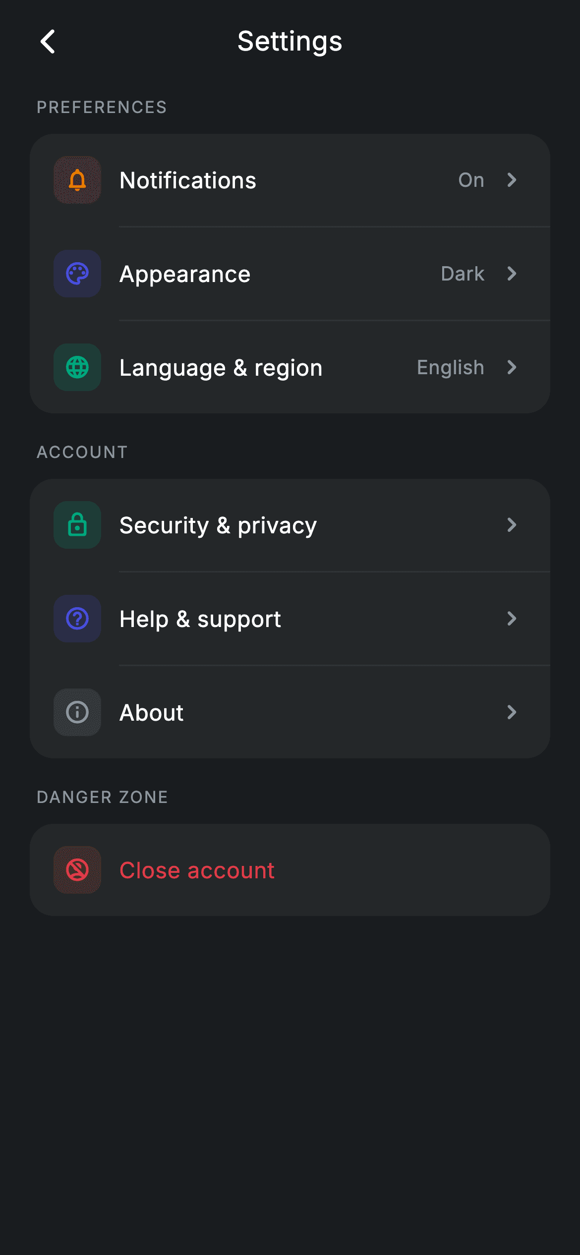
Settings screens are where copy-pasted widget code piles up fastest — seven near-identical rows, each with a tinted icon, a label, sometimes a value, sometimes a chevron. This build replaces all of it with one `_group()` helper that takes a `List<_Item>` and returns a finished rounded card, inserting hairline dividers between rows and indenting them past the icons. Adding a setting is one line of data, and the danger row proves the pattern flexes without a second widget.
Watch the Flutter UI walkthrough
A short screen recording of Settings hub running, if you'd rather see it before you read the code. The written tutorial below covers everything in it.
Can't see the video? Watch it on YouTube.
What you'll build
- ✓A `_group()` builder that turns a list of item records into a rounded settings card
- ✓Dividers inserted only *between* rows, indented 60px so they start where the labels do
- ✓Rows with optional trailing values, spread in only when present
- ✓A danger variant that turns its label red and drops the chevron, from one `bool` flag
- ✓Tinted icon tiles where each item's colour drives both the glyph and its background
Step-by-step build
Create the file
Add a new file at lib/fintech_settings/fintech_settings_screen.dart in your Flutter project.
Register the bundled fonts
No external packages — this is pure Flutter. It does bundle its design font (Inter), so drop the font file into fonts/ and declare it in pubspec.yaml:
flutter:
  fonts:
    - family: Inter
      fonts:
- asset: fonts/Inter-Regular.ttfBuild it, piece by piece
Here's how the screen goes together. Each block below is a real slice of the code with a plain-English explanation — paste them in order, or grab the whole file from the next section.
Eight callbacks and a colour set
class FintechSettingsScreen extends StatelessWidget {
  const FintechSettingsScreen({
    super.key,
    this.onBack,
    this.onSecurity,
    this.onNotifications,
    this.onAppearance,
    this.onLanguage,
    this.onAbout,
    this.onHelp,
    this.onClose,
  });

  final VoidCallback? onBack;
  final VoidCallback? onSecurity;
  final VoidCallback? onNotifications;
  final VoidCallback? onAppearance;
  final VoidCallback? onLanguage;
  final VoidCallback? onAbout;
  final VoidCallback? onHelp;
  final VoidCallback? onClose;

  static const String _font = 'Inter';
  static const Color _bg = Color(0xFF191C1F);
  static const Color _surface = Color(0xFF242729);
  static const Color _brand = Color(0xFF494FDF);
  static const Color _teal = Color(0xFF00A87E);
  static const Color _amber = Color(0xFFEC7E00);
  static const Color _red = Color(0xFFE23B4A);
  static const Color _muted = Color(0xFF8D969E);
  static const Color _hairline = Color(0xFF2E3235);
A `StatelessWidget` with one callback per destination — this screen is a router, not a form, so nothing is held locally (the 'On' and 'Dark' values shown on the rows are display strings that would come from your settings store in a real app). The palette adds `_hairline` (#2E3235) beyond the usual tokens, a colour that exists purely for the dividers: mid-way between the card surface and the page background, so the separators read as seams rather than lines.
The whole screen as three data lists
  @override
  Widget build(BuildContext context) {
    return Theme(
      data: ThemeData.dark(useMaterial3: true),
      child: Scaffold(
        backgroundColor: _bg,
        body: SafeArea(
          child: Column(
            children: <Widget>[
              _buildAppBar(),
              Expanded(
                child: ListView(
                  physics: const BouncingScrollPhysics(),
                  padding: const EdgeInsets.fromLTRB(20, 8, 20, 24),
                  children: <Widget>[
                    _label('Preferences'),
                    _group(<_Item>[
                      _Item(Icons.notifications_none_rounded, _amber,
                          'Notifications', 'On', onNotifications),
                      _Item(Icons.palette_outlined, _brand, 'Appearance', 'Dark',
                          onAppearance),
                      _Item(Icons.language_rounded, _teal, 'Language & region',
                          'English', onLanguage),
                    ]),
                    const SizedBox(height: 18),
                    _label('Account'),
                    _group(<_Item>[
                      _Item(Icons.lock_outline_rounded, _teal,
                          'Security & privacy', null, onSecurity),
                      _Item(Icons.help_outline_rounded, _brand, 'Help & support',
                          null, onHelp),
                      _Item(Icons.info_outline_rounded, _muted, 'About', null,
                          onAbout),
                    ]),
                    const SizedBox(height: 18),
                    _label('Danger zone'),
                    _group(<_Item>[
                      _Item(Icons.no_accounts_outlined, _red, 'Close account',
                          null, onClose, danger: true),
                    ]),
                  ],
                ),
              ),
            ],
          ),
        ),
      ),
    );
  }
This is the payoff. The body is three `_label` / `_group` pairs, and each group is just a `List<_Item>` literal — icon, tint, label, optional value, callback. Adding 'Linked devices' to the Account group is one line, and it will automatically get the right padding, the right divider, and the right chevron. The grouping itself does information architecture work: Preferences holds things with current values, Account holds pure navigation, and Danger zone isolates the one destructive action, so it can't be mistaken for a neighbour of 'About'.
Section labels
  Widget _label(String text) {
    return Padding(
      padding: const EdgeInsets.only(left: 4, bottom: 10),
      child: Text(
        text.toUpperCase(),
        style: const TextStyle(
          fontFamily: _font,
          fontSize: 11,
          fontWeight: FontWeight.w500,
          letterSpacing: 1.0,
          color: _muted,
        ),
      ),
    );
  }
`_label` applies `text.toUpperCase()` in code rather than shouting in the string, which keeps the call sites readable ('Preferences', 'Danger zone') while rendering the 11px `letterSpacing: 1.0` small-caps convention used across this design system. The `left: 4` padding aligns the caption optically with the card content below rather than flush to the card's outer edge, since the rows carry their own 16px inset.
Building a group with separators
  Widget _group(List<_Item> items) {
    final List<Widget> children = <Widget>[];
    for (int i = 0; i < items.length; i++) {
      if (i != 0) {
        children.add(const Divider(height: 1, color: _hairline, indent: 60));
      }
      final _Item it = items[i];
      children.add(InkWell(
        onTap: it.onTap,
        child: Padding(
          padding: const EdgeInsets.symmetric(horizontal: 16, vertical: 15),
The loop builds a `List<Widget>` imperatively, and the `if (i != 0)` guard is what puts dividers *between* rows rather than after each one — so no group ever ends with a stray hairline above its rounded bottom edge. The divider’s `indent: 60` is the detail that makes it look designed: 16px of row padding plus a 32px icon tile plus the 12px gap is exactly 60, so the line starts precisely where the labels start, the standard iOS settings treatment. Note also that the `Padding` sits *inside* the `InkWell` rather than outside it, which is what lets each row’s ripple cover its full width.
One row, three variations
          child: Row(
            children: <Widget>[
              Container(
                width: 32,
                height: 32,
                alignment: Alignment.center,
                decoration: BoxDecoration(
                  color: it.tint.withValues(alpha: 0.16),
                  borderRadius: BorderRadius.circular(9),
                ),
                child: Icon(it.icon, size: 18, color: it.tint),
              ),
              const SizedBox(width: 12),
              Expanded(
                child: Text(
                  it.label,
                  style: TextStyle(
                    fontFamily: _font,
                    fontSize: 15,
                    fontWeight: FontWeight.w500,
                    letterSpacing: 0.24,
                    color: it.danger ? _red : Colors.white,
                  ),
                ),
              ),
              if (it.value != null) ...<Widget>[
                Text(
                  it.value!,
                  style: const TextStyle(
                    fontFamily: _font,
                    fontSize: 13,
                    letterSpacing: 0.24,
                    color: _muted,
                  ),
                ),
                const SizedBox(width: 8),
              ],
              if (!it.danger)
                const Icon(Icons.chevron_right_rounded,
                    size: 20, color: _muted),
            ],
          ),
        ),
      ));
    }
    return Container(
      decoration: BoxDecoration(
        color: _surface,
        borderRadius: BorderRadius.circular(16),
      ),
      child: Column(children: children),
    );
  }
Every difference between rows is data-driven. The 32px icon tile uses `it.tint.withValues(alpha: 0.16)` behind the glyph at full strength, so one colour per item yields a matched pair. The trailing value is spread in with `if (it.value != null) ...<Widget>[...]` — including its 8px gap — so rows without a value have no leftover space. And `it.danger` does two things: it turns the label `_red`, and via `if (!it.danger)` it suppresses the chevron, because a destructive action is not ‘navigation into a sub-page’ and should not promise one. The method closes by wrapping the assembled `Column` in the rounded `_surface` container — three visual variants, no subclassing, no second widget.
Full code
The complete, ready-to-paste source. Free to use in your projects — one click copies it all.
import 'package:flutter/material.dart';

/// Settings — the settings hub (Revolut-inspired design system).
///
/// Self-contained per CONVENTIONS.md: pure Flutter only, the exact design font
/// (Inter) is bundled under `fonts/`, no network/emoji images, and the screen
/// forces its own dark theme. Grouped navigation rows route to each settings
/// area; a danger row closes the account.
class FintechSettingsScreen extends StatelessWidget {
  const FintechSettingsScreen({
    super.key,
    this.onBack,
    this.onSecurity,
    this.onNotifications,
    this.onAppearance,
    this.onLanguage,
    this.onAbout,
    this.onHelp,
    this.onClose,
  });

  final VoidCallback? onBack;
  final VoidCallback? onSecurity;
  final VoidCallback? onNotifications;
  final VoidCallback? onAppearance;
  final VoidCallback? onLanguage;
  final VoidCallback? onAbout;
  final VoidCallback? onHelp;
  final VoidCallback? onClose;

  static const String _font = 'Inter';
  static const Color _bg = Color(0xFF191C1F);
  static const Color _surface = Color(0xFF242729);
  static const Color _brand = Color(0xFF494FDF);
  static const Color _teal = Color(0xFF00A87E);
  static const Color _amber = Color(0xFFEC7E00);
  static const Color _red = Color(0xFFE23B4A);
  static const Color _muted = Color(0xFF8D969E);
  static const Color _hairline = Color(0xFF2E3235);

  @override
  Widget build(BuildContext context) {
    return Theme(
      data: ThemeData.dark(useMaterial3: true),
      child: Scaffold(
        backgroundColor: _bg,
        body: SafeArea(
          child: Column(
            children: <Widget>[
              _buildAppBar(),
              Expanded(
                child: ListView(
                  physics: const BouncingScrollPhysics(),
                  padding: const EdgeInsets.fromLTRB(20, 8, 20, 24),
                  children: <Widget>[
                    _label('Preferences'),
                    _group(<_Item>[
                      _Item(Icons.notifications_none_rounded, _amber,
                          'Notifications', 'On', onNotifications),
                      _Item(Icons.palette_outlined, _brand, 'Appearance', 'Dark',
                          onAppearance),
                      _Item(Icons.language_rounded, _teal, 'Language & region',
                          'English', onLanguage),
                    ]),
                    const SizedBox(height: 18),
                    _label('Account'),
                    _group(<_Item>[
                      _Item(Icons.lock_outline_rounded, _teal,
                          'Security & privacy', null, onSecurity),
                      _Item(Icons.help_outline_rounded, _brand, 'Help & support',
                          null, onHelp),
                      _Item(Icons.info_outline_rounded, _muted, 'About', null,
                          onAbout),
                    ]),
                    const SizedBox(height: 18),
                    _label('Danger zone'),
                    _group(<_Item>[
                      _Item(Icons.no_accounts_outlined, _red, 'Close account',
                          null, onClose, danger: true),
                    ]),
                  ],
                ),
              ),
            ],
          ),
        ),
      ),
    );
  }

  Widget _buildAppBar() {
    return Padding(
      padding: const EdgeInsets.fromLTRB(8, 4, 8, 4),
      child: Row(
        children: <Widget>[
          IconButton(
            onPressed: onBack,
            icon: const Icon(Icons.arrow_back_ios_new_rounded,
                size: 20, color: Colors.white),
          ),
          const Expanded(
            child: Text(
              'Settings',
              textAlign: TextAlign.center,
              style: TextStyle(
                fontFamily: _font,
                fontSize: 18,
                fontWeight: FontWeight.w500,
                letterSpacing: 0.24,
                color: Colors.white,
              ),
            ),
          ),
          const SizedBox(width: 48),
        ],
      ),
    );
  }

  Widget _label(String text) {
    return Padding(
      padding: const EdgeInsets.only(left: 4, bottom: 10),
      child: Text(
        text.toUpperCase(),
        style: const TextStyle(
          fontFamily: _font,
          fontSize: 11,
          fontWeight: FontWeight.w500,
          letterSpacing: 1.0,
          color: _muted,
        ),
      ),
    );
  }

  Widget _group(List<_Item> items) {
    final List<Widget> children = <Widget>[];
    for (int i = 0; i < items.length; i++) {
      if (i != 0) {
        children.add(const Divider(height: 1, color: _hairline, indent: 60));
      }
      final _Item it = items[i];
      children.add(InkWell(
        onTap: it.onTap,
        child: Padding(
          padding: const EdgeInsets.symmetric(horizontal: 16, vertical: 15),
          child: Row(
            children: <Widget>[
              Container(
                width: 32,
                height: 32,
                alignment: Alignment.center,
                decoration: BoxDecoration(
                  color: it.tint.withValues(alpha: 0.16),
                  borderRadius: BorderRadius.circular(9),
                ),
                child: Icon(it.icon, size: 18, color: it.tint),
              ),
              const SizedBox(width: 12),
              Expanded(
                child: Text(
                  it.label,
                  style: TextStyle(
                    fontFamily: _font,
                    fontSize: 15,
                    fontWeight: FontWeight.w500,
                    letterSpacing: 0.24,
                    color: it.danger ? _red : Colors.white,
                  ),
                ),
              ),
              if (it.value != null) ...<Widget>[
                Text(
                  it.value!,
                  style: const TextStyle(
                    fontFamily: _font,
                    fontSize: 13,
                    letterSpacing: 0.24,
                    color: _muted,
                  ),
                ),
                const SizedBox(width: 8),
              ],
              if (!it.danger)
                const Icon(Icons.chevron_right_rounded,
                    size: 20, color: _muted),
            ],
          ),
        ),
      ));
    }
    return Container(
      decoration: BoxDecoration(
        color: _surface,
        borderRadius: BorderRadius.circular(16),
      ),
      child: Column(children: children),
    );
  }
}

class _Item {
  const _Item(this.icon, this.tint, this.label, this.value, this.onTap,
      {this.danger = false});
  final IconData icon;
  final Color tint;
  final String label;
  final String? value;
  final VoidCallback? onTap;
  final bool danger;
}
Plus bundled 1 binary asset (fonts/images). The CLI and MCP install those for you automatically.
Two faster ways to add it
Copy-paste works, but you can skip it entirely.
1. FlutterKit CLI
One command drops this screen — and its fonts — straight into your project.
$ flutterkit add fintech-settings2. AI agent (MCP)
Connect FlutterKit's MCP server in Claude or Cursor and just ask your agent to install fintech-settings — it fetches and writes the files for you.
FAQ
Is this settings screen free to use?
Yes. The full Dart source on this page is free for personal and commercial apps. Copy it from the code block, install it with the FlutterKit CLI (flutterkit add fintech-settings), or add it via an AI agent over MCP.
Does it need any packages?
No — it's pure Flutter on material.dart, with no settings_ui or preferences package. The only asset to register in pubspec.yaml is the bundled Inter font family, which the CLI and MCP install for you.
How do I add a toggle switch row?
Add a nullable bool field (say toggle) and a ValueChanged<bool> to _Item, then in the row builder render a Switch instead of the chevron when it's non-null. Because every row is built from one loop, the new variant inherits the padding, dividers, and tinted icon automatically.
How do I show real current values?
The value field is just a string — feed it from your settings store (shared_preferences, a ChangeNotifier, whatever you use) so 'On' and 'Dark' reflect actual state. If those values can change while the screen is open, convert the widget to a StatefulWidget or wrap the groups in a listener so they rebuild.
Which Flutter version does it target?
It uses Color.withValues(alpha:) and Material 3, so it targets Flutter 3.27+. On an older SDK, replace it.tint.withValues(alpha: 0.16) with withOpacity(0.16) and it compiles back to Flutter 3.10.


