How to Build a Security and Privacy Settings Screen in Flutter (Full Code + Preview)
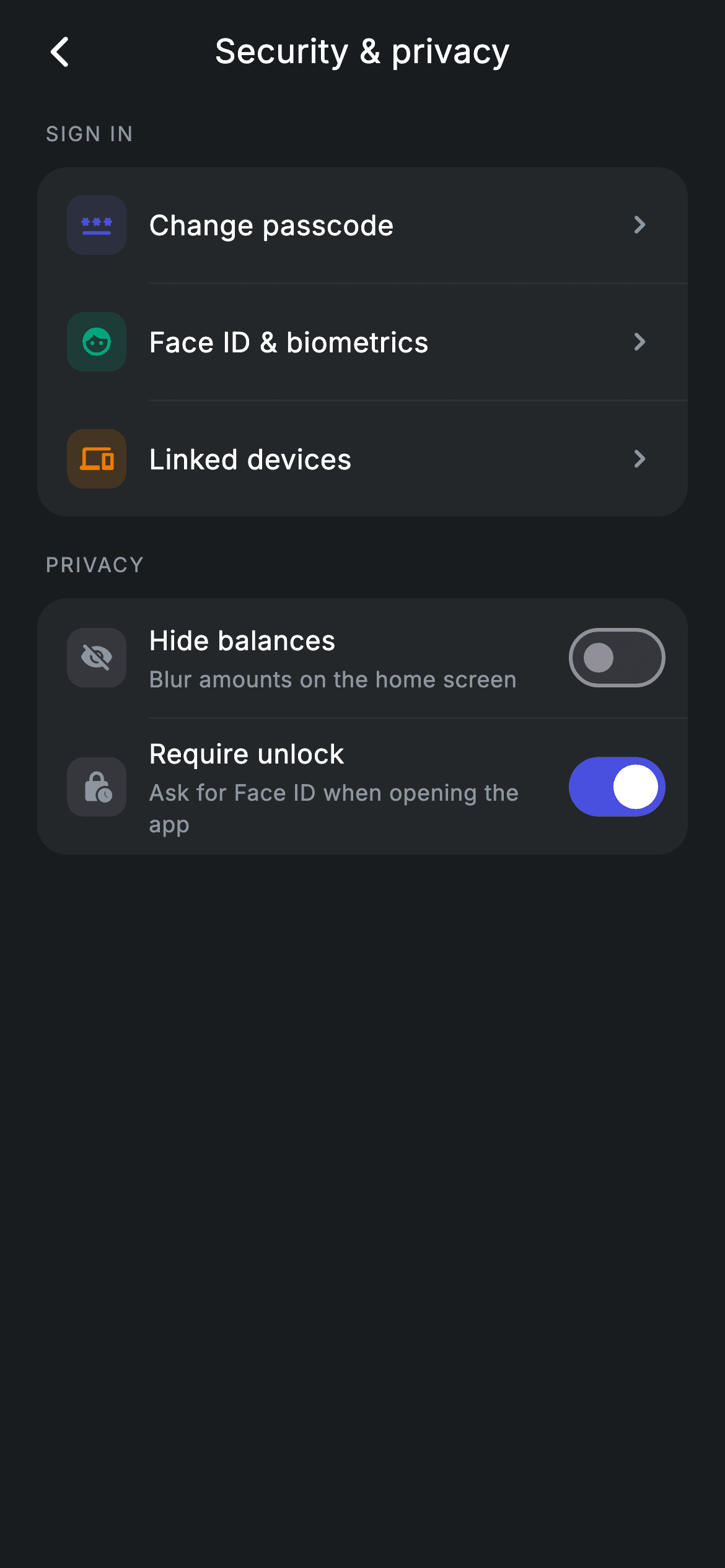
Settings screens have two kinds of row and mixing them up confuses people: rows that navigate somewhere, and rows that change something right here. This tutorial builds a security hub in Flutter that keeps them visually distinct — navigation rows carry colour-coded icons and a chevron, while privacy rows use grey icons, a subtitle, and an inline `Switch`. Both live in grouped cards separated by uppercase section labels, with hairline `Divider`s indented to line up under the text rather than the icons.
Watch the Flutter UI walkthrough
A short screen recording of Security & privacy running, if you'd rather see it before you read the code. The written tutorial below covers everything in it.
Can't see the video? Watch it on YouTube.
What you'll build
- ✓Two grouped settings cards with uppercase section labels above them
- ✓Navigation rows with colour-coded 32px icon tiles and a trailing chevron
- ✓Switch rows deliberately styled grey, so 'changes something here' reads differently from 'goes somewhere'
- ✓`Divider(indent: 60)` so separators start under the label, not under the icon
- ✓Live-toggling privacy switches backed by two booleans
- ✓Per-row callbacks so the host app owns all navigation
Step-by-step build
Create the file
Add a new file at lib/fintech_security/fintech_security_screen.dart in your Flutter project.
Register the bundled fonts
No external packages — this is pure Flutter. It does bundle its design font (Inter), so drop the font file into fonts/ and declare it in pubspec.yaml:
flutter:
  fonts:
    - family: Inter
      fonts:
- asset: fonts/Inter-Regular.ttfBuild it, piece by piece
Here's how the screen goes together. Each block below is a real slice of the code with a plain-English explanation — paste them in order, or grab the whole file from the next section.
Four navigation callbacks, two booleans of state
class FintechSecurityScreen extends StatefulWidget {
  const FintechSecurityScreen({
    super.key,
    this.onBack,
    this.onChangePasscode,
    this.onBiometrics,
    this.onDevices,
  });

  final VoidCallback? onBack;
  final VoidCallback? onChangePasscode;
  final VoidCallback? onBiometrics;
  final VoidCallback? onDevices;

  @override
  State<FintechSecurityScreen> createState() => _FintechSecurityScreenState();
}

class _FintechSecurityScreenState extends State<FintechSecurityScreen> {
  static const String _font = 'Inter';
  static const Color _bg = Color(0xFF191C1F);
  static const Color _surface = Color(0xFF242729);
  static const Color _brand = Color(0xFF494FDF);
  static const Color _teal = Color(0xFF00A87E);
  static const Color _amber = Color(0xFFEC7E00);
  static const Color _muted = Color(0xFF8D969E);
  static const Color _hairline = Color(0xFF2E3235);

  bool _hideBalances = false;
  bool _screenLock = true;
The widget takes `onBack`, `onChangePasscode`, `onBiometrics` and `onDevices` — one per navigation row — so the screen never decides where anything goes; the host app wires those up. Everything the screen *owns* is the two fields below: `bool _hideBalances = false` and `bool _screenLock = true`. That split is the whole architecture: navigation is delegated outward, toggle state is kept local. `_screenLock` defaults to true because requiring an unlock is the safer default for a banking app.
Grouped cards and indented dividers
  @override
  Widget build(BuildContext context) {
    return Theme(
      data: ThemeData.dark(useMaterial3: true),
      child: Scaffold(
        backgroundColor: _bg,
        body: SafeArea(
          child: Column(
            children: <Widget>[
              _buildAppBar(),
              Expanded(
                child: ListView(
                  physics: const BouncingScrollPhysics(),
                  padding: const EdgeInsets.fromLTRB(20, 8, 20, 24),
                  children: <Widget>[
                    _label('Sign in'),
                    Container(
                      decoration: BoxDecoration(
                        color: _surface,
                        borderRadius: BorderRadius.circular(16),
                      ),
                      child: Column(
                        children: <Widget>[
                          _navRow(Icons.password_rounded, _brand,
                              'Change passcode', widget.onChangePasscode),
                          const Divider(height: 1, color: _hairline, indent: 60),
                          _navRow(Icons.face_rounded, _teal, 'Face ID & biometrics',
                              widget.onBiometrics),
                          const Divider(height: 1, color: _hairline, indent: 60),
                          _navRow(Icons.devices_rounded, _amber,
                              'Linked devices', widget.onDevices),
                        ],
                      ),
                    ),
                    const SizedBox(height: 18),
                    _label('Privacy'),
                    Container(
                      decoration: BoxDecoration(
                        color: _surface,
                        borderRadius: BorderRadius.circular(16),
                      ),
                      child: Column(
                        children: <Widget>[
                          _switchRow(
                            Icons.visibility_off_rounded,
                            'Hide balances',
                            'Blur amounts on the home screen',
                            _hideBalances,
                            (bool v) => setState(() => _hideBalances = v),
                          ),
                          const Divider(height: 1, color: _hairline, indent: 60),
                          _switchRow(
                            Icons.lock_clock_rounded,
                            'Require unlock',
                            'Ask for Face ID when opening the app',
                            _screenLock,
                            (bool v) => setState(() => _screenLock = v),
                          ),
                        ],
                      ),
                    ),
                  ],
                ),
              ),
            ],
          ),
        ),
      ),
    );
  }
The body builds two cards inline rather than through helpers, because their *contents* differ while their shells are identical: a `_surface` `Container` with a 16px radius wrapping a `Column` of rows. Rows are separated by `const Divider(height: 1, color: _hairline, indent: 60)`. That `indent: 60` is the detail — it pushes the line start past the 16px padding plus the 32px icon plus the 12px gap, so the divider begins exactly under the label text. Full-width dividers would cut through the icon column and make the card look sliced. `height: 1` stops `Divider` adding its usual 16px of vertical breathing room.
The section label helper
  Widget _label(String text) {
    return Padding(
      padding: const EdgeInsets.only(left: 4, bottom: 10),
      child: Text(
        text.toUpperCase(),
        style: const TextStyle(
          fontFamily: _font,
          fontSize: 11,
          fontWeight: FontWeight.w500,
          letterSpacing: 1.0,
          color: _muted,
        ),
      ),
    );
  }
`_label` is four lines that do a lot of work: uppercase the text, drop it to 11px, and open it up with `letterSpacing: 1.0` in muted grey. Wide tracking is what makes small uppercase text readable — set tight, 11px caps turn into a smudge. The 4px left inset aligns the label optically with the card's content below rather than with the card's outer edge, and the 10px bottom padding is what visually binds the label to the card it introduces.
Navigation rows: colour-coded and chevroned
  Widget _navRow(IconData icon, Color tint, String label, VoidCallback? onTap) {
    return InkWell(
      onTap: onTap,
      child: Padding(
        padding: const EdgeInsets.symmetric(horizontal: 16, vertical: 15),
        child: Row(
          children: <Widget>[
            Container(
              width: 32,
              height: 32,
              alignment: Alignment.center,
              decoration: BoxDecoration(
                color: tint.withValues(alpha: 0.16),
                borderRadius: BorderRadius.circular(9),
              ),
              child: Icon(icon, size: 18, color: tint),
            ),
            const SizedBox(width: 12),
            Expanded(
              child: Text(
                label,
                style: const TextStyle(
                  fontFamily: _font,
                  fontSize: 15,
                  fontWeight: FontWeight.w500,
                  letterSpacing: 0.24,
                  color: Colors.white,
                ),
              ),
            ),
            const Icon(Icons.chevron_right_rounded, size: 20, color: _muted),
          ],
        ),
      ),
    );
  }
`_navRow` takes its own `tint`, so passcode is brand indigo, biometrics teal and devices amber — colour is being used as a wayfinding aid across the three destinations, not as decoration. Each icon sits in a 32px rounded square filled `tint.withValues(alpha: 0.16)` with the icon itself at full strength, the standard tint recipe. The `InkWell` wraps the `Padding` rather than sitting inside it, which is what makes the entire row width tappable and lets the ripple span the full card. The trailing `chevron_right_rounded` is the signal that tapping leaves this screen.
Switch rows: grey by design
  Widget _switchRow(IconData icon, String title, String sub, bool value,
      ValueChanged<bool> onChanged) {
    return Padding(
      padding: const EdgeInsets.fromLTRB(16, 8, 8, 8),
      child: Row(
        children: <Widget>[
          Container(
            width: 32,
            height: 32,
            alignment: Alignment.center,
            decoration: BoxDecoration(
              color: _muted.withValues(alpha: 0.16),
              borderRadius: BorderRadius.circular(9),
            ),
            child: Icon(icon, size: 18, color: _muted),
          ),
          const SizedBox(width: 12),
          Expanded(
            child: Column(
              crossAxisAlignment: CrossAxisAlignment.start,
              children: <Widget>[
                Text(
                  title,
                  style: const TextStyle(
                    fontFamily: _font,
                    fontSize: 14.5,
                    fontWeight: FontWeight.w500,
                    letterSpacing: 0.24,
                    color: Colors.white,
                  ),
                ),
                const SizedBox(height: 2),
                Text(
                  sub,
                  style: const TextStyle(
                    fontFamily: _font,
                    fontSize: 12,
                    letterSpacing: 0.24,
                    color: _muted,
                  ),
                ),
              ],
            ),
          ),
          Switch(
            value: value,
            onChanged: onChanged,
            activeThumbColor: Colors.white,
            activeTrackColor: _brand,
          ),
        ],
      ),
    );
  }
`_switchRow` is deliberately *not* colour-coded — its tile uses `_muted.withValues(alpha: 0.16)` behind a muted icon, so the eye reads these rows as a different class from the coloured navigation rows above. They also carry a 12px subtitle explaining what the toggle actually does ('Blur amounts on the home screen'), which navigation rows don't need. The padding is asymmetric — `fromLTRB(16, 8, 8, 8)` — because `Switch` ships with its own internal padding; giving the right edge only 8px stops the control sitting too far inside the card. There's no `InkWell` here, since the `Switch` is the only tap target.
Full code
The complete, ready-to-paste source. Free to use in your projects — one click copies it all.
import 'package:flutter/material.dart';

/// Security & privacy — security settings hub (Revolut-inspired design).
///
/// Self-contained per CONVENTIONS.md: pure Flutter only, the exact design font
/// (Inter) is bundled under `fonts/`, no network/emoji images, and the screen
/// forces its own dark theme. Navigation rows route to passcode / biometrics /
/// devices; inline switches toggle privacy options live.
class FintechSecurityScreen extends StatefulWidget {
  const FintechSecurityScreen({
    super.key,
    this.onBack,
    this.onChangePasscode,
    this.onBiometrics,
    this.onDevices,
  });

  final VoidCallback? onBack;
  final VoidCallback? onChangePasscode;
  final VoidCallback? onBiometrics;
  final VoidCallback? onDevices;

  @override
  State<FintechSecurityScreen> createState() => _FintechSecurityScreenState();
}

class _FintechSecurityScreenState extends State<FintechSecurityScreen> {
  static const String _font = 'Inter';
  static const Color _bg = Color(0xFF191C1F);
  static const Color _surface = Color(0xFF242729);
  static const Color _brand = Color(0xFF494FDF);
  static const Color _teal = Color(0xFF00A87E);
  static const Color _amber = Color(0xFFEC7E00);
  static const Color _muted = Color(0xFF8D969E);
  static const Color _hairline = Color(0xFF2E3235);

  bool _hideBalances = false;
  bool _screenLock = true;

  @override
  Widget build(BuildContext context) {
    return Theme(
      data: ThemeData.dark(useMaterial3: true),
      child: Scaffold(
        backgroundColor: _bg,
        body: SafeArea(
          child: Column(
            children: <Widget>[
              _buildAppBar(),
              Expanded(
                child: ListView(
                  physics: const BouncingScrollPhysics(),
                  padding: const EdgeInsets.fromLTRB(20, 8, 20, 24),
                  children: <Widget>[
                    _label('Sign in'),
                    Container(
                      decoration: BoxDecoration(
                        color: _surface,
                        borderRadius: BorderRadius.circular(16),
                      ),
                      child: Column(
                        children: <Widget>[
                          _navRow(Icons.password_rounded, _brand,
                              'Change passcode', widget.onChangePasscode),
                          const Divider(height: 1, color: _hairline, indent: 60),
                          _navRow(Icons.face_rounded, _teal, 'Face ID & biometrics',
                              widget.onBiometrics),
                          const Divider(height: 1, color: _hairline, indent: 60),
                          _navRow(Icons.devices_rounded, _amber,
                              'Linked devices', widget.onDevices),
                        ],
                      ),
                    ),
                    const SizedBox(height: 18),
                    _label('Privacy'),
                    Container(
                      decoration: BoxDecoration(
                        color: _surface,
                        borderRadius: BorderRadius.circular(16),
                      ),
                      child: Column(
                        children: <Widget>[
                          _switchRow(
                            Icons.visibility_off_rounded,
                            'Hide balances',
                            'Blur amounts on the home screen',
                            _hideBalances,
                            (bool v) => setState(() => _hideBalances = v),
                          ),
                          const Divider(height: 1, color: _hairline, indent: 60),
                          _switchRow(
                            Icons.lock_clock_rounded,
                            'Require unlock',
                            'Ask for Face ID when opening the app',
                            _screenLock,
                            (bool v) => setState(() => _screenLock = v),
                          ),
                        ],
                      ),
                    ),
                  ],
                ),
              ),
            ],
          ),
        ),
      ),
    );
  }

  Widget _buildAppBar() {
    return Padding(
      padding: const EdgeInsets.fromLTRB(8, 4, 8, 4),
      child: Row(
        children: <Widget>[
          IconButton(
            onPressed: widget.onBack,
            icon: const Icon(Icons.arrow_back_ios_new_rounded,
                size: 20, color: Colors.white),
          ),
          const Expanded(
            child: Text(
              'Security & privacy',
              textAlign: TextAlign.center,
              style: TextStyle(
                fontFamily: _font,
                fontSize: 18,
                fontWeight: FontWeight.w500,
                letterSpacing: 0.24,
                color: Colors.white,
              ),
            ),
          ),
          const SizedBox(width: 48),
        ],
      ),
    );
  }

  Widget _label(String text) {
    return Padding(
      padding: const EdgeInsets.only(left: 4, bottom: 10),
      child: Text(
        text.toUpperCase(),
        style: const TextStyle(
          fontFamily: _font,
          fontSize: 11,
          fontWeight: FontWeight.w500,
          letterSpacing: 1.0,
          color: _muted,
        ),
      ),
    );
  }

  Widget _navRow(IconData icon, Color tint, String label, VoidCallback? onTap) {
    return InkWell(
      onTap: onTap,
      child: Padding(
        padding: const EdgeInsets.symmetric(horizontal: 16, vertical: 15),
        child: Row(
          children: <Widget>[
            Container(
              width: 32,
              height: 32,
              alignment: Alignment.center,
              decoration: BoxDecoration(
                color: tint.withValues(alpha: 0.16),
                borderRadius: BorderRadius.circular(9),
              ),
              child: Icon(icon, size: 18, color: tint),
            ),
            const SizedBox(width: 12),
            Expanded(
              child: Text(
                label,
                style: const TextStyle(
                  fontFamily: _font,
                  fontSize: 15,
                  fontWeight: FontWeight.w500,
                  letterSpacing: 0.24,
                  color: Colors.white,
                ),
              ),
            ),
            const Icon(Icons.chevron_right_rounded, size: 20, color: _muted),
          ],
        ),
      ),
    );
  }

  Widget _switchRow(IconData icon, String title, String sub, bool value,
      ValueChanged<bool> onChanged) {
    return Padding(
      padding: const EdgeInsets.fromLTRB(16, 8, 8, 8),
      child: Row(
        children: <Widget>[
          Container(
            width: 32,
            height: 32,
            alignment: Alignment.center,
            decoration: BoxDecoration(
              color: _muted.withValues(alpha: 0.16),
              borderRadius: BorderRadius.circular(9),
            ),
            child: Icon(icon, size: 18, color: _muted),
          ),
          const SizedBox(width: 12),
          Expanded(
            child: Column(
              crossAxisAlignment: CrossAxisAlignment.start,
              children: <Widget>[
                Text(
                  title,
                  style: const TextStyle(
                    fontFamily: _font,
                    fontSize: 14.5,
                    fontWeight: FontWeight.w500,
                    letterSpacing: 0.24,
                    color: Colors.white,
                  ),
                ),
                const SizedBox(height: 2),
                Text(
                  sub,
                  style: const TextStyle(
                    fontFamily: _font,
                    fontSize: 12,
                    letterSpacing: 0.24,
                    color: _muted,
                  ),
                ),
              ],
            ),
          ),
          Switch(
            value: value,
            onChanged: onChanged,
            activeThumbColor: Colors.white,
            activeTrackColor: _brand,
          ),
        ],
      ),
    );
  }
}
Plus bundled 1 binary asset (fonts/images). The CLI and MCP install those for you automatically.
Two faster ways to add it
Copy-paste works, but you can skip it entirely.
1. FlutterKit CLI
One command drops this screen — and its fonts — straight into your project.
$ flutterkit add fintech-security2. AI agent (MCP)
Connect FlutterKit's MCP server in Claude or Cursor and just ask your agent to install fintech-security — it fetches and writes the files for you.
FAQ
Is this security settings screen free to use?
Yes. The complete Dart source on this page is free for personal and commercial apps. Copy it from the code block, install it with the FlutterKit CLI (flutterkit add fintech-security), or add it through an AI agent over MCP.
Why do the dividers start 60 pixels in?
So the line begins under the row's text rather than slicing through the icon column: 16px card padding + 32px icon + 12px gap = 60. If you resize the icon tiles, update the indent to match or the separators will look misaligned.
How do I persist the two toggles?
Read the saved values in initState and write them inside each onChanged, using SharedPreferences or your own storage. The widget already rebuilds from _hideBalances and _screenLock, so only the load and save calls need adding.
Does it actually enable Face ID?
No — this is the UI layer. The 'Require unlock' switch flips a boolean; wiring it to real biometrics needs a plugin such as local_auth plus the platform entitlements. Keeping the screen dependency-free means you can drop in whichever auth package your app already uses.
Which Flutter version does it target?
Switch's activeThumbColor and Color.withValues(alpha:) both need a recent SDK, so target Flutter 3.27+. On older versions swap activeThumbColor for activeColor and withValues(alpha: x) for withOpacity(x).


