How to Build a Savings Vaults List Screen in Flutter (Full Code + Preview)
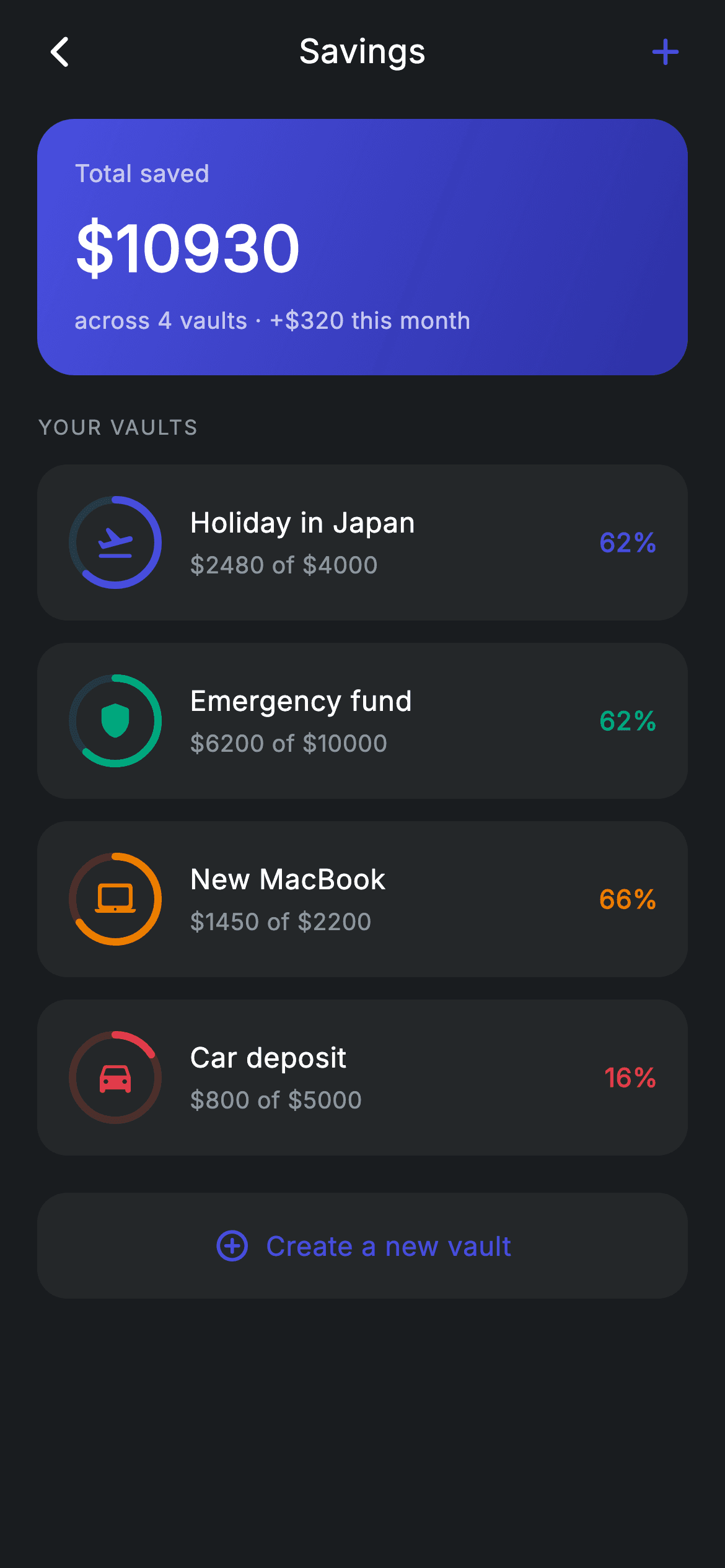
Four savings goals, each showing progress as a ring drawn *around* its own icon — that's the pattern worth taking from this screen. A 52px `Stack` layers a `CustomPaint` ring under a centred `Icon`, so the goal's identity and its progress occupy the same space instead of competing for row width. Above the list, a gradient total card sums the vaults with a `fold`, and every percentage on screen is derived from saved ÷ goal rather than stored.
Watch the Flutter UI walkthrough
A short screen recording of Savings vaults running, if you'd rather see it before you read the code. The written tutorial below covers everything in it.
Can't see the video? Watch it on YouTube.
What you'll build
- ✓Circular progress rings painted around each vault's icon in a single 52px slot
- ✓A gradient summary card whose total is computed with `fold` over the vault list
- ✓Per-vault colour theming where one `Color` drives the ring, the icon, and the percentage
- ✓A dashed-free 'Create a new vault' tile that closes the list without pretending to be one
- ✓Rings drawn from 12 o'clock with a rounded cap, clamped so over-funded goals still render correctly
Step-by-step build
Create the file
Add a new file at lib/fintech_savings/fintech_savings_screen.dart in your Flutter project.
Register the bundled fonts
No external packages — this is pure Flutter. It does bundle its design font (Inter), so drop the font file into fonts/ and declare it in pubspec.yaml:
flutter:
  fonts:
    - family: Inter
      fonts:
- asset: fonts/Inter-Regular.ttfBuild it, piece by piece
Here's how the screen goes together. Each block below is a real slice of the code with a plain-English explanation — paste them in order, or grab the whole file from the next section.
Vaults as data, total as a fold
class FintechSavingsScreen extends StatelessWidget {
  const FintechSavingsScreen({
    super.key,
    this.onBack,
    this.onVaultTap,
    this.onCreate,
  });

  final VoidCallback? onBack;
  final VoidCallback? onVaultTap;
  final VoidCallback? onCreate;

  static const String _font = 'Inter';
  static const Color _bg = Color(0xFF191C1F);
  static const Color _surface = Color(0xFF242729);
  static const Color _brand = Color(0xFF494FDF);
  static const Color _teal = Color(0xFF00A87E);
  static const Color _amber = Color(0xFFEC7E00);
  static const Color _red = Color(0xFFE23B4A);
  static const Color _muted = Color(0xFF8D969E);

  static const List<_Vault> _vaults = <_Vault>[
    _Vault('Holiday in Japan', Icons.flight_takeoff_rounded, _brand, 2480, 4000),
    _Vault('Emergency fund', Icons.shield_rounded, _teal, 6200, 10000),
    _Vault('New MacBook', Icons.laptop_mac_rounded, _amber, 1450, 2200),
    _Vault('Car deposit', Icons.directions_car_rounded, _red, 800, 5000),
  ];

  double get _totalSaved =>
      _vaults.fold<double>(0, (double s, _Vault v) => s + v.saved);
Each `_Vault` carries a name, an icon, an identity colour, and two doubles — `saved` and `goal`. Note what is *not* stored: no percentage and no remaining amount, because both are derivable and a stored copy is a copy that can go stale. `_totalSaved` is a getter folding across the list: `_vaults.fold<double>(0, (s, v) => s + v.saved)`. Because it's a getter rather than a field, adding or removing a vault updates the header card automatically. The four colours (brand, teal, amber, red) are assigned per goal, which is what lets each row be colour-coded without a palette lookup.
Shell and the brand-accented app bar
  @override
  Widget build(BuildContext context) {
    return Theme(
      data: ThemeData.dark(useMaterial3: true),
      child: Scaffold(
        backgroundColor: _bg,
        body: SafeArea(
          child: Column(
            children: <Widget>[
              _buildAppBar(),
              Expanded(
                child: ListView(
                  physics: const BouncingScrollPhysics(),
                  padding: const EdgeInsets.fromLTRB(20, 8, 20, 24),
                  children: <Widget>[
                    _buildTotal(),
                    const SizedBox(height: 20),
                    _sectionLabel('Your vaults'),
                    const SizedBox(height: 12),
                    for (final _Vault v in _vaults)
                      _VaultTile(vault: v, onTap: onVaultTap),
                    const SizedBox(height: 8),
                    _buildCreateTile(),
                  ],
                ),
              ),
            ],
          ),
        ),
      ),
    );
  }

  Widget _buildAppBar() {
    return Padding(
      padding: const EdgeInsets.fromLTRB(8, 4, 8, 4),
      child: Row(
        children: <Widget>[
          IconButton(
            onPressed: onBack,
            icon: const Icon(Icons.arrow_back_ios_new_rounded,
                size: 20, color: Colors.white),
          ),
          const Expanded(
            child: Text(
              'Savings',
              textAlign: TextAlign.center,
              style: TextStyle(
                fontFamily: _font,
                fontSize: 18,
                fontWeight: FontWeight.w500,
                letterSpacing: 0.24,
                color: Colors.white,
              ),
            ),
          ),
          IconButton(
            onPressed: onCreate,
            icon: const Icon(Icons.add_rounded, size: 24, color: _brand),
          ),
        ],
      ),
    );
  }
A fixed app bar over `Expanded(child: ListView(...))` with `BouncingScrollPhysics`. The app bar's trailing `add_rounded` is coloured `_brand` rather than white — the only tinted icon in the bar, which is how you signal the primary action on a screen without adding a floating action button. It shares the `onCreate` callback with the tile at the bottom of the list, so the affordance exists at both ends of the scroll.
The gradient total card
  Widget _buildTotal() {
    return Container(
      padding: const EdgeInsets.all(20),
      decoration: BoxDecoration(
        gradient: const LinearGradient(
          begin: Alignment.topLeft,
          end: Alignment.bottomRight,
          colors: <Color>[Color(0xFF494FDF), Color(0xFF2D31A6)],
        ),
        borderRadius: BorderRadius.circular(20),
      ),
      child: Column(
        crossAxisAlignment: CrossAxisAlignment.start,
        children: <Widget>[
          const Text(
            'Total saved',
            style: TextStyle(
              fontFamily: _font,
              fontSize: 13,
              letterSpacing: 0.24,
              color: Colors.white70,
            ),
          ),
          const SizedBox(height: 6),
          Text(
            '\$${_totalSaved.toStringAsFixed(0)}',
            style: const TextStyle(
              fontFamily: _font,
              fontSize: 34,
              fontWeight: FontWeight.w600,
              letterSpacing: 0.24,
              color: Colors.white,
            ),
          ),
          const SizedBox(height: 6),
          const Text(
            'across 4 vaults · +\$320 this month',
            style: TextStyle(
              fontFamily: _font,
              fontSize: 12.5,
              letterSpacing: 0.24,
              color: Colors.white70,
            ),
          ),
        ],
      ),
    );
  }
The summary is a `LinearGradient` running `topLeft` to `bottomRight` from #494FDF to the darker #2D31A6 — a diagonal sweep of a single hue, which reads as depth rather than decoration. Its text uses `Colors.white70` for the label and supporting line against pure white for the amount; on a saturated background, dropping the secondary text to 70% opacity is more reliable than picking a lighter grey, because it stays legible whatever the gradient does underneath. The amount is `'\$${_totalSaved.toStringAsFixed(0)}'`, formatting the folded total to whole dollars at display time.
The create tile
  Widget _buildCreateTile() {
    return GestureDetector(
      onTap: onCreate,
      child: Container(
        padding: const EdgeInsets.symmetric(vertical: 18),
        decoration: BoxDecoration(
          color: _surface,
          borderRadius: BorderRadius.circular(16),
        ),
        child: const Row(
          mainAxisAlignment: MainAxisAlignment.center,
          children: <Widget>[
            Icon(Icons.add_circle_outline_rounded, size: 20, color: _brand),
            SizedBox(width: 8),
            Text(
              'Create a new vault',
              style: TextStyle(
                fontFamily: _font,
                fontSize: 14.5,
                fontWeight: FontWeight.w500,
                letterSpacing: 0.24,
                color: _brand,
              ),
            ),
          ],
        ),
      ),
    );
  }
The final tile deliberately breaks the pattern: same `_surface` fill and 16px radius as a vault, but centred content in brand colour with an outline `add_circle_outline_rounded` icon and no ring, no name, no percentage. It reads as an action inside the list rather than a fifth vault. Placing it after the loop with an 8px gap — rather than as a header button — means it appears exactly where the user finishes reading their goals, which is when adding another occurs to them.
The vault tile and its derived numbers
class _VaultTile extends StatelessWidget {
  const _VaultTile({required this.vault, this.onTap});

  final _Vault vault;
  final VoidCallback? onTap;

  @override
  Widget build(BuildContext context) {
    final double frac = (vault.saved / vault.goal).clamp(0, 1);
    return InkWell(
      onTap: onTap,
      borderRadius: BorderRadius.circular(16),
      child: Container(
        margin: const EdgeInsets.only(bottom: 12),
        padding: const EdgeInsets.all(16),
        decoration: BoxDecoration(
          color: FintechSavingsScreen._surface,
          borderRadius: BorderRadius.circular(16),
        ),
        child: Row(
          children: <Widget>[
            SizedBox(
              width: 52,
              height: 52,
              child: Stack(
                alignment: Alignment.center,
                children: <Widget>[
                  CustomPaint(
                    size: const Size(52, 52),
                    painter: _RingPainter(progress: frac, color: vault.color),
                  ),
                  Icon(vault.icon, size: 22, color: vault.color),
                ],
              ),
            ),
            const SizedBox(width: 14),
            Expanded(
              child: Column(
                crossAxisAlignment: CrossAxisAlignment.start,
                children: <Widget>[
                  Text(
                    vault.name,
                    style: const TextStyle(
                      fontFamily: FintechSavingsScreen._font,
                      fontSize: 15,
                      fontWeight: FontWeight.w500,
                      letterSpacing: 0.24,
                      color: Colors.white,
                    ),
                  ),
                  const SizedBox(height: 4),
                  Text(
                    '\$${vault.saved.toStringAsFixed(0)} of \$${vault.goal.toStringAsFixed(0)}',
                    style: const TextStyle(
                      fontFamily: FintechSavingsScreen._font,
                      fontSize: 12.5,
                      letterSpacing: 0.24,
                      color: FintechSavingsScreen._muted,
                    ),
                  ),
                ],
              ),
            ),
            Text(
              '${(frac * 100).round()}%',
              style: TextStyle(
                fontFamily: FintechSavingsScreen._font,
                fontSize: 14,
                fontWeight: FontWeight.w600,
                letterSpacing: 0.24,
                color: vault.color,
              ),
            ),
          ],
        ),
      ),
    );
  }
}
`frac = (vault.saved / vault.goal).clamp(0, 1)` is computed once and used twice — for the ring's sweep and for the `'${(frac * 100).round()}%'` label — so the ring and the number can never disagree. The `clamp` matters for a real app: a goal that's been over-funded would otherwise sweep past a full circle and draw a second overlapping arc. The 52px slot is a `Stack` with `alignment: Alignment.center` holding the painter and the icon, which is what puts progress and identity in the same footprint. `InkWell` carries a `borderRadius` matching the container's 16px so the ripple is clipped to the tile rather than splashing square. The subtitle spells out `'\$2480 of \$4000'` in full, giving the absolute numbers the percentage alone can't.
Painting the progress ring
class _RingPainter extends CustomPainter {
  _RingPainter({required this.progress, required this.color});

  final double progress;
  final Color color;

  @override
  void paint(Canvas canvas, Size size) {
    final Offset center = size.center(Offset.zero);
    final double radius = size.width / 2 - 3;
    final Rect rect = Rect.fromCircle(center: center, radius: radius);
    canvas.drawCircle(
      center,
      radius,
      Paint()
        ..color = color.withValues(alpha: 0.2)
        ..style = PaintingStyle.stroke
        ..strokeWidth = 4,
    );
    canvas.drawArc(
      rect,
      -1.5708,
      6.2832 * progress.clamp(0, 1),
      false,
      Paint()
        ..color = color
        ..style = PaintingStyle.stroke
        ..strokeWidth = 4
        ..strokeCap = StrokeCap.round,
    );
  }

  @override
  bool shouldRepaint(covariant _RingPainter oldDelegate) =>
      oldDelegate.progress != progress || oldDelegate.color != color;
}
Two draws. First a full `drawCircle` stroked at 4px in `color.withValues(alpha: 0.2)` — deriving the track from the vault's own colour rather than using a neutral grey is what keeps each row visually unified. Then `drawArc` over a `Rect.fromCircle` with the same radius and stroke width. The start angle `-1.5708` is -π/2 radians, which rotates the origin from three o'clock (Flutter's default) to twelve o'clock, so progress climbs the way people expect. The sweep is `6.2832 * progress.clamp(0, 1)` — 2π times the fraction — and `StrokeCap.round` gives the arc's leading edge its rounded tip. `radius = size.width / 2 - 3` insets by roughly the stroke width so the 4px band isn't clipped at the box edge. `shouldRepaint` compares both progress and colour, so unchanged rows never repaint.
Full code
The complete, ready-to-paste source. Free to use in your projects — one click copies it all.
import 'package:flutter/material.dart';

/// Savings — vaults / goals list (Revolut-inspired design system).
///
/// Self-contained per CONVENTIONS.md: pure Flutter only, the exact design font
/// (Inter) is bundled under `fonts/`, progress rings are custom-painted (no
/// charting package, no network/emoji), and the screen forces its own dark
/// theme. Each vault shows its goal, saved amount and progress.
class FintechSavingsScreen extends StatelessWidget {
  const FintechSavingsScreen({
    super.key,
    this.onBack,
    this.onVaultTap,
    this.onCreate,
  });

  final VoidCallback? onBack;
  final VoidCallback? onVaultTap;
  final VoidCallback? onCreate;

  static const String _font = 'Inter';
  static const Color _bg = Color(0xFF191C1F);
  static const Color _surface = Color(0xFF242729);
  static const Color _brand = Color(0xFF494FDF);
  static const Color _teal = Color(0xFF00A87E);
  static const Color _amber = Color(0xFFEC7E00);
  static const Color _red = Color(0xFFE23B4A);
  static const Color _muted = Color(0xFF8D969E);

  static const List<_Vault> _vaults = <_Vault>[
    _Vault('Holiday in Japan', Icons.flight_takeoff_rounded, _brand, 2480, 4000),
    _Vault('Emergency fund', Icons.shield_rounded, _teal, 6200, 10000),
    _Vault('New MacBook', Icons.laptop_mac_rounded, _amber, 1450, 2200),
    _Vault('Car deposit', Icons.directions_car_rounded, _red, 800, 5000),
  ];

  double get _totalSaved =>
      _vaults.fold<double>(0, (double s, _Vault v) => s + v.saved);

  @override
  Widget build(BuildContext context) {
    return Theme(
      data: ThemeData.dark(useMaterial3: true),
      child: Scaffold(
        backgroundColor: _bg,
        body: SafeArea(
          child: Column(
            children: <Widget>[
              _buildAppBar(),
              Expanded(
                child: ListView(
                  physics: const BouncingScrollPhysics(),
                  padding: const EdgeInsets.fromLTRB(20, 8, 20, 24),
                  children: <Widget>[
                    _buildTotal(),
                    const SizedBox(height: 20),
                    _sectionLabel('Your vaults'),
                    const SizedBox(height: 12),
                    for (final _Vault v in _vaults)
                      _VaultTile(vault: v, onTap: onVaultTap),
                    const SizedBox(height: 8),
                    _buildCreateTile(),
                  ],
                ),
              ),
            ],
          ),
        ),
      ),
    );
  }

  Widget _buildAppBar() {
    return Padding(
      padding: const EdgeInsets.fromLTRB(8, 4, 8, 4),
      child: Row(
        children: <Widget>[
          IconButton(
            onPressed: onBack,
            icon: const Icon(Icons.arrow_back_ios_new_rounded,
                size: 20, color: Colors.white),
          ),
          const Expanded(
            child: Text(
              'Savings',
              textAlign: TextAlign.center,
              style: TextStyle(
                fontFamily: _font,
                fontSize: 18,
                fontWeight: FontWeight.w500,
                letterSpacing: 0.24,
                color: Colors.white,
              ),
            ),
          ),
          IconButton(
            onPressed: onCreate,
            icon: const Icon(Icons.add_rounded, size: 24, color: _brand),
          ),
        ],
      ),
    );
  }

  Widget _buildTotal() {
    return Container(
      padding: const EdgeInsets.all(20),
      decoration: BoxDecoration(
        gradient: const LinearGradient(
          begin: Alignment.topLeft,
          end: Alignment.bottomRight,
          colors: <Color>[Color(0xFF494FDF), Color(0xFF2D31A6)],
        ),
        borderRadius: BorderRadius.circular(20),
      ),
      child: Column(
        crossAxisAlignment: CrossAxisAlignment.start,
        children: <Widget>[
          const Text(
            'Total saved',
            style: TextStyle(
              fontFamily: _font,
              fontSize: 13,
              letterSpacing: 0.24,
              color: Colors.white70,
            ),
          ),
          const SizedBox(height: 6),
          Text(
            '\$${_totalSaved.toStringAsFixed(0)}',
            style: const TextStyle(
              fontFamily: _font,
              fontSize: 34,
              fontWeight: FontWeight.w600,
              letterSpacing: 0.24,
              color: Colors.white,
            ),
          ),
          const SizedBox(height: 6),
          const Text(
            'across 4 vaults · +\$320 this month',
            style: TextStyle(
              fontFamily: _font,
              fontSize: 12.5,
              letterSpacing: 0.24,
              color: Colors.white70,
            ),
          ),
        ],
      ),
    );
  }

  Widget _sectionLabel(String text) {
    return Text(
      text.toUpperCase(),
      style: const TextStyle(
        fontFamily: _font,
        fontSize: 11,
        fontWeight: FontWeight.w500,
        letterSpacing: 1.0,
        color: _muted,
      ),
    );
  }

  Widget _buildCreateTile() {
    return GestureDetector(
      onTap: onCreate,
      child: Container(
        padding: const EdgeInsets.symmetric(vertical: 18),
        decoration: BoxDecoration(
          color: _surface,
          borderRadius: BorderRadius.circular(16),
        ),
        child: const Row(
          mainAxisAlignment: MainAxisAlignment.center,
          children: <Widget>[
            Icon(Icons.add_circle_outline_rounded, size: 20, color: _brand),
            SizedBox(width: 8),
            Text(
              'Create a new vault',
              style: TextStyle(
                fontFamily: _font,
                fontSize: 14.5,
                fontWeight: FontWeight.w500,
                letterSpacing: 0.24,
                color: _brand,
              ),
            ),
          ],
        ),
      ),
    );
  }
}

class _Vault {
  const _Vault(this.name, this.icon, this.color, this.saved, this.goal);
  final String name;
  final IconData icon;
  final Color color;
  final double saved;
  final double goal;
}

class _VaultTile extends StatelessWidget {
  const _VaultTile({required this.vault, this.onTap});

  final _Vault vault;
  final VoidCallback? onTap;

  @override
  Widget build(BuildContext context) {
    final double frac = (vault.saved / vault.goal).clamp(0, 1);
    return InkWell(
      onTap: onTap,
      borderRadius: BorderRadius.circular(16),
      child: Container(
        margin: const EdgeInsets.only(bottom: 12),
        padding: const EdgeInsets.all(16),
        decoration: BoxDecoration(
          color: FintechSavingsScreen._surface,
          borderRadius: BorderRadius.circular(16),
        ),
        child: Row(
          children: <Widget>[
            SizedBox(
              width: 52,
              height: 52,
              child: Stack(
                alignment: Alignment.center,
                children: <Widget>[
                  CustomPaint(
                    size: const Size(52, 52),
                    painter: _RingPainter(progress: frac, color: vault.color),
                  ),
                  Icon(vault.icon, size: 22, color: vault.color),
                ],
              ),
            ),
            const SizedBox(width: 14),
            Expanded(
              child: Column(
                crossAxisAlignment: CrossAxisAlignment.start,
                children: <Widget>[
                  Text(
                    vault.name,
                    style: const TextStyle(
                      fontFamily: FintechSavingsScreen._font,
                      fontSize: 15,
                      fontWeight: FontWeight.w500,
                      letterSpacing: 0.24,
                      color: Colors.white,
                    ),
                  ),
                  const SizedBox(height: 4),
                  Text(
                    '\$${vault.saved.toStringAsFixed(0)} of \$${vault.goal.toStringAsFixed(0)}',
                    style: const TextStyle(
                      fontFamily: FintechSavingsScreen._font,
                      fontSize: 12.5,
                      letterSpacing: 0.24,
                      color: FintechSavingsScreen._muted,
                    ),
                  ),
                ],
              ),
            ),
            Text(
              '${(frac * 100).round()}%',
              style: TextStyle(
                fontFamily: FintechSavingsScreen._font,
                fontSize: 14,
                fontWeight: FontWeight.w600,
                letterSpacing: 0.24,
                color: vault.color,
              ),
            ),
          ],
        ),
      ),
    );
  }
}

/// Paints a circular progress ring over a faint track.
class _RingPainter extends CustomPainter {
  _RingPainter({required this.progress, required this.color});

  final double progress;
  final Color color;

  @override
  void paint(Canvas canvas, Size size) {
    final Offset center = size.center(Offset.zero);
    final double radius = size.width / 2 - 3;
    final Rect rect = Rect.fromCircle(center: center, radius: radius);
    canvas.drawCircle(
      center,
      radius,
      Paint()
        ..color = color.withValues(alpha: 0.2)
        ..style = PaintingStyle.stroke
        ..strokeWidth = 4,
    );
    canvas.drawArc(
      rect,
      -1.5708,
      6.2832 * progress.clamp(0, 1),
      false,
      Paint()
        ..color = color
        ..style = PaintingStyle.stroke
        ..strokeWidth = 4
        ..strokeCap = StrokeCap.round,
    );
  }

  @override
  bool shouldRepaint(covariant _RingPainter oldDelegate) =>
      oldDelegate.progress != progress || oldDelegate.color != color;
}
Plus bundled 1 binary asset (fonts/images). The CLI and MCP install those for you automatically.
Two faster ways to add it
Copy-paste works, but you can skip it entirely.
1. FlutterKit CLI
One command drops this screen — and its fonts — straight into your project.
$ flutterkit add fintech-savings2. AI agent (MCP)
Connect FlutterKit's MCP server in Claude or Cursor and just ask your agent to install fintech-savings — it fetches and writes the files for you.
FAQ
Is this savings vaults screen free to use?
Yes. The full Dart source on this page is free for personal and commercial apps. Copy it from the code block, install it with the FlutterKit CLI (flutterkit add fintech-savings), or add it via an AI agent over MCP.
Does it need a progress-indicator package?
No. The rings are a 35-line CustomPainter using drawCircle and drawArc — no percent_indicator, no charting library. The screen is pure Flutter; the only asset to register is the bundled Inter font family.
How do I animate a ring when the balance changes?
Wrap the CustomPaint in a TweenAnimationBuilder<double> tweening to frac and pass the animated value to _RingPainter. No painter changes are needed — shouldRepaint already compares progress, so it redraws on each frame of the tween.
Can I use it for something other than savings?
Yes — the tile is a generic 'labelled item with circular progress' row. Habit streaks, download queues, course completion, and storage quotas all fit the same shape: swap the _Vault fields for your own and keep saved/goal as the two numbers the ring divides.
Which Flutter version does it target?
It uses Color.withValues(alpha:) and Material 3, so it targets Flutter 3.27+. On an older SDK, replace color.withValues(alpha: 0.2) in the ring painter with withOpacity(0.2) and it compiles back to Flutter 3.10.


