How to Build a Profile Account Hub with a Bottom Nav Bar in Flutter (Full Code + Preview)
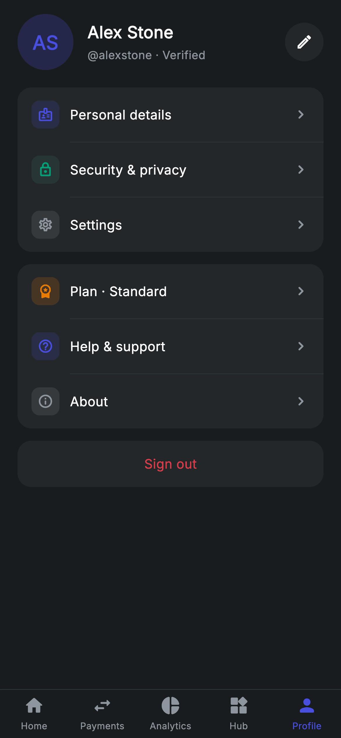
The profile tab is a router disguised as a screen — it has to present a dozen destinations without turning into a wall of grey rows. This tutorial builds Nova's account hub in Flutter: a monogram header with a circular edit button, six navigation rows split into two grouped cards with colour-coded icon tiles, a red sign-out, and a five-item bottom nav bar with double SafeArea handling. The `_group` helper injects indented dividers between rows so you never hand-place a separator again.
Watch the Flutter UI walkthrough
A short screen recording of Profile Account Hub running, if you'd rather see it before you read the code. The written tutorial below covers everything in it.
Can't see the video? Watch it on YouTube.
What you'll build
- ✓A group builder that interleaves indented dividers between any number of rows
- ✓Colour-coded icon tiles that make a long settings list scannable rather than uniform
- ✓A circular icon button built from Material with CircleBorder and customBorder
- ✓A five-item bottom nav bar that handles the home indicator with a nested SafeArea
Step-by-step build
Create the file
Add a new file at lib/fintech_profile/fintech_profile_screen.dart in your Flutter project.
Register the bundled fonts
No external packages — this is pure Flutter. It does bundle its design font (Inter), so drop the font file into fonts/ and declare it in pubspec.yaml:
flutter:
  fonts:
    - family: Inter
      fonts:
- asset: fonts/Inter-Regular.ttfBuild it, piece by piece
Here's how the screen goes together. Each block below is a real slice of the code with a plain-English explanation — paste them in order, or grab the whole file from the next section.
Seven callbacks and no state
import 'package:flutter/material.dart';

/// Profile — the account hub (Revolut-inspired design system).
///
/// Self-contained per CONVENTIONS.md: pure Flutter only, the exact design font
/// (Inter) is bundled under `fonts/`, the avatar is a painted monogram (no
/// network/emoji), and the screen forces its own dark theme. This is the
/// Profile bottom-nav tab, so it carries the shared 5-tab bar via callback.
class FintechProfileScreen extends StatelessWidget {
  const FintechProfileScreen({
    super.key,
    this.onTabSelected,
    this.onEdit,
    this.onPersonal,
    this.onSecurity,
    this.onSettings,
    this.onHelp,
    this.onAbout,
  });

  final ValueChanged<int>? onTabSelected;
  final VoidCallback? onEdit;
  final VoidCallback? onPersonal;
  final VoidCallback? onSecurity;
  final VoidCallback? onSettings;
  final VoidCallback? onHelp;
  final VoidCallback? onAbout;

  static const String _font = 'Inter';
  static const Color _bg = Color(0xFF191C1F);
  static const Color _surface = Color(0xFF242729);
  static const Color _brand = Color(0xFF494FDF);
  static const Color _teal = Color(0xFF00A87E);
  static const Color _amber = Color(0xFFEC7E00);
  static const Color _red = Color(0xFFE23B4A);
  static const Color _muted = Color(0xFF8D969E);
The hub is a `StatelessWidget` exposing seven callbacks — one per destination plus `onTabSelected` for the nav bar — so every navigation decision belongs to the host app rather than to this file. That is what makes the screen droppable into any router. The palette carries five accent colours (`_brand`, `_teal`, `_amber`, `_red`, `_muted`) because, unlike most screens here, this one uses colour as a wayfinding device: each row's icon tile is tinted differently so the eye can return to 'the green one' without re-reading the labels.
Two groups, and the SafeArea that is switched off
  @override
  Widget build(BuildContext context) {
    return Theme(
      data: ThemeData.dark(useMaterial3: true),
      child: Scaffold(
        backgroundColor: _bg,
        body: SafeArea(
          bottom: false,
          child: Column(
            children: <Widget>[
              Expanded(
                child: ListView(
                  physics: const BouncingScrollPhysics(),
                  padding: const EdgeInsets.fromLTRB(20, 16, 20, 24),
                  children: <Widget>[
                    _buildHeader(),
                    const SizedBox(height: 20),
                    _group(<Widget>[
                      _row(Icons.badge_outlined, _brand, 'Personal details',
                          onPersonal),
                      _row(Icons.lock_outline_rounded, _teal, 'Security & privacy',
                          onSecurity),
                      _row(Icons.settings_outlined, _muted, 'Settings', onSettings),
                    ]),
                    const SizedBox(height: 14),
                    _group(<Widget>[
                      _row(Icons.workspace_premium_rounded, _amber,
                          'Plan · Standard', onSettings),
                      _row(Icons.help_outline_rounded, _brand, 'Help & support',
                          onHelp),
                      _row(Icons.info_outline_rounded, _muted, 'About', onAbout),
                    ]),
                    const SizedBox(height: 14),
                    _signOut(),
                  ],
                ),
              ),
              _buildNavBar(),
            ],
          ),
        ),
      ),
    );
  }
Note `SafeArea(bottom: false)` on the body. The nav bar at the bottom draws its own background right down to the screen edge and applies its own SafeArea internally, so letting the outer one inset the whole Column would leave a strip of page background below the bar on a device with a home indicator. Above it, the rows are split into two `_group` cards rather than one long list: the first holds identity and settings, the second holds plan, help and about. That gap is the only grouping cue there is, and it is enough to stop six rows reading as an undifferentiated list. Each `_row` call passes an icon, a tint, a label and one of the callbacks.
The header and a properly circular icon button
  Widget _buildHeader() {
    return Row(
      children: <Widget>[
        Container(
          width: 64,
          height: 64,
          alignment: Alignment.center,
          decoration: BoxDecoration(
            color: _brand.withValues(alpha: 0.22),
            shape: BoxShape.circle,
          ),
          child: const Text(
            'AS',
            style: TextStyle(
              fontFamily: _font,
              fontSize: 22,
              fontWeight: FontWeight.w600,
              color: _brand,
            ),
          ),
        ),
        const SizedBox(width: 16),
        const Expanded(
          child: Column(
            crossAxisAlignment: CrossAxisAlignment.start,
            children: <Widget>[
              Text(
                'Alex Stone',
                style: TextStyle(
                  fontFamily: _font,
                  fontSize: 19,
                  fontWeight: FontWeight.w600,
                  letterSpacing: 0.24,
                  color: Colors.white,
                ),
              ),
              SizedBox(height: 3),
              Text(
                '@alexstone · Verified',
                style: TextStyle(
                  fontFamily: _font,
                  fontSize: 13,
                  letterSpacing: 0.24,
                  color: _muted,
                ),
              ),
            ],
          ),
        ),
        Material(
          color: _surface,
          shape: const CircleBorder(),
          child: InkWell(
            customBorder: const CircleBorder(),
            onTap: onEdit,
            child: const SizedBox(
              width: 44,
              height: 44,
              child: Icon(Icons.edit_outlined, size: 20, color: Colors.white),
            ),
          ),
        ),
      ],
    );
  }
The avatar is a 64px circle at `_brand.withValues(alpha: 0.22)` carrying the initials in full `_brand` — a monogram, so no image asset and no network fetch. Beside it the name sits at 19px `w600` over a `_muted` handle line. The edit affordance on the right is the piece worth studying: `Material(color: _surface, shape: const CircleBorder())` with an `InkWell` using `customBorder: const CircleBorder()`. Both halves are needed — `shape` clips the background, `customBorder` clips the ripple. Set only the first and the splash still washes out as a square over the circle's corners.
The group builder that places its own dividers
  Widget _group(List<Widget> rows) {
    final List<Widget> children = <Widget>[];
    for (int i = 0; i < rows.length; i++) {
      if (i != 0) {
        children.add(const Divider(
            height: 1, color: Color(0xFF2E3235), indent: 60));
      }
      children.add(rows[i]);
    }
    return Container(
      decoration: BoxDecoration(
        color: _surface,
        borderRadius: BorderRadius.circular(16),
      ),
      child: Column(children: children),
    );
  }
`_group` takes a list of row widgets and builds a new list, inserting a `Divider` before every row except the first — that `if (i != 0)` test is what prevents a stray line at the top or bottom of the card. The divider uses `indent: 60`, so it starts past the 16px padding plus the 32px icon tile plus its 12px gap, aligning with the label text instead of running edge to edge. That inset is the standard iOS-style settings look and it visually keeps each icon attached to its own row. Adding or removing a row from either group needs no separator bookkeeping at all.
One row builder, tinted per destination
  Widget _row(IconData icon, Color tint, String label, VoidCallback? onTap) {
    return InkWell(
      onTap: onTap,
      child: Padding(
        padding: const EdgeInsets.symmetric(horizontal: 16, vertical: 15),
        child: Row(
          children: <Widget>[
            Container(
              width: 32,
              height: 32,
              alignment: Alignment.center,
              decoration: BoxDecoration(
                color: tint.withValues(alpha: 0.16),
                borderRadius: BorderRadius.circular(9),
              ),
              child: Icon(icon, size: 18, color: tint),
            ),
            const SizedBox(width: 12),
            Expanded(
              child: Text(
                label,
                style: const TextStyle(
                  fontFamily: _font,
                  fontSize: 15,
                  fontWeight: FontWeight.w500,
                  letterSpacing: 0.24,
                  color: Colors.white,
                ),
              ),
            ),
            const Icon(Icons.chevron_right_rounded, size: 20, color: _muted),
          ],
        ),
      ),
    );
  }

  Widget _signOut() {
    return Container(
      decoration: BoxDecoration(
        color: _surface,
        borderRadius: BorderRadius.circular(16),
      ),
      child: InkWell(
        onTap: () {},
        borderRadius: BorderRadius.circular(16),
        child: const Padding(
          padding: EdgeInsets.symmetric(vertical: 16),
          child: Center(
            child: Text(
              'Sign out',
              style: TextStyle(
                fontFamily: _font,
                fontSize: 15,
                fontWeight: FontWeight.w500,
                letterSpacing: 0.24,
                color: _red,
              ),
            ),
          ),
        ),
      ),
    );
  }
`_row` produces every navigation line from four arguments. The icon sits in a 32px rounded square filled `tint.withValues(alpha: 0.16)` with the glyph at full `tint` — the same tinted-tile formula used across this app, here parameterised so one function yields six visually distinct rows. The label is `Expanded` so long text truncates rather than pushing the chevron off-screen, and the trailing `chevron_right_rounded` marks the row as a destination rather than a toggle. `_signOut` deliberately breaks the pattern: no icon, no chevron, centred text in `_red`. A destructive action should not look like the five navigational rows above it.
The bottom nav bar and its nested SafeArea
  Widget _buildNavBar() {
    const List<IconData> icons = <IconData>[
      Icons.home_rounded,
      Icons.swap_horiz_rounded,
      Icons.pie_chart_rounded,
      Icons.widgets_rounded,
      Icons.person_rounded,
    ];
    const List<String> labels = <String>[
      'Home', 'Payments', 'Analytics', 'Hub', 'Profile'
    ];
    return Container(
      decoration: const BoxDecoration(
        color: _bg,
        border: Border(top: BorderSide(color: Color(0xFF2E3235))),
      ),
      child: SafeArea(
        top: false,
        child: Padding(
          padding: const EdgeInsets.symmetric(vertical: 6),
          child: Row(
            children: <Widget>[
              for (int i = 0; i < icons.length; i++)
                Expanded(
                  child: GestureDetector(
                    onTap: () => onTabSelected?.call(i),
                    behavior: HitTestBehavior.opaque,
                    child: Column(
                      mainAxisSize: MainAxisSize.min,
                      children: <Widget>[
                        Icon(icons[i],
                            size: 24, color: i == 4 ? _brand : _muted),
                        const SizedBox(height: 4),
                        Text(
                          labels[i],
                          style: TextStyle(
                            fontFamily: _font,
                            fontSize: 10.5,
                            fontWeight: FontWeight.w500,
                            letterSpacing: 0.24,
                            color: i == 4 ? _brand : _muted,
                          ),
                        ),
                      ],
                    ),
                  ),
                ),
            ],
          ),
        ),
      ),
    );
  }
The bar is built from two parallel const lists of icons and labels, walked by a collection-for that wraps each item in `Expanded` so the five tabs divide the width evenly. The active state is `i == 4`, hard-coded because this file *is* the Profile tab — the icon and label both switch from `_muted` to `_brand` together. The structure is a Container painting `_bg` with a top `BorderSide` hairline, wrapping `SafeArea(top: false)`. Putting the SafeArea *inside* the Container is what makes the bar's background extend under the home indicator while the icons stay above it; wrapping the Container instead would leave an unpainted gap. Each tab reports outward through `onTabSelected?.call(i)`, so this screen never decides what a tab press does.
Full code
The complete, ready-to-paste source. Free to use in your projects — one click copies it all.
import 'package:flutter/material.dart';

/// Profile — the account hub (Revolut-inspired design system).
///
/// Self-contained per CONVENTIONS.md: pure Flutter only, the exact design font
/// (Inter) is bundled under `fonts/`, the avatar is a painted monogram (no
/// network/emoji), and the screen forces its own dark theme. This is the
/// Profile bottom-nav tab, so it carries the shared 5-tab bar via callback.
class FintechProfileScreen extends StatelessWidget {
  const FintechProfileScreen({
    super.key,
    this.onTabSelected,
    this.onEdit,
    this.onPersonal,
    this.onSecurity,
    this.onSettings,
    this.onHelp,
    this.onAbout,
  });

  final ValueChanged<int>? onTabSelected;
  final VoidCallback? onEdit;
  final VoidCallback? onPersonal;
  final VoidCallback? onSecurity;
  final VoidCallback? onSettings;
  final VoidCallback? onHelp;
  final VoidCallback? onAbout;

  static const String _font = 'Inter';
  static const Color _bg = Color(0xFF191C1F);
  static const Color _surface = Color(0xFF242729);
  static const Color _brand = Color(0xFF494FDF);
  static const Color _teal = Color(0xFF00A87E);
  static const Color _amber = Color(0xFFEC7E00);
  static const Color _red = Color(0xFFE23B4A);
  static const Color _muted = Color(0xFF8D969E);

  @override
  Widget build(BuildContext context) {
    return Theme(
      data: ThemeData.dark(useMaterial3: true),
      child: Scaffold(
        backgroundColor: _bg,
        body: SafeArea(
          bottom: false,
          child: Column(
            children: <Widget>[
              Expanded(
                child: ListView(
                  physics: const BouncingScrollPhysics(),
                  padding: const EdgeInsets.fromLTRB(20, 16, 20, 24),
                  children: <Widget>[
                    _buildHeader(),
                    const SizedBox(height: 20),
                    _group(<Widget>[
                      _row(Icons.badge_outlined, _brand, 'Personal details',
                          onPersonal),
                      _row(Icons.lock_outline_rounded, _teal, 'Security & privacy',
                          onSecurity),
                      _row(Icons.settings_outlined, _muted, 'Settings', onSettings),
                    ]),
                    const SizedBox(height: 14),
                    _group(<Widget>[
                      _row(Icons.workspace_premium_rounded, _amber,
                          'Plan · Standard', onSettings),
                      _row(Icons.help_outline_rounded, _brand, 'Help & support',
                          onHelp),
                      _row(Icons.info_outline_rounded, _muted, 'About', onAbout),
                    ]),
                    const SizedBox(height: 14),
                    _signOut(),
                  ],
                ),
              ),
              _buildNavBar(),
            ],
          ),
        ),
      ),
    );
  }

  Widget _buildHeader() {
    return Row(
      children: <Widget>[
        Container(
          width: 64,
          height: 64,
          alignment: Alignment.center,
          decoration: BoxDecoration(
            color: _brand.withValues(alpha: 0.22),
            shape: BoxShape.circle,
          ),
          child: const Text(
            'AS',
            style: TextStyle(
              fontFamily: _font,
              fontSize: 22,
              fontWeight: FontWeight.w600,
              color: _brand,
            ),
          ),
        ),
        const SizedBox(width: 16),
        const Expanded(
          child: Column(
            crossAxisAlignment: CrossAxisAlignment.start,
            children: <Widget>[
              Text(
                'Alex Stone',
                style: TextStyle(
                  fontFamily: _font,
                  fontSize: 19,
                  fontWeight: FontWeight.w600,
                  letterSpacing: 0.24,
                  color: Colors.white,
                ),
              ),
              SizedBox(height: 3),
              Text(
                '@alexstone · Verified',
                style: TextStyle(
                  fontFamily: _font,
                  fontSize: 13,
                  letterSpacing: 0.24,
                  color: _muted,
                ),
              ),
            ],
          ),
        ),
        Material(
          color: _surface,
          shape: const CircleBorder(),
          child: InkWell(
            customBorder: const CircleBorder(),
            onTap: onEdit,
            child: const SizedBox(
              width: 44,
              height: 44,
              child: Icon(Icons.edit_outlined, size: 20, color: Colors.white),
            ),
          ),
        ),
      ],
    );
  }

  Widget _group(List<Widget> rows) {
    final List<Widget> children = <Widget>[];
    for (int i = 0; i < rows.length; i++) {
      if (i != 0) {
        children.add(const Divider(
            height: 1, color: Color(0xFF2E3235), indent: 60));
      }
      children.add(rows[i]);
    }
    return Container(
      decoration: BoxDecoration(
        color: _surface,
        borderRadius: BorderRadius.circular(16),
      ),
      child: Column(children: children),
    );
  }

  Widget _row(IconData icon, Color tint, String label, VoidCallback? onTap) {
    return InkWell(
      onTap: onTap,
      child: Padding(
        padding: const EdgeInsets.symmetric(horizontal: 16, vertical: 15),
        child: Row(
          children: <Widget>[
            Container(
              width: 32,
              height: 32,
              alignment: Alignment.center,
              decoration: BoxDecoration(
                color: tint.withValues(alpha: 0.16),
                borderRadius: BorderRadius.circular(9),
              ),
              child: Icon(icon, size: 18, color: tint),
            ),
            const SizedBox(width: 12),
            Expanded(
              child: Text(
                label,
                style: const TextStyle(
                  fontFamily: _font,
                  fontSize: 15,
                  fontWeight: FontWeight.w500,
                  letterSpacing: 0.24,
                  color: Colors.white,
                ),
              ),
            ),
            const Icon(Icons.chevron_right_rounded, size: 20, color: _muted),
          ],
        ),
      ),
    );
  }

  Widget _signOut() {
    return Container(
      decoration: BoxDecoration(
        color: _surface,
        borderRadius: BorderRadius.circular(16),
      ),
      child: InkWell(
        onTap: () {},
        borderRadius: BorderRadius.circular(16),
        child: const Padding(
          padding: EdgeInsets.symmetric(vertical: 16),
          child: Center(
            child: Text(
              'Sign out',
              style: TextStyle(
                fontFamily: _font,
                fontSize: 15,
                fontWeight: FontWeight.w500,
                letterSpacing: 0.24,
                color: _red,
              ),
            ),
          ),
        ),
      ),
    );
  }

  Widget _buildNavBar() {
    const List<IconData> icons = <IconData>[
      Icons.home_rounded,
      Icons.swap_horiz_rounded,
      Icons.pie_chart_rounded,
      Icons.widgets_rounded,
      Icons.person_rounded,
    ];
    const List<String> labels = <String>[
      'Home', 'Payments', 'Analytics', 'Hub', 'Profile'
    ];
    return Container(
      decoration: const BoxDecoration(
        color: _bg,
        border: Border(top: BorderSide(color: Color(0xFF2E3235))),
      ),
      child: SafeArea(
        top: false,
        child: Padding(
          padding: const EdgeInsets.symmetric(vertical: 6),
          child: Row(
            children: <Widget>[
              for (int i = 0; i < icons.length; i++)
                Expanded(
                  child: GestureDetector(
                    onTap: () => onTabSelected?.call(i),
                    behavior: HitTestBehavior.opaque,
                    child: Column(
                      mainAxisSize: MainAxisSize.min,
                      children: <Widget>[
                        Icon(icons[i],
                            size: 24, color: i == 4 ? _brand : _muted),
                        const SizedBox(height: 4),
                        Text(
                          labels[i],
                          style: TextStyle(
                            fontFamily: _font,
                            fontSize: 10.5,
                            fontWeight: FontWeight.w500,
                            letterSpacing: 0.24,
                            color: i == 4 ? _brand : _muted,
                          ),
                        ),
                      ],
                    ),
                  ),
                ),
            ],
          ),
        ),
      ),
    );
  }
}
Plus bundled 1 binary asset (fonts/images). The CLI and MCP install those for you automatically.
Two faster ways to add it
Copy-paste works, but you can skip it entirely.
1. FlutterKit CLI
One command drops this screen — and its fonts — straight into your project.
$ flutterkit add fintech-profile2. AI agent (MCP)
Connect FlutterKit's MCP server in Claude or Cursor and just ask your agent to install fintech-profile — it fetches and writes the files for you.
FAQ
Is this profile hub free to use in commercial apps?
Yes — FlutterKit is free permanently. Copy the Dart from this page, install it with the CLI, or pull it over MCP in your AI editor, then ship it in client work or a paid product. No account, no licence, no attribution.
How do I wire the bottom nav bar to real tabs?
Pass `onTabSelected` and handle the index in your shell widget — typically by switching an `IndexedStack` child or calling `go_router`. The bar reports the index and nothing else, so it works with any navigation approach. Change the `i == 4` comparison to whatever index the screen represents when you reuse the bar elsewhere.
Why is the InkWell ripple square on my circular button?
Because clipping the `Material` shape does not clip the splash. You need both: `shape: const CircleBorder()` on the Material for the background, and `customBorder: const CircleBorder()` on the InkWell for the ripple. This screen's edit button sets both.
Why does the divider start partway across the card?
`indent: 60` pushes it past the row's left padding, icon tile and gap so it lines up with the label text. That inset is the conventional settings-list look and keeps each icon visually attached to its own row rather than being cut off by the line above.
Which Flutter version does this need?
Flutter 3.22 or newer, because the avatar and the icon tiles use `Color.withValues(alpha: ...)`. On an older SDK swap them for `withOpacity(...)` and expand the constructor to the `{Key? key, ...} : super(key: key)` form.


