How to Build a Subscription Plans Comparison Screen in Flutter (Full Code + Preview)
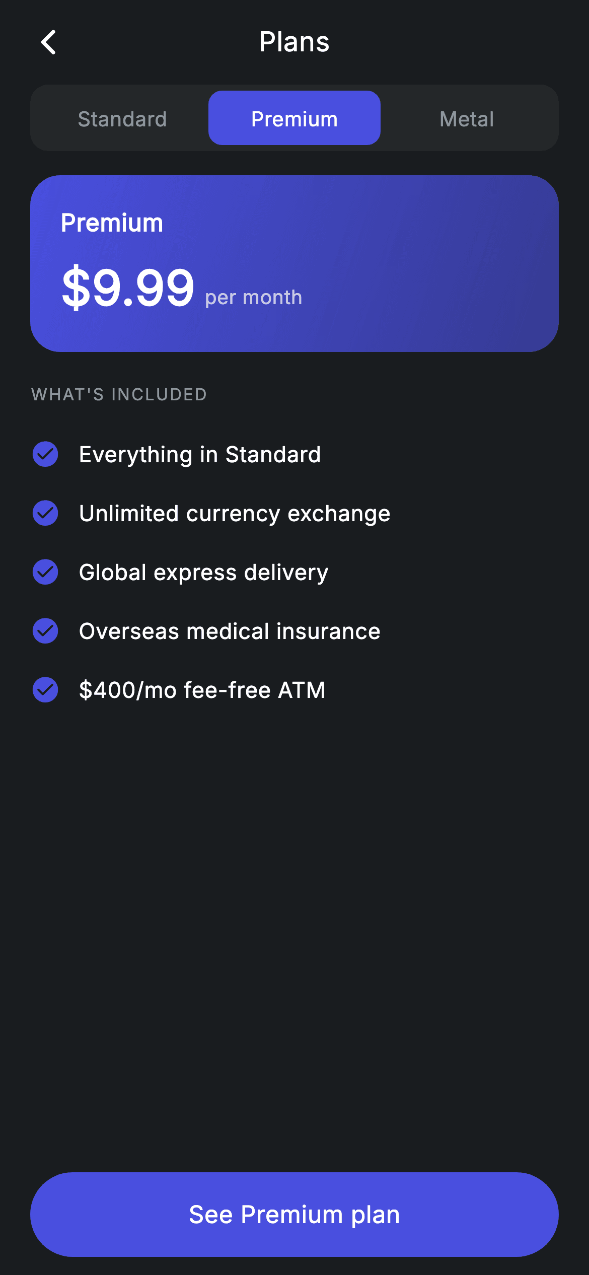
Three subscription tiers, one screen, and no repeated markup. The pattern is worth internalising: `_plans[_selected]` is resolved once at the top of `build`, and every widget below takes that `_Plan` as an argument — so the selector pill, the gradient price card, the feature checkmarks, and even the CTA's label and enabled state all re-theme themselves when you tap a different tier. Adding a fourth plan means adding one list entry and nothing else.
Watch the Flutter UI walkthrough
A short screen recording of Plans running, if you'd rather see it before you read the code. The written tutorial below covers everything in it.
Can't see the video? Watch it on YouTube.
What you'll build
- ✓A segmented tier selector where each pill takes its *own* plan's colour when selected
- ✓A price card whose gradient is generated from the active plan's colour at two alpha levels
- ✓A feature list that rebuilds per tier and tints its checkmarks to match
- ✓Baseline-aligned price and period text, so '$9.99' and 'per month' sit on the same line properly
- ✓A CTA that disables itself and relabels to 'Your current plan' when the selected tier is already active
Step-by-step build
Create the file
Add a new file at lib/fintech_plans/fintech_plans_screen.dart in your Flutter project.
Register the bundled fonts
No external packages — this is pure Flutter. It does bundle its design font (Inter), so drop the font file into fonts/ and declare it in pubspec.yaml:
flutter:
  fonts:
    - family: Inter
      fonts:
- asset: fonts/Inter-Regular.ttfBuild it, piece by piece
Here's how the screen goes together. Each block below is a real slice of the code with a plain-English explanation — paste them in order, or grab the whole file from the next section.
Three plans as one list
class FintechPlansScreen extends StatefulWidget {
  const FintechPlansScreen({super.key, this.onBack, this.onPlanTap});

  final VoidCallback? onBack;
  final VoidCallback? onPlanTap;

  @override
  State<FintechPlansScreen> createState() => _FintechPlansScreenState();
}

class _FintechPlansScreenState extends State<FintechPlansScreen> {
  static const String _font = 'Inter';
  static const Color _bg = Color(0xFF191C1F);
  static const Color _surface = Color(0xFF242729);
  static const Color _muted = Color(0xFF8D969E);

  static const List<_Plan> _plans = <_Plan>[
    _Plan('Standard', r'$0', 'Free forever', Color(0xFF8D969E), <String>[
      'Free local payments',
      'Spend in 150+ currencies',
      '1 free card',
      r'$200/mo fee-free ATM',
    ], true),
    _Plan('Premium', r'$9.99', 'per month', Color(0xFF494FDF), <String>[
      'Everything in Standard',
      'Unlimited currency exchange',
      'Global express delivery',
      'Overseas medical insurance',
      r'$400/mo fee-free ATM',
    ], false),
    _Plan('Metal', r'$16.99', 'per month', Color(0xFFEC7E00), <String>[
      'Everything in Premium',
      '1% cashback outside Europe',
      'Exclusive metal card',
      'Concierge service',
      'Higher savings rates',
    ], false),
  ];

  int _selected = 1;
Each `_Plan` carries a name, a price string, a period string, an identity colour, its feature list, and a `current` flag. Two details make the screen work. First, price and period are separate fields — that split is what allows the baseline-aligned '\$9.99' plus 'per month' treatment later, and it lets Standard read '\$0 / Free forever' without special-casing. Second, each feature list opens with 'Everything in Standard' or 'Everything in Premium', the standard pricing-page convention that avoids repeating every lower tier's perks. `_selected = 1` starts the screen on Premium — the tier you want compared, not the free one.
Resolving the plan once
  @override
  Widget build(BuildContext context) {
    final _Plan plan = _plans[_selected];
    return Theme(
      data: ThemeData.dark(useMaterial3: true),
      child: Scaffold(
        backgroundColor: _bg,
        body: SafeArea(
          child: Column(
            children: <Widget>[
              _buildAppBar(),
              _buildSelector(),
              Expanded(
                child: ListView(
                  physics: const BouncingScrollPhysics(),
                  padding: const EdgeInsets.fromLTRB(20, 16, 20, 24),
                  children: <Widget>[
                    _buildPriceCard(plan),
                    const SizedBox(height: 20),
                    _sectionLabel("What's included"),
                    const SizedBox(height: 12),
                    for (final String f in plan.features) _featureRow(f, plan.color),
                  ],
                ),
              ),
              _buildButton(plan),
            ],
          ),
        ),
      ),
    );
  }
Line 52 is the whole architecture: `final _Plan plan = _plans[_selected];` at the top of `build`, then `plan` is passed into `_buildPriceCard`, `_featureRow`, and `_buildButton`. Nothing downstream reads `_selected` again, so there's no chance of one section showing Premium while another shows Metal. The features are emitted by a collection-for over `plan.features`, meaning a tier with five perks renders five rows and one with four renders four — no fixed slots, no placeholder rows. The CTA sits outside the `ListView` so it stays pinned while the feature list scrolls.
A selector that changes colour per tier
  Widget _buildSelector() {
    return Padding(
      padding: const EdgeInsets.symmetric(horizontal: 20),
      child: Container(
        height: 44,
        padding: const EdgeInsets.all(4),
        decoration: BoxDecoration(
          color: _surface,
          borderRadius: BorderRadius.circular(12),
        ),
        child: Row(
          children: <Widget>[
            for (int i = 0; i < _plans.length; i++)
              Expanded(
                child: GestureDetector(
                  onTap: () => setState(() => _selected = i),
                  behavior: HitTestBehavior.opaque,
                  child: Container(
                    alignment: Alignment.center,
                    decoration: BoxDecoration(
                      color: _selected == i ? _plans[i].color : Colors.transparent,
                      borderRadius: BorderRadius.circular(9),
                    ),
                    child: Text(
                      _plans[i].name,
                      style: TextStyle(
                        fontFamily: _font,
                        fontSize: 13.5,
                        fontWeight: FontWeight.w500,
                        letterSpacing: 0.24,
                        color: _selected == i ? Colors.white : _muted,
                      ),
                    ),
                  ),
                ),
              ),
          ],
        ),
      ),
    );
  }
This is a segmented control with a twist: the selected pill uses `_plans[i].color` rather than one fixed accent, so tapping Metal turns the pill amber while Premium turns it indigo. The track is a 44px `_surface` container with `padding: EdgeInsets.all(4)` — that inset is what leaves room for the pill to sit inside the track instead of covering it — and the pill's 9px radius is deliberately tighter than the track's 12px so the corners nest. Each segment is `Expanded` for an even three-way split, and `HitTestBehavior.opaque` makes the whole cell tappable rather than just the label.
The gradient price card
  Widget _buildPriceCard(_Plan plan) {
    return Container(
      padding: const EdgeInsets.all(20),
      decoration: BoxDecoration(
        gradient: LinearGradient(
          begin: Alignment.topLeft,
          end: Alignment.bottomRight,
          colors: <Color>[plan.color, plan.color.withValues(alpha: 0.6)],
        ),
        borderRadius: BorderRadius.circular(20),
      ),
      child: Row(
        children: <Widget>[
          Column(
            crossAxisAlignment: CrossAxisAlignment.start,
            children: <Widget>[
              Text(
                plan.name,
                style: const TextStyle(
                  fontFamily: _font,
                  fontSize: 16,
                  fontWeight: FontWeight.w600,
                  letterSpacing: 0.24,
                  color: Colors.white,
                ),
              ),
              const SizedBox(height: 8),
              Row(
                crossAxisAlignment: CrossAxisAlignment.baseline,
                textBaseline: TextBaseline.alphabetic,
                children: <Widget>[
                  Text(
                    plan.price,
                    style: const TextStyle(
                      fontFamily: _font,
                      fontSize: 32,
                      fontWeight: FontWeight.w700,
                      letterSpacing: 0.24,
                      color: Colors.white,
                    ),
                  ),
                  const SizedBox(width: 6),
                  Text(
                    plan.period,
                    style: const TextStyle(
                      fontFamily: _font,
                      fontSize: 13,
                      letterSpacing: 0.24,
                      color: Colors.white70,
                    ),
                  ),
                ],
              ),
            ],
          ),
          const Spacer(),
          if (plan.current)
            Container(
              padding: const EdgeInsets.symmetric(horizontal: 12, vertical: 7),
              decoration: BoxDecoration(
                color: Colors.white.withValues(alpha: 0.2),
                borderRadius: BorderRadius.circular(9999),
              ),
              child: const Text(
                'Current',
                style: TextStyle(
                  fontFamily: _font,
                  fontSize: 12,
                  fontWeight: FontWeight.w600,
                  letterSpacing: 0.24,
                  color: Colors.white,
                ),
              ),
            ),
        ],
      ),
    );
  }
The gradient is generated rather than hard-coded: `colors: [plan.color, plan.color.withValues(alpha: 0.6)]` running `topLeft` to `bottomRight`. Fading a single colour to 60% of itself gives a diagonal sheen that works for any tier without maintaining three gradient definitions. The price row uses `crossAxisAlignment: CrossAxisAlignment.baseline` with `textBaseline: TextBaseline.alphabetic` — the correct way to line up 32px and 13px text, since default centre alignment would leave 'per month' floating in the middle of the price's height. The 'Current' badge is spread in with `if (plan.current)` and uses `Colors.white.withValues(alpha: 0.2)` — a translucent white that adapts to whichever gradient is behind it, unlike a fixed grey.
Feature rows and the section label
  Widget _sectionLabel(String text) {
    return Text(
      text.toUpperCase(),
      style: const TextStyle(
        fontFamily: _font,
        fontSize: 11,
        fontWeight: FontWeight.w500,
        letterSpacing: 1.0,
        color: _muted,
      ),
    );
  }

  Widget _featureRow(String text, Color color) {
    return Padding(
      padding: const EdgeInsets.symmetric(vertical: 9),
      child: Row(
        children: <Widget>[
          Icon(Icons.check_circle_rounded, size: 20, color: color),
          const SizedBox(width: 12),
          Expanded(
            child: Text(
              text,
              style: const TextStyle(
                fontFamily: _font,
                fontSize: 14.5,
                letterSpacing: 0.24,
                color: Colors.white,
              ),
            ),
          ),
        ],
      ),
    );
  }
`_featureRow` takes the plan's colour and applies it to the `check_circle_rounded` icon, so the checkmarks re-theme along with everything else — a small touch that makes the tier switch feel complete rather than partial. The text sits in `Expanded` so a long perk wraps rather than overflowing, and 9px symmetric vertical padding sets the list rhythm without dividers. `_sectionLabel` calls `text.toUpperCase()` in code rather than in the string, which keeps the call site readable (`"What's included"`) while rendering the 11px `letterSpacing: 1.0` small-caps convention.
The context-aware CTA
  Widget _buildButton(_Plan plan) {
    return Padding(
      padding: const EdgeInsets.fromLTRB(20, 0, 20, 12),
      child: SizedBox(
        width: double.infinity,
        height: 56,
        child: Material(
          color: plan.current ? _surface : plan.color,
          borderRadius: BorderRadius.circular(9999),
          child: InkWell(
            borderRadius: BorderRadius.circular(9999),
            onTap: plan.current ? null : widget.onPlanTap,
            child: Center(
              child: Text(
                plan.current ? 'Your current plan' : 'See ${plan.name} plan',
                style: TextStyle(
                  fontFamily: _font,
                  fontSize: 16,
                  fontWeight: FontWeight.w500,
                  letterSpacing: 0.24,
                  color: plan.current ? _muted : Colors.white,
                ),
              ),
            ),
          ),
        ),
      ),
    );
  }
`plan.current` is read four times and drives everything: the `Material` colour (inert `_surface` versus the plan's own colour), the `InkWell`'s `onTap` (`null` versus the callback), the label text ('Your current plan' versus `'See ${plan.name} plan'`), and the label colour. Passing `null` to `onTap` also suppresses the ripple, so the button on your existing tier gives no touch feedback at all — correct, since there's nothing to do. Interpolating the plan name into the CTA is a small copy win: 'See Metal plan' is a clearer promise than a generic 'Continue'.
Full code
The complete, ready-to-paste source. Free to use in your projects — one click copies it all.
import 'package:flutter/material.dart';

/// Plans — compare subscription tiers (Revolut-inspired design system).
///
/// Self-contained per CONVENTIONS.md: pure Flutter only, the exact design font
/// (Inter) is bundled under `fonts/`, no network/emoji images, and the screen
/// forces its own dark theme. A segmented tier selector swaps the price + perks
/// live; the current plan is marked and the CTA opens its detail.
class FintechPlansScreen extends StatefulWidget {
  const FintechPlansScreen({super.key, this.onBack, this.onPlanTap});

  final VoidCallback? onBack;
  final VoidCallback? onPlanTap;

  @override
  State<FintechPlansScreen> createState() => _FintechPlansScreenState();
}

class _FintechPlansScreenState extends State<FintechPlansScreen> {
  static const String _font = 'Inter';
  static const Color _bg = Color(0xFF191C1F);
  static const Color _surface = Color(0xFF242729);
  static const Color _muted = Color(0xFF8D969E);

  static const List<_Plan> _plans = <_Plan>[
    _Plan('Standard', r'$0', 'Free forever', Color(0xFF8D969E), <String>[
      'Free local payments',
      'Spend in 150+ currencies',
      '1 free card',
      r'$200/mo fee-free ATM',
    ], true),
    _Plan('Premium', r'$9.99', 'per month', Color(0xFF494FDF), <String>[
      'Everything in Standard',
      'Unlimited currency exchange',
      'Global express delivery',
      'Overseas medical insurance',
      r'$400/mo fee-free ATM',
    ], false),
    _Plan('Metal', r'$16.99', 'per month', Color(0xFFEC7E00), <String>[
      'Everything in Premium',
      '1% cashback outside Europe',
      'Exclusive metal card',
      'Concierge service',
      'Higher savings rates',
    ], false),
  ];

  int _selected = 1;

  @override
  Widget build(BuildContext context) {
    final _Plan plan = _plans[_selected];
    return Theme(
      data: ThemeData.dark(useMaterial3: true),
      child: Scaffold(
        backgroundColor: _bg,
        body: SafeArea(
          child: Column(
            children: <Widget>[
              _buildAppBar(),
              _buildSelector(),
              Expanded(
                child: ListView(
                  physics: const BouncingScrollPhysics(),
                  padding: const EdgeInsets.fromLTRB(20, 16, 20, 24),
                  children: <Widget>[
                    _buildPriceCard(plan),
                    const SizedBox(height: 20),
                    _sectionLabel("What's included"),
                    const SizedBox(height: 12),
                    for (final String f in plan.features) _featureRow(f, plan.color),
                  ],
                ),
              ),
              _buildButton(plan),
            ],
          ),
        ),
      ),
    );
  }

  Widget _buildAppBar() {
    return Padding(
      padding: const EdgeInsets.fromLTRB(8, 4, 8, 4),
      child: Row(
        children: <Widget>[
          IconButton(
            onPressed: widget.onBack,
            icon: const Icon(Icons.arrow_back_ios_new_rounded,
                size: 20, color: Colors.white),
          ),
          const Expanded(
            child: Text(
              'Plans',
              textAlign: TextAlign.center,
              style: TextStyle(
                fontFamily: _font,
                fontSize: 18,
                fontWeight: FontWeight.w500,
                letterSpacing: 0.24,
                color: Colors.white,
              ),
            ),
          ),
          const SizedBox(width: 48),
        ],
      ),
    );
  }

  Widget _buildSelector() {
    return Padding(
      padding: const EdgeInsets.symmetric(horizontal: 20),
      child: Container(
        height: 44,
        padding: const EdgeInsets.all(4),
        decoration: BoxDecoration(
          color: _surface,
          borderRadius: BorderRadius.circular(12),
        ),
        child: Row(
          children: <Widget>[
            for (int i = 0; i < _plans.length; i++)
              Expanded(
                child: GestureDetector(
                  onTap: () => setState(() => _selected = i),
                  behavior: HitTestBehavior.opaque,
                  child: Container(
                    alignment: Alignment.center,
                    decoration: BoxDecoration(
                      color: _selected == i ? _plans[i].color : Colors.transparent,
                      borderRadius: BorderRadius.circular(9),
                    ),
                    child: Text(
                      _plans[i].name,
                      style: TextStyle(
                        fontFamily: _font,
                        fontSize: 13.5,
                        fontWeight: FontWeight.w500,
                        letterSpacing: 0.24,
                        color: _selected == i ? Colors.white : _muted,
                      ),
                    ),
                  ),
                ),
              ),
          ],
        ),
      ),
    );
  }

  Widget _buildPriceCard(_Plan plan) {
    return Container(
      padding: const EdgeInsets.all(20),
      decoration: BoxDecoration(
        gradient: LinearGradient(
          begin: Alignment.topLeft,
          end: Alignment.bottomRight,
          colors: <Color>[plan.color, plan.color.withValues(alpha: 0.6)],
        ),
        borderRadius: BorderRadius.circular(20),
      ),
      child: Row(
        children: <Widget>[
          Column(
            crossAxisAlignment: CrossAxisAlignment.start,
            children: <Widget>[
              Text(
                plan.name,
                style: const TextStyle(
                  fontFamily: _font,
                  fontSize: 16,
                  fontWeight: FontWeight.w600,
                  letterSpacing: 0.24,
                  color: Colors.white,
                ),
              ),
              const SizedBox(height: 8),
              Row(
                crossAxisAlignment: CrossAxisAlignment.baseline,
                textBaseline: TextBaseline.alphabetic,
                children: <Widget>[
                  Text(
                    plan.price,
                    style: const TextStyle(
                      fontFamily: _font,
                      fontSize: 32,
                      fontWeight: FontWeight.w700,
                      letterSpacing: 0.24,
                      color: Colors.white,
                    ),
                  ),
                  const SizedBox(width: 6),
                  Text(
                    plan.period,
                    style: const TextStyle(
                      fontFamily: _font,
                      fontSize: 13,
                      letterSpacing: 0.24,
                      color: Colors.white70,
                    ),
                  ),
                ],
              ),
            ],
          ),
          const Spacer(),
          if (plan.current)
            Container(
              padding: const EdgeInsets.symmetric(horizontal: 12, vertical: 7),
              decoration: BoxDecoration(
                color: Colors.white.withValues(alpha: 0.2),
                borderRadius: BorderRadius.circular(9999),
              ),
              child: const Text(
                'Current',
                style: TextStyle(
                  fontFamily: _font,
                  fontSize: 12,
                  fontWeight: FontWeight.w600,
                  letterSpacing: 0.24,
                  color: Colors.white,
                ),
              ),
            ),
        ],
      ),
    );
  }

  Widget _sectionLabel(String text) {
    return Text(
      text.toUpperCase(),
      style: const TextStyle(
        fontFamily: _font,
        fontSize: 11,
        fontWeight: FontWeight.w500,
        letterSpacing: 1.0,
        color: _muted,
      ),
    );
  }

  Widget _featureRow(String text, Color color) {
    return Padding(
      padding: const EdgeInsets.symmetric(vertical: 9),
      child: Row(
        children: <Widget>[
          Icon(Icons.check_circle_rounded, size: 20, color: color),
          const SizedBox(width: 12),
          Expanded(
            child: Text(
              text,
              style: const TextStyle(
                fontFamily: _font,
                fontSize: 14.5,
                letterSpacing: 0.24,
                color: Colors.white,
              ),
            ),
          ),
        ],
      ),
    );
  }

  Widget _buildButton(_Plan plan) {
    return Padding(
      padding: const EdgeInsets.fromLTRB(20, 0, 20, 12),
      child: SizedBox(
        width: double.infinity,
        height: 56,
        child: Material(
          color: plan.current ? _surface : plan.color,
          borderRadius: BorderRadius.circular(9999),
          child: InkWell(
            borderRadius: BorderRadius.circular(9999),
            onTap: plan.current ? null : widget.onPlanTap,
            child: Center(
              child: Text(
                plan.current ? 'Your current plan' : 'See ${plan.name} plan',
                style: TextStyle(
                  fontFamily: _font,
                  fontSize: 16,
                  fontWeight: FontWeight.w500,
                  letterSpacing: 0.24,
                  color: plan.current ? _muted : Colors.white,
                ),
              ),
            ),
          ),
        ),
      ),
    );
  }
}

class _Plan {
  const _Plan(this.name, this.price, this.period, this.color, this.features,
      this.current);
  final String name;
  final String price;
  final String period;
  final Color color;
  final List<String> features;
  final bool current;
}
Plus bundled 1 binary asset (fonts/images). The CLI and MCP install those for you automatically.
Two faster ways to add it
Copy-paste works, but you can skip it entirely.
1. FlutterKit CLI
One command drops this screen — and its fonts — straight into your project.
$ flutterkit add fintech-plans2. AI agent (MCP)
Connect FlutterKit's MCP server in Claude or Cursor and just ask your agent to install fintech-plans — it fetches and writes the files for you.
FAQ
Is this subscription plans screen free to use?
Yes. The full Dart source on this page is free for personal and commercial apps. Copy it from the code block, install it with the FlutterKit CLI (flutterkit add fintech-plans), or add it via an AI agent over MCP.
Does it need any packages?
No — it's pure Flutter on material.dart, with no pricing-table or in-app-purchase dependency. The only asset to register in pubspec.yaml is the bundled Inter font family, which the CLI and MCP install for you.
How do I add a fourth tier?
Append one _Plan entry to the list. The selector loops over _plans.length, the price card and feature rows read from the resolved plan, and the CTA derives its label from plan.name — so nothing else needs editing. Pick a distinct colour and the whole screen re-themes for it automatically.
How do I connect it to real subscriptions?
Set current from the user's active entitlement rather than hard-coding it on the Standard entry, and wire onPlanTap to your purchase flow (in_app_purchase, RevenueCat, or a web checkout). The price and period strings should come from the store's localised product data so currency and formatting match the user's region.
Which Flutter version does it target?
It uses Color.withValues(alpha:) and Material 3, so it targets Flutter 3.27+. On an older SDK, replace the two withValues(alpha: x) calls — in the gradient and the Current badge — with withOpacity(x), and it compiles back to Flutter 3.10.


