How to Build a Plan Upgraded Success Screen in Flutter (Full Code + Preview)
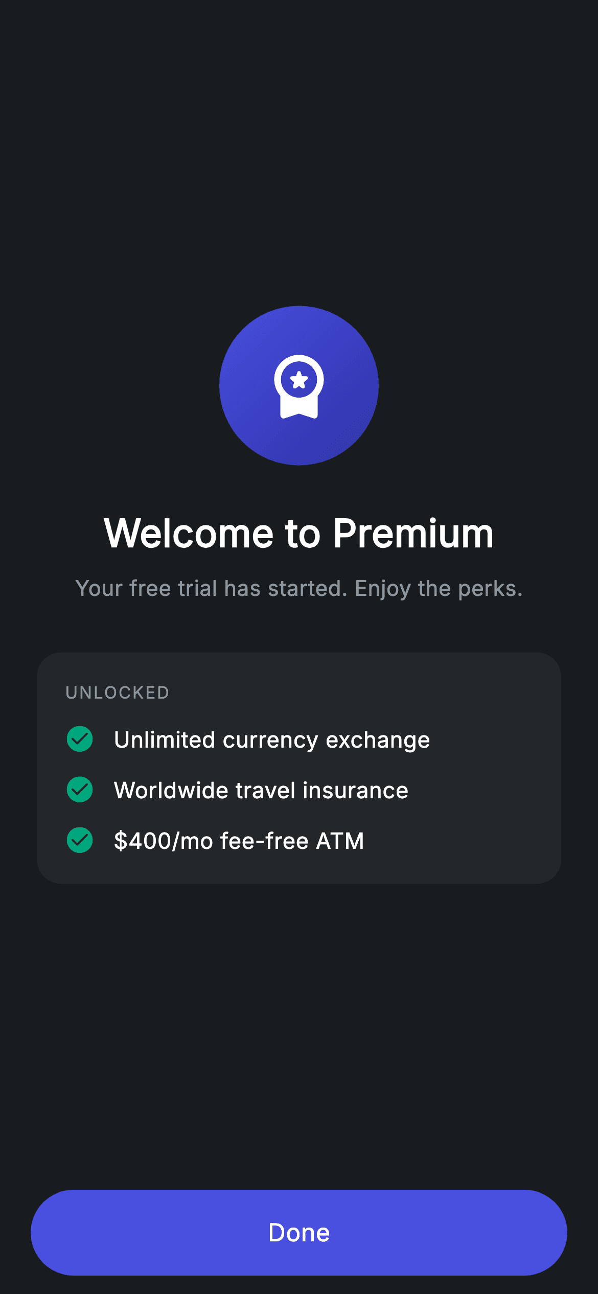
The moment after someone upgrades is the one chance to show them what they just bought. This tutorial builds Nova's plan-upgraded screen in Flutter: a solid gradient premium badge rather than the usual tinted check, a welcome headline, and an UNLOCKED card listing three perks with teal check marks. The list is generated from a String array, and the spacing between items is handled by a last-item check in the loop rather than by trailing padding you later have to strip.
Watch the Flutter UI walkthrough
A short screen recording of Plan Upgraded running, if you'd rather see it before you read the code. The written tutorial below covers everything in it.
Can't see the video? Watch it on YouTube.
What you'll build
- ✓A gradient-filled premium badge that reads as a reward rather than a receipt
- ✓A perks list generated from a String array with a section eyebrow above it
- ✓Gap handling inside the loop so the final item carries no trailing space
- ✓A centred success layout with the Done button anchored outside the scroll area
Step-by-step build
Create the file
Add a new file at lib/fintech_plan_upgraded/fintech_plan_upgraded_screen.dart in your Flutter project.
Register the bundled fonts
No external packages — this is pure Flutter. It does bundle its design font (Inter), so drop the font file into fonts/ and declare it in pubspec.yaml:
flutter:
  fonts:
    - family: Inter
      fonts:
- asset: fonts/Inter-Regular.ttfBuild it, piece by piece
Here's how the screen goes together. Each block below is a real slice of the code with a plain-English explanation — paste them in order, or grab the whole file from the next section.
Perks as data and the centred layout
import 'package:flutter/material.dart';

/// Plan upgraded — upgrade success (Revolut-inspired design system).
///
/// Self-contained per CONVENTIONS.md: pure Flutter only, the exact design font
/// (Inter) is bundled under `fonts/`, the badge is painted (no emoji/network),
/// and the screen forces its own dark theme. A few unlocked perks make the
/// confirmation feel rewarding.
class FintechPlanUpgradedScreen extends StatelessWidget {
  const FintechPlanUpgradedScreen({super.key, this.onDone});

  final VoidCallback? onDone;

  static const String _font = 'Inter';
  static const Color _bg = Color(0xFF191C1F);
  static const Color _surface = Color(0xFF242729);
  static const Color _brand = Color(0xFF494FDF);
  static const Color _teal = Color(0xFF00A87E);
  static const Color _muted = Color(0xFF8D969E);

  static const List<String> _unlocked = <String>[
    'Unlimited currency exchange',
    'Worldwide travel insurance',
    r'$400/mo fee-free ATM',
  ];

  @override
  Widget build(BuildContext context) {
    return Theme(
      data: ThemeData.dark(useMaterial3: true),
      child: Scaffold(
        backgroundColor: _bg,
        body: SafeArea(
          child: Column(
            children: <Widget>[
              Expanded(
                child: Padding(
                  padding: const EdgeInsets.symmetric(horizontal: 24),
                  child: Column(
                    mainAxisAlignment: MainAxisAlignment.center,
                    children: <Widget>[
                      _buildBadge(),
                      const SizedBox(height: 26),
                      const Text(
                        'Welcome to Premium',
                        style: TextStyle(
                          fontFamily: _font,
                          fontSize: 25,
                          fontWeight: FontWeight.w600,
                          letterSpacing: 0.24,
                          color: Colors.white,
                        ),
                      ),
                      const SizedBox(height: 8),
                      const Text(
                        'Your free trial has started. Enjoy the perks.',
                        style: TextStyle(
                          fontFamily: _font,
                          fontSize: 14,
                          letterSpacing: 0.24,
                          color: _muted,
                        ),
                      ),
                      const SizedBox(height: 32),
                      _buildUnlocked(),
                    ],
                  ),
                ),
              ),
              _buildButton(),
            ],
          ),
        ),
      ),
    );
  }
The three benefits live in a `static const List<String> _unlocked` — note the third entry uses a raw string, `r'$400/mo fee-free ATM'`, because an unescaped `$4` would be read as interpolation and fail to compile. The screen is stateless with a single `onDone`. Its layout is the standard success shape used across this app: an `Expanded` wrapping a Column centred on the main axis, with the button held outside so it stays pinned. Between badge and card the copy is short and forward-looking — 'Welcome to Premium' at 25px `w600`, then a `_muted` line confirming the trial has started rather than restating what was charged.
A badge that rewards instead of confirming
  Widget _buildBadge() {
    return Container(
      width: 104,
      height: 104,
      decoration: BoxDecoration(
        gradient: const LinearGradient(
          begin: Alignment.topLeft,
          end: Alignment.bottomRight,
          colors: <Color>[Color(0xFF494FDF), Color(0xFF2D31A6)],
        ),
        shape: BoxShape.circle,
      ),
      child: const Icon(Icons.workspace_premium_rounded,
          size: 48, color: Colors.white),
    );
  }
Where the other confirmation screens in this app use a tinted ring around a solid circle, this badge is a single 104px circle filled with a `LinearGradient` running `topLeft` to `bottomRight` from #494FDF into #2D31A6, carrying a 48px `workspace_premium_rounded` glyph. The difference is intentional: a check mark says 'that worked', while a gradient medallion says 'you now have something'. Combining `gradient` with `shape: BoxShape.circle` in one `BoxDecoration` is all it takes — no `ClipOval`, no custom painter, and no image asset to keep in sync with the brand colours.
The perks list and its gap trick
  Widget _buildUnlocked() {
    return Container(
      padding: const EdgeInsets.all(18),
      decoration: BoxDecoration(
        color: _surface,
        borderRadius: BorderRadius.circular(16),
      ),
      child: Column(
        crossAxisAlignment: CrossAxisAlignment.start,
        children: <Widget>[
          const Text(
            'UNLOCKED',
            style: TextStyle(
              fontFamily: _font,
              fontSize: 11,
              fontWeight: FontWeight.w500,
              letterSpacing: 1.0,
              color: _muted,
            ),
          ),
          const SizedBox(height: 12),
          for (int i = 0; i < _unlocked.length; i++)
            Padding(
              padding: EdgeInsets.only(bottom: i == _unlocked.length - 1 ? 0 : 12),
              child: Row(
                children: <Widget>[
                  const Icon(Icons.check_circle_rounded, size: 20, color: _teal),
                  const SizedBox(width: 12),
                  Expanded(
                    child: Text(
                      _unlocked[i],
                      style: const TextStyle(
                        fontFamily: _font,
                        fontSize: 14.5,
                        letterSpacing: 0.24,
                        color: Colors.white,
                      ),
                    ),
                  ),
                ],
              ),
            ),
        ],
      ),
    );
  }
`_buildUnlocked` is a `_surface` card opening with the word 'UNLOCKED' at 11px with `letterSpacing: 1.0` — the same tracked-out eyebrow used for section headers elsewhere in the app, here reused inside a card to label the list without spending a full heading on it. The items come from a collection-for over `_unlocked`, and the spacing is done with `EdgeInsets.only(bottom: i == _unlocked.length - 1 ? 0 : 12)`. Testing for the last index inside the loop is what keeps the card's own 18px padding correct at the bottom; a flat 12px on every row would leave 30px of dead space under the final perk. Each row pairs a 20px `check_circle_rounded` in `_teal` with an `Expanded` Text, so a long perk wraps instead of overflowing.
The Done button
  Widget _buildButton() {
    return Padding(
      padding: const EdgeInsets.fromLTRB(20, 0, 20, 12),
      child: SizedBox(
        width: double.infinity,
        height: 56,
        child: Material(
          color: _brand,
          borderRadius: BorderRadius.circular(9999),
          child: InkWell(
            borderRadius: BorderRadius.circular(9999),
            onTap: onDone,
            child: const Center(
              child: Text(
                'Done',
                style: TextStyle(
                  fontFamily: _font,
                  fontSize: 16,
                  fontWeight: FontWeight.w500,
                  letterSpacing: 0.24,
                  color: Colors.white,
                ),
              ),
            ),
          ),
        ),
      ),
    );
  }
The button lives outside the `Expanded`, which is what anchors it to the bottom while the content above centres itself in the remaining space. It is the app's standard pill: `SizedBox(width: double.infinity, height: 56)` around a `Material` filled `_brand` at `BorderRadius.circular(9999)`, with the `InkWell` repeating that radius so the ripple is clipped to the pill. `onTap` receives `onDone` directly, so leaving the callback null gives you a harmless inert button rather than an exception.
Full code
The complete, ready-to-paste source. Free to use in your projects — one click copies it all.
import 'package:flutter/material.dart';

/// Plan upgraded — upgrade success (Revolut-inspired design system).
///
/// Self-contained per CONVENTIONS.md: pure Flutter only, the exact design font
/// (Inter) is bundled under `fonts/`, the badge is painted (no emoji/network),
/// and the screen forces its own dark theme. A few unlocked perks make the
/// confirmation feel rewarding.
class FintechPlanUpgradedScreen extends StatelessWidget {
  const FintechPlanUpgradedScreen({super.key, this.onDone});

  final VoidCallback? onDone;

  static const String _font = 'Inter';
  static const Color _bg = Color(0xFF191C1F);
  static const Color _surface = Color(0xFF242729);
  static const Color _brand = Color(0xFF494FDF);
  static const Color _teal = Color(0xFF00A87E);
  static const Color _muted = Color(0xFF8D969E);

  static const List<String> _unlocked = <String>[
    'Unlimited currency exchange',
    'Worldwide travel insurance',
    r'$400/mo fee-free ATM',
  ];

  @override
  Widget build(BuildContext context) {
    return Theme(
      data: ThemeData.dark(useMaterial3: true),
      child: Scaffold(
        backgroundColor: _bg,
        body: SafeArea(
          child: Column(
            children: <Widget>[
              Expanded(
                child: Padding(
                  padding: const EdgeInsets.symmetric(horizontal: 24),
                  child: Column(
                    mainAxisAlignment: MainAxisAlignment.center,
                    children: <Widget>[
                      _buildBadge(),
                      const SizedBox(height: 26),
                      const Text(
                        'Welcome to Premium',
                        style: TextStyle(
                          fontFamily: _font,
                          fontSize: 25,
                          fontWeight: FontWeight.w600,
                          letterSpacing: 0.24,
                          color: Colors.white,
                        ),
                      ),
                      const SizedBox(height: 8),
                      const Text(
                        'Your free trial has started. Enjoy the perks.',
                        style: TextStyle(
                          fontFamily: _font,
                          fontSize: 14,
                          letterSpacing: 0.24,
                          color: _muted,
                        ),
                      ),
                      const SizedBox(height: 32),
                      _buildUnlocked(),
                    ],
                  ),
                ),
              ),
              _buildButton(),
            ],
          ),
        ),
      ),
    );
  }

  Widget _buildBadge() {
    return Container(
      width: 104,
      height: 104,
      decoration: BoxDecoration(
        gradient: const LinearGradient(
          begin: Alignment.topLeft,
          end: Alignment.bottomRight,
          colors: <Color>[Color(0xFF494FDF), Color(0xFF2D31A6)],
        ),
        shape: BoxShape.circle,
      ),
      child: const Icon(Icons.workspace_premium_rounded,
          size: 48, color: Colors.white),
    );
  }

  Widget _buildUnlocked() {
    return Container(
      padding: const EdgeInsets.all(18),
      decoration: BoxDecoration(
        color: _surface,
        borderRadius: BorderRadius.circular(16),
      ),
      child: Column(
        crossAxisAlignment: CrossAxisAlignment.start,
        children: <Widget>[
          const Text(
            'UNLOCKED',
            style: TextStyle(
              fontFamily: _font,
              fontSize: 11,
              fontWeight: FontWeight.w500,
              letterSpacing: 1.0,
              color: _muted,
            ),
          ),
          const SizedBox(height: 12),
          for (int i = 0; i < _unlocked.length; i++)
            Padding(
              padding: EdgeInsets.only(bottom: i == _unlocked.length - 1 ? 0 : 12),
              child: Row(
                children: <Widget>[
                  const Icon(Icons.check_circle_rounded, size: 20, color: _teal),
                  const SizedBox(width: 12),
                  Expanded(
                    child: Text(
                      _unlocked[i],
                      style: const TextStyle(
                        fontFamily: _font,
                        fontSize: 14.5,
                        letterSpacing: 0.24,
                        color: Colors.white,
                      ),
                    ),
                  ),
                ],
              ),
            ),
        ],
      ),
    );
  }

  Widget _buildButton() {
    return Padding(
      padding: const EdgeInsets.fromLTRB(20, 0, 20, 12),
      child: SizedBox(
        width: double.infinity,
        height: 56,
        child: Material(
          color: _brand,
          borderRadius: BorderRadius.circular(9999),
          child: InkWell(
            borderRadius: BorderRadius.circular(9999),
            onTap: onDone,
            child: const Center(
              child: Text(
                'Done',
                style: TextStyle(
                  fontFamily: _font,
                  fontSize: 16,
                  fontWeight: FontWeight.w500,
                  letterSpacing: 0.24,
                  color: Colors.white,
                ),
              ),
            ),
          ),
        ),
      ),
    );
  }
}
Plus bundled 1 binary asset (fonts/images). The CLI and MCP install those for you automatically.
Two faster ways to add it
Copy-paste works, but you can skip it entirely.
1. FlutterKit CLI
One command drops this screen — and its fonts — straight into your project.
$ flutterkit add fintech-plan-upgraded2. AI agent (MCP)
Connect FlutterKit's MCP server in Claude or Cursor and just ask your agent to install fintech-plan-upgraded — it fetches and writes the files for you.
FAQ
Is this upgrade success screen free for commercial projects?
Yes. FlutterKit is free and always will be — copy the code from this page, install it with the CLI, or pull it through MCP in your AI editor, then use it in a paid app or client work. No sign-up, no licence, no attribution.
How do I show a different set of perks per plan tier?
Move `_unlocked` out of the class and into a constructor parameter — `final List<String> unlocked;` — then pass the right list when you build the screen. The loop already works off list length, so a tier with five perks renders correctly with no other change.
Why does the last perk have zero bottom padding?
Because the card already supplies 18px of its own padding. The loop uses `i == _unlocked.length - 1 ? 0 : 12` so only the gaps *between* items are added; a uniform bottom margin would stack on top of the card padding and leave the list looking bottom-heavy.
Does it need any packages or image assets?
No. The single import is `package:flutter/material.dart`, and the badge is a gradient `BoxDecoration` rather than an illustration. The bundled Inter font is the only asset — register it in your pubspec's `fonts:` block or drop the `fontFamily` lines.
Which Flutter version does this require?
Flutter 3.10 or newer is enough — this file has no `Color.withValues` calls, only the Dart 3 `super.key` shorthand. On an older SDK write the constructor as `const FintechPlanUpgradedScreen({Key? key, this.onDone}) : super(key: key);`.


