How to Build a Cashback Offer Detail Screen in Flutter (Full Code + Preview)
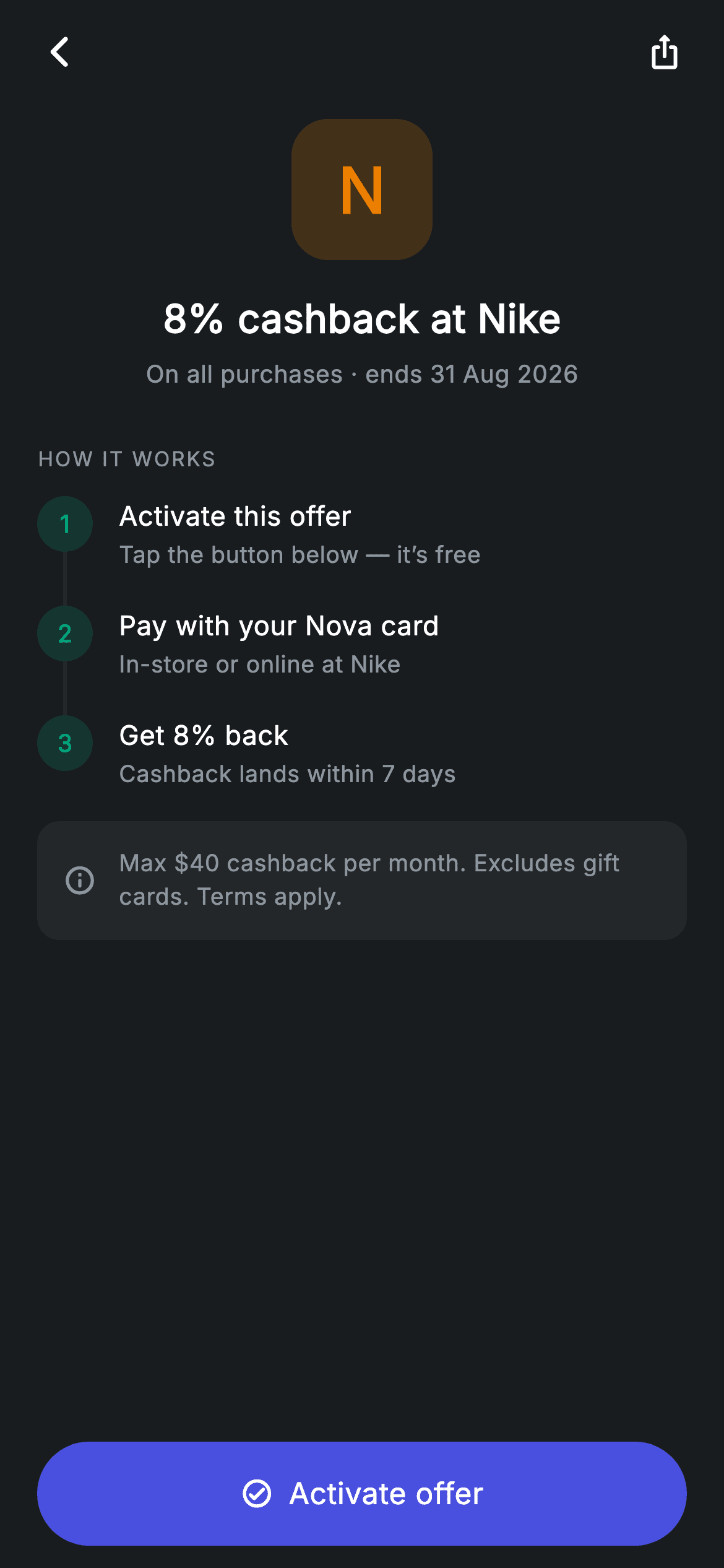
A cashback offer only converts if the user understands what they have to do to earn it. This tutorial builds a partner-perk detail screen in Flutter — an amber monogram tile standing in for a brand logo, the headline rate and expiry, a numbered three-step 'How it works' timeline whose connector lines size themselves to the text, a terms note, and an Activate button. The connector trick uses IntrinsicHeight, and the whole screen ships without a single image.
Watch the Flutter UI walkthrough
A short screen recording of Offer Detail running, if you'd rather see it before you read the code. The written tutorial below covers everything in it.
Can't see the video? Watch it on YouTube.
What you'll build
- ✓A numbered step timeline where each connector line stretches to match its row's real text height
- ✓A brand tile built from one letter in a tinted rounded square, so no partner logo is needed
- ✓Steps declared as plain data and expanded with a loop that flags its own last item
- ✓An icon-and-label activate button built from Material and InkWell with a clipped ripple
Step-by-step build
Create the file
Add a new file at lib/fintech_offer_detail/fintech_offer_detail_screen.dart in your Flutter project.
Register the bundled fonts
No external packages — this is pure Flutter. It does bundle its design font (Inter), so drop the font file into fonts/ and declare it in pubspec.yaml:
flutter:
  fonts:
    - family: Inter
      fonts:
- asset: fonts/Inter-Regular.ttfBuild it, piece by piece
Here's how the screen goes together. Each block below is a real slice of the code with a plain-English explanation — paste them in order, or grab the whole file from the next section.
The offer steps as data
import 'package:flutter/material.dart';

/// Offer detail — a single partner perk/offer (Revolut-inspired design system).
///
/// Self-contained per CONVENTIONS.md: pure Flutter only, the exact design font
/// (Inter) is bundled under `fonts/`, the brand mark is a painted monogram (no
/// network/emoji), and the screen forces its own dark theme. How-it-works steps
/// and terms make the offer read like a real product.
class FintechOfferDetailScreen extends StatelessWidget {
  const FintechOfferDetailScreen({super.key, this.onBack, this.onActivate});

  final VoidCallback? onBack;
  final VoidCallback? onActivate;

  static const String _font = 'Inter';
  static const Color _bg = Color(0xFF191C1F);
  static const Color _surface = Color(0xFF242729);
  static const Color _brand = Color(0xFF494FDF);
  static const Color _teal = Color(0xFF00A87E);
  static const Color _amber = Color(0xFFEC7E00);
  static const Color _muted = Color(0xFF8D969E);

  static const List<List<String>> _steps = <List<String>>[
    <String>['Activate this offer', 'Tap the button below — it’s free'],
    <String>['Pay with your Nova card', 'In-store or online at Nike'],
    <String>['Get 8% back', 'Cashback lands within 7 days'],
  ];
The screen is stateless with `onBack` and `onActivate`. `_steps` is a `static const List<List<String>>` — three [title, subtitle] pairs describing activate, pay, receive. Nested lists rather than a record class is a reasonable trade at this size since every entry has the same two-string shape. What matters is the content: each step pairs the action with the detail people actually worry about — that activating is free, which card to use, and that the cashback takes seven days. The palette reserves `_teal` for the step markers and `_amber` for the partner brand, so the offer's identity never competes with the flow's progress indicators.
The page flow and the step loop
  @override
  Widget build(BuildContext context) {
    return Theme(
      data: ThemeData.dark(useMaterial3: true),
      child: Scaffold(
        backgroundColor: _bg,
        body: SafeArea(
          child: Column(
            children: <Widget>[
              _buildAppBar(),
              Expanded(
                child: ListView(
                  physics: const BouncingScrollPhysics(),
                  padding: const EdgeInsets.fromLTRB(20, 8, 20, 24),
                  children: <Widget>[
                    _buildHeader(),
                    const SizedBox(height: 28),
                    _sectionLabel('How it works'),
                    const SizedBox(height: 12),
                    for (int i = 0; i < _steps.length; i++)
                      _StepRow(
                        index: i + 1,
                        title: _steps[i][0],
                        sub: _steps[i][1],
                        last: i == _steps.length - 1,
                      ),
                    const SizedBox(height: 16),
                    _buildTerms(),
                  ],
                ),
              ),
              _buildButton(),
            ],
          ),
        ),
      ),
    );
  }
The body is an app bar, an `Expanded` ListView and a pinned activate button — so the CTA never scrolls away no matter how long the terms grow. The steps are emitted with an indexed for-loop rather than a collection-for over the list, because each `_StepRow` needs two derived values: `index: i + 1` for the human-readable number, and `last: i == _steps.length - 1`. That `last` flag is the only thing the row needs to know about its position, and it's what stops the final connector line dangling below the last step.
A monogram instead of a partner logo
  Widget _buildAppBar() {
    return Padding(
      padding: const EdgeInsets.fromLTRB(8, 4, 8, 4),
      child: Row(
        children: <Widget>[
          IconButton(
            onPressed: onBack,
            icon: const Icon(Icons.arrow_back_ios_new_rounded,
                size: 20, color: Colors.white),
          ),
          const Spacer(),
          IconButton(
            onPressed: () {},
            icon: const Icon(Icons.ios_share_rounded,
                size: 20, color: Colors.white),
          ),
        ],
      ),
    );
  }

  Widget _buildHeader() {
    return Column(
      children: <Widget>[
        Container(
          width: 76,
          height: 76,
          alignment: Alignment.center,
          decoration: BoxDecoration(
            color: _amber.withValues(alpha: 0.2),
            borderRadius: BorderRadius.circular(20),
          ),
          child: const Text(
            'N',
            style: TextStyle(
              fontFamily: _font,
              fontSize: 34,
              fontWeight: FontWeight.w700,
              color: _amber,
            ),
          ),
        ),
        const SizedBox(height: 16),
        const Text(
          '8% cashback at Nike',
          style: TextStyle(
            fontFamily: _font,
            fontSize: 21,
            fontWeight: FontWeight.w600,
            letterSpacing: 0.24,
            color: Colors.white,
          ),
        ),
        const SizedBox(height: 6),
        const Text(
          'On all purchases · ends 31 Aug 2026',
          style: TextStyle(
            fontFamily: _font,
            fontSize: 13,
            letterSpacing: 0.24,
            color: _muted,
          ),
        ),
      ],
    );
  }
The app bar is minimal — a back button, a `Spacer()` and a share icon, with no title, letting the offer's own header act as the heading. That header centres a 76px rounded square filled `_amber.withValues(alpha: 0.2)` with a single 'N' at 34px w700 in solid amber. Using the partner's initial in a tinted tile is how this screen ships with no logo assets: nothing to license, nothing to fetch, no broken-image state, and it works for any merchant. Below it the rate is stated as a headline and the conditions — 'On all purchases · ends 31 Aug 2026' — sit directly underneath, so the scope and the deadline are visible before any scrolling.
The section label, terms, and activate button
  Widget _sectionLabel(String text) {
    return Text(
      text.toUpperCase(),
      style: const TextStyle(
        fontFamily: _font,
        fontSize: 11,
        fontWeight: FontWeight.w500,
        letterSpacing: 1.0,
        color: _muted,
      ),
    );
  }

  Widget _buildTerms() {
    return Container(
      padding: const EdgeInsets.all(14),
      decoration: BoxDecoration(
        color: _surface,
        borderRadius: BorderRadius.circular(12),
      ),
      child: Row(
        children: const <Widget>[
          Icon(Icons.info_outline_rounded, size: 18, color: _muted),
          SizedBox(width: 12),
          Expanded(
            child: Text(
              'Max \$40 cashback per month. Excludes gift cards. Terms apply.',
              style: TextStyle(
                fontFamily: _font,
                fontSize: 12.5,
                height: 1.4,
                letterSpacing: 0.24,
                color: _muted,
              ),
            ),
          ),
        ],
      ),
    );
  }

  Widget _buildButton() {
    return Padding(
      padding: const EdgeInsets.fromLTRB(20, 0, 20, 12),
      child: SizedBox(
        width: double.infinity,
        height: 56,
        child: Material(
          color: _brand,
          borderRadius: BorderRadius.circular(9999),
          child: InkWell(
            borderRadius: BorderRadius.circular(9999),
            onTap: onActivate,
            child: Row(
              mainAxisAlignment: MainAxisAlignment.center,
              children: const <Widget>[
                Icon(Icons.check_circle_outline_rounded,
                    size: 18, color: Colors.white),
                SizedBox(width: 8),
                Text(
                  'Activate offer',
                  style: TextStyle(
                    fontFamily: _font,
                    fontSize: 16,
                    fontWeight: FontWeight.w500,
                    letterSpacing: 0.24,
                    color: Colors.white,
                  ),
                ),
              ],
            ),
          ),
        ),
      ),
    );
  }
`_sectionLabel` uppercases in code rather than storing shouty strings, styled at 11px w500 with `letterSpacing: 1.0` — wide tracking is what keeps small uppercase text readable. The terms box pairs an info icon with the caps and exclusions at 12.5px with `height: 1.4`: quiet, but present, because 'Max $40 cashback per month' is the line that prevents a support ticket later. The button is Material plus InkWell with `BorderRadius.circular(9999)` on both so the ripple follows the pill, and its child is a centred Row of a check icon and 'Activate offer' — pairing a glyph with the label makes the primary action read faster than text alone.
The self-sizing step connector
class _StepRow extends StatelessWidget {
  const _StepRow({
    required this.index,
    required this.title,
    required this.sub,
    required this.last,
  });

  final int index;
  final String title;
  final String sub;
  final bool last;

  @override
  Widget build(BuildContext context) {
    return IntrinsicHeight(
      child: Row(
        crossAxisAlignment: CrossAxisAlignment.start,
        children: <Widget>[
          Column(
            children: <Widget>[
              Container(
                width: 30,
                height: 30,
                alignment: Alignment.center,
                decoration: BoxDecoration(
                  color: FintechOfferDetailScreen._teal.withValues(alpha: 0.18),
                  shape: BoxShape.circle,
                ),
                child: Text(
                  '$index',
                  style: const TextStyle(
                    fontFamily: FintechOfferDetailScreen._font,
                    fontSize: 13,
                    fontWeight: FontWeight.w700,
                    color: FintechOfferDetailScreen._teal,
                  ),
                ),
              ),
              if (!last)
                Expanded(
                  child: Container(
                    width: 2,
                    color: FintechOfferDetailScreen._surface,
                  ),
                ),
            ],
          ),
          const SizedBox(width: 14),
          Expanded(
            child: Padding(
              padding: EdgeInsets.only(bottom: last ? 0 : 18),
              child: Column(
                crossAxisAlignment: CrossAxisAlignment.start,
                children: <Widget>[
                  Text(
                    title,
                    style: const TextStyle(
                      fontFamily: FintechOfferDetailScreen._font,
                      fontSize: 14.5,
                      fontWeight: FontWeight.w500,
                      letterSpacing: 0.24,
                      color: Colors.white,
                    ),
                  ),
                  const SizedBox(height: 2),
                  Text(
                    sub,
                    style: const TextStyle(
                      fontFamily: FintechOfferDetailScreen._font,
                      fontSize: 12.5,
                      letterSpacing: 0.24,
                      color: FintechOfferDetailScreen._muted,
                    ),
                  ),
                ],
              ),
            ),
          ),
        ],
      ),
    );
  }
}
This is the technique worth taking away. Each step wraps its Row in `IntrinsicHeight`, which measures the tallest child — the text column — and forces the Row to exactly that height. The left column then holds a 30px numbered circle and, when this isn't the last step, an `Expanded` 2px-wide Container. Because Expanded fills whatever vertical space remains inside that measured height, the connector line automatically stretches to reach the next marker however many lines the description wraps to. Without IntrinsicHeight the Expanded would have no bounded height to expand into. The marker is a teal circle at 18% opacity with the number in solid teal, and the text column's bottom padding is `last ? 0 : 18`, giving the gap between steps without leaving dead space under the final one.
Full code
The complete, ready-to-paste source. Free to use in your projects — one click copies it all.
import 'package:flutter/material.dart';

/// Offer detail — a single partner perk/offer (Revolut-inspired design system).
///
/// Self-contained per CONVENTIONS.md: pure Flutter only, the exact design font
/// (Inter) is bundled under `fonts/`, the brand mark is a painted monogram (no
/// network/emoji), and the screen forces its own dark theme. How-it-works steps
/// and terms make the offer read like a real product.
class FintechOfferDetailScreen extends StatelessWidget {
  const FintechOfferDetailScreen({super.key, this.onBack, this.onActivate});

  final VoidCallback? onBack;
  final VoidCallback? onActivate;

  static const String _font = 'Inter';
  static const Color _bg = Color(0xFF191C1F);
  static const Color _surface = Color(0xFF242729);
  static const Color _brand = Color(0xFF494FDF);
  static const Color _teal = Color(0xFF00A87E);
  static const Color _amber = Color(0xFFEC7E00);
  static const Color _muted = Color(0xFF8D969E);

  static const List<List<String>> _steps = <List<String>>[
    <String>['Activate this offer', 'Tap the button below — it’s free'],
    <String>['Pay with your Nova card', 'In-store or online at Nike'],
    <String>['Get 8% back', 'Cashback lands within 7 days'],
  ];

  @override
  Widget build(BuildContext context) {
    return Theme(
      data: ThemeData.dark(useMaterial3: true),
      child: Scaffold(
        backgroundColor: _bg,
        body: SafeArea(
          child: Column(
            children: <Widget>[
              _buildAppBar(),
              Expanded(
                child: ListView(
                  physics: const BouncingScrollPhysics(),
                  padding: const EdgeInsets.fromLTRB(20, 8, 20, 24),
                  children: <Widget>[
                    _buildHeader(),
                    const SizedBox(height: 28),
                    _sectionLabel('How it works'),
                    const SizedBox(height: 12),
                    for (int i = 0; i < _steps.length; i++)
                      _StepRow(
                        index: i + 1,
                        title: _steps[i][0],
                        sub: _steps[i][1],
                        last: i == _steps.length - 1,
                      ),
                    const SizedBox(height: 16),
                    _buildTerms(),
                  ],
                ),
              ),
              _buildButton(),
            ],
          ),
        ),
      ),
    );
  }

  Widget _buildAppBar() {
    return Padding(
      padding: const EdgeInsets.fromLTRB(8, 4, 8, 4),
      child: Row(
        children: <Widget>[
          IconButton(
            onPressed: onBack,
            icon: const Icon(Icons.arrow_back_ios_new_rounded,
                size: 20, color: Colors.white),
          ),
          const Spacer(),
          IconButton(
            onPressed: () {},
            icon: const Icon(Icons.ios_share_rounded,
                size: 20, color: Colors.white),
          ),
        ],
      ),
    );
  }

  Widget _buildHeader() {
    return Column(
      children: <Widget>[
        Container(
          width: 76,
          height: 76,
          alignment: Alignment.center,
          decoration: BoxDecoration(
            color: _amber.withValues(alpha: 0.2),
            borderRadius: BorderRadius.circular(20),
          ),
          child: const Text(
            'N',
            style: TextStyle(
              fontFamily: _font,
              fontSize: 34,
              fontWeight: FontWeight.w700,
              color: _amber,
            ),
          ),
        ),
        const SizedBox(height: 16),
        const Text(
          '8% cashback at Nike',
          style: TextStyle(
            fontFamily: _font,
            fontSize: 21,
            fontWeight: FontWeight.w600,
            letterSpacing: 0.24,
            color: Colors.white,
          ),
        ),
        const SizedBox(height: 6),
        const Text(
          'On all purchases · ends 31 Aug 2026',
          style: TextStyle(
            fontFamily: _font,
            fontSize: 13,
            letterSpacing: 0.24,
            color: _muted,
          ),
        ),
      ],
    );
  }

  Widget _sectionLabel(String text) {
    return Text(
      text.toUpperCase(),
      style: const TextStyle(
        fontFamily: _font,
        fontSize: 11,
        fontWeight: FontWeight.w500,
        letterSpacing: 1.0,
        color: _muted,
      ),
    );
  }

  Widget _buildTerms() {
    return Container(
      padding: const EdgeInsets.all(14),
      decoration: BoxDecoration(
        color: _surface,
        borderRadius: BorderRadius.circular(12),
      ),
      child: Row(
        children: const <Widget>[
          Icon(Icons.info_outline_rounded, size: 18, color: _muted),
          SizedBox(width: 12),
          Expanded(
            child: Text(
              'Max \$40 cashback per month. Excludes gift cards. Terms apply.',
              style: TextStyle(
                fontFamily: _font,
                fontSize: 12.5,
                height: 1.4,
                letterSpacing: 0.24,
                color: _muted,
              ),
            ),
          ),
        ],
      ),
    );
  }

  Widget _buildButton() {
    return Padding(
      padding: const EdgeInsets.fromLTRB(20, 0, 20, 12),
      child: SizedBox(
        width: double.infinity,
        height: 56,
        child: Material(
          color: _brand,
          borderRadius: BorderRadius.circular(9999),
          child: InkWell(
            borderRadius: BorderRadius.circular(9999),
            onTap: onActivate,
            child: Row(
              mainAxisAlignment: MainAxisAlignment.center,
              children: const <Widget>[
                Icon(Icons.check_circle_outline_rounded,
                    size: 18, color: Colors.white),
                SizedBox(width: 8),
                Text(
                  'Activate offer',
                  style: TextStyle(
                    fontFamily: _font,
                    fontSize: 16,
                    fontWeight: FontWeight.w500,
                    letterSpacing: 0.24,
                    color: Colors.white,
                  ),
                ),
              ],
            ),
          ),
        ),
      ),
    );
  }
}

class _StepRow extends StatelessWidget {
  const _StepRow({
    required this.index,
    required this.title,
    required this.sub,
    required this.last,
  });

  final int index;
  final String title;
  final String sub;
  final bool last;

  @override
  Widget build(BuildContext context) {
    return IntrinsicHeight(
      child: Row(
        crossAxisAlignment: CrossAxisAlignment.start,
        children: <Widget>[
          Column(
            children: <Widget>[
              Container(
                width: 30,
                height: 30,
                alignment: Alignment.center,
                decoration: BoxDecoration(
                  color: FintechOfferDetailScreen._teal.withValues(alpha: 0.18),
                  shape: BoxShape.circle,
                ),
                child: Text(
                  '$index',
                  style: const TextStyle(
                    fontFamily: FintechOfferDetailScreen._font,
                    fontSize: 13,
                    fontWeight: FontWeight.w700,
                    color: FintechOfferDetailScreen._teal,
                  ),
                ),
              ),
              if (!last)
                Expanded(
                  child: Container(
                    width: 2,
                    color: FintechOfferDetailScreen._surface,
                  ),
                ),
            ],
          ),
          const SizedBox(width: 14),
          Expanded(
            child: Padding(
              padding: EdgeInsets.only(bottom: last ? 0 : 18),
              child: Column(
                crossAxisAlignment: CrossAxisAlignment.start,
                children: <Widget>[
                  Text(
                    title,
                    style: const TextStyle(
                      fontFamily: FintechOfferDetailScreen._font,
                      fontSize: 14.5,
                      fontWeight: FontWeight.w500,
                      letterSpacing: 0.24,
                      color: Colors.white,
                    ),
                  ),
                  const SizedBox(height: 2),
                  Text(
                    sub,
                    style: const TextStyle(
                      fontFamily: FintechOfferDetailScreen._font,
                      fontSize: 12.5,
                      letterSpacing: 0.24,
                      color: FintechOfferDetailScreen._muted,
                    ),
                  ),
                ],
              ),
            ),
          ),
        ],
      ),
    );
  }
}
Plus bundled 1 binary asset (fonts/images). The CLI and MCP install those for you automatically.
Two faster ways to add it
Copy-paste works, but you can skip it entirely.
1. FlutterKit CLI
One command drops this screen — and its fonts — straight into your project.
$ flutterkit add fintech-offer-detail2. AI agent (MCP)
Connect FlutterKit's MCP server in Claude or Cursor and just ask your agent to install fintech-offer-detail — it fetches and writes the files for you.
FAQ
Is this Flutter offer detail screen free to use?
Yes. The complete Dart source on this page is free for personal and commercial projects. Copy it directly, install it with the FlutterKit CLI (flutterkit add fintech-offer-detail), or have an AI agent add it for you over MCP.
Can I reuse _StepRow for other flows?
Yes — it's fully generic, taking an index, a title, a subtitle and a `last` flag, so it works for onboarding checklists, KYC progress or delivery stages. The only coupling is that it reads its colours from `FintechOfferDetailScreen`'s private statics, which works because Dart privacy is per-file; move it to its own file and you'll need to pass the tint in as a field.
How do I show an activated state after the button is tapped?
Convert the screen to a StatefulWidget with an `_activated` bool, set it in the `onActivate` handler, and swap the button's fill to `_teal` with a 'Offer activated' label and a null onTap. It's also worth marking the first step complete — pass a `done` flag into `_StepRow` and render a check icon in place of the number when it's set.
Which Flutter version does it target?
It uses Color.withValues() and super parameters, so Flutter 3.22+ (Dart 3). On an older SDK, change the two withValues(alpha: ...) calls — the monogram tile and the step marker — to withOpacity(...). The only bundled asset is the Inter font, registered in pubspec.yaml as shown in step 2; there are no images.


