How to Build a Notification Settings Screen in Flutter (Full Code + Preview)
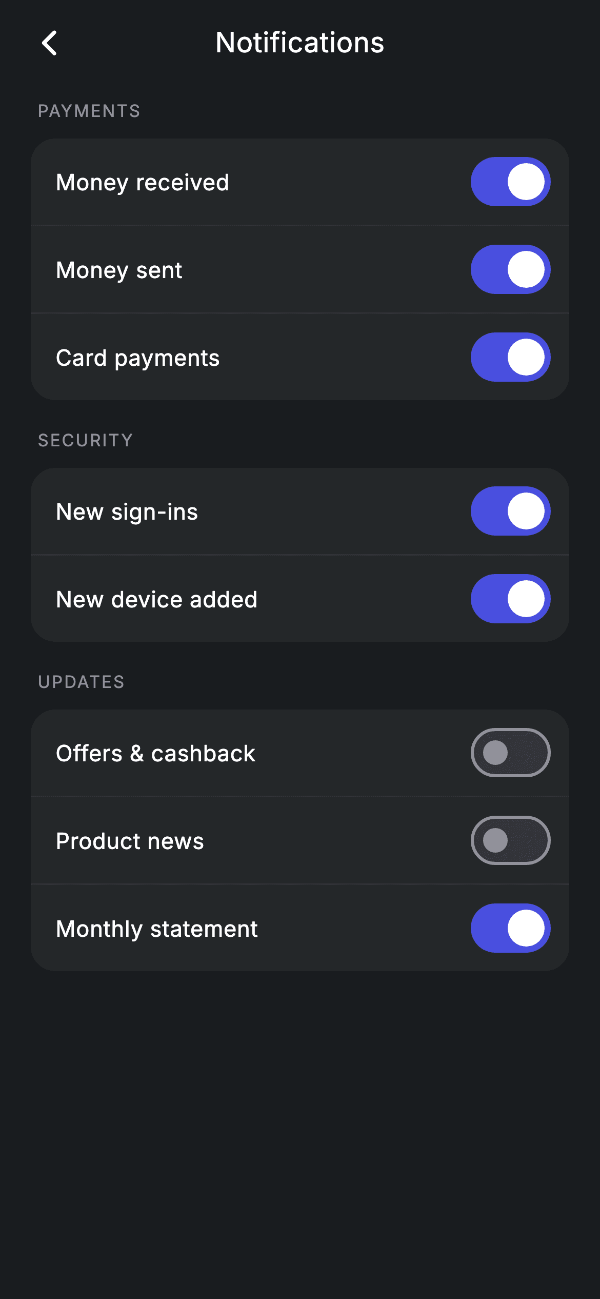
Notification preferences are where banking apps earn or lose trust, so the grouping matters as much as the switches. This tutorial builds a Revolut-style notifications screen in Flutter — eight independent toggles split into Payments, Security and Updates, backed by a single `Map<String, bool>` rather than eight separate fields. Security alerts default on and marketing defaults off. It's 158 lines, and the group builder is a pattern you'll reuse for every settings screen you write.
Watch the Flutter UI walkthrough
A short screen recording of Notifications Settings running, if you'd rather see it before you read the code. The written tutorial below covers everything in it.
Can't see the video? Watch it on YouTube.
What you'll build
- ✓Eight independent switches driven by one string-keyed map instead of eight boolean fields
- ✓Three grouped cards where dividers are inserted by index so no group ends with a stray rule
- ✓Defaults that opt users into money and security alerts while leaving marketing off
- ✓Material switches restyled to the app's indigo with a white thumb, no theme override needed
Step-by-step build
Create the file
Add a new file at lib/fintech_notifications_settings/fintech_notifications_settings_screen.dart in your Flutter project.
Register the bundled fonts
No external packages — this is pure Flutter. It does bundle its design font (Inter), so drop the font file into fonts/ and declare it in pubspec.yaml:
flutter:
  fonts:
    - family: Inter
      fonts:
- asset: fonts/Inter-Regular.ttfBuild it, piece by piece
Here's how the screen goes together. Each block below is a real slice of the code with a plain-English explanation — paste them in order, or grab the whole file from the next section.
One map holding eight preferences
import 'package:flutter/material.dart';

/// Notification settings — per-category preferences (Revolut-inspired design).
///
/// Self-contained per CONVENTIONS.md: pure Flutter only, the exact design font
/// (Inter) is bundled under `fonts/`, no network/emoji images, and the screen
/// forces its own dark theme. Each preference is an independent switch grouped
/// by category.
class FintechNotificationsSettingsScreen extends StatefulWidget {
  const FintechNotificationsSettingsScreen({super.key, this.onBack});

  final VoidCallback? onBack;

  @override
  State<FintechNotificationsSettingsScreen> createState() =>
      _FintechNotificationsSettingsScreenState();
}

class _FintechNotificationsSettingsScreenState
    extends State<FintechNotificationsSettingsScreen> {
  static const String _font = 'Inter';
  static const Color _bg = Color(0xFF191C1F);
  static const Color _surface = Color(0xFF242729);
  static const Color _brand = Color(0xFF494FDF);
  static const Color _muted = Color(0xFF8D969E);
  static const Color _hairline = Color(0xFF2E3235);

  final Map<String, bool> _v = <String, bool>{
    'Money received': true,
    'Money sent': true,
    'Card payments': true,
    'New sign-ins': true,
    'New device added': true,
    'Offers & cashback': false,
    'Product news': false,
    'Monthly statement': true,
  };
The state is a single `Map<String, bool>` keyed by the label shown on screen. That's the design decision worth taking: eight named boolean fields would need eight getters, eight setters and eight call sites, whereas one map means the row builder can read and write any preference by key. Look at the defaults, because they encode a policy — everything under money movement and security starts `true`, while 'Offers & cashback' and 'Product news' start `false`. Opting users into transaction and sign-in alerts but not marketing is both the respectful default and the one that keeps you on the right side of consent rules.
Three groups in a scrolling list
  @override
  Widget build(BuildContext context) {
    return Theme(
      data: ThemeData.dark(useMaterial3: true),
      child: Scaffold(
        backgroundColor: _bg,
        body: SafeArea(
          child: Column(
            children: <Widget>[
              _buildAppBar(),
              Expanded(
                child: ListView(
                  physics: const BouncingScrollPhysics(),
                  padding: const EdgeInsets.fromLTRB(20, 8, 20, 24),
                  children: <Widget>[
                    _label('Payments'),
                    _group(<String>['Money received', 'Money sent', 'Card payments']),
                    const SizedBox(height: 18),
                    _label('Security'),
                    _group(<String>['New sign-ins', 'New device added']),
                    const SizedBox(height: 18),
                    _label('Updates'),
                    _group(<String>['Offers & cashback', 'Product news',
                        'Monthly statement']),
                  ],
                ),
              ),
            ],
          ),
        ),
      ),
    );
  }
The body is an app bar over an `Expanded` ListView whose children alternate `_label` and `_group`, three times, with 18px between sections. Each `_group` call passes a `List<String>` of keys — the group widget looks each one up in the map rather than owning any data itself, so a preference can be moved between categories by editing one line here. The categories themselves do real work: separating Security from Updates lets someone silence marketing without accidentally silencing a new-device alert. `BouncingScrollPhysics` gives the iOS-style overscroll used across this fintech set.
The centred app bar and section label
  Widget _buildAppBar() {
    return Padding(
      padding: const EdgeInsets.fromLTRB(8, 4, 8, 4),
      child: Row(
        children: <Widget>[
          IconButton(
            onPressed: widget.onBack,
            icon: const Icon(Icons.arrow_back_ios_new_rounded,
                size: 20, color: Colors.white),
          ),
          const Expanded(
            child: Text(
              'Notifications',
              textAlign: TextAlign.center,
              style: TextStyle(
                fontFamily: _font,
                fontSize: 18,
                fontWeight: FontWeight.w500,
                letterSpacing: 0.24,
                color: Colors.white,
              ),
            ),
          ),
          const SizedBox(width: 48),
        ],
      ),
    );
  }

  Widget _label(String text) {
    return Padding(
      padding: const EdgeInsets.only(left: 4, bottom: 10),
      child: Text(
        text.toUpperCase(),
        style: const TextStyle(
          fontFamily: _font,
          fontSize: 11,
          fontWeight: FontWeight.w500,
          letterSpacing: 1.0,
          color: _muted,
        ),
      ),
    );
  }
The app bar centres its title with the balancing trick used throughout this kit: an `Expanded` Text with `textAlign: TextAlign.center`, offset by a `const SizedBox(width: 48)` on the trailing side to match the leading IconButton's 48px tap target — without it the title would sit visibly right of centre. `_label` uppercases its argument in code rather than storing shouty strings, and styles it at 11px w500 with `letterSpacing: 1.0`. That wide tracking is what keeps small uppercase text legible instead of collapsing into a grey block, and the 4px left inset nudges it to sit optically over the card below.
Building a group with interleaved dividers
  Widget _group(List<String> keys) {
    final List<Widget> children = <Widget>[];
    for (int i = 0; i < keys.length; i++) {
      if (i != 0) children.add(const Divider(height: 1, color: _hairline));
      final String k = keys[i];
      children.add(Padding(
        padding: const EdgeInsets.fromLTRB(16, 4, 8, 4),
        child: Row(
          children: <Widget>[
            Expanded(
              child: Text(
                k,
                style: const TextStyle(
                  fontFamily: _font,
                  fontSize: 14.5,
                  fontWeight: FontWeight.w500,
                  letterSpacing: 0.24,
                  color: Colors.white,
                ),
              ),
            ),
            Switch(
              value: _v[k]!,
              onChanged: (bool val) => setState(() => _v[k] = val),
              activeThumbColor: Colors.white,
              activeTrackColor: _brand,
            ),
          ],
        ),
      ));
    }
    return Container(
      decoration: BoxDecoration(
        color: _surface,
        borderRadius: BorderRadius.circular(16),
      ),
      child: Column(children: children),
    );
  }
`_group` builds its children imperatively, and the reason is the divider rule: `if (i != 0) children.add(const Divider(...))` adds a rule *before* every row except the first, giving N rows and exactly N−1 dividers with nothing butting against the card's rounded bottom. Each row is an `Expanded` label plus a Switch reading `_v[k]!` and writing back through `setState(() => _v[k] = val)` — the map lookup is why one builder serves all eight preferences. The switch is restyled inline with `activeThumbColor: Colors.white` and `activeTrackColor: _brand`, which is simpler than overriding SwitchTheme for a single screen. Note the row padding is `fromLTRB(16, 4, 8, 4)`: tight vertically because a Switch already carries its own 48px tap height, and tighter on the right because the switch's own padding covers that edge.
Full code
The complete, ready-to-paste source. Free to use in your projects — one click copies it all.
import 'package:flutter/material.dart';

/// Notification settings — per-category preferences (Revolut-inspired design).
///
/// Self-contained per CONVENTIONS.md: pure Flutter only, the exact design font
/// (Inter) is bundled under `fonts/`, no network/emoji images, and the screen
/// forces its own dark theme. Each preference is an independent switch grouped
/// by category.
class FintechNotificationsSettingsScreen extends StatefulWidget {
  const FintechNotificationsSettingsScreen({super.key, this.onBack});

  final VoidCallback? onBack;

  @override
  State<FintechNotificationsSettingsScreen> createState() =>
      _FintechNotificationsSettingsScreenState();
}

class _FintechNotificationsSettingsScreenState
    extends State<FintechNotificationsSettingsScreen> {
  static const String _font = 'Inter';
  static const Color _bg = Color(0xFF191C1F);
  static const Color _surface = Color(0xFF242729);
  static const Color _brand = Color(0xFF494FDF);
  static const Color _muted = Color(0xFF8D969E);
  static const Color _hairline = Color(0xFF2E3235);

  final Map<String, bool> _v = <String, bool>{
    'Money received': true,
    'Money sent': true,
    'Card payments': true,
    'New sign-ins': true,
    'New device added': true,
    'Offers & cashback': false,
    'Product news': false,
    'Monthly statement': true,
  };

  @override
  Widget build(BuildContext context) {
    return Theme(
      data: ThemeData.dark(useMaterial3: true),
      child: Scaffold(
        backgroundColor: _bg,
        body: SafeArea(
          child: Column(
            children: <Widget>[
              _buildAppBar(),
              Expanded(
                child: ListView(
                  physics: const BouncingScrollPhysics(),
                  padding: const EdgeInsets.fromLTRB(20, 8, 20, 24),
                  children: <Widget>[
                    _label('Payments'),
                    _group(<String>['Money received', 'Money sent', 'Card payments']),
                    const SizedBox(height: 18),
                    _label('Security'),
                    _group(<String>['New sign-ins', 'New device added']),
                    const SizedBox(height: 18),
                    _label('Updates'),
                    _group(<String>['Offers & cashback', 'Product news',
                        'Monthly statement']),
                  ],
                ),
              ),
            ],
          ),
        ),
      ),
    );
  }

  Widget _buildAppBar() {
    return Padding(
      padding: const EdgeInsets.fromLTRB(8, 4, 8, 4),
      child: Row(
        children: <Widget>[
          IconButton(
            onPressed: widget.onBack,
            icon: const Icon(Icons.arrow_back_ios_new_rounded,
                size: 20, color: Colors.white),
          ),
          const Expanded(
            child: Text(
              'Notifications',
              textAlign: TextAlign.center,
              style: TextStyle(
                fontFamily: _font,
                fontSize: 18,
                fontWeight: FontWeight.w500,
                letterSpacing: 0.24,
                color: Colors.white,
              ),
            ),
          ),
          const SizedBox(width: 48),
        ],
      ),
    );
  }

  Widget _label(String text) {
    return Padding(
      padding: const EdgeInsets.only(left: 4, bottom: 10),
      child: Text(
        text.toUpperCase(),
        style: const TextStyle(
          fontFamily: _font,
          fontSize: 11,
          fontWeight: FontWeight.w500,
          letterSpacing: 1.0,
          color: _muted,
        ),
      ),
    );
  }

  Widget _group(List<String> keys) {
    final List<Widget> children = <Widget>[];
    for (int i = 0; i < keys.length; i++) {
      if (i != 0) children.add(const Divider(height: 1, color: _hairline));
      final String k = keys[i];
      children.add(Padding(
        padding: const EdgeInsets.fromLTRB(16, 4, 8, 4),
        child: Row(
          children: <Widget>[
            Expanded(
              child: Text(
                k,
                style: const TextStyle(
                  fontFamily: _font,
                  fontSize: 14.5,
                  fontWeight: FontWeight.w500,
                  letterSpacing: 0.24,
                  color: Colors.white,
                ),
              ),
            ),
            Switch(
              value: _v[k]!,
              onChanged: (bool val) => setState(() => _v[k] = val),
              activeThumbColor: Colors.white,
              activeTrackColor: _brand,
            ),
          ],
        ),
      ));
    }
    return Container(
      decoration: BoxDecoration(
        color: _surface,
        borderRadius: BorderRadius.circular(16),
      ),
      child: Column(children: children),
    );
  }
}
Plus bundled 1 binary asset (fonts/images). The CLI and MCP install those for you automatically.
Two faster ways to add it
Copy-paste works, but you can skip it entirely.
1. FlutterKit CLI
One command drops this screen — and its fonts — straight into your project.
$ flutterkit add fintech-notifications-settings2. AI agent (MCP)
Connect FlutterKit's MCP server in Claude or Cursor and just ask your agent to install fintech-notifications-settings — it fetches and writes the files for you.
FAQ
Is this Flutter notification settings screen free to use?
Yes. The complete Dart source on this page is free for personal and commercial projects. Copy it directly, install it with the FlutterKit CLI (flutterkit add fintech-notifications-settings), or have an AI agent add it for you over MCP.
Should I key the map by label or by an id?
Label keys keep this demo readable, but for production you want stable ids — a label is user-facing text that will change when copy is rewritten or the app is localised, and changing it would silently orphan the stored preference. Switch to a small record with an id and a label, key the map by id, and render the label; `_group` then takes a list of ids and everything else works the same.
Does it actually persist the switches?
No — the map lives in State, so the values reset when the screen is rebuilt from scratch. Persisting them is the natural next step: write to your backend in the same `onChanged` handler that calls setState, and seed the map from your API in initState. Because every preference already flows through one map, that's two touchpoints rather than eight.
Which Flutter version does it target?
The Switch uses `activeThumbColor`, which replaced `activeColor` in Flutter 3.31 — on an earlier SDK use `activeColor: Colors.white` instead. Otherwise it's plain Material 3 with super parameters and no Color.withValues calls. The only bundled asset is the Inter font, registered in pubspec.yaml as shown in step 2.


