How to Build a Help Center Support Hub in Flutter (Full Code + Preview)
A good support screen answers the common question before anyone types, and keeps the escape hatch visible the whole time. This tutorial builds that in Flutter: a search entry point, a 2×2 grid of colour-coded help categories, a card of five popular articles separated by hairlines, and a 'Chat with us' button pinned below the scroll so it never disappears. The grid nests inside a `ListView`, which needs two specific properties to work — that's the part most people get wrong.
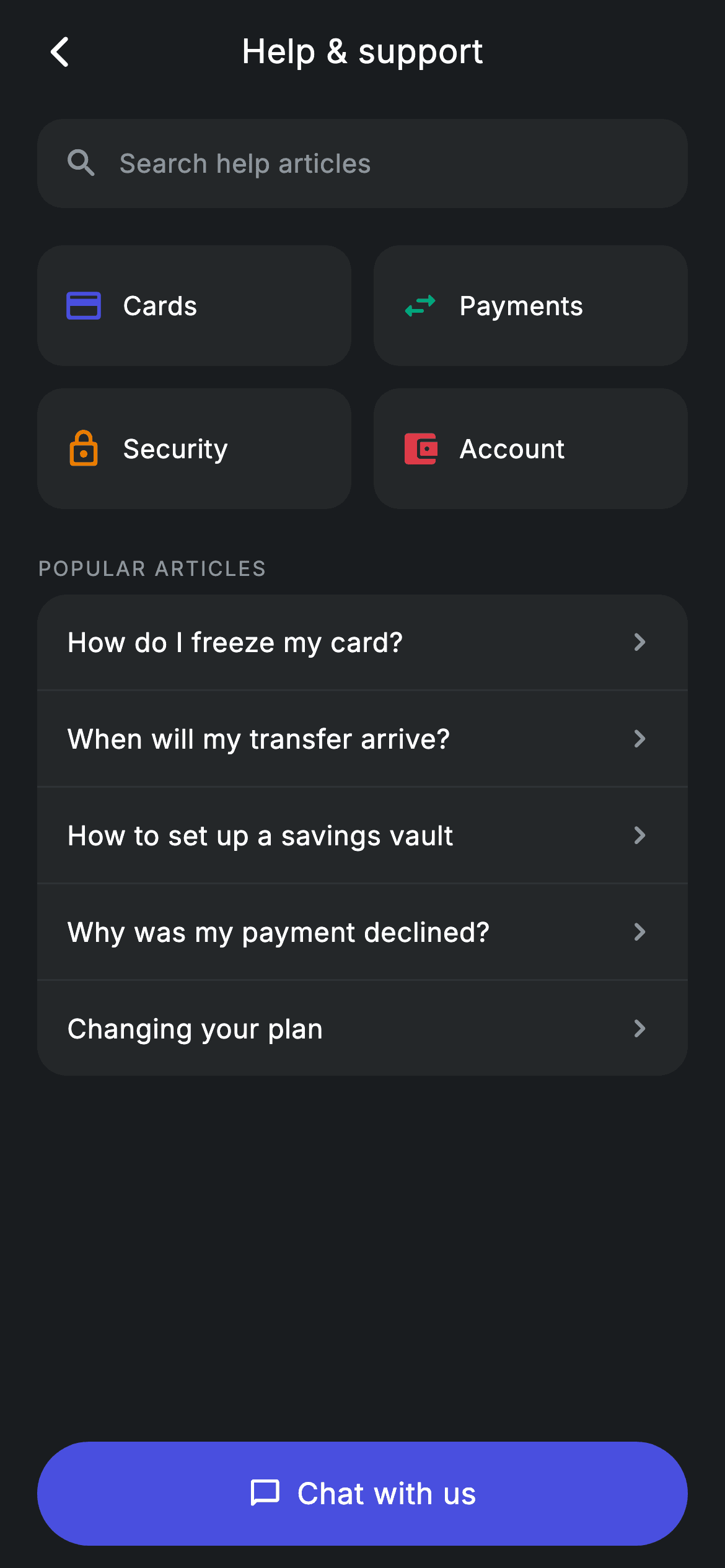
Watch the Flutter UI walkthrough
A short screen recording of Help Center running, if you'd rather see it before you read the code. The written tutorial below covers everything in it.
Can't see the video? Watch it on YouTube.
What you'll build
- ✓A 2×2 category grid nested inside a `ListView` via `shrinkWrap` and locked physics
- ✓A wide `childAspectRatio` (2.6) that turns grid cells into short, wide tiles
- ✓Article rows separated by dividers inserted with an `if (i != 0)` guard
- ✓A tappable search entry point that's a styled `Row`, not a live `TextField`
- ✓Category tiles built on `Material` + `InkWell` so the ripple stays inside the rounded corners
- ✓A pinned contact CTA with an icon and label centred as a pair
Step-by-step build
Create the file
Add a new file at lib/fintech_help_center/fintech_help_center_screen.dart in your Flutter project.
Register the bundled fonts
No external packages — this is pure Flutter. It does bundle its design font (Inter), so drop the font file into fonts/ and declare it in pubspec.yaml:
flutter:
  fonts:
    - family: Inter
      fonts:
- asset: fonts/Inter-Regular.ttfBuild it, piece by piece
Here's how the screen goes together. Each block below is a real slice of the code with a plain-English explanation — paste them in order, or grab the whole file from the next section.
Categories and articles as const data
class FintechHelpCenterScreen extends StatelessWidget {
  const FintechHelpCenterScreen({
    super.key,
    this.onBack,
    this.onArticle,
    this.onChat,
  });

  final VoidCallback? onBack;
  final VoidCallback? onArticle;
  final VoidCallback? onChat;

  static const String _font = 'Inter';
  static const Color _bg = Color(0xFF191C1F);
  static const Color _surface = Color(0xFF242729);
  static const Color _brand = Color(0xFF494FDF);
  static const Color _teal = Color(0xFF00A87E);
  static const Color _amber = Color(0xFFEC7E00);
  static const Color _red = Color(0xFFE23B4A);
  static const Color _muted = Color(0xFF8D969E);

  static const List<List<dynamic>> _cats = <List<dynamic>>[
    <dynamic>[Icons.credit_card_rounded, 'Cards', _brand],
    <dynamic>[Icons.swap_horiz_rounded, 'Payments', _teal],
    <dynamic>[Icons.lock_outline_rounded, 'Security', _amber],
    <dynamic>[Icons.account_balance_wallet_rounded, 'Account', _red],
  ];

  static const List<String> _articles = <String>[
    'How do I freeze my card?',
    'When will my transfer arrive?',
    'How to set up a savings vault',
    'Why was my payment declined?',
    'Changing your plan',
  ];
Three callbacks — `onBack`, `onArticle`, `onChat` — mean the screen delegates every destination to its host. `_cats` is a `const List<List<dynamic>>` where each row is `[IconData, String, Color]`; it's the loosest possible model, which is why the builder later has to write `c[0] as IconData`. That's a fair trade at four fixed entries, though a record or small class is the better shape once the list grows or gains fields. `_articles` needs no structure at all — five strings, since every article row renders identically and shares one `onArticle` callback.
Page layout and the divider-guard loop
  @override
  Widget build(BuildContext context) {
    return Theme(
      data: ThemeData.dark(useMaterial3: true),
      child: Scaffold(
        backgroundColor: _bg,
        body: SafeArea(
          child: Column(
            children: <Widget>[
              _buildAppBar(),
              Expanded(
                child: ListView(
                  physics: const BouncingScrollPhysics(),
                  padding: const EdgeInsets.fromLTRB(20, 8, 20, 24),
                  children: <Widget>[
                    _buildSearch(),
                    const SizedBox(height: 20),
                    _buildCatGrid(),
                    const SizedBox(height: 24),
                    _label('Popular articles'),
                    const SizedBox(height: 6),
                    Container(
                      decoration: BoxDecoration(
                        color: _surface,
                        borderRadius: BorderRadius.circular(16),
                      ),
                      child: Column(
                        children: <Widget>[
                          for (int i = 0; i < _articles.length; i++) ...<Widget>[
                            if (i != 0)
                              const Divider(
                                  height: 1, color: Color(0xFF2E3235)),
                            _articleRow(_articles[i]),
                          ],
                        ],
                      ),
                    ),
                  ],
                ),
              ),
              _buildContact(),
            ],
          ),
        ),
      ),
    );
  }
The app bar and the contact button sit outside the `Expanded` `ListView`, which pins the CTA to the bottom — important on a support screen, where 'talk to a human' has to stay reachable while someone scrolls. The articles card uses an indexed collection-for with `if (i != 0) const Divider(height: 1, ...)` before each row. Guarding on the index is what produces *n−1* dividers, so there's no stray line above the first article or below the last — the usual bug when you append a separator after every item instead.
A search box that isn't a text field
  Widget _buildSearch() {
    return Container(
      height: 48,
      padding: const EdgeInsets.symmetric(horizontal: 14),
      decoration: BoxDecoration(
        color: _surface,
        borderRadius: BorderRadius.circular(14),
      ),
      child: Row(
        children: const <Widget>[
          Icon(Icons.search_rounded, size: 20, color: _muted),
          SizedBox(width: 10),
          Text(
            'Search help articles',
            style: TextStyle(
              fontFamily: _font,
              fontSize: 14,
              letterSpacing: 0.24,
              color: _muted,
            ),
          ),
        ],
      ),
    );
  }
This looks like a search input but contains no `TextField` at all — it's a 48px `Container` holding a `search_rounded` icon and static muted 'Search help articles' text, with every child `const`. That's an intentional pattern for a hub screen: tapping it should push a dedicated search route with its own results list and keyboard handling, rather than opening a keyboard that covers the categories you just showed. It costs nothing to build and never rebuilds.
Nesting the category grid inside a ListView
  Widget _buildCatGrid() {
    return GridView.count(
      crossAxisCount: 2,
      shrinkWrap: true,
      physics: const NeverScrollableScrollPhysics(),
      mainAxisSpacing: 12,
      crossAxisSpacing: 12,
      childAspectRatio: 2.6,
      children: <Widget>[
        for (final List<dynamic> c in _cats)
          Material(
            color: _surface,
            borderRadius: BorderRadius.circular(14),
            child: InkWell(
              borderRadius: BorderRadius.circular(14),
              onTap: onArticle,
              child: Padding(
                padding: const EdgeInsets.symmetric(horizontal: 14),
                child: Row(
                  children: <Widget>[
                    Icon(c[0] as IconData, size: 22, color: c[2] as Color),
                    const SizedBox(width: 10),
                    Text(
                      c[1] as String,
                      style: const TextStyle(
                        fontFamily: _font,
                        fontSize: 14,
                        fontWeight: FontWeight.w500,
                        letterSpacing: 0.24,
                        color: Colors.white,
                      ),
                    ),
                  ],
                ),
              ),
            ),
          ),
      ],
    );
  }
`GridView.count` inside a scrolling parent needs both properties on lines 151–152: `shrinkWrap: true` so the grid measures itself against its content rather than demanding unbounded height, and `NeverScrollableScrollPhysics` so it doesn't fight the `ListView` for scroll gestures — the page then moves as one surface. `childAspectRatio: 2.6` makes each cell more than twice as wide as it is tall, which is what turns grid cells into label rows rather than square cards. Each tile is `Material` + `InkWell` sharing `BorderRadius.circular(14)`, so the ripple is clipped to the rounded rectangle instead of spilling to a square.
Article rows and the contact button
  Widget _articleRow(String title) {
    return InkWell(
      onTap: onArticle,
      child: Padding(
        padding: const EdgeInsets.symmetric(horizontal: 16, vertical: 15),
        child: Row(
          children: <Widget>[
            Expanded(
              child: Text(
                title,
                style: const TextStyle(
                  fontFamily: _font,
                  fontSize: 14.5,
                  fontWeight: FontWeight.w500,
                  letterSpacing: 0.24,
                  color: Colors.white,
                ),
              ),
            ),
            const Icon(Icons.chevron_right_rounded, size: 20, color: _muted),
          ],
        ),
      ),
    );
  }

  Widget _buildContact() {
    return Padding(
      padding: const EdgeInsets.fromLTRB(20, 0, 20, 12),
      child: SizedBox(
        width: double.infinity,
        height: 56,
        child: Material(
          color: _brand,
          borderRadius: BorderRadius.circular(9999),
          child: InkWell(
            borderRadius: BorderRadius.circular(9999),
            onTap: onChat,
            child: Row(
              mainAxisAlignment: MainAxisAlignment.center,
              children: const <Widget>[
                Icon(Icons.chat_bubble_outline_rounded,
                    size: 18, color: Colors.white),
                SizedBox(width: 8),
                Text(
                  'Chat with us',
                  style: TextStyle(
                    fontFamily: _font,
                    fontSize: 16,
                    fontWeight: FontWeight.w500,
                    letterSpacing: 0.24,
                    color: Colors.white,
                  ),
                ),
              ],
            ),
          ),
        ),
      ),
    );
  }
`_articleRow` puts the `InkWell` *outside* the `Padding`, which is what makes the whole 16×15 row tappable and lets the ripple reach the card's edges — swap the order and the touch target would shrink to the text itself. The title is `Expanded` so a long question wraps rather than pushing the chevron off-screen. The contact button is `Material` + `InkWell` at a 9999 radius (a value far larger than the height, which Flutter clamps to a perfect pill), and its child is a `Row` with `MainAxisAlignment.center` so the chat icon and label are centred together as one unit rather than the label alone.
Full code
The complete, ready-to-paste source. Free to use in your projects — one click copies it all.
import 'package:flutter/material.dart';

/// Help center — support hub with search (Revolut-inspired design system).
///
/// Self-contained per CONVENTIONS.md: pure Flutter only, the exact design font
/// (Inter) is bundled under `fonts/`, no network/emoji images, and the screen
/// forces its own dark theme. Category tiles + popular articles route to an
/// article; a pinned button opens live chat.
class FintechHelpCenterScreen extends StatelessWidget {
  const FintechHelpCenterScreen({
    super.key,
    this.onBack,
    this.onArticle,
    this.onChat,
  });

  final VoidCallback? onBack;
  final VoidCallback? onArticle;
  final VoidCallback? onChat;

  static const String _font = 'Inter';
  static const Color _bg = Color(0xFF191C1F);
  static const Color _surface = Color(0xFF242729);
  static const Color _brand = Color(0xFF494FDF);
  static const Color _teal = Color(0xFF00A87E);
  static const Color _amber = Color(0xFFEC7E00);
  static const Color _red = Color(0xFFE23B4A);
  static const Color _muted = Color(0xFF8D969E);

  static const List<List<dynamic>> _cats = <List<dynamic>>[
    <dynamic>[Icons.credit_card_rounded, 'Cards', _brand],
    <dynamic>[Icons.swap_horiz_rounded, 'Payments', _teal],
    <dynamic>[Icons.lock_outline_rounded, 'Security', _amber],
    <dynamic>[Icons.account_balance_wallet_rounded, 'Account', _red],
  ];

  static const List<String> _articles = <String>[
    'How do I freeze my card?',
    'When will my transfer arrive?',
    'How to set up a savings vault',
    'Why was my payment declined?',
    'Changing your plan',
  ];

  @override
  Widget build(BuildContext context) {
    return Theme(
      data: ThemeData.dark(useMaterial3: true),
      child: Scaffold(
        backgroundColor: _bg,
        body: SafeArea(
          child: Column(
            children: <Widget>[
              _buildAppBar(),
              Expanded(
                child: ListView(
                  physics: const BouncingScrollPhysics(),
                  padding: const EdgeInsets.fromLTRB(20, 8, 20, 24),
                  children: <Widget>[
                    _buildSearch(),
                    const SizedBox(height: 20),
                    _buildCatGrid(),
                    const SizedBox(height: 24),
                    _label('Popular articles'),
                    const SizedBox(height: 6),
                    Container(
                      decoration: BoxDecoration(
                        color: _surface,
                        borderRadius: BorderRadius.circular(16),
                      ),
                      child: Column(
                        children: <Widget>[
                          for (int i = 0; i < _articles.length; i++) ...<Widget>[
                            if (i != 0)
                              const Divider(
                                  height: 1, color: Color(0xFF2E3235)),
                            _articleRow(_articles[i]),
                          ],
                        ],
                      ),
                    ),
                  ],
                ),
              ),
              _buildContact(),
            ],
          ),
        ),
      ),
    );
  }

  Widget _buildAppBar() {
    return Padding(
      padding: const EdgeInsets.fromLTRB(8, 4, 8, 4),
      child: Row(
        children: <Widget>[
          IconButton(
            onPressed: onBack,
            icon: const Icon(Icons.arrow_back_ios_new_rounded,
                size: 20, color: Colors.white),
          ),
          const Expanded(
            child: Text(
              'Help & support',
              textAlign: TextAlign.center,
              style: TextStyle(
                fontFamily: _font,
                fontSize: 18,
                fontWeight: FontWeight.w500,
                letterSpacing: 0.24,
                color: Colors.white,
              ),
            ),
          ),
          const SizedBox(width: 48),
        ],
      ),
    );
  }

  Widget _buildSearch() {
    return Container(
      height: 48,
      padding: const EdgeInsets.symmetric(horizontal: 14),
      decoration: BoxDecoration(
        color: _surface,
        borderRadius: BorderRadius.circular(14),
      ),
      child: Row(
        children: const <Widget>[
          Icon(Icons.search_rounded, size: 20, color: _muted),
          SizedBox(width: 10),
          Text(
            'Search help articles',
            style: TextStyle(
              fontFamily: _font,
              fontSize: 14,
              letterSpacing: 0.24,
              color: _muted,
            ),
          ),
        ],
      ),
    );
  }

  Widget _buildCatGrid() {
    return GridView.count(
      crossAxisCount: 2,
      shrinkWrap: true,
      physics: const NeverScrollableScrollPhysics(),
      mainAxisSpacing: 12,
      crossAxisSpacing: 12,
      childAspectRatio: 2.6,
      children: <Widget>[
        for (final List<dynamic> c in _cats)
          Material(
            color: _surface,
            borderRadius: BorderRadius.circular(14),
            child: InkWell(
              borderRadius: BorderRadius.circular(14),
              onTap: onArticle,
              child: Padding(
                padding: const EdgeInsets.symmetric(horizontal: 14),
                child: Row(
                  children: <Widget>[
                    Icon(c[0] as IconData, size: 22, color: c[2] as Color),
                    const SizedBox(width: 10),
                    Text(
                      c[1] as String,
                      style: const TextStyle(
                        fontFamily: _font,
                        fontSize: 14,
                        fontWeight: FontWeight.w500,
                        letterSpacing: 0.24,
                        color: Colors.white,
                      ),
                    ),
                  ],
                ),
              ),
            ),
          ),
      ],
    );
  }

  Widget _label(String text) {
    return Text(
      text.toUpperCase(),
      style: const TextStyle(
        fontFamily: _font,
        fontSize: 11,
        fontWeight: FontWeight.w500,
        letterSpacing: 1.0,
        color: _muted,
      ),
    );
  }

  Widget _articleRow(String title) {
    return InkWell(
      onTap: onArticle,
      child: Padding(
        padding: const EdgeInsets.symmetric(horizontal: 16, vertical: 15),
        child: Row(
          children: <Widget>[
            Expanded(
              child: Text(
                title,
                style: const TextStyle(
                  fontFamily: _font,
                  fontSize: 14.5,
                  fontWeight: FontWeight.w500,
                  letterSpacing: 0.24,
                  color: Colors.white,
                ),
              ),
            ),
            const Icon(Icons.chevron_right_rounded, size: 20, color: _muted),
          ],
        ),
      ),
    );
  }

  Widget _buildContact() {
    return Padding(
      padding: const EdgeInsets.fromLTRB(20, 0, 20, 12),
      child: SizedBox(
        width: double.infinity,
        height: 56,
        child: Material(
          color: _brand,
          borderRadius: BorderRadius.circular(9999),
          child: InkWell(
            borderRadius: BorderRadius.circular(9999),
            onTap: onChat,
            child: Row(
              mainAxisAlignment: MainAxisAlignment.center,
              children: const <Widget>[
                Icon(Icons.chat_bubble_outline_rounded,
                    size: 18, color: Colors.white),
                SizedBox(width: 8),
                Text(
                  'Chat with us',
                  style: TextStyle(
                    fontFamily: _font,
                    fontSize: 16,
                    fontWeight: FontWeight.w500,
                    letterSpacing: 0.24,
                    color: Colors.white,
                  ),
                ),
              ],
            ),
          ),
        ),
      ),
    );
  }
}
Plus bundled 1 binary asset (fonts/images). The CLI and MCP install those for you automatically.
Two faster ways to add it
Copy-paste works, but you can skip it entirely.
1. FlutterKit CLI
One command drops this screen — and its fonts — straight into your project.
$ flutterkit add fintech-help-center2. AI agent (MCP)
Connect FlutterKit's MCP server in Claude or Cursor and just ask your agent to install fintech-help-center — it fetches and writes the files for you.
FAQ
Is this help center screen free to use?
Yes. The full Dart source on this page is free for personal and commercial apps. Copy it from the code block, install it with the FlutterKit CLI (flutterkit add fintech-help-center), or add it via an AI agent over MCP.
Why is the search box not a real TextField?
Because on a hub screen the right response to a tap is to push a dedicated search route, not to raise a keyboard that hides the categories underneath. Wrap the container in a GestureDetector and navigate; if you do want inline search, drop a TextField into the same shell with border: InputBorder.none.
Why does the grid need shrinkWrap and NeverScrollableScrollPhysics?
Without shrinkWrap the GridView asks for infinite height inside the ListView and throws a layout error. Without NeverScrollableScrollPhysics it would capture drag gestures and fight the parent, so the page would scroll in two independent pieces.
Should I replace the List<List<dynamic>> categories?
For four entries it's fine, but the casts (c[0] as IconData) are a smell. A Dart 3 record — ({IconData icon, String label, Color tint}) — gives you named fields and static typing with no class boilerplate, and removes every cast in _buildCatGrid.
Which Flutter version does it target?
It uses super parameters and Material 3, so target Flutter 3.16+ with Dart 3. This screen makes no withValues calls, so it needs no colour-API changes on slightly older SDKs.


