How to Build a Help Centre Article Screen in Flutter (Full Code + Preview)
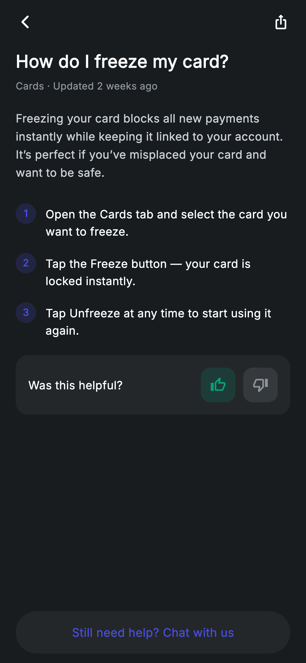
In-app help articles are long-form reading inside a product built for tapping, so the typography has to change gear. This tutorial builds Nova's help article screen in Flutter: a 22px question as the title, body copy set softer than white at a generous 1.6 line height, numbered steps generated from a list of strings, a thumbs up/down feedback card, and a contact button that stays pinned at the bottom. The share button in the app bar replaces the usual centred title.
Watch the Flutter UI walkthrough
A short screen recording of Help Article running, if you'd rather see it before you read the code. The written tutorial below covers everything in it.
Can't see the video? Watch it on YouTube.
What you'll build
- ✓Long-form body copy tuned for reading with height 1.6 and an off-white text colour
- ✓Numbered steps generated from a String list, with the counter derived from the index
- ✓Circular number badges top-aligned against wrapping multi-line step text
- ✓A feedback card with two tinted icon pills and a pinned contact-support button
Step-by-step build
Create the file
Add a new file at lib/fintech_help_article/fintech_help_article_screen.dart in your Flutter project.
Register the bundled fonts
No external packages — this is pure Flutter. It does bundle its design font (Inter), so drop the font file into fonts/ and declare it in pubspec.yaml:
flutter:
  fonts:
    - family: Inter
      fonts:
- asset: fonts/Inter-Regular.ttfBuild it, piece by piece
Here's how the screen goes together. Each block below is a real slice of the code with a plain-English explanation — paste them in order, or grab the whole file from the next section.
Steps as data, not markup
import 'package:flutter/material.dart';

/// Help article — a single FAQ article (Revolut-inspired design system).
///
/// Self-contained per CONVENTIONS.md: pure Flutter only, the exact design font
/// (Inter) is bundled under `fonts/`, no network/emoji images, and the screen
/// forces its own dark theme. Body copy, numbered steps and a helpfulness
/// prompt make the article read like a real product.
class FintechHelpArticleScreen extends StatelessWidget {
  const FintechHelpArticleScreen({super.key, this.onBack});

  final VoidCallback? onBack;

  static const String _font = 'Inter';
  static const Color _bg = Color(0xFF191C1F);
  static const Color _surface = Color(0xFF242729);
  static const Color _brand = Color(0xFF494FDF);
  static const Color _teal = Color(0xFF00A87E);
  static const Color _muted = Color(0xFF8D969E);

  static const List<String> _steps = <String>[
    'Open the Cards tab and select the card you want to freeze.',
    'Tap the Freeze button — your card is locked instantly.',
    'Tap Unfreeze at any time to start using it again.',
  ];
The three instructions live in a `static const List<String> _steps` rather than being written out as three widgets. That separation is what lets the numbering be generated instead of typed, so reordering or inserting a step never leaves a wrong number behind. The widget is stateless with a single `onBack` callback — an article has nothing to mutate. The palette is the app's usual set plus `_teal`, used once, on the positive feedback pill.
Typography tuned for reading
  @override
  Widget build(BuildContext context) {
    return Theme(
      data: ThemeData.dark(useMaterial3: true),
      child: Scaffold(
        backgroundColor: _bg,
        body: SafeArea(
          child: Column(
            children: <Widget>[
              _buildAppBar(),
              Expanded(
                child: ListView(
                  physics: const BouncingScrollPhysics(),
                  padding: const EdgeInsets.fromLTRB(20, 8, 20, 24),
                  children: <Widget>[
                    const Text(
                      'How do I freeze my card?',
                      style: TextStyle(
                        fontFamily: _font,
                        fontSize: 22,
                        fontWeight: FontWeight.w600,
                        height: 1.3,
                        letterSpacing: 0.24,
                        color: Colors.white,
                      ),
                    ),
                    const SizedBox(height: 8),
                    const Text(
                      'Cards · Updated 2 weeks ago',
                      style: TextStyle(
                        fontFamily: _font,
                        fontSize: 12.5,
                        letterSpacing: 0.24,
                        color: _muted,
                      ),
                    ),
                    const SizedBox(height: 20),
                    const Text(
                      'Freezing your card blocks all new payments instantly '
                      'while keeping it linked to your account. It’s perfect if '
                      'you’ve misplaced your card and want to be safe.',
                      style: TextStyle(
                        fontFamily: _font,
                        fontSize: 14.5,
                        height: 1.6,
                        letterSpacing: 0.24,
                        color: Color(0xFFCBD2D8),
                      ),
                    ),
                    const SizedBox(height: 20),
                    for (int i = 0; i < _steps.length; i++) _stepRow(i + 1, _steps[i]),
                    const SizedBox(height: 12),
                    _buildHelpful(),
                  ],
                ),
              ),
              _buildContact(),
            ],
          ),
        ),
      ),
    );
  }
This block is the reason the screen works. The title is 22px `w600` at `height: 1.3` — tight, because headlines wrapping at normal leading look loose. The body directly below runs at 14.5px but `height: 1.6`, nearly a third more line spacing than UI text, which is what makes a paragraph scannable on a phone. Its colour is `Color(0xFFCBD2D8)`, deliberately not pure white: at this length, full-contrast white on a near-black background causes halation and tires the eye, while a soft grey-blue stays comfortable. Between them sits a 12.5px `_muted` byline giving the category and freshness. The steps are emitted with a collection-for — `for (int i = 0; i < _steps.length; i++) _stepRow(i + 1, _steps[i])` — passing `i + 1` so the badge shows a human-readable 1, 2, 3.
An app bar with no title
  Widget _buildAppBar() {
    return Padding(
      padding: const EdgeInsets.fromLTRB(8, 4, 8, 4),
      child: Row(
        children: <Widget>[
          IconButton(
            onPressed: onBack,
            icon: const Icon(Icons.arrow_back_ios_new_rounded,
                size: 20, color: Colors.white),
          ),
          const Spacer(),
          IconButton(
            onPressed: () {},
            icon: const Icon(Icons.ios_share_rounded,
                size: 20, color: Colors.white),
          ),
        ],
      ),
    );
  }
Unlike every other screen in this app, `_buildAppBar` has no centred heading — just a back button, a `Spacer()`, and a share icon. That is the right call for an article: the 22px question directly below is already the title, and repeating it in the bar would state the same thing twice in the first 100 pixels. Using `Spacer()` between the two `IconButton`s pushes them to opposite edges with no width calculation, and there is no counterweight `SizedBox` here because there is nothing that needs centring.
Numbered steps that survive wrapping
  Widget _stepRow(int n, String text) {
    return Padding(
      padding: const EdgeInsets.symmetric(vertical: 8),
      child: Row(
        crossAxisAlignment: CrossAxisAlignment.start,
        children: <Widget>[
          Container(
            width: 26,
            height: 26,
            alignment: Alignment.center,
            decoration: BoxDecoration(
              color: _brand.withValues(alpha: 0.18),
              shape: BoxShape.circle,
            ),
            child: Text(
              '$n',
              style: const TextStyle(
                fontFamily: _font,
                fontSize: 12.5,
                fontWeight: FontWeight.w700,
                color: _brand,
              ),
            ),
          ),
          const SizedBox(width: 12),
          Expanded(
            child: Padding(
              padding: const EdgeInsets.only(top: 3),
              child: Text(
                text,
                style: const TextStyle(
                  fontFamily: _font,
                  fontSize: 14.5,
                  height: 1.5,
                  letterSpacing: 0.24,
                  color: Colors.white,
                ),
              ),
            ),
          ),
        ],
      ),
    );
  }
`_stepRow` pairs a 26px circle badge — filled `_brand.withValues(alpha: 0.18)` with the number in full `_brand` at `w700` — against the step text. The detail that makes it hold up is `crossAxisAlignment: CrossAxisAlignment.start` on the Row combined with wrapping the text in `Expanded`. Together they keep the badge pinned beside the *first* line when a step runs to two or three lines, instead of the default centre alignment floating it into the middle of the paragraph. The extra `EdgeInsets.only(top: 3)` on the text is optical correction: text and a circle of the same nominal height do not appear aligned, and 3px of nudge fixes the baseline by eye.
Feedback pills and the pinned contact button
  Widget _buildHelpful() {
    return Container(
      padding: const EdgeInsets.all(16),
      decoration: BoxDecoration(
        color: _surface,
        borderRadius: BorderRadius.circular(16),
      ),
      child: Row(
        children: <Widget>[
          const Expanded(
            child: Text(
              'Was this helpful?',
              style: TextStyle(
                fontFamily: _font,
                fontSize: 14.5,
                fontWeight: FontWeight.w500,
                letterSpacing: 0.24,
                color: Colors.white,
              ),
            ),
          ),
          _pill(Icons.thumb_up_alt_outlined, _teal),
          const SizedBox(width: 10),
          _pill(Icons.thumb_down_alt_outlined, _muted),
        ],
      ),
    );
  }

  Widget _pill(IconData icon, Color tint) {
    return Container(
      width: 44,
      height: 44,
      decoration: BoxDecoration(
        color: tint.withValues(alpha: 0.16),
        borderRadius: BorderRadius.circular(12),
      ),
      child: Icon(icon, size: 20, color: tint),
    );
  }

  Widget _buildContact() {
    return Padding(
      padding: const EdgeInsets.fromLTRB(20, 0, 20, 12),
      child: SizedBox(
        width: double.infinity,
        height: 54,
        child: Material(
          color: _surface,
          borderRadius: BorderRadius.circular(9999),
          child: InkWell(
            borderRadius: BorderRadius.circular(9999),
            onTap: () {},
            child: const Center(
              child: Text(
                'Still need help? Chat with us',
                style: TextStyle(
                  fontFamily: _font,
                  fontSize: 15,
                  fontWeight: FontWeight.w500,
                  letterSpacing: 0.24,
                  color: _brand,
                ),
              ),
            ),
          ),
        ),
      ),
    );
  }
`_buildHelpful` is a `_surface` card with the prompt in an `Expanded` and two icon pills pushed right. `_pill` is a four-line helper taking an icon and a tint, filling a 44px rounded square with `tint.withValues(alpha: 0.16)` and drawing the icon at full strength — the same tinted-icon formula used across this app, here reused twice with different colours. Passing `_teal` for thumbs-up and `_muted` for thumbs-down gently favours the positive without disabling the negative. The contact button below is the app's pill shape but inverted: `_surface` fill with `_brand` text rather than a filled brand button, marking it as a secondary escape hatch that should not compete with the article itself. It sits outside the `ListView`, so it stays reachable however long the article runs.
Full code
The complete, ready-to-paste source. Free to use in your projects — one click copies it all.
import 'package:flutter/material.dart';

/// Help article — a single FAQ article (Revolut-inspired design system).
///
/// Self-contained per CONVENTIONS.md: pure Flutter only, the exact design font
/// (Inter) is bundled under `fonts/`, no network/emoji images, and the screen
/// forces its own dark theme. Body copy, numbered steps and a helpfulness
/// prompt make the article read like a real product.
class FintechHelpArticleScreen extends StatelessWidget {
  const FintechHelpArticleScreen({super.key, this.onBack});

  final VoidCallback? onBack;

  static const String _font = 'Inter';
  static const Color _bg = Color(0xFF191C1F);
  static const Color _surface = Color(0xFF242729);
  static const Color _brand = Color(0xFF494FDF);
  static const Color _teal = Color(0xFF00A87E);
  static const Color _muted = Color(0xFF8D969E);

  static const List<String> _steps = <String>[
    'Open the Cards tab and select the card you want to freeze.',
    'Tap the Freeze button — your card is locked instantly.',
    'Tap Unfreeze at any time to start using it again.',
  ];

  @override
  Widget build(BuildContext context) {
    return Theme(
      data: ThemeData.dark(useMaterial3: true),
      child: Scaffold(
        backgroundColor: _bg,
        body: SafeArea(
          child: Column(
            children: <Widget>[
              _buildAppBar(),
              Expanded(
                child: ListView(
                  physics: const BouncingScrollPhysics(),
                  padding: const EdgeInsets.fromLTRB(20, 8, 20, 24),
                  children: <Widget>[
                    const Text(
                      'How do I freeze my card?',
                      style: TextStyle(
                        fontFamily: _font,
                        fontSize: 22,
                        fontWeight: FontWeight.w600,
                        height: 1.3,
                        letterSpacing: 0.24,
                        color: Colors.white,
                      ),
                    ),
                    const SizedBox(height: 8),
                    const Text(
                      'Cards · Updated 2 weeks ago',
                      style: TextStyle(
                        fontFamily: _font,
                        fontSize: 12.5,
                        letterSpacing: 0.24,
                        color: _muted,
                      ),
                    ),
                    const SizedBox(height: 20),
                    const Text(
                      'Freezing your card blocks all new payments instantly '
                      'while keeping it linked to your account. It’s perfect if '
                      'you’ve misplaced your card and want to be safe.',
                      style: TextStyle(
                        fontFamily: _font,
                        fontSize: 14.5,
                        height: 1.6,
                        letterSpacing: 0.24,
                        color: Color(0xFFCBD2D8),
                      ),
                    ),
                    const SizedBox(height: 20),
                    for (int i = 0; i < _steps.length; i++) _stepRow(i + 1, _steps[i]),
                    const SizedBox(height: 12),
                    _buildHelpful(),
                  ],
                ),
              ),
              _buildContact(),
            ],
          ),
        ),
      ),
    );
  }

  Widget _buildAppBar() {
    return Padding(
      padding: const EdgeInsets.fromLTRB(8, 4, 8, 4),
      child: Row(
        children: <Widget>[
          IconButton(
            onPressed: onBack,
            icon: const Icon(Icons.arrow_back_ios_new_rounded,
                size: 20, color: Colors.white),
          ),
          const Spacer(),
          IconButton(
            onPressed: () {},
            icon: const Icon(Icons.ios_share_rounded,
                size: 20, color: Colors.white),
          ),
        ],
      ),
    );
  }

  Widget _stepRow(int n, String text) {
    return Padding(
      padding: const EdgeInsets.symmetric(vertical: 8),
      child: Row(
        crossAxisAlignment: CrossAxisAlignment.start,
        children: <Widget>[
          Container(
            width: 26,
            height: 26,
            alignment: Alignment.center,
            decoration: BoxDecoration(
              color: _brand.withValues(alpha: 0.18),
              shape: BoxShape.circle,
            ),
            child: Text(
              '$n',
              style: const TextStyle(
                fontFamily: _font,
                fontSize: 12.5,
                fontWeight: FontWeight.w700,
                color: _brand,
              ),
            ),
          ),
          const SizedBox(width: 12),
          Expanded(
            child: Padding(
              padding: const EdgeInsets.only(top: 3),
              child: Text(
                text,
                style: const TextStyle(
                  fontFamily: _font,
                  fontSize: 14.5,
                  height: 1.5,
                  letterSpacing: 0.24,
                  color: Colors.white,
                ),
              ),
            ),
          ),
        ],
      ),
    );
  }

  Widget _buildHelpful() {
    return Container(
      padding: const EdgeInsets.all(16),
      decoration: BoxDecoration(
        color: _surface,
        borderRadius: BorderRadius.circular(16),
      ),
      child: Row(
        children: <Widget>[
          const Expanded(
            child: Text(
              'Was this helpful?',
              style: TextStyle(
                fontFamily: _font,
                fontSize: 14.5,
                fontWeight: FontWeight.w500,
                letterSpacing: 0.24,
                color: Colors.white,
              ),
            ),
          ),
          _pill(Icons.thumb_up_alt_outlined, _teal),
          const SizedBox(width: 10),
          _pill(Icons.thumb_down_alt_outlined, _muted),
        ],
      ),
    );
  }

  Widget _pill(IconData icon, Color tint) {
    return Container(
      width: 44,
      height: 44,
      decoration: BoxDecoration(
        color: tint.withValues(alpha: 0.16),
        borderRadius: BorderRadius.circular(12),
      ),
      child: Icon(icon, size: 20, color: tint),
    );
  }

  Widget _buildContact() {
    return Padding(
      padding: const EdgeInsets.fromLTRB(20, 0, 20, 12),
      child: SizedBox(
        width: double.infinity,
        height: 54,
        child: Material(
          color: _surface,
          borderRadius: BorderRadius.circular(9999),
          child: InkWell(
            borderRadius: BorderRadius.circular(9999),
            onTap: () {},
            child: const Center(
              child: Text(
                'Still need help? Chat with us',
                style: TextStyle(
                  fontFamily: _font,
                  fontSize: 15,
                  fontWeight: FontWeight.w500,
                  letterSpacing: 0.24,
                  color: _brand,
                ),
              ),
            ),
          ),
        ),
      ),
    );
  }
}
Plus bundled 1 binary asset (fonts/images). The CLI and MCP install those for you automatically.
Two faster ways to add it
Copy-paste works, but you can skip it entirely.
1. FlutterKit CLI
One command drops this screen — and its fonts — straight into your project.
$ flutterkit add fintech-help-article2. AI agent (MCP)
Connect FlutterKit's MCP server in Claude or Cursor and just ask your agent to install fintech-help-article — it fetches and writes the files for you.
FAQ
Is this help article screen free for commercial use?
Yes. FlutterKit is free permanently — copy the code from this page, install it with the CLI, or pull it through MCP in your AI editor, then use it in a paid app or client project. No sign-up, no licence key, no attribution.
How do I load real article content into it?
Pass the title, byline, body and `List<String>` of steps into the constructor and replace the hard-coded literals. The steps loop already works off list length, so an article with five steps needs no code change at all. For rich text with links or bold spans, swap the body `Text` for a `RichText` with `TextSpan` children.
Why is the body text grey rather than white?
Because it is set for reading, not for UI. Pure white on a near-black background at this length produces halation — the letters appear to bleed — so the body uses `Color(0xFFCBD2D8)` at `height: 1.6`. Titles and step text stay full white because they are short and need to punch.
Why does the step number float when my text wraps?
Because a Row centres its children by default. Set `crossAxisAlignment: CrossAxisAlignment.start` on the Row and wrap the text in `Expanded`, as this screen does, and the badge stays level with the first line no matter how many lines follow.
Which Flutter version does this need?
Flutter 3.22 or newer, because the step badges and feedback pills use `Color.withValues(alpha: ...)`. On an older SDK use `withOpacity(...)` instead and expand the constructor to `const FintechHelpArticleScreen({Key? key, this.onBack}) : super(key: key);`.


