How to Build a Currency Exchange Success Screen in Flutter (Full Code + Preview)
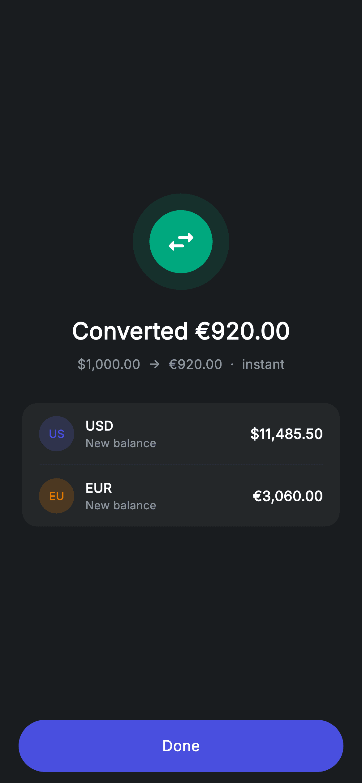
A currency conversion touches two balances, so its confirmation has to report both. This tutorial builds Nova's exchange-complete screen in Flutter: a swap-arrows badge, a one-line summary showing the rate that was actually applied, and a two-row card giving the post-conversion balance of the USD pocket and the EUR pocket side by side. The row builder takes a colour parameter, so each currency gets its own tinted chip from the same code — a small piece of parameterisation worth copying into any multi-account app.
Watch the Flutter UI walkthrough
A short screen recording of Exchange Success running, if you'd rather see it before you read the code. The written tutorial below covers everything in it.
Can't see the video? Watch it on YouTube.
What you'll build
- ✓A two-row balance card where each currency carries its own tinted identity chip
- ✓A colour-parameterised row builder that generates a chip from a currency code
- ✓A summary line showing both sides of the conversion and the settlement speed
- ✓A swap-arrows badge built from two concentric circles rather than an illustration
Step-by-step build
Create the file
Add a new file at lib/fintech_exchange_success/fintech_exchange_success_screen.dart in your Flutter project.
Register the bundled fonts
No external packages — this is pure Flutter. It does bundle its design font (Inter), so drop the font file into fonts/ and declare it in pubspec.yaml:
flutter:
  fonts:
    - family: Inter
      fonts:
- asset: fonts/Inter-Regular.ttfBuild it, piece by piece
Here's how the screen goes together. Each block below is a real slice of the code with a plain-English explanation — paste them in order, or grab the whole file from the next section.
The palette does the labelling
import 'package:flutter/material.dart';

/// Exchange success — converted confirmation (Revolut-inspired design system).
///
/// Self-contained per CONVENTIONS.md: pure Flutter only, the exact design font
/// (Inter) is bundled under `fonts/`, the success badge + currency chips are
/// painted (no emoji/flag images, no network), and the screen forces its own
/// dark theme. Updated balances for both pockets make it feel complete.
class FintechExchangeSuccessScreen extends StatelessWidget {
  const FintechExchangeSuccessScreen({super.key, this.onDone});

  final VoidCallback? onDone;

  static const String _font = 'Inter';
  static const Color _bg = Color(0xFF191C1F);
  static const Color _surface = Color(0xFF242729);
  static const Color _brand = Color(0xFF494FDF);
  static const Color _teal = Color(0xFF00A87E);
  static const Color _amber = Color(0xFFEC7E00);
  static const Color _muted = Color(0xFF8D969E);
  static const Color _hairline = Color(0xFF2E3235);

  @override
  Widget build(BuildContext context) {
    return Theme(
      data: ThemeData.dark(useMaterial3: true),
      child: Scaffold(
        backgroundColor: _bg,
        body: SafeArea(
          child: Column(
            children: <Widget>[
              Expanded(
                child: Padding(
                  padding: const EdgeInsets.symmetric(horizontal: 24),
                  child: Column(
                    mainAxisAlignment: MainAxisAlignment.center,
                    children: <Widget>[
                      _buildBadge(),
                      const SizedBox(height: 26),
                      const Text(
                        'Converted €920.00',
                        style: TextStyle(
                          fontFamily: _font,
                          fontSize: 25,
                          fontWeight: FontWeight.w600,
                          letterSpacing: 0.24,
                          color: Colors.white,
                        ),
                      ),
                      const SizedBox(height: 8),
                      const Text(
                        r'$1,000.00  →  €920.00  ·  instant',
                        style: TextStyle(
                          fontFamily: _font,
                          fontSize: 14,
                          letterSpacing: 0.24,
                          color: _muted,
                        ),
                      ),
                      const SizedBox(height: 32),
                      _buildBalances(),
                    ],
                  ),
                ),
              ),
              _buildButton(),
            ],
          ),
        ),
      ),
    );
  }
This is a `StatelessWidget` with one `onDone` callback — a conversion that has already settled has nothing to change. The palette matters more here than usual: `_teal` marks success, `_brand` indigo identifies the USD pocket and `_amber` the EUR pocket, and those two are passed as arguments rather than hard-coded so the row builder stays generic. The centred column runs badge, headline, summary and card. That summary line is the useful bit — `r'$1,000.00 → €920.00 · instant'` shows what went in, what came out and how fast it settled, which together let the reader infer the applied rate without the screen having to state it. The `r` prefix keeps `$1,000` a literal instead of a Dart interpolation.
A badge whose icon carries the meaning
  Widget _buildBadge() {
    return Container(
      width: 104,
      height: 104,
      decoration: BoxDecoration(
        color: _teal.withValues(alpha: 0.14),
        shape: BoxShape.circle,
      ),
      child: Center(
        child: Container(
          width: 68,
          height: 68,
          decoration: const BoxDecoration(color: _teal, shape: BoxShape.circle),
          child: const Icon(Icons.swap_horiz_rounded,
              size: 36, color: Colors.white),
        ),
      ),
    );
  }
The badge is a 104px circle at `_teal.withValues(alpha: 0.14)` wrapping a solid 68px `_teal` circle — one colour at two strengths, so the tinted halo can never drift from the core. What distinguishes this from a generic success mark is the glyph: `Icons.swap_horiz_rounded` at 36px rather than a check. On a confirmation screen the icon is read before any text, so choosing one that names the action — swap for exchange, check for a completed order, an arrow for a transfer — tells the reader which flow they just finished before they read a single word.
Two pockets, one card
  Widget _buildBalances() {
    return Container(
      padding: const EdgeInsets.symmetric(horizontal: 18),
      decoration: BoxDecoration(
        color: _surface,
        borderRadius: BorderRadius.circular(16),
      ),
      child: Column(
        children: <Widget>[
          _row('USD', _brand, r'$11,485.50', 'New balance'),
          const Divider(height: 1, color: _hairline),
          _row('EUR', _amber, '€3,060.00', 'New balance'),
        ],
      ),
    );
  }
`_buildBalances` is a `_surface` Container with horizontal padding only, holding exactly two `_row` calls split by a hairline `Divider(height: 1)`. Each call passes four things: the currency code, the colour that identifies it, the new balance, and the label 'New balance'. Showing both sides is what completes the mental model of a conversion — money left one pocket and arrived in another, and a confirmation that reported only the destination would leave the reader checking the source themselves. The vertical padding lives on the rows rather than the container, which is what lets the divider sit centred in the gap.
A currency chip generated from the code itself
  Widget _row(String code, Color color, String balance, String label) {
    return Padding(
      padding: const EdgeInsets.symmetric(vertical: 14),
      child: Row(
        children: <Widget>[
          Container(
            width: 38,
            height: 38,
            alignment: Alignment.center,
            decoration: BoxDecoration(
              color: color.withValues(alpha: 0.2),
              shape: BoxShape.circle,
            ),
            child: Text(
              code.substring(0, 2),
              style: TextStyle(
                fontFamily: _font,
                fontSize: 12,
                fontWeight: FontWeight.w700,
                color: color,
              ),
            ),
          ),
          const SizedBox(width: 12),
          Column(
            crossAxisAlignment: CrossAxisAlignment.start,
            children: <Widget>[
              Text(
                code,
                style: const TextStyle(
                  fontFamily: _font,
                  fontSize: 14,
                  fontWeight: FontWeight.w600,
                  letterSpacing: 0.24,
                  color: Colors.white,
                ),
              ),
              Text(
                label,
                style: const TextStyle(
                  fontFamily: _font,
                  fontSize: 12,
                  letterSpacing: 0.24,
                  color: _muted,
                ),
              ),
            ],
          ),
          const Spacer(),
          Text(
            balance,
            style: const TextStyle(
              fontFamily: _font,
              fontSize: 15,
              fontWeight: FontWeight.w600,
              letterSpacing: 0.24,
              color: Colors.white,
            ),
          ),
        ],
      ),
    );
  }
`_row` builds a 38px circle filled `color.withValues(alpha: 0.2)` containing `code.substring(0, 2)` in that same colour at `w700`. Slicing the first two characters of 'USD' and 'EUR' means the chip is generated from the data rather than maintained beside it — add a third currency and the chip writes itself, with no flag image or emoji to source. The rest of the row is a standard three-part layout: chip, a Column pairing the code with its `_muted` caption, a `Spacer()`, and the balance right-aligned at 15px `w600`. Using `Spacer()` rather than `mainAxisAlignment: spaceBetween` is what lets the left group stay tight while the number is pushed all the way to the edge.
The Done button
  Widget _buildButton() {
    return Padding(
      padding: const EdgeInsets.fromLTRB(20, 0, 20, 12),
      child: SizedBox(
        width: double.infinity,
        height: 56,
        child: Material(
          color: _brand,
          borderRadius: BorderRadius.circular(9999),
          child: InkWell(
            borderRadius: BorderRadius.circular(9999),
            onTap: onDone,
            child: const Center(
              child: Text(
                'Done',
                style: TextStyle(
                  fontFamily: _font,
                  fontSize: 16,
                  fontWeight: FontWeight.w500,
                  letterSpacing: 0.24,
                  color: Colors.white,
                ),
              ),
            ),
          ),
        ),
      ),
    );
  }
The button sits outside the `Expanded` in the outer Column, so it is anchored to the bottom of the screen while the content above centres itself in whatever space remains. It is the app's standard pill — a 56px `Material` filled `_brand` with `BorderRadius.circular(9999)`, and an `InkWell` repeating the radius so the ripple is clipped to the pill shape. `onTap` is wired straight to `onDone`, so passing nothing yields an inert button rather than an exception while you are still wiring the flow together.
Full code
The complete, ready-to-paste source. Free to use in your projects — one click copies it all.
import 'package:flutter/material.dart';

/// Exchange success — converted confirmation (Revolut-inspired design system).
///
/// Self-contained per CONVENTIONS.md: pure Flutter only, the exact design font
/// (Inter) is bundled under `fonts/`, the success badge + currency chips are
/// painted (no emoji/flag images, no network), and the screen forces its own
/// dark theme. Updated balances for both pockets make it feel complete.
class FintechExchangeSuccessScreen extends StatelessWidget {
  const FintechExchangeSuccessScreen({super.key, this.onDone});

  final VoidCallback? onDone;

  static const String _font = 'Inter';
  static const Color _bg = Color(0xFF191C1F);
  static const Color _surface = Color(0xFF242729);
  static const Color _brand = Color(0xFF494FDF);
  static const Color _teal = Color(0xFF00A87E);
  static const Color _amber = Color(0xFFEC7E00);
  static const Color _muted = Color(0xFF8D969E);
  static const Color _hairline = Color(0xFF2E3235);

  @override
  Widget build(BuildContext context) {
    return Theme(
      data: ThemeData.dark(useMaterial3: true),
      child: Scaffold(
        backgroundColor: _bg,
        body: SafeArea(
          child: Column(
            children: <Widget>[
              Expanded(
                child: Padding(
                  padding: const EdgeInsets.symmetric(horizontal: 24),
                  child: Column(
                    mainAxisAlignment: MainAxisAlignment.center,
                    children: <Widget>[
                      _buildBadge(),
                      const SizedBox(height: 26),
                      const Text(
                        'Converted €920.00',
                        style: TextStyle(
                          fontFamily: _font,
                          fontSize: 25,
                          fontWeight: FontWeight.w600,
                          letterSpacing: 0.24,
                          color: Colors.white,
                        ),
                      ),
                      const SizedBox(height: 8),
                      const Text(
                        r'$1,000.00  →  €920.00  ·  instant',
                        style: TextStyle(
                          fontFamily: _font,
                          fontSize: 14,
                          letterSpacing: 0.24,
                          color: _muted,
                        ),
                      ),
                      const SizedBox(height: 32),
                      _buildBalances(),
                    ],
                  ),
                ),
              ),
              _buildButton(),
            ],
          ),
        ),
      ),
    );
  }

  Widget _buildBadge() {
    return Container(
      width: 104,
      height: 104,
      decoration: BoxDecoration(
        color: _teal.withValues(alpha: 0.14),
        shape: BoxShape.circle,
      ),
      child: Center(
        child: Container(
          width: 68,
          height: 68,
          decoration: const BoxDecoration(color: _teal, shape: BoxShape.circle),
          child: const Icon(Icons.swap_horiz_rounded,
              size: 36, color: Colors.white),
        ),
      ),
    );
  }

  Widget _buildBalances() {
    return Container(
      padding: const EdgeInsets.symmetric(horizontal: 18),
      decoration: BoxDecoration(
        color: _surface,
        borderRadius: BorderRadius.circular(16),
      ),
      child: Column(
        children: <Widget>[
          _row('USD', _brand, r'$11,485.50', 'New balance'),
          const Divider(height: 1, color: _hairline),
          _row('EUR', _amber, '€3,060.00', 'New balance'),
        ],
      ),
    );
  }

  Widget _row(String code, Color color, String balance, String label) {
    return Padding(
      padding: const EdgeInsets.symmetric(vertical: 14),
      child: Row(
        children: <Widget>[
          Container(
            width: 38,
            height: 38,
            alignment: Alignment.center,
            decoration: BoxDecoration(
              color: color.withValues(alpha: 0.2),
              shape: BoxShape.circle,
            ),
            child: Text(
              code.substring(0, 2),
              style: TextStyle(
                fontFamily: _font,
                fontSize: 12,
                fontWeight: FontWeight.w700,
                color: color,
              ),
            ),
          ),
          const SizedBox(width: 12),
          Column(
            crossAxisAlignment: CrossAxisAlignment.start,
            children: <Widget>[
              Text(
                code,
                style: const TextStyle(
                  fontFamily: _font,
                  fontSize: 14,
                  fontWeight: FontWeight.w600,
                  letterSpacing: 0.24,
                  color: Colors.white,
                ),
              ),
              Text(
                label,
                style: const TextStyle(
                  fontFamily: _font,
                  fontSize: 12,
                  letterSpacing: 0.24,
                  color: _muted,
                ),
              ),
            ],
          ),
          const Spacer(),
          Text(
            balance,
            style: const TextStyle(
              fontFamily: _font,
              fontSize: 15,
              fontWeight: FontWeight.w600,
              letterSpacing: 0.24,
              color: Colors.white,
            ),
          ),
        ],
      ),
    );
  }

  Widget _buildButton() {
    return Padding(
      padding: const EdgeInsets.fromLTRB(20, 0, 20, 12),
      child: SizedBox(
        width: double.infinity,
        height: 56,
        child: Material(
          color: _brand,
          borderRadius: BorderRadius.circular(9999),
          child: InkWell(
            borderRadius: BorderRadius.circular(9999),
            onTap: onDone,
            child: const Center(
              child: Text(
                'Done',
                style: TextStyle(
                  fontFamily: _font,
                  fontSize: 16,
                  fontWeight: FontWeight.w500,
                  letterSpacing: 0.24,
                  color: Colors.white,
                ),
              ),
            ),
          ),
        ),
      ),
    );
  }
}
Plus bundled 1 binary asset (fonts/images). The CLI and MCP install those for you automatically.
Two faster ways to add it
Copy-paste works, but you can skip it entirely.
1. FlutterKit CLI
One command drops this screen — and its fonts — straight into your project.
$ flutterkit add fintech-exchange-success2. AI agent (MCP)
Connect FlutterKit's MCP server in Claude or Cursor and just ask your agent to install fintech-exchange-success — it fetches and writes the files for you.
FAQ
Is this exchange confirmation screen free to use?
Yes — FlutterKit is free and stays free. Copy the Dart from this page, install it via the CLI, or pull it over MCP in your AI editor, then ship it in a commercial app or client project with no licence, account or attribution.
How do I add a third or fourth currency to the balance card?
Add another `_row(...)` call with a `Divider` before it. Because the chip is generated by `code.substring(0, 2)` and tinted by the colour you pass in, a new currency needs only a code, a colour and a balance — there is no image asset or lookup table to extend.
Where do the currency flags or logos come from?
There aren't any. Each currency is represented by a two-letter chip drawn from its own code on a tinted circle, so the screen ships with no images, no emoji and no network calls — which also sidesteps the licensing and rendering inconsistencies that come with flag assets.
Does it need any packages?
No — the only import is `package:flutter/material.dart`. The bundled Inter font is the sole asset; register it in your pubspec's `fonts:` section, or remove the `fontFamily` lines to fall back to the system typeface.
Which Flutter version does this require?
Flutter 3.22 or newer, because the badge and the currency chips use `Color.withValues(alpha: ...)`. On an older SDK swap those calls for `withOpacity(...)` and expand the constructor to `const FintechExchangeSuccessScreen({Key? key, this.onDone}) : super(key: key);`.


