How to Build a Currency Exchange Review Screen in Flutter (Full Code + Preview)
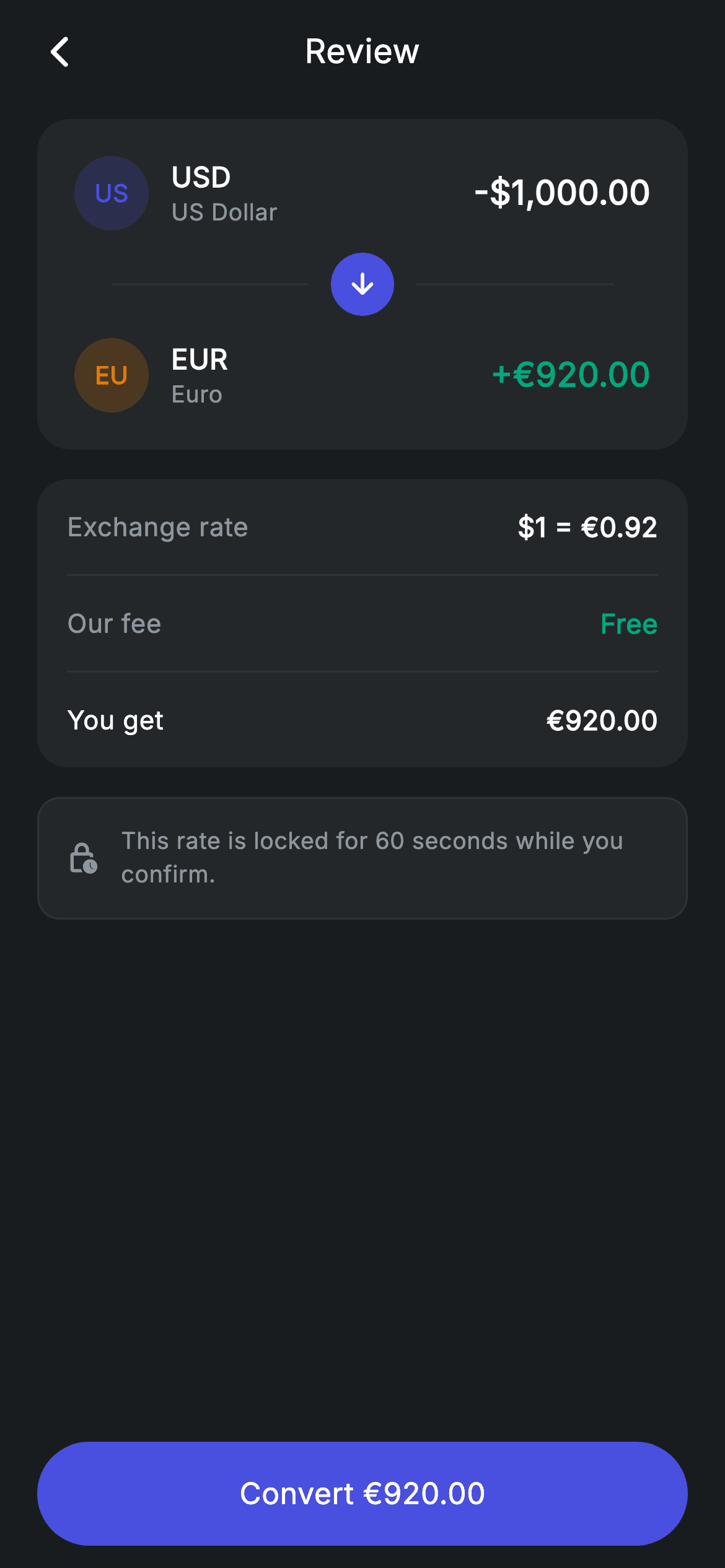
Currency conversion is where hidden fees usually live, so the review step has to be unambiguous. This tutorial builds a Revolut-style exchange confirmation in Flutter — a from→to card with painted currency chips joined by an arrow set into a broken divider, an itemised rate and fee breakdown, a rate-lock notice, and a confirm button that names the exact amount you'll receive. You'll see how a two-letter code chip replaces flag images, and how one Row builds a line-arrow-line separator.
Watch the Flutter UI walkthrough
A short screen recording of Exchange Review running, if you'd rather see it before you read the code. The written tutorial below covers everything in it.
Can't see the video? Watch it on YouTube.
What you'll build
- ✓A from→to conversion card where the outgoing amount stays white and the incoming turns teal
- ✓Currency badges built from a substring of the code — no flag images and no emoji
- ✓A centred arrow set into a broken hairline, built from two Expanded dividers around a circle
- ✓A rate-and-fee breakdown where the final 'You get' row is emphasised through weight and colour, not size
Step-by-step build
Create the file
Add a new file at lib/fintech_exchange_review/fintech_exchange_review_screen.dart in your Flutter project.
Register the bundled fonts
No external packages — this is pure Flutter. It does bundle its design font (Inter), so drop the font file into fonts/ and declare it in pubspec.yaml:
flutter:
  fonts:
    - family: Inter
      fonts:
- asset: fonts/Inter-Regular.ttfBuild it, piece by piece
Here's how the screen goes together. Each block below is a real slice of the code with a plain-English explanation — paste them in order, or grab the whole file from the next section.
A stateless review with two callbacks
import 'package:flutter/material.dart';

/// Exchange review — confirm rate & fee before converting (Revolut-inspired).
///
/// Self-contained per CONVENTIONS.md: pure Flutter only, the exact design font
/// (Inter) is bundled under `fonts/`, currency badges are painted code chips (no
/// emoji/flag images, no network), and the screen forces its own dark theme. A
/// clear from→to summary and an itemised rate/fee breakdown precede confirm.
class FintechExchangeReviewScreen extends StatelessWidget {
  const FintechExchangeReviewScreen({super.key, this.onBack, this.onConfirm});

  final VoidCallback? onBack;
  final VoidCallback? onConfirm;

  static const String _font = 'Inter';
  static const Color _bg = Color(0xFF191C1F);
  static const Color _surface = Color(0xFF242729);
  static const Color _brand = Color(0xFF494FDF);
  static const Color _teal = Color(0xFF00A87E);
  static const Color _amber = Color(0xFFEC7E00);
  static const Color _muted = Color(0xFF8D969E);
  static const Color _hairline = Color(0xFF2E3235);
A review screen holds no state — the amounts were chosen on the previous step and nothing here is editable — so this is a StatelessWidget with just `onBack` and `onConfirm`. The palette is the shared dark fintech set: `_bg` behind the page, `_surface` for the three cards, `_hairline` for rules, and three accents. Two of them, `_brand` indigo and `_amber`, are used as per-currency tints rather than semantic states, while `_teal` is reserved for money arriving and for the word 'Free'.
Three cards above a pinned confirm
  @override
  Widget build(BuildContext context) {
    return Theme(
      data: ThemeData.dark(useMaterial3: true),
      child: Scaffold(
        backgroundColor: _bg,
        body: SafeArea(
          child: Column(
            children: <Widget>[
              _buildAppBar(),
              Expanded(
                child: ListView(
                  physics: const BouncingScrollPhysics(),
                  padding: const EdgeInsets.fromLTRB(20, 8, 20, 24),
                  children: <Widget>[
                    _buildConvertCard(),
                    const SizedBox(height: 16),
                    _buildBreakdown(),
                    const SizedBox(height: 16),
                    _buildRateNote(),
                  ],
                ),
              ),
              _buildConfirm(),
            ],
          ),
        ),
      ),
    );
  }

  Widget _buildAppBar() {
    return Padding(
      padding: const EdgeInsets.fromLTRB(8, 4, 8, 4),
      child: Row(
        children: <Widget>[
          IconButton(
            onPressed: onBack,
            icon: const Icon(Icons.arrow_back_ios_new_rounded,
                size: 20, color: Colors.white),
          ),
          const Expanded(
            child: Text(
              'Review',
              textAlign: TextAlign.center,
              style: TextStyle(
                fontFamily: _font,
                fontSize: 18,
                fontWeight: FontWeight.w500,
                letterSpacing: 0.24,
                color: Colors.white,
              ),
            ),
          ),
          const SizedBox(width: 48),
        ],
      ),
    );
  }
The body is an app bar, an `Expanded` ListView of three cards, and a pinned confirm button — so the primary action never scrolls out of reach even on a small phone. The cards run in order of decreasing importance: what's being converted, what it costs, then the fine print. The app bar centres its title using the same balancing trick as the rest of this kit: an `Expanded` Text with `textAlign: TextAlign.center` and a `const SizedBox(width: 48)` on the trailing side to offset the leading IconButton's 48px tap target.
The from→to card and its broken divider
  Widget _buildConvertCard() {
    return Container(
      padding: const EdgeInsets.all(20),
      decoration: BoxDecoration(
        color: _surface,
        borderRadius: BorderRadius.circular(18),
      ),
      child: Column(
        children: <Widget>[
          _line('USD', 'US Dollar', _brand, r'-$1,000.00', false),
          Padding(
            padding: const EdgeInsets.symmetric(vertical: 12),
            child: Row(
              children: <Widget>[
                const SizedBox(width: 20),
                Expanded(child: Container(height: 1, color: _hairline)),
                Container(
                  margin: const EdgeInsets.symmetric(horizontal: 12),
                  width: 34,
                  height: 34,
                  decoration: const BoxDecoration(
                    color: _brand,
                    shape: BoxShape.circle,
                  ),
                  child: const Icon(Icons.arrow_downward_rounded,
                      size: 18, color: Colors.white),
                ),
                Expanded(child: Container(height: 1, color: _hairline)),
                const SizedBox(width: 20),
              ],
            ),
          ),
          _line('EUR', 'Euro', _amber, '+€920.00', true),
        ],
      ),
    );
  }
The card stacks two `_line` calls with a separator between them. That separator is the interesting bit: it's a Row containing a 20px spacer, an `Expanded` 1px Container, a 34px indigo circle holding a downward arrow, another `Expanded` 1px Container, and a final 20px spacer. Because both dividers are Expanded, they split whatever width remains after the circle, so the arrow stays perfectly centred at any screen size — and the 20px insets at each end align the rule with the text above rather than running to the card's padding edge. Notice the two `_line` calls pass `false` then `true` for the last argument, which is what makes the outgoing amount white and the incoming teal.
A currency row with a code-chip badge
  Widget _line(String code, String name, Color color, String amount, bool inc) {
    return Row(
      children: <Widget>[
        Container(
          width: 40,
          height: 40,
          alignment: Alignment.center,
          decoration: BoxDecoration(
            color: color.withValues(alpha: 0.2),
            shape: BoxShape.circle,
          ),
          child: Text(
            code.substring(0, 2),
            style: TextStyle(
              fontFamily: _font,
              fontSize: 13,
              fontWeight: FontWeight.w700,
              color: color,
            ),
          ),
        ),
        const SizedBox(width: 12),
        Expanded(
          child: Column(
            crossAxisAlignment: CrossAxisAlignment.start,
            children: <Widget>[
              Text(
                code,
                style: const TextStyle(
                  fontFamily: _font,
                  fontSize: 15,
                  fontWeight: FontWeight.w600,
                  letterSpacing: 0.24,
                  color: Colors.white,
                ),
              ),
              Text(
                name,
                style: const TextStyle(
                  fontFamily: _font,
                  fontSize: 12.5,
                  letterSpacing: 0.24,
                  color: _muted,
                ),
              ),
            ],
          ),
        ),
        Text(
          amount,
          style: TextStyle(
            fontFamily: _font,
            fontSize: 18,
            fontWeight: FontWeight.w600,
            letterSpacing: 0.24,
            color: inc ? _teal : Colors.white,
          ),
        ),
      ],
    );
  }
`_line` renders one side of the conversion. The badge takes the currency code and calls `code.substring(0, 2)` — so 'USD' displays as 'US' and 'EUR' as 'EU' — inside a 40px circle tinted with `color.withValues(alpha: 0.2)` and the letters in solid colour. Two characters is the sweet spot: three would crowd a 40px circle at readable weight. This is why the screen needs no flag assets and works for any currency you pass in. The rest of the row is a standard tinted-icon layout: an `Expanded` code-over-name column and a trailing 18px amount whose colour is chosen by the `inc` flag.
The rate and fee breakdown
  Widget _buildBreakdown() {
    return Container(
      padding: const EdgeInsets.symmetric(horizontal: 16),
      decoration: BoxDecoration(
        color: _surface,
        borderRadius: BorderRadius.circular(16),
      ),
      child: Column(
        children: <Widget>[
          _row('Exchange rate', r'$1 = €0.92'),
          const Divider(height: 1, color: _hairline),
          _row('Our fee', 'Free', valueColor: _teal),
          const Divider(height: 1, color: _hairline),
          _row('You get', '€920.00', bold: true),
        ],
      ),
    );
  }

  Widget _row(String label, String value, {bool bold = false, Color? valueColor}) {
    return Padding(
      padding: const EdgeInsets.symmetric(vertical: 15),
      child: Row(
        mainAxisAlignment: MainAxisAlignment.spaceBetween,
        children: <Widget>[
          Text(
            label,
            style: TextStyle(
              fontFamily: _font,
              fontSize: 14,
              fontWeight: bold ? FontWeight.w500 : FontWeight.w400,
              letterSpacing: 0.24,
              color: bold ? Colors.white : _muted,
            ),
          ),
          Text(
            value,
            style: TextStyle(
              fontFamily: _font,
              fontSize: 14.5,
              fontWeight: FontWeight.w600,
              letterSpacing: 0.24,
              color: valueColor ?? Colors.white,
            ),
          ),
        ],
      ),
    );
  }
The breakdown container sets only horizontal padding, letting each `_row` supply its own 15px vertical inset so the `Divider(height: 1)` rules sit flush against the row edges with no double spacing. `_row` takes two optional named arguments that do all the emphasis work. `valueColor` tints 'Free' in `_teal`, making a zero fee read as a positive rather than just another grey number. `bold` flips the *label* from `_muted` w400 to white w500 — note it changes the label, not the value, since values are already w600 throughout. So the 'You get' row stands out purely through label contrast, with every number staying the same size and the column alignment undisturbed.
The rate-lock note and confirm button
  Widget _buildRateNote() {
    return Container(
      padding: const EdgeInsets.all(14),
      decoration: BoxDecoration(
        color: _surface,
        borderRadius: BorderRadius.circular(12),
        border: Border.all(color: _hairline),
      ),
      child: Row(
        children: const <Widget>[
          Icon(Icons.lock_clock_outlined, size: 18, color: _muted),
          SizedBox(width: 12),
          Expanded(
            child: Text(
              'This rate is locked for 60 seconds while you confirm.',
              style: TextStyle(
                fontFamily: _font,
                fontSize: 12.5,
                height: 1.4,
                letterSpacing: 0.24,
                color: _muted,
              ),
            ),
          ),
        ],
      ),
    );
  }

  Widget _buildConfirm() {
    return Padding(
      padding: const EdgeInsets.fromLTRB(20, 0, 20, 12),
      child: SizedBox(
        width: double.infinity,
        height: 56,
        child: Material(
          color: _brand,
          borderRadius: BorderRadius.circular(9999),
          child: InkWell(
            borderRadius: BorderRadius.circular(9999),
            onTap: onConfirm,
            child: const Center(
              child: Text(
                'Convert €920.00',
                style: TextStyle(
                  fontFamily: _font,
                  fontSize: 16,
                  fontWeight: FontWeight.w500,
                  letterSpacing: 0.24,
                  color: Colors.white,
                ),
              ),
            ),
          ),
        ),
      ),
    );
  }
The note is a bordered `_surface` box pairing a lock-clock icon with 'This rate is locked for 60 seconds while you confirm.' It's set at 12.5px with `height: 1.4` in `_muted` — visually quiet, but it answers the question a review screen always raises, which is whether the quoted rate can move before you tap. The confirm button is built from Material + InkWell with `BorderRadius.circular(9999)` on both, so the ripple is clipped to the pill. Its label is 'Convert €920.00' rather than a bare 'Confirm': restating the destination amount on the button is the last chance to catch a mistake before the conversion is irreversible.
Full code
The complete, ready-to-paste source. Free to use in your projects — one click copies it all.
import 'package:flutter/material.dart';

/// Exchange review — confirm rate & fee before converting (Revolut-inspired).
///
/// Self-contained per CONVENTIONS.md: pure Flutter only, the exact design font
/// (Inter) is bundled under `fonts/`, currency badges are painted code chips (no
/// emoji/flag images, no network), and the screen forces its own dark theme. A
/// clear from→to summary and an itemised rate/fee breakdown precede confirm.
class FintechExchangeReviewScreen extends StatelessWidget {
  const FintechExchangeReviewScreen({super.key, this.onBack, this.onConfirm});

  final VoidCallback? onBack;
  final VoidCallback? onConfirm;

  static const String _font = 'Inter';
  static const Color _bg = Color(0xFF191C1F);
  static const Color _surface = Color(0xFF242729);
  static const Color _brand = Color(0xFF494FDF);
  static const Color _teal = Color(0xFF00A87E);
  static const Color _amber = Color(0xFFEC7E00);
  static const Color _muted = Color(0xFF8D969E);
  static const Color _hairline = Color(0xFF2E3235);

  @override
  Widget build(BuildContext context) {
    return Theme(
      data: ThemeData.dark(useMaterial3: true),
      child: Scaffold(
        backgroundColor: _bg,
        body: SafeArea(
          child: Column(
            children: <Widget>[
              _buildAppBar(),
              Expanded(
                child: ListView(
                  physics: const BouncingScrollPhysics(),
                  padding: const EdgeInsets.fromLTRB(20, 8, 20, 24),
                  children: <Widget>[
                    _buildConvertCard(),
                    const SizedBox(height: 16),
                    _buildBreakdown(),
                    const SizedBox(height: 16),
                    _buildRateNote(),
                  ],
                ),
              ),
              _buildConfirm(),
            ],
          ),
        ),
      ),
    );
  }

  Widget _buildAppBar() {
    return Padding(
      padding: const EdgeInsets.fromLTRB(8, 4, 8, 4),
      child: Row(
        children: <Widget>[
          IconButton(
            onPressed: onBack,
            icon: const Icon(Icons.arrow_back_ios_new_rounded,
                size: 20, color: Colors.white),
          ),
          const Expanded(
            child: Text(
              'Review',
              textAlign: TextAlign.center,
              style: TextStyle(
                fontFamily: _font,
                fontSize: 18,
                fontWeight: FontWeight.w500,
                letterSpacing: 0.24,
                color: Colors.white,
              ),
            ),
          ),
          const SizedBox(width: 48),
        ],
      ),
    );
  }

  Widget _buildConvertCard() {
    return Container(
      padding: const EdgeInsets.all(20),
      decoration: BoxDecoration(
        color: _surface,
        borderRadius: BorderRadius.circular(18),
      ),
      child: Column(
        children: <Widget>[
          _line('USD', 'US Dollar', _brand, r'-$1,000.00', false),
          Padding(
            padding: const EdgeInsets.symmetric(vertical: 12),
            child: Row(
              children: <Widget>[
                const SizedBox(width: 20),
                Expanded(child: Container(height: 1, color: _hairline)),
                Container(
                  margin: const EdgeInsets.symmetric(horizontal: 12),
                  width: 34,
                  height: 34,
                  decoration: const BoxDecoration(
                    color: _brand,
                    shape: BoxShape.circle,
                  ),
                  child: const Icon(Icons.arrow_downward_rounded,
                      size: 18, color: Colors.white),
                ),
                Expanded(child: Container(height: 1, color: _hairline)),
                const SizedBox(width: 20),
              ],
            ),
          ),
          _line('EUR', 'Euro', _amber, '+€920.00', true),
        ],
      ),
    );
  }

  Widget _line(String code, String name, Color color, String amount, bool inc) {
    return Row(
      children: <Widget>[
        Container(
          width: 40,
          height: 40,
          alignment: Alignment.center,
          decoration: BoxDecoration(
            color: color.withValues(alpha: 0.2),
            shape: BoxShape.circle,
          ),
          child: Text(
            code.substring(0, 2),
            style: TextStyle(
              fontFamily: _font,
              fontSize: 13,
              fontWeight: FontWeight.w700,
              color: color,
            ),
          ),
        ),
        const SizedBox(width: 12),
        Expanded(
          child: Column(
            crossAxisAlignment: CrossAxisAlignment.start,
            children: <Widget>[
              Text(
                code,
                style: const TextStyle(
                  fontFamily: _font,
                  fontSize: 15,
                  fontWeight: FontWeight.w600,
                  letterSpacing: 0.24,
                  color: Colors.white,
                ),
              ),
              Text(
                name,
                style: const TextStyle(
                  fontFamily: _font,
                  fontSize: 12.5,
                  letterSpacing: 0.24,
                  color: _muted,
                ),
              ),
            ],
          ),
        ),
        Text(
          amount,
          style: TextStyle(
            fontFamily: _font,
            fontSize: 18,
            fontWeight: FontWeight.w600,
            letterSpacing: 0.24,
            color: inc ? _teal : Colors.white,
          ),
        ),
      ],
    );
  }

  Widget _buildBreakdown() {
    return Container(
      padding: const EdgeInsets.symmetric(horizontal: 16),
      decoration: BoxDecoration(
        color: _surface,
        borderRadius: BorderRadius.circular(16),
      ),
      child: Column(
        children: <Widget>[
          _row('Exchange rate', r'$1 = €0.92'),
          const Divider(height: 1, color: _hairline),
          _row('Our fee', 'Free', valueColor: _teal),
          const Divider(height: 1, color: _hairline),
          _row('You get', '€920.00', bold: true),
        ],
      ),
    );
  }

  Widget _row(String label, String value, {bool bold = false, Color? valueColor}) {
    return Padding(
      padding: const EdgeInsets.symmetric(vertical: 15),
      child: Row(
        mainAxisAlignment: MainAxisAlignment.spaceBetween,
        children: <Widget>[
          Text(
            label,
            style: TextStyle(
              fontFamily: _font,
              fontSize: 14,
              fontWeight: bold ? FontWeight.w500 : FontWeight.w400,
              letterSpacing: 0.24,
              color: bold ? Colors.white : _muted,
            ),
          ),
          Text(
            value,
            style: TextStyle(
              fontFamily: _font,
              fontSize: 14.5,
              fontWeight: FontWeight.w600,
              letterSpacing: 0.24,
              color: valueColor ?? Colors.white,
            ),
          ),
        ],
      ),
    );
  }

  Widget _buildRateNote() {
    return Container(
      padding: const EdgeInsets.all(14),
      decoration: BoxDecoration(
        color: _surface,
        borderRadius: BorderRadius.circular(12),
        border: Border.all(color: _hairline),
      ),
      child: Row(
        children: const <Widget>[
          Icon(Icons.lock_clock_outlined, size: 18, color: _muted),
          SizedBox(width: 12),
          Expanded(
            child: Text(
              'This rate is locked for 60 seconds while you confirm.',
              style: TextStyle(
                fontFamily: _font,
                fontSize: 12.5,
                height: 1.4,
                letterSpacing: 0.24,
                color: _muted,
              ),
            ),
          ),
        ],
      ),
    );
  }

  Widget _buildConfirm() {
    return Padding(
      padding: const EdgeInsets.fromLTRB(20, 0, 20, 12),
      child: SizedBox(
        width: double.infinity,
        height: 56,
        child: Material(
          color: _brand,
          borderRadius: BorderRadius.circular(9999),
          child: InkWell(
            borderRadius: BorderRadius.circular(9999),
            onTap: onConfirm,
            child: const Center(
              child: Text(
                'Convert €920.00',
                style: TextStyle(
                  fontFamily: _font,
                  fontSize: 16,
                  fontWeight: FontWeight.w500,
                  letterSpacing: 0.24,
                  color: Colors.white,
                ),
              ),
            ),
          ),
        ),
      ),
    );
  }
}
Plus bundled 1 binary asset (fonts/images). The CLI and MCP install those for you automatically.
Two faster ways to add it
Copy-paste works, but you can skip it entirely.
1. FlutterKit CLI
One command drops this screen — and its fonts — straight into your project.
$ flutterkit add fintech-exchange-review2. AI agent (MCP)
Connect FlutterKit's MCP server in Claude or Cursor and just ask your agent to install fintech-exchange-review — it fetches and writes the files for you.
FAQ
Is this Flutter exchange review screen free to use?
Yes. The complete Dart source on this page is free for personal and commercial projects. Copy it directly, install it with the FlutterKit CLI (flutterkit add fintech-exchange-review), or have an AI agent add it for you over MCP.
How do I make the amounts dynamic instead of hard-coded?
Every value on this screen is a literal, which keeps the demo self-contained. Add constructor fields for the from and to currency codes, names, tints and amounts, plus the rate and fee strings, and pass them into `_buildConvertCard` and `_buildBreakdown`. Because `_line` already takes the code, name, colour and amount as arguments, that widget needs no changes at all — only its two call sites.
Does the 60-second rate lock actually count down?
No — as written it's static copy inside `_buildRateNote`, not a live timer. To make it real, convert the screen to a StatefulWidget, start a `Timer.periodic` from `dart:async` in initState, decrement a seconds counter in setState, and interpolate it into the note. Remember to cancel the timer in dispose, and to decide what happens when it hits zero — usually re-quoting the rate.
Which Flutter version does it target?
It uses Color.withValues() and super parameters, so Flutter 3.22+ (Dart 3). On an older SDK, change the single withValues(alpha: 0.2) call inside `_line` to withOpacity(0.2). The only bundled asset is the Inter font, registered in pubspec.yaml as shown in step 2.


