How to Build a Crypto Order Confirmation Screen in Flutter (Full Code + Preview)
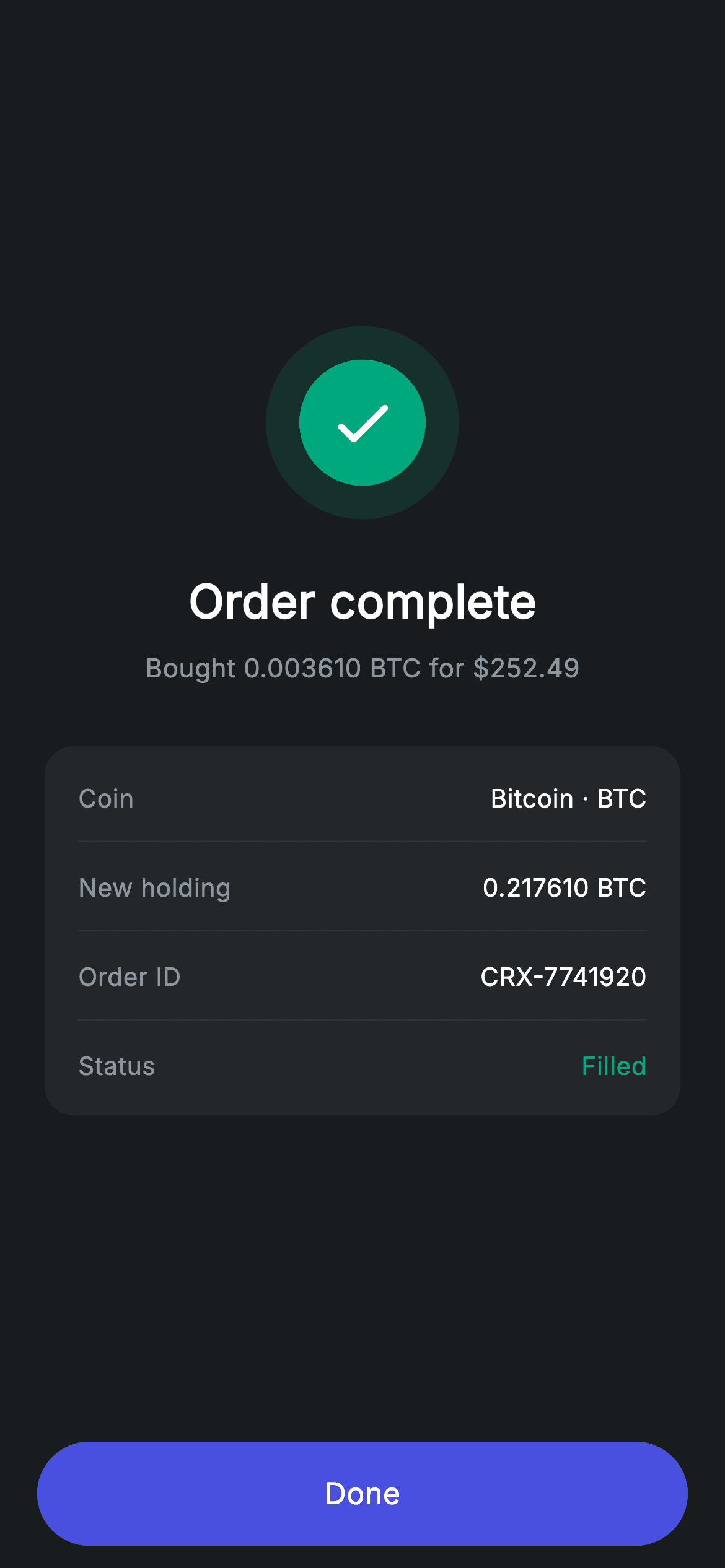
A confirmation screen that only says 'Success' leaves the reader checking their portfolio to be sure. This tutorial builds Nova's crypto order-placed screen in Flutter, which answers the follow-up questions on the spot: a double-ring teal check badge, the exact trade restated in one line, and a four-row receipt card carrying the coin, the new holding, an order ID to quote in support, and a Filled status tinted teal. It is a StatelessWidget of about 170 lines with no packages and no assets.
Watch the Flutter UI walkthrough
A short screen recording of Crypto Order Confirmation running, if you'd rather see it before you read the code. The written tutorial below covers everything in it.
Can't see the video? Watch it on YouTube.
What you'll build
- ✓A concentric success badge built from two circles at 14% and 100% of the same teal
- ✓A receipt card with hairline dividers and a per-row colour override for the status
- ✓A confirmation line that restates both the quantity bought and the amount paid
- ✓A Done button pinned outside the scrolling area so it never leaves the thumb
Step-by-step build
Create the file
Add a new file at lib/fintech_crypto_success/fintech_crypto_success_screen.dart in your Flutter project.
Register the bundled fonts
No external packages — this is pure Flutter. It does bundle its design font (Inter), so drop the font file into fonts/ and declare it in pubspec.yaml:
flutter:
  fonts:
    - family: Inter
      fonts:
- asset: fonts/Inter-Regular.ttfBuild it, piece by piece
Here's how the screen goes together. Each block below is a real slice of the code with a plain-English explanation — paste them in order, or grab the whole file from the next section.
Stateless by nature, and the centred layout
import 'package:flutter/material.dart';

/// Crypto success — order placed confirmation (Revolut-inspired design system).
///
/// Self-contained per CONVENTIONS.md: pure Flutter only, the exact design font
/// (Inter) is bundled under `fonts/`, the success badge + coin chip are painted
/// (no emoji/network), and the screen forces its own dark theme. The updated
/// holding makes the confirmation feel complete.
class FintechCryptoSuccessScreen extends StatelessWidget {
  const FintechCryptoSuccessScreen({super.key, this.onDone});

  final VoidCallback? onDone;

  static const String _font = 'Inter';
  static const Color _bg = Color(0xFF191C1F);
  static const Color _surface = Color(0xFF242729);
  static const Color _brand = Color(0xFF494FDF);
  static const Color _teal = Color(0xFF00A87E);
  static const Color _muted = Color(0xFF8D969E);
  static const Color _hairline = Color(0xFF2E3235);

  @override
  Widget build(BuildContext context) {
    return Theme(
      data: ThemeData.dark(useMaterial3: true),
      child: Scaffold(
        backgroundColor: _bg,
        body: SafeArea(
          child: Column(
            children: <Widget>[
              Expanded(
                child: Padding(
                  padding: const EdgeInsets.symmetric(horizontal: 24),
                  child: Column(
                    mainAxisAlignment: MainAxisAlignment.center,
                    children: <Widget>[
                      _buildBadge(),
                      const SizedBox(height: 26),
                      const Text(
                        'Order complete',
                        style: TextStyle(
                          fontFamily: _font,
                          fontSize: 25,
                          fontWeight: FontWeight.w600,
                          letterSpacing: 0.24,
                          color: Colors.white,
                        ),
                      ),
                      const SizedBox(height: 8),
                      const Text(
                        r'Bought 0.003610 BTC for $252.49',
                        style: TextStyle(
                          fontFamily: _font,
                          fontSize: 14,
                          letterSpacing: 0.24,
                          color: _muted,
                        ),
                      ),
                      const SizedBox(height: 32),
                      _buildHoldingCard(),
                    ],
                  ),
                ),
              ),
              _buildButton(),
            ],
          ),
        ),
      ),
    );
  }
A confirmation has nothing left to change, so this is a `StatelessWidget` with a single `onDone` callback. The layout is the classic success-screen shape: an `Expanded` holding a Column with `mainAxisAlignment: MainAxisAlignment.center`, and the button outside that Expanded so it stays pinned at the bottom. Between the badge and the receipt sit two lines that do the real reassurance work — a 25px `w600` headline and, at 14px in `_muted`, `r'Bought 0.003610 BTC for $252.49'`. Restating both sides of the trade is what stops the reader going to check. Note the `r` prefix: it makes that a raw string so Dart does not read `$252` as an interpolation.
The double-ring badge
  Widget _buildBadge() {
    return Container(
      width: 104,
      height: 104,
      decoration: BoxDecoration(
        color: _teal.withValues(alpha: 0.14),
        shape: BoxShape.circle,
      ),
      child: Center(
        child: Container(
          width: 68,
          height: 68,
          decoration: const BoxDecoration(color: _teal, shape: BoxShape.circle),
          child: const Icon(Icons.check_rounded, size: 38, color: Colors.white),
        ),
      ),
    );
  }
`_buildBadge` nests two circles of the same colour at different strengths: a 104px outer Container filled `_teal.withValues(alpha: 0.14)` and, centred inside it, a 68px solid `_teal` circle carrying a 38px check. The 18px of tinted ring that results reads as a soft glow without any shadow, blur or image, and because both circles derive from one constant you can restyle the whole badge by changing `_teal` alone. This pattern is worth keeping in your toolkit — the same two-circle trick works for error (red), warning (amber) and info (indigo) states with a single colour swap.
The receipt card and its row builder
  Widget _buildHoldingCard() {
    return Container(
      padding: const EdgeInsets.symmetric(horizontal: 18, vertical: 4),
      decoration: BoxDecoration(
        color: _surface,
        borderRadius: BorderRadius.circular(16),
      ),
      child: Column(
        children: <Widget>[
          _row('Coin', 'Bitcoin · BTC'),
          const Divider(height: 1, color: _hairline),
          _row('New holding', '0.217610 BTC'),
          const Divider(height: 1, color: _hairline),
          _row('Order ID', 'CRX-7741920'),
          const Divider(height: 1, color: _hairline),
          _row('Status', 'Filled', valueColor: _teal),
        ],
      ),
    );
  }

  Widget _row(String label, String value, {Color? valueColor}) {
    return Padding(
      padding: const EdgeInsets.symmetric(vertical: 14),
      child: Row(
        mainAxisAlignment: MainAxisAlignment.spaceBetween,
        children: <Widget>[
          Text(
            label,
            style: const TextStyle(
              fontFamily: _font,
              fontSize: 13.5,
              letterSpacing: 0.24,
              color: _muted,
            ),
          ),
          Text(
            value,
            style: TextStyle(
              fontFamily: _font,
              fontSize: 13.5,
              fontWeight: FontWeight.w500,
              letterSpacing: 0.24,
              color: valueColor ?? Colors.white,
            ),
          ),
        ],
      ),
    );
  }
`_buildHoldingCard` is a `_surface` Container with `vertical: 4` padding only, letting each row's own `vertical: 14` set the rhythm and the hairline `Divider(height: 1)` land centred between rows. The four rows are chosen deliberately: 'Coin' identifies the asset, 'New holding' at 0.217610 BTC shows the post-trade balance, 'Order ID' gives something quotable to support, and 'Status' confirms it actually filled rather than sitting pending. `_row` keeps labels at 13.5px `_muted` w400 and values at the same size but `w500` white, so the pairing reads as label-and-answer at a glance. Its one optional argument, `valueColor`, is used exactly once — tinting 'Filled' `_teal` to tie it back to the badge at the top.
The Done button
  Widget _buildButton() {
    return Padding(
      padding: const EdgeInsets.fromLTRB(20, 0, 20, 12),
      child: SizedBox(
        width: double.infinity,
        height: 56,
        child: Material(
          color: _brand,
          borderRadius: BorderRadius.circular(9999),
          child: InkWell(
            borderRadius: BorderRadius.circular(9999),
            onTap: onDone,
            child: const Center(
              child: Text(
                'Done',
                style: TextStyle(
                  fontFamily: _font,
                  fontSize: 16,
                  fontWeight: FontWeight.w500,
                  letterSpacing: 0.24,
                  color: Colors.white,
                ),
              ),
            ),
          ),
        ),
      ),
    );
  }
The button sits outside the `Expanded` in the parent Column, so it holds the bottom of the screen regardless of how tall the content above it grows. It is the app's standard pill: a `SizedBox(width: double.infinity, height: 56)` around a `Material` filled `_brand` with `BorderRadius.circular(9999)`, and an `InkWell` repeating that radius so the ripple is clipped to the pill rather than splashing square corners. Its `onTap` is `onDone` directly, so a host app that passes nothing gets an inert button instead of an exception — usually what you want while wiring a flow up.
Full code
The complete, ready-to-paste source. Free to use in your projects — one click copies it all.
import 'package:flutter/material.dart';

/// Crypto success — order placed confirmation (Revolut-inspired design system).
///
/// Self-contained per CONVENTIONS.md: pure Flutter only, the exact design font
/// (Inter) is bundled under `fonts/`, the success badge + coin chip are painted
/// (no emoji/network), and the screen forces its own dark theme. The updated
/// holding makes the confirmation feel complete.
class FintechCryptoSuccessScreen extends StatelessWidget {
  const FintechCryptoSuccessScreen({super.key, this.onDone});

  final VoidCallback? onDone;

  static const String _font = 'Inter';
  static const Color _bg = Color(0xFF191C1F);
  static const Color _surface = Color(0xFF242729);
  static const Color _brand = Color(0xFF494FDF);
  static const Color _teal = Color(0xFF00A87E);
  static const Color _muted = Color(0xFF8D969E);
  static const Color _hairline = Color(0xFF2E3235);

  @override
  Widget build(BuildContext context) {
    return Theme(
      data: ThemeData.dark(useMaterial3: true),
      child: Scaffold(
        backgroundColor: _bg,
        body: SafeArea(
          child: Column(
            children: <Widget>[
              Expanded(
                child: Padding(
                  padding: const EdgeInsets.symmetric(horizontal: 24),
                  child: Column(
                    mainAxisAlignment: MainAxisAlignment.center,
                    children: <Widget>[
                      _buildBadge(),
                      const SizedBox(height: 26),
                      const Text(
                        'Order complete',
                        style: TextStyle(
                          fontFamily: _font,
                          fontSize: 25,
                          fontWeight: FontWeight.w600,
                          letterSpacing: 0.24,
                          color: Colors.white,
                        ),
                      ),
                      const SizedBox(height: 8),
                      const Text(
                        r'Bought 0.003610 BTC for $252.49',
                        style: TextStyle(
                          fontFamily: _font,
                          fontSize: 14,
                          letterSpacing: 0.24,
                          color: _muted,
                        ),
                      ),
                      const SizedBox(height: 32),
                      _buildHoldingCard(),
                    ],
                  ),
                ),
              ),
              _buildButton(),
            ],
          ),
        ),
      ),
    );
  }

  Widget _buildBadge() {
    return Container(
      width: 104,
      height: 104,
      decoration: BoxDecoration(
        color: _teal.withValues(alpha: 0.14),
        shape: BoxShape.circle,
      ),
      child: Center(
        child: Container(
          width: 68,
          height: 68,
          decoration: const BoxDecoration(color: _teal, shape: BoxShape.circle),
          child: const Icon(Icons.check_rounded, size: 38, color: Colors.white),
        ),
      ),
    );
  }

  Widget _buildHoldingCard() {
    return Container(
      padding: const EdgeInsets.symmetric(horizontal: 18, vertical: 4),
      decoration: BoxDecoration(
        color: _surface,
        borderRadius: BorderRadius.circular(16),
      ),
      child: Column(
        children: <Widget>[
          _row('Coin', 'Bitcoin · BTC'),
          const Divider(height: 1, color: _hairline),
          _row('New holding', '0.217610 BTC'),
          const Divider(height: 1, color: _hairline),
          _row('Order ID', 'CRX-7741920'),
          const Divider(height: 1, color: _hairline),
          _row('Status', 'Filled', valueColor: _teal),
        ],
      ),
    );
  }

  Widget _row(String label, String value, {Color? valueColor}) {
    return Padding(
      padding: const EdgeInsets.symmetric(vertical: 14),
      child: Row(
        mainAxisAlignment: MainAxisAlignment.spaceBetween,
        children: <Widget>[
          Text(
            label,
            style: const TextStyle(
              fontFamily: _font,
              fontSize: 13.5,
              letterSpacing: 0.24,
              color: _muted,
            ),
          ),
          Text(
            value,
            style: TextStyle(
              fontFamily: _font,
              fontSize: 13.5,
              fontWeight: FontWeight.w500,
              letterSpacing: 0.24,
              color: valueColor ?? Colors.white,
            ),
          ),
        ],
      ),
    );
  }

  Widget _buildButton() {
    return Padding(
      padding: const EdgeInsets.fromLTRB(20, 0, 20, 12),
      child: SizedBox(
        width: double.infinity,
        height: 56,
        child: Material(
          color: _brand,
          borderRadius: BorderRadius.circular(9999),
          child: InkWell(
            borderRadius: BorderRadius.circular(9999),
            onTap: onDone,
            child: const Center(
              child: Text(
                'Done',
                style: TextStyle(
                  fontFamily: _font,
                  fontSize: 16,
                  fontWeight: FontWeight.w500,
                  letterSpacing: 0.24,
                  color: Colors.white,
                ),
              ),
            ),
          ),
        ),
      ),
    );
  }
}
Plus bundled 1 binary asset (fonts/images). The CLI and MCP install those for you automatically.
Two faster ways to add it
Copy-paste works, but you can skip it entirely.
1. FlutterKit CLI
One command drops this screen — and its fonts — straight into your project.
$ flutterkit add fintech-crypto-success2. AI agent (MCP)
Connect FlutterKit's MCP server in Claude or Cursor and just ask your agent to install fintech-crypto-success — it fetches and writes the files for you.
FAQ
Can I use this confirmation screen in a commercial project?
Yes — FlutterKit is free, permanently. Copy the Dart from this page, install it with the CLI, or pull it over MCP in your AI editor, then ship it in a paid app or client work. No sign-up, no licence, no attribution.
How do I reuse this as an error or pending screen?
Change one constant. The badge derives both its ring and its core from `_teal`, so swapping that for a red or amber value restyles the whole badge coherently. Then change the check icon, the headline, and the `valueColor` on the Status row, which is the only other place that colour appears.
Does it need any packages or image assets?
No. The single import is `package:flutter/material.dart`, and the badge is two Containers rather than an illustration. The bundled Inter font is the only asset — register it under `fonts:` in your pubspec, or drop the `fontFamily` lines to use the system typeface.
How do I feed in real order data?
Add fields to the constructor — quantity, amount, order id, new holding — and replace the hard-coded strings in the headline, subline and `_buildHoldingCard`. Because the widget is stateless, that is the only change needed; nothing has to be lifted into a State class.
Which Flutter version does this require?
Flutter 3.22 or newer, because the badge ring uses `Color.withValues(alpha: 0.14)`. On an older SDK use `withOpacity(0.14)` instead and expand the constructor to `const FintechCryptoSuccessScreen({Key? key, this.onDone}) : super(key: key);`.


