How to Build a Crypto Sell Screen with a Percentage Slider in Flutter (Full Code + Preview)
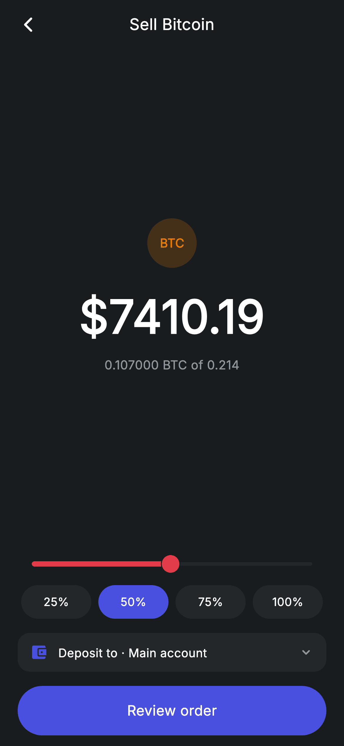
Selling crypto is rarely 'sell exactly $412.60' — it is 'sell about half'. This tutorial builds Nova's sell screen in Flutter around that idea: a red-tracked Slider running from 1% to 100% of the holding, four quick-percentage pills beneath it, and a 52px dollar figure that recalculates on every drag. Two computed getters do all the maths, and a `FittedBox` keeps the headline from ever overflowing when the number grows. No packages, no controllers, one double of state.
Watch the Flutter UI walkthrough
A short screen recording of Crypto Sell running, if you'd rather see it before you read the code. The written tutorial below covers everything in it.
Can't see the video? Watch it on YouTube.
What you'll build
- ✓A percentage slider restyled through SliderTheme to a red sell-action track
- ✓Two getters that derive the coin quantity and dollar value from a single stored double
- ✓Quick-select pills at 25/50/75/100% that highlight when they match the slider
- ✓A FittedBox headline that scales itself down instead of overflowing on large amounts
Step-by-step build
Create the file
Add a new file at lib/fintech_crypto_sell/fintech_crypto_sell_screen.dart in your Flutter project.
Register the bundled fonts
No external packages — this is pure Flutter. It does bundle its design font (Inter), so drop the font file into fonts/ and declare it in pubspec.yaml:
flutter:
  fonts:
    - family: Inter
      fonts:
- asset: fonts/Inter-Regular.ttfBuild it, piece by piece
Here's how the screen goes together. Each block below is a real slice of the code with a plain-English explanation — paste them in order, or grab the whole file from the next section.
One double of state, two derived getters
import 'package:flutter/material.dart';

/// Crypto sell — sell a coin by percentage of holding (Revolut-inspired).
///
/// Self-contained per CONVENTIONS.md: pure Flutter only, the exact design font
/// (Inter) is bundled under `fonts/`, no network/emoji images, and the screen
/// forces its own dark theme. A percentage slider of the user's holding drives
/// the coin + USD amounts live; proceeds land in the selected account.
class FintechCryptoSellScreen extends StatefulWidget {
  const FintechCryptoSellScreen({super.key, this.onBack, this.onReview});

  final VoidCallback? onBack;
  final VoidCallback? onReview;

  @override
  State<FintechCryptoSellScreen> createState() =>
      _FintechCryptoSellScreenState();
}

class _FintechCryptoSellScreenState extends State<FintechCryptoSellScreen> {
  static const String _font = 'Inter';
  static const Color _bg = Color(0xFF191C1F);
  static const Color _surface = Color(0xFF242729);
  static const Color _brand = Color(0xFF494FDF);
  static const Color _red = Color(0xFFE23B4A);
  static const Color _amber = Color(0xFFEC7E00);
  static const Color _muted = Color(0xFF8D969E);

  static const double _holding = 0.214; // BTC
  static const double _price = 69254.10;

  double _pct = 0.5;

  double get _coin => _holding * _pct;
  double get _usd => _coin * _price;
The only mutable value on this screen is `double _pct`, starting at `0.5`. Everything displayed comes from two getters built on it: `_coin => _holding * _pct` and `_usd => _coin * _price`, with `_holding` (0.214 BTC) and `_price` (69254.10) as `static const` stand-ins for real data. Deriving rather than storing is the point — there is no way for the coin figure, the dollar figure and the slider to drift out of sync, because two of the three are recomputed from the third on every build. The palette adds `_red` (#E23B4A) for the sell action and `_amber` (#EC7E00) for the Bitcoin badge, keeping the indigo `_brand` for neutral controls.
A layout that squeezes the amount, not the controls
  @override
  Widget build(BuildContext context) {
    return Theme(
      data: ThemeData.dark(useMaterial3: true),
      child: Scaffold(
        backgroundColor: _bg,
        body: SafeArea(
          child: Column(
            children: <Widget>[
              _buildAppBar(),
              Expanded(child: _buildAmount()),
              _buildSlider(),
              _buildQuick(),
              const SizedBox(height: 16),
              _buildDepositTo(),
              const SizedBox(height: 16),
              _buildButton(),
            ],
          ),
        ),
      ),
    );
  }

  Widget _buildAppBar() {
    return Padding(
      padding: const EdgeInsets.fromLTRB(8, 4, 8, 4),
      child: Row(
        children: <Widget>[
          IconButton(
            onPressed: widget.onBack,
            icon: const Icon(Icons.arrow_back_ios_new_rounded,
                size: 20, color: Colors.white),
          ),
          const Expanded(
            child: Text(
              'Sell Bitcoin',
              textAlign: TextAlign.center,
              style: TextStyle(
                fontFamily: _font,
                fontSize: 18,
                fontWeight: FontWeight.w500,
                letterSpacing: 0.24,
                color: Colors.white,
              ),
            ),
          ),
          const SizedBox(width: 48),
        ],
      ),
    );
  }
The Column gives `Expanded` to exactly one child — `_buildAmount()` — while the slider, quick pills, deposit row and button all take their natural height. That means on a small device the big number's whitespace compresses first and the controls stay fully sized and reachable, rather than everything shrinking evenly. It is a good default shape for any 'enter an amount' screen. The back bar underneath follows the same pattern used across this app: an `IconButton`, an `Expanded` centred title, and a `SizedBox(width: 48)` on the right to counterweight the icon.
The amount block and why FittedBox is here
  Widget _buildAmount() {
    return Center(
      child: Column(
        mainAxisAlignment: MainAxisAlignment.center,
        mainAxisSize: MainAxisSize.min,
        children: <Widget>[
          Container(
            width: 56,
            height: 56,
            alignment: Alignment.center,
            decoration: BoxDecoration(
              color: _amber.withValues(alpha: 0.2),
              shape: BoxShape.circle,
            ),
            child: const Text('BTC',
                style: TextStyle(
                  fontFamily: _font,
                  fontSize: 14,
                  fontWeight: FontWeight.w700,
                  color: _amber,
                )),
          ),
          const SizedBox(height: 18),
          FittedBox(
            fit: BoxFit.scaleDown,
            child: Text(
              '\$${_usd.toStringAsFixed(2)}',
              style: const TextStyle(
                fontFamily: _font,
                fontSize: 52,
                fontWeight: FontWeight.w600,
                letterSpacing: 0.24,
                color: Colors.white,
              ),
            ),
          ),
          const SizedBox(height: 8),
          Text(
            '${_coin.toStringAsFixed(6)} BTC of ${_holding.toStringAsFixed(3)}',
            style: const TextStyle(
              fontFamily: _font,
              fontSize: 14,
              letterSpacing: 0.24,
              color: _muted,
            ),
          ),
        ],
      ),
    );
  }
A 56px circle tinted `_amber.withValues(alpha: 0.2)` carries the letters 'BTC' — a painted badge, so no logo asset ships with the screen. Under it the dollar amount renders at `fontSize: 52` inside a `FittedBox(fit: BoxFit.scaleDown)`. That wrapper is doing real work: `scaleDown` shrinks the text only when it would not fit and otherwise leaves it at 52px, so a seven-figure sale still renders on a narrow phone instead of throwing a yellow overflow stripe. `_usd.toStringAsFixed(2)` fixes the cents, and the sub-line uses `toStringAsFixed(6)` for the coin quantity — six decimals is the convention for BTC, where the whole holding is a fraction of a coin. Showing '… of 0.214' next to it means the reader always sees the sale against the total they own.
Restyling the Slider with SliderTheme
  Widget _buildSlider() {
    return Padding(
      padding: const EdgeInsets.symmetric(horizontal: 12),
      child: SliderTheme(
        data: SliderTheme.of(context).copyWith(
          activeTrackColor: _red,
          inactiveTrackColor: _surface,
          thumbColor: _red,
          overlayColor: _red.withValues(alpha: 0.18),
          trackHeight: 4,
        ),
        child: Slider(
          value: _pct,
          min: 0.01,
          max: 1,
          onChanged: (double v) => setState(() => _pct = v),
        ),
      ),
    );
  }
`Slider` has no colour parameters of its own worth using, so the way to restyle it is `SliderTheme(data: SliderTheme.of(context).copyWith(...))` — start from the inherited theme and override only what you need. Here that is `activeTrackColor` and `thumbColor` in `_red`, `inactiveTrackColor` in `_surface`, an `overlayColor` of `_red.withValues(alpha: 0.18)` for the press halo, and `trackHeight: 4` to slim down Material's default. The `min: 0.01` is the detail to copy: starting at 0.01 rather than 0 means the slider can never produce a zero-value sale, so no downstream code has to special-case an empty order.
Quick pills that stay in sync with the slider
  Widget _buildQuick() {
    return Padding(
      padding: const EdgeInsets.symmetric(horizontal: 20),
      child: Row(
        children: <Widget>[
          for (final double p in <double>[0.25, 0.5, 0.75, 1.0])
            Expanded(
              child: Padding(
                padding: const EdgeInsets.symmetric(horizontal: 4),
                child: GestureDetector(
                  onTap: () => setState(() => _pct = p),
                  child: Container(
                    height: 38,
                    alignment: Alignment.center,
                    decoration: BoxDecoration(
                      color: (_pct - p).abs() < 0.001 ? _brand : _surface,
                      borderRadius: BorderRadius.circular(9999),
                    ),
                    child: Text(
                      p == 1.0 ? '100%' : '${(p * 100).round()}%',
                      style: const TextStyle(
                        fontFamily: _font,
                        fontSize: 13,
                        fontWeight: FontWeight.w500,
                        letterSpacing: 0.24,
                        color: Colors.white,
                      ),
                    ),
                  ),
                ),
              ),
            ),
        ],
      ),
    );
  }
The four presets are generated by a collection-for over `<double>[0.25, 0.5, 0.75, 1.0]`, each wrapped in `Expanded` so they divide the width evenly. The highlight test is `(_pct - p).abs() < 0.001` rather than `_pct == p` — comparing doubles with `==` is unreliable, and dragging the slider produces values that are near but never exactly 0.25. An epsilon comparison means the 25% pill lights up when the slider lands on it and releases as soon as you drag away. The label uses a ternary so 1.0 prints '100%' instead of the `(p * 100).round()` path, which would give the same result here but reads clearer for the edge case.
Destination row and the review CTA
  Widget _buildDepositTo() {
    return Padding(
      padding: const EdgeInsets.symmetric(horizontal: 20),
      child: Container(
        padding: const EdgeInsets.symmetric(horizontal: 14, vertical: 12),
        decoration: BoxDecoration(
          color: _surface,
          borderRadius: BorderRadius.circular(14),
        ),
        child: Row(
          children: const <Widget>[
            Icon(Icons.account_balance_wallet_rounded, size: 20, color: _brand),
            SizedBox(width: 12),
            Text(
              'Deposit to · Main account',
              style: TextStyle(
                fontFamily: _font,
                fontSize: 13.5,
                fontWeight: FontWeight.w500,
                letterSpacing: 0.24,
                color: Colors.white,
              ),
            ),
            Spacer(),
            Icon(Icons.keyboard_arrow_down_rounded, size: 18, color: _muted),
          ],
        ),
      ),
    );
  }

  Widget _buildButton() {
    return Padding(
      padding: const EdgeInsets.fromLTRB(20, 0, 20, 12),
      child: SizedBox(
        width: double.infinity,
        height: 56,
        child: Material(
          color: _brand,
          borderRadius: BorderRadius.circular(9999),
          child: InkWell(
            borderRadius: BorderRadius.circular(9999),
            onTap: widget.onReview,
            child: const Center(
              child: Text(
                'Review order',
                style: TextStyle(
                  fontFamily: _font,
                  fontSize: 16,
                  fontWeight: FontWeight.w500,
                  letterSpacing: 0.24,
                  color: Colors.white,
                ),
              ),
            ),
          ),
        ),
      ),
    );
  }
`_buildDepositTo` is a compact `_surface` row: wallet icon, label, `Spacer()`, and a chevron hinting the account is changeable. Building it as `children: const <Widget>[...]` — a const list — means Flutter can skip rebuilding this subtree entirely on every slider drag, which matters on a screen that calls `setState` on every pixel of movement. The final button is the app's standard 56px pill, `Material` filled `_brand` with a matching-radius `InkWell`, labelled 'Review order' rather than 'Sell' because this screen deliberately hands off to a confirmation step instead of executing the trade.
Full code
The complete, ready-to-paste source. Free to use in your projects — one click copies it all.
import 'package:flutter/material.dart';

/// Crypto sell — sell a coin by percentage of holding (Revolut-inspired).
///
/// Self-contained per CONVENTIONS.md: pure Flutter only, the exact design font
/// (Inter) is bundled under `fonts/`, no network/emoji images, and the screen
/// forces its own dark theme. A percentage slider of the user's holding drives
/// the coin + USD amounts live; proceeds land in the selected account.
class FintechCryptoSellScreen extends StatefulWidget {
  const FintechCryptoSellScreen({super.key, this.onBack, this.onReview});

  final VoidCallback? onBack;
  final VoidCallback? onReview;

  @override
  State<FintechCryptoSellScreen> createState() =>
      _FintechCryptoSellScreenState();
}

class _FintechCryptoSellScreenState extends State<FintechCryptoSellScreen> {
  static const String _font = 'Inter';
  static const Color _bg = Color(0xFF191C1F);
  static const Color _surface = Color(0xFF242729);
  static const Color _brand = Color(0xFF494FDF);
  static const Color _red = Color(0xFFE23B4A);
  static const Color _amber = Color(0xFFEC7E00);
  static const Color _muted = Color(0xFF8D969E);

  static const double _holding = 0.214; // BTC
  static const double _price = 69254.10;

  double _pct = 0.5;

  double get _coin => _holding * _pct;
  double get _usd => _coin * _price;

  @override
  Widget build(BuildContext context) {
    return Theme(
      data: ThemeData.dark(useMaterial3: true),
      child: Scaffold(
        backgroundColor: _bg,
        body: SafeArea(
          child: Column(
            children: <Widget>[
              _buildAppBar(),
              Expanded(child: _buildAmount()),
              _buildSlider(),
              _buildQuick(),
              const SizedBox(height: 16),
              _buildDepositTo(),
              const SizedBox(height: 16),
              _buildButton(),
            ],
          ),
        ),
      ),
    );
  }

  Widget _buildAppBar() {
    return Padding(
      padding: const EdgeInsets.fromLTRB(8, 4, 8, 4),
      child: Row(
        children: <Widget>[
          IconButton(
            onPressed: widget.onBack,
            icon: const Icon(Icons.arrow_back_ios_new_rounded,
                size: 20, color: Colors.white),
          ),
          const Expanded(
            child: Text(
              'Sell Bitcoin',
              textAlign: TextAlign.center,
              style: TextStyle(
                fontFamily: _font,
                fontSize: 18,
                fontWeight: FontWeight.w500,
                letterSpacing: 0.24,
                color: Colors.white,
              ),
            ),
          ),
          const SizedBox(width: 48),
        ],
      ),
    );
  }

  Widget _buildAmount() {
    return Center(
      child: Column(
        mainAxisAlignment: MainAxisAlignment.center,
        mainAxisSize: MainAxisSize.min,
        children: <Widget>[
          Container(
            width: 56,
            height: 56,
            alignment: Alignment.center,
            decoration: BoxDecoration(
              color: _amber.withValues(alpha: 0.2),
              shape: BoxShape.circle,
            ),
            child: const Text('BTC',
                style: TextStyle(
                  fontFamily: _font,
                  fontSize: 14,
                  fontWeight: FontWeight.w700,
                  color: _amber,
                )),
          ),
          const SizedBox(height: 18),
          FittedBox(
            fit: BoxFit.scaleDown,
            child: Text(
              '\$${_usd.toStringAsFixed(2)}',
              style: const TextStyle(
                fontFamily: _font,
                fontSize: 52,
                fontWeight: FontWeight.w600,
                letterSpacing: 0.24,
                color: Colors.white,
              ),
            ),
          ),
          const SizedBox(height: 8),
          Text(
            '${_coin.toStringAsFixed(6)} BTC of ${_holding.toStringAsFixed(3)}',
            style: const TextStyle(
              fontFamily: _font,
              fontSize: 14,
              letterSpacing: 0.24,
              color: _muted,
            ),
          ),
        ],
      ),
    );
  }

  Widget _buildSlider() {
    return Padding(
      padding: const EdgeInsets.symmetric(horizontal: 12),
      child: SliderTheme(
        data: SliderTheme.of(context).copyWith(
          activeTrackColor: _red,
          inactiveTrackColor: _surface,
          thumbColor: _red,
          overlayColor: _red.withValues(alpha: 0.18),
          trackHeight: 4,
        ),
        child: Slider(
          value: _pct,
          min: 0.01,
          max: 1,
          onChanged: (double v) => setState(() => _pct = v),
        ),
      ),
    );
  }

  Widget _buildQuick() {
    return Padding(
      padding: const EdgeInsets.symmetric(horizontal: 20),
      child: Row(
        children: <Widget>[
          for (final double p in <double>[0.25, 0.5, 0.75, 1.0])
            Expanded(
              child: Padding(
                padding: const EdgeInsets.symmetric(horizontal: 4),
                child: GestureDetector(
                  onTap: () => setState(() => _pct = p),
                  child: Container(
                    height: 38,
                    alignment: Alignment.center,
                    decoration: BoxDecoration(
                      color: (_pct - p).abs() < 0.001 ? _brand : _surface,
                      borderRadius: BorderRadius.circular(9999),
                    ),
                    child: Text(
                      p == 1.0 ? '100%' : '${(p * 100).round()}%',
                      style: const TextStyle(
                        fontFamily: _font,
                        fontSize: 13,
                        fontWeight: FontWeight.w500,
                        letterSpacing: 0.24,
                        color: Colors.white,
                      ),
                    ),
                  ),
                ),
              ),
            ),
        ],
      ),
    );
  }

  Widget _buildDepositTo() {
    return Padding(
      padding: const EdgeInsets.symmetric(horizontal: 20),
      child: Container(
        padding: const EdgeInsets.symmetric(horizontal: 14, vertical: 12),
        decoration: BoxDecoration(
          color: _surface,
          borderRadius: BorderRadius.circular(14),
        ),
        child: Row(
          children: const <Widget>[
            Icon(Icons.account_balance_wallet_rounded, size: 20, color: _brand),
            SizedBox(width: 12),
            Text(
              'Deposit to · Main account',
              style: TextStyle(
                fontFamily: _font,
                fontSize: 13.5,
                fontWeight: FontWeight.w500,
                letterSpacing: 0.24,
                color: Colors.white,
              ),
            ),
            Spacer(),
            Icon(Icons.keyboard_arrow_down_rounded, size: 18, color: _muted),
          ],
        ),
      ),
    );
  }

  Widget _buildButton() {
    return Padding(
      padding: const EdgeInsets.fromLTRB(20, 0, 20, 12),
      child: SizedBox(
        width: double.infinity,
        height: 56,
        child: Material(
          color: _brand,
          borderRadius: BorderRadius.circular(9999),
          child: InkWell(
            borderRadius: BorderRadius.circular(9999),
            onTap: widget.onReview,
            child: const Center(
              child: Text(
                'Review order',
                style: TextStyle(
                  fontFamily: _font,
                  fontSize: 16,
                  fontWeight: FontWeight.w500,
                  letterSpacing: 0.24,
                  color: Colors.white,
                ),
              ),
            ),
          ),
        ),
      ),
    );
  }
}
Plus bundled 1 binary asset (fonts/images). The CLI and MCP install those for you automatically.
Two faster ways to add it
Copy-paste works, but you can skip it entirely.
1. FlutterKit CLI
One command drops this screen — and its fonts — straight into your project.
$ flutterkit add fintech-crypto-sell2. AI agent (MCP)
Connect FlutterKit's MCP server in Claude or Cursor and just ask your agent to install fintech-crypto-sell — it fetches and writes the files for you.
FAQ
Is this crypto sell screen free for commercial apps?
Yes. FlutterKit is free and always will be — copy the code from this page, install it with the CLI, or pull it through MCP from your AI editor, then ship it in client work or a paid product. No account, no licence, no attribution required.
Does it connect to a real exchange or price feed?
No. `_holding` and `_price` are `static const` placeholders, so the screen runs with zero network calls. Replace them with values passed into the widget and the two getters keep working unchanged — that is the advantage of deriving the amounts rather than storing them.
Why compare the quick-select percentages with an epsilon?
Because floating-point equality is unreliable and a dragged Slider almost never produces exactly 0.25. `(_pct - p).abs() < 0.001` asks 'is it close enough', which makes the pill highlight when the slider lands on that value and release when it moves off. A plain `==` would leave the pills apparently broken.
How do I change the slider's colours?
Not on the `Slider` itself — wrap it in `SliderTheme` and pass `SliderTheme.of(context).copyWith(...)`, as this screen does for `activeTrackColor`, `thumbColor`, `inactiveTrackColor`, `overlayColor` and `trackHeight`. Starting from the inherited theme keeps everything you do not override consistent with the rest of your app.
Which Flutter version does this need?
Flutter 3.22 or newer, because of the `Color.withValues(alpha: ...)` calls on the badge and the slider overlay. On an older SDK replace them with `withOpacity(...)` and expand the `super.key` constructor to `const FintechCryptoSellScreen({Key? key, this.onBack, this.onReview}) : super(key: key);`.


