How to Build a Close Account Confirmation Screen in Flutter (Full Code + Preview)
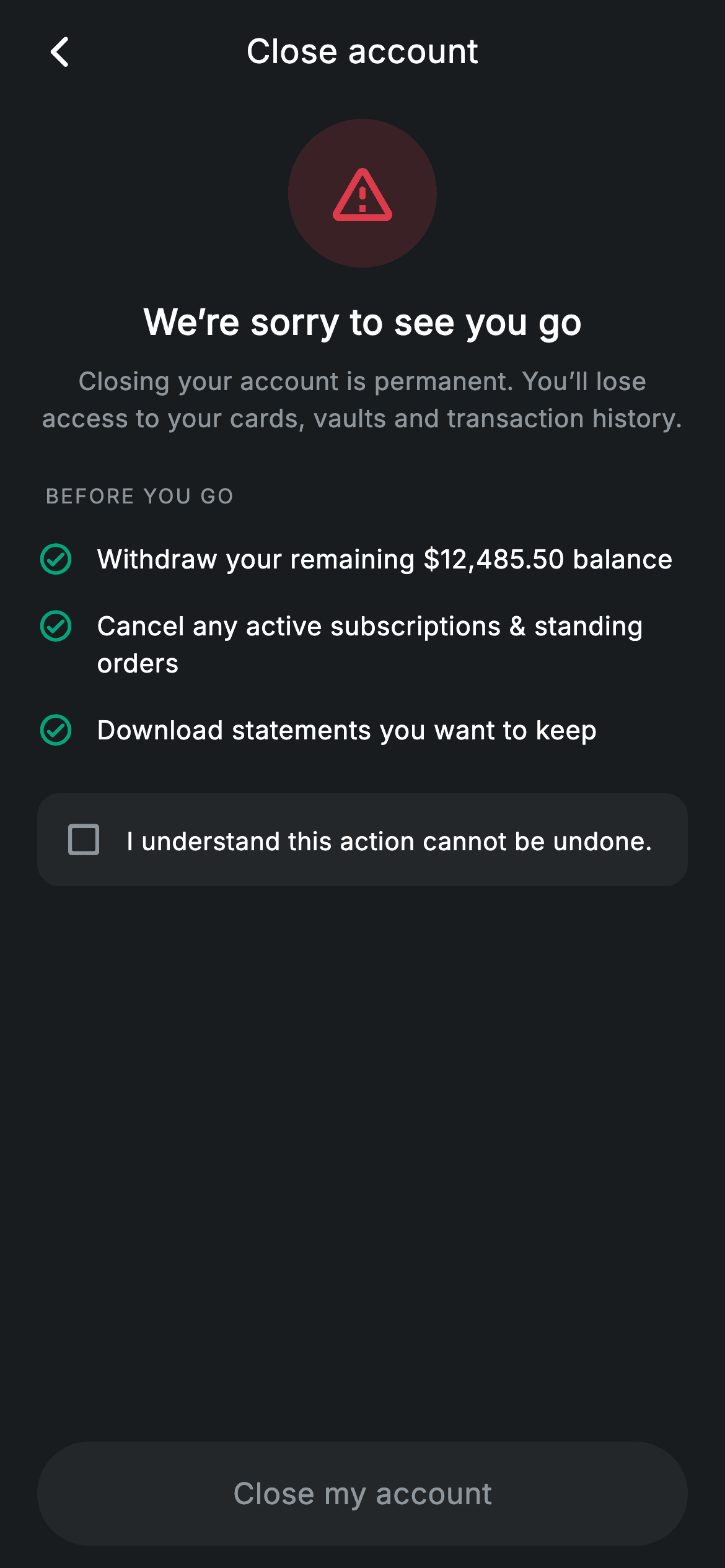
Closing an account is the one destructive action a banking app must make hard to do by accident and impossible to misunderstand. This screen is that guardrail: a red warning halo, a plain sentence about what is lost forever, a three-item checklist of things to do first, and a consent checkbox that keeps the confirm button dead until it is ticked. You'll build it as a stateful widget in pure Flutter where a single bool drives the checkbox, the button colour and whether the tap callback exists at all.
Watch the Flutter UI walkthrough
A short screen recording of Close Account running, if you'd rather see it before you read the code. The written tutorial below covers everything in it.
Can't see the video? Watch it on YouTube.
What you'll build
- ✓A destructive CTA that is genuinely inert until an explicit consent box is ticked
- ✓A tinted warning halo built from one colour at two alpha values
- ✓A pre-closure checklist rendered from a list of strings, with an escaped currency literal
- ✓A consent row where the whole padded card is the hit target, not just the checkbox
- ✓A confirm button pinned below the scroll area so it never scrolls out of reach
Step-by-step build
Create the file
Add a new file at lib/fintech_close_account/fintech_close_account_screen.dart in your Flutter project.
Register the bundled fonts
No external packages — this is pure Flutter. It does bundle its design font (Inter), so drop the font file into fonts/ and declare it in pubspec.yaml:
flutter:
  fonts:
    - family: Inter
      fonts:
- asset: fonts/Inter-Regular.ttfBuild it, piece by piece
Here's how the screen goes together. Each block below is a real slice of the code with a plain-English explanation — paste them in order, or grab the whole file from the next section.
One bool, and the checklist it guards
import 'package:flutter/material.dart';

/// Close account — account closure flow (Revolut-inspired design system).
///
/// Self-contained per CONVENTIONS.md: pure Flutter only, the exact design font
/// (Inter) is bundled under `fonts/`, no network/emoji images, and the screen
/// forces its own dark theme. A warning hero, a pre-closure checklist and a
/// hold-to-confirm-style destructive CTA make the flow read carefully.
class FintechCloseAccountScreen extends StatefulWidget {
  const FintechCloseAccountScreen({super.key, this.onBack, this.onConfirm});

  final VoidCallback? onBack;
  final VoidCallback? onConfirm;

  @override
  State<FintechCloseAccountScreen> createState() =>
      _FintechCloseAccountScreenState();
}

class _FintechCloseAccountScreenState extends State<FintechCloseAccountScreen> {
  static const String _font = 'Inter';
  static const Color _bg = Color(0xFF191C1F);
  static const Color _surface = Color(0xFF242729);
  static const Color _red = Color(0xFFE23B4A);
  static const Color _teal = Color(0xFF00A87E);
  static const Color _muted = Color(0xFF8D969E);

  static const List<String> _checks = <String>[
    'Withdraw your remaining \$12,485.50 balance',
    'Cancel any active subscriptions & standing orders',
    'Download statements you want to keep',
  ];

  bool _agree = false;
This is a `StatefulWidget` for exactly one reason: `bool _agree = false`. Everything else is constant. The palette pairs `_red` `0xFFE23B4A` for danger with `_teal` `0xFF00A87E` for the checklist ticks — the items are things you can go and *do*, so marking them in red would read as three more warnings. Note the escape in the first check: `'Withdraw your remaining \$12,485.50 balance'`. In Dart a bare `$` starts an interpolation, so a literal dollar amount inside a single-quoted string has to be written `\$` or the file will not compile.
Scrolling content, pinned decision
  Widget build(BuildContext context) {
    return Theme(
      data: ThemeData.dark(useMaterial3: true),
      child: Scaffold(
        backgroundColor: _bg,
        body: SafeArea(
          child: Column(
            children: <Widget>[
              _buildAppBar(),
              Expanded(
                child: ListView(
                  physics: const BouncingScrollPhysics(),
                  padding: const EdgeInsets.fromLTRB(20, 8, 20, 24),
                  children: <Widget>[
                    _buildHero(),
                    const SizedBox(height: 24),
                    _label('Before you go'),
                    const SizedBox(height: 8),
                    for (final String c in _checks) _checkRow(c),
                    const SizedBox(height: 16),
                    _buildAgree(),
                  ],
                ),
              ),
              _buildButton(),
            ],
          ),
        ),
      ),
    );
  }
The `Column` holds three things: the app bar, an `Expanded` `ListView`, and `_buildButton()` *outside* the list. That placement is the whole layout decision — the hero, checklist and consent box scroll, but the confirm button is pinned to the bottom of the screen and cannot be scrolled away from. The checklist itself is emitted with `for (final String c in _checks) _checkRow(c)` directly inside the children list, a collection-for that avoids the `..._checks.map(...).toList()` dance.
The warning hero
  Widget _buildHero() {
    return Column(
      children: <Widget>[
        Container(
          width: 80,
          height: 80,
          decoration: BoxDecoration(
            color: _red.withValues(alpha: 0.16),
            shape: BoxShape.circle,
          ),
          child: const Icon(Icons.warning_amber_rounded, size: 40, color: _red),
        ),
        const SizedBox(height: 16),
        const Text(
          'We’re sorry to see you go',
          style: TextStyle(
            fontFamily: _font,
            fontSize: 19,
            fontWeight: FontWeight.w600,
            letterSpacing: 0.24,
            color: Colors.white,
          ),
        ),
        const SizedBox(height: 8),
        const Text(
          'Closing your account is permanent. You’ll lose access to your '
          'cards, vaults and transaction history.',
          textAlign: TextAlign.center,
          style: TextStyle(
            fontFamily: _font,
            fontSize: 13.5,
            height: 1.5,
            letterSpacing: 0.24,
            color: _muted,
          ),
        ),
      ],
    );
  }
The hero is an 80×80 circle — `shape: BoxShape.circle`, so no radius arithmetic — filled with `_red.withValues(alpha: 0.16)` and holding a 40px `Icons.warning_amber_rounded` in full `_red`. One colour at two alphas is what makes the halo read as a tint of the icon rather than a second colour. The heading is gentle ('We're sorry to see you go') while the paragraph under it is blunt: closing is permanent, and cards, vaults and history all go. Softening the headline and hardening the detail is deliberate — the warmth costs nothing as long as the consequence is stated plainly.
The section label and the checklist rows
  Widget _label(String text) {
    return Padding(
      padding: const EdgeInsets.only(left: 4),
      child: Text(
        text.toUpperCase(),
        style: const TextStyle(
          fontFamily: _font,
          fontSize: 11,
          fontWeight: FontWeight.w500,
          letterSpacing: 1.0,
          color: _muted,
        ),
      ),
    );
  }

  Widget _checkRow(String text) {
    return Padding(
      padding: const EdgeInsets.symmetric(vertical: 8),
      child: Row(
        crossAxisAlignment: CrossAxisAlignment.start,
        children: <Widget>[
          const Icon(Icons.check_circle_outline_rounded, size: 20, color: _teal),
          const SizedBox(width: 12),
          Expanded(
            child: Text(
              text,
              style: const TextStyle(
                fontFamily: _font,
                fontSize: 14,
                height: 1.4,
                letterSpacing: 0.24,
                color: Colors.white,
              ),
            ),
          ),
        ],
      ),
    );
  }
`_label` upper-cases its argument at runtime with `text.toUpperCase()` and sets `letterSpacing: 1.0` at 11px — tracking matters far more for all-caps than for sentence case, which is why this label style is 1.0 while every other style on the screen is 0.24. Each `_checkRow` is a teal outline tick beside an `Expanded` text at `height: 1.4`, with `crossAxisAlignment: CrossAxisAlignment.start` so a wrapping item keeps its icon level with the first line instead of floating to the vertical middle.
The consent gate
  Widget _buildAgree() {
    return GestureDetector(
      onTap: () => setState(() => _agree = !_agree),
      behavior: HitTestBehavior.opaque,
      child: Container(
        padding: const EdgeInsets.all(14),
        decoration: BoxDecoration(
          color: _surface,
          borderRadius: BorderRadius.circular(12),
        ),
        child: Row(
          children: <Widget>[
            Icon(
              _agree
                  ? Icons.check_box_rounded
                  : Icons.check_box_outline_blank_rounded,
              size: 22,
              color: _agree ? _red : _muted,
            ),
            const SizedBox(width: 12),
            const Expanded(
              child: Text(
                'I understand this action cannot be undone.',
                style: TextStyle(
                  fontFamily: _font,
                  fontSize: 13.5,
                  letterSpacing: 0.24,
                  color: Colors.white,
                ),
              ),
            ),
          ],
        ),
      ),
    );
  }
The consent row is a `GestureDetector` with `behavior: HitTestBehavior.opaque` wrapped around the whole `_surface` card, so the 14px padding and the empty space beside the text are all tappable — a real checkbox target is the sentence, not the 22px glyph. `onTap` flips `_agree` inside `setState`, and the icon swaps between `Icons.check_box_rounded` and `Icons.check_box_outline_blank_rounded` while its colour moves from `_muted` to `_red`. Ticked state is coloured with the danger colour rather than a friendly accent, because agreeing here is not a positive action.
A button that is actually disabled
  Widget _buildButton() {
    return Padding(
      padding: const EdgeInsets.fromLTRB(20, 0, 20, 12),
      child: SizedBox(
        width: double.infinity,
        height: 56,
        child: Material(
          color: _agree ? _red : _surface,
          borderRadius: BorderRadius.circular(9999),
          child: InkWell(
            borderRadius: BorderRadius.circular(9999),
            onTap: _agree ? widget.onConfirm : null,
            child: Center(
              child: Text(
                'Close my account',
                style: TextStyle(
                  fontFamily: _font,
                  fontSize: 16,
                  fontWeight: FontWeight.w500,
                  letterSpacing: 0.24,
                  color: _agree ? Colors.white : _muted,
                ),
              ),
            ),
          ),
        ),
      ),
    );
  }
The CTA is a `Material` + `InkWell` pair rather than a `FilledButton`, which buys full control of the fully-round `BorderRadius.circular(9999)` pill and the exact disabled colours. Two things key off `_agree`: the fill (`_red` when agreed, `_surface` when not) and, crucially, `onTap: _agree ? widget.onConfirm : null`. Passing `null` is what genuinely disables an `InkWell` — it stops the ripple as well as the callback, so a premature tap gives no feedback at all rather than looking pressed but doing nothing. The label colour shifts to `_muted` to match.
Full code
The complete, ready-to-paste source. Free to use in your projects — one click copies it all.
import 'package:flutter/material.dart';

/// Close account — account closure flow (Revolut-inspired design system).
///
/// Self-contained per CONVENTIONS.md: pure Flutter only, the exact design font
/// (Inter) is bundled under `fonts/`, no network/emoji images, and the screen
/// forces its own dark theme. A warning hero, a pre-closure checklist and a
/// hold-to-confirm-style destructive CTA make the flow read carefully.
class FintechCloseAccountScreen extends StatefulWidget {
  const FintechCloseAccountScreen({super.key, this.onBack, this.onConfirm});

  final VoidCallback? onBack;
  final VoidCallback? onConfirm;

  @override
  State<FintechCloseAccountScreen> createState() =>
      _FintechCloseAccountScreenState();
}

class _FintechCloseAccountScreenState extends State<FintechCloseAccountScreen> {
  static const String _font = 'Inter';
  static const Color _bg = Color(0xFF191C1F);
  static const Color _surface = Color(0xFF242729);
  static const Color _red = Color(0xFFE23B4A);
  static const Color _teal = Color(0xFF00A87E);
  static const Color _muted = Color(0xFF8D969E);

  static const List<String> _checks = <String>[
    'Withdraw your remaining \$12,485.50 balance',
    'Cancel any active subscriptions & standing orders',
    'Download statements you want to keep',
  ];

  bool _agree = false;

  @override
  Widget build(BuildContext context) {
    return Theme(
      data: ThemeData.dark(useMaterial3: true),
      child: Scaffold(
        backgroundColor: _bg,
        body: SafeArea(
          child: Column(
            children: <Widget>[
              _buildAppBar(),
              Expanded(
                child: ListView(
                  physics: const BouncingScrollPhysics(),
                  padding: const EdgeInsets.fromLTRB(20, 8, 20, 24),
                  children: <Widget>[
                    _buildHero(),
                    const SizedBox(height: 24),
                    _label('Before you go'),
                    const SizedBox(height: 8),
                    for (final String c in _checks) _checkRow(c),
                    const SizedBox(height: 16),
                    _buildAgree(),
                  ],
                ),
              ),
              _buildButton(),
            ],
          ),
        ),
      ),
    );
  }

  Widget _buildAppBar() {
    return Padding(
      padding: const EdgeInsets.fromLTRB(8, 4, 8, 4),
      child: Row(
        children: <Widget>[
          IconButton(
            onPressed: widget.onBack,
            icon: const Icon(Icons.arrow_back_ios_new_rounded,
                size: 20, color: Colors.white),
          ),
          const Expanded(
            child: Text(
              'Close account',
              textAlign: TextAlign.center,
              style: TextStyle(
                fontFamily: _font,
                fontSize: 18,
                fontWeight: FontWeight.w500,
                letterSpacing: 0.24,
                color: Colors.white,
              ),
            ),
          ),
          const SizedBox(width: 48),
        ],
      ),
    );
  }

  Widget _buildHero() {
    return Column(
      children: <Widget>[
        Container(
          width: 80,
          height: 80,
          decoration: BoxDecoration(
            color: _red.withValues(alpha: 0.16),
            shape: BoxShape.circle,
          ),
          child: const Icon(Icons.warning_amber_rounded, size: 40, color: _red),
        ),
        const SizedBox(height: 16),
        const Text(
          'We’re sorry to see you go',
          style: TextStyle(
            fontFamily: _font,
            fontSize: 19,
            fontWeight: FontWeight.w600,
            letterSpacing: 0.24,
            color: Colors.white,
          ),
        ),
        const SizedBox(height: 8),
        const Text(
          'Closing your account is permanent. You’ll lose access to your '
          'cards, vaults and transaction history.',
          textAlign: TextAlign.center,
          style: TextStyle(
            fontFamily: _font,
            fontSize: 13.5,
            height: 1.5,
            letterSpacing: 0.24,
            color: _muted,
          ),
        ),
      ],
    );
  }

  Widget _label(String text) {
    return Padding(
      padding: const EdgeInsets.only(left: 4),
      child: Text(
        text.toUpperCase(),
        style: const TextStyle(
          fontFamily: _font,
          fontSize: 11,
          fontWeight: FontWeight.w500,
          letterSpacing: 1.0,
          color: _muted,
        ),
      ),
    );
  }

  Widget _checkRow(String text) {
    return Padding(
      padding: const EdgeInsets.symmetric(vertical: 8),
      child: Row(
        crossAxisAlignment: CrossAxisAlignment.start,
        children: <Widget>[
          const Icon(Icons.check_circle_outline_rounded, size: 20, color: _teal),
          const SizedBox(width: 12),
          Expanded(
            child: Text(
              text,
              style: const TextStyle(
                fontFamily: _font,
                fontSize: 14,
                height: 1.4,
                letterSpacing: 0.24,
                color: Colors.white,
              ),
            ),
          ),
        ],
      ),
    );
  }

  Widget _buildAgree() {
    return GestureDetector(
      onTap: () => setState(() => _agree = !_agree),
      behavior: HitTestBehavior.opaque,
      child: Container(
        padding: const EdgeInsets.all(14),
        decoration: BoxDecoration(
          color: _surface,
          borderRadius: BorderRadius.circular(12),
        ),
        child: Row(
          children: <Widget>[
            Icon(
              _agree
                  ? Icons.check_box_rounded
                  : Icons.check_box_outline_blank_rounded,
              size: 22,
              color: _agree ? _red : _muted,
            ),
            const SizedBox(width: 12),
            const Expanded(
              child: Text(
                'I understand this action cannot be undone.',
                style: TextStyle(
                  fontFamily: _font,
                  fontSize: 13.5,
                  letterSpacing: 0.24,
                  color: Colors.white,
                ),
              ),
            ),
          ],
        ),
      ),
    );
  }

  Widget _buildButton() {
    return Padding(
      padding: const EdgeInsets.fromLTRB(20, 0, 20, 12),
      child: SizedBox(
        width: double.infinity,
        height: 56,
        child: Material(
          color: _agree ? _red : _surface,
          borderRadius: BorderRadius.circular(9999),
          child: InkWell(
            borderRadius: BorderRadius.circular(9999),
            onTap: _agree ? widget.onConfirm : null,
            child: Center(
              child: Text(
                'Close my account',
                style: TextStyle(
                  fontFamily: _font,
                  fontSize: 16,
                  fontWeight: FontWeight.w500,
                  letterSpacing: 0.24,
                  color: _agree ? Colors.white : _muted,
                ),
              ),
            ),
          ),
        ),
      ),
    );
  }
}
Plus bundled 1 binary asset (fonts/images). The CLI and MCP install those for you automatically.
Two faster ways to add it
Copy-paste works, but you can skip it entirely.
1. FlutterKit CLI
One command drops this screen — and its fonts — straight into your project.
$ flutterkit add fintech-close-account2. AI agent (MCP)
Connect FlutterKit's MCP server in Claude or Cursor and just ask your agent to install fintech-close-account — it fetches and writes the files for you.
FAQ
The description mentions hold-to-confirm — does this screen implement that?
No. The doc comment above the class calls it a 'hold-to-confirm-style' CTA, but the Dart implements a checkbox gate: you tick 'I understand this action cannot be undone' and the button becomes live on a normal tap. There is no long-press timer anywhere in the file. Trust the code — this page walks the real implementation.
How do I add a real confirmation step after the button?
The screen exposes `onConfirm` and calls it only when `_agree` is true, so the parent decides what happens next — push a password or 2FA screen, or show a dialog. Keeping the network call outside the widget is why this screen stays pure Flutter and drops into any state-management setup.
Why is the confirm button outside the ListView?
So it stays pinned to the bottom while the content scrolls. If it were the last child of the list, a user on a small phone would have to scroll to reach it, and on a tall phone it would float mid-screen. Pinned placement also keeps the disabled state visible the whole time the checklist is being read.
Does it need any packages or fonts?
No packages — just `material.dart`. The Inter family is bundled with the screen and registered in your pubspec under `fonts:`; without it the text renders in the platform default at slightly different widths, which is harmless but changes the line breaks in the paragraph.
Which Flutter version does this need?
Flutter 3.22 or newer, because the warning halo uses `Color.withValues(alpha: 0.16)`. On an older SDK replace it with `withOpacity(0.16)` and change the constructor to the `{Key? key, ...}) : super(key: key)` form.


