How to Build a Change Passcode Flow with a Custom Numpad in Flutter (Full Code + Preview)
Changing a passcode is really three entries in a row: prove the old one, choose a new one, type it again. This tutorial builds that whole flow in Flutter as a single screen with a custom 68px numpad, six fill-in dots, and a step counter that advances the moment the sixth digit lands. There is no PageView and no route push — the title text and the dots simply re-render from two state variables, which keeps the entire flow in one small file.
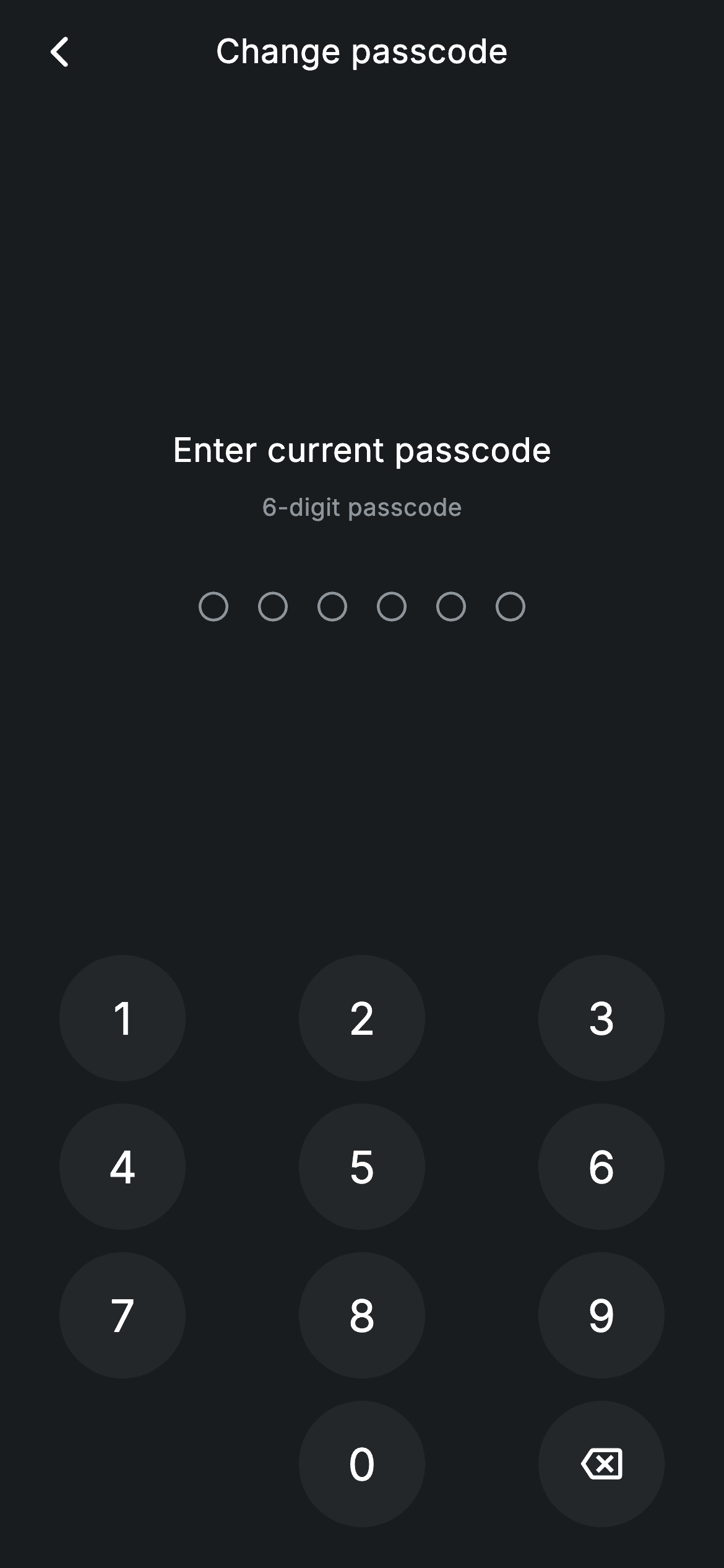
Watch the Flutter UI walkthrough
A short screen recording of Change Passcode running, if you'd rather see it before you read the code. The written tutorial below covers everything in it.
Can't see the video? Watch it on YouTube.
What you'll build
- ✓A three-step passcode flow driven by one int, with no navigation between steps
- ✓A custom circular numpad laid out from a 4x3 String matrix, including a blank cell
- ✓Six progress dots that fill from transparent-with-outline to solid brand
- ✓Keypress handling that auto-advances at six digits and calls onDone on the last step
Step-by-step build
Create the file
Add a new file at lib/fintech_change_passcode/fintech_change_passcode_screen.dart in your Flutter project.
Register the bundled fonts
No external packages — this is pure Flutter. It does bundle its design font (Inter), so drop the font file into fonts/ and declare it in pubspec.yaml:
flutter:
  fonts:
    - family: Inter
      fonts:
- asset: fonts/Inter-Regular.ttfBuild it, piece by piece
Here's how the screen goes together. Each block below is a real slice of the code with a plain-English explanation — paste them in order, or grab the whole file from the next section.
The step titles and the two variables that drive everything
import 'package:flutter/material.dart';

/// Change passcode — step through current → new → confirm (Revolut-inspired).
///
/// Self-contained per CONVENTIONS.md: pure Flutter only, the exact design font
/// (Inter) is bundled under `fonts/`, no network/emoji images, and the screen
/// forces its own dark theme. The numpad fills six dots; completing each step
/// advances to the next, and the final step calls onDone.
class FintechChangePasscodeScreen extends StatefulWidget {
  const FintechChangePasscodeScreen({super.key, this.onBack, this.onDone});

  final VoidCallback? onBack;
  final VoidCallback? onDone;

  @override
  State<FintechChangePasscodeScreen> createState() =>
      _FintechChangePasscodeScreenState();
}

class _FintechChangePasscodeScreenState
    extends State<FintechChangePasscodeScreen> {
  static const String _font = 'Inter';
  static const Color _bg = Color(0xFF191C1F);
  static const Color _surface = Color(0xFF242729);
  static const Color _brand = Color(0xFF494FDF);
  static const Color _muted = Color(0xFF8D969E);

  static const List<String> _titles = <String>[
    'Enter current passcode',
    'Choose a new passcode',
    'Confirm new passcode',
  ];

  int _step = 0;
  String _code = '';
`_titles` is a `static const` list of the three prompts — 'Enter current passcode', 'Choose a new passcode', 'Confirm new passcode' — and the whole flow is just an index into it. State is `_step` (0 to 2) and `_code`, the digits typed so far held as a plain `String`. Using a String rather than a `List<int>` pays off twice below: `_code.length` gives the dot count directly, and appending a digit is a one-character `+=`. The widget exposes `onBack` and `onDone` so the host app decides what a completed change actually does.
The keypress handler, where the whole flow lives
  void _onKey(String key) {
    setState(() {
      if (key == '⌫') {
        if (_code.isNotEmpty) _code = _code.substring(0, _code.length - 1);
        return;
      }
      if (_code.length >= 6) return;
      _code += key;
      if (_code.length == 6) {
        if (_step < 2) {
          _step++;
          _code = '';
        } else {
          widget.onDone?.call();
        }
      }
    });
  }
`_onKey` handles every button in one `setState`. The backspace branch runs first and returns early, trimming the last character with `substring(0, _code.length - 1)` and guarding against an empty string so it can't throw. Then `if (_code.length >= 6) return;` caps input — worth keeping even though the UI advances at six, because it makes the method safe against a fast double-tap. After appending, hitting exactly six digits either advances (`_step++` and reset `_code = ''`) or, on the last step, fires `widget.onDone?.call()`. The `?.call()` form is the safe way to invoke a nullable callback: no null check, no crash when the host didn't pass one.
Prompt, dots and numpad in a three-part column
  @override
  Widget build(BuildContext context) {
    return Theme(
      data: ThemeData.dark(useMaterial3: true),
      child: Scaffold(
        backgroundColor: _bg,
        body: SafeArea(
          child: Column(
            children: <Widget>[
              _buildAppBar(),
              Expanded(
                child: Column(
                  mainAxisAlignment: MainAxisAlignment.center,
                  children: <Widget>[
                    Text(
                      _titles[_step],
                      style: const TextStyle(
                        fontFamily: _font,
                        fontSize: 18,
                        fontWeight: FontWeight.w500,
                        letterSpacing: 0.24,
                        color: Colors.white,
                      ),
                    ),
                    const SizedBox(height: 8),
                    const Text(
                      '6-digit passcode',
                      style: TextStyle(
                        fontFamily: _font,
                        fontSize: 13,
                        letterSpacing: 0.24,
                        color: _muted,
                      ),
                    ),
                    const SizedBox(height: 36),
                    _buildDots(),
                  ],
                ),
              ),
              _Numpad(onKey: _onKey),
              const SizedBox(height: 16),
            ],
          ),
        ),
      ),
    );
  }

  Widget _buildAppBar() {
    return Padding(
      padding: const EdgeInsets.fromLTRB(8, 4, 8, 4),
      child: Row(
        children: <Widget>[
          IconButton(
            onPressed: widget.onBack,
            icon: const Icon(Icons.arrow_back_ios_new_rounded,
                size: 20, color: Colors.white),
          ),
          const Expanded(
            child: Text(
              'Change passcode',
              textAlign: TextAlign.center,
              style: TextStyle(
                fontFamily: _font,
                fontSize: 18,
                fontWeight: FontWeight.w500,
                letterSpacing: 0.24,
                color: Colors.white,
              ),
            ),
          ),
          const SizedBox(width: 48),
        ],
      ),
    );
  }
The body is a Column of back-bar, an `Expanded` middle section, and the numpad pinned above a 16px bottom gap. Because the middle is `Expanded` with `mainAxisAlignment: MainAxisAlignment.center`, the prompt and dots centre themselves in whatever room the numpad leaves, so the layout adapts from a small phone to a tall one without media queries. `Text(_titles[_step])` is the only thing that changes between steps — reading the title straight from state rather than duplicating three near-identical screens. The back bar underneath is the usual Row with a trailing `SizedBox(width: 48)` balancing the leading IconButton so the title centres properly.
Six dots that fill as you type
  Widget _buildDots() {
    return Row(
      mainAxisAlignment: MainAxisAlignment.center,
      children: <Widget>[
        for (int i = 0; i < 6; i++)
          Container(
            margin: const EdgeInsets.symmetric(horizontal: 8),
            width: 16,
            height: 16,
            decoration: BoxDecoration(
              shape: BoxShape.circle,
              color: i < _code.length ? _brand : Colors.transparent,
              border: Border.all(
                color: i < _code.length ? _brand : _muted,
                width: 1.5,
              ),
            ),
          ),
      ],
    );
  }
`_buildDots` uses a collection-for loop to emit six 16px circles. Each one compares `i < _code.length` twice: once for the fill (`_brand` when reached, `Colors.transparent` when not) and once for the 1.5px border (`_brand` or `_muted`). Keeping the border present at both states rather than adding it only when empty means the dot never changes size as it fills — the same discipline that stops selection borders shifting layout elsewhere in this app. A horizontal margin of 8 on each side yields the 16px gap between neighbours.
Building the numpad from a String matrix
class _Numpad extends StatelessWidget {
  const _Numpad({required this.onKey});

  final ValueChanged<String> onKey;

  static const List<List<String>> _rows = <List<String>>[
    <String>['1', '2', '3'],
    <String>['4', '5', '6'],
    <String>['7', '8', '9'],
    <String>['', '0', '⌫'],
  ];

  @override
  Widget build(BuildContext context) {
    return Padding(
      padding: const EdgeInsets.symmetric(horizontal: 32),
      child: Column(
        mainAxisSize: MainAxisSize.min,
        children: <Widget>[
          for (final List<String> row in _rows)
            Padding(
              padding: const EdgeInsets.symmetric(vertical: 6),
              child: Row(
                mainAxisAlignment: MainAxisAlignment.spaceBetween,
                children: <Widget>[
                  for (final String key in row)
                    key.isEmpty
                        ? const SizedBox(width: 68, height: 68)
                        : GestureDetector(
                            onTap: () => onKey(key),
                            behavior: HitTestBehavior.opaque,
                            child: Container(
                              width: 68,
                              height: 68,
                              decoration: const BoxDecoration(
                                shape: BoxShape.circle,
                                color: _FintechChangePasscodeScreenState._surface,
                              ),
                              alignment: Alignment.center,
                              child: key == '⌫'
                                  ? const Icon(Icons.backspace_outlined,
                                      size: 22, color: Colors.white)
                                  : Text(
                                      key,
                                      style: const TextStyle(
                                        fontFamily:
                                            _FintechChangePasscodeScreenState._font,
                                        fontSize: 24,
                                        fontWeight: FontWeight.w500,
                                        letterSpacing: 0.24,
                                        color: Colors.white,
                                      ),
                                    ),
                            ),
                          ),
                ],
              ),
            ),
        ],
      ),
    );
  }
}
`_Numpad` is a separate `StatelessWidget` taking only a `ValueChanged<String>`, so it never rebuilds any of the passcode state — it just reports which key was hit. Its `_rows` is a `List<List<String>>` describing the pad literally, including `''` in the bottom-left. That empty string is rendered as a bare `SizedBox(width: 68, height: 68)`, which holds the grid position so `MainAxisAlignment.spaceBetween` still lines '0' up under '8'. Every real key is a 68px circle — well above the 48px minimum tap target — with `behavior: HitTestBehavior.opaque` so taps anywhere in the box register, not just on the glyph. The '⌫' key swaps the Text for `Icons.backspace_outlined`, and the pad reaches back into `_FintechChangePasscodeScreenState._surface` and `._font` for its constants, which is legal because both classes live in the same library file.
Full code
The complete, ready-to-paste source. Free to use in your projects — one click copies it all.
import 'package:flutter/material.dart';

/// Change passcode — step through current → new → confirm (Revolut-inspired).
///
/// Self-contained per CONVENTIONS.md: pure Flutter only, the exact design font
/// (Inter) is bundled under `fonts/`, no network/emoji images, and the screen
/// forces its own dark theme. The numpad fills six dots; completing each step
/// advances to the next, and the final step calls onDone.
class FintechChangePasscodeScreen extends StatefulWidget {
  const FintechChangePasscodeScreen({super.key, this.onBack, this.onDone});

  final VoidCallback? onBack;
  final VoidCallback? onDone;

  @override
  State<FintechChangePasscodeScreen> createState() =>
      _FintechChangePasscodeScreenState();
}

class _FintechChangePasscodeScreenState
    extends State<FintechChangePasscodeScreen> {
  static const String _font = 'Inter';
  static const Color _bg = Color(0xFF191C1F);
  static const Color _surface = Color(0xFF242729);
  static const Color _brand = Color(0xFF494FDF);
  static const Color _muted = Color(0xFF8D969E);

  static const List<String> _titles = <String>[
    'Enter current passcode',
    'Choose a new passcode',
    'Confirm new passcode',
  ];

  int _step = 0;
  String _code = '';

  void _onKey(String key) {
    setState(() {
      if (key == '⌫') {
        if (_code.isNotEmpty) _code = _code.substring(0, _code.length - 1);
        return;
      }
      if (_code.length >= 6) return;
      _code += key;
      if (_code.length == 6) {
        if (_step < 2) {
          _step++;
          _code = '';
        } else {
          widget.onDone?.call();
        }
      }
    });
  }

  @override
  Widget build(BuildContext context) {
    return Theme(
      data: ThemeData.dark(useMaterial3: true),
      child: Scaffold(
        backgroundColor: _bg,
        body: SafeArea(
          child: Column(
            children: <Widget>[
              _buildAppBar(),
              Expanded(
                child: Column(
                  mainAxisAlignment: MainAxisAlignment.center,
                  children: <Widget>[
                    Text(
                      _titles[_step],
                      style: const TextStyle(
                        fontFamily: _font,
                        fontSize: 18,
                        fontWeight: FontWeight.w500,
                        letterSpacing: 0.24,
                        color: Colors.white,
                      ),
                    ),
                    const SizedBox(height: 8),
                    const Text(
                      '6-digit passcode',
                      style: TextStyle(
                        fontFamily: _font,
                        fontSize: 13,
                        letterSpacing: 0.24,
                        color: _muted,
                      ),
                    ),
                    const SizedBox(height: 36),
                    _buildDots(),
                  ],
                ),
              ),
              _Numpad(onKey: _onKey),
              const SizedBox(height: 16),
            ],
          ),
        ),
      ),
    );
  }

  Widget _buildAppBar() {
    return Padding(
      padding: const EdgeInsets.fromLTRB(8, 4, 8, 4),
      child: Row(
        children: <Widget>[
          IconButton(
            onPressed: widget.onBack,
            icon: const Icon(Icons.arrow_back_ios_new_rounded,
                size: 20, color: Colors.white),
          ),
          const Expanded(
            child: Text(
              'Change passcode',
              textAlign: TextAlign.center,
              style: TextStyle(
                fontFamily: _font,
                fontSize: 18,
                fontWeight: FontWeight.w500,
                letterSpacing: 0.24,
                color: Colors.white,
              ),
            ),
          ),
          const SizedBox(width: 48),
        ],
      ),
    );
  }

  Widget _buildDots() {
    return Row(
      mainAxisAlignment: MainAxisAlignment.center,
      children: <Widget>[
        for (int i = 0; i < 6; i++)
          Container(
            margin: const EdgeInsets.symmetric(horizontal: 8),
            width: 16,
            height: 16,
            decoration: BoxDecoration(
              shape: BoxShape.circle,
              color: i < _code.length ? _brand : Colors.transparent,
              border: Border.all(
                color: i < _code.length ? _brand : _muted,
                width: 1.5,
              ),
            ),
          ),
      ],
    );
  }
}

class _Numpad extends StatelessWidget {
  const _Numpad({required this.onKey});

  final ValueChanged<String> onKey;

  static const List<List<String>> _rows = <List<String>>[
    <String>['1', '2', '3'],
    <String>['4', '5', '6'],
    <String>['7', '8', '9'],
    <String>['', '0', '⌫'],
  ];

  @override
  Widget build(BuildContext context) {
    return Padding(
      padding: const EdgeInsets.symmetric(horizontal: 32),
      child: Column(
        mainAxisSize: MainAxisSize.min,
        children: <Widget>[
          for (final List<String> row in _rows)
            Padding(
              padding: const EdgeInsets.symmetric(vertical: 6),
              child: Row(
                mainAxisAlignment: MainAxisAlignment.spaceBetween,
                children: <Widget>[
                  for (final String key in row)
                    key.isEmpty
                        ? const SizedBox(width: 68, height: 68)
                        : GestureDetector(
                            onTap: () => onKey(key),
                            behavior: HitTestBehavior.opaque,
                            child: Container(
                              width: 68,
                              height: 68,
                              decoration: const BoxDecoration(
                                shape: BoxShape.circle,
                                color: _FintechChangePasscodeScreenState._surface,
                              ),
                              alignment: Alignment.center,
                              child: key == '⌫'
                                  ? const Icon(Icons.backspace_outlined,
                                      size: 22, color: Colors.white)
                                  : Text(
                                      key,
                                      style: const TextStyle(
                                        fontFamily:
                                            _FintechChangePasscodeScreenState._font,
                                        fontSize: 24,
                                        fontWeight: FontWeight.w500,
                                        letterSpacing: 0.24,
                                        color: Colors.white,
                                      ),
                                    ),
                            ),
                          ),
                ],
              ),
            ),
        ],
      ),
    );
  }
}
Plus bundled 1 binary asset (fonts/images). The CLI and MCP install those for you automatically.
Two faster ways to add it
Copy-paste works, but you can skip it entirely.
1. FlutterKit CLI
One command drops this screen — and its fonts — straight into your project.
$ flutterkit add fintech-change-passcode2. AI agent (MCP)
Connect FlutterKit's MCP server in Claude or Cursor and just ask your agent to install fintech-change-passcode — it fetches and writes the files for you.
FAQ
Is this passcode screen free for commercial use?
Yes. FlutterKit is permanently free — copy the Dart from this page, run the CLI, or install it through MCP in your AI editor, then ship it in a client app or a paid product. No account, no licence, no attribution needed.
Does it validate the passcode or store it anywhere?
No — it is the UI and the step machine only. The screen never compares the confirm entry against the new one and never persists anything. Hook it up by capturing `_code` before each `_step++`, comparing steps two and three yourself, and writing the result to secure storage from your `onDone` callback.
Why build a custom numpad instead of using a TextField?
Because a passcode entry needs a fixed 6-digit keypad with no keyboard chrome, no paste and no autocorrect, and it must stay visible at all times. Laying it out from a `List<List<String>>` also lets you place the backspace and the blank cell exactly where the design wants them, which is not something you can control on a system keyboard.
Does it need any packages?
None — the only import is `package:flutter/material.dart`. The bundled Inter font is the sole asset; declare it in your pubspec's `fonts:` block or remove the `fontFamily` references to fall back to the system typeface.
Which Flutter version does this require?
Flutter 3.10 or newer. The file uses Dart 3's `super.key` shorthand and collection-for loops but no `Color.withValues`, so any recent SDK compiles it. On something older, expand the constructor to `const FintechChangePasscodeScreen({Key? key, this.onBack, this.onDone}) : super(key: key);`.


