How to Build a Card Delivery Screen in Flutter (Full Code + Preview)
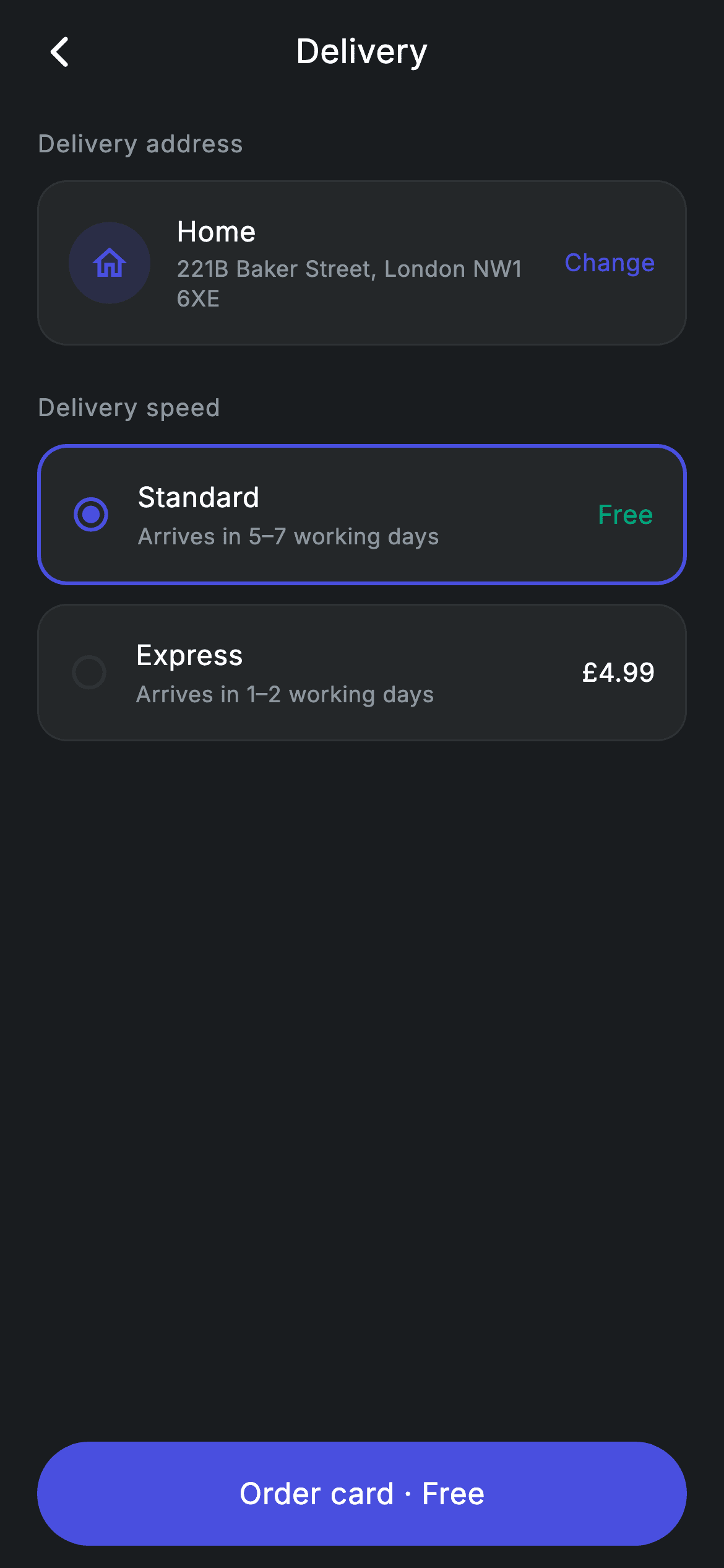
Ordering a physical bank card ends with two questions: where should it go, and how fast? This screen answers both. A confirmed 'Home' address sits in a rounded card with a 'Change' action, and below it two tappable rows — Standard (free, 5–7 days) and Express (£4.99, 1–2 days) — behave like radio buttons. Choosing one repaints its border indigo and rewrites the bottom button from 'Order card · Free' to 'Order card · £4.99'. You'll build all of it in pure Flutter from a single int of state and a Dart record list.
Watch the Flutter UI walkthrough
A short screen recording of Fintech · Card Delivery running, if you'd rather see it before you read the code. The written tutorial below covers everything in it.
Can't see the video? Watch it on YouTube.
What you'll build
- ✓A dark checkout screen driven by one `int _speed` — the selected row, its border, and the button's price label all read from it
- ✓Two delivery-speed rows generated from a typed Dart record list, so adding a third tier is one line
- ✓An address card with a tinted circular home icon, two-line address text and an inline 'Change' link
- ✓A pill-shaped `Material` + `InkWell` order button pinned below a scrolling `ListView`, with a price that updates on selection
- ✓A reusable dark palette (#191C1F canvas, #242729 surfaces, #494FDF brand, #2E3235 hairlines) and the bundled Inter font
Step-by-step build
Create the file
Add a new file at lib/fintech_card_delivery/fintech_card_delivery_screen.dart in your Flutter project.
Register the bundled fonts
No external packages — this is pure Flutter. It does bundle its design font (Inter), so drop the font file into fonts/ and declare it in pubspec.yaml:
flutter:
  fonts:
    - family: Inter
      fonts:
- asset: fonts/Inter-Regular.ttfBuild it, piece by piece
Here's how the screen goes together. Each block below is a real slice of the code with a plain-English explanation — paste them in order, or grab the whole file from the next section.
State, colour tokens, and the delivery-speed records
import 'package:flutter/material.dart';

/// Card Delivery — confirm address and pick a delivery speed. Self-contained per
/// CONVENTIONS.md: pure Flutter, bundled Inter font, forced dark theme. Stateful:
/// the chosen delivery speed updates the ETA and CTA.
class FintechCardDeliveryScreen extends StatefulWidget {
  const FintechCardDeliveryScreen({super.key, this.onBack, this.onOrder});

  final VoidCallback? onBack;
  final VoidCallback? onOrder;

  @override
  State<FintechCardDeliveryScreen> createState() =>
      _FintechCardDeliveryScreenState();
}

class _FintechCardDeliveryScreenState extends State<FintechCardDeliveryScreen> {
  static const String _font = 'Inter';
  static const Color _bg = Color(0xFF191C1F);
  static const Color _surface = Color(0xFF242729);
  static const Color _brand = Color(0xFF494FDF);
  static const Color _teal = Color(0xFF00A87E);
  static const Color _muted = Color(0xFF8D969E);
  static const Color _hairline = Color(0xFF2E3235);

  static const List<({String name, String eta, String price})> _speeds =
      <({String name, String eta, String price})>[
    (name: 'Standard', eta: 'Arrives in 5–7 working days', price: 'Free'),
    (name: 'Express', eta: 'Arrives in 1–2 working days', price: '£4.99'),
  ];

  int _speed = 0;
`FintechCardDeliveryScreen` is a `StatefulWidget` because one thing changes: which delivery speed is chosen. It exposes two optional callbacks, `onBack` and `onOrder`, so the host app decides what navigation and ordering actually mean. Inside the state class, six `static const Color` tokens name the palette — `_bg` (#191C1F) for the canvas, `_surface` (#242729) for cards, `_brand` (#494FDF) indigo for selection, `_teal` (#00A87E) reserved for the word 'Free', `_muted` (#8D969E) for secondary text and `_hairline` (#2E3235) for borders. `_speeds` is a `List` of Dart 3 **records** typed `({String name, String eta, String price})`; each entry carries its label, ETA copy and price together, which is why the UI code below never hard-codes a second option. `int _speed = 0` is the entire state of the screen — index 0, Standard, is selected by default.
Dark theme, scrolling body, and the generated speed rows
  @override
  Widget build(BuildContext context) {
    return Theme(
      data: ThemeData.dark(useMaterial3: true),
      child: Scaffold(
        backgroundColor: _bg,
        body: SafeArea(
          child: Column(
            crossAxisAlignment: CrossAxisAlignment.stretch,
            children: <Widget>[
              _appBar(context),
              Expanded(
                child: ListView(
                  physics: const BouncingScrollPhysics(),
                  padding: const EdgeInsets.fromLTRB(20, 8, 20, 24),
                  children: <Widget>[
                    _label('Delivery address'),
                    _addressCard(),
                    const SizedBox(height: 24),
                    _label('Delivery speed'),
                    for (int i = 0; i < _speeds.length; i++) ...<Widget>[
                      _speedRow(i),
                      const SizedBox(height: 10),
                    ],
                  ],
                ),
              ),
`build()` wraps everything in `Theme(data: ThemeData.dark(useMaterial3: true))` so the screen stays dark even if the surrounding app is in light mode — useful when you drop this in as a standalone route. The `Scaffold` is painted `_bg`, `SafeArea` clears the notch and home indicator, and a `Column` with `crossAxisAlignment: CrossAxisAlignment.stretch` makes children fill the width. The custom `_appBar` sits at the top, then an `Expanded` `ListView` takes all remaining height with `BouncingScrollPhysics` and 20px side padding. Inside it, a plain `for` loop with the spread operator (`...<Widget>[]`) emits one `_speedRow(i)` plus a 10px gap for every record in `_speeds` — that's how the list stays data-driven rather than two copy-pasted widgets.
The price-aware order button
              Padding(
                padding: const EdgeInsets.fromLTRB(20, 4, 20, 12),
                child: SizedBox(
                  height: 56,
                  child: Material(
                    color: _brand,
                    borderRadius: BorderRadius.circular(9999),
                    child: InkWell(
                      borderRadius: BorderRadius.circular(9999),
                      onTap: widget.onOrder,
                      child: Center(
                        child: Text(
                          _speed == 0 ? 'Order card · Free' : 'Order card · £4.99',
                          style: const TextStyle(
                            fontFamily: _font,
                            fontSize: 16,
                            fontWeight: FontWeight.w500,
                            letterSpacing: 0.24,
                            color: Colors.white,
                          ),
                        ),
                      ),
                    ),
                  ),
                ),
              ),
            ],
          ),
        ),
      ),
    );
  }
Because the button lives outside the `Expanded` `ListView`, it is pinned to the bottom and never scrolls away. `SizedBox(height: 56)` fixes the touch target, and `Material(color: _brand, borderRadius: BorderRadius.circular(9999))` gives the fully-rounded indigo pill; the same 9999 radius is repeated on the `InkWell` so the ripple is clipped to the pill instead of splashing into the corners. The label is the payoff of the whole screen: `_speed == 0 ? 'Order card · Free' : 'Order card · £4.99'` re-reads the state on every rebuild, so tapping a speed row instantly changes the price the user is about to confirm. The tap itself just fires `widget.onOrder` — this is a UI screen, so there's no payment call behind it.
A centred app bar and the small section labels
  Widget _appBar(BuildContext context) {
    return Padding(
      padding: const EdgeInsets.fromLTRB(8, 4, 8, 8),
      child: Row(
        children: <Widget>[
          IconButton(
            onPressed: widget.onBack ?? () => Navigator.of(context).maybePop(),
            icon: const Icon(Icons.arrow_back_ios_new_rounded,
                size: 20, color: Colors.white),
          ),
          const Expanded(
            child: Text(
              'Delivery',
              textAlign: TextAlign.center,
              style: TextStyle(
                fontFamily: _font,
                fontSize: 18,
                fontWeight: FontWeight.w500,
                letterSpacing: 0.24,
                color: Colors.white,
              ),
            ),
          ),
          const SizedBox(width: 48),
        ],
      ),
    );
  }

  Widget _label(String s) => Padding(
        padding: const EdgeInsets.only(bottom: 10),
        child: Text(
          s,
          style: const TextStyle(
            fontFamily: _font,
            fontSize: 13,
            fontWeight: FontWeight.w500,
            letterSpacing: 0.5,
            color: _muted,
          ),
        ),
      );
`_appBar` is a hand-rolled `Row` rather than an `AppBar`, which keeps the padding tight (8/4/8/8) and the title flush with the list below. The leading `IconButton` uses `Icons.arrow_back_ios_new_rounded` and falls back to `Navigator.of(context).maybePop()` when no `onBack` is supplied, so the screen works even if you forget to wire it. The trick for the centred 'Delivery' title is the `Expanded` text with `textAlign: TextAlign.center` balanced by a `SizedBox(width: 48)` on the right — that 48px stands in for the invisible trailing button so the title lands in the true centre. `_label` is a one-line helper for the 13px muted, 0.5-letter-spaced 'Delivery address' and 'Delivery speed' headings, with 10px of bottom padding baked in.
The delivery address card
  Widget _addressCard() {
    return Container(
      padding: const EdgeInsets.all(16),
      decoration: BoxDecoration(
        color: _surface,
        borderRadius: BorderRadius.circular(16),
        border: Border.all(color: _hairline),
      ),
      child: Row(
        children: <Widget>[
          Container(
            width: 44,
            height: 44,
            decoration: BoxDecoration(
              shape: BoxShape.circle,
              color: _brand.withValues(alpha: 0.16),
            ),
            child: const Icon(Icons.home_outlined, size: 22, color: _brand),
          ),
          const SizedBox(width: 14),
          const Expanded(
            child: Column(
              crossAxisAlignment: CrossAxisAlignment.start,
              children: <Widget>[
                Text(
                  'Home',
                  style: TextStyle(
                    fontFamily: _font,
                    fontSize: 15,
                    fontWeight: FontWeight.w500,
                    letterSpacing: 0.24,
                    color: Colors.white,
                  ),
                ),
                SizedBox(height: 2),
                Text(
                  '221B Baker Street, London NW1 6XE',
                  style: TextStyle(
                    fontFamily: _font,
                    fontSize: 12,
                    height: 1.3,
                    letterSpacing: 0.24,
                    color: _muted,
                  ),
                ),
              ],
            ),
          ),
          const Text(
            'Change',
            style: TextStyle(
              fontFamily: _font,
              fontSize: 13,
              fontWeight: FontWeight.w500,
              letterSpacing: 0.24,
              color: _brand,
            ),
          ),
        ],
      ),
    );
  }
`_addressCard` is a `Container` on `_surface` with a 16px radius and a 1px `_hairline` border — the standard card recipe reused by the speed rows below. Its leading element is a 44×44 circle (`shape: BoxShape.circle`) filled with `_brand.withValues(alpha: 0.16)`, giving a soft indigo wash behind a solid `_brand` `Icons.home_outlined` glyph; tinting the brand colour at low alpha is cheaper and more consistent than shipping a coloured asset. The middle `Expanded` `Column` stacks the 15px white 'Home' nickname over the 12px muted '221B Baker Street, London NW1 6XE' line, with `height: 1.3` so a wrapped address stays readable. The trailing 'Change' text is styled in `_brand` to read as a link — note it's a plain `Text`, so if you want it interactive you wrap it in a `GestureDetector` or `TextButton` yourself.
Selectable speed rows built from the records
  Widget _speedRow(int i) {
    final ({String name, String eta, String price}) s = _speeds[i];
    final bool active = i == _speed;
    return GestureDetector(
      onTap: () => setState(() => _speed = i),
      behavior: HitTestBehavior.opaque,
      child: Container(
        padding: const EdgeInsets.all(16),
        decoration: BoxDecoration(
          color: _surface,
          borderRadius: BorderRadius.circular(16),
          border: Border.all(
            color: active ? _brand : _hairline,
            width: active ? 2 : 1,
          ),
        ),
        child: Row(
          children: <Widget>[
            Icon(
              active
                  ? Icons.radio_button_checked_rounded
                  : Icons.radio_button_unchecked_rounded,
              size: 22,
              color: active ? _brand : _hairline,
            ),
            const SizedBox(width: 14),
            Expanded(
              child: Column(
                crossAxisAlignment: CrossAxisAlignment.start,
                children: <Widget>[
                  Text(
                    s.name,
                    style: const TextStyle(
                      fontFamily: _font,
                      fontSize: 15,
                      fontWeight: FontWeight.w500,
                      letterSpacing: 0.24,
                      color: Colors.white,
                    ),
                  ),
                  const SizedBox(height: 2),
                  Text(
                    s.eta,
                    style: const TextStyle(
                      fontFamily: _font,
                      fontSize: 12,
                      letterSpacing: 0.24,
                      color: _muted,
                    ),
                  ),
                ],
              ),
            ),
            Text(
              s.price,
              style: TextStyle(
                fontFamily: _font,
                fontSize: 14,
                fontWeight: FontWeight.w500,
                letterSpacing: 0.24,
                color: s.price == 'Free' ? _teal : Colors.white,
              ),
            ),
          ],
        ),
      ),
    );
  }
}
`_speedRow(i)` destructures `_speeds[i]` into `s` and computes `final bool active = i == _speed;` — that single boolean drives three visual changes at once. The `GestureDetector` uses `behavior: HitTestBehavior.opaque` so the whole card area is tappable, including the padding, and `onTap` calls `setState(() => _speed = i)`. When `active`, the border becomes `_brand` at 2px instead of `_hairline` at 1px, and the icon swaps from `Icons.radio_button_unchecked_rounded` to `Icons.radio_button_checked_rounded` in indigo — no `Radio` widget or `RadioListTile` needed. The text column shows `s.name` at 15px white over `s.eta` at 12px muted, and the trailing price uses a conditional colour: `s.price == 'Free' ? _teal : Colors.white`, which is why the free option's price reads green while '£4.99' stays white.
Full code
The complete, ready-to-paste source. Free to use in your projects — one click copies it all.
import 'package:flutter/material.dart';

/// Card Delivery — confirm address and pick a delivery speed. Self-contained per
/// CONVENTIONS.md: pure Flutter, bundled Inter font, forced dark theme. Stateful:
/// the chosen delivery speed updates the ETA and CTA.
class FintechCardDeliveryScreen extends StatefulWidget {
  const FintechCardDeliveryScreen({super.key, this.onBack, this.onOrder});

  final VoidCallback? onBack;
  final VoidCallback? onOrder;

  @override
  State<FintechCardDeliveryScreen> createState() =>
      _FintechCardDeliveryScreenState();
}

class _FintechCardDeliveryScreenState extends State<FintechCardDeliveryScreen> {
  static const String _font = 'Inter';
  static const Color _bg = Color(0xFF191C1F);
  static const Color _surface = Color(0xFF242729);
  static const Color _brand = Color(0xFF494FDF);
  static const Color _teal = Color(0xFF00A87E);
  static const Color _muted = Color(0xFF8D969E);
  static const Color _hairline = Color(0xFF2E3235);

  static const List<({String name, String eta, String price})> _speeds =
      <({String name, String eta, String price})>[
    (name: 'Standard', eta: 'Arrives in 5–7 working days', price: 'Free'),
    (name: 'Express', eta: 'Arrives in 1–2 working days', price: '£4.99'),
  ];

  int _speed = 0;

  @override
  Widget build(BuildContext context) {
    return Theme(
      data: ThemeData.dark(useMaterial3: true),
      child: Scaffold(
        backgroundColor: _bg,
        body: SafeArea(
          child: Column(
            crossAxisAlignment: CrossAxisAlignment.stretch,
            children: <Widget>[
              _appBar(context),
              Expanded(
                child: ListView(
                  physics: const BouncingScrollPhysics(),
                  padding: const EdgeInsets.fromLTRB(20, 8, 20, 24),
                  children: <Widget>[
                    _label('Delivery address'),
                    _addressCard(),
                    const SizedBox(height: 24),
                    _label('Delivery speed'),
                    for (int i = 0; i < _speeds.length; i++) ...<Widget>[
                      _speedRow(i),
                      const SizedBox(height: 10),
                    ],
                  ],
                ),
              ),
              Padding(
                padding: const EdgeInsets.fromLTRB(20, 4, 20, 12),
                child: SizedBox(
                  height: 56,
                  child: Material(
                    color: _brand,
                    borderRadius: BorderRadius.circular(9999),
                    child: InkWell(
                      borderRadius: BorderRadius.circular(9999),
                      onTap: widget.onOrder,
                      child: Center(
                        child: Text(
                          _speed == 0 ? 'Order card · Free' : 'Order card · £4.99',
                          style: const TextStyle(
                            fontFamily: _font,
                            fontSize: 16,
                            fontWeight: FontWeight.w500,
                            letterSpacing: 0.24,
                            color: Colors.white,
                          ),
                        ),
                      ),
                    ),
                  ),
                ),
              ),
            ],
          ),
        ),
      ),
    );
  }

  Widget _appBar(BuildContext context) {
    return Padding(
      padding: const EdgeInsets.fromLTRB(8, 4, 8, 8),
      child: Row(
        children: <Widget>[
          IconButton(
            onPressed: widget.onBack ?? () => Navigator.of(context).maybePop(),
            icon: const Icon(Icons.arrow_back_ios_new_rounded,
                size: 20, color: Colors.white),
          ),
          const Expanded(
            child: Text(
              'Delivery',
              textAlign: TextAlign.center,
              style: TextStyle(
                fontFamily: _font,
                fontSize: 18,
                fontWeight: FontWeight.w500,
                letterSpacing: 0.24,
                color: Colors.white,
              ),
            ),
          ),
          const SizedBox(width: 48),
        ],
      ),
    );
  }

  Widget _label(String s) => Padding(
        padding: const EdgeInsets.only(bottom: 10),
        child: Text(
          s,
          style: const TextStyle(
            fontFamily: _font,
            fontSize: 13,
            fontWeight: FontWeight.w500,
            letterSpacing: 0.5,
            color: _muted,
          ),
        ),
      );

  Widget _addressCard() {
    return Container(
      padding: const EdgeInsets.all(16),
      decoration: BoxDecoration(
        color: _surface,
        borderRadius: BorderRadius.circular(16),
        border: Border.all(color: _hairline),
      ),
      child: Row(
        children: <Widget>[
          Container(
            width: 44,
            height: 44,
            decoration: BoxDecoration(
              shape: BoxShape.circle,
              color: _brand.withValues(alpha: 0.16),
            ),
            child: const Icon(Icons.home_outlined, size: 22, color: _brand),
          ),
          const SizedBox(width: 14),
          const Expanded(
            child: Column(
              crossAxisAlignment: CrossAxisAlignment.start,
              children: <Widget>[
                Text(
                  'Home',
                  style: TextStyle(
                    fontFamily: _font,
                    fontSize: 15,
                    fontWeight: FontWeight.w500,
                    letterSpacing: 0.24,
                    color: Colors.white,
                  ),
                ),
                SizedBox(height: 2),
                Text(
                  '221B Baker Street, London NW1 6XE',
                  style: TextStyle(
                    fontFamily: _font,
                    fontSize: 12,
                    height: 1.3,
                    letterSpacing: 0.24,
                    color: _muted,
                  ),
                ),
              ],
            ),
          ),
          const Text(
            'Change',
            style: TextStyle(
              fontFamily: _font,
              fontSize: 13,
              fontWeight: FontWeight.w500,
              letterSpacing: 0.24,
              color: _brand,
            ),
          ),
        ],
      ),
    );
  }

  Widget _speedRow(int i) {
    final ({String name, String eta, String price}) s = _speeds[i];
    final bool active = i == _speed;
    return GestureDetector(
      onTap: () => setState(() => _speed = i),
      behavior: HitTestBehavior.opaque,
      child: Container(
        padding: const EdgeInsets.all(16),
        decoration: BoxDecoration(
          color: _surface,
          borderRadius: BorderRadius.circular(16),
          border: Border.all(
            color: active ? _brand : _hairline,
            width: active ? 2 : 1,
          ),
        ),
        child: Row(
          children: <Widget>[
            Icon(
              active
                  ? Icons.radio_button_checked_rounded
                  : Icons.radio_button_unchecked_rounded,
              size: 22,
              color: active ? _brand : _hairline,
            ),
            const SizedBox(width: 14),
            Expanded(
              child: Column(
                crossAxisAlignment: CrossAxisAlignment.start,
                children: <Widget>[
                  Text(
                    s.name,
                    style: const TextStyle(
                      fontFamily: _font,
                      fontSize: 15,
                      fontWeight: FontWeight.w500,
                      letterSpacing: 0.24,
                      color: Colors.white,
                    ),
                  ),
                  const SizedBox(height: 2),
                  Text(
                    s.eta,
                    style: const TextStyle(
                      fontFamily: _font,
                      fontSize: 12,
                      letterSpacing: 0.24,
                      color: _muted,
                    ),
                  ),
                ],
              ),
            ),
            Text(
              s.price,
              style: TextStyle(
                fontFamily: _font,
                fontSize: 14,
                fontWeight: FontWeight.w500,
                letterSpacing: 0.24,
                color: s.price == 'Free' ? _teal : Colors.white,
              ),
            ),
          ],
        ),
      ),
    );
  }
}
Plus bundled 1 binary asset (fonts/images). The CLI and MCP install those for you automatically.
Two faster ways to add it
Copy-paste works, but you can skip it entirely.
1. FlutterKit CLI
One command drops this screen — and its fonts — straight into your project.
$ flutterkit add fintech-card-delivery2. AI agent (MCP)
Connect FlutterKit's MCP server in Claude or Cursor and just ask your agent to install fintech-card-delivery — it fetches and writes the files for you.
FAQ
Can I use this card-delivery screen in a commercial app?
Yes. The full Dart for `FintechCardDeliveryScreen` on this page is free to copy into personal or commercial projects. Paste it straight in, run `flutterkit add fintech-card-delivery` with the CLI, or let an AI agent install it for you over MCP.
Do the radio rows or the pill button need any packages?
No — `packages` is empty for this screen. The selection icons are stock Material icons (`radio_button_checked_rounded` / `radio_button_unchecked_rounded`) and the order button is just `Material` + `InkWell`, so everything comes from `package:flutter/material.dart`. The one bundled asset is the Inter font used by every `TextStyle` here; register it in `pubspec.yaml` as shown in step 2, or let the CLI and MCP copy the font file in for you.
What Flutter SDK does this screen need?
Two modern APIs set the floor. The `_speeds` list uses Dart 3 records (`({String name, String eta, String price})`), so you need Dart 3 / Flutter 3.10 or newer, and the address icon's tint calls `Color.withValues(alpha: 0.16)`, which arrived in Flutter 3.27. On an older SDK, change that one call to `withOpacity(0.16)`; if you're stuck before Dart 3, replace the record list with a tiny `class Speed { final String name, eta, price; ... }` and the rest compiles unchanged.


