How to Build a Card Ordered Screen in Flutter (Full Code + Preview)
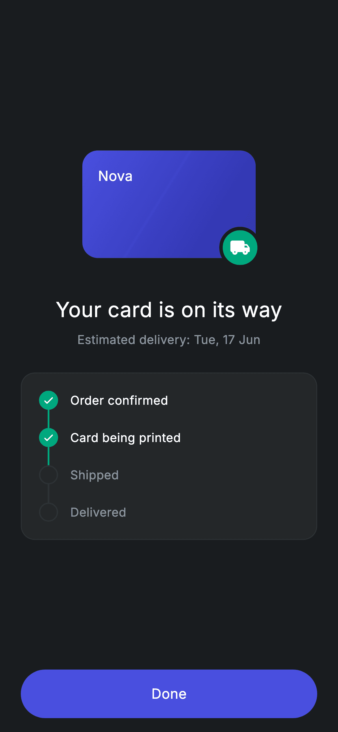
Once a user orders a physical debit card, the app owes them one answer: where is it? This tutorial builds that answer screen in Flutter — a gradient 'Nova' card illustration with a teal shipping badge hanging off its corner, an estimated-delivery line, and a vertical four-step tracker that checks off 'Order confirmed' and 'Card being printed' while 'Shipped' and 'Delivered' stay hollow. Along the way you'll see how a const list of Dart 3 records drives every step, and why IntrinsicHeight is what makes the connector lines stretch correctly.
Watch the Flutter UI walkthrough
A short screen recording of Fintech · Card Ordered running, if you'd rather see it before you read the code. The written tutorial below covers everything in it.
Can't see the video? Watch it on YouTube.
What you'll build
- ✓A 200×130 Stack with clipBehavior: Clip.none so a 48px teal shipping badge can hang 6px outside the gradient card
- ✓A vertical four-step delivery tracker generated from one const list of records — no copy-pasted step widgets
- ✓Connector lines that size themselves to each label using IntrinsicHeight plus an Expanded 2px bar
- ✓Completed vs pending styling driven by a single bool: a filled teal circle with a check, or a hollow hairline ring
- ✓A stateless, self-contained dark screen with a pill-shaped 'Done' button wired to one optional onDone callback
Step-by-step build
Create the file
Add a new file at lib/fintech_card_ordered/fintech_card_ordered_screen.dart in your Flutter project.
Register the bundled fonts
No external packages — this is pure Flutter. It does bundle its design font (Inter), so drop the font file into fonts/ and declare it in pubspec.yaml:
flutter:
  fonts:
    - family: Inter
      fonts:
- asset: fonts/Inter-Regular.ttfBuild it, piece by piece
Here's how the screen goes together. Each block below is a real slice of the code with a plain-English explanation — paste them in order, or grab the whole file from the next section.
Tokens and the record list that drives the tracker
import 'package:flutter/material.dart';

/// Card Ordered — physical card order confirmation with a delivery tracker.
/// Self-contained per CONVENTIONS.md: pure Flutter, bundled Inter font, forced
/// dark theme so it renders standalone as a route.
class FintechCardOrderedScreen extends StatelessWidget {
  const FintechCardOrderedScreen({super.key, this.onDone});

  final VoidCallback? onDone;

  static const String _font = 'Inter';
  static const Color _bg = Color(0xFF191C1F);
  static const Color _surface = Color(0xFF242729);
  static const Color _brand = Color(0xFF494FDF);
  static const Color _teal = Color(0xFF00A87E);
  static const Color _muted = Color(0xFF8D969E);
  static const Color _hairline = Color(0xFF2E3235);

  static const List<({String label, bool done})> _steps =
      <({String label, bool done})>[
    (label: 'Order confirmed', done: true),
    (label: 'Card being printed', done: true),
    (label: 'Shipped', done: false),
    (label: 'Delivered', done: false),
  ];
FintechCardOrderedScreen is a StatelessWidget — nothing on this screen ever changes after it's drawn, so there's no need for state. It takes one optional VoidCallback? onDone, which the bottom button fires. Six private const Colors act as design tokens: _bg (#191C1F) is the near-black canvas, _surface (#242729) is the tracker card, _brand (#494FDF) is the indigo used for both the card gradient and the button, _teal (#00A87E) marks anything completed, _muted (#8D969E) is secondary text, and _hairline (#2E3235) draws 1px borders and inactive connectors. The interesting part is _steps: a const List of Dart 3 records typed ({String label, bool done}). A record is an anonymous, lightweight tuple with named fields — you get s.label and s.done without writing a class. Four entries describe the journey, the first two marked done: true, so the tracker's state is pure data you can swap out in one place.
Forcing dark mode and framing the page
  @override
  Widget build(BuildContext context) {
    return Theme(
      data: ThemeData.dark(useMaterial3: true),
      child: Scaffold(
        backgroundColor: _bg,
        body: SafeArea(
          child: Padding(
            padding: const EdgeInsets.fromLTRB(24, 24, 24, 16),
            child: Column(
              crossAxisAlignment: CrossAxisAlignment.stretch,
              children: <Widget>[
                const Spacer(),
                Center(
                  child: SizedBox(
                    width: 200,
                    height: 130,
                    child: Stack(
                      clipBehavior: Clip.none,
                      children: <Widget>[
build() wraps everything in a Theme with ThemeData.dark(useMaterial3: true). That's deliberate: the screen is designed for a dark canvas, and wrapping it locally means it still renders correctly even if you drop it into an app whose global theme is light. Inside sits a Scaffold painted _bg, a SafeArea to clear the notch and home indicator, and EdgeInsets.fromLTRB(24, 24, 24, 16) — slightly tighter at the bottom because the button already has visual weight. The Column uses CrossAxisAlignment.stretch so the tracker card and the button both run edge to edge, and it opens with a Spacer(); a second Spacer() appears later, and the matching pair is what vertically centres the whole content block between the safe-area edges.
The gradient card and its overhanging shipping badge
                        Container(
                          width: 200,
                          height: 124,
                          padding: const EdgeInsets.all(18),
                          decoration: BoxDecoration(
                            borderRadius: BorderRadius.circular(18),
                            gradient: const LinearGradient(
                              begin: Alignment.topLeft,
                              end: Alignment.bottomRight,
                              colors: <Color>[_brand, Color(0xFF2D31A6)],
                            ),
                          ),
                          child: const Align(
                            alignment: Alignment.topLeft,
                            child: Text(
                              'Nova',
                              style: TextStyle(
                                fontFamily: _font,
                                fontSize: 16,
                                fontWeight: FontWeight.w500,
                                color: Colors.white,
                              ),
                            ),
                          ),
                        ),
                        Positioned(
                          right: -6,
                          bottom: -6,
                          child: Container(
                            width: 48,
                            height: 48,
                            decoration: BoxDecoration(
                              shape: BoxShape.circle,
                              color: _teal,
                              border: Border.all(color: _bg, width: 4),
                            ),
                            child: const Icon(Icons.local_shipping_rounded,
                                size: 24, color: Colors.white),
                          ),
                        ),
                      ],
                    ),
                  ),
                ),
The illustration is a Stack inside a 200×130 SizedBox, while the card itself is only 200×124 — the extra 6px of room is what the badge overhangs into. The card is a Container with an 18px corner radius and a LinearGradient running topLeft → bottomRight from _brand to a deeper #2D31A6, with the 'Nova' wordmark pinned by Align(alignment: Alignment.topLeft) inside 18px of padding. The badge is a Positioned at right: -6, bottom: -6 — negative offsets, which only render because the Stack sets clipBehavior: Clip.none (the default, Clip.hardEdge, would slice it off). It's a 48px teal circle holding Icons.local_shipping_rounded, and its Border.all(color: _bg, width: 4) is a classic trick: the ring is painted in the page's own background colour, so it reads as a gap punched through the card edge rather than a visible outline.
Headline, delivery date, and the tracker card
                const SizedBox(height: 36),
                const Text(
                  'Your card is on its way',
                  textAlign: TextAlign.center,
                  style: TextStyle(
                    fontFamily: _font,
                    fontSize: 24,
                    fontWeight: FontWeight.w500,
                    letterSpacing: 0.24,
                    color: Colors.white,
                  ),
                ),
                const SizedBox(height: 8),
                const Text(
                  'Estimated delivery: Tue, 17 Jun',
                  textAlign: TextAlign.center,
                  style: TextStyle(
                    fontFamily: _font,
                    fontSize: 14,
                    letterSpacing: 0.24,
                    color: _muted,
                  ),
                ),
                const SizedBox(height: 28),
                Container(
                  padding: const EdgeInsets.all(20),
                  decoration: BoxDecoration(
                    color: _surface,
                    borderRadius: BorderRadius.circular(16),
                    border: Border.all(color: _hairline),
                  ),
                  child: Column(
                    children: <Widget>[
                      for (int i = 0; i < _steps.length; i++) _step(i),
                    ],
                  ),
                ),
                const Spacer(),
Below a 36px gap, 'Your card is on its way' is set at 24px, FontWeight.w500, letterSpacing 0.24 in white, with the 14px 'Estimated delivery: Tue, 17 Jun' line 8px under it in _muted — the size and colour contrast alone establish the hierarchy, no extra styling needed. The tracker is a Container with 20px padding, _surface fill, a 16px radius, and a 1px _hairline border. Its children come from a collection-for: `for (int i = 0; i < _steps.length; i++) _step(i)` builds one row per record inline, right in the Column's children list. Passing the index rather than the record lets _step work out whether it's the last item. A second Spacer() then pushes the button to the bottom.
A pill-shaped Done button with a clipped ripple
                SizedBox(
                  height: 56,
                  child: Material(
                    color: _brand,
                    borderRadius: BorderRadius.circular(9999),
                    child: InkWell(
                      borderRadius: BorderRadius.circular(9999),
                      onTap: onDone,
                      child: const Center(
                        child: Text(
                          'Done',
                          style: TextStyle(
                            fontFamily: _font,
                            fontSize: 16,
                            fontWeight: FontWeight.w500,
                            letterSpacing: 0.24,
                            color: Colors.white,
                          ),
                        ),
                      ),
                    ),
                  ),
                ),
              ],
            ),
          ),
        ),
      ),
    );
  }
The CTA is a SizedBox(height: 56) holding a Material coloured _brand with borderRadius: BorderRadius.circular(9999) — a radius far larger than half the height, which Flutter clamps into a perfect pill. The InkWell inside repeats the same 9999 radius, and that repetition matters: Material paints the shape, but the InkWell needs its own borderRadius or the touch ripple would splash out as a rectangle over the rounded corners. onTap is handed onDone directly, so if the parent passes null the button is automatically inert and shows no ripple — Flutter's standard disabled behaviour for a null callback. The 'Done' label is centred at 16px w500 white with the same 0.24 letterSpacing used across the screen.
One step row: circle, connector, label
  Widget _step(int i) {
    final ({String label, bool done}) s = _steps[i];
    final bool last = i == _steps.length - 1;
    final bool active = s.done;
    return IntrinsicHeight(
      child: Row(
        crossAxisAlignment: CrossAxisAlignment.start,
        children: <Widget>[
          Column(
            children: <Widget>[
              Container(
                width: 22,
                height: 22,
                decoration: BoxDecoration(
                  shape: BoxShape.circle,
                  color: active ? _teal : Colors.transparent,
                  border: Border.all(
                    color: active ? _teal : _hairline,
                    width: 1.5,
                  ),
                ),
                child: active
                    ? const Icon(Icons.check_rounded, size: 14, color: Colors.white)
                    : null,
              ),
              if (!last)
                Expanded(
                  child: Container(
                    width: 2,
                    color: active ? _teal : _hairline,
                  ),
                ),
            ],
          ),
          const SizedBox(width: 14),
          Padding(
            padding: EdgeInsets.only(bottom: last ? 0 : 22, top: 1),
            child: Text(
              s.label,
              style: TextStyle(
                fontFamily: _font,
                fontSize: 14,
                fontWeight: active ? FontWeight.w500 : FontWeight.w400,
                letterSpacing: 0.24,
                color: active ? Colors.white : _muted,
              ),
            ),
          ),
        ],
      ),
    );
  }
}
_step(i) pulls the record out of _steps and derives two booleans: last (is this the final step?) and active (is s.done?). Everything else is those two flags applied to styling. The whole row is wrapped in IntrinsicHeight, and that's the load-bearing widget here — a Row gives its children unbounded height, so the Expanded connector inside the left Column would have nothing to expand into and would throw. IntrinsicHeight measures the tallest child first and gives the Row a definite height, letting the 2px connector bar stretch exactly as far as the label beside it is tall. The marker is a 22px circle: when active it's filled _teal with a 14px Icons.check_rounded; when not, it's transparent with a 1.5px _hairline ring and no child. The connector is skipped for the last step via `if (!last)`, and it takes its colour from the current step's active flag — so the line leaving a completed step stays teal even when the next step is still pending. On the right, 14px of gap, then the label at 14px, w500 white when done and w400 _muted when not, with 22px of bottom padding on every row except the last so the rhythm doesn't leave dead space under the final step.
Full code
The complete, ready-to-paste source. Free to use in your projects — one click copies it all.
import 'package:flutter/material.dart';

/// Card Ordered — physical card order confirmation with a delivery tracker.
/// Self-contained per CONVENTIONS.md: pure Flutter, bundled Inter font, forced
/// dark theme so it renders standalone as a route.
class FintechCardOrderedScreen extends StatelessWidget {
  const FintechCardOrderedScreen({super.key, this.onDone});

  final VoidCallback? onDone;

  static const String _font = 'Inter';
  static const Color _bg = Color(0xFF191C1F);
  static const Color _surface = Color(0xFF242729);
  static const Color _brand = Color(0xFF494FDF);
  static const Color _teal = Color(0xFF00A87E);
  static const Color _muted = Color(0xFF8D969E);
  static const Color _hairline = Color(0xFF2E3235);

  static const List<({String label, bool done})> _steps =
      <({String label, bool done})>[
    (label: 'Order confirmed', done: true),
    (label: 'Card being printed', done: true),
    (label: 'Shipped', done: false),
    (label: 'Delivered', done: false),
  ];

  @override
  Widget build(BuildContext context) {
    return Theme(
      data: ThemeData.dark(useMaterial3: true),
      child: Scaffold(
        backgroundColor: _bg,
        body: SafeArea(
          child: Padding(
            padding: const EdgeInsets.fromLTRB(24, 24, 24, 16),
            child: Column(
              crossAxisAlignment: CrossAxisAlignment.stretch,
              children: <Widget>[
                const Spacer(),
                Center(
                  child: SizedBox(
                    width: 200,
                    height: 130,
                    child: Stack(
                      clipBehavior: Clip.none,
                      children: <Widget>[
                        Container(
                          width: 200,
                          height: 124,
                          padding: const EdgeInsets.all(18),
                          decoration: BoxDecoration(
                            borderRadius: BorderRadius.circular(18),
                            gradient: const LinearGradient(
                              begin: Alignment.topLeft,
                              end: Alignment.bottomRight,
                              colors: <Color>[_brand, Color(0xFF2D31A6)],
                            ),
                          ),
                          child: const Align(
                            alignment: Alignment.topLeft,
                            child: Text(
                              'Nova',
                              style: TextStyle(
                                fontFamily: _font,
                                fontSize: 16,
                                fontWeight: FontWeight.w500,
                                color: Colors.white,
                              ),
                            ),
                          ),
                        ),
                        Positioned(
                          right: -6,
                          bottom: -6,
                          child: Container(
                            width: 48,
                            height: 48,
                            decoration: BoxDecoration(
                              shape: BoxShape.circle,
                              color: _teal,
                              border: Border.all(color: _bg, width: 4),
                            ),
                            child: const Icon(Icons.local_shipping_rounded,
                                size: 24, color: Colors.white),
                          ),
                        ),
                      ],
                    ),
                  ),
                ),
                const SizedBox(height: 36),
                const Text(
                  'Your card is on its way',
                  textAlign: TextAlign.center,
                  style: TextStyle(
                    fontFamily: _font,
                    fontSize: 24,
                    fontWeight: FontWeight.w500,
                    letterSpacing: 0.24,
                    color: Colors.white,
                  ),
                ),
                const SizedBox(height: 8),
                const Text(
                  'Estimated delivery: Tue, 17 Jun',
                  textAlign: TextAlign.center,
                  style: TextStyle(
                    fontFamily: _font,
                    fontSize: 14,
                    letterSpacing: 0.24,
                    color: _muted,
                  ),
                ),
                const SizedBox(height: 28),
                Container(
                  padding: const EdgeInsets.all(20),
                  decoration: BoxDecoration(
                    color: _surface,
                    borderRadius: BorderRadius.circular(16),
                    border: Border.all(color: _hairline),
                  ),
                  child: Column(
                    children: <Widget>[
                      for (int i = 0; i < _steps.length; i++) _step(i),
                    ],
                  ),
                ),
                const Spacer(),
                SizedBox(
                  height: 56,
                  child: Material(
                    color: _brand,
                    borderRadius: BorderRadius.circular(9999),
                    child: InkWell(
                      borderRadius: BorderRadius.circular(9999),
                      onTap: onDone,
                      child: const Center(
                        child: Text(
                          'Done',
                          style: TextStyle(
                            fontFamily: _font,
                            fontSize: 16,
                            fontWeight: FontWeight.w500,
                            letterSpacing: 0.24,
                            color: Colors.white,
                          ),
                        ),
                      ),
                    ),
                  ),
                ),
              ],
            ),
          ),
        ),
      ),
    );
  }

  Widget _step(int i) {
    final ({String label, bool done}) s = _steps[i];
    final bool last = i == _steps.length - 1;
    final bool active = s.done;
    return IntrinsicHeight(
      child: Row(
        crossAxisAlignment: CrossAxisAlignment.start,
        children: <Widget>[
          Column(
            children: <Widget>[
              Container(
                width: 22,
                height: 22,
                decoration: BoxDecoration(
                  shape: BoxShape.circle,
                  color: active ? _teal : Colors.transparent,
                  border: Border.all(
                    color: active ? _teal : _hairline,
                    width: 1.5,
                  ),
                ),
                child: active
                    ? const Icon(Icons.check_rounded, size: 14, color: Colors.white)
                    : null,
              ),
              if (!last)
                Expanded(
                  child: Container(
                    width: 2,
                    color: active ? _teal : _hairline,
                  ),
                ),
            ],
          ),
          const SizedBox(width: 14),
          Padding(
            padding: EdgeInsets.only(bottom: last ? 0 : 22, top: 1),
            child: Text(
              s.label,
              style: TextStyle(
                fontFamily: _font,
                fontSize: 14,
                fontWeight: active ? FontWeight.w500 : FontWeight.w400,
                letterSpacing: 0.24,
                color: active ? Colors.white : _muted,
              ),
            ),
          ),
        ],
      ),
    );
  }
}
Plus bundled 1 binary asset (fonts/images). The CLI and MCP install those for you automatically.
Two faster ways to add it
Copy-paste works, but you can skip it entirely.
1. FlutterKit CLI
One command drops this screen — and its fonts — straight into your project.
$ flutterkit add fintech-card-ordered2. AI agent (MCP)
Connect FlutterKit's MCP server in Claude or Cursor and just ask your agent to install fintech-card-ordered — it fetches and writes the files for you.
FAQ
Can I use this card-ordered confirmation screen in a commercial app?
Yes. The full Dart source on this page is free to copy into personal or commercial projects, tracker and all. Paste it straight in, run flutterkit add fintech-card-ordered with the CLI, or let an AI agent install it for you over MCP.
Do the shipping badge and check marks need an icon package?
No. Icons.local_shipping_rounded and Icons.check_rounded both ship with Flutter's built-in Material icon font, and the gradient card is a plain Container with a LinearGradient rather than an image asset. The screen depends on nothing beyond package:flutter/material.dart. The only bundled asset is the Inter font, which you register in pubspec.yaml as shown in step 2 — the CLI and MCP copy the font file in automatically.
What Flutter SDK does this screen require?
Dart 3, so Flutter 3.10 or newer. The blocker is the _steps list, typed List<({String label, bool done})> — records are a Dart 3 language feature. The constructor's super.key also needs Dart 2.17+. On an older SDK, replace the record with a tiny private class holding a final String label and final bool done, keep the same const list, and the rest of the screen compiles unchanged (there are no Color.withValues calls to swap out).


