How to Build a Face ID and Biometrics Settings Screen in Flutter (Full Code + Preview)
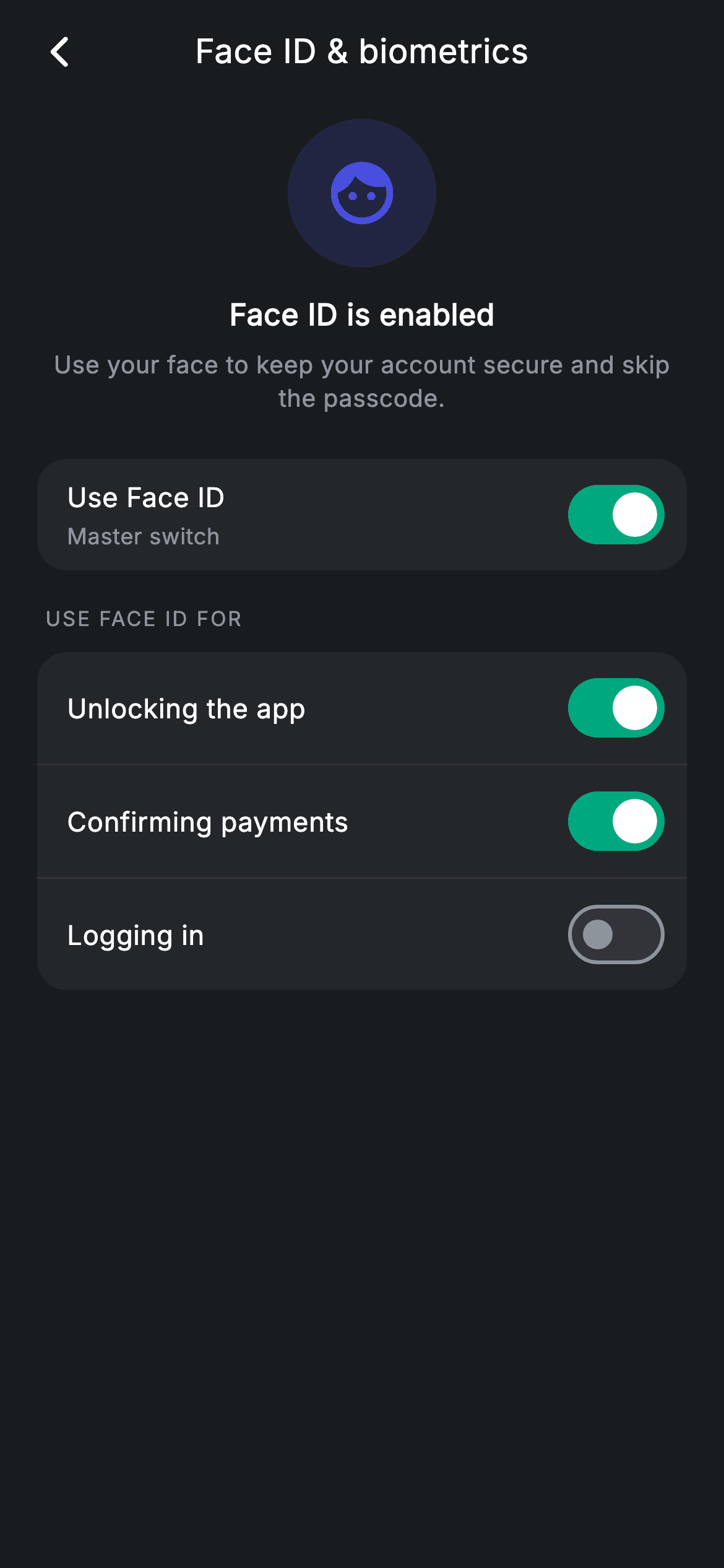
Biometric settings have a hierarchy problem: one master switch governs several sub-switches, and the sub-switches must clearly stop working when the master is off. This tutorial builds Nova's Face ID screen in Flutter, where the master toggle sits alone in its own card and three per-action toggles sit grouped below it. The disabling trick is worth learning on its own — the parent passes `null` instead of a callback, and a single `onChanged != null` check greys the label and deadens the Switch together.
Watch the Flutter UI walkthrough
A short screen recording of Biometrics Settings running, if you'd rather see it before you read the code. The written tutorial below covers everything in it.
Can't see the video? Watch it on YouTube.
What you'll build
- ✓A master switch that disables three dependent switches by withholding their callbacks
- ✓A tinted circular hero icon made from one brand colour at 18% alpha
- ✓A grouped settings card with hairline Dividers between rows and rounded outer corners
- ✓One row builder that handles titles, optional subtitles and the enabled/disabled look
Step-by-step build
Create the file
Add a new file at lib/fintech_biometrics_settings/fintech_biometrics_settings_screen.dart in your Flutter project.
Register the bundled fonts
No external packages — this is pure Flutter. It does bundle its design font (Inter), so drop the font file into fonts/ and declare it in pubspec.yaml:
flutter:
  fonts:
    - family: Inter
      fonts:
- asset: fonts/Inter-Regular.ttfBuild it, piece by piece
Here's how the screen goes together. Each block below is a real slice of the code with a plain-English explanation — paste them in order, or grab the whole file from the next section.
Four booleans and a palette
import 'package:flutter/material.dart';

/// Biometrics settings — Face ID toggles (Revolut-inspired design system).
///
/// Self-contained per CONVENTIONS.md: pure Flutter only, the exact design font
/// (Inter) is bundled under `fonts/`, no network/emoji images, and the screen
/// forces its own dark theme. A master toggle enables Face ID; per-action
/// toggles below it are disabled until the master is on.
class FintechBiometricsSettingsScreen extends StatefulWidget {
  const FintechBiometricsSettingsScreen({super.key, this.onBack});

  final VoidCallback? onBack;

  @override
  State<FintechBiometricsSettingsScreen> createState() =>
      _FintechBiometricsSettingsScreenState();
}

class _FintechBiometricsSettingsScreenState
    extends State<FintechBiometricsSettingsScreen> {
  static const String _font = 'Inter';
  static const Color _bg = Color(0xFF191C1F);
  static const Color _surface = Color(0xFF242729);
  static const Color _brand = Color(0xFF494FDF);
  static const Color _teal = Color(0xFF00A87E);
  static const Color _muted = Color(0xFF8D969E);
  static const Color _hairline = Color(0xFF2E3235);

  bool _master = true;
  bool _unlock = true;
  bool _payments = true;
  bool _login = false;
The state is four plain bools: `_master` for Face ID overall, then `_unlock`, `_payments` and `_login` for the individual actions. Three start `true` and `_login` starts `false`, so the screen opens showing a realistic mixed state rather than everything switched on. The palette adds `_teal` (#00A87E) and `_hairline` (#2E3235) to the usual set — teal is used only for the 'on' track of the switches, keeping the indigo `_brand` reserved for the hero icon so the two never compete for meaning in the same view.
Where the master/child relationship is expressed
  @override
  Widget build(BuildContext context) {
    return Theme(
      data: ThemeData.dark(useMaterial3: true),
      child: Scaffold(
        backgroundColor: _bg,
        body: SafeArea(
          child: Column(
            children: <Widget>[
              _buildAppBar(),
              Expanded(
                child: ListView(
                  physics: const BouncingScrollPhysics(),
                  padding: const EdgeInsets.fromLTRB(20, 8, 20, 24),
                  children: <Widget>[
                    _buildHero(),
                    const SizedBox(height: 24),
                    Container(
                      decoration: BoxDecoration(
                        color: _surface,
                        borderRadius: BorderRadius.circular(16),
                      ),
                      child: _switchRow('Use Face ID', 'Master switch', _master,
                          (bool v) => setState(() => _master = v)),
                    ),
                    const SizedBox(height: 18),
                    _label('Use Face ID for'),
                    Container(
                      decoration: BoxDecoration(
                        color: _surface,
                        borderRadius: BorderRadius.circular(16),
                      ),
                      child: Column(
                        children: <Widget>[
                          _switchRow('Unlocking the app', null, _unlock,
                              _master ? (bool v) => setState(() => _unlock = v) : null),
                          const Divider(height: 1, color: _hairline),
                          _switchRow('Confirming payments', null, _payments,
                              _master ? (bool v) => setState(() => _payments = v) : null),
                          const Divider(height: 1, color: _hairline),
                          _switchRow('Logging in', null, _login,
                              _master ? (bool v) => setState(() => _login = v) : null),
                        ],
                      ),
                    ),
                  ],
                ),
              ),
            ],
          ),
        ),
      ),
    );
  }
This is the important block. The master row gets a real callback unconditionally: `(bool v) => setState(() => _master = v)`. Each dependent row instead gets `_master ? (bool v) => setState(...) : null` — when the master is off, the child's `onChanged` is literally `null`. Flutter's `Switch` already treats a null `onChanged` as disabled, so no extra `enabled` flag has to be threaded through. Structurally, the master lives in its own `_surface` Container while the three children share a second Container with `Divider(height: 1, color: _hairline)` between them; grouping in separate cards is what tells the eye that one governs the others. Note `height: 1` on the Divider — the default is 16, which would add unwanted space between rows.
The hero: one colour at two alphas
  Widget _buildAppBar() {
    return Padding(
      padding: const EdgeInsets.fromLTRB(8, 4, 8, 4),
      child: Row(
        children: <Widget>[
          IconButton(
            onPressed: widget.onBack,
            icon: const Icon(Icons.arrow_back_ios_new_rounded,
                size: 20, color: Colors.white),
          ),
          const Expanded(
            child: Text(
              'Face ID & biometrics',
              textAlign: TextAlign.center,
              style: TextStyle(
                fontFamily: _font,
                fontSize: 18,
                fontWeight: FontWeight.w500,
                letterSpacing: 0.24,
                color: Colors.white,
              ),
            ),
          ),
          const SizedBox(width: 48),
        ],
      ),
    );
  }

  Widget _buildHero() {
    return Column(
      children: <Widget>[
        Container(
          width: 80,
          height: 80,
          decoration: BoxDecoration(
            color: _brand.withValues(alpha: 0.18),
            shape: BoxShape.circle,
          ),
          child: const Icon(Icons.face_rounded, size: 40, color: _brand),
        ),
        const SizedBox(height: 14),
        const Text(
          'Face ID is enabled',
          style: TextStyle(
            fontFamily: _font,
            fontSize: 16,
            fontWeight: FontWeight.w600,
            letterSpacing: 0.24,
            color: Colors.white,
          ),
        ),
        const SizedBox(height: 6),
        const Text(
          'Use your face to keep your account secure and skip the passcode.',
          textAlign: TextAlign.center,
          style: TextStyle(
            fontFamily: _font,
            fontSize: 13,
            height: 1.4,
            letterSpacing: 0.24,
            color: _muted,
          ),
        ),
      ],
    );
  }
After the standard back-bar Row, `_buildHero` builds the top-of-screen status block. The circle is an 80px Container filled with `_brand.withValues(alpha: 0.18)` holding a 40px `Icons.face_rounded` at full `_brand`. Deriving the tinted background from the same colour as the icon is the whole technique — it gives a coloured badge that always harmonises, and swapping `_brand` for any other hue keeps working with no second value to update. Below it, a 16px `w600` status line and a 13px `_muted` explanation at `height: 1.4` with `textAlign: TextAlign.center`, which is the readable line spacing for small centred body copy.
One row builder for every switch on the screen
  Widget _label(String text) {
    return Padding(
      padding: const EdgeInsets.only(left: 4, bottom: 10),
      child: Text(
        text.toUpperCase(),
        style: const TextStyle(
          fontFamily: _font,
          fontSize: 11,
          fontWeight: FontWeight.w500,
          letterSpacing: 1.0,
          color: _muted,
        ),
      ),
    );
  }

  Widget _switchRow(String title, String? sub, bool value,
      ValueChanged<bool>? onChanged) {
    final bool enabled = onChanged != null;
    return Padding(
      padding: const EdgeInsets.fromLTRB(16, 6, 8, 6),
      child: Row(
        children: <Widget>[
          Expanded(
            child: Column(
              crossAxisAlignment: CrossAxisAlignment.start,
              children: <Widget>[
                Text(
                  title,
                  style: TextStyle(
                    fontFamily: _font,
                    fontSize: 14.5,
                    fontWeight: FontWeight.w500,
                    letterSpacing: 0.24,
                    color: enabled ? Colors.white : _muted,
                  ),
                ),
                if (sub != null) ...<Widget>[
                  const SizedBox(height: 2),
                  Text(
                    sub,
                    style: const TextStyle(
                      fontFamily: _font,
                      fontSize: 12,
                      letterSpacing: 0.24,
                      color: _muted,
                    ),
                  ),
                ],
              ],
            ),
          ),
          Switch(
            value: value,
            onChanged: onChanged,
            activeThumbColor: Colors.white,
            activeTrackColor: _teal,
          ),
        ],
      ),
    );
  }
`_switchRow` takes a title, a nullable subtitle, the current value, and a nullable `ValueChanged<bool>`. Its first line — `final bool enabled = onChanged != null` — derives the visual state from the same fact that controls behaviour, so a disabled row can never look active by mistake. That boolean drives the title colour between `Colors.white` and `_muted`, while the Switch reads `onChanged` directly. The subtitle uses a conditional spread, `if (sub != null) ...<Widget>[...]`, contributing both a 2px gap and the text or nothing at all — cleaner than emitting an empty `SizedBox`. The asymmetric padding `fromLTRB(16, 6, 8, 6)` compensates for the transparent margin Material paints around a Switch, so the control lines up with the card edge. `_label` above it reuses the uppercase 11px tracked-out settings header seen across the app.
Full code
The complete, ready-to-paste source. Free to use in your projects — one click copies it all.
import 'package:flutter/material.dart';

/// Biometrics settings — Face ID toggles (Revolut-inspired design system).
///
/// Self-contained per CONVENTIONS.md: pure Flutter only, the exact design font
/// (Inter) is bundled under `fonts/`, no network/emoji images, and the screen
/// forces its own dark theme. A master toggle enables Face ID; per-action
/// toggles below it are disabled until the master is on.
class FintechBiometricsSettingsScreen extends StatefulWidget {
  const FintechBiometricsSettingsScreen({super.key, this.onBack});

  final VoidCallback? onBack;

  @override
  State<FintechBiometricsSettingsScreen> createState() =>
      _FintechBiometricsSettingsScreenState();
}

class _FintechBiometricsSettingsScreenState
    extends State<FintechBiometricsSettingsScreen> {
  static const String _font = 'Inter';
  static const Color _bg = Color(0xFF191C1F);
  static const Color _surface = Color(0xFF242729);
  static const Color _brand = Color(0xFF494FDF);
  static const Color _teal = Color(0xFF00A87E);
  static const Color _muted = Color(0xFF8D969E);
  static const Color _hairline = Color(0xFF2E3235);

  bool _master = true;
  bool _unlock = true;
  bool _payments = true;
  bool _login = false;

  @override
  Widget build(BuildContext context) {
    return Theme(
      data: ThemeData.dark(useMaterial3: true),
      child: Scaffold(
        backgroundColor: _bg,
        body: SafeArea(
          child: Column(
            children: <Widget>[
              _buildAppBar(),
              Expanded(
                child: ListView(
                  physics: const BouncingScrollPhysics(),
                  padding: const EdgeInsets.fromLTRB(20, 8, 20, 24),
                  children: <Widget>[
                    _buildHero(),
                    const SizedBox(height: 24),
                    Container(
                      decoration: BoxDecoration(
                        color: _surface,
                        borderRadius: BorderRadius.circular(16),
                      ),
                      child: _switchRow('Use Face ID', 'Master switch', _master,
                          (bool v) => setState(() => _master = v)),
                    ),
                    const SizedBox(height: 18),
                    _label('Use Face ID for'),
                    Container(
                      decoration: BoxDecoration(
                        color: _surface,
                        borderRadius: BorderRadius.circular(16),
                      ),
                      child: Column(
                        children: <Widget>[
                          _switchRow('Unlocking the app', null, _unlock,
                              _master ? (bool v) => setState(() => _unlock = v) : null),
                          const Divider(height: 1, color: _hairline),
                          _switchRow('Confirming payments', null, _payments,
                              _master ? (bool v) => setState(() => _payments = v) : null),
                          const Divider(height: 1, color: _hairline),
                          _switchRow('Logging in', null, _login,
                              _master ? (bool v) => setState(() => _login = v) : null),
                        ],
                      ),
                    ),
                  ],
                ),
              ),
            ],
          ),
        ),
      ),
    );
  }

  Widget _buildAppBar() {
    return Padding(
      padding: const EdgeInsets.fromLTRB(8, 4, 8, 4),
      child: Row(
        children: <Widget>[
          IconButton(
            onPressed: widget.onBack,
            icon: const Icon(Icons.arrow_back_ios_new_rounded,
                size: 20, color: Colors.white),
          ),
          const Expanded(
            child: Text(
              'Face ID & biometrics',
              textAlign: TextAlign.center,
              style: TextStyle(
                fontFamily: _font,
                fontSize: 18,
                fontWeight: FontWeight.w500,
                letterSpacing: 0.24,
                color: Colors.white,
              ),
            ),
          ),
          const SizedBox(width: 48),
        ],
      ),
    );
  }

  Widget _buildHero() {
    return Column(
      children: <Widget>[
        Container(
          width: 80,
          height: 80,
          decoration: BoxDecoration(
            color: _brand.withValues(alpha: 0.18),
            shape: BoxShape.circle,
          ),
          child: const Icon(Icons.face_rounded, size: 40, color: _brand),
        ),
        const SizedBox(height: 14),
        const Text(
          'Face ID is enabled',
          style: TextStyle(
            fontFamily: _font,
            fontSize: 16,
            fontWeight: FontWeight.w600,
            letterSpacing: 0.24,
            color: Colors.white,
          ),
        ),
        const SizedBox(height: 6),
        const Text(
          'Use your face to keep your account secure and skip the passcode.',
          textAlign: TextAlign.center,
          style: TextStyle(
            fontFamily: _font,
            fontSize: 13,
            height: 1.4,
            letterSpacing: 0.24,
            color: _muted,
          ),
        ),
      ],
    );
  }

  Widget _label(String text) {
    return Padding(
      padding: const EdgeInsets.only(left: 4, bottom: 10),
      child: Text(
        text.toUpperCase(),
        style: const TextStyle(
          fontFamily: _font,
          fontSize: 11,
          fontWeight: FontWeight.w500,
          letterSpacing: 1.0,
          color: _muted,
        ),
      ),
    );
  }

  Widget _switchRow(String title, String? sub, bool value,
      ValueChanged<bool>? onChanged) {
    final bool enabled = onChanged != null;
    return Padding(
      padding: const EdgeInsets.fromLTRB(16, 6, 8, 6),
      child: Row(
        children: <Widget>[
          Expanded(
            child: Column(
              crossAxisAlignment: CrossAxisAlignment.start,
              children: <Widget>[
                Text(
                  title,
                  style: TextStyle(
                    fontFamily: _font,
                    fontSize: 14.5,
                    fontWeight: FontWeight.w500,
                    letterSpacing: 0.24,
                    color: enabled ? Colors.white : _muted,
                  ),
                ),
                if (sub != null) ...<Widget>[
                  const SizedBox(height: 2),
                  Text(
                    sub,
                    style: const TextStyle(
                      fontFamily: _font,
                      fontSize: 12,
                      letterSpacing: 0.24,
                      color: _muted,
                    ),
                  ),
                ],
              ],
            ),
          ),
          Switch(
            value: value,
            onChanged: onChanged,
            activeThumbColor: Colors.white,
            activeTrackColor: _teal,
          ),
        ],
      ),
    );
  }
}
Plus bundled 1 binary asset (fonts/images). The CLI and MCP install those for you automatically.
Two faster ways to add it
Copy-paste works, but you can skip it entirely.
1. FlutterKit CLI
One command drops this screen — and its fonts — straight into your project.
$ flutterkit add fintech-biometrics-settings2. AI agent (MCP)
Connect FlutterKit's MCP server in Claude or Cursor and just ask your agent to install fintech-biometrics-settings — it fetches and writes the files for you.
FAQ
Is this biometrics settings screen free to use?
Yes — FlutterKit is free and stays free. Copy the code from this page, install it with the CLI, or pull it over MCP from your AI editor, then use it in commercial apps or client work. No licence, no sign-up, no attribution.
Does this screen actually authenticate with Face ID?
No — it is the settings UI only, with no plugin dependency. To make it functional, store these four booleans in your app state and call a biometric package such as `local_auth` at the points they guard (app unlock, payment confirmation, login). Keeping the UI plugin-free means you can drop it in before choosing an auth library.
How do the sub-switches get disabled?
By passing `null` as their `onChanged` when `_master` is false. Flutter's `Switch` renders greyed and ignores taps whenever `onChanged` is null, so there is no separate disabled flag. The row builder then reads `onChanged != null` to dim the label to `_muted`, keeping look and behaviour derived from one source.
Why does the Divider look too tall in my version?
`Divider` defaults to `height: 16`, which reserves vertical space around the line. This screen sets `Divider(height: 1, color: _hairline)` so the divider is exactly the hairline itself, letting the rows' own padding control the spacing.
Which Flutter version does this need?
Flutter 3.27 or newer, because the Switch uses `activeThumbColor` — on earlier versions that property was named `thumbColor`/`activeColor`. The hero also uses `Color.withValues(alpha: ...)`, which needs 3.22+; substitute `withOpacity(0.18)` on an older SDK.


