How to Build an E-commerce Login Screen in Flutter (Full Code + Preview)
A login screen is the most-copied screen in any app, and the details are what separate a rough one from a shippable one: a password field that toggles visibility, social buttons that don't hard-code a provider, and a CTA that stays pinned above the keyboard instead of scrolling away with the form. This tutorial builds all of that — email and password fields, a show/hide eye, a 'forgot password' link, an Apple/Google row, and a fixed bottom bar carrying the 'Log in' button and the sign-up prompt. Pure Flutter, one boolean of state.
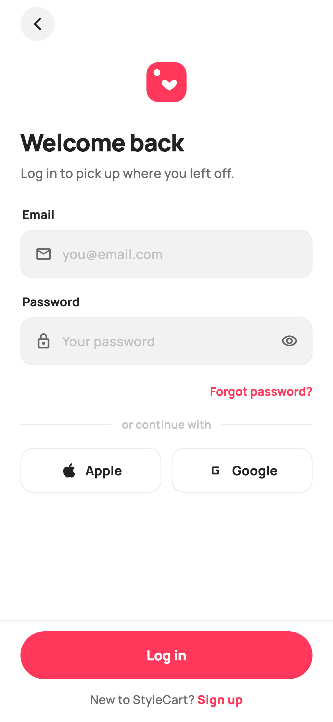
Watch the Flutter UI walkthrough
A short screen recording of Log In running, if you'd rather see it before you read the code. The written tutorial below covers everything in it.
Can't see the video? Watch it on YouTube.
What you'll build
- ✓A scrollable form paired with a pinned bottom action bar, so the primary CTA never scrolls out of reach
- ✓A reusable `_Field` widget that composes a leading icon, a borderless `TextField`, and an optional trailing widget inside one rounded container
- ✓A password show/hide toggle driven by a single `_obscure` boolean
- ✓A divider row reading 'or continue with' and two social buttons that report the provider through one `ValueChanged<String>` callback
- ✓A pinned bar with a stadium-shaped `FilledButton` and a centred 'New to StyleCart? Sign up' footer
Step-by-step build
Create the file
Add a new file at lib/ecom_auth_login/ecom_auth_login_screen.dart in your Flutter project.
Register the bundled fonts
No external packages — this is pure Flutter. It does bundle its design font (Manrope), so drop the font file into fonts/ and declare it in pubspec.yaml:
flutter:
  fonts:
    - family: Manrope
      fonts:
- asset: fonts/Manrope-Regular.ttfBuild it, piece by piece
Here's how the screen goes together. Each block below is a real slice of the code with a plain-English explanation — paste them in order, or grab the whole file from the next section.
Four callbacks and the token block
class EcomAuthLoginScreen extends StatefulWidget {
  const EcomAuthLoginScreen({
    super.key,
    this.onLogin,
    this.onForgot,
    this.onSignup,
    this.onContinueWith,
  });

  /// Successful email/password sign-in.
  final VoidCallback? onLogin;

  /// Tapped the forgot-password link.
  final VoidCallback? onForgot;

  /// Tapped "Sign up".
  final VoidCallback? onSignup;

  /// Continue with a social provider (Apple / Google).
  final ValueChanged<String>? onContinueWith;

  @override
  State<EcomAuthLoginScreen> createState() => _EcomAuthLoginScreenState();
}

class _EcomAuthLoginScreenState extends State<EcomAuthLoginScreen> {
  static const String _font = 'Manrope';
  static const Color _canvas = Color(0xFFFFFFFF);
  static const Color _ink = Color(0xFF222222);
  static const Color _muted = Color(0xFF6A6A6A);
  static const Color _faint = Color(0xFFC1C1C1);
  static const Color _brand = Color(0xFFFF385C);
  static const Color _surface = Color(0xFFF2F2F2);
  static const Color _hairline = Color(0xFFEBEBEB);

  final TextEditingController _email = TextEditingController();
  final TextEditingController _password = TextEditingController();
  bool _obscure = true;

  @override
  void dispose() {
    _email.dispose();
    _password.dispose();
    super.dispose();
  }
The widget exposes four optional callbacks — `onLogin`, `onForgot`, `onSignup`, and `onContinueWith`. Notice that the last one is a `ValueChanged<String>` rather than a `VoidCallback`: both social buttons feed into it with a provider string, so you don't need one callback per provider. The state class begins with the shared design tokens (`_font`, `_canvas`, `_ink`, `_muted`, `_faint`, `_brand`, `_surface`, `_hairline`) declared `static const` so the private sub-widgets further down the file can reach them by name. Then two `TextEditingController`s and the `_obscure` flag — that's the entire state of the screen — with `dispose()` releasing both controllers.
Scroll region plus a pinned bar
  @override
  Widget build(BuildContext context) {
    return Theme(
      data: ThemeData.light(useMaterial3: true),
      child: Scaffold(
        backgroundColor: _canvas,
        body: SafeArea(
          child: Column(
            children: <Widget>[
              Expanded(
                child: SingleChildScrollView(
                  padding: const EdgeInsets.fromLTRB(24, 8, 24, 24),
                  child: Column(
                    crossAxisAlignment: CrossAxisAlignment.stretch,
                    children: <Widget>[
                      Align(
                        alignment: Alignment.centerLeft,
                        child: _BackButton(onTap: () => Navigator.maybePop(context)),
                      ),
                      const SizedBox(height: 20),
                      Center(
                        child: SizedBox(
                          width: 56,
                          height: 56,
                          child: CustomPaint(painter: _HeartTagPainter()),
                        ),
                      ),
                      const SizedBox(height: 22),
This is the layout pattern worth stealing. The `SafeArea` holds a `Column` whose first child is `Expanded(child: SingleChildScrollView(...))` and whose second is `_PinnedBar`. Because the scroll view is inside `Expanded`, the form takes all leftover height and scrolls internally, while the bar keeps its natural height glued to the bottom — so when the keyboard opens, the CTA rides above it instead of disappearing. `crossAxisAlignment: CrossAxisAlignment.stretch` makes every field span the full width automatically, which is why no field needs its own width. The circular `_BackButton` is wrapped in `Align(centerLeft)` to opt out of that stretch.
Headline, email field, and the password toggle
                      const Text(
                        'Welcome back',
                        style: TextStyle(
                          fontFamily: _font,
                          fontSize: 28,
                          fontWeight: FontWeight.w800,
                          letterSpacing: -0.6,
                          color: _ink,
                        ),
                      ),
                      const SizedBox(height: 6),
                      const Text(
                        'Log in to pick up where you left off.',
                        style: TextStyle(
                          fontFamily: _font,
                          fontSize: 15,
                          fontWeight: FontWeight.w500,
                          color: _muted,
                        ),
                      ),
                      const SizedBox(height: 28),
                      const _FieldLabel('Email'),
                      _Field(
                        controller: _email,
                        hint: 'you@email.com',
                        keyboardType: TextInputType.emailAddress,
                        icon: Icons.mail_outline_rounded,
                      ),
                      const SizedBox(height: 18),
                      const _FieldLabel('Password'),
                      _Field(
                        controller: _password,
                        hint: 'Your password',
                        obscure: _obscure,
                        icon: Icons.lock_outline_rounded,
                        trailing: GestureDetector(
                          onTap: () => setState(() => _obscure = !_obscure),
                          child: Icon(
                            _obscure
                                ? Icons.visibility_outlined
                                : Icons.visibility_off_outlined,
                            size: 20,
                            color: _muted,
                          ),
                        ),
                      ),
'Welcome back' is set at 28px `w800` with `letterSpacing: -0.6` — negative tracking on large bold type is what keeps a headline from looking airy. Each input is a `_FieldLabel` followed by a `_Field`. The email one passes `keyboardType: TextInputType.emailAddress` so the OS shows the @ key, and a `mail_outline_rounded` leading icon. The password `_Field` gets `obscure: _obscure` plus a `trailing` `GestureDetector` whose `onTap` does `setState(() => _obscure = !_obscure)` — the same boolean both hides the text and picks between `visibility_outlined` and `visibility_off_outlined`, so the icon can never disagree with the field's actual state.
Forgot-password link, divider, and social row
                      const SizedBox(height: 12),
                      Align(
                        alignment: Alignment.centerRight,
                        child: TextButton(
                          onPressed: widget.onForgot,
                          style: TextButton.styleFrom(
                            foregroundColor: _brand,
                            padding: EdgeInsets.zero,
                            minimumSize: const Size(0, 36),
                            tapTargetSize: MaterialTapTargetSize.shrinkWrap,
                            textStyle: const TextStyle(
                              fontFamily: _font,
                              fontSize: 14,
                              fontWeight: FontWeight.w700,
                            ),
                          ),
                          child: const Text('Forgot password?'),
                        ),
                      ),
                      const SizedBox(height: 12),
                      Row(
                        children: <Widget>[
                          const Expanded(child: Divider(color: _hairline, height: 1)),
                          Padding(
                            padding: const EdgeInsets.symmetric(horizontal: 12),
                            child: Text(
                              'or continue with',
                              style: TextStyle(
                                fontFamily: _font,
                                fontSize: 13,
                                fontWeight: FontWeight.w600,
                                color: _faint,
                              ),
                            ),
                          ),
                          const Expanded(child: Divider(color: _hairline, height: 1)),
                        ],
                      ),
                      const SizedBox(height: 18),
                      Row(
                        children: <Widget>[
                          Expanded(
                            child: _SocialButton(
                              label: 'Apple',
                              icon: Icons.apple,
                              onTap: () => widget.onContinueWith?.call('apple'),
                            ),
                          ),
                          const SizedBox(width: 12),
                          Expanded(
                            child: _SocialButton(
                              label: 'Google',
                              icon: Icons.g_mobiledata_rounded,
                              onTap: () => widget.onContinueWith?.call('google'),
                            ),
                          ),
                        ],
                      ),
                    ],
                  ),
                ),
              ),
              _PinnedBar(
                primaryLabel: 'Log in',
                onPrimary: widget.onLogin,
                footer: _SignupRow(onTap: widget.onSignup),
              ),
            ],
          ),
        ),
      ),
    );
  }
}
The 'Forgot password?' `TextButton` is shrunk deliberately: `padding: EdgeInsets.zero`, `minimumSize: Size(0, 36)` and `MaterialTapTargetSize.shrinkWrap` strip Material's default 48px padding so the link sits tight against the right edge while keeping a usable 36px tap height. The 'or continue with' rule is a `Row` of two `Expanded(child: Divider(height: 1))` around a padded label — using `Expanded` on both sides is what centres the text regardless of its length. The two `_SocialButton`s are each wrapped in `Expanded` with a 12px gap, so they split the width evenly, and both call `widget.onContinueWith?.call(...)` with 'apple' or 'google'.
The reusable field container
class _Field extends StatelessWidget {
  const _Field({
    required this.controller,
    required this.hint,
    this.icon,
    this.trailing,
    this.obscure = false,
    this.keyboardType,
  });

  final TextEditingController controller;
  final String hint;
  final IconData? icon;
  final Widget? trailing;
  final bool obscure;
  final TextInputType? keyboardType;

  @override
  Widget build(BuildContext context) {
    return Container(
      height: 56,
      padding: const EdgeInsets.symmetric(horizontal: 16),
      decoration: BoxDecoration(
        color: _EcomAuthLoginScreenState._surface,
        borderRadius: BorderRadius.circular(14),
        border: Border.all(color: _EcomAuthLoginScreenState._hairline),
      ),
      child: Row(
        children: <Widget>[
          if (icon != null) ...<Widget>[
            Icon(icon, size: 20, color: _EcomAuthLoginScreenState._muted),
            const SizedBox(width: 12),
          ],
          Expanded(
            child: TextField(
              controller: controller,
              obscureText: obscure,
              keyboardType: keyboardType,
              style: const TextStyle(
                fontFamily: _EcomAuthLoginScreenState._font,
                fontSize: 15,
                fontWeight: FontWeight.w600,
                color: _EcomAuthLoginScreenState._ink,
              ),
              cursorColor: _EcomAuthLoginScreenState._brand,
              decoration: InputDecoration(
                isCollapsed: true,
                border: InputBorder.none,
                hintText: hint,
                hintStyle: const TextStyle(
                  fontFamily: _EcomAuthLoginScreenState._font,
                  fontSize: 15,
                  fontWeight: FontWeight.w500,
                  color: _EcomAuthLoginScreenState._faint,
                ),
              ),
            ),
          ),
          if (trailing != null) ...<Widget>[
            const SizedBox(width: 8),
            trailing!,
          ],
        ],
      ),
    );
  }
}
`_Field` is a 56px-tall `Container` with a `_surface` grey fill, a 14px radius and a `_hairline` border — all the visual chrome lives here, not on the `TextField`. Inside, the `TextField` itself is stripped bare: `border: InputBorder.none` and `isCollapsed: true` remove Material's underline and its built-in vertical padding, which is what lets the text sit perfectly centred in a container you control. The leading icon and the `trailing` widget are spread in conditionally with `if (icon != null) ...<Widget>[...]` collection-if, so a field with no icon has no leftover gap. `cursorColor: _brand` is the one place the accent red appears while typing.
The pinned bar and the painted brand mark
class _PinnedBar extends StatelessWidget {
  const _PinnedBar({
    required this.primaryLabel,
    required this.onPrimary,
    this.footer,
  });

  final String primaryLabel;
  final VoidCallback? onPrimary;
  final Widget? footer;

  @override
  Widget build(BuildContext context) {
    return Container(
      padding: const EdgeInsets.fromLTRB(24, 12, 24, 16),
      decoration: const BoxDecoration(
        color: _EcomAuthLoginScreenState._canvas,
        border: Border(
          top: BorderSide(color: _EcomAuthLoginScreenState._hairline),
        ),
      ),
      child: Column(
        mainAxisSize: MainAxisSize.min,
        children: <Widget>[
          SizedBox(
            height: 56,
            width: double.infinity,
            child: FilledButton(
              onPressed: onPrimary,
              style: FilledButton.styleFrom(
                backgroundColor: _EcomAuthLoginScreenState._brand,
                foregroundColor: _EcomAuthLoginScreenState._canvas,
                shape: const StadiumBorder(),
                textStyle: const TextStyle(
                  fontFamily: _EcomAuthLoginScreenState._font,
                  fontSize: 16,
                  fontWeight: FontWeight.w800,
                ),
              ),
              child: Text(primaryLabel),
            ),
          ),
          if (footer != null) ...<Widget>[
            const SizedBox(height: 14),
            footer!,
          ],
        ],
      ),
    );
  }
}

/// Painted heart price-tag brand mark — matches the onboarding splash glyph.
class _HeartTagPainter extends CustomPainter {
  @override
  void paint(Canvas c, Size size) {
    const Color brand = Color(0xFFFF385C);
    final double w = size.width;
    final double h = size.height;
    final RRect tile = RRect.fromRectAndRadius(
      Rect.fromLTWH(w * 0.08, h * 0.08, w * 0.84, h * 0.84),
      Radius.circular(w * 0.26),
    );
    c.drawRRect(tile, Paint()..color = brand);
    // Punched hole top-left.
    c.drawCircle(
      Offset(w * 0.30, h * 0.30),
      w * 0.07,
      Paint()..color = Colors.white,
    );
    // Heart.
    final Path heart = Path();
    final double cx = w * 0.56;
    final double cy = h * 0.58;
    final double s = w * 0.30;
    heart.moveTo(cx, cy + s * 0.32);
    heart.cubicTo(cx - s * 0.95, cy - s * 0.18, cx - s * 0.42, cy - s * 0.72,
        cx, cy - s * 0.22);
    heart.cubicTo(cx + s * 0.42, cy - s * 0.72, cx + s * 0.95, cy - s * 0.18,
        cx, cy + s * 0.32);
    heart.close();
    c.drawPath(heart, Paint()..color = Colors.white);
  }

  @override
  bool shouldRepaint(_HeartTagPainter oldDelegate) => false;
}
`_PinnedBar` is a `Container` with a top `BorderSide` hairline — that single line is what visually separates it from the scrolling form. Its `Column` uses `MainAxisSize.min` so the bar hugs its contents, and the CTA is a `FilledButton` forced to 56×infinity with a `StadiumBorder()` for the fully-rounded pill shape. The optional `footer` slot is where `_SignupRow` plugs in. At the bottom of the file, `_HeartTagPainter` re-draws the 56px brand mark used on the splash: a rounded `RRect` tile with a `w * 0.26` radius, a white punched hole at 30%/30%, and a two-curve heart path. `shouldRepaint` returns `false` outright because this painter takes no parameters and can never change.
Full code
The complete, ready-to-paste source. Free to use in your projects — one click copies it all.
import 'package:flutter/material.dart';
/// StyleCart — Log In.
///
/// Email + password sign-in with show/hide, a social-login row, a forgot-password
/// link and a pinned primary CTA. Self-contained per CONVENTIONS.md: pure Flutter,
/// bundled Manrope, inline Airbnb-style tokens, own light theme + SafeArea. All
/// marks are painted (no asset, no emoji glyph). Exposes callbacks only — the
/// gallery wires navigation.
class EcomAuthLoginScreen extends StatefulWidget {
const EcomAuthLoginScreen({
super.key,
this.onLogin,
this.onForgot,
this.onSignup,
this.onContinueWith,
});
/// Successful email/password sign-in.
final VoidCallback? onLogin;
/// Tapped the forgot-password link.
final VoidCallback? onForgot;
/// Tapped "Sign up".
final VoidCallback? onSignup;
/// Continue with a social provider (Apple / Google).
final ValueChanged<String>? onContinueWith;
@override
State<EcomAuthLoginScreen> createState() => _EcomAuthLoginScreenState();
}
class _EcomAuthLoginScreenState extends State<EcomAuthLoginScreen> {
static const String _font = 'Manrope';
static const Color _canvas = Color(0xFFFFFFFF);
static const Color _ink = Color(0xFF222222);
static const Color _muted = Color(0xFF6A6A6A);
static const Color _faint = Color(0xFFC1C1C1);
static const Color _brand = Color(0xFFFF385C);
static const Color _surface = Color(0xFFF2F2F2);
static const Color _hairline = Color(0xFFEBEBEB);
final TextEditingController _email = TextEditingController();
final TextEditingController _password = TextEditingController();
bool _obscure = true;
@override
void dispose() {
_email.dispose();
_password.dispose();
super.dispose();
}
@override
Widget build(BuildContext context) {
return Theme(
data: ThemeData.light(useMaterial3: true),
child: Scaffold(
backgroundColor: _canvas,
body: SafeArea(
child: Column(
children: <Widget>[
Expanded(
child: SingleChildScrollView(
padding: const EdgeInsets.fromLTRB(24, 8, 24, 24),
child: Column(
crossAxisAlignment: CrossAxisAlignment.stretch,
children: <Widget>[
Align(
alignment: Alignment.centerLeft,
child: _BackButton(onTap: () => Navigator.maybePop(context)),
),
const SizedBox(height: 20),
Center(
child: SizedBox(
width: 56,
height: 56,
child: CustomPaint(painter: _HeartTagPainter()),
),
),
const SizedBox(height: 22),
const Text(
'Welcome back',
style: TextStyle(
fontFamily: _font,
fontSize: 28,
fontWeight: FontWeight.w800,
letterSpacing: -0.6,
color: _ink,
),
),
const SizedBox(height: 6),
const Text(
'Log in to pick up where you left off.',
style: TextStyle(
fontFamily: _font,
fontSize: 15,
fontWeight: FontWeight.w500,
color: _muted,
),
),
const SizedBox(height: 28),
const _FieldLabel('Email'),
_Field(
controller: _email,
hint: 'you@email.com',
keyboardType: TextInputType.emailAddress,
icon: Icons.mail_outline_rounded,
),
const SizedBox(height: 18),
const _FieldLabel('Password'),
_Field(
controller: _password,
hint: 'Your password',
obscure: _obscure,
icon: Icons.lock_outline_rounded,
trailing: GestureDetector(
onTap: () => setState(() => _obscure = !_obscure),
child: Icon(
_obscure
? Icons.visibility_outlined
: Icons.visibility_off_outlined,
size: 20,
color: _muted,
),
),
),
const SizedBox(height: 12),
Align(
alignment: Alignment.centerRight,
child: TextButton(
onPressed: widget.onForgot,
style: TextButton.styleFrom(
foregroundColor: _brand,
padding: EdgeInsets.zero,
minimumSize: const Size(0, 36),
tapTargetSize: MaterialTapTargetSize.shrinkWrap,
textStyle: const TextStyle(
fontFamily: _font,
fontSize: 14,
fontWeight: FontWeight.w700,
),
),
child: const Text('Forgot password?'),
),
),
const SizedBox(height: 12),
Row(
children: <Widget>[
const Expanded(child: Divider(color: _hairline, height: 1)),
Padding(
padding: const EdgeInsets.symmetric(horizontal: 12),
child: Text(
'or continue with',
style: TextStyle(
fontFamily: _font,
fontSize: 13,
fontWeight: FontWeight.w600,
color: _faint,
),
),
),
const Expanded(child: Divider(color: _hairline, height: 1)),
],
),
const SizedBox(height: 18),
Row(
children: <Widget>[
Expanded(
child: _SocialButton(
label: 'Apple',
icon: Icons.apple,
onTap: () => widget.onContinueWith?.call('apple'),
),
),
const SizedBox(width: 12),
Expanded(
child: _SocialButton(
label: 'Google',
icon: Icons.g_mobiledata_rounded,
onTap: () => widget.onContinueWith?.call('google'),
),
),
],
),
],
),
),
),
_PinnedBar(
primaryLabel: 'Log in',
onPrimary: widget.onLogin,
footer: _SignupRow(onTap: widget.onSignup),
),
],
),
),
),
);
}
}
class _SignupRow extends StatelessWidget {
const _SignupRow({required this.onTap});
final VoidCallback? onTap;
@override
Widget build(BuildContext context) {
return Row(
mainAxisAlignment: MainAxisAlignment.center,
children: <Widget>[
const Text(
"New to StyleCart? ",
style: TextStyle(
fontFamily: _EcomAuthLoginScreenState._font,
fontSize: 14,
fontWeight: FontWeight.w500,
color: _EcomAuthLoginScreenState._muted,
),
),
GestureDetector(
onTap: onTap,
child: const Text(
'Sign up',
style: TextStyle(
fontFamily: _EcomAuthLoginScreenState._font,
fontSize: 14,
fontWeight: FontWeight.w800,
color: _EcomAuthLoginScreenState._brand,
),
),
),
],
);
}
}
// ── Shared auth widgets (kept private to this screen for self-containment) ──
class _FieldLabel extends StatelessWidget {
const _FieldLabel(this.text);
final String text;
@override
Widget build(BuildContext context) {
return Padding(
padding: const EdgeInsets.only(bottom: 8, left: 2),
child: Text(
text,
style: const TextStyle(
fontFamily: _EcomAuthLoginScreenState._font,
fontSize: 14,
fontWeight: FontWeight.w700,
color: _EcomAuthLoginScreenState._ink,
),
),
);
}
}
class _Field extends StatelessWidget {
const _Field({
required this.controller,
required this.hint,
this.icon,
this.trailing,
this.obscure = false,
this.keyboardType,
});
final TextEditingController controller;
final String hint;
final IconData? icon;
final Widget? trailing;
final bool obscure;
final TextInputType? keyboardType;
@override
Widget build(BuildContext context) {
return Container(
height: 56,
padding: const EdgeInsets.symmetric(horizontal: 16),
decoration: BoxDecoration(
color: _EcomAuthLoginScreenState._surface,
borderRadius: BorderRadius.circular(14),
border: Border.all(color: _EcomAuthLoginScreenState._hairline),
),
child: Row(
children: <Widget>[
if (icon != null) ...<Widget>[
Icon(icon, size: 20, color: _EcomAuthLoginScreenState._muted),
const SizedBox(width: 12),
],
Expanded(
child: TextField(
controller: controller,
obscureText: obscure,
keyboardType: keyboardType,
style: const TextStyle(
fontFamily: _EcomAuthLoginScreenState._font,
fontSize: 15,
fontWeight: FontWeight.w600,
color: _EcomAuthLoginScreenState._ink,
),
cursorColor: _EcomAuthLoginScreenState._brand,
decoration: InputDecoration(
isCollapsed: true,
border: InputBorder.none,
hintText: hint,
hintStyle: const TextStyle(
fontFamily: _EcomAuthLoginScreenState._font,
fontSize: 15,
fontWeight: FontWeight.w500,
color: _EcomAuthLoginScreenState._faint,
),
),
),
),
if (trailing != null) ...<Widget>[
const SizedBox(width: 8),
trailing!,
],
],
),
);
}
}
class _SocialButton extends StatelessWidget {
const _SocialButton({
required this.label,
required this.icon,
required this.onTap,
});
final String label;
final IconData icon;
final VoidCallback onTap;
@override
Widget build(BuildContext context) {
return GestureDetector(
onTap: onTap,
child: Container(
height: 52,
decoration: BoxDecoration(
color: _EcomAuthLoginScreenState._canvas,
borderRadius: BorderRadius.circular(14),
border: Border.all(color: _EcomAuthLoginScreenState._hairline),
),
child: Row(
mainAxisAlignment: MainAxisAlignment.center,
children: <Widget>[
Icon(icon, size: 22, color: _EcomAuthLoginScreenState._ink),
const SizedBox(width: 8),
Text(
label,
style: const TextStyle(
fontFamily: _EcomAuthLoginScreenState._font,
fontSize: 15,
fontWeight: FontWeight.w700,
color: _EcomAuthLoginScreenState._ink,
),
),
],
),
),
);
}
}
class _BackButton extends StatelessWidget {
const _BackButton({required this.onTap});
final VoidCallback onTap;
@override
Widget build(BuildContext context) {
return GestureDetector(
onTap: onTap,
child: Container(
width: 40,
height: 40,
decoration: BoxDecoration(
color: _EcomAuthLoginScreenState._surface,
shape: BoxShape.circle,
),
child: const Icon(Icons.arrow_back_ios_new_rounded,
size: 18, color: _EcomAuthLoginScreenState._ink),
),
);
}
}
class _PinnedBar extends StatelessWidget {
const _PinnedBar({
required this.primaryLabel,
required this.onPrimary,
this.footer,
});
final String primaryLabel;
final VoidCallback? onPrimary;
final Widget? footer;
@override
Widget build(BuildContext context) {
return Container(
padding: const EdgeInsets.fromLTRB(24, 12, 24, 16),
decoration: const BoxDecoration(
color: _EcomAuthLoginScreenState._canvas,
border: Border(
top: BorderSide(color: _EcomAuthLoginScreenState._hairline),
),
),
child: Column(
mainAxisSize: MainAxisSize.min,
children: <Widget>[
SizedBox(
height: 56,
width: double.infinity,
child: FilledButton(
onPressed: onPrimary,
style: FilledButton.styleFrom(
backgroundColor: _EcomAuthLoginScreenState._brand,
foregroundColor: _EcomAuthLoginScreenState._canvas,
shape: const StadiumBorder(),
textStyle: const TextStyle(
fontFamily: _EcomAuthLoginScreenState._font,
fontSize: 16,
fontWeight: FontWeight.w800,
),
),
child: Text(primaryLabel),
),
),
if (footer != null) ...<Widget>[
const SizedBox(height: 14),
footer!,
],
],
),
);
}
}
/// Painted heart price-tag brand mark — matches the onboarding splash glyph.
class _HeartTagPainter extends CustomPainter {
@override
void paint(Canvas c, Size size) {
const Color brand = Color(0xFFFF385C);
final double w = size.width;
final double h = size.height;
final RRect tile = RRect.fromRectAndRadius(
Rect.fromLTWH(w * 0.08, h * 0.08, w * 0.84, h * 0.84),
Radius.circular(w * 0.26),
);
c.drawRRect(tile, Paint()..color = brand);
// Punched hole top-left.
c.drawCircle(
Offset(w * 0.30, h * 0.30),
w * 0.07,
Paint()..color = Colors.white,
);
// Heart.
final Path heart = Path();
final double cx = w * 0.56;
final double cy = h * 0.58;
final double s = w * 0.30;
heart.moveTo(cx, cy + s * 0.32);
heart.cubicTo(cx - s * 0.95, cy - s * 0.18, cx - s * 0.42, cy - s * 0.72,
cx, cy - s * 0.22);
heart.cubicTo(cx + s * 0.42, cy - s * 0.72, cx + s * 0.95, cy - s * 0.18,
cx, cy + s * 0.32);
heart.close();
c.drawPath(heart, Paint()..color = Colors.white);
}
@override
bool shouldRepaint(_HeartTagPainter oldDelegate) => false;
}
Plus bundled 5 binary assets (fonts/images). The CLI and MCP install those for you automatically.
Two faster ways to add it
Copy-paste works, but you can skip it entirely.
1. FlutterKit CLI
One command drops this screen — and its fonts — straight into your project.
$ flutterkit add ecom-auth-login2. AI agent (MCP)
Connect FlutterKit's MCP server in Claude or Cursor and just ask your agent to install ecom-auth-login — it fetches and writes the files for you.
FAQ
Is this Flutter login screen free to use?
Yes. The whole Dart file on this page is free for personal and commercial projects. Copy it from the code block, install it with the FlutterKit CLI (flutterkit add ecom-auth-login), or have an AI agent drop it in over MCP.
Does it need Firebase or any auth package?
No. It's pure Flutter UI with no auth backend attached — it just hands you the email and password through the two TextEditingControllers and fires onLogin. Wire that callback to Firebase Auth, Supabase, or your own API. The only asset to register is the bundled Manrope font family.
How do I add form validation?
The fields are plain TextFields, so the smallest change is to validate inside onLogin against _email.text and _password.text and hold an error string in state. If you want per-field error text, wrap the column in a Form and swap each TextField for a TextFormField with a validator — the _Field wrapper takes the same child either way.
Which Flutter version does it target?
It uses super parameters, FilledButton, and Material 3, so it targets Flutter 3.10+ with Dart 3. On an older SDK, replace FilledButton with ElevatedButton and use an explicit Key? key constructor.


