How to Build a Rewards Home Screen in Flutter (Full Code + Preview)
Loyalty screens fail when the points feel abstract — a number with no obvious next step. This tutorial builds StyleCart's rewards home in Flutter: a dark tier card where a sweep-gradient progress ring wraps the live balance, a Gold badge and a '520 pts to Platinum' line make the next tier concrete, and an expiry note adds urgency. Below it sit a two-column redeem grid, four 'ways to earn' rows with reward badges, and a referral banner. Everything is pure Flutter — one CustomPainter, bundled Manrope, callbacks for navigation — ready to drop into any shopping app.
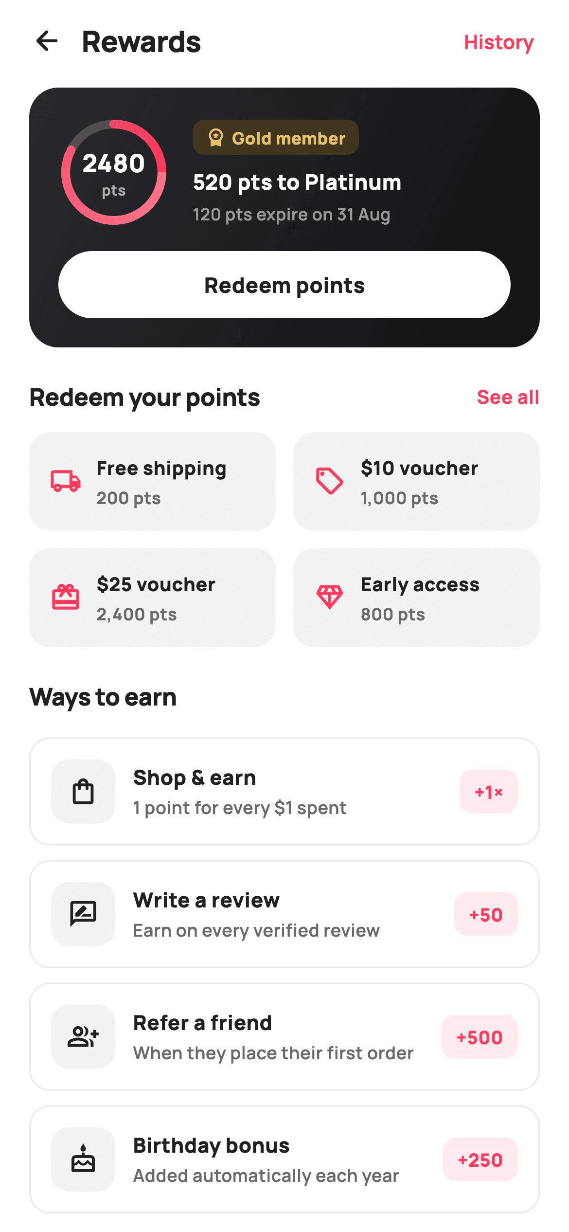
What you'll build
- ✓A dark gradient tier card with a CustomPainter progress ring drawn around the live points balance
- ✓A gold-tinted 'Gold member' badge, a computed 'pts to Platinum' line, and a points-expiry warning
- ✓A two-column redeem grid where each reward shows its icon, label, and points cost
- ✓Four 'ways to earn' rows driven by a const data list, each with a brand-tinted reward badge
- ✓A referral banner offering 'Give $10, get 500 points' with its own tap callback
Step-by-step build
Create the file
Add a new file at lib/ecom_rewards_home/ecom_rewards_home_screen.dart in your Flutter project.
Register the bundled fonts
No external packages — this is pure Flutter. It does bundle its design font (Manrope), so drop the font file into fonts/ and declare it in pubspec.yaml:
flutter:
  fonts:
    - family: Manrope
      fonts:
- asset: fonts/Manrope-Regular.ttfBuild it, piece by piece
Here's how the screen goes together. Each block below is a real slice of the code with a plain-English explanation — paste them in order, or grab the whole file from the next section.
Tokens, points maths, and the two reward catalogues
import 'dart:math' as math;

import 'package:flutter/material.dart';

/// StyleCart — Rewards home.
///
/// The loyalty hub: a tier card with a painted progress ring toward the next
/// tier, the points balance + expiry note, a "ways to earn" list, a "redeem"
/// shortcut grid, and a benefits strip. Header actions reach points history.
///
/// Self-contained per CONVENTIONS.md: pure Flutter, bundled Manrope, inline
/// Airbnb-style tokens, own light theme + SafeArea. Painter-only graphics
/// (progress ring). Exposes callbacks only.
class EcomRewardsHomeScreen extends StatelessWidget {
  const EcomRewardsHomeScreen({
    super.key,
    this.onBack,
    this.onHistory,
    this.onRedeem,
    this.onReferral,
  });

  final VoidCallback? onBack;
  final VoidCallback? onHistory;
  final VoidCallback? onRedeem;
  final VoidCallback? onReferral;

  static const String _font = 'Manrope';
  static const Color _canvas = Color(0xFFFFFFFF);
  static const Color _ink = Color(0xFF222222);
  static const Color _muted = Color(0xFF6A6A6A);
  static const Color _brand = Color(0xFFFF385C);
  static const Color _surface = Color(0xFFF2F2F2);
  static const Color _hairline = Color(0xFFEBEBEB);
  static const Color _gold = Color(0xFFB8860B);

  static const int _points = 2480;
  static const int _nextTier = 3000;

  static const List<_Earn> _earn = <_Earn>[
    _Earn(Icons.shopping_bag_outlined, 'Shop & earn',
        '1 point for every \$1 spent', '+1×'),
    _Earn(Icons.rate_review_outlined, 'Write a review',
        'Earn on every verified review', '+50'),
    _Earn(Icons.group_add_outlined, 'Refer a friend',
        'When they place their first order', '+500'),
    _Earn(Icons.cake_outlined, 'Birthday bonus',
        'Added automatically each year', '+250'),
  ];

  static const List<_Redeem> _redeem = <_Redeem>[
    _Redeem(Icons.local_shipping_outlined, 'Free shipping', '200 pts'),
    _Redeem(Icons.sell_outlined, '\$10 voucher', '1,000 pts'),
    _Redeem(Icons.card_giftcard_outlined, '\$25 voucher', '2,400 pts'),
    _Redeem(Icons.diamond_outlined, 'Early access', '800 pts'),
  ];
The screen is a `StatelessWidget` taking four optional callbacks — `onBack`, `onHistory`, `onRedeem`, `onReferral` — because a rewards hub reads state and routes taps; it never mutates anything itself. The palette is Airbnb-ish: `_brand` coral `#FF385C`, near-black `_ink` `#222222`, plus a dedicated `_gold` `#B8860B` used only for the membership badge, so tier status and tappable actions never share a colour. The two facts the whole screen pivots on are `_points = 2480` and `_nextTier = 3000` — every progress number is derived from them, never hard-coded twice. Both content lists are `static const` records: `_earn` pairs each earning route with its payout string ('+1×', '+50', '+500', '+250') and `_redeem` pairs each reward with its cost, so changing your loyalty economy is a data edit, not a widget edit.
build(): derive progress once, then stack the page
  @override
  Widget build(BuildContext context) {
    final double progress = _points / _nextTier;
    return Theme(
      data: ThemeData.light(useMaterial3: true),
      child: Scaffold(
        backgroundColor: _canvas,
        body: SafeArea(
          child: Column(
            children: <Widget>[
              _header(),
              Expanded(
                child: ListView(
                  padding: const EdgeInsets.fromLTRB(20, 4, 20, 28),
                  children: <Widget>[
                    _tierCard(progress),
                    const SizedBox(height: 22),
                    _sectionTitle('Redeem your points', onRedeem, 'See all'),
                    const SizedBox(height: 12),
                    _redeemGrid(),
                    const SizedBox(height: 22),
                    _sectionTitle('Ways to earn', null, null),
                    const SizedBox(height: 6),
                    for (final _Earn e in _earn) _earnRow(e),
                    const SizedBox(height: 10),
                    _referralBanner(),
                  ],
                ),
              ),
            ],
          ),
        ),
      ),
    );
  }
The first line of `build` computes `progress = _points / _nextTier` — 2480/3000 ≈ 0.83 — and hands it down to the tier card, keeping the ring, the balance text, and the 'pts to Platinum' line guaranteed to agree because they share one source. The page is a `Column` with a fixed `_header()` above an `Expanded` `ListView`, so the title bar stays put while everything else scrolls. Content order is a deliberate funnel: the tier card (status) first, the redeem grid (spend) second, the earn list (accumulate) third, the referral banner last. Note the `for (final _Earn e in _earn) _earnRow(e)` collection-for inside the ListView's children — four rows materialise straight from the data list with no builder callback needed at this size.
A header with one exit and one escape hatch
  Widget _header() {
    return Padding(
      padding: const EdgeInsets.fromLTRB(8, 4, 12, 4),
      child: Row(
        children: <Widget>[
          IconButton(
            onPressed: onBack,
            icon: const Icon(Icons.arrow_back_rounded, size: 22, color: _ink),
          ),
          const Text(
            'Rewards',
            style: TextStyle(
              fontFamily: _font,
              fontSize: 20,
              fontWeight: FontWeight.w800,
              letterSpacing: -0.3,
              color: _ink,
            ),
          ),
          const Spacer(),
          TextButton(
            onPressed: onHistory,
            child: const Text(
              'History',
              style: TextStyle(
                fontFamily: _font,
                fontSize: 13.5,
                fontWeight: FontWeight.w700,
                color: _brand,
              ),
            ),
          ),
        ],
      ),
    );
  }
The header is a plain `Padding` + `Row`, not an `AppBar` — the screen owns its own `SafeArea`, so a full app bar would only add elevation and theme baggage. A back `IconButton` leads, the 20px `w800` 'Rewards' title with `letterSpacing: -0.3` sits beside it, and a `Spacer` pushes a 'History' `TextButton` to the far edge. History is styled in `_brand` coral at 13.5px `w700`, matching every other tappable text on the page — one colour rule that teaches the user what is pressable. Wiring it to `onHistory` matters in a rewards context: 'where did my points go?' is the first support question loyalty programmes get, and a one-tap ledger answers it before it becomes a ticket.
The dark tier card and the ring around the balance
  Widget _tierCard(double progress) {
    return Container(
      padding: const EdgeInsets.all(20),
      decoration: BoxDecoration(
        borderRadius: BorderRadius.circular(20),
        gradient: const LinearGradient(
          begin: Alignment.topLeft,
          end: Alignment.bottomRight,
          colors: <Color>[Color(0xFF2A2A2E), Color(0xFF111114)],
        ),
      ),
      child: Column(
        children: <Widget>[
          Row(
            children: <Widget>[
              CustomPaint(
                size: const Size(76, 76),
                painter: _RingPainter(progress),
                child: SizedBox(
                  width: 76,
                  height: 76,
                  child: Center(
                    child: Column(
                      mainAxisSize: MainAxisSize.min,
                      children: <Widget>[
                        Text(
                          '$_points',
                          style: const TextStyle(
                            fontFamily: _font,
                            fontSize: 17,
                            fontWeight: FontWeight.w800,
                            color: Colors.white,
                          ),
                        ),
                        const Text(
                          'pts',
                          style: TextStyle(
                            fontFamily: _font,
                            fontSize: 10,
                            fontWeight: FontWeight.w700,
                            color: Colors.white60,
                          ),
                        ),
                      ],
                    ),
                  ),
                ),
              ),
The tier card is the only dark element on a white page — a `LinearGradient` from `#2A2A2E` to `#111114` inside a 20px-radius Container — which is exactly why the eye lands on it first. Inside, a `CustomPaint` sized 76×76 runs `_RingPainter(progress)` with the child slot holding a centred mini-Column: the balance '2480' at 17px `w800` white over a 10px 'pts' label in `Colors.white60`. Putting the number inside the ring rather than beside it is the load-bearing decision — balance and progress become one glanceable unit, the same pattern watch faces use for activity rings. `mainAxisSize: MainAxisSize.min` on that Column keeps the two lines hugging the centre instead of stretching the full 76px.
Gold badge, next-tier line, expiry, and the redeem pill
              Expanded(
                child: Column(
                  crossAxisAlignment: CrossAxisAlignment.start,
                  children: <Widget>[
                    Container(
                      padding: const EdgeInsets.symmetric(
                          horizontal: 9, vertical: 4),
                      decoration: BoxDecoration(
                        color: _gold.withValues(alpha: 0.22),
                        borderRadius: BorderRadius.circular(8),
                      ),
                      child: Row(
                        mainAxisSize: MainAxisSize.min,
                        children: const <Widget>[
                          Icon(Icons.workspace_premium_rounded,
                              size: 14, color: Color(0xFFE9C46A)),
                          SizedBox(width: 4),
                          Text(
                            'Gold member',
                            style: TextStyle(
                              fontFamily: _font,
                              fontSize: 11.5,
                              fontWeight: FontWeight.w800,
                              color: Color(0xFFE9C46A),
                            ),
                          ),
                        ],
                      ),
                    ),
                    const SizedBox(height: 8),
                    Text(
                      '${_nextTier - _points} pts to Platinum',
                      style: const TextStyle(
                        fontFamily: _font,
                        fontSize: 14.5,
                        fontWeight: FontWeight.w800,
                        color: Colors.white,
                      ),
                    ),
                    const SizedBox(height: 3),
                    const Text(
                      '120 pts expire on 31 Aug',
                      style: TextStyle(
                        fontFamily: _font,
                        fontSize: 11.5,
                        fontWeight: FontWeight.w600,
                        color: Colors.white54,
                      ),
                    ),
                  ],
                ),
              ),
            ],
          ),
          const SizedBox(height: 16),
          GestureDetector(
            onTap: onRedeem,
            child: Container(
              height: 46,
              alignment: Alignment.center,
              decoration: BoxDecoration(
                color: _canvas,
                borderRadius: BorderRadius.circular(9999),
              ),
              child: const Text(
                'Redeem points',
                style: TextStyle(
                  fontFamily: _font,
                  fontSize: 14.5,
                  fontWeight: FontWeight.w800,
                  color: _ink,
                ),
              ),
            ),
          ),
        ],
      ),
    );
  }
Beside the ring, an `Expanded` column stacks three signals in priority order. The 'Gold member' chip sits on `_gold.withValues(alpha: 0.22)` with its `workspace_premium_rounded` icon and text both in `#E9C46A` — a lightened gold, because the raw `#B8860B` would vanish against the dark gradient. Next, `'${_nextTier - _points} pts to Platinum'` renders '520 pts to Platinum' — computed, so it can never drift out of sync with the ring. Third, '120 pts expire on 31 Aug' in `Colors.white54`: quiet, but it is the line that actually drives redemptions, since loss aversion beats reward-seeking. The card closes with a full-width white pill (`borderRadius: BorderRadius.circular(9999)`, height 46) reading 'Redeem points' in `_ink` — inverted white-on-dark so the card's one action is unmistakable, wired to the same `onRedeem` as the grid below.
Reusable section titles and the redeem grid
  Widget _sectionTitle(String title, VoidCallback? onAction, String? action) {
    return Row(
      children: <Widget>[
        Text(
          title,
          style: const TextStyle(
            fontFamily: _font,
            fontSize: 16.5,
            fontWeight: FontWeight.w800,
            letterSpacing: -0.2,
            color: _ink,
          ),
        ),
        const Spacer(),
        if (action != null)
          GestureDetector(
            onTap: onAction,
            child: Text(
              action,
              style: const TextStyle(
                fontFamily: _font,
                fontSize: 13,
                fontWeight: FontWeight.w700,
                color: _brand,
              ),
            ),
          ),
      ],
    );
  }

  Widget _redeemGrid() {
    return GridView.count(
      crossAxisCount: 2,
      shrinkWrap: true,
      physics: const NeverScrollableScrollPhysics(),
      mainAxisSpacing: 12,
      crossAxisSpacing: 12,
      childAspectRatio: 2.5,
      children: <Widget>[
        for (final _Redeem r in _redeem)
          GestureDetector(
            onTap: onRedeem,
            child: Container(
              padding: const EdgeInsets.symmetric(horizontal: 14),
              decoration: BoxDecoration(
                color: _surface,
                borderRadius: BorderRadius.circular(14),
              ),
              child: Row(
                children: <Widget>[
                  Icon(r.icon, size: 22, color: _brand),
                  const SizedBox(width: 10),
                  Expanded(
                    child: Column(
                      mainAxisSize: MainAxisSize.min,
                      crossAxisAlignment: CrossAxisAlignment.start,
                      children: <Widget>[
                        Text(
                          r.label,
                          maxLines: 1,
                          overflow: TextOverflow.ellipsis,
                          style: const TextStyle(
                            fontFamily: _font,
                            fontSize: 13,
                            fontWeight: FontWeight.w800,
                            color: _ink,
                          ),
                        ),
                        const SizedBox(height: 2),
                        Text(
                          r.cost,
                          style: const TextStyle(
                            fontFamily: _font,
                            fontSize: 11.5,
                            fontWeight: FontWeight.w700,
                            color: _muted,
                          ),
                        ),
                      ],
                    ),
                  ),
                ],
              ),
            ),
          ),
      ],
    );
  }
`_sectionTitle` takes a nullable action: 'Redeem your points' passes `onRedeem` and a 'See all' label, while 'Ways to earn' passes `null` twice and the `if (action != null)` collection-if simply omits the trailing link — one helper, two behaviours, no empty GestureDetectors. The grid itself is `GridView.count` with `crossAxisCount: 2`, `shrinkWrap: true` and `NeverScrollableScrollPhysics`, because it lives inside the outer ListView and must measure itself rather than fight for scroll gestures. `childAspectRatio: 2.5` produces short, wide tiles — these are shortcuts, not product cards. Each tile is a `_surface` grey rounded Container with the reward icon in `_brand`, a `maxLines: 1` ellipsised label, and the cost ('200 pts', '1,000 pts'…) in `_muted` — cost visible up front so nobody taps into a reward they cannot afford.
Earn rows and the referral banner
  Widget _earnRow(_Earn e) {
    return Container(
      margin: const EdgeInsets.only(top: 10),
      padding: const EdgeInsets.all(14),
      decoration: BoxDecoration(
        color: _canvas,
        borderRadius: BorderRadius.circular(14),
        border: Border.all(color: _hairline),
      ),
      child: Row(
        children: <Widget>[
          Container(
            width: 44,
            height: 44,
            decoration: BoxDecoration(
              color: _surface,
              borderRadius: BorderRadius.circular(12),
            ),
            child: Icon(e.icon, size: 21, color: _ink),
          ),
          const SizedBox(width: 12),
          Expanded(
            child: Column(
              crossAxisAlignment: CrossAxisAlignment.start,
              children: <Widget>[
                Text(
                  e.title,
                  style: const TextStyle(
                    fontFamily: _font,
                    fontSize: 14,
                    fontWeight: FontWeight.w800,
                    color: _ink,
                  ),
                ),
                const SizedBox(height: 2),
                Text(
                  e.subtitle,
                  style: const TextStyle(
                    fontFamily: _font,
                    fontSize: 12,
                    fontWeight: FontWeight.w600,
                    color: _muted,
                  ),
                ),
              ],
            ),
          ),
          Container(
            padding: const EdgeInsets.symmetric(horizontal: 10, vertical: 6),
            decoration: BoxDecoration(
              color: _brand.withValues(alpha: 0.10),
              borderRadius: BorderRadius.circular(9),
            ),
            child: Text(
              e.reward,
              style: const TextStyle(
                fontFamily: _font,
                fontSize: 12.5,
                fontWeight: FontWeight.w800,
                color: _brand,
              ),
            ),
          ),
        ],
      ),
    );
  }

  Widget _referralBanner() {
    return GestureDetector(
      onTap: onReferral,
      child: Container(
        margin: const EdgeInsets.only(top: 14),
        padding: const EdgeInsets.all(16),
        decoration: BoxDecoration(
          borderRadius: BorderRadius.circular(16),
          color: _brand.withValues(alpha: 0.08),
          border: Border.all(color: _brand.withValues(alpha: 0.20)),
        ),
        child: Row(
          children: <Widget>[
            const Icon(Icons.card_giftcard_rounded, size: 26, color: _brand),
            const SizedBox(width: 12),
            const Expanded(
              child: Text(
                'Give \$10, get 500 points',
                style: TextStyle(
                  fontFamily: _font,
                  fontSize: 14.5,
                  fontWeight: FontWeight.w800,
                  color: _ink,
                ),
              ),
            ),
            const Icon(Icons.chevron_right_rounded, size: 22, color: _brand),
          ],
        ),
      ),
    );
  }
Each `_earnRow` is a white card defined by a `_hairline` `#EBEBEB` border rather than a fill — the inverse of the grey redeem tiles, so the two lists read as different kinds of thing at a glance. A 44×44 `_surface` squircle holds the icon in neutral `_ink`, the title/subtitle pair sits in an `Expanded`, and the row ends with the payout badge: `_brand.withValues(alpha: 0.10)` behind 12.5px `w800` coral text like '+500'. Making the reward the only coloured element in the row puts the incentive, not the chore, in focus. `_referralBanner` breaks the pattern deliberately — a coral-tinted panel (`alpha: 0.08` fill, `alpha: 0.20` border) with a gift icon, 'Give $10, get 500 points', and a chevron — because referral is the highest-value earn action and matches the '+500' top payout in the list above. It fires `onReferral`, its own callback, since referral flows usually open a share sheet rather than a route.
Data classes and the sweep-gradient ring painter
class _Earn {
  const _Earn(this.icon, this.title, this.subtitle, this.reward);
  final IconData icon;
  final String title;
  final String subtitle;
  final String reward;
}

class _Redeem {
  const _Redeem(this.icon, this.label, this.cost);
  final IconData icon;
  final String label;
  final String cost;
}

/// A loyalty progress ring: faint track + brand-red sweep from the top.
class _RingPainter extends CustomPainter {
  _RingPainter(this.progress);
  final double progress;

  @override
  void paint(Canvas canvas, Size size) {
    final Offset c = size.center(Offset.zero);
    final double r = size.width / 2 - 5;
    final Paint track = Paint()
      ..style = PaintingStyle.stroke
      ..strokeWidth = 6
      ..color = Colors.white.withValues(alpha: 0.18);
    canvas.drawCircle(c, r, track);

    final Paint arc = Paint()
      ..style = PaintingStyle.stroke
      ..strokeWidth = 6
      ..strokeCap = StrokeCap.round
      ..shader = const SweepGradient(
        colors: <Color>[Color(0xFFFF7A8C), Color(0xFFFF385C)],
      ).createShader(Rect.fromCircle(center: c, radius: r));
    canvas.drawArc(
      Rect.fromCircle(center: c, radius: r),
      -math.pi / 2,
      2 * math.pi * progress.clamp(0.0, 1.0),
      false,
      arc,
    );
  }

  @override
  bool shouldRepaint(_RingPainter old) => old.progress != progress;
}
`_Earn` and `_Redeem` are four- and three-field const holder classes — enough structure for the collection-fors without dragging in freezed or json_serializable for what is demo data. `_RingPainter` paints two strokes: a faint full-circle track at `Colors.white.withValues(alpha: 0.18)` so the remaining distance to Platinum is always visible, then the progress arc starting at `-math.pi / 2` (12 o'clock) and sweeping `2 * math.pi * progress.clamp(0.0, 1.0)` radians. The clamp is cheap insurance — points past the tier threshold would otherwise wrap the arc over itself. The arc's paint uses a `SweepGradient` shader from `#FF7A8C` to `#FF385C`, so the stroke brightens as it travels, with `StrokeCap.round` softening both ends of the 6px line. `shouldRepaint` compares `old.progress != progress` — the ring repaints only when the balance actually changes.
Full code
The complete, ready-to-paste source. Free to use in your projects — one click copies it all.
import 'dart:math' as math;
import 'package:flutter/material.dart';
/// StyleCart — Rewards home.
///
/// The loyalty hub: a tier card with a painted progress ring toward the next
/// tier, the points balance + expiry note, a "ways to earn" list, a "redeem"
/// shortcut grid, and a benefits strip. Header actions reach points history.
///
/// Self-contained per CONVENTIONS.md: pure Flutter, bundled Manrope, inline
/// Airbnb-style tokens, own light theme + SafeArea. Painter-only graphics
/// (progress ring). Exposes callbacks only.
class EcomRewardsHomeScreen extends StatelessWidget {
const EcomRewardsHomeScreen({
super.key,
this.onBack,
this.onHistory,
this.onRedeem,
this.onReferral,
});
final VoidCallback? onBack;
final VoidCallback? onHistory;
final VoidCallback? onRedeem;
final VoidCallback? onReferral;
static const String _font = 'Manrope';
static const Color _canvas = Color(0xFFFFFFFF);
static const Color _ink = Color(0xFF222222);
static const Color _muted = Color(0xFF6A6A6A);
static const Color _brand = Color(0xFFFF385C);
static const Color _surface = Color(0xFFF2F2F2);
static const Color _hairline = Color(0xFFEBEBEB);
static const Color _gold = Color(0xFFB8860B);
static const int _points = 2480;
static const int _nextTier = 3000;
static const List<_Earn> _earn = <_Earn>[
_Earn(Icons.shopping_bag_outlined, 'Shop & earn',
'1 point for every \$1 spent', '+1×'),
_Earn(Icons.rate_review_outlined, 'Write a review',
'Earn on every verified review', '+50'),
_Earn(Icons.group_add_outlined, 'Refer a friend',
'When they place their first order', '+500'),
_Earn(Icons.cake_outlined, 'Birthday bonus',
'Added automatically each year', '+250'),
];
static const List<_Redeem> _redeem = <_Redeem>[
_Redeem(Icons.local_shipping_outlined, 'Free shipping', '200 pts'),
_Redeem(Icons.sell_outlined, '\$10 voucher', '1,000 pts'),
_Redeem(Icons.card_giftcard_outlined, '\$25 voucher', '2,400 pts'),
_Redeem(Icons.diamond_outlined, 'Early access', '800 pts'),
];
@override
Widget build(BuildContext context) {
final double progress = _points / _nextTier;
return Theme(
data: ThemeData.light(useMaterial3: true),
child: Scaffold(
backgroundColor: _canvas,
body: SafeArea(
child: Column(
children: <Widget>[
_header(),
Expanded(
child: ListView(
padding: const EdgeInsets.fromLTRB(20, 4, 20, 28),
children: <Widget>[
_tierCard(progress),
const SizedBox(height: 22),
_sectionTitle('Redeem your points', onRedeem, 'See all'),
const SizedBox(height: 12),
_redeemGrid(),
const SizedBox(height: 22),
_sectionTitle('Ways to earn', null, null),
const SizedBox(height: 6),
for (final _Earn e in _earn) _earnRow(e),
const SizedBox(height: 10),
_referralBanner(),
],
),
),
],
),
),
),
);
}
Widget _header() {
return Padding(
padding: const EdgeInsets.fromLTRB(8, 4, 12, 4),
child: Row(
children: <Widget>[
IconButton(
onPressed: onBack,
icon: const Icon(Icons.arrow_back_rounded, size: 22, color: _ink),
),
const Text(
'Rewards',
style: TextStyle(
fontFamily: _font,
fontSize: 20,
fontWeight: FontWeight.w800,
letterSpacing: -0.3,
color: _ink,
),
),
const Spacer(),
TextButton(
onPressed: onHistory,
child: const Text(
'History',
style: TextStyle(
fontFamily: _font,
fontSize: 13.5,
fontWeight: FontWeight.w700,
color: _brand,
),
),
),
],
),
);
}
Widget _tierCard(double progress) {
return Container(
padding: const EdgeInsets.all(20),
decoration: BoxDecoration(
borderRadius: BorderRadius.circular(20),
gradient: const LinearGradient(
begin: Alignment.topLeft,
end: Alignment.bottomRight,
colors: <Color>[Color(0xFF2A2A2E), Color(0xFF111114)],
),
),
child: Column(
children: <Widget>[
Row(
children: <Widget>[
CustomPaint(
size: const Size(76, 76),
painter: _RingPainter(progress),
child: SizedBox(
width: 76,
height: 76,
child: Center(
child: Column(
mainAxisSize: MainAxisSize.min,
children: <Widget>[
Text(
'$_points',
style: const TextStyle(
fontFamily: _font,
fontSize: 17,
fontWeight: FontWeight.w800,
color: Colors.white,
),
),
const Text(
'pts',
style: TextStyle(
fontFamily: _font,
fontSize: 10,
fontWeight: FontWeight.w700,
color: Colors.white60,
),
),
],
),
),
),
),
const SizedBox(width: 16),
Expanded(
child: Column(
crossAxisAlignment: CrossAxisAlignment.start,
children: <Widget>[
Container(
padding: const EdgeInsets.symmetric(
horizontal: 9, vertical: 4),
decoration: BoxDecoration(
color: _gold.withValues(alpha: 0.22),
borderRadius: BorderRadius.circular(8),
),
child: Row(
mainAxisSize: MainAxisSize.min,
children: const <Widget>[
Icon(Icons.workspace_premium_rounded,
size: 14, color: Color(0xFFE9C46A)),
SizedBox(width: 4),
Text(
'Gold member',
style: TextStyle(
fontFamily: _font,
fontSize: 11.5,
fontWeight: FontWeight.w800,
color: Color(0xFFE9C46A),
),
),
],
),
),
const SizedBox(height: 8),
Text(
'${_nextTier - _points} pts to Platinum',
style: const TextStyle(
fontFamily: _font,
fontSize: 14.5,
fontWeight: FontWeight.w800,
color: Colors.white,
),
),
const SizedBox(height: 3),
const Text(
'120 pts expire on 31 Aug',
style: TextStyle(
fontFamily: _font,
fontSize: 11.5,
fontWeight: FontWeight.w600,
color: Colors.white54,
),
),
],
),
),
],
),
const SizedBox(height: 16),
GestureDetector(
onTap: onRedeem,
child: Container(
height: 46,
alignment: Alignment.center,
decoration: BoxDecoration(
color: _canvas,
borderRadius: BorderRadius.circular(9999),
),
child: const Text(
'Redeem points',
style: TextStyle(
fontFamily: _font,
fontSize: 14.5,
fontWeight: FontWeight.w800,
color: _ink,
),
),
),
),
],
),
);
}
Widget _sectionTitle(String title, VoidCallback? onAction, String? action) {
return Row(
children: <Widget>[
Text(
title,
style: const TextStyle(
fontFamily: _font,
fontSize: 16.5,
fontWeight: FontWeight.w800,
letterSpacing: -0.2,
color: _ink,
),
),
const Spacer(),
if (action != null)
GestureDetector(
onTap: onAction,
child: Text(
action,
style: const TextStyle(
fontFamily: _font,
fontSize: 13,
fontWeight: FontWeight.w700,
color: _brand,
),
),
),
],
);
}
Widget _redeemGrid() {
return GridView.count(
crossAxisCount: 2,
shrinkWrap: true,
physics: const NeverScrollableScrollPhysics(),
mainAxisSpacing: 12,
crossAxisSpacing: 12,
childAspectRatio: 2.5,
children: <Widget>[
for (final _Redeem r in _redeem)
GestureDetector(
onTap: onRedeem,
child: Container(
padding: const EdgeInsets.symmetric(horizontal: 14),
decoration: BoxDecoration(
color: _surface,
borderRadius: BorderRadius.circular(14),
),
child: Row(
children: <Widget>[
Icon(r.icon, size: 22, color: _brand),
const SizedBox(width: 10),
Expanded(
child: Column(
mainAxisSize: MainAxisSize.min,
crossAxisAlignment: CrossAxisAlignment.start,
children: <Widget>[
Text(
r.label,
maxLines: 1,
overflow: TextOverflow.ellipsis,
style: const TextStyle(
fontFamily: _font,
fontSize: 13,
fontWeight: FontWeight.w800,
color: _ink,
),
),
const SizedBox(height: 2),
Text(
r.cost,
style: const TextStyle(
fontFamily: _font,
fontSize: 11.5,
fontWeight: FontWeight.w700,
color: _muted,
),
),
],
),
),
],
),
),
),
],
);
}
Widget _earnRow(_Earn e) {
return Container(
margin: const EdgeInsets.only(top: 10),
padding: const EdgeInsets.all(14),
decoration: BoxDecoration(
color: _canvas,
borderRadius: BorderRadius.circular(14),
border: Border.all(color: _hairline),
),
child: Row(
children: <Widget>[
Container(
width: 44,
height: 44,
decoration: BoxDecoration(
color: _surface,
borderRadius: BorderRadius.circular(12),
),
child: Icon(e.icon, size: 21, color: _ink),
),
const SizedBox(width: 12),
Expanded(
child: Column(
crossAxisAlignment: CrossAxisAlignment.start,
children: <Widget>[
Text(
e.title,
style: const TextStyle(
fontFamily: _font,
fontSize: 14,
fontWeight: FontWeight.w800,
color: _ink,
),
),
const SizedBox(height: 2),
Text(
e.subtitle,
style: const TextStyle(
fontFamily: _font,
fontSize: 12,
fontWeight: FontWeight.w600,
color: _muted,
),
),
],
),
),
Container(
padding: const EdgeInsets.symmetric(horizontal: 10, vertical: 6),
decoration: BoxDecoration(
color: _brand.withValues(alpha: 0.10),
borderRadius: BorderRadius.circular(9),
),
child: Text(
e.reward,
style: const TextStyle(
fontFamily: _font,
fontSize: 12.5,
fontWeight: FontWeight.w800,
color: _brand,
),
),
),
],
),
);
}
Widget _referralBanner() {
return GestureDetector(
onTap: onReferral,
child: Container(
margin: const EdgeInsets.only(top: 14),
padding: const EdgeInsets.all(16),
decoration: BoxDecoration(
borderRadius: BorderRadius.circular(16),
color: _brand.withValues(alpha: 0.08),
border: Border.all(color: _brand.withValues(alpha: 0.20)),
),
child: Row(
children: <Widget>[
const Icon(Icons.card_giftcard_rounded, size: 26, color: _brand),
const SizedBox(width: 12),
const Expanded(
child: Text(
'Give \$10, get 500 points',
style: TextStyle(
fontFamily: _font,
fontSize: 14.5,
fontWeight: FontWeight.w800,
color: _ink,
),
),
),
const Icon(Icons.chevron_right_rounded, size: 22, color: _brand),
],
),
),
);
}
}
class _Earn {
const _Earn(this.icon, this.title, this.subtitle, this.reward);
final IconData icon;
final String title;
final String subtitle;
final String reward;
}
class _Redeem {
const _Redeem(this.icon, this.label, this.cost);
final IconData icon;
final String label;
final String cost;
}
/// A loyalty progress ring: faint track + brand-red sweep from the top.
class _RingPainter extends CustomPainter {
_RingPainter(this.progress);
final double progress;
@override
void paint(Canvas canvas, Size size) {
final Offset c = size.center(Offset.zero);
final double r = size.width / 2 - 5;
final Paint track = Paint()
..style = PaintingStyle.stroke
..strokeWidth = 6
..color = Colors.white.withValues(alpha: 0.18);
canvas.drawCircle(c, r, track);
final Paint arc = Paint()
..style = PaintingStyle.stroke
..strokeWidth = 6
..strokeCap = StrokeCap.round
..shader = const SweepGradient(
colors: <Color>[Color(0xFFFF7A8C), Color(0xFFFF385C)],
).createShader(Rect.fromCircle(center: c, radius: r));
canvas.drawArc(
Rect.fromCircle(center: c, radius: r),
-math.pi / 2,
2 * math.pi * progress.clamp(0.0, 1.0),
false,
arc,
);
}
@override
bool shouldRepaint(_RingPainter old) => old.progress != progress;
}
Plus bundled 5 binary assets (fonts/images). The CLI and MCP install those for you automatically.
Two faster ways to add it
Copy-paste works, but you can skip it entirely.
1. FlutterKit CLI
One command drops this screen — and its fonts — straight into your project.
$ flutterkit add ecom-rewards-home2. AI agent (MCP)
Connect FlutterKit's MCP server in Claude or Cursor and just ask your agent to install ecom-rewards-home — it fetches and writes the files for you.
FAQ
Can I use this rewards screen in a commercial app?
Yes. FlutterKit screens are free, commercial use included — copy the code from this page, install it with the CLI command, or pull it over MCP. No licence key, no attribution, no catch.
Does this screen need any packages or font setup?
No third-party packages — it is pure Flutter, `dart:math` included only for the ring's pi maths. The one asset is the Manrope font family, referenced as `fontFamily: 'Manrope'` throughout; the install bundles the ttf files and pubspec entries so it works immediately.
How do I connect real points instead of the hard-coded 2480?
Promote `_points` and `_nextTier` from `static const` to constructor parameters and pass your loyalty API's values. Because `progress`, the ring sweep, and the '520 pts to Platinum' string are all derived from those two ints in `build`, everything updates together — do the same for the `_earn` and `_redeem` lists if your catalogue is server-driven.
Can the progress ring animate when points change?
Yes, without touching the painter. Wrap the `CustomPaint` in a `TweenAnimationBuilder<double>` tweening to the current progress and hand the interpolated value to `_RingPainter`. Its `shouldRepaint` already compares progress values, so each animation frame repaints exactly as it should.
Which Flutter version does this code require?
Flutter 3.22 or newer: the gold badge, reward chips, referral banner, and ring track all use `Color.withValues(alpha: …)`, and the constructor uses `super.key`. On an older SDK, swap each `withValues(alpha: x)` for `withOpacity(x)` and expand the constructor to the `{Key? key} : super(key: key)` form.


