How to Build a Saved Payment Cards Screen in Flutter (Full Code + Preview)
A saved-cards page has to let shoppers recognise each card at a glance without ever showing the full number, and make it obvious which card checkout will charge. This tutorial builds StyleCart's payment-cards screen in Flutter: card-proportioned gradient tiles with a gold chip, a number masked down to its last four digits, holder and expiry captions, and painted Visa and Mastercard marks. Under each tile sits a Set as default link or a Default card label beside a red Remove action.
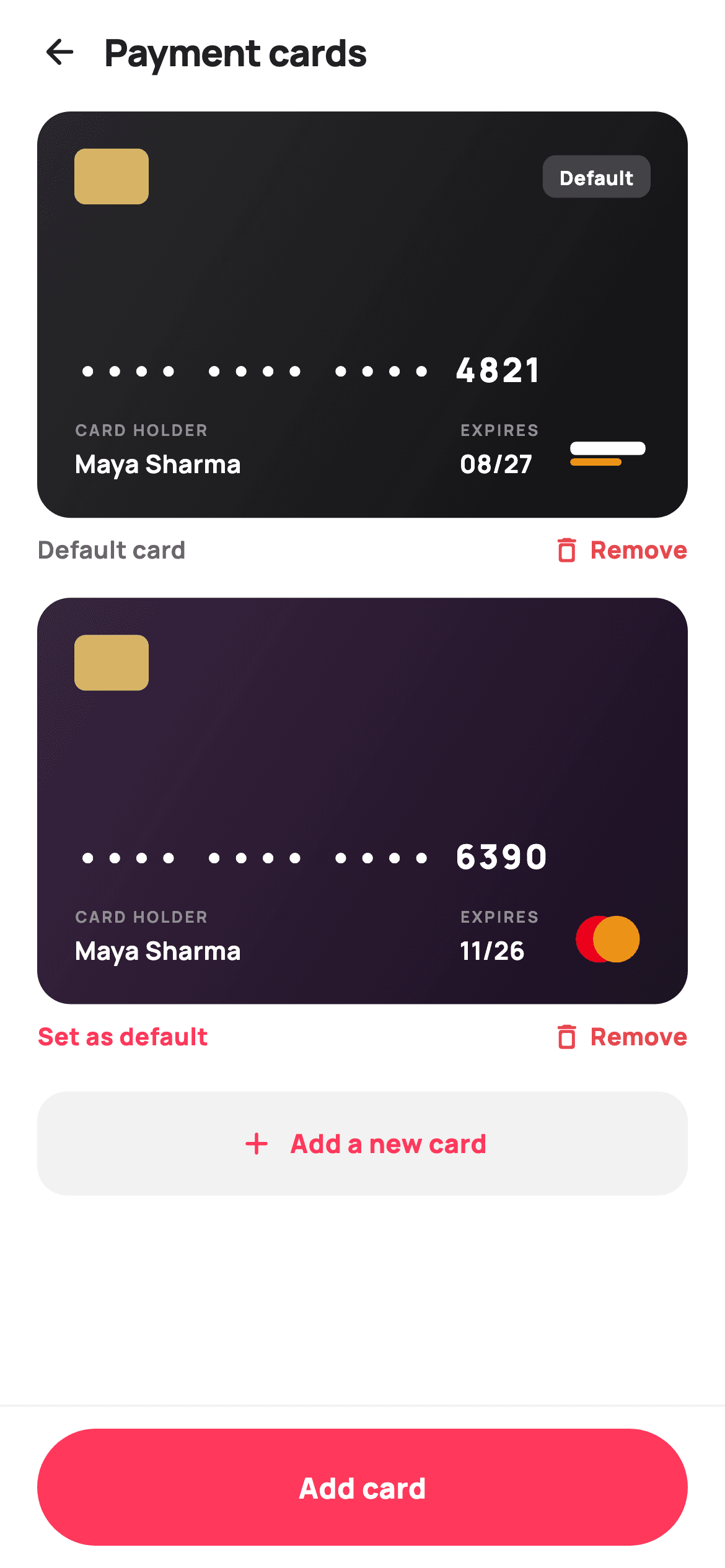
What you'll build
- ✓Card-art tiles locked to a 1.6 aspect ratio, each with its own two-stop gradient carried on the data record
- ✓A masked number line built from only the last four digits, with spaced groups like a printed card
- ✓Visa and Mastercard brand marks drawn by one small CustomPainter that switches on a brand string
- ✓A frosted Default badge on the card face plus a Set as default / Default card toggle beneath it
- ✓A per-card Remove action that hands the card's last four digits to an onRemove callback
Step-by-step build
Create the file
Add a new file at lib/ecom_profile_cards/ecom_profile_cards_screen.dart in your Flutter project.
Register the bundled fonts
No external packages — this is pure Flutter. It does bundle its design font (Manrope), so drop the font file into fonts/ and declare it in pubspec.yaml:
flutter:
  fonts:
    - family: Manrope
      fonts:
- asset: fonts/Manrope-Regular.ttfBuild it, piece by piece
Here's how the screen goes together. Each block below is a real slice of the code with a plain-English explanation — paste them in order, or grab the whole file from the next section.
Three callbacks and two seeded cards
import 'package:flutter/material.dart';

/// StyleCart — Payment cards.
///
/// Saved payment methods: full-width gradient card-art tiles (painted brand
/// mark + masked number + holder + expiry, with a "Default" ribbon), a remove
/// action per card, and a dashed "add new card" tile. A pinned bar adds a card.
///
/// Self-contained per CONVENTIONS.md: pure Flutter, bundled Manrope, inline
/// Airbnb-style tokens, own light theme + SafeArea. Painter-only graphics
/// (card brand marks). Exposes callbacks only.
class EcomProfileCardsScreen extends StatefulWidget {
  const EcomProfileCardsScreen({
    super.key,
    this.onBack,
    this.onAdd,
    this.onRemove,
  });

  final VoidCallback? onBack;
  final VoidCallback? onAdd;
  final ValueChanged<String>? onRemove;

  @override
  State<EcomProfileCardsScreen> createState() => _EcomProfileCardsScreenState();
}

class _EcomProfileCardsScreenState extends State<EcomProfileCardsScreen> {
  static const String _font = 'Manrope';
  static const Color _canvas = Color(0xFFFFFFFF);
  static const Color _ink = Color(0xFF222222);
  static const Color _muted = Color(0xFF6A6A6A);
  static const Color _brand = Color(0xFFFF385C);
  static const Color _surface = Color(0xFFF2F2F2);
  static const Color _hairline = Color(0xFFEBEBEB);

  static const List<_PayCard> _cards = <_PayCard>[
    _PayCard('visa', 'Maya Sharma', '4821', '08/27',
        <Color>[Color(0xFF2A2A2E), Color(0xFF111114)]),
    _PayCard('mc', 'Maya Sharma', '6390', '11/26',
        <Color>[Color(0xFF3A2540), Color(0xFF1A0F22)]),
  ];

  int _default = 0;
The constructor exposes only `onBack`, `onAdd` and `onRemove`. `onRemove` is a `ValueChanged<String>` because the parent has to know which card to delete, and the screen identifies a card by its `last4`. There is no callback for changing the default — that happens inside the widget with `setState`, which is why this is a `StatefulWidget` and why the only mutable field is `int _default = 0`. The two seed cards are `_PayCard` records holding a brand key (`'visa'` or `'mc'`), the holder, the last four digits, the expiry and a two-colour gradient: graphite `#2A2A2E` to `#111114` for the Visa, plum `#3A2540` to `#1A0F22` for the Mastercard. Putting the gradient on the record means each card's look is data, not a branch in the builder. The coral, ink and hairline tokens are the shared StyleCart set.
One scrolling list between a fixed header and bar
  @override
  Widget build(BuildContext context) {
    return Theme(
      data: ThemeData.light(useMaterial3: true),
      child: Scaffold(
        backgroundColor: _canvas,
        body: SafeArea(
          child: Column(
            children: <Widget>[
              _header(),
              Expanded(
                child: ListView(
                  padding: const EdgeInsets.fromLTRB(20, 4, 20, 20),
                  children: <Widget>[
                    for (int i = 0; i < _cards.length; i++)
                      _cardTile(i, _cards[i]),
                    const SizedBox(height: 4),
                    _addTile(),
                  ],
                ),
              ),
              _bottomBar(),
            ],
          ),
        ),
      ),
    );
  }

  Widget _header() {
    return Padding(
      padding: const EdgeInsets.fromLTRB(8, 4, 20, 4),
      child: Row(
        children: <Widget>[
          IconButton(
            onPressed: widget.onBack,
            icon: const Icon(Icons.arrow_back_rounded, size: 22, color: _ink),
          ),
          const Text(
            'Payment cards',
            style: TextStyle(
              fontFamily: _font,
              fontSize: 20,
              fontWeight: FontWeight.w800,
              letterSpacing: -0.3,
              color: _ink,
            ),
          ),
        ],
      ),
    );
  }
`build` puts `_header()`, an `Expanded` ListView and `_bottomBar()` in a Column, so the 'Payment cards' title and the Add card button stay put while only the cards move. The list builds its tiles with `for (int i = 0; i < _cards.length; i++) _cardTile(i, _cards[i])`. Passing the index matters because `_cardTile` compares `i` with `_default` to decide which card wears the badge. Each tile already ends with 16px of bottom padding, so the `SizedBox(height: 4)` before `_addTile()` brings that gap up to 20px, a little more space than the cards have between each other. The header is a back `IconButton` next to a 20px `w800` title with `letterSpacing: -0.3`. Its left padding is only 8px because the IconButton brings its own touch padding.
The card face: real proportions, gradient and chip
  Widget _cardTile(int i, _PayCard c) {
    final bool isDefault = _default == i;
    return Padding(
      padding: const EdgeInsets.only(bottom: 16),
      child: Column(
        children: <Widget>[
          AspectRatio(
            aspectRatio: 1.6,
            child: Container(
              padding: const EdgeInsets.all(20),
              decoration: BoxDecoration(
                borderRadius: BorderRadius.circular(18),
                gradient: LinearGradient(
                  begin: Alignment.topLeft,
                  end: Alignment.bottomRight,
                  colors: c.gradient,
                ),
              ),
              child: Column(
                crossAxisAlignment: CrossAxisAlignment.start,
                children: <Widget>[
                  Row(
                    children: <Widget>[
                      Container(
                        width: 40,
                        height: 30,
                        decoration: BoxDecoration(
                          color: const Color(0xFFE9C46A).withValues(alpha: 0.9),
                          borderRadius: BorderRadius.circular(6),
                        ),
                      ),
`_cardTile` starts with `final bool isDefault = _default == i`, then wraps the card art in `AspectRatio(aspectRatio: 1.6)`. That is close to the 85.6 × 54 mm shape of a real bank card (about 1.586), so the tile keeps the same proportions on any phone width instead of turning into a short strip on a tablet. The face is a Container with an 18px radius and a `LinearGradient` from `topLeft` to `bottomRight` that reads `c.gradient` from the record. The diagonal gives the flat colour a hint of shine. The chip is just a 40×30 Container in `#E9C46A` at `withValues(alpha: 0.9)` with a 6px radius. It is a plain gold rectangle, not a painted EMV chip with contact lines, so add those yourself if you want more detail.
Frosted Default badge and the masked number
                      const Spacer(),
                      if (isDefault)
                        Container(
                          padding: const EdgeInsets.symmetric(
                              horizontal: 9, vertical: 4),
                          decoration: BoxDecoration(
                            color: Colors.white.withValues(alpha: 0.18),
                            borderRadius: BorderRadius.circular(7),
                          ),
                          child: const Text(
                            'Default',
                            style: TextStyle(
                              fontFamily: _font,
                              fontSize: 10.5,
                              fontWeight: FontWeight.w800,
                              color: Colors.white,
                            ),
                          ),
                        ),
                    ],
                  ),
                  const Spacer(),
                  Text(
                    '••••  ••••  ••••  ${c.last4}',
                    style: const TextStyle(
                      fontFamily: _font,
                      fontSize: 18,
                      fontWeight: FontWeight.w800,
                      letterSpacing: 1.5,
                      color: Colors.white,
                    ),
                  ),
A `Spacer` in the chip row pushes the badge to the top-right corner, and `if (isDefault)` means only one card ever shows it. The badge is white at `alpha: 0.18` with 10.5px `w800` white text. A translucent white works on both the graphite and plum gradients without picking a separate colour for each, where a coral badge would clash with the card art. The second `Spacer`, between that row and the number, does the vertical layout: it fills the space inside the fixed-ratio card and pushes the number and the captions under it to the lower half, where a real card prints them. The number is the string `'•••• •••• •••• ${c.last4}'` at 18px `w800` with `letterSpacing: 1.5`. The double spaces separate the groups like the gaps on an embossed card. Only `last4` is stored, so the full number never exists anywhere in the widget.
Holder, expiry and the brand mark
                  const SizedBox(height: 14),
                  Row(
                    crossAxisAlignment: CrossAxisAlignment.end,
                    children: <Widget>[
                      Expanded(
                        child: Column(
                          crossAxisAlignment: CrossAxisAlignment.start,
                          children: <Widget>[
                            Text(
                              'CARD HOLDER',
                              style: TextStyle(
                                fontFamily: _font,
                                fontSize: 8.5,
                                fontWeight: FontWeight.w700,
                                letterSpacing: 1.2,
                                color: Colors.white.withValues(alpha: 0.5),
                              ),
                            ),
                            const SizedBox(height: 2),
                            Text(
                              c.holder,
                              style: const TextStyle(
                                fontFamily: _font,
                                fontSize: 13.5,
                                fontWeight: FontWeight.w700,
                                color: Colors.white,
                              ),
                            ),
                          ],
                        ),
                      ),
                      Column(
                        crossAxisAlignment: CrossAxisAlignment.start,
                        children: <Widget>[
                          Text(
                            'EXPIRES',
                            style: TextStyle(
                              fontFamily: _font,
                              fontSize: 8.5,
                              fontWeight: FontWeight.w700,
                              letterSpacing: 1.2,
                              color: Colors.white.withValues(alpha: 0.5),
                            ),
                          ),
                          const SizedBox(height: 2),
                          Text(
                            c.exp,
                            style: const TextStyle(
                              fontFamily: _font,
                              fontSize: 13.5,
                              fontWeight: FontWeight.w700,
                              color: Colors.white,
                            ),
                          ),
                        ],
                      ),
                      const SizedBox(width: 14),
                      CustomPaint(
                        size: const Size(46, 30),
                        painter: _CardMarkPainter(c.brand),
                      ),
                    ],
                  ),
                ],
              ),
            ),
          ),
The bottom row uses `CrossAxisAlignment.end`, so the 46×30 brand mark lines up with the baseline of the text columns instead of floating at their centre. Each column has an 8.5px caption — 'CARD HOLDER' and 'EXPIRES' — at `w700` with `letterSpacing: 1.2` in white at `alpha: 0.5`, above a 13.5px `w700` value in solid white. The faded small-caps label and bright value repeat the style printed on physical cards. The holder column is wrapped in `Expanded`, so a long name takes up the free width and pushes the expiry and brand mark to the right edge. The expiry column is not expanded and stays as narrow as its text. A 14px gap separates it from `CustomPaint(size: const Size(46, 30), painter: _CardMarkPainter(c.brand))`, which draws the network mark from the record's brand key.
Default toggle and Remove beneath each card
          const SizedBox(height: 8),
          Row(
            children: <Widget>[
              if (!isDefault)
                GestureDetector(
                  onTap: () => setState(() => _default = i),
                  child: const Text(
                    'Set as default',
                    style: TextStyle(
                      fontFamily: _font,
                      fontSize: 13,
                      fontWeight: FontWeight.w800,
                      color: _brand,
                    ),
                  ),
                )
              else
                const Text(
                  'Default card',
                  style: TextStyle(
                    fontFamily: _font,
                    fontSize: 13,
                    fontWeight: FontWeight.w700,
                    color: _muted,
                  ),
                ),
              const Spacer(),
              GestureDetector(
                onTap: () => widget.onRemove?.call(c.last4),
                child: const Row(
                  children: <Widget>[
                    Icon(Icons.delete_outline_rounded,
                        size: 17, color: Color(0xFFE5484D)),
                    SizedBox(width: 4),
                    Text(
                      'Remove',
                      style: TextStyle(
                        fontFamily: _font,
                        fontSize: 13,
                        fontWeight: FontWeight.w800,
                        color: Color(0xFFE5484D),
                      ),
                    ),
                  ],
                ),
              ),
            ],
          ),
        ],
      ),
    );
  }
The action row sits outside the card art, 8px below it, so links never compete with the card's own typography. On cards that are not the default, an `if (!isDefault) ... else ...` shows a 13px coral 'Set as default' link whose `onTap` runs `setState(() => _default = i)`. On the default card the same spot shows a muted 'Default card' label instead of going empty, so the row keeps the same left-hand layout on every tile. One index change moves the frosted badge and swaps both labels in a single rebuild. After a `Spacer`, 'Remove' pairs `Icons.delete_outline_rounded` with text in `#E5484D` red and calls `widget.onRemove?.call(c.last4)`. The screen does not remove the tile itself; it only reports the request. Neither GestureDetector sets `HitTestBehavior.opaque`, so the tap targets are only the size of the glyphs. Add padding if you need larger targets.
Add tile, pinned bar and the card record
  Widget _addTile() {
    return GestureDetector(
      onTap: widget.onAdd,
      child: Container(
        padding: const EdgeInsets.symmetric(vertical: 18),
        decoration: BoxDecoration(
          color: _surface,
          borderRadius: BorderRadius.circular(16),
        ),
        child: const Row(
          mainAxisAlignment: MainAxisAlignment.center,
          children: <Widget>[
            Icon(Icons.add_rounded, size: 20, color: _brand),
            SizedBox(width: 8),
            Text(
              'Add a new card',
              style: TextStyle(
                fontFamily: _font,
                fontSize: 14,
                fontWeight: FontWeight.w800,
                color: _brand,
              ),
            ),
          ],
        ),
      ),
    );
  }

  Widget _bottomBar() {
    return Container(
      height: 88,
      decoration: const BoxDecoration(
        color: _canvas,
        border: Border(top: BorderSide(color: _hairline)),
      ),
      padding: const EdgeInsets.fromLTRB(20, 12, 20, 12),
      child: GestureDetector(
        onTap: widget.onAdd,
        child: Container(
          height: 56,
          alignment: Alignment.center,
          decoration: BoxDecoration(
            color: _brand,
            borderRadius: BorderRadius.circular(9999),
          ),
          child: const Text(
            'Add card',
            style: TextStyle(
              fontFamily: _font,
              fontSize: 15.5,
              fontWeight: FontWeight.w800,
              color: Colors.white,
            ),
          ),
        ),
      ),
    );
  }
}

class _PayCard {
  const _PayCard(this.brand, this.holder, this.last4, this.exp, this.gradient);
  final String brand;
  final String holder;
  final String last4;
  final String exp;
  final List<Color> gradient;
}
Two widgets lead to adding a card, and both call the same `widget.onAdd`. `_addTile` is a `_surface` `#F2F2F2` block with a 16px radius, 18px vertical padding and a coral plus icon next to 'Add a new card'. The file's doc comment calls it a dashed tile, but there is no border at all — it is a solid grey fill. `_bottomBar` is an 88px strip with a hairline top border and a 56px coral pill made with `BorderRadius.circular(9999)`, so the add action is always reachable however many cards are saved. `_PayCard` is a five-field const class. Note what it leaves out: no full card number, no CVV and no ID. The `last4` string is both the display value and the key passed to `onRemove`, which is fine for the demo data but not unique once real users save more cards.
Painting Visa and Mastercard marks
/// A painted card-brand mark: Visa wordmark plate, or Mastercard discs.
class _CardMarkPainter extends CustomPainter {
  _CardMarkPainter(this.brand);
  final String brand;

  @override
  void paint(Canvas canvas, Size size) {
    if (brand == 'mc') {
      final double r = size.height * 0.42;
      final double cy = size.height / 2;
      canvas.drawCircle(Offset(size.width * 0.40, cy), r,
          Paint()..color = const Color(0xFFEB001B));
      canvas.drawCircle(
        Offset(size.width * 0.60, cy),
        r,
        Paint()..color = const Color(0xFFF79E1B).withValues(alpha: 0.88),
      );
    } else {
      canvas.drawRRect(
        RRect.fromRectAndRadius(
          Rect.fromLTWH(size.width * 0.06, size.height * 0.30,
              size.width * 0.88, size.height * 0.24),
          const Radius.circular(3),
        ),
        Paint()..color = Colors.white,
      );
      canvas.drawRRect(
        RRect.fromRectAndRadius(
          Rect.fromLTWH(size.width * 0.06, size.height * 0.60,
              size.width * 0.6, size.height * 0.13),
          const Radius.circular(3),
        ),
        Paint()..color = const Color(0xFFF7B600),
      );
    }
  }

  @override
  bool shouldRepaint(_CardMarkPainter old) => old.brand != brand;
}
`_CardMarkPainter` checks `brand == 'mc'`, and every other value falls through to the Visa branch. An Amex or RuPay key would therefore quietly get a Visa mark, so add explicit branches before you add more networks. The Mastercard mark is two circles of radius `size.height * 0.42` (about 12.6px) centred at 40% and 60% of the width. They are only about 9px apart, so they overlap heavily. The left disc is solid `#EB001B` and the right is `#F79E1B` at `alpha: 0.88`, so a little red shows through where they overlap and gives a darker middle without drawing that shape. The Visa mark has no text: a white rounded bar across 88% of the width at 30% height, then a shorter `#F7B600` gold bar beneath it. It suggests the white-and-gold colours, not the actual wordmark. `shouldRepaint` returns true only when `brand` changes.
Full code
The complete, ready-to-paste source. Free to use in your projects — one click copies it all.
import 'package:flutter/material.dart';
/// StyleCart — Payment cards.
///
/// Saved payment methods: full-width gradient card-art tiles (painted brand
/// mark + masked number + holder + expiry, with a "Default" ribbon), a remove
/// action per card, and a dashed "add new card" tile. A pinned bar adds a card.
///
/// Self-contained per CONVENTIONS.md: pure Flutter, bundled Manrope, inline
/// Airbnb-style tokens, own light theme + SafeArea. Painter-only graphics
/// (card brand marks). Exposes callbacks only.
class EcomProfileCardsScreen extends StatefulWidget {
const EcomProfileCardsScreen({
super.key,
this.onBack,
this.onAdd,
this.onRemove,
});
final VoidCallback? onBack;
final VoidCallback? onAdd;
final ValueChanged<String>? onRemove;
@override
State<EcomProfileCardsScreen> createState() => _EcomProfileCardsScreenState();
}
class _EcomProfileCardsScreenState extends State<EcomProfileCardsScreen> {
static const String _font = 'Manrope';
static const Color _canvas = Color(0xFFFFFFFF);
static const Color _ink = Color(0xFF222222);
static const Color _muted = Color(0xFF6A6A6A);
static const Color _brand = Color(0xFFFF385C);
static const Color _surface = Color(0xFFF2F2F2);
static const Color _hairline = Color(0xFFEBEBEB);
static const List<_PayCard> _cards = <_PayCard>[
_PayCard('visa', 'Maya Sharma', '4821', '08/27',
<Color>[Color(0xFF2A2A2E), Color(0xFF111114)]),
_PayCard('mc', 'Maya Sharma', '6390', '11/26',
<Color>[Color(0xFF3A2540), Color(0xFF1A0F22)]),
];
int _default = 0;
@override
Widget build(BuildContext context) {
return Theme(
data: ThemeData.light(useMaterial3: true),
child: Scaffold(
backgroundColor: _canvas,
body: SafeArea(
child: Column(
children: <Widget>[
_header(),
Expanded(
child: ListView(
padding: const EdgeInsets.fromLTRB(20, 4, 20, 20),
children: <Widget>[
for (int i = 0; i < _cards.length; i++)
_cardTile(i, _cards[i]),
const SizedBox(height: 4),
_addTile(),
],
),
),
_bottomBar(),
],
),
),
),
);
}
Widget _header() {
return Padding(
padding: const EdgeInsets.fromLTRB(8, 4, 20, 4),
child: Row(
children: <Widget>[
IconButton(
onPressed: widget.onBack,
icon: const Icon(Icons.arrow_back_rounded, size: 22, color: _ink),
),
const Text(
'Payment cards',
style: TextStyle(
fontFamily: _font,
fontSize: 20,
fontWeight: FontWeight.w800,
letterSpacing: -0.3,
color: _ink,
),
),
],
),
);
}
Widget _cardTile(int i, _PayCard c) {
final bool isDefault = _default == i;
return Padding(
padding: const EdgeInsets.only(bottom: 16),
child: Column(
children: <Widget>[
AspectRatio(
aspectRatio: 1.6,
child: Container(
padding: const EdgeInsets.all(20),
decoration: BoxDecoration(
borderRadius: BorderRadius.circular(18),
gradient: LinearGradient(
begin: Alignment.topLeft,
end: Alignment.bottomRight,
colors: c.gradient,
),
),
child: Column(
crossAxisAlignment: CrossAxisAlignment.start,
children: <Widget>[
Row(
children: <Widget>[
Container(
width: 40,
height: 30,
decoration: BoxDecoration(
color: const Color(0xFFE9C46A).withValues(alpha: 0.9),
borderRadius: BorderRadius.circular(6),
),
),
const Spacer(),
if (isDefault)
Container(
padding: const EdgeInsets.symmetric(
horizontal: 9, vertical: 4),
decoration: BoxDecoration(
color: Colors.white.withValues(alpha: 0.18),
borderRadius: BorderRadius.circular(7),
),
child: const Text(
'Default',
style: TextStyle(
fontFamily: _font,
fontSize: 10.5,
fontWeight: FontWeight.w800,
color: Colors.white,
),
),
),
],
),
const Spacer(),
Text(
'•••• •••• •••• ${c.last4}',
style: const TextStyle(
fontFamily: _font,
fontSize: 18,
fontWeight: FontWeight.w800,
letterSpacing: 1.5,
color: Colors.white,
),
),
const SizedBox(height: 14),
Row(
crossAxisAlignment: CrossAxisAlignment.end,
children: <Widget>[
Expanded(
child: Column(
crossAxisAlignment: CrossAxisAlignment.start,
children: <Widget>[
Text(
'CARD HOLDER',
style: TextStyle(
fontFamily: _font,
fontSize: 8.5,
fontWeight: FontWeight.w700,
letterSpacing: 1.2,
color: Colors.white.withValues(alpha: 0.5),
),
),
const SizedBox(height: 2),
Text(
c.holder,
style: const TextStyle(
fontFamily: _font,
fontSize: 13.5,
fontWeight: FontWeight.w700,
color: Colors.white,
),
),
],
),
),
Column(
crossAxisAlignment: CrossAxisAlignment.start,
children: <Widget>[
Text(
'EXPIRES',
style: TextStyle(
fontFamily: _font,
fontSize: 8.5,
fontWeight: FontWeight.w700,
letterSpacing: 1.2,
color: Colors.white.withValues(alpha: 0.5),
),
),
const SizedBox(height: 2),
Text(
c.exp,
style: const TextStyle(
fontFamily: _font,
fontSize: 13.5,
fontWeight: FontWeight.w700,
color: Colors.white,
),
),
],
),
const SizedBox(width: 14),
CustomPaint(
size: const Size(46, 30),
painter: _CardMarkPainter(c.brand),
),
],
),
],
),
),
),
const SizedBox(height: 8),
Row(
children: <Widget>[
if (!isDefault)
GestureDetector(
onTap: () => setState(() => _default = i),
child: const Text(
'Set as default',
style: TextStyle(
fontFamily: _font,
fontSize: 13,
fontWeight: FontWeight.w800,
color: _brand,
),
),
)
else
const Text(
'Default card',
style: TextStyle(
fontFamily: _font,
fontSize: 13,
fontWeight: FontWeight.w700,
color: _muted,
),
),
const Spacer(),
GestureDetector(
onTap: () => widget.onRemove?.call(c.last4),
child: const Row(
children: <Widget>[
Icon(Icons.delete_outline_rounded,
size: 17, color: Color(0xFFE5484D)),
SizedBox(width: 4),
Text(
'Remove',
style: TextStyle(
fontFamily: _font,
fontSize: 13,
fontWeight: FontWeight.w800,
color: Color(0xFFE5484D),
),
),
],
),
),
],
),
],
),
);
}
Widget _addTile() {
return GestureDetector(
onTap: widget.onAdd,
child: Container(
padding: const EdgeInsets.symmetric(vertical: 18),
decoration: BoxDecoration(
color: _surface,
borderRadius: BorderRadius.circular(16),
),
child: const Row(
mainAxisAlignment: MainAxisAlignment.center,
children: <Widget>[
Icon(Icons.add_rounded, size: 20, color: _brand),
SizedBox(width: 8),
Text(
'Add a new card',
style: TextStyle(
fontFamily: _font,
fontSize: 14,
fontWeight: FontWeight.w800,
color: _brand,
),
),
],
),
),
);
}
Widget _bottomBar() {
return Container(
height: 88,
decoration: const BoxDecoration(
color: _canvas,
border: Border(top: BorderSide(color: _hairline)),
),
padding: const EdgeInsets.fromLTRB(20, 12, 20, 12),
child: GestureDetector(
onTap: widget.onAdd,
child: Container(
height: 56,
alignment: Alignment.center,
decoration: BoxDecoration(
color: _brand,
borderRadius: BorderRadius.circular(9999),
),
child: const Text(
'Add card',
style: TextStyle(
fontFamily: _font,
fontSize: 15.5,
fontWeight: FontWeight.w800,
color: Colors.white,
),
),
),
),
);
}
}
class _PayCard {
const _PayCard(this.brand, this.holder, this.last4, this.exp, this.gradient);
final String brand;
final String holder;
final String last4;
final String exp;
final List<Color> gradient;
}
/// A painted card-brand mark: Visa wordmark plate, or Mastercard discs.
class _CardMarkPainter extends CustomPainter {
_CardMarkPainter(this.brand);
final String brand;
@override
void paint(Canvas canvas, Size size) {
if (brand == 'mc') {
final double r = size.height * 0.42;
final double cy = size.height / 2;
canvas.drawCircle(Offset(size.width * 0.40, cy), r,
Paint()..color = const Color(0xFFEB001B));
canvas.drawCircle(
Offset(size.width * 0.60, cy),
r,
Paint()..color = const Color(0xFFF79E1B).withValues(alpha: 0.88),
);
} else {
canvas.drawRRect(
RRect.fromRectAndRadius(
Rect.fromLTWH(size.width * 0.06, size.height * 0.30,
size.width * 0.88, size.height * 0.24),
const Radius.circular(3),
),
Paint()..color = Colors.white,
);
canvas.drawRRect(
RRect.fromRectAndRadius(
Rect.fromLTWH(size.width * 0.06, size.height * 0.60,
size.width * 0.6, size.height * 0.13),
const Radius.circular(3),
),
Paint()..color = const Color(0xFFF7B600),
);
}
}
@override
bool shouldRepaint(_CardMarkPainter old) => old.brand != brand;
}
Plus bundled 5 binary assets (fonts/images). The CLI and MCP install those for you automatically.
Two faster ways to add it
Copy-paste works, but you can skip it entirely.
1. FlutterKit CLI
One command drops this screen — and its fonts — straight into your project.
$ flutterkit add ecom-profile-cards2. AI agent (MCP)
Connect FlutterKit's MCP server in Claude or Cursor and just ask your agent to install ecom-profile-cards — it fetches and writes the files for you.
FAQ
Can I ship this payment cards screen in a commercial app?
Yes. It is free to use in commercial projects, including paid shopping or wallet apps. There is no licence key, no account and no attribution requirement. Copy the code from this page or install it with the CLI command.
Does it need any packages, fonts or logo assets?
No third-party packages, and no image or SVG assets either. The chip is a Container and the two network marks are drawn by `_CardMarkPainter`. The only bundled resource is the Manrope font family, set through the `_font` constant and installed with the screen.
What Flutter version does this require?
Flutter 3.22 or newer, because the chip, the Default badge, the caption labels and the Mastercard disc all use `Color.withValues(alpha: ...)`. On an older SDK, replace each one with `withOpacity` and the same value, for example `Colors.white.withOpacity(0.18)`. The constructor also uses the `super.key` super parameter, which needs Dart 2.17 or later.
Does my backend find out when the user taps Set as default?
Not as written. The tap only runs `setState(() => _default = i)`, so the change exists only inside the widget and is lost when it rebuilds from fresh data. Add a `ValueChanged<String>? onSetDefault` callback, call it in that same handler, and give `_PayCard` a real ID from your payment provider's saved-method token. Then pass the ID to both callbacks instead of `last4`, since two cards can share their last four digits.
Are the Visa and Mastercard marks the real logos?
No, they are lightweight stand-ins. The Mastercard mark is two overlapping discs in close-to-brand colours, and the Visa mark is an abstract white-and-gold plate with no lettering. For a production checkout, check each network's brand guidelines and swap in their official artwork if you need it. Keep the painter's `brand` switch and add a branch for every network you accept, because unknown brands currently fall back to the Visa plate.


