How to Build a Saved Addresses Screen in Flutter (Full Code + Preview)
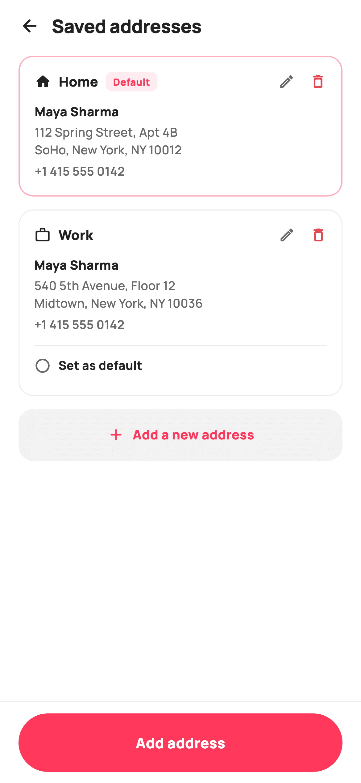
Every store app eventually needs an address book, and the tricky part is not the list — it is making the default unambiguous while keeping edit, delete and switch-default one tap away. This tutorial walks through StyleCart's saved-addresses screen in Flutter: bordered cards with Home and Work tags, a coral 'Default' pill, recipient name, multi-line street address and phone, inline edit and delete icons, and a tap-to-set radio row that promotes any card with one setState. You also get a grey add tile and a pinned pill-shaped Add button.
What you'll build
- ✓Address cards whose border colour and width change when they hold the default
- ✓A tinted 'Default' pill that appears inline next to the Home or Work tag
- ✓A 'Set as default' radio row that only non-default cards render, driven by one int of state
- ✓Inline edit and delete icons wired to ValueChanged<String> callbacks, with delete tinted red
- ✓A grey add-address tile in the scroll plus a pinned fully-rounded Add button below it
Step-by-step build
Create the file
Add a new file at lib/ecom_profile_addresses/ecom_profile_addresses_screen.dart in your Flutter project.
Register the bundled fonts
No external packages — this is pure Flutter. It does bundle its design font (Manrope), so drop the font file into fonts/ and declare it in pubspec.yaml:
flutter:
  fonts:
    - family: Manrope
      fonts:
- asset: fonts/Manrope-Regular.ttfBuild it, piece by piece
Here's how the screen goes together. Each block below is a real slice of the code with a plain-English explanation — paste them in order, or grab the whole file from the next section.
Four callbacks and a StatefulWidget
import 'package:flutter/material.dart';

/// StyleCart — Saved addresses.
///
/// The address book: cards for each saved address with a type tag (Home / Work
/// / Other), a "Default" badge, full address + phone, and edit / delete / set-
/// default actions. A dashed "add new address" tile sits at the bottom; a
/// pinned bar adds an address.
///
/// Self-contained per CONVENTIONS.md: pure Flutter, bundled Manrope, inline
/// Airbnb-style tokens, own light theme + SafeArea. Painter-free. Exposes
/// callbacks only.
class EcomProfileAddressesScreen extends StatefulWidget {
  const EcomProfileAddressesScreen({
    super.key,
    this.onBack,
    this.onAdd,
    this.onEdit,
    this.onDelete,
  });

  final VoidCallback? onBack;
  final VoidCallback? onAdd;
  final ValueChanged<String>? onEdit;
  final ValueChanged<String>? onDelete;

  @override
  State<EcomProfileAddressesScreen> createState() =>
      _EcomProfileAddressesScreenState();
}
The widget takes `onBack`, `onAdd`, `onEdit` and `onDelete` — nothing else. `onEdit` and `onDelete` are typed `ValueChanged<String>?` rather than plain `VoidCallback`s because the parent needs to know which address was tapped; the screen passes the address's type string through when the icon fires. Unlike most confirmation-style pages this one is a `StatefulWidget`, and for exactly one reason: the default selection can change without leaving the screen. Everything else — adding, editing, deleting — is a navigation event and gets delegated out through a callback instead of being mutated locally.
Tokens, seed data and one int of state
class _EcomProfileAddressesScreenState
    extends State<EcomProfileAddressesScreen> {
  static const String _font = 'Manrope';
  static const Color _canvas = Color(0xFFFFFFFF);
  static const Color _ink = Color(0xFF222222);
  static const Color _muted = Color(0xFF6A6A6A);
  static const Color _brand = Color(0xFFFF385C);
  static const Color _surface = Color(0xFFF2F2F2);
  static const Color _hairline = Color(0xFFEBEBEB);
  static const Color _danger = Color(0xFFE5484D);

  static const List<_Address> _addresses = <_Address>[
    _Address('Home', Icons.home_rounded, 'Maya Sharma',
        '112 Spring Street, Apt 4B\nSoHo, New York, NY 10012',
        '+1 415 555 0142'),
    _Address('Work', Icons.work_outline_rounded, 'Maya Sharma',
        '540 5th Avenue, Floor 12\nMidtown, New York, NY 10036',
        '+1 415 555 0142'),
  ];

  int _default = 0;
The palette is Airbnb-flavoured: `#FF385C` coral as `_brand`, `#222222` ink, `#6A6A6A` muted grey, an `#EBEBEB` hairline, and a separate `#E5484D` `_danger` red so the delete icon reads as destructive without borrowing the brand colour. The two seed addresses are a `static const List<_Address>` — each record carries a type, an icon, a name, a multi-line street string with an embedded `\n`, and a phone number, so the card builder never hardcodes copy. The entire mutable state is `int _default = 0`: an index, not a boolean per card, which makes 'exactly one default' true by construction rather than something you have to enforce.
The build: pinned header and bar, scrolling middle
  @override
  Widget build(BuildContext context) {
    return Theme(
      data: ThemeData.light(useMaterial3: true),
      child: Scaffold(
        backgroundColor: _canvas,
        body: SafeArea(
          child: Column(
            children: <Widget>[
              _header(),
              Expanded(
                child: ListView(
                  padding: const EdgeInsets.fromLTRB(20, 4, 20, 20),
                  children: <Widget>[
                    for (int i = 0; i < _addresses.length; i++)
                      _card(i, _addresses[i]),
                    _addTile(),
                  ],
                ),
              ),
              _bottomBar(),
            ],
          ),
        ),
      ),
    );
  }
`build` wraps everything in `Theme(data: ThemeData.light(useMaterial3: true))` so the screen carries its own light theme wherever you drop it, then lays out a Column of `_header()`, an `Expanded` ListView, and `_bottomBar()`. Because header and bar sit outside the ListView, they stay pinned while only the cards scroll. The list's children use a collection-for — `for (int i = 0; i < _addresses.length; i++) _card(i, _addresses[i])` — passing the index alongside the record, since `_card` needs `i` to compare against `_default` and to write it back on tap. The add tile is simply the last scrolling child, so it always follows the final card.
A left-aligned header, not an AppBar
  Widget _header() {
    return Padding(
      padding: const EdgeInsets.fromLTRB(8, 4, 20, 4),
      child: Row(
        children: <Widget>[
          IconButton(
            onPressed: widget.onBack,
            icon: const Icon(Icons.arrow_back_rounded, size: 22, color: _ink),
          ),
          const Text(
            'Saved addresses',
            style: TextStyle(
              fontFamily: _font,
              fontSize: 20,
              fontWeight: FontWeight.w800,
              letterSpacing: -0.3,
              color: _ink,
            ),
          ),
        ],
      ),
    );
  }
The header is a hand-rolled `Padding` + Row instead of an `AppBar`: a back-arrow `IconButton` wired to `widget.onBack`, then 'Saved addresses' at 20px `w800` in Manrope with `letterSpacing: -0.3`. Leaving the title next to the arrow rather than centring it matches the settings-page feel this screen lives in, and skipping `AppBar` avoids Material's default elevation, tinting and centre-title behaviour on different platforms. Note the asymmetric padding — 8 on the left, 20 on the right — because the `IconButton` brings its own touch-target padding and would otherwise sit visually indented.
The card's top row: tag, pill, edit, delete
  Widget _card(int i, _Address a) {
    final bool isDefault = _default == i;
    return Container(
      margin: const EdgeInsets.only(bottom: 14),
      padding: const EdgeInsets.all(16),
      decoration: BoxDecoration(
        color: _canvas,
        borderRadius: BorderRadius.circular(16),
        border: Border.all(
          color: isDefault ? _brand.withValues(alpha: 0.4) : _hairline,
          width: isDefault ? 1.4 : 1,
        ),
      ),
      child: Column(
        crossAxisAlignment: CrossAxisAlignment.start,
        children: <Widget>[
          Row(
            children: <Widget>[
              Icon(a.icon, size: 18, color: _ink),
              const SizedBox(width: 8),
              Text(
                a.type,
                style: const TextStyle(
                  fontFamily: _font,
                  fontSize: 14.5,
                  fontWeight: FontWeight.w800,
                  color: _ink,
                ),
              ),
              const SizedBox(width: 8),
              if (isDefault)
                Container(
                  padding:
                      const EdgeInsets.symmetric(horizontal: 8, vertical: 3),
                  decoration: BoxDecoration(
                    color: _brand.withValues(alpha: 0.10),
                    borderRadius: BorderRadius.circular(7),
                  ),
                  child: const Text(
                    'Default',
                    style: TextStyle(
                      fontFamily: _font,
                      fontSize: 10.5,
                      fontWeight: FontWeight.w800,
                      color: _brand,
                    ),
                  ),
                ),
              const Spacer(),
              GestureDetector(
                onTap: () => widget.onEdit?.call(a.type),
                child: const Icon(Icons.edit_outlined, size: 18, color: _muted),
              ),
              const SizedBox(width: 16),
              GestureDetector(
                onTap: () => widget.onDelete?.call(a.type),
                child:
                    const Icon(Icons.delete_outline_rounded, size: 18, color: _danger),
              ),
            ],
          ),
`_card` computes `final bool isDefault = _default == i` once and lets it steer three things. First the border: `_brand.withValues(alpha: 0.4)` at 1.4px for the default card versus a 1px `_hairline` for the rest — a promotion you notice at a glance without any fill change. Second, the top Row shows the type icon and tag (14.5px `w800`), then an `if (isDefault)` collection-if drops in the 'Default' pill: 10.5px coral text on a `_brand.withValues(alpha: 0.10)` tint with a tight 7px radius. A `Spacer` then pushes the actions right: an edit pencil in `_muted` and a delete bin in `_danger`, each a bare 18px `Icon` in a `GestureDetector` that forwards `a.type` to the matching callback. Keeping delete red and edit grey ranks the two actions without any button chrome.
Address details and the set-as-default row
          const SizedBox(height: 12),
          Text(
            a.name,
            style: const TextStyle(
              fontFamily: _font,
              fontSize: 13.5,
              fontWeight: FontWeight.w800,
              color: _ink,
            ),
          ),
          const SizedBox(height: 4),
          Text(
            a.address,
            style: const TextStyle(
              fontFamily: _font,
              fontSize: 13,
              fontWeight: FontWeight.w500,
              height: 1.45,
              color: _muted,
            ),
          ),
          const SizedBox(height: 4),
          Text(
            a.phone,
            style: const TextStyle(
              fontFamily: _font,
              fontSize: 13,
              fontWeight: FontWeight.w600,
              color: _muted,
            ),
          ),
          if (!isDefault) ...<Widget>[
            const SizedBox(height: 12),
            const Divider(height: 1, color: _hairline),
            const SizedBox(height: 6),
            GestureDetector(
              onTap: () => setState(() => _default = i),
              behavior: HitTestBehavior.opaque,
              child: const Padding(
                padding: EdgeInsets.symmetric(vertical: 6),
                child: Row(
                  children: <Widget>[
                    Icon(Icons.radio_button_unchecked_rounded,
                        size: 18, color: _muted),
                    SizedBox(width: 8),
                    Text(
                      'Set as default',
                      style: TextStyle(
                        fontFamily: _font,
                        fontSize: 13,
                        fontWeight: FontWeight.w700,
                        color: _ink,
                      ),
                    ),
                  ],
                ),
              ),
            ),
          ],
        ],
      ),
    );
  }
The body is three stacked Texts with deliberate weight steps: the recipient name at 13.5px `w800` in ink, the street address at 13px `w500` in `_muted` with `height: 1.45` so its embedded newline breathes, and the phone at `w600` — slightly heavier than the address because it is the line a courier actually dials. Then the interesting bit: `if (!isDefault) ...` spreads a divider plus a 'Set as default' row into the Column, so the default card simply ends after the phone number — no disabled control, no checked radio, nothing to tap. The row's `GestureDetector` uses `behavior: HitTestBehavior.opaque` and 6px vertical padding so the whole strip is tappable, not just the glyphs, and its handler is one line: `setState(() => _default = i)`. Changing the index restyles both cards in a single rebuild — the old default grows this row back automatically.
The in-list add tile
  Widget _addTile() {
    return GestureDetector(
      onTap: widget.onAdd,
      child: Container(
        padding: const EdgeInsets.symmetric(vertical: 18),
        decoration: BoxDecoration(
          color: _surface,
          borderRadius: BorderRadius.circular(16),
        ),
        child: const Row(
          mainAxisAlignment: MainAxisAlignment.center,
          children: <Widget>[
            Icon(Icons.add_rounded, size: 20, color: _brand),
            SizedBox(width: 8),
            Text(
              'Add a new address',
              style: TextStyle(
                fontFamily: _font,
                fontSize: 14,
                fontWeight: FontWeight.w800,
                color: _brand,
              ),
            ),
          ],
        ),
      ),
    );
  }
`_addTile` is a full-width `#F2F2F2` `_surface` container with the card's same 16px radius, holding a centred Row of a coral plus icon and 'Add a new address' at 14px `w800` in `_brand`. It reuses the exact `widget.onAdd` callback as the bottom bar, and that redundancy is the point: after scrolling past their addresses the user's thumb is already in the list, and the tile catches the intent right where the eye stops. The grey fill and coral text make it read as an action, not another address card.
The pinned Add bar, and the address record
  Widget _bottomBar() {
    return Container(
      height: 88,
      decoration: const BoxDecoration(
        color: _canvas,
        border: Border(top: BorderSide(color: _hairline)),
      ),
      padding: const EdgeInsets.fromLTRB(20, 12, 20, 12),
      child: GestureDetector(
        onTap: widget.onAdd,
        child: Container(
          height: 56,
          alignment: Alignment.center,
          decoration: BoxDecoration(
            color: _brand,
            borderRadius: BorderRadius.circular(9999),
          ),
          child: const Text(
            'Add address',
            style: TextStyle(
              fontFamily: _font,
              fontSize: 15.5,
              fontWeight: FontWeight.w800,
              color: Colors.white,
            ),
          ),
        ),
      ),
    );
  }
}

class _Address {
  const _Address(this.type, this.icon, this.name, this.address, this.phone);
  final String type;
  final IconData icon;
  final String name;
  final String address;
  final String phone;
}
`_bottomBar` is an 88px container with a `_hairline` top border, holding a 56px coral button built as a plain Container with `BorderRadius.circular(9999)` — the oversized radius is a cheap way to guarantee a full pill at any height, no `StadiumBorder` needed. The label sits at 15.5px `w800` white, and the tap goes to the same `widget.onAdd` as the tile. The file closes with `_Address`, a five-field const class (type, icon, name, address, phone) instead of a `Map<String, String>` — the `IconData` field is why: keeping the icon on the record means the card builder never switches on the type string to pick a glyph.
Full code
The complete, ready-to-paste source. Free to use in your projects — one click copies it all.
import 'package:flutter/material.dart';

/// StyleCart — Saved addresses.
///
/// The address book: cards for each saved address with a type tag (Home / Work
/// / Other), a "Default" badge, full address + phone, and edit / delete / set-
/// default actions. A dashed "add new address" tile sits at the bottom; a
/// pinned bar adds an address.
///
/// Self-contained per CONVENTIONS.md: pure Flutter, bundled Manrope, inline
/// Airbnb-style tokens, own light theme + SafeArea. Painter-free. Exposes
/// callbacks only.
class EcomProfileAddressesScreen extends StatefulWidget {
  const EcomProfileAddressesScreen({
    super.key,
    this.onBack,
    this.onAdd,
    this.onEdit,
    this.onDelete,
  });

  final VoidCallback? onBack;
  final VoidCallback? onAdd;
  final ValueChanged<String>? onEdit;
  final ValueChanged<String>? onDelete;

  @override
  State<EcomProfileAddressesScreen> createState() =>
      _EcomProfileAddressesScreenState();
}

class _EcomProfileAddressesScreenState
    extends State<EcomProfileAddressesScreen> {
  static const String _font = 'Manrope';
  static const Color _canvas = Color(0xFFFFFFFF);
  static const Color _ink = Color(0xFF222222);
  static const Color _muted = Color(0xFF6A6A6A);
  static const Color _brand = Color(0xFFFF385C);
  static const Color _surface = Color(0xFFF2F2F2);
  static const Color _hairline = Color(0xFFEBEBEB);
  static const Color _danger = Color(0xFFE5484D);

  static const List<_Address> _addresses = <_Address>[
    _Address('Home', Icons.home_rounded, 'Maya Sharma',
        '112 Spring Street, Apt 4B\nSoHo, New York, NY 10012',
        '+1 415 555 0142'),
    _Address('Work', Icons.work_outline_rounded, 'Maya Sharma',
        '540 5th Avenue, Floor 12\nMidtown, New York, NY 10036',
        '+1 415 555 0142'),
  ];

  int _default = 0;

  @override
  Widget build(BuildContext context) {
    return Theme(
      data: ThemeData.light(useMaterial3: true),
      child: Scaffold(
        backgroundColor: _canvas,
        body: SafeArea(
          child: Column(
            children: <Widget>[
              _header(),
              Expanded(
                child: ListView(
                  padding: const EdgeInsets.fromLTRB(20, 4, 20, 20),
                  children: <Widget>[
                    for (int i = 0; i < _addresses.length; i++)
                      _card(i, _addresses[i]),
                    _addTile(),
                  ],
                ),
              ),
              _bottomBar(),
            ],
          ),
        ),
      ),
    );
  }

  Widget _header() {
    return Padding(
      padding: const EdgeInsets.fromLTRB(8, 4, 20, 4),
      child: Row(
        children: <Widget>[
          IconButton(
            onPressed: widget.onBack,
            icon: const Icon(Icons.arrow_back_rounded, size: 22, color: _ink),
          ),
          const Text(
            'Saved addresses',
            style: TextStyle(
              fontFamily: _font,
              fontSize: 20,
              fontWeight: FontWeight.w800,
              letterSpacing: -0.3,
              color: _ink,
            ),
          ),
        ],
      ),
    );
  }

  Widget _card(int i, _Address a) {
    final bool isDefault = _default == i;
    return Container(
      margin: const EdgeInsets.only(bottom: 14),
      padding: const EdgeInsets.all(16),
      decoration: BoxDecoration(
        color: _canvas,
        borderRadius: BorderRadius.circular(16),
        border: Border.all(
          color: isDefault ? _brand.withValues(alpha: 0.4) : _hairline,
          width: isDefault ? 1.4 : 1,
        ),
      ),
      child: Column(
        crossAxisAlignment: CrossAxisAlignment.start,
        children: <Widget>[
          Row(
            children: <Widget>[
              Icon(a.icon, size: 18, color: _ink),
              const SizedBox(width: 8),
              Text(
                a.type,
                style: const TextStyle(
                  fontFamily: _font,
                  fontSize: 14.5,
                  fontWeight: FontWeight.w800,
                  color: _ink,
                ),
              ),
              const SizedBox(width: 8),
              if (isDefault)
                Container(
                  padding:
                      const EdgeInsets.symmetric(horizontal: 8, vertical: 3),
                  decoration: BoxDecoration(
                    color: _brand.withValues(alpha: 0.10),
                    borderRadius: BorderRadius.circular(7),
                  ),
                  child: const Text(
                    'Default',
                    style: TextStyle(
                      fontFamily: _font,
                      fontSize: 10.5,
                      fontWeight: FontWeight.w800,
                      color: _brand,
                    ),
                  ),
                ),
              const Spacer(),
              GestureDetector(
                onTap: () => widget.onEdit?.call(a.type),
                child: const Icon(Icons.edit_outlined, size: 18, color: _muted),
              ),
              const SizedBox(width: 16),
              GestureDetector(
                onTap: () => widget.onDelete?.call(a.type),
                child:
                    const Icon(Icons.delete_outline_rounded, size: 18, color: _danger),
              ),
            ],
          ),
          const SizedBox(height: 12),
          Text(
            a.name,
            style: const TextStyle(
              fontFamily: _font,
              fontSize: 13.5,
              fontWeight: FontWeight.w800,
              color: _ink,
            ),
          ),
          const SizedBox(height: 4),
          Text(
            a.address,
            style: const TextStyle(
              fontFamily: _font,
              fontSize: 13,
              fontWeight: FontWeight.w500,
              height: 1.45,
              color: _muted,
            ),
          ),
          const SizedBox(height: 4),
          Text(
            a.phone,
            style: const TextStyle(
              fontFamily: _font,
              fontSize: 13,
              fontWeight: FontWeight.w600,
              color: _muted,
            ),
          ),
          if (!isDefault) ...<Widget>[
            const SizedBox(height: 12),
            const Divider(height: 1, color: _hairline),
            const SizedBox(height: 6),
            GestureDetector(
              onTap: () => setState(() => _default = i),
              behavior: HitTestBehavior.opaque,
              child: const Padding(
                padding: EdgeInsets.symmetric(vertical: 6),
                child: Row(
                  children: <Widget>[
                    Icon(Icons.radio_button_unchecked_rounded,
                        size: 18, color: _muted),
                    SizedBox(width: 8),
                    Text(
                      'Set as default',
                      style: TextStyle(
                        fontFamily: _font,
                        fontSize: 13,
                        fontWeight: FontWeight.w700,
                        color: _ink,
                      ),
                    ),
                  ],
                ),
              ),
            ),
          ],
        ],
      ),
    );
  }

  Widget _addTile() {
    return GestureDetector(
      onTap: widget.onAdd,
      child: Container(
        padding: const EdgeInsets.symmetric(vertical: 18),
        decoration: BoxDecoration(
          color: _surface,
          borderRadius: BorderRadius.circular(16),
        ),
        child: const Row(
          mainAxisAlignment: MainAxisAlignment.center,
          children: <Widget>[
            Icon(Icons.add_rounded, size: 20, color: _brand),
            SizedBox(width: 8),
            Text(
              'Add a new address',
              style: TextStyle(
                fontFamily: _font,
                fontSize: 14,
                fontWeight: FontWeight.w800,
                color: _brand,
              ),
            ),
          ],
        ),
      ),
    );
  }

  Widget _bottomBar() {
    return Container(
      height: 88,
      decoration: const BoxDecoration(
        color: _canvas,
        border: Border(top: BorderSide(color: _hairline)),
      ),
      padding: const EdgeInsets.fromLTRB(20, 12, 20, 12),
      child: GestureDetector(
        onTap: widget.onAdd,
        child: Container(
          height: 56,
          alignment: Alignment.center,
          decoration: BoxDecoration(
            color: _brand,
            borderRadius: BorderRadius.circular(9999),
          ),
          child: const Text(
            'Add address',
            style: TextStyle(
              fontFamily: _font,
              fontSize: 15.5,
              fontWeight: FontWeight.w800,
              color: Colors.white,
            ),
          ),
        ),
      ),
    );
  }
}

class _Address {
  const _Address(this.type, this.icon, this.name, this.address, this.phone);
  final String type;
  final IconData icon;
  final String name;
  final String address;
  final String phone;
}
Plus bundled 5 binary assets (fonts/images). The CLI and MCP install those for you automatically.
Two faster ways to add it
Copy-paste works, but you can skip it entirely.
1. FlutterKit CLI
One command drops this screen — and its fonts — straight into your project.
$ flutterkit add ecom-profile-addresses2. AI agent (MCP)
Connect FlutterKit's MCP server in Claude or Cursor and just ask your agent to install ecom-profile-addresses — it fetches and writes the files for you.
FAQ
Can I use this saved-addresses screen in a commercial app?
Yes. FlutterKit screens are free, commercial use included — ship it in a paid shopping or delivery app without a licence key, sign-up or attribution. Copy the code from this page or install it with the CLI command shown above.
Does this screen depend on any packages or external fonts?
No third-party packages at all — it is pure Flutter and Material icons. The typography is Manrope, and the font files (Regular through ExtraBold) come bundled with the screen, referenced through a single `_font` constant so swapping in your own typeface is a one-line change.
Which Flutter version do I need?
Flutter 3.22 or newer, since the default border and pill use `Color.withValues(alpha: ...)`. On an older SDK, replace those two calls with `withOpacity(0.4)` and `withOpacity(0.10)`; the constructor also uses `super.key`, so a much older project would need the long-form `Key? key` constructor too.
How do I show a user's real addresses instead of the two hardcoded ones?
The list is a `static const List<_Address>` purely so the screen previews standalone. Promote it to a constructor parameter (or a state-managed list), keep `_Address` as your row shape, and add an `id` field — the callbacks currently pass `a.type`, which works for Home/Work demo data but is not unique once users can save several addresses of the same kind.
Why does 'Set as default' use setState while edit and delete are callbacks?
Because they are different kinds of actions. Switching the default is a selection the screen can resolve itself — flipping `_default` restyles both cards instantly, and you can persist it in the background. Edit and delete need a form or a confirmation elsewhere, so they are delegated out as `ValueChanged<String>` callbacks and the screen stays backend-agnostic.


