How to Build a Fashion Size Guide Screen in Flutter (Full Code + Preview)
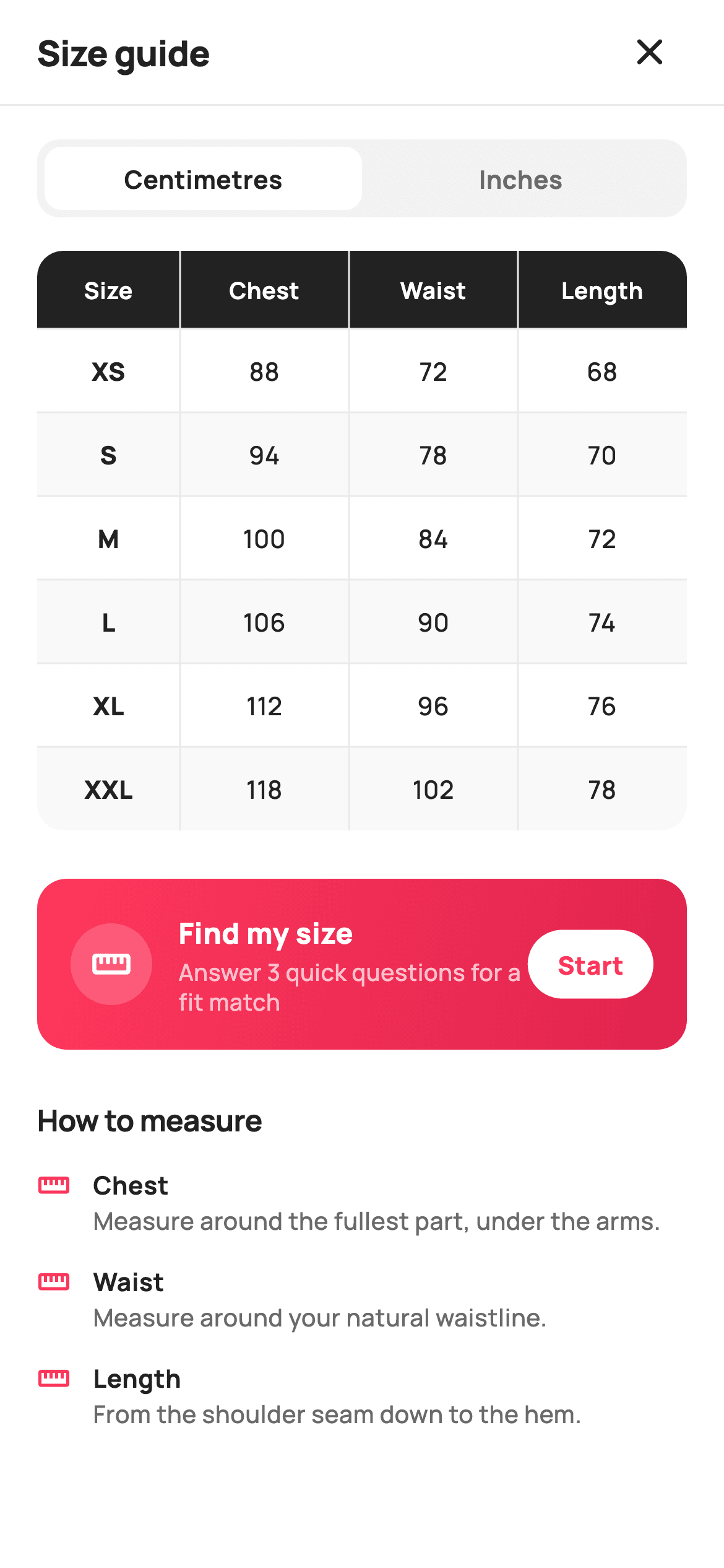
Most apparel returns happen because the shopper guessed a size, and a size chart buried in a product description does not stop the guess. This tutorial builds StyleCart's size-guide screen in Flutter: a segmented Centimetres / Inches toggle driven by a single `_cmUnit` boolean, a six-row `Table` from XS to XXL whose cells convert through one `_v()` helper, a gradient 'Find my size' card wired to `onFindMySize`, and a 'How to measure' list generated from a nested string list. Pure Flutter, no packages, no images.
Watch the Flutter UI walkthrough
A short screen recording of Size Guide running, if you'd rather see it before you read the code. The written tutorial below covers everything in it.
Can't see the video? Watch it on YouTube.
What you'll build
- ✓A cm/inch segmented control whose selected tab is a white pill on a `_surface` track, flipped by one `bool _cmUnit`
- ✓A `_v(int cm)` formatter that keeps centimetres as integers and renders inches to one decimal place
- ✓A `ClipRRect`-rounded `Table` with a `_ink` header row, `FlexColumnWidth` ratios and zebra rows generated from a `List<List<int>>`
- ✓A coral `LinearGradient` 'Find my size' card with a translucent ruler badge and a white 'Start' pill bound to `onFindMySize`
- ✓A 'How to measure' section that maps a `const List<List<String>>` into icon-led tip rows
Step-by-step build
Create the file
Add a new file at lib/ecom_product_size_guide/ecom_product_size_guide_screen.dart in your Flutter project.
Register the bundled fonts
No external packages — this is pure Flutter. It does bundle its design font (Manrope), so drop the font file into fonts/ and declare it in pubspec.yaml:
flutter:
  fonts:
    - family: Manrope
      fonts:
- asset: fonts/Manrope-Regular.ttfBuild it, piece by piece
Here's how the screen goes together. Each block below is a real slice of the code with a plain-English explanation — paste them in order, or grab the whole file from the next section.
A stateful screen with two exits
import 'package:flutter/material.dart';

/// StyleCart — Size Guide.
///
/// A measurements reference: a unit toggle (cm / in), a size-chart table with
/// crisp rules, body-measuring tips and a "find my size" helper that suggests a
/// size from height + weight.
///
/// Self-contained per CONVENTIONS.md: pure Flutter, bundled Manrope, inline
/// Airbnb-style tokens, own light theme + SafeArea, no images (table + icons).
/// Exposes callbacks only; the registry wires navigation.
class EcomProductSizeGuideScreen extends StatefulWidget {
  const EcomProductSizeGuideScreen({
    super.key,
    this.onClose,
    this.onFindMySize,
  });

  final VoidCallback? onClose;
  final VoidCallback? onFindMySize;

  @override
  State<EcomProductSizeGuideScreen> createState() =>
      _EcomProductSizeGuideScreenState();
}
Unlike most reference screens, this one is a `StatefulWidget`, and the reason is small but real: the unit toggle changes every number in the chart, so something has to hold which unit is selected. The widget itself stays thin — two optional callbacks, `onClose` and `onFindMySize`, and nothing else. There is no size parameter and no data parameter because the chart is a static reference for the shop's own garments; the registry only needs to wire where the close icon and the Start button go. The doc comment spells out the self-contained contract: pure Flutter, the bundled Manrope font, inline tokens, its own light theme and `SafeArea`, and no images, since a table and two icons are all the screen needs.
Tokens, the measurement matrix and the unit formatter
class _EcomProductSizeGuideScreenState
    extends State<EcomProductSizeGuideScreen> {
  static const String _font = 'Manrope';
  static const Color _canvas = Color(0xFFFFFFFF);
  static const Color _ink = Color(0xFF222222);
  static const Color _muted = Color(0xFF6A6A6A);
  static const Color _brand = Color(0xFFFF385C);
  static const Color _surface = Color(0xFFF2F2F2);
  static const Color _hairline = Color(0xFFEBEBEB);

  // Measurements in cm: [chest, waist, length].
  static const List<String> _sizes = <String>['XS', 'S', 'M', 'L', 'XL', 'XXL'];
  static const List<List<int>> _cm = <List<int>>[
    <int>[88, 72, 68],
    <int>[94, 78, 70],
    <int>[100, 84, 72],
    <int>[106, 90, 74],
    <int>[112, 96, 76],
    <int>[118, 102, 78],
  ];

  bool _cmUnit = true;

  String _v(int cm) =>
      _cmUnit ? '$cm' : (cm / 2.54).toStringAsFixed(1);
The palette is Airbnb-flavoured: `_brand` `#FF385C` coral, `_ink` `#222222`, `_muted` `#6A6A6A`, a `_surface` `#F2F2F2` for the toggle track and a `_hairline` `#EBEBEB` for rules. The chart data is a `List<List<int>> _cm` — six rows of `[chest, waist, length]` in centimetres — paired with a parallel `_sizes` list from XS to XXL, so adding a size means appending one entry to each. The only mutable state is `bool _cmUnit = true`. Everything flows through `_v(int cm)`: with centimetres selected it returns the integer as-is, otherwise it divides by 2.54 and calls `toStringAsFixed(1)`, so 88 cm becomes '34.6' rather than a long decimal tail. Storing metric only and converting at render time keeps a single source of truth and makes the toggle a pure display concern.
Forcing a light theme and stacking the page
  @override
  Widget build(BuildContext context) {
    return Theme(
      data: ThemeData.light(useMaterial3: true),
      child: Scaffold(
        backgroundColor: _canvas,
        body: SafeArea(
          child: Column(
            children: <Widget>[
              _header(),
              const Divider(height: 1, color: _hairline),
              Expanded(
                child: ListView(
                  padding: const EdgeInsets.fromLTRB(20, 18, 20, 28),
                  children: <Widget>[
                    _unitToggle(),
                    const SizedBox(height: 18),
                    _table(),
                    const SizedBox(height: 26),
                    _findMySize(),
                    const SizedBox(height: 26),
                    _tips(),
                  ],
                ),
              ),
            ],
          ),
        ),
      ),
    );
  }
`build` wraps the `Scaffold` in `Theme(data: ThemeData.light(useMaterial3: true))`, so the screen looks identical even if the host app runs a dark theme — a size chart with inverted zebra stripes would be hard to read. Inside `SafeArea`, a `Column` places `_header()` and a one-pixel `Divider` in `_hairline` above an `Expanded` `ListView`. The list carries the four sections in reading order — `_unitToggle()`, `_table()`, `_findMySize()`, `_tips()` — separated by 18px and 26px `SizedBox` gaps, with padding of `fromLTRB(20, 18, 20, 28)` so the last tip clears the home indicator. Using `ListView` rather than `SingleChildScrollView` means the whole body scrolls as one and the header stays pinned.
The close-only header
  Widget _header() {
    return Padding(
      padding: const EdgeInsets.fromLTRB(8, 4, 16, 4),
      child: Row(
        children: <Widget>[
          const Expanded(
            child: Padding(
              padding: EdgeInsets.only(left: 12),
              child: Text(
                'Size guide',
                style: TextStyle(
                  fontFamily: _font,
                  fontSize: 19,
                  fontWeight: FontWeight.w800,
                  letterSpacing: -0.3,
                  color: _ink,
                ),
              ),
            ),
          ),
          IconButton(
            onPressed: widget.onClose,
            icon: const Icon(Icons.close_rounded, size: 24, color: _ink),
          ),
        ],
      ),
    );
  }
The header is a `Row` with an `Expanded` title and a trailing `IconButton`. The title 'Size guide' is 19px Manrope `w800` with `letterSpacing: -0.3` and is nudged 12px right by an inner `Padding`, while the row's own padding is `fromLTRB(8, 4, 16, 4)` — the asymmetric left inset compensates for the fact that there is no leading icon on this side. The trailing icon is `Icons.close_rounded` rather than a back arrow, because this screen opens as a sheet or modal from a product page and closing it returns to that product; a back arrow would imply it sits inside a longer flow. Its `onPressed` is `widget.onClose`, left null-safe so the screen still renders in a preview with no navigation attached.
The segmented Centimetres / Inches toggle
  Widget _unitToggle() {
    return Container(
      height: 42,
      padding: const EdgeInsets.all(4),
      decoration: BoxDecoration(
        color: _surface,
        borderRadius: BorderRadius.circular(12),
      ),
      child: Row(
        children: <Widget>[
          _unitTab('Centimetres', _cmUnit, () => setState(() => _cmUnit = true)),
          _unitTab('Inches', !_cmUnit, () => setState(() => _cmUnit = false)),
        ],
      ),
    );
  }

  Widget _unitTab(String t, bool on, VoidCallback onTap) {
    return Expanded(
      child: GestureDetector(
        onTap: onTap,
        child: Container(
          alignment: Alignment.center,
          decoration: BoxDecoration(
            color: on ? _canvas : Colors.transparent,
            borderRadius: BorderRadius.circular(9),
          ),
          child: Text(
            t,
            style: TextStyle(
              fontFamily: _font,
              fontSize: 13.5,
              fontWeight: FontWeight.w700,
              color: on ? _ink : _muted,
            ),
          ),
        ),
      ),
    );
  }
`_unitToggle` is a 42px `Container` in `_surface` with 12px corners and 4px inner padding, holding two `_unitTab` widgets in a `Row`. Each tab is `Expanded`, so both halves are equal width, and is wrapped in a `GestureDetector` whose `onTap` runs `setState(() => _cmUnit = true)` or `false`. The selected tab paints a `_canvas` white pill with 9px corners — 3px less than the track, so the inner and outer radii stay concentric — while the unselected one is `Colors.transparent`. Text is 13.5px `w700`, `_ink` when on and `_muted` when off. Because the whole screen rebuilds on `setState`, the table below recomputes every cell through `_v()` in the same frame; there is no separate conversion step or cached inch list.
The size-chart table with dark header and zebra rows
  Widget _table() {
    return ClipRRect(
      borderRadius: BorderRadius.circular(14),
      child: Table(
        border: TableBorder.symmetric(
          inside: const BorderSide(color: _hairline),
        ),
        columnWidths: const <int, TableColumnWidth>{
          0: FlexColumnWidth(1.1),
          1: FlexColumnWidth(1.3),
          2: FlexColumnWidth(1.3),
          3: FlexColumnWidth(1.3),
        },
        children: <TableRow>[
          TableRow(
            decoration: const BoxDecoration(color: _ink),
            children: <Widget>[
              _th('Size'),
              _th('Chest'),
              _th('Waist'),
              _th('Length'),
            ],
          ),
          ...List<TableRow>.generate(_sizes.length, (int i) {
            return TableRow(
              decoration: BoxDecoration(
                color: i.isEven ? _canvas : _surface.withValues(alpha: 0.5),
              ),
              children: <Widget>[
                _td(_sizes[i], bold: true),
                _td(_v(_cm[i][0])),
                _td(_v(_cm[i][1])),
                _td(_v(_cm[i][2])),
              ],
            );
          }),
        ],
      ),
    );
  }

  Widget _th(String t) {
    return Padding(
      padding: const EdgeInsets.symmetric(vertical: 12, horizontal: 8),
      child: Text(
        t,
        textAlign: TextAlign.center,
        style: const TextStyle(
          fontFamily: _font,
          fontSize: 12.5,
          fontWeight: FontWeight.w700,
          color: _canvas,
        ),
      ),
    );
  }

  Widget _td(String t, {bool bold = false}) {
    return Padding(
      padding: const EdgeInsets.symmetric(vertical: 13, horizontal: 8),
      child: Text(
        t,
        textAlign: TextAlign.center,
        style: TextStyle(
          fontFamily: _font,
          fontSize: 13.5,
          fontWeight: bold ? FontWeight.w800 : FontWeight.w500,
          color: _ink,
        ),
      ),
    );
  }
`_table` uses Flutter's `Table` widget rather than a column of rows, so the four columns align exactly regardless of text width. `ClipRRect` with a 14px radius rounds the corners because `Table` cannot round itself. `TableBorder.symmetric(inside: BorderSide(color: _hairline))` draws rules only between cells, leaving the outside clean. `columnWidths` gives the Size column `FlexColumnWidth(1.1)` against `1.3` for the three measurements, so the short labels take slightly less room. The header `TableRow` is solid `_ink` with white 12.5px `w700` `_th` cells. Body rows come from `List.generate(_sizes.length, ...)`: even rows are `_canvas`, odd rows `_surface.withValues(alpha: 0.5)` for a soft zebra, and each row calls `_td` once for the bold size label and three times through `_v(_cm[i][n])` for chest, waist and length. `_td` uses 13px vertical padding versus 12px in `_th`, giving body rows a touch more breathing room than the header.
The gradient 'Find my size' card
  Widget _findMySize() {
    return Container(
      padding: const EdgeInsets.all(18),
      decoration: BoxDecoration(
        borderRadius: BorderRadius.circular(16),
        gradient: const LinearGradient(
          colors: <Color>[Color(0xFFFF385C), Color(0xFFE0244E)],
          begin: Alignment.topLeft,
          end: Alignment.bottomRight,
        ),
      ),
      child: Row(
        children: <Widget>[
          Container(
            width: 44,
            height: 44,
            alignment: Alignment.center,
            decoration: BoxDecoration(
              color: Colors.white.withValues(alpha: 0.18),
              shape: BoxShape.circle,
            ),
            child: const Icon(Icons.straighten_rounded,
                size: 22, color: Colors.white),
          ),
          const SizedBox(width: 14),
          const Expanded(
            child: Column(
              crossAxisAlignment: CrossAxisAlignment.start,
              children: <Widget>[
                Text(
                  'Find my size',
                  style: TextStyle(
                    fontFamily: _font,
                    fontSize: 15.5,
                    fontWeight: FontWeight.w800,
                    color: Colors.white,
                  ),
                ),
                SizedBox(height: 2),
                Text(
                  'Answer 3 quick questions for a fit match',
                  style: TextStyle(
                    fontFamily: _font,
                    fontSize: 12.5,
                    fontWeight: FontWeight.w500,
                    height: 1.3,
                    color: Colors.white70,
                  ),
                ),
              ],
            ),
          ),
          GestureDetector(
            onTap: widget.onFindMySize,
            child: Container(
              padding:
                  const EdgeInsets.symmetric(horizontal: 16, vertical: 9),
              decoration: BoxDecoration(
                color: Colors.white,
                borderRadius: BorderRadius.circular(20),
              ),
              child: const Text(
                'Start',
                style: TextStyle(
                  fontFamily: _font,
                  fontSize: 13.5,
                  fontWeight: FontWeight.w800,
                  color: _brand,
                ),
              ),
            ),
          ),
        ],
      ),
    );
  }
The fit helper is the only saturated block on the page, so it pulls the eye after the table. It is a `Container` with 16px corners and a `LinearGradient` from `#FF385C` to a darker `#E0244E` running top-left to bottom-right — the two coral stops give it depth without a shadow. On the left, a 44px circle at `Colors.white.withValues(alpha: 0.18)` holds a white `Icons.straighten_rounded` ruler. The `Expanded` middle stacks 'Find my size' at 15.5px `w800` over 'Answer 3 quick questions for a fit match' at 12.5px in `Colors.white70`, with `height: 1.3` for a tidy wrap. The trailing 'Start' button is a plain `GestureDetector` around a white 20px-radius pill with the label in `_brand` — a colour inversion that reads as the primary action against the gradient. It fires `widget.onFindMySize`; the screen itself has no quiz, so the host app decides where that flow lives.
How-to-measure tips from a nested list
  Widget _tips() {
    const List<List<String>> tips = <List<String>>[
      <String>['Chest', 'Measure around the fullest part, under the arms.'],
      <String>['Waist', 'Measure around your natural waistline.'],
      <String>['Length', 'From the shoulder seam down to the hem.'],
    ];
    return Column(
      crossAxisAlignment: CrossAxisAlignment.start,
      children: <Widget>[
        const Text(
          'How to measure',
          style: TextStyle(
            fontFamily: _font,
            fontSize: 16,
            fontWeight: FontWeight.w700,
            letterSpacing: -0.2,
            color: _ink,
          ),
        ),
        const SizedBox(height: 14),
        ...tips.map(
          (List<String> t) => Padding(
            padding: const EdgeInsets.only(bottom: 14),
            child: Row(
              crossAxisAlignment: CrossAxisAlignment.start,
              children: <Widget>[
                const Padding(
                  padding: EdgeInsets.only(top: 1),
                  child: Icon(Icons.straighten_outlined,
                      size: 18, color: _brand),
                ),
                const SizedBox(width: 12),
                Expanded(
                  child: Column(
                    crossAxisAlignment: CrossAxisAlignment.start,
                    children: <Widget>[
                      Text(
                        t[0],
                        style: const TextStyle(
                          fontFamily: _font,
                          fontSize: 13.5,
                          fontWeight: FontWeight.w700,
                          color: _ink,
                        ),
                      ),
                      const SizedBox(height: 1),
                      Text(
                        t[1],
                        style: const TextStyle(
                          fontFamily: _font,
                          fontSize: 13,
                          fontWeight: FontWeight.w500,
                          height: 1.35,
                          color: _muted,
                        ),
                      ),
                    ],
                  ),
                ),
              ],
            ),
          ),
        ),
      ],
    );
  }
`_tips` declares its copy as a local `const List<List<String>>` — three `[title, body]` pairs for Chest, Waist and Length, matching the three chart columns in the same order. A 16px `w700` heading 'How to measure' with `letterSpacing: -0.2` sits above, and the rows are produced with `...tips.map(...)` spread into the `Column`. Each row is `crossAxisAlignment: CrossAxisAlignment.start` with a `_brand` `Icons.straighten_outlined` at 18px, pushed down 1px so it lines up with the title's cap height, then a 12px gap and an `Expanded` text column. The title is 13.5px `w700` `_ink`, the instruction 13px `w500` `_muted` with `height: 1.35` so a two-line sentence stays readable. Every row carries `bottom: 14` padding, so the last item's spacing is absorbed by the list's 28px bottom padding rather than a dedicated trailing gap.
Full code
The complete, ready-to-paste source. Free to use in your projects — one click copies it all.
import 'package:flutter/material.dart';

/// StyleCart — Size Guide.
///
/// A measurements reference: a unit toggle (cm / in), a size-chart table with
/// crisp rules, body-measuring tips and a "find my size" helper that suggests a
/// size from height + weight.
///
/// Self-contained per CONVENTIONS.md: pure Flutter, bundled Manrope, inline
/// Airbnb-style tokens, own light theme + SafeArea, no images (table + icons).
/// Exposes callbacks only; the registry wires navigation.
class EcomProductSizeGuideScreen extends StatefulWidget {
  const EcomProductSizeGuideScreen({
    super.key,
    this.onClose,
    this.onFindMySize,
  });

  final VoidCallback? onClose;
  final VoidCallback? onFindMySize;

  @override
  State<EcomProductSizeGuideScreen> createState() =>
      _EcomProductSizeGuideScreenState();
}

class _EcomProductSizeGuideScreenState
    extends State<EcomProductSizeGuideScreen> {
  static const String _font = 'Manrope';
  static const Color _canvas = Color(0xFFFFFFFF);
  static const Color _ink = Color(0xFF222222);
  static const Color _muted = Color(0xFF6A6A6A);
  static const Color _brand = Color(0xFFFF385C);
  static const Color _surface = Color(0xFFF2F2F2);
  static const Color _hairline = Color(0xFFEBEBEB);

  // Measurements in cm: [chest, waist, length].
  static const List<String> _sizes = <String>['XS', 'S', 'M', 'L', 'XL', 'XXL'];
  static const List<List<int>> _cm = <List<int>>[
    <int>[88, 72, 68],
    <int>[94, 78, 70],
    <int>[100, 84, 72],
    <int>[106, 90, 74],
    <int>[112, 96, 76],
    <int>[118, 102, 78],
  ];

  bool _cmUnit = true;

  String _v(int cm) =>
      _cmUnit ? '$cm' : (cm / 2.54).toStringAsFixed(1);

  @override
  Widget build(BuildContext context) {
    return Theme(
      data: ThemeData.light(useMaterial3: true),
      child: Scaffold(
        backgroundColor: _canvas,
        body: SafeArea(
          child: Column(
            children: <Widget>[
              _header(),
              const Divider(height: 1, color: _hairline),
              Expanded(
                child: ListView(
                  padding: const EdgeInsets.fromLTRB(20, 18, 20, 28),
                  children: <Widget>[
                    _unitToggle(),
                    const SizedBox(height: 18),
                    _table(),
                    const SizedBox(height: 26),
                    _findMySize(),
                    const SizedBox(height: 26),
                    _tips(),
                  ],
                ),
              ),
            ],
          ),
        ),
      ),
    );
  }

  Widget _header() {
    return Padding(
      padding: const EdgeInsets.fromLTRB(8, 4, 16, 4),
      child: Row(
        children: <Widget>[
          const Expanded(
            child: Padding(
              padding: EdgeInsets.only(left: 12),
              child: Text(
                'Size guide',
                style: TextStyle(
                  fontFamily: _font,
                  fontSize: 19,
                  fontWeight: FontWeight.w800,
                  letterSpacing: -0.3,
                  color: _ink,
                ),
              ),
            ),
          ),
          IconButton(
            onPressed: widget.onClose,
            icon: const Icon(Icons.close_rounded, size: 24, color: _ink),
          ),
        ],
      ),
    );
  }

  Widget _unitToggle() {
    return Container(
      height: 42,
      padding: const EdgeInsets.all(4),
      decoration: BoxDecoration(
        color: _surface,
        borderRadius: BorderRadius.circular(12),
      ),
      child: Row(
        children: <Widget>[
          _unitTab('Centimetres', _cmUnit, () => setState(() => _cmUnit = true)),
          _unitTab('Inches', !_cmUnit, () => setState(() => _cmUnit = false)),
        ],
      ),
    );
  }

  Widget _unitTab(String t, bool on, VoidCallback onTap) {
    return Expanded(
      child: GestureDetector(
        onTap: onTap,
        child: Container(
          alignment: Alignment.center,
          decoration: BoxDecoration(
            color: on ? _canvas : Colors.transparent,
            borderRadius: BorderRadius.circular(9),
          ),
          child: Text(
            t,
            style: TextStyle(
              fontFamily: _font,
              fontSize: 13.5,
              fontWeight: FontWeight.w700,
              color: on ? _ink : _muted,
            ),
          ),
        ),
      ),
    );
  }

  Widget _table() {
    return ClipRRect(
      borderRadius: BorderRadius.circular(14),
      child: Table(
        border: TableBorder.symmetric(
          inside: const BorderSide(color: _hairline),
        ),
        columnWidths: const <int, TableColumnWidth>{
          0: FlexColumnWidth(1.1),
          1: FlexColumnWidth(1.3),
          2: FlexColumnWidth(1.3),
          3: FlexColumnWidth(1.3),
        },
        children: <TableRow>[
          TableRow(
            decoration: const BoxDecoration(color: _ink),
            children: <Widget>[
              _th('Size'),
              _th('Chest'),
              _th('Waist'),
              _th('Length'),
            ],
          ),
          ...List<TableRow>.generate(_sizes.length, (int i) {
            return TableRow(
              decoration: BoxDecoration(
                color: i.isEven ? _canvas : _surface.withValues(alpha: 0.5),
              ),
              children: <Widget>[
                _td(_sizes[i], bold: true),
                _td(_v(_cm[i][0])),
                _td(_v(_cm[i][1])),
                _td(_v(_cm[i][2])),
              ],
            );
          }),
        ],
      ),
    );
  }

  Widget _th(String t) {
    return Padding(
      padding: const EdgeInsets.symmetric(vertical: 12, horizontal: 8),
      child: Text(
        t,
        textAlign: TextAlign.center,
        style: const TextStyle(
          fontFamily: _font,
          fontSize: 12.5,
          fontWeight: FontWeight.w700,
          color: _canvas,
        ),
      ),
    );
  }

  Widget _td(String t, {bool bold = false}) {
    return Padding(
      padding: const EdgeInsets.symmetric(vertical: 13, horizontal: 8),
      child: Text(
        t,
        textAlign: TextAlign.center,
        style: TextStyle(
          fontFamily: _font,
          fontSize: 13.5,
          fontWeight: bold ? FontWeight.w800 : FontWeight.w500,
          color: _ink,
        ),
      ),
    );
  }

  Widget _findMySize() {
    return Container(
      padding: const EdgeInsets.all(18),
      decoration: BoxDecoration(
        borderRadius: BorderRadius.circular(16),
        gradient: const LinearGradient(
          colors: <Color>[Color(0xFFFF385C), Color(0xFFE0244E)],
          begin: Alignment.topLeft,
          end: Alignment.bottomRight,
        ),
      ),
      child: Row(
        children: <Widget>[
          Container(
            width: 44,
            height: 44,
            alignment: Alignment.center,
            decoration: BoxDecoration(
              color: Colors.white.withValues(alpha: 0.18),
              shape: BoxShape.circle,
            ),
            child: const Icon(Icons.straighten_rounded,
                size: 22, color: Colors.white),
          ),
          const SizedBox(width: 14),
          const Expanded(
            child: Column(
              crossAxisAlignment: CrossAxisAlignment.start,
              children: <Widget>[
                Text(
                  'Find my size',
                  style: TextStyle(
                    fontFamily: _font,
                    fontSize: 15.5,
                    fontWeight: FontWeight.w800,
                    color: Colors.white,
                  ),
                ),
                SizedBox(height: 2),
                Text(
                  'Answer 3 quick questions for a fit match',
                  style: TextStyle(
                    fontFamily: _font,
                    fontSize: 12.5,
                    fontWeight: FontWeight.w500,
                    height: 1.3,
                    color: Colors.white70,
                  ),
                ),
              ],
            ),
          ),
          GestureDetector(
            onTap: widget.onFindMySize,
            child: Container(
              padding:
                  const EdgeInsets.symmetric(horizontal: 16, vertical: 9),
              decoration: BoxDecoration(
                color: Colors.white,
                borderRadius: BorderRadius.circular(20),
              ),
              child: const Text(
                'Start',
                style: TextStyle(
                  fontFamily: _font,
                  fontSize: 13.5,
                  fontWeight: FontWeight.w800,
                  color: _brand,
                ),
              ),
            ),
          ),
        ],
      ),
    );
  }

  Widget _tips() {
    const List<List<String>> tips = <List<String>>[
      <String>['Chest', 'Measure around the fullest part, under the arms.'],
      <String>['Waist', 'Measure around your natural waistline.'],
      <String>['Length', 'From the shoulder seam down to the hem.'],
    ];
    return Column(
      crossAxisAlignment: CrossAxisAlignment.start,
      children: <Widget>[
        const Text(
          'How to measure',
          style: TextStyle(
            fontFamily: _font,
            fontSize: 16,
            fontWeight: FontWeight.w700,
            letterSpacing: -0.2,
            color: _ink,
          ),
        ),
        const SizedBox(height: 14),
        ...tips.map(
          (List<String> t) => Padding(
            padding: const EdgeInsets.only(bottom: 14),
            child: Row(
              crossAxisAlignment: CrossAxisAlignment.start,
              children: <Widget>[
                const Padding(
                  padding: EdgeInsets.only(top: 1),
                  child: Icon(Icons.straighten_outlined,
                      size: 18, color: _brand),
                ),
                const SizedBox(width: 12),
                Expanded(
                  child: Column(
                    crossAxisAlignment: CrossAxisAlignment.start,
                    children: <Widget>[
                      Text(
                        t[0],
                        style: const TextStyle(
                          fontFamily: _font,
                          fontSize: 13.5,
                          fontWeight: FontWeight.w700,
                          color: _ink,
                        ),
                      ),
                      const SizedBox(height: 1),
                      Text(
                        t[1],
                        style: const TextStyle(
                          fontFamily: _font,
                          fontSize: 13,
                          fontWeight: FontWeight.w500,
                          height: 1.35,
                          color: _muted,
                        ),
                      ),
                    ],
                  ),
                ),
              ],
            ),
          ),
        ),
      ],
    );
  }
}
Plus bundled 5 binary assets (fonts/images). The CLI and MCP install those for you automatically.
Two faster ways to add it
Copy-paste works, but you can skip it entirely.
1. FlutterKit CLI
One command drops this screen — and its fonts — straight into your project.
$ flutterkit add ecom-product-size-guide2. AI agent (MCP)
Connect FlutterKit's MCP server in Claude or Cursor and just ask your agent to install ecom-product-size-guide — it fetches and writes the files for you.
FAQ
Can I ship this size guide in a commercial app?
Yes. FlutterKit screens are free under MIT-style terms for personal and commercial projects alike — there is no key to enter and no attribution required. Copy the code from this page or run `flutterkit add ecom-product-size-guide` and use it in your storefront.
How do I load the chart from my own product data?
Replace the static `_sizes` and `_cm` lists with constructor parameters — for example `List<String> sizes` and `List<List<int>> measurementsCm` — and keep everything in centimetres. `_v()` already handles the inch conversion at render time, so the toggle keeps working with no further change. If a product has different columns (say, hip instead of length), pass the header labels too and generate the `_th` cells from them.
Why does the inch value show one decimal but centimetres none?
Garment charts are published as whole centimetres, so `_v()` returns the integer unchanged when `_cmUnit` is true. Dividing by 2.54 produces values like 34.645..., which would clutter the table, so the inch branch calls `toStringAsFixed(1)`. If your brand rounds to the nearest half inch, swap that line for a small rounding helper.
Does it need any pub packages or extra fonts?
No packages — it is pure Flutter using `Table`, `ClipRRect`, `LinearGradient` and Material icons. The only asset is the Manrope font family, which `flutterkit add ecom-product-size-guide` bundles and registers in your pubspec for you.
Which Flutter version does this need?
Flutter 3.22 or newer, because the zebra rows and the ruler badge use `Color.withValues(alpha: ...)` and the constructor uses `super.key`. On an older SDK change those calls to `withOpacity(0.5)` and `withOpacity(0.18)`, and write the constructor as `{Key? key, ...} : super(key: key)`.


