How to Build a Product Review Detail Screen in Flutter (Full Code + Preview)
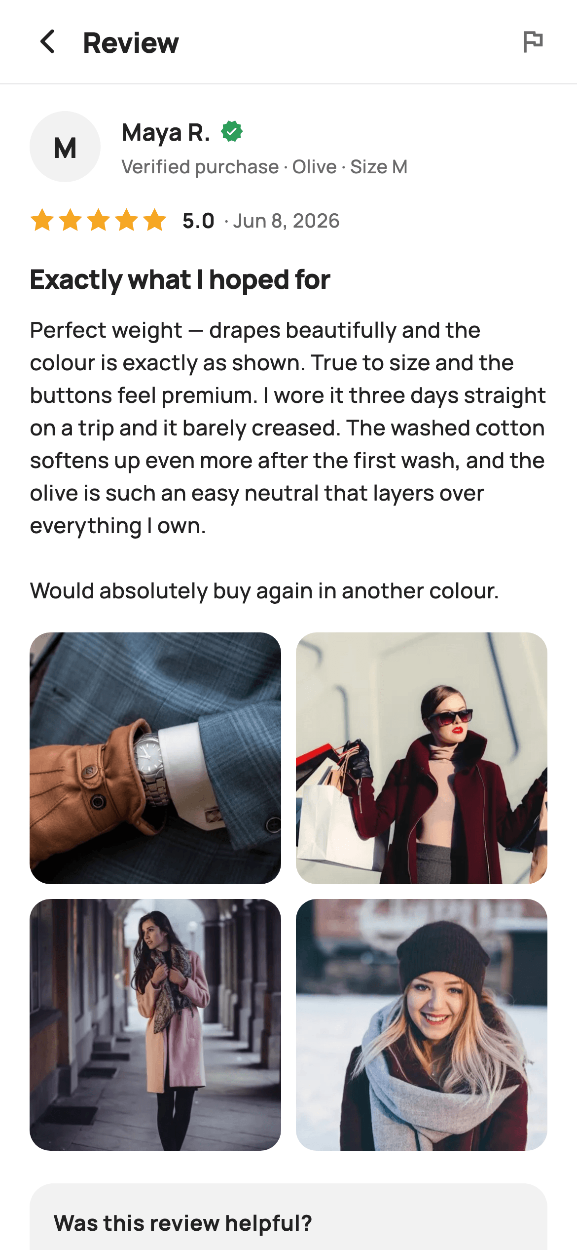
Star ratings sell the product, but the single review someone taps into is where the buying decision actually gets made — did it fit, what colour is it really, does the fabric hold up. This tutorial builds StyleCart's review detail screen in Flutter: one review opened in full with a monogram avatar, a green verified-purchase badge, the exact variant bought, a five-point star row painted with a CustomPainter, a two-column photo grid of customer shots, and a helpful vote that toggles its own count.
Watch the Flutter UI walkthrough
A short screen recording of Review Detail running, if you'd rather see it before you read the code. The written tutorial below covers everything in it.
Can't see the video? Watch it on YouTube.
What you'll build
- ✓A reviewer row pairing a 48px monogram circle with a green verified badge and the exact colour and size that was bought
- ✓A five-point star row generated from polar coordinates by a CustomPainter — no icon font, no emoji glyph
- ✓A two-column square photo grid of tappable customer shots that nests inside the scrolling ListView without fighting it
- ✓A 'Yes' helpful chip that inverts to white-on-ink and increments or decrements its live count on every tap
- ✓A report action reachable twice — a flag icon in the header and an outlined chip beside the vote
Step-by-step build
Create the file
Add a new file at lib/ecom_product_review_detail/ecom_product_review_detail_screen.dart in your Flutter project.
Register the bundled fonts
No external packages — this is pure Flutter. It does bundle its design font (Manrope), so drop the font file into fonts/ and declare it in pubspec.yaml:
flutter:
  fonts:
    - family: Manrope
      fonts:
- asset: fonts/Manrope-Regular.ttfBuild it, piece by piece
Here's how the screen goes together. Each block below is a real slice of the code with a plain-English explanation — paste them in order, or grab the whole file from the next section.
Tokens, the photo list, and the helpful toggle
import 'dart:math' as math;

import 'package:flutter/material.dart';

/// StyleCart — Review Detail.
///
/// One review expanded in full: reviewer identity with verified badge and the
/// variant they bought, the complete rating + body, a full-width photo grid and
/// helpful / report actions with a "was this helpful?" prompt.
///
/// Self-contained per CONVENTIONS.md: pure Flutter, bundled Manrope, inline
/// Airbnb-style tokens, own light theme + SafeArea, bundled webp. Stars are a
/// CustomPainter (no emoji glyph). Exposes callbacks only.
class EcomProductReviewDetailScreen extends StatefulWidget {
  const EcomProductReviewDetailScreen({
    super.key,
    this.onBack,
    this.onReport,
    this.onPhoto,
  });

  final VoidCallback? onBack;
  final VoidCallback? onReport;
  final ValueChanged<int>? onPhoto;

  @override
  State<EcomProductReviewDetailScreen> createState() =>
      _EcomProductReviewDetailScreenState();
}

class _EcomProductReviewDetailScreenState
    extends State<EcomProductReviewDetailScreen> {
  static const String _font = 'Manrope';
  static const Color _canvas = Color(0xFFFFFFFF);
  static const Color _ink = Color(0xFF222222);
  static const Color _muted = Color(0xFF6A6A6A);
  static const Color _surface = Color(0xFFF2F2F2);
  static const Color _imageBg = Color(0xFFF5F5F5);
  static const Color _success = Color(0xFF2E9E5B);
  static const Color _hairline = Color(0xFFEBEBEB);

  static const String _dir =
      'lib/screens/ecommerce/ecom_product_review_detail/images';
  static const List<String> _photos = <String>[
    'p06.webp',
    'p07.webp',
    'p08.webp',
    'p09.webp',
  ];

  int _helpful = 42;
  bool _voted = false;

  void _markHelpful() {
    setState(() {
      if (_voted) {
        _helpful--;
      } else {
        _helpful++;
      }
      _voted = !_voted;
    });
  }
This is a `StatefulWidget` for exactly one reason: `_helpful` (starting at 42) and `_voted` change on tap. Everything else — reviewer, stars, body, photos — is fixed content. The three callbacks `onBack`, `onReport` and `onPhoto` (a `ValueChanged<int>` carrying the tapped index) are the screen's whole API, so it never imports a client. Note `_success` at `#2E9E5B`: green is used only for the verified badge, never for anything tappable, so trust signalling and affordance stay separate. `_markHelpful` deliberately implements a real toggle — decrement when already voted, increment otherwise — instead of a one-way counter, because a mis-tap must be undoable.
Fixed header, scrolling review body
  @override
  Widget build(BuildContext context) {
    return Theme(
      data: ThemeData.light(useMaterial3: true),
      child: Scaffold(
        backgroundColor: _canvas,
        body: SafeArea(
          child: Column(
            children: <Widget>[
              _header(),
              const Divider(height: 1, color: _hairline),
              Expanded(
                child: ListView(
                  padding: const EdgeInsets.fromLTRB(20, 18, 20, 28),
                  children: <Widget>[
                    _reviewer(),
                    const SizedBox(height: 16),
                    _stars(),
                    const SizedBox(height: 16),
                    const Text(
                      'Exactly what I hoped for',
                      style: TextStyle(
                        fontFamily: _font,
                        fontSize: 18,
                        fontWeight: FontWeight.w800,
                        letterSpacing: -0.3,
                        color: _ink,
                      ),
                    ),
                    const SizedBox(height: 10),
                    const Text(
                      'Perfect weight — drapes beautifully and the colour is '
                      'exactly as shown. True to size and the buttons feel '
                      'premium. I wore it three days straight on a trip and it '
                      'barely creased. The washed cotton softens up even more '
                      'after the first wash, and the olive is such an easy '
                      'neutral that layers over everything I own.\n\nWould '
                      'absolutely buy again in another colour.',
                      style: TextStyle(
                        fontFamily: _font,
                        fontSize: 14.5,
                        fontWeight: FontWeight.w500,
                        height: 1.55,
                        color: _ink,
                      ),
                    ),
                    const SizedBox(height: 18),
                    _photoGrid(),
                    const SizedBox(height: 22),
                    _helpfulBlock(),
                  ],
                ),
              ),
            ],
          ),
        ),
      ),
    );
  }
`Theme(data: ThemeData.light(useMaterial3: true))` wraps the `Scaffold` so the screen renders identically no matter what theme the host app runs. The `Column` pins `_header()` and a 1px `Divider` above an `Expanded` `ListView` — the title bar stays put while a long review scrolls, and the hairline appears the moment content slides under it. The body is a single `Text` with `height: 1.55` at 14.5px and an embedded `\n\n`, which produces a real paragraph break inside one widget rather than two stacked Texts. The 18px `w800` headline above it summarises the verdict so a skimmer gets the answer before reading.
A header that carries the report affordance
  Widget _header() {
    return Padding(
      padding: const EdgeInsets.fromLTRB(8, 4, 20, 4),
      child: Row(
        children: <Widget>[
          IconButton(
            onPressed: widget.onBack,
            icon: const Icon(Icons.arrow_back_ios_new_rounded,
                size: 20, color: _ink),
          ),
          const Expanded(
            child: Text(
              'Review',
              style: TextStyle(
                fontFamily: _font,
                fontSize: 19,
                fontWeight: FontWeight.w800,
                letterSpacing: -0.3,
                color: _ink,
              ),
            ),
          ),
          GestureDetector(
            onTap: widget.onReport,
            child: const Icon(Icons.flag_outlined, size: 20, color: _muted),
          ),
        ],
      ),
    );
  }
The row asymmetrically pads `fromLTRB(8, 4, 20, 4)` — 8px on the left because `IconButton` supplies its own 48px touch target and hit padding, 20px on the right to line the flag icon up with the ListView's 20px gutter. The title is just 'Review', not the product name, since the product sits one screen back. The flag on the right is a plain `GestureDetector` around `Icons.flag_outlined` in `_muted`, keeping moderation available from the top of the page while visually receding: a report control that looked like a primary action would invite accidental taps.
Reviewer identity and the verified badge
  Widget _reviewer() {
    return Row(
      children: <Widget>[
        Container(
          width: 48,
          height: 48,
          alignment: Alignment.center,
          decoration: const BoxDecoration(
            color: _surface,
            shape: BoxShape.circle,
          ),
          child: const Text(
            'M',
            style: TextStyle(
              fontFamily: _font,
              fontSize: 19,
              fontWeight: FontWeight.w800,
              color: _ink,
            ),
          ),
        ),
        const SizedBox(width: 14),
        Expanded(
          child: Column(
            crossAxisAlignment: CrossAxisAlignment.start,
            children: <Widget>[
              Row(
                children: <Widget>[
                  const Text(
                    'Maya R.',
                    style: TextStyle(
                      fontFamily: _font,
                      fontSize: 16,
                      fontWeight: FontWeight.w700,
                      color: _ink,
                    ),
                  ),
                  const SizedBox(width: 6),
                  const Icon(Icons.verified_rounded,
                      size: 16, color: _success),
                ],
              ),
              const SizedBox(height: 3),
              const Text(
                'Verified purchase · Olive · Size M',
                style: TextStyle(
                  fontFamily: _font,
                  fontSize: 12.5,
                  fontWeight: FontWeight.w500,
                  color: _muted,
                ),
              ),
            ],
          ),
        ),
      ],
    );
  }
Instead of an avatar image, a 48px `BoxShape.circle` Container in `_surface` grey centres the initial 'M' at 19px `w800` — a monogram never 404s, needs no network call and no placeholder state. The name sits in a Row beside `Icons.verified_rounded` at 16px in green, tight against the text with 6px so the badge reads as belonging to Maya rather than floating in the row. Underneath, 'Verified purchase · Olive · Size M' at 12.5px `_muted` does the heavy lifting: it proves the review came from a buyer and names the exact variant, which is what makes a fit or colour opinion usable.
The star row, score and date
  Widget _stars() {
    return Row(
      children: <Widget>[
        ...List<Widget>.generate(
          5,
          (int i) => const Padding(
            padding: EdgeInsets.only(right: 2),
            child: SizedBox(
              width: 17,
              height: 17,
              child: CustomPaint(painter: _StarPainter(filled: true)),
            ),
          ),
        ),
        const SizedBox(width: 8),
        const Text(
          '5.0',
          style: TextStyle(
            fontFamily: _font,
            fontSize: 14,
            fontWeight: FontWeight.w700,
            color: _ink,
          ),
        ),
        const SizedBox(width: 6),
        const Text(
          '· Jun 8, 2026',
          style: TextStyle(
            fontFamily: _font,
            fontSize: 13,
            fontWeight: FontWeight.w500,
            color: _muted,
          ),
        ),
      ],
    );
  }
`List<Widget>.generate(5, ...)` spreads five 17×17 `CustomPaint` boxes, each with `EdgeInsets.only(right: 2)` so the gaps sit between stars and the row still ends flush. Every star is constructed `const _StarPainter(filled: true)`, so this screen shows a hard 5.0 — the painter accepts a `filled` flag, but nothing here varies it. The numeric '5.0' follows at 14px `w700`, then '· Jun 8, 2026' in muted 13px. Repeating the score as a number matters for accessibility and for glanceability, and the date is what tells a reader whether this opinion is about the current version of the product.
The customer photo grid
  Widget _photoGrid() {
    return GridView.builder(
      shrinkWrap: true,
      physics: const NeverScrollableScrollPhysics(),
      padding: EdgeInsets.zero,
      gridDelegate: const SliverGridDelegateWithFixedCrossAxisCount(
        crossAxisCount: 2,
        mainAxisSpacing: 10,
        crossAxisSpacing: 10,
        childAspectRatio: 1,
      ),
      itemCount: _photos.length,
      itemBuilder: (BuildContext context, int i) {
        return GestureDetector(
          onTap: () => widget.onPhoto?.call(i),
          child: ClipRRect(
            borderRadius: BorderRadius.circular(14),
            child: Container(
              color: _imageBg,
              child: Image.asset('$_dir/${_photos[i]}', fit: BoxFit.cover),
            ),
          ),
        );
      },
    );
  }
`GridView.builder` with `shrinkWrap: true` and `NeverScrollableScrollPhysics()` is the pattern for nesting a grid inside a `ListView`: shrinkWrap makes it size to its content, and killing its physics hands all scrolling to the parent so the two never compete. `SliverGridDelegateWithFixedCrossAxisCount` uses `crossAxisCount: 2` with 10px spacing both ways and `childAspectRatio: 1` for square tiles. Each tile is a `ClipRRect` at radius 14 over a `_imageBg` Container, so the grey shows through while a webp decodes and `BoxFit.cover` crops rather than letterboxes. The tap forwards the index via `widget.onPhoto?.call(i)` for a lightbox.
The helpful vote and report chips
  Widget _helpfulBlock() {
    return Container(
      padding: const EdgeInsets.all(16),
      decoration: BoxDecoration(
        color: _surface,
        borderRadius: BorderRadius.circular(16),
      ),
      child: Column(
        crossAxisAlignment: CrossAxisAlignment.start,
        children: <Widget>[
          const Text(
            'Was this review helpful?',
            style: TextStyle(
              fontFamily: _font,
              fontSize: 14.5,
              fontWeight: FontWeight.w700,
              color: _ink,
            ),
          ),
          const SizedBox(height: 12),
          Row(
            children: <Widget>[
              GestureDetector(
                onTap: _markHelpful,
                child: Container(
                  padding:
                      const EdgeInsets.symmetric(horizontal: 16, vertical: 10),
                  decoration: BoxDecoration(
                    color: _voted ? _ink : _canvas,
                    borderRadius: BorderRadius.circular(22),
                    border: Border.all(color: _voted ? _ink : _hairline),
                  ),
                  child: Row(
                    children: <Widget>[
                      Icon(
                        _voted
                            ? Icons.thumb_up_rounded
                            : Icons.thumb_up_outlined,
                        size: 16,
                        color: _voted ? _canvas : _ink,
                      ),
                      const SizedBox(width: 7),
                      Text(
                        'Yes ($_helpful)',
                        style: TextStyle(
                          fontFamily: _font,
                          fontSize: 13.5,
                          fontWeight: FontWeight.w700,
                          color: _voted ? _canvas : _ink,
                        ),
                      ),
                    ],
                  ),
                ),
              ),
              const SizedBox(width: 10),
              GestureDetector(
                onTap: widget.onReport,
                child: Container(
                  padding:
                      const EdgeInsets.symmetric(horizontal: 16, vertical: 10),
                  decoration: BoxDecoration(
                    color: _canvas,
                    borderRadius: BorderRadius.circular(22),
                    border: Border.all(color: _hairline),
                  ),
                  child: const Row(
                    children: <Widget>[
                      Icon(Icons.flag_outlined, size: 16, color: _muted),
                      SizedBox(width: 7),
                      Text(
                        'Report',
                        style: TextStyle(
                          fontFamily: _font,
                          fontSize: 13.5,
                          fontWeight: FontWeight.w700,
                          color: _muted,
                        ),
                      ),
                    ],
                  ),
                ),
              ),
            ],
          ),
        ],
      ),
    );
  }
The block is a `_surface` card at radius 16 asking 'Was this review helpful?'. The Yes chip is fully state-driven: `_voted` swaps its fill between `_ink` and `_canvas`, its border between `_ink` and `_hairline`, its icon between `thumb_up_rounded` and `thumb_up_outlined`, and its label colour to match — one boolean, four coordinated changes, so the pressed state is unmistakable. The count is interpolated inline as `'Yes ($_helpful)'`, updating in the same frame as the fill, which is what makes the tap feel like it registered. Report sits beside it at the identical 22-radius pill size but stays muted-on-white — same shape, clearly lower rank.
Painting a five-point star from polar coordinates
/// Paints a filled five-point amber star.
class _StarPainter extends CustomPainter {
  const _StarPainter({required this.filled});
  final bool filled;

  @override
  void paint(Canvas canvas, Size size) {
    final Path star = _starPath(
        size.width / 2, size.height / 2, size.width / 2, size.width / 4);
    canvas.drawPath(
      star,
      Paint()
        ..color = filled ? const Color(0xFFF5A623) : const Color(0xFFC1C1C1),
    );
  }

  Path _starPath(double cx, double cy, double outer, double inner) {
    final Path p = Path();
    const double step = math.pi / 5;
    double a = -math.pi / 2;
    for (int i = 0; i < 10; i++) {
      final double r = i.isEven ? outer : inner;
      final double x = cx + r * math.cos(a);
      final double y = cy + r * math.sin(a);
      if (i == 0) {
        p.moveTo(x, y);
      } else {
        p.lineTo(x, y);
      }
      a += step;
    }
    p.close();
    return p;
  }

  @override
  bool shouldRepaint(_StarPainter old) => old.filled != filled;
}
`_starPath` walks ten vertices around a centre, alternating `outer` and `inner` radii via `i.isEven`, stepping `math.pi / 5` each time and starting at `-math.pi / 2` so the first point aims straight up. The caller passes `size.width / 2` as the outer radius and `size.width / 4` as the inner — that 2:1 ratio is what gives the classic star its proportions; raise the inner value and it puffs toward a pentagon. Only `moveTo` on the first vertex, `lineTo` after, then `close()`. The fill is amber `#F5A623` when filled and grey `#C1C1C1` otherwise, and `shouldRepaint` returns true only when `filled` actually changed.
Full code
The complete, ready-to-paste source. Free to use in your projects — one click copies it all.
import 'dart:math' as math;

import 'package:flutter/material.dart';

/// StyleCart — Review Detail.
///
/// One review expanded in full: reviewer identity with verified badge and the
/// variant they bought, the complete rating + body, a full-width photo grid and
/// helpful / report actions with a "was this helpful?" prompt.
///
/// Self-contained per CONVENTIONS.md: pure Flutter, bundled Manrope, inline
/// Airbnb-style tokens, own light theme + SafeArea, bundled webp. Stars are a
/// CustomPainter (no emoji glyph). Exposes callbacks only.
class EcomProductReviewDetailScreen extends StatefulWidget {
  const EcomProductReviewDetailScreen({
    super.key,
    this.onBack,
    this.onReport,
    this.onPhoto,
  });

  final VoidCallback? onBack;
  final VoidCallback? onReport;
  final ValueChanged<int>? onPhoto;

  @override
  State<EcomProductReviewDetailScreen> createState() =>
      _EcomProductReviewDetailScreenState();
}

class _EcomProductReviewDetailScreenState
    extends State<EcomProductReviewDetailScreen> {
  static const String _font = 'Manrope';
  static const Color _canvas = Color(0xFFFFFFFF);
  static const Color _ink = Color(0xFF222222);
  static const Color _muted = Color(0xFF6A6A6A);
  static const Color _surface = Color(0xFFF2F2F2);
  static const Color _imageBg = Color(0xFFF5F5F5);
  static const Color _success = Color(0xFF2E9E5B);
  static const Color _hairline = Color(0xFFEBEBEB);

  static const String _dir =
      'lib/screens/ecommerce/ecom_product_review_detail/images';
  static const List<String> _photos = <String>[
    'p06.webp',
    'p07.webp',
    'p08.webp',
    'p09.webp',
  ];

  int _helpful = 42;
  bool _voted = false;

  void _markHelpful() {
    setState(() {
      if (_voted) {
        _helpful--;
      } else {
        _helpful++;
      }
      _voted = !_voted;
    });
  }

  @override
  Widget build(BuildContext context) {
    return Theme(
      data: ThemeData.light(useMaterial3: true),
      child: Scaffold(
        backgroundColor: _canvas,
        body: SafeArea(
          child: Column(
            children: <Widget>[
              _header(),
              const Divider(height: 1, color: _hairline),
              Expanded(
                child: ListView(
                  padding: const EdgeInsets.fromLTRB(20, 18, 20, 28),
                  children: <Widget>[
                    _reviewer(),
                    const SizedBox(height: 16),
                    _stars(),
                    const SizedBox(height: 16),
                    const Text(
                      'Exactly what I hoped for',
                      style: TextStyle(
                        fontFamily: _font,
                        fontSize: 18,
                        fontWeight: FontWeight.w800,
                        letterSpacing: -0.3,
                        color: _ink,
                      ),
                    ),
                    const SizedBox(height: 10),
                    const Text(
                      'Perfect weight — drapes beautifully and the colour is '
                      'exactly as shown. True to size and the buttons feel '
                      'premium. I wore it three days straight on a trip and it '
                      'barely creased. The washed cotton softens up even more '
                      'after the first wash, and the olive is such an easy '
                      'neutral that layers over everything I own.\n\nWould '
                      'absolutely buy again in another colour.',
                      style: TextStyle(
                        fontFamily: _font,
                        fontSize: 14.5,
                        fontWeight: FontWeight.w500,
                        height: 1.55,
                        color: _ink,
                      ),
                    ),
                    const SizedBox(height: 18),
                    _photoGrid(),
                    const SizedBox(height: 22),
                    _helpfulBlock(),
                  ],
                ),
              ),
            ],
          ),
        ),
      ),
    );
  }

  Widget _header() {
    return Padding(
      padding: const EdgeInsets.fromLTRB(8, 4, 20, 4),
      child: Row(
        children: <Widget>[
          IconButton(
            onPressed: widget.onBack,
            icon: const Icon(Icons.arrow_back_ios_new_rounded,
                size: 20, color: _ink),
          ),
          const Expanded(
            child: Text(
              'Review',
              style: TextStyle(
                fontFamily: _font,
                fontSize: 19,
                fontWeight: FontWeight.w800,
                letterSpacing: -0.3,
                color: _ink,
              ),
            ),
          ),
          GestureDetector(
            onTap: widget.onReport,
            child: const Icon(Icons.flag_outlined, size: 20, color: _muted),
          ),
        ],
      ),
    );
  }

  Widget _reviewer() {
    return Row(
      children: <Widget>[
        Container(
          width: 48,
          height: 48,
          alignment: Alignment.center,
          decoration: const BoxDecoration(
            color: _surface,
            shape: BoxShape.circle,
          ),
          child: const Text(
            'M',
            style: TextStyle(
              fontFamily: _font,
              fontSize: 19,
              fontWeight: FontWeight.w800,
              color: _ink,
            ),
          ),
        ),
        const SizedBox(width: 14),
        Expanded(
          child: Column(
            crossAxisAlignment: CrossAxisAlignment.start,
            children: <Widget>[
              Row(
                children: <Widget>[
                  const Text(
                    'Maya R.',
                    style: TextStyle(
                      fontFamily: _font,
                      fontSize: 16,
                      fontWeight: FontWeight.w700,
                      color: _ink,
                    ),
                  ),
                  const SizedBox(width: 6),
                  const Icon(Icons.verified_rounded,
                      size: 16, color: _success),
                ],
              ),
              const SizedBox(height: 3),
              const Text(
                'Verified purchase · Olive · Size M',
                style: TextStyle(
                  fontFamily: _font,
                  fontSize: 12.5,
                  fontWeight: FontWeight.w500,
                  color: _muted,
                ),
              ),
            ],
          ),
        ),
      ],
    );
  }

  Widget _stars() {
    return Row(
      children: <Widget>[
        ...List<Widget>.generate(
          5,
          (int i) => const Padding(
            padding: EdgeInsets.only(right: 2),
            child: SizedBox(
              width: 17,
              height: 17,
              child: CustomPaint(painter: _StarPainter(filled: true)),
            ),
          ),
        ),
        const SizedBox(width: 8),
        const Text(
          '5.0',
          style: TextStyle(
            fontFamily: _font,
            fontSize: 14,
            fontWeight: FontWeight.w700,
            color: _ink,
          ),
        ),
        const SizedBox(width: 6),
        const Text(
          '· Jun 8, 2026',
          style: TextStyle(
            fontFamily: _font,
            fontSize: 13,
            fontWeight: FontWeight.w500,
            color: _muted,
          ),
        ),
      ],
    );
  }

  Widget _photoGrid() {
    return GridView.builder(
      shrinkWrap: true,
      physics: const NeverScrollableScrollPhysics(),
      padding: EdgeInsets.zero,
      gridDelegate: const SliverGridDelegateWithFixedCrossAxisCount(
        crossAxisCount: 2,
        mainAxisSpacing: 10,
        crossAxisSpacing: 10,
        childAspectRatio: 1,
      ),
      itemCount: _photos.length,
      itemBuilder: (BuildContext context, int i) {
        return GestureDetector(
          onTap: () => widget.onPhoto?.call(i),
          child: ClipRRect(
            borderRadius: BorderRadius.circular(14),
            child: Container(
              color: _imageBg,
              child: Image.asset('$_dir/${_photos[i]}', fit: BoxFit.cover),
            ),
          ),
        );
      },
    );
  }

  Widget _helpfulBlock() {
    return Container(
      padding: const EdgeInsets.all(16),
      decoration: BoxDecoration(
        color: _surface,
        borderRadius: BorderRadius.circular(16),
      ),
      child: Column(
        crossAxisAlignment: CrossAxisAlignment.start,
        children: <Widget>[
          const Text(
            'Was this review helpful?',
            style: TextStyle(
              fontFamily: _font,
              fontSize: 14.5,
              fontWeight: FontWeight.w700,
              color: _ink,
            ),
          ),
          const SizedBox(height: 12),
          Row(
            children: <Widget>[
              GestureDetector(
                onTap: _markHelpful,
                child: Container(
                  padding:
                      const EdgeInsets.symmetric(horizontal: 16, vertical: 10),
                  decoration: BoxDecoration(
                    color: _voted ? _ink : _canvas,
                    borderRadius: BorderRadius.circular(22),
                    border: Border.all(color: _voted ? _ink : _hairline),
                  ),
                  child: Row(
                    children: <Widget>[
                      Icon(
                        _voted
                            ? Icons.thumb_up_rounded
                            : Icons.thumb_up_outlined,
                        size: 16,
                        color: _voted ? _canvas : _ink,
                      ),
                      const SizedBox(width: 7),
                      Text(
                        'Yes ($_helpful)',
                        style: TextStyle(
                          fontFamily: _font,
                          fontSize: 13.5,
                          fontWeight: FontWeight.w700,
                          color: _voted ? _canvas : _ink,
                        ),
                      ),
                    ],
                  ),
                ),
              ),
              const SizedBox(width: 10),
              GestureDetector(
                onTap: widget.onReport,
                child: Container(
                  padding:
                      const EdgeInsets.symmetric(horizontal: 16, vertical: 10),
                  decoration: BoxDecoration(
                    color: _canvas,
                    borderRadius: BorderRadius.circular(22),
                    border: Border.all(color: _hairline),
                  ),
                  child: const Row(
                    children: <Widget>[
                      Icon(Icons.flag_outlined, size: 16, color: _muted),
                      SizedBox(width: 7),
                      Text(
                        'Report',
                        style: TextStyle(
                          fontFamily: _font,
                          fontSize: 13.5,
                          fontWeight: FontWeight.w700,
                          color: _muted,
                        ),
                      ),
                    ],
                  ),
                ),
              ),
            ],
          ),
        ],
      ),
    );
  }
}

/// Paints a filled five-point amber star.
class _StarPainter extends CustomPainter {
  const _StarPainter({required this.filled});
  final bool filled;

  @override
  void paint(Canvas canvas, Size size) {
    final Path star = _starPath(
        size.width / 2, size.height / 2, size.width / 2, size.width / 4);
    canvas.drawPath(
      star,
      Paint()
        ..color = filled ? const Color(0xFFF5A623) : const Color(0xFFC1C1C1),
    );
  }

  Path _starPath(double cx, double cy, double outer, double inner) {
    final Path p = Path();
    const double step = math.pi / 5;
    double a = -math.pi / 2;
    for (int i = 0; i < 10; i++) {
      final double r = i.isEven ? outer : inner;
      final double x = cx + r * math.cos(a);
      final double y = cy + r * math.sin(a);
      if (i == 0) {
        p.moveTo(x, y);
      } else {
        p.lineTo(x, y);
      }
      a += step;
    }
    p.close();
    return p;
  }

  @override
  bool shouldRepaint(_StarPainter old) => old.filled != filled;
}
Plus bundled 9 binary assets (fonts/images). The CLI and MCP install those for you automatically.
Two faster ways to add it
Copy-paste works, but you can skip it entirely.
1. FlutterKit CLI
One command drops this screen — and its fonts — straight into your project.
$ flutterkit add ecom-product-review-detail2. AI agent (MCP)
Connect FlutterKit's MCP server in Claude or Cursor and just ask your agent to install ecom-product-review-detail — it fetches and writes the files for you.
FAQ
Can I use this review detail screen in a commercial app?
Yes. FlutterKit is free — no paid tier behind it, no licence key, no sign-up and no attribution line. Copy the Dart from this page, install it with the CLI, or pull it through MCP, and ship it in a store app.
Which packages, fonts and assets does it need?
No pub packages at all — `dart:math` and `package:flutter/material.dart` only. Manrope is bundled as a font family and declared in your pubspec. The four customer photos are local webp files loaded from the `_dir` constant, so either place them at that path or repoint `_dir` and `_photos` at your own assets; swap `Image.asset` for `Image.network` if the shots come from an API.
How do I show a rating other than five stars?
`_StarPainter` already takes a `filled` flag and paints grey `#C1C1C1` when it is false — the screen just never passes false. In `_stars()`, change the generator body to `_StarPainter(filled: i < rating)` and drop the `const`, then feed the same `rating` into the '5.0' label. For half stars, clip the star box to a fraction of its width and paint a filled star under a grey one.
How do I persist the helpful vote to a backend?
`_markHelpful` updates local state optimistically, which is the right feel — the chip must flip instantly. Add an `onHelpful` callback (or a `ValueChanged<bool>`) and fire it after the `setState`, then let your API confirm. Seed `_helpful` and `_voted` from the server when the screen opens, and on a failed request roll the two fields back so the count never drifts from the truth.
Which Flutter version does this need?
Flutter 3.10 or newer is a safe floor: the widget uses super parameters (`super.key`) and `ThemeData.light(useMaterial3: true)`. There is no `Color.withValues` anywhere in this file, so no 3.22 requirement. On a much older SDK, expand the constructor to the `{Key? key, ...}) : super(key: key)` form and drop `useMaterial3`.


