How to Build a Full-Screen Photo Gallery in Flutter (Full Code + Preview)
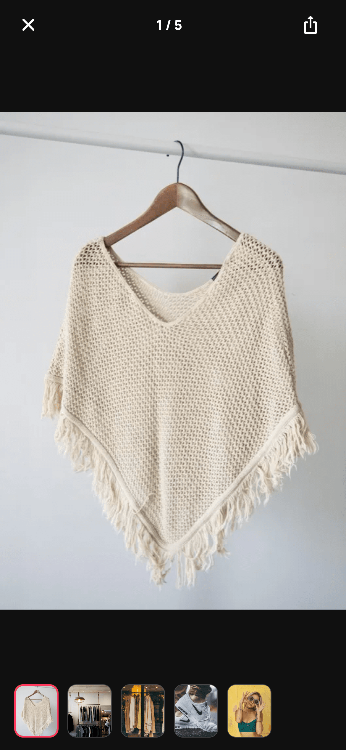
This is the full-screen viewer a product page opens when you tap its photo: five images on a near-black canvas, swipeable page by page, each one pinch-zoomable up to 4×, with a counter in the top bar and a thumbnail strip along the bottom that both tracks the current page and jumps to any other. The whole thing is about 150 lines, because Flutter already ships the two hard parts — `PageView` and `InteractiveViewer` — and the interesting work is wiring them to a shared controller.
Watch the Flutter UI walkthrough
A short screen recording of Photo Gallery running, if you'd rather see it before you read the code. The written tutorial below covers everything in it.
Can't see the video? Watch it on YouTube.
What you'll build
- ✓A full-screen `PageView` on a #101010 canvas that forces its own dark theme
- ✓Pinch-to-zoom and pan on every page via `InteractiveViewer` with a 1× to 4× scale range
- ✓A live '3 / 5' counter that stays centred between the close and share buttons
- ✓A thumbnail strip where the active thumb gets a 2px brand-red border and the rest a hairline white
- ✓Two-way sync: swiping updates the thumbs, tapping a thumb animates the pager to that photo
Step-by-step build
Create the file
Add a new file at lib/ecom_product_gallery/ecom_product_gallery_screen.dart in your Flutter project.
Register the bundled fonts
No external packages — this is pure Flutter. It does bundle its design font (Manrope), so drop the font file into fonts/ and declare it in pubspec.yaml:
flutter:
  fonts:
    - family: Manrope
      fonts:
- asset: fonts/Manrope-Regular.ttfBuild it, piece by piece
Here's how the screen goes together. Each block below is a real slice of the code with a plain-English explanation — paste them in order, or grab the whole file from the next section.
Dark tokens, the photo list, and the animated jump
class EcomProductGalleryScreen extends StatefulWidget {
  const EcomProductGalleryScreen({
    super.key,
    this.onBack,
    this.onShare,
  });

  final VoidCallback? onBack;
  final VoidCallback? onShare;

  @override
  State<EcomProductGalleryScreen> createState() =>
      _EcomProductGalleryScreenState();
}

class _EcomProductGalleryScreenState extends State<EcomProductGalleryScreen> {
  static const String _font = 'Manrope';
  static const Color _bg = Color(0xFF101010);
  static const Color _brand = Color(0xFFFF385C);

  static const String _dir = 'lib/screens/ecommerce/ecom_product_gallery/images';
  static const List<String> _photos = <String>[
    'p01.webp',
    'p02.webp',
    'p03.webp',
    'p04.webp',
    'p05.webp',
  ];

  final PageController _pager = PageController();
  int _page = 0;

  @override
  void dispose() {
    _pager.dispose();
    super.dispose();
  }

  void _jump(int i) {
    _pager.animateToPage(i,
        duration: const Duration(milliseconds: 280), curve: Curves.easeOut);
  }
The palette is deliberately tiny — `_bg` at #101010 and the brand red — because a photo viewer should be almost entirely image. Everything else on screen is white or `Colors.white24`. The state is a `PageController` plus a single `_page` index, disposed properly in `dispose()`. `_jump(i)` is the interesting method: it calls `_pager.animateToPage` with a 280ms `Curves.easeOut` rather than `jumpToPage`, so tapping a distant thumbnail glides there instead of teleporting. Because the pager's own `onPageChanged` fires during that animation, `_page` updates itself — `_jump` never needs to call `setState`.
The zoomable page view
  @override
  Widget build(BuildContext context) {
    return Theme(
      data: ThemeData.dark(useMaterial3: true),
      child: Scaffold(
        backgroundColor: _bg,
        body: SafeArea(
          child: Column(
            children: <Widget>[
              _topBar(),
              Expanded(
                child: PageView.builder(
                  controller: _pager,
                  itemCount: _photos.length,
                  onPageChanged: (int i) => setState(() => _page = i),
                  itemBuilder: (BuildContext context, int i) {
                    return InteractiveViewer(
                      minScale: 1,
                      maxScale: 4,
                      child: Center(
                        child: Image.asset('$_dir/${_photos[i]}',
                            fit: BoxFit.contain),
                      ),
                    );
                  },
                ),
              ),
              _thumbs(),
            ],
          ),
        ),
      ),
    );
  }
`Theme(data: ThemeData.dark(useMaterial3: true))` forces the dark rendering even inside a light app, which matters for a route pushed over a white product page. The body is a three-part `Column`: fixed top bar, `Expanded` pager, fixed thumbnail strip. Each page wraps its image in an `InteractiveViewer` with `minScale: 1` and `maxScale: 4` — that one widget gives you pinch-to-zoom, double-finger pan, and the elastic snap-back when you release below minimum scale, with no gesture code of your own. `BoxFit.contain` inside a `Center` is the right pairing here: unlike the `BoxFit.cover` used on thumbnails and cards, `contain` guarantees the whole photo is visible rather than cropping it to fill.
A top bar that centres its counter
  Widget _topBar() {
    return Padding(
      padding: const EdgeInsets.fromLTRB(8, 4, 16, 4),
      child: Row(
        children: <Widget>[
          IconButton(
            onPressed: widget.onBack,
            icon: const Icon(Icons.close_rounded, size: 24, color: Colors.white),
          ),
          Expanded(
            child: Text(
              '${_page + 1} / ${_photos.length}',
              textAlign: TextAlign.center,
              style: const TextStyle(
                fontFamily: _font,
                fontSize: 15,
                fontWeight: FontWeight.w700,
                color: Colors.white,
              ),
            ),
          ),
          IconButton(
            onPressed: widget.onShare,
            icon: const Icon(Icons.ios_share_rounded,
                size: 22, color: Colors.white),
          ),
        ],
      ),
    );
  }
The counter reads `'${_page + 1} / ${_photos.length}'` — the `+ 1` converts the zero-based index to human numbering. The layout detail worth copying is that the counter sits in an `Expanded` with `textAlign: TextAlign.center`, flanked by two `IconButton`s. Because both `IconButton`s have the same intrinsic width, the `Expanded` middle is symmetric and the text lands optically centred on the screen — without hard-coding any widths or reaching for a `Stack`. Close uses `close_rounded` rather than a back arrow, the conventional signal for a modal full-screen route.
The thumbnail strip and its selected state
  Widget _thumbs() {
    return Container(
      height: 88,
      padding: const EdgeInsets.symmetric(vertical: 14),
      child: ListView.separated(
        scrollDirection: Axis.horizontal,
        padding: const EdgeInsets.symmetric(horizontal: 16),
        itemCount: _photos.length,
        separatorBuilder: (_, _) => const SizedBox(width: 10),
        itemBuilder: (BuildContext context, int i) {
          final bool on = i == _page;
          return GestureDetector(
            onTap: () => _jump(i),
            child: Container(
              width: 50,
              decoration: BoxDecoration(
                borderRadius: BorderRadius.circular(10),
                border: Border.all(
                  color: on ? _brand : Colors.white24,
                  width: on ? 2 : 1,
                ),
              ),
              child: ClipRRect(
                borderRadius: BorderRadius.circular(8),
                child: Image.asset('$_dir/${_photos[i]}', fit: BoxFit.cover),
              ),
            ),
          );
        },
      ),
    );
  }
The strip is an 88px `Container` with 14px vertical padding around a horizontal `ListView.separated`, leaving each thumb 60px tall and 50px wide. The selection is expressed twice on the same border: colour switches from `Colors.white24` to `_brand`, and width from 1 to 2 — doubling the stroke is what makes the active thumb legible at small size on a dark background. Note the nested radii: the bordered `Container` uses 10px and the `ClipRRect` inside uses 8px. That 2px difference matches the border width, so the clipped photo sits perfectly inside the frame instead of bleeding into its corners. Each thumb's `onTap` calls `_jump(i)`, closing the loop with the pager above.
Full code
The complete, ready-to-paste source. Free to use in your projects — one click copies it all.
import 'package:flutter/material.dart';

/// StyleCart — Photo Gallery.
///
/// A full-screen, zoomable image carousel for one product: swipeable pages on a
/// dark canvas with pinch-to-zoom, a page counter, a share action and a
/// thumbnail strip that tracks and jumps to the active photo.
///
/// Self-contained per CONVENTIONS.md: pure Flutter, bundled Manrope, inline
/// tokens, own dark theme + SafeArea, bundled webp photos. Exposes callbacks
/// only; the registry wires navigation.
class EcomProductGalleryScreen extends StatefulWidget {
  const EcomProductGalleryScreen({
    super.key,
    this.onBack,
    this.onShare,
  });

  final VoidCallback? onBack;
  final VoidCallback? onShare;

  @override
  State<EcomProductGalleryScreen> createState() =>
      _EcomProductGalleryScreenState();
}

class _EcomProductGalleryScreenState extends State<EcomProductGalleryScreen> {
  static const String _font = 'Manrope';
  static const Color _bg = Color(0xFF101010);
  static const Color _brand = Color(0xFFFF385C);

  static const String _dir = 'lib/screens/ecommerce/ecom_product_gallery/images';
  static const List<String> _photos = <String>[
    'p01.webp',
    'p02.webp',
    'p03.webp',
    'p04.webp',
    'p05.webp',
  ];

  final PageController _pager = PageController();
  int _page = 0;

  @override
  void dispose() {
    _pager.dispose();
    super.dispose();
  }

  void _jump(int i) {
    _pager.animateToPage(i,
        duration: const Duration(milliseconds: 280), curve: Curves.easeOut);
  }

  @override
  Widget build(BuildContext context) {
    return Theme(
      data: ThemeData.dark(useMaterial3: true),
      child: Scaffold(
        backgroundColor: _bg,
        body: SafeArea(
          child: Column(
            children: <Widget>[
              _topBar(),
              Expanded(
                child: PageView.builder(
                  controller: _pager,
                  itemCount: _photos.length,
                  onPageChanged: (int i) => setState(() => _page = i),
                  itemBuilder: (BuildContext context, int i) {
                    return InteractiveViewer(
                      minScale: 1,
                      maxScale: 4,
                      child: Center(
                        child: Image.asset('$_dir/${_photos[i]}',
                            fit: BoxFit.contain),
                      ),
                    );
                  },
                ),
              ),
              _thumbs(),
            ],
          ),
        ),
      ),
    );
  }

  Widget _topBar() {
    return Padding(
      padding: const EdgeInsets.fromLTRB(8, 4, 16, 4),
      child: Row(
        children: <Widget>[
          IconButton(
            onPressed: widget.onBack,
            icon: const Icon(Icons.close_rounded, size: 24, color: Colors.white),
          ),
          Expanded(
            child: Text(
              '${_page + 1} / ${_photos.length}',
              textAlign: TextAlign.center,
              style: const TextStyle(
                fontFamily: _font,
                fontSize: 15,
                fontWeight: FontWeight.w700,
                color: Colors.white,
              ),
            ),
          ),
          IconButton(
            onPressed: widget.onShare,
            icon: const Icon(Icons.ios_share_rounded,
                size: 22, color: Colors.white),
          ),
        ],
      ),
    );
  }

  Widget _thumbs() {
    return Container(
      height: 88,
      padding: const EdgeInsets.symmetric(vertical: 14),
      child: ListView.separated(
        scrollDirection: Axis.horizontal,
        padding: const EdgeInsets.symmetric(horizontal: 16),
        itemCount: _photos.length,
        separatorBuilder: (_, _) => const SizedBox(width: 10),
        itemBuilder: (BuildContext context, int i) {
          final bool on = i == _page;
          return GestureDetector(
            onTap: () => _jump(i),
            child: Container(
              width: 50,
              decoration: BoxDecoration(
                borderRadius: BorderRadius.circular(10),
                border: Border.all(
                  color: on ? _brand : Colors.white24,
                  width: on ? 2 : 1,
                ),
              ),
              child: ClipRRect(
                borderRadius: BorderRadius.circular(8),
                child: Image.asset('$_dir/${_photos[i]}', fit: BoxFit.cover),
              ),
            ),
          );
        },
      ),
    );
  }
}
Plus bundled 10 binary assets (fonts/images). The CLI and MCP install those for you automatically.
Two faster ways to add it
Copy-paste works, but you can skip it entirely.
1. FlutterKit CLI
One command drops this screen — and its fonts — straight into your project.
$ flutterkit add ecom-product-gallery2. AI agent (MCP)
Connect FlutterKit's MCP server in Claude or Cursor and just ask your agent to install ecom-product-gallery — it fetches and writes the files for you.
FAQ
Is this Flutter photo gallery free to use?
Yes. The full Dart source on this page is free for personal and commercial apps. Copy it from the code block, run flutterkit add ecom-product-gallery with the CLI, or install it through an AI agent over MCP.
Does it need photo_view or another gallery package?
No. The zoom comes from Flutter's built-in InteractiveViewer and the paging from PageView — no photo_view, no carousel_slider. It's pure Flutter plus the bundled WebP photos and the Manrope font family.
Why doesn't swiping work when the photo is zoomed in?
That's expected: while InteractiveViewer is scaled above 1×, it claims the pan gesture so you can move around the photo, and the PageView only regains the swipe once you're back at minimum scale. If you'd rather always page, wrap the image in a GestureDetector-driven scale instead, or reset the transformation on page change with a TransformationController.
Which Flutter version does it target?
It uses super parameters, Material 3, and a wildcard lambda (_, _) in the separatorBuilder, so it targets Flutter 3.10+ with Dart 3.7+ for the wildcard specifically. On an older SDK, write the separator lambda as (_, __) and it compiles.


