How to Build a Return or Exchange Screen in Flutter (Full Code + Preview)
Returns are where shopping apps quietly lose trust: buried forms, an unclear refund-versus-exchange choice, and a submit button that fails with no explanation. This tutorial builds StyleCart's start-a-return screen in Flutter — an animated Refund-vs-Exchange segmented toggle, order items as tappable cards that grow an inline reason-chip picker when selected, an optional photo-evidence row, and a pinned Continue bar that stays disabled (with a label explaining exactly why) until every chosen item has a reason. You get the complete Dart, driven by one Set and one Map of state.
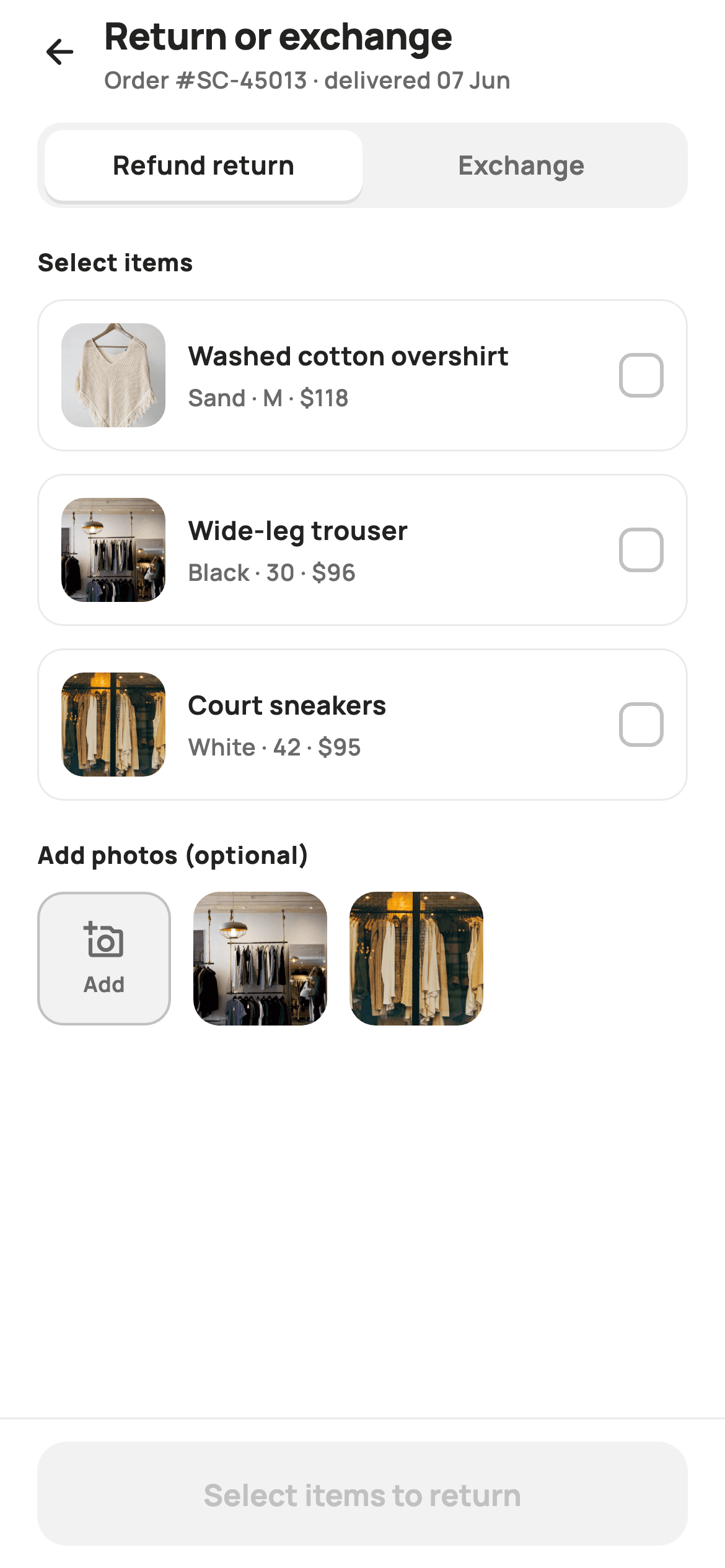
What you'll build
- ✓A Refund-vs-Exchange segmented toggle whose active half slides in as a shadowed white pill over 160ms
- ✓Item cards that swap their border to translucent brand red and reveal an inline Wrap of five reason chips when tapped
- ✓Single-select reason chips per item, implemented as nothing more than a Map<int, int> assignment
- ✓A photo-evidence row pairing an Add tile (border drawn inside its own edge) with rounded webp thumbnails
- ✓A pinned Continue bar whose label walks through three states — select items, choose reasons, then a live item count
Step-by-step build
Create the file
Add a new file at lib/ecom_orders_return_start/ecom_orders_return_start_screen.dart in your Flutter project.
Register the bundled fonts
No external packages — this is pure Flutter. It does bundle its design font (Manrope), so drop the font file into fonts/ and declare it in pubspec.yaml:
flutter:
  fonts:
    - family: Manrope
      fonts:
- asset: fonts/Manrope-Regular.ttfBuild it, piece by piece
Here's how the screen goes together. Each block below is a real slice of the code with a plain-English explanation — paste them in order, or grab the whole file from the next section.
Two collections of state and one derived gate
import 'package:flutter/material.dart';

/// StyleCart — Return / Exchange.
///
/// Start a return: a Return-vs-Exchange segmented toggle, an item list where
/// each selected item reveals reason chips, and a painted photo-upload row for
/// evidence. A pinned Continue bar advances to the pickup/drop-off method and
/// is disabled until at least one item (with a reason) is chosen.
///
/// Self-contained per CONVENTIONS.md: pure Flutter, bundled Manrope, inline
/// Airbnb-style tokens, own light theme + SafeArea, bundled webp. Painter-only
/// graphics. Exposes callbacks only.
class EcomOrdersReturnStartScreen extends StatefulWidget {
  const EcomOrdersReturnStartScreen({
    super.key,
    this.onBack,
    this.onContinue,
  });

  final VoidCallback? onBack;

  /// Fires with `true` for an exchange, `false` for a refund return.
  final ValueChanged<bool>? onContinue;

  @override
  State<EcomOrdersReturnStartScreen> createState() =>
      _EcomOrdersReturnStartScreenState();
}

class _EcomOrdersReturnStartScreenState
    extends State<EcomOrdersReturnStartScreen> {
  static const String _font = 'Manrope';
  static const Color _canvas = Color(0xFFFFFFFF);
  static const Color _ink = Color(0xFF222222);
  static const Color _muted = Color(0xFF6A6A6A);
  static const Color _faint = Color(0xFFC1C1C1);
  static const Color _brand = Color(0xFFFF385C);
  static const Color _surface = Color(0xFFF2F2F2);
  static const Color _imageBg = Color(0xFFF5F5F5);
  static const Color _hairline = Color(0xFFEBEBEB);

  static const String _dir =
      'lib/screens/ecommerce/ecom_orders_return_start/images';

  static const List<_Item> _items = <_Item>[
    _Item('p01', 'Washed cotton overshirt', 'Sand · M', 118),
    _Item('p02', 'Wide-leg trouser', 'Black · 30', 96),
    _Item('p03', 'Court sneakers', 'White · 42', 95),
  ];

  static const List<String> _reasons = <String>[
    'Too small',
    'Too large',
    'Not as described',
    'Quality issue',
    'Changed my mind',
  ];

  bool _exchange = false;
  final Set<int> _picked = <int>{};
  final Map<int, int> _reasonFor = <int, int>{}; // item index → reason index

  bool get _canContinue =>
      _picked.isNotEmpty && _picked.every((int i) => _reasonFor.containsKey(i));
The widget takes just `onBack` and `onContinue`, and `onContinue` is a `ValueChanged<bool>` — the screen's entire output is one boolean, `true` for an exchange, `false` for a refund. The palette is Airbnb-flavoured: `_brand` is the coral-red `#FF385C`, ink is `#222222`, and greys step down through `#6A6A6A`, `#C1C1C1`, `#F2F2F2` and the `#EBEBEB` hairline. Three `_Item` records and five reason strings are `static const` data, so copy edits never touch widget code. The mutable state is exactly three members: an `_exchange` bool, a `Set<int>` of picked item indices, and a `Map<int, int>` from item index to reason index. Crucially, `_canContinue` is a derived getter — `_picked.isNotEmpty && _picked.every((i) => _reasonFor.containsKey(i))` — not a flag anyone has to remember to update, so the Continue button can never fall out of sync with the selections.
A build that pins the exit outside the scroll
  @override
  Widget build(BuildContext context) {
    return Theme(
      data: ThemeData.light(useMaterial3: true),
      child: Scaffold(
        backgroundColor: _canvas,
        body: SafeArea(
          child: Column(
            children: <Widget>[
              _header(),
              Expanded(
                child: ListView(
                  padding: const EdgeInsets.fromLTRB(20, 8, 20, 24),
                  children: <Widget>[
                    _toggle(),
                    const SizedBox(height: 20),
                    _sectionTitle('Select items'),
                    const SizedBox(height: 10),
                    for (int i = 0; i < _items.length; i++) _itemBlock(i),
                    const SizedBox(height: 8),
                    _sectionTitle('Add photos (optional)'),
                    const SizedBox(height: 10),
                    _photoRow(),
                  ],
                ),
              ),
              _continueBar(),
            ],
          ),
        ),
      ),
    );
  }
The screen wraps itself in `Theme(data: ThemeData.light(useMaterial3: true))` so it renders identically inside any host app, dark-themed or not. The body is a `Column` with three slots: the header, an `Expanded` `ListView`, and `_continueBar()` as a sibling below the list — because the bar sits outside the scroll view, it stays pinned while the item list scrolls under it, which matters once a shopper selects several items and the reason pickers stretch the page. Inside the list, a collection-for emits `_itemBlock(i)` for each of the three items, and the photo section's heading reads 'Add photos (optional)' — the word optional lives in the title itself, so nobody stalls wondering whether evidence is required.
A header that names the order and its delivery date
  Widget _header() {
    return Padding(
      padding: const EdgeInsets.fromLTRB(8, 4, 20, 6),
      child: Row(
        children: <Widget>[
          IconButton(
            onPressed: widget.onBack,
            icon: const Icon(Icons.arrow_back_rounded, size: 22, color: _ink),
          ),
          const Expanded(
            child: Column(
              crossAxisAlignment: CrossAxisAlignment.start,
              children: <Widget>[
                Text(
                  'Return or exchange',
                  style: TextStyle(
                    fontFamily: _font,
                    fontSize: 20,
                    fontWeight: FontWeight.w800,
                    letterSpacing: -0.3,
                    color: _ink,
                  ),
                ),
                Text(
                  'Order #SC-45013 · delivered 07 Jun',
                  style: TextStyle(
                    fontFamily: _font,
                    fontSize: 12.5,
                    fontWeight: FontWeight.w600,
                    color: _muted,
                  ),
                ),
              ],
            ),
          ),
        ],
      ),
    );
  }
A back arrow, then an `Expanded` column holding the 20px `w800` title at `letterSpacing: -0.3` with 'Order #SC-45013 · delivered 07 Jun' beneath it in 12.5px muted grey. That subtitle is doing real work: return windows are measured from the delivery date, and a shopper who ordered twice needs to confirm which order they are about to open a return against — both answers sit in one line before they touch anything. The row's padding starts at 8 on the left rather than 20 because `IconButton` brings its own touch padding; a full 20 would visually double it.
The Refund-vs-Exchange toggle
  Widget _toggle() {
    return Container(
      height: 46,
      padding: const EdgeInsets.all(4),
      decoration: BoxDecoration(
        color: _surface,
        borderRadius: BorderRadius.circular(13),
      ),
      child: Row(
        children: <Widget>[
          _toggleHalf('Refund return', !_exchange, () {
            setState(() => _exchange = false);
          }),
          _toggleHalf('Exchange', _exchange, () {
            setState(() => _exchange = true);
          }),
        ],
      ),
    );
  }

  Widget _toggleHalf(String label, bool on, VoidCallback onTap) {
    return Expanded(
      child: GestureDetector(
        onTap: onTap,
        child: AnimatedContainer(
          duration: const Duration(milliseconds: 160),
          alignment: Alignment.center,
          decoration: BoxDecoration(
            color: on ? _canvas : Colors.transparent,
            borderRadius: BorderRadius.circular(10),
            boxShadow: on
                ? const <BoxShadow>[
                    BoxShadow(
                      color: Color(0x14000000),
                      blurRadius: 6,
                      offset: Offset(0, 2),
                    ),
                  ]
                : null,
          ),
          child: Text(
            label,
            style: TextStyle(
              fontFamily: _font,
              fontSize: 14,
              fontWeight: FontWeight.w700,
              color: on ? _ink : _muted,
            ),
          ),
        ),
      ),
    );
  }
A 46px `_surface` track with `borderRadius: 13` and 4px of internal padding holds two `Expanded` halves. Each half is an `AnimatedContainer` with a 160ms duration: the active one paints white at radius 10 and carries a `0x14000000` shadow (blur 6, offset 0,2) so it reads as a raised pill, while the inactive half is transparent and its label drops from `_ink` to `_muted`. The inner radius of 10 against the track's 13 is deliberate — with 4px padding between them, slightly tighter inner corners keep the two curves visually concentric. Tapping just flips `_exchange` in `setState`; nothing else on the screen changes, because the refund/exchange decision only matters at the end, when it rides out through `onContinue`. The default is a refund return, the more common intent.
Item cards that grow a reason picker in place
  Widget _sectionTitle(String text) {
    return Text(
      text,
      style: const TextStyle(
        fontFamily: _font,
        fontSize: 13,
        fontWeight: FontWeight.w800,
        letterSpacing: 0.3,
        color: _ink,
      ),
    );
  }

  Widget _itemBlock(int i) {
    final _Item it = _items[i];
    final bool on = _picked.contains(i);
    return Container(
      margin: const EdgeInsets.only(bottom: 12),
      padding: const EdgeInsets.all(12),
      decoration: BoxDecoration(
        color: _canvas,
        borderRadius: BorderRadius.circular(14),
        border: Border.all(
          color: on ? _brand.withValues(alpha: 0.5) : _hairline,
          width: on ? 1.4 : 1,
        ),
      ),
      child: Column(
        crossAxisAlignment: CrossAxisAlignment.start,
        children: <Widget>[
          GestureDetector(
            onTap: () => setState(() {
              if (on) {
                _picked.remove(i);
                _reasonFor.remove(i);
              } else {
                _picked.add(i);
              }
            }),
            child: Row(
              children: <Widget>[
                Container(
                  width: 56,
                  height: 56,
                  decoration: BoxDecoration(
                    color: _imageBg,
                    borderRadius: BorderRadius.circular(12),
                  ),
                  child: ClipRRect(
                    borderRadius: BorderRadius.circular(12),
                    child:
                        Image.asset('$_dir/${it.id}.webp', fit: BoxFit.cover),
                  ),
                ),
                const SizedBox(width: 12),
                Expanded(
                  child: Column(
                    crossAxisAlignment: CrossAxisAlignment.start,
                    children: <Widget>[
                      Text(
                        it.name,
                        maxLines: 1,
                        overflow: TextOverflow.ellipsis,
                        style: const TextStyle(
                          fontFamily: _font,
                          fontSize: 14,
                          fontWeight: FontWeight.w700,
                          color: _ink,
                        ),
                      ),
                      const SizedBox(height: 3),
                      Text(
                        '${it.variant} · \$${it.price}',
                        style: const TextStyle(
                          fontFamily: _font,
                          fontSize: 12.5,
                          fontWeight: FontWeight.w600,
                          color: _muted,
                        ),
                      ),
                    ],
                  ),
                ),
                const SizedBox(width: 10),
                Container(
                  width: 24,
                  height: 24,
                  decoration: BoxDecoration(
                    color: on ? _brand : _canvas,
                    borderRadius: BorderRadius.circular(7),
                    border: on ? null : Border.all(color: _faint, width: 2),
                  ),
                  child: on
                      ? const Icon(Icons.check_rounded,
                          size: 16, color: _canvas)
                      : null,
                ),
              ],
            ),
          ),
          if (on) ...<Widget>[
            const SizedBox(height: 12),
            const Divider(height: 1, color: _hairline),
            const SizedBox(height: 12),
            const Text(
              'Reason',
              style: TextStyle(
                fontFamily: _font,
                fontSize: 12.5,
                fontWeight: FontWeight.w700,
                color: _muted,
              ),
            ),
            const SizedBox(height: 8),
            Wrap(
              spacing: 8,
              runSpacing: 8,
              children: <Widget>[
                for (int r = 0; r < _reasons.length; r++) _reasonChip(i, r),
              ],
            ),
          ],
        ],
      ),
    );
  }
`_itemBlock` computes `on = _picked.contains(i)` once and lets everything key off it. Selection is shown by the border alone — `_hairline` at 1px normally, `_brand.withValues(alpha: 0.5)` at 1.4px when picked — leaving the card's white fill untouched so the 56px webp thumbnail and text keep their contrast. The tap handler is the screen's most important four lines: deselecting removes the index from `_picked` *and* deletes its entry from `_reasonFor`, so a re-selected item starts with no reason and `_canContinue` goes false again instead of trusting a stale answer. The checkbox is hand-rolled — a 24px `Container` at radius 7 that is brand-filled with a white `check_rounded` when on, or bordered 2px in `_faint` when off — matching the card's rounded language in a way a stock Material `Checkbox` would not. Then the reveal: `if (on) ...[...]` spreads a divider, a muted 'Reason' label and a `Wrap` of chips into the card's own column, so the reason question appears physically inside the item it belongs to rather than as a later step.
Single-select chips from Map semantics
  Widget _reasonChip(int item, int r) {
    final bool on = _reasonFor[item] == r;
    return GestureDetector(
      onTap: () => setState(() => _reasonFor[item] = r),
      child: Container(
        padding: const EdgeInsets.symmetric(horizontal: 13, vertical: 8),
        decoration: BoxDecoration(
          color: on ? _brand : _surface,
          borderRadius: BorderRadius.circular(9),
        ),
        child: Text(
          _reasons[r],
          style: TextStyle(
            fontFamily: _font,
            fontSize: 12.5,
            fontWeight: FontWeight.w700,
            color: on ? _canvas : _muted,
          ),
        ),
      ),
    );
  }
Each chip decides its own state with `_reasonFor[item] == r` and its tap simply assigns `_reasonFor[item] = r`. That assignment is the whole radio-group implementation: writing a new value into the map replaces the old one, so exactly one reason can be selected per item and there is no deselect-the-others loop anywhere. Visually a chip is a 9-radius pill, `_surface` with muted 12.5px `w700` text when idle, flipping to a solid `_brand` fill with white text when chosen — the only place besides the checkbox and Continue button that the coral appears, which keeps selections easy to scan.
The photo evidence row
  Widget _photoRow() {
    return Row(
      children: <Widget>[
        _addPhotoTile(),
        const SizedBox(width: 12),
        _photoThumb('p02'),
        const SizedBox(width: 12),
        _photoThumb('p03'),
      ],
    );
  }

  Widget _addPhotoTile() {
    return Container(
      width: 72,
      height: 72,
      decoration: BoxDecoration(
        color: _surface,
        borderRadius: BorderRadius.circular(14),
        border: Border.all(
          color: _faint,
          width: 1.4,
          strokeAlign: BorderSide.strokeAlignInside,
        ),
      ),
      child: const Column(
        mainAxisAlignment: MainAxisAlignment.center,
        children: <Widget>[
          Icon(Icons.add_a_photo_outlined, size: 22, color: _muted),
          SizedBox(height: 4),
          Text(
            'Add',
            style: TextStyle(
              fontFamily: _font,
              fontSize: 11.5,
              fontWeight: FontWeight.w700,
              color: _muted,
            ),
          ),
        ],
      ),
    );
  }

  Widget _photoThumb(String id) {
    return Container(
      width: 72,
      height: 72,
      decoration: BoxDecoration(
        color: _imageBg,
        borderRadius: BorderRadius.circular(14),
      ),
      child: ClipRRect(
        borderRadius: BorderRadius.circular(14),
        child: Image.asset('$_dir/$id.webp', fit: BoxFit.cover),
      ),
    );
  }
Three 72px squares in a row: an Add tile first, then two webp thumbnails. Placing the Add tile at the head of the row means the affordance is always visible even if the thumbnails grow into a longer strip later. The tile borders itself in 1.4px `_faint` with `strokeAlign: BorderSide.strokeAlignInside` — a small but worthwhile detail, since Flutter's default centre-aligned stroke would push half the border outside the 72px box and make the tile render a hair larger than its neighbours. Inside, an `add_a_photo_outlined` icon stacks over an 11.5px 'Add' label. The thumbnails paint `_imageBg` (`#F5F5F5`) behind a `ClipRRect`, so the tile shows a soft grey square rather than a flash of white while the asset decodes.
A Continue bar that explains its own disabled state
  Widget _continueBar() {
    return Container(
      decoration: const BoxDecoration(
        color: _canvas,
        border: Border(top: BorderSide(color: _hairline)),
      ),
      child: SafeArea(
        top: false,
        child: Padding(
          padding: const EdgeInsets.fromLTRB(20, 12, 20, 12),
          child: SizedBox(
            height: 56,
            child: FilledButton(
              onPressed:
                  _canContinue ? () => widget.onContinue?.call(_exchange) : null,
              style: FilledButton.styleFrom(
                backgroundColor: _brand,
                foregroundColor: _canvas,
                disabledBackgroundColor: _surface,
                disabledForegroundColor: _faint,
                minimumSize: const Size.fromHeight(56),
                shape: RoundedRectangleBorder(
                  borderRadius: BorderRadius.circular(16),
                ),
              ),
              child: Text(
                _picked.isEmpty
                    ? 'Select items to return'
                    : !_canContinue
                        ? 'Choose a reason for each item'
                        : 'Continue · ${_picked.length} item'
                            '${_picked.length == 1 ? '' : 's'}',
                style: const TextStyle(
                  fontFamily: _font,
                  fontSize: 16,
                  fontWeight: FontWeight.w700,
                ),
              ),
            ),
          ),
        ),
      ),
    );
  }
}

class _Item {
  const _Item(this.id, this.name, this.variant, this.price);
  final String id;
  final String name;
  final String variant;
  final int price;
}
The bar is a `Container` with only a hairline top border, wrapping `SafeArea(top: false)` internally so the white background extends beneath the home indicator while the button stays above it. The 56px `FilledButton` defines its entire disabled look in `styleFrom` — `disabledBackgroundColor: _surface`, `disabledForegroundColor: _faint` — alongside the brand-on-white enabled colours. The label is a nested ternary through three states: '`Select items to return`' when nothing is picked, '`Choose a reason for each item`' when items lack reasons, and finally '`Continue · 2 items`' with manual pluralisation once `_canContinue` is true. A disabled button that says *why* it is disabled turns a dead control into instructions. When enabled, `onPressed` fires `widget.onContinue?.call(_exchange)`, handing the host the refund/exchange choice. The file closes with `_Item`, a four-field const class — typed access to id, name, variant and price instead of a stringly-typed map.
Full code
The complete, ready-to-paste source. Free to use in your projects — one click copies it all.
import 'package:flutter/material.dart';

/// StyleCart — Return / Exchange.
///
/// Start a return: a Return-vs-Exchange segmented toggle, an item list where
/// each selected item reveals reason chips, and a painted photo-upload row for
/// evidence. A pinned Continue bar advances to the pickup/drop-off method and
/// is disabled until at least one item (with a reason) is chosen.
///
/// Self-contained per CONVENTIONS.md: pure Flutter, bundled Manrope, inline
/// Airbnb-style tokens, own light theme + SafeArea, bundled webp. Painter-only
/// graphics. Exposes callbacks only.
class EcomOrdersReturnStartScreen extends StatefulWidget {
  const EcomOrdersReturnStartScreen({
    super.key,
    this.onBack,
    this.onContinue,
  });

  final VoidCallback? onBack;

  /// Fires with `true` for an exchange, `false` for a refund return.
  final ValueChanged<bool>? onContinue;

  @override
  State<EcomOrdersReturnStartScreen> createState() =>
      _EcomOrdersReturnStartScreenState();
}

class _EcomOrdersReturnStartScreenState
    extends State<EcomOrdersReturnStartScreen> {
  static const String _font = 'Manrope';
  static const Color _canvas = Color(0xFFFFFFFF);
  static const Color _ink = Color(0xFF222222);
  static const Color _muted = Color(0xFF6A6A6A);
  static const Color _faint = Color(0xFFC1C1C1);
  static const Color _brand = Color(0xFFFF385C);
  static const Color _surface = Color(0xFFF2F2F2);
  static const Color _imageBg = Color(0xFFF5F5F5);
  static const Color _hairline = Color(0xFFEBEBEB);

  static const String _dir =
      'lib/screens/ecommerce/ecom_orders_return_start/images';

  static const List<_Item> _items = <_Item>[
    _Item('p01', 'Washed cotton overshirt', 'Sand · M', 118),
    _Item('p02', 'Wide-leg trouser', 'Black · 30', 96),
    _Item('p03', 'Court sneakers', 'White · 42', 95),
  ];

  static const List<String> _reasons = <String>[
    'Too small',
    'Too large',
    'Not as described',
    'Quality issue',
    'Changed my mind',
  ];

  bool _exchange = false;
  final Set<int> _picked = <int>{};
  final Map<int, int> _reasonFor = <int, int>{}; // item index → reason index

  bool get _canContinue =>
      _picked.isNotEmpty && _picked.every((int i) => _reasonFor.containsKey(i));

  @override
  Widget build(BuildContext context) {
    return Theme(
      data: ThemeData.light(useMaterial3: true),
      child: Scaffold(
        backgroundColor: _canvas,
        body: SafeArea(
          child: Column(
            children: <Widget>[
              _header(),
              Expanded(
                child: ListView(
                  padding: const EdgeInsets.fromLTRB(20, 8, 20, 24),
                  children: <Widget>[
                    _toggle(),
                    const SizedBox(height: 20),
                    _sectionTitle('Select items'),
                    const SizedBox(height: 10),
                    for (int i = 0; i < _items.length; i++) _itemBlock(i),
                    const SizedBox(height: 8),
                    _sectionTitle('Add photos (optional)'),
                    const SizedBox(height: 10),
                    _photoRow(),
                  ],
                ),
              ),
              _continueBar(),
            ],
          ),
        ),
      ),
    );
  }

  Widget _header() {
    return Padding(
      padding: const EdgeInsets.fromLTRB(8, 4, 20, 6),
      child: Row(
        children: <Widget>[
          IconButton(
            onPressed: widget.onBack,
            icon: const Icon(Icons.arrow_back_rounded, size: 22, color: _ink),
          ),
          const Expanded(
            child: Column(
              crossAxisAlignment: CrossAxisAlignment.start,
              children: <Widget>[
                Text(
                  'Return or exchange',
                  style: TextStyle(
                    fontFamily: _font,
                    fontSize: 20,
                    fontWeight: FontWeight.w800,
                    letterSpacing: -0.3,
                    color: _ink,
                  ),
                ),
                Text(
                  'Order #SC-45013 · delivered 07 Jun',
                  style: TextStyle(
                    fontFamily: _font,
                    fontSize: 12.5,
                    fontWeight: FontWeight.w600,
                    color: _muted,
                  ),
                ),
              ],
            ),
          ),
        ],
      ),
    );
  }

  Widget _toggle() {
    return Container(
      height: 46,
      padding: const EdgeInsets.all(4),
      decoration: BoxDecoration(
        color: _surface,
        borderRadius: BorderRadius.circular(13),
      ),
      child: Row(
        children: <Widget>[
          _toggleHalf('Refund return', !_exchange, () {
            setState(() => _exchange = false);
          }),
          _toggleHalf('Exchange', _exchange, () {
            setState(() => _exchange = true);
          }),
        ],
      ),
    );
  }

  Widget _toggleHalf(String label, bool on, VoidCallback onTap) {
    return Expanded(
      child: GestureDetector(
        onTap: onTap,
        child: AnimatedContainer(
          duration: const Duration(milliseconds: 160),
          alignment: Alignment.center,
          decoration: BoxDecoration(
            color: on ? _canvas : Colors.transparent,
            borderRadius: BorderRadius.circular(10),
            boxShadow: on
                ? const <BoxShadow>[
                    BoxShadow(
                      color: Color(0x14000000),
                      blurRadius: 6,
                      offset: Offset(0, 2),
                    ),
                  ]
                : null,
          ),
          child: Text(
            label,
            style: TextStyle(
              fontFamily: _font,
              fontSize: 14,
              fontWeight: FontWeight.w700,
              color: on ? _ink : _muted,
            ),
          ),
        ),
      ),
    );
  }

  Widget _sectionTitle(String text) {
    return Text(
      text,
      style: const TextStyle(
        fontFamily: _font,
        fontSize: 13,
        fontWeight: FontWeight.w800,
        letterSpacing: 0.3,
        color: _ink,
      ),
    );
  }

  Widget _itemBlock(int i) {
    final _Item it = _items[i];
    final bool on = _picked.contains(i);
    return Container(
      margin: const EdgeInsets.only(bottom: 12),
      padding: const EdgeInsets.all(12),
      decoration: BoxDecoration(
        color: _canvas,
        borderRadius: BorderRadius.circular(14),
        border: Border.all(
          color: on ? _brand.withValues(alpha: 0.5) : _hairline,
          width: on ? 1.4 : 1,
        ),
      ),
      child: Column(
        crossAxisAlignment: CrossAxisAlignment.start,
        children: <Widget>[
          GestureDetector(
            onTap: () => setState(() {
              if (on) {
                _picked.remove(i);
                _reasonFor.remove(i);
              } else {
                _picked.add(i);
              }
            }),
            child: Row(
              children: <Widget>[
                Container(
                  width: 56,
                  height: 56,
                  decoration: BoxDecoration(
                    color: _imageBg,
                    borderRadius: BorderRadius.circular(12),
                  ),
                  child: ClipRRect(
                    borderRadius: BorderRadius.circular(12),
                    child:
                        Image.asset('$_dir/${it.id}.webp', fit: BoxFit.cover),
                  ),
                ),
                const SizedBox(width: 12),
                Expanded(
                  child: Column(
                    crossAxisAlignment: CrossAxisAlignment.start,
                    children: <Widget>[
                      Text(
                        it.name,
                        maxLines: 1,
                        overflow: TextOverflow.ellipsis,
                        style: const TextStyle(
                          fontFamily: _font,
                          fontSize: 14,
                          fontWeight: FontWeight.w700,
                          color: _ink,
                        ),
                      ),
                      const SizedBox(height: 3),
                      Text(
                        '${it.variant} · \$${it.price}',
                        style: const TextStyle(
                          fontFamily: _font,
                          fontSize: 12.5,
                          fontWeight: FontWeight.w600,
                          color: _muted,
                        ),
                      ),
                    ],
                  ),
                ),
                const SizedBox(width: 10),
                Container(
                  width: 24,
                  height: 24,
                  decoration: BoxDecoration(
                    color: on ? _brand : _canvas,
                    borderRadius: BorderRadius.circular(7),
                    border: on ? null : Border.all(color: _faint, width: 2),
                  ),
                  child: on
                      ? const Icon(Icons.check_rounded,
                          size: 16, color: _canvas)
                      : null,
                ),
              ],
            ),
          ),
          if (on) ...<Widget>[
            const SizedBox(height: 12),
            const Divider(height: 1, color: _hairline),
            const SizedBox(height: 12),
            const Text(
              'Reason',
              style: TextStyle(
                fontFamily: _font,
                fontSize: 12.5,
                fontWeight: FontWeight.w700,
                color: _muted,
              ),
            ),
            const SizedBox(height: 8),
            Wrap(
              spacing: 8,
              runSpacing: 8,
              children: <Widget>[
                for (int r = 0; r < _reasons.length; r++) _reasonChip(i, r),
              ],
            ),
          ],
        ],
      ),
    );
  }

  Widget _reasonChip(int item, int r) {
    final bool on = _reasonFor[item] == r;
    return GestureDetector(
      onTap: () => setState(() => _reasonFor[item] = r),
      child: Container(
        padding: const EdgeInsets.symmetric(horizontal: 13, vertical: 8),
        decoration: BoxDecoration(
          color: on ? _brand : _surface,
          borderRadius: BorderRadius.circular(9),
        ),
        child: Text(
          _reasons[r],
          style: TextStyle(
            fontFamily: _font,
            fontSize: 12.5,
            fontWeight: FontWeight.w700,
            color: on ? _canvas : _muted,
          ),
        ),
      ),
    );
  }

  Widget _photoRow() {
    return Row(
      children: <Widget>[
        _addPhotoTile(),
        const SizedBox(width: 12),
        _photoThumb('p02'),
        const SizedBox(width: 12),
        _photoThumb('p03'),
      ],
    );
  }

  Widget _addPhotoTile() {
    return Container(
      width: 72,
      height: 72,
      decoration: BoxDecoration(
        color: _surface,
        borderRadius: BorderRadius.circular(14),
        border: Border.all(
          color: _faint,
          width: 1.4,
          strokeAlign: BorderSide.strokeAlignInside,
        ),
      ),
      child: const Column(
        mainAxisAlignment: MainAxisAlignment.center,
        children: <Widget>[
          Icon(Icons.add_a_photo_outlined, size: 22, color: _muted),
          SizedBox(height: 4),
          Text(
            'Add',
            style: TextStyle(
              fontFamily: _font,
              fontSize: 11.5,
              fontWeight: FontWeight.w700,
              color: _muted,
            ),
          ),
        ],
      ),
    );
  }

  Widget _photoThumb(String id) {
    return Container(
      width: 72,
      height: 72,
      decoration: BoxDecoration(
        color: _imageBg,
        borderRadius: BorderRadius.circular(14),
      ),
      child: ClipRRect(
        borderRadius: BorderRadius.circular(14),
        child: Image.asset('$_dir/$id.webp', fit: BoxFit.cover),
      ),
    );
  }

  Widget _continueBar() {
    return Container(
      decoration: const BoxDecoration(
        color: _canvas,
        border: Border(top: BorderSide(color: _hairline)),
      ),
      child: SafeArea(
        top: false,
        child: Padding(
          padding: const EdgeInsets.fromLTRB(20, 12, 20, 12),
          child: SizedBox(
            height: 56,
            child: FilledButton(
              onPressed:
                  _canContinue ? () => widget.onContinue?.call(_exchange) : null,
              style: FilledButton.styleFrom(
                backgroundColor: _brand,
                foregroundColor: _canvas,
                disabledBackgroundColor: _surface,
                disabledForegroundColor: _faint,
                minimumSize: const Size.fromHeight(56),
                shape: RoundedRectangleBorder(
                  borderRadius: BorderRadius.circular(16),
                ),
              ),
              child: Text(
                _picked.isEmpty
                    ? 'Select items to return'
                    : !_canContinue
                        ? 'Choose a reason for each item'
                        : 'Continue · ${_picked.length} item'
                            '${_picked.length == 1 ? '' : 's'}',
                style: const TextStyle(
                  fontFamily: _font,
                  fontSize: 16,
                  fontWeight: FontWeight.w700,
                ),
              ),
            ),
          ),
        ),
      ),
    );
  }
}

class _Item {
  const _Item(this.id, this.name, this.variant, this.price);
  final String id;
  final String name;
  final String variant;
  final int price;
}
Plus bundled 8 binary assets (fonts/images). The CLI and MCP install those for you automatically.
Two faster ways to add it
Copy-paste works, but you can skip it entirely.
1. FlutterKit CLI
One command drops this screen — and its fonts — straight into your project.
$ flutterkit add ecom-orders-return-start2. AI agent (MCP)
Connect FlutterKit's MCP server in Claude or Cursor and just ask your agent to install ecom-orders-return-start — it fetches and writes the files for you.
FAQ
Can I use this return and exchange screen in a commercial app?
Yes. FlutterKit screens are free, commercial use included — copy the code from this page, install it with the CLI command, or pull it over MCP. There is no licence key to manage and no attribution requirement.
Does this screen depend on any packages or fonts?
No third-party packages — it is pure Flutter, right down to the hand-rolled checkbox and segmented toggle. Typography is the bundled Manrope family, referenced through a single `_font` constant, and the product images ship as small webp assets alongside the Dart.
Which Flutter version do I need?
A recent stable — Flutter 3.22 or newer — because the selected card border uses `Color.withValues(alpha: 0.5)` and the constructor uses super parameters. On an older SDK, swap `withValues(alpha: 0.5)` for `withOpacity(0.5)` and expand the constructor to the `{Key? key} : super(key: key)` form.
Why does deselecting an item also clear its reason?
The tap handler removes the index from `_picked` and deletes its `_reasonFor` entry in the same `setState`. If the reason survived, re-selecting the item would sail past the `_canContinue` gate with an answer the shopper gave earlier and may no longer mean — clearing it forces a fresh, deliberate choice.
How do I get the selected items and reasons out of the screen?
As shipped, `onContinue` reports only the refund/exchange boolean. To submit a real return, widen the callback — for example to a record carrying `_picked.map((i) => (_items[i].id, _reasons[_reasonFor[i]!]))` — or lift `_picked` and `_reasonFor` into your own controller and pass them in.


