How to Build a Return Requested Confirmation Screen in Flutter (Full Code + Preview)
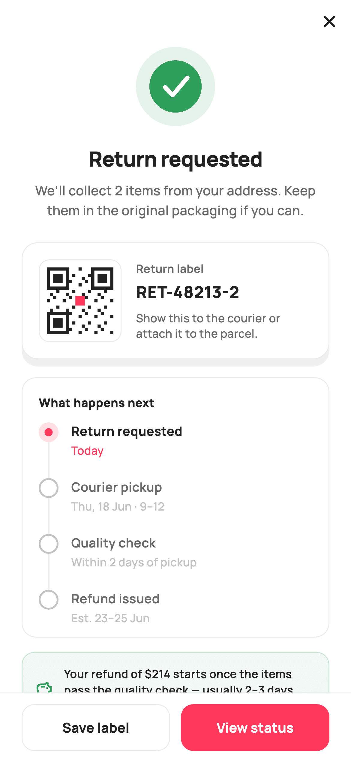
The moment after a shopper submits a return is where support tickets are born: they want to know the request went through, what to hand the courier, and when the money comes back. This tutorial builds StyleCart's return-requested screen in Flutter: an 88px `_CheckPainter` success disc, a return-label card with a deterministic 21×21 `_QrPainter` and the `RET-48213-2` ID, a four-step `IntrinsicHeight` timeline driven by a `_StepState` enum, a soft-green refund note, and a Save label / View status footer. Pure Flutter, no images, callbacks only.
Watch the Flutter UI walkthrough
A short screen recording of Return Requested running, if you'd rather see it before you read the code. The written tutorial below covers everything in it.
Can't see the video? Watch it on YouTube.
What you'll build
- ✓A success check painted by `_CheckPainter` as two green discs and a stroked tick, with every coordinate a fraction of the radius
- ✓A return-label card whose QR graphic is generated by `_QrPainter` from an integer formula and three finder patterns — no package, no asset
- ✓A 'What happens next' timeline where `_NodePainter` draws a done / active / todo node plus its connector from a `_StepState` enum
- ✓A refund-ETA note tinted with `_success.withValues(alpha: 0.07)` and a hairline-bordered footer that ranks View status above Save label
Step-by-step build
Create the file
Add a new file at lib/ecom_orders_return_confirmed/ecom_orders_return_confirmed_screen.dart in your Flutter project.
Register the bundled fonts
No external packages — this is pure Flutter. It does bundle its design font (Manrope), so drop the font file into fonts/ and declare it in pubspec.yaml:
flutter:
  fonts:
    - family: Manrope
      fonts:
- asset: fonts/Manrope-Regular.ttfBuild it, piece by piece
Here's how the screen goes together. Each block below is a real slice of the code with a plain-English explanation — paste them in order, or grab the whole file from the next section.
Callbacks, tokens, and the timeline as data
import 'package:flutter/material.dart';

/// StyleCart — Return Requested.
///
/// Confirms a return request: a painted success check, the return ID, a painted
/// QR return-label card (no network, no glyph), a short status timeline built
/// with the IntrinsicHeight stepper, and a refund-ETA note. CTAs save the label
/// and view the return status.
///
/// Self-contained per CONVENTIONS.md: pure Flutter, bundled Manrope, inline
/// Airbnb-style tokens, own light theme + SafeArea. Painter-only graphics.
/// Exposes callbacks only.
class EcomOrdersReturnConfirmedScreen extends StatelessWidget {
  const EcomOrdersReturnConfirmedScreen({
    super.key,
    this.onClose,
    this.onSaveLabel,
    this.onViewStatus,
  });

  final VoidCallback? onClose;
  final VoidCallback? onSaveLabel;
  final VoidCallback? onViewStatus;

  static const String _font = 'Manrope';
  static const Color _canvas = Color(0xFFFFFFFF);
  static const Color _ink = Color(0xFF222222);
  static const Color _muted = Color(0xFF6A6A6A);
  static const Color _faint = Color(0xFFC1C1C1);
  static const Color _brand = Color(0xFFFF385C);
  static const Color _success = Color(0xFF2E9E5B);
  static const Color _hairline = Color(0xFFEBEBEB);

  static const List<_Step> _steps = <_Step>[
    _Step('Return requested', 'Today', _StepState.active),
    _Step('Courier pickup', 'Thu, 18 Jun · 9–12', _StepState.todo),
    _Step('Quality check', 'Within 2 days of pickup', _StepState.todo),
    _Step('Refund issued', 'Est. 23–25 Jun', _StepState.todo),
  ];
`EcomOrdersReturnConfirmedScreen` is a `StatelessWidget` with three optional callbacks — `onClose`, `onSaveLabel`, `onViewStatus` — and no state at all, because a confirmation page only reports a result and offers exits. The palette is Airbnb-flavoured: `_brand` coral `#FF385C` for the primary action and the active step, `_success` green `#2E9E5B` reserved for the check and the refund note, and three greys (`_ink` `#222222`, `_muted` `#6A6A6A`, `_faint` `#C1C1C1`) that grade text by importance. The interesting bit is `_steps`: a `static const List<_Step>` of four label/time/state triples. Only the first is `_StepState.active`; the rest are `todo`. Keeping the timeline as data means swapping in server statuses later is a one-list change rather than a widget rewrite.
Forced light theme, close button, and the scrolling body
  @override
  Widget build(BuildContext context) {
    return Theme(
      data: ThemeData.light(useMaterial3: true),
      child: Scaffold(
        backgroundColor: _canvas,
        body: SafeArea(
          child: Column(
            children: <Widget>[
              Align(
                alignment: Alignment.centerRight,
                child: IconButton(
                  onPressed: onClose,
                  icon: const Icon(Icons.close_rounded, size: 22, color: _ink),
                ),
              ),
              Expanded(
                child: ListView(
                  padding: const EdgeInsets.fromLTRB(24, 4, 24, 24),
                  children: <Widget>[
                    Center(
                      child: SizedBox(
                        width: 88,
                        height: 88,
                        child: CustomPaint(painter: _CheckPainter()),
                      ),
                    ),
                    const SizedBox(height: 20),
                    const Text(
                      'Return requested',
                      textAlign: TextAlign.center,
                      style: TextStyle(
                        fontFamily: _font,
                        fontSize: 23,
                        fontWeight: FontWeight.w800,
                        letterSpacing: -0.4,
                        color: _ink,
                      ),
                    ),
                    const SizedBox(height: 8),
                    const Text(
                      'We’ll collect 2 items from your address. Keep them in '
                      'the original packaging if you can.',
                      textAlign: TextAlign.center,
                      style: TextStyle(
                        fontFamily: _font,
                        fontSize: 14.5,
                        fontWeight: FontWeight.w500,
                        height: 1.5,
                        color: _muted,
                      ),
                    ),
                    const SizedBox(height: 24),
                    _labelCard(),
                    const SizedBox(height: 20),
                    _timeline(),
                    const SizedBox(height: 16),
                    _refundNote(),
                  ],
                ),
              ),
              _footer(),
            ],
          ),
        ),
      ),
    );
  }
`build` wraps everything in `Theme(data: ThemeData.light(useMaterial3: true))` so the screen looks identical inside a dark-themed host app — the white `_canvas` and dark `_ink` are hard-coded, so inheriting a dark theme would break contrast. Inside `SafeArea`, a `Column` holds three parts: an `Align(centerRight)` close `IconButton` (a close glyph, not a back arrow, because this screen ends the return flow), an `Expanded` `ListView` for the content, and the `_footer()` pinned beneath. The `ListView` starts with an 88×88 `CustomPaint(painter: _CheckPainter())` centred, then the 23px `w800` headline with `letterSpacing: -0.4`, then body copy at 14.5px with `height: 1.5` telling the shopper two items will be collected. Using a `ListView` rather than a `Column` means the label card, timeline and refund note still fit on a small phone by scrolling.
The return-label card with a painted QR
  Widget _labelCard() {
    return Container(
      padding: const EdgeInsets.all(18),
      decoration: BoxDecoration(
        color: _canvas,
        borderRadius: BorderRadius.circular(18),
        border: Border.all(color: _hairline),
        boxShadow: const <BoxShadow>[
          BoxShadow(
            color: Color(0x0F000000),
            blurRadius: 18,
            offset: Offset(0, 8),
          ),
        ],
      ),
      child: Row(
        children: <Widget>[
          Container(
            width: 92,
            height: 92,
            padding: const EdgeInsets.all(8),
            decoration: BoxDecoration(
              color: _canvas,
              borderRadius: BorderRadius.circular(12),
              border: Border.all(color: _hairline),
            ),
            child: CustomPaint(painter: _QrPainter()),
          ),
          const SizedBox(width: 16),
          Expanded(
            child: Column(
              crossAxisAlignment: CrossAxisAlignment.start,
              children: <Widget>[
                const Text(
                  'Return label',
                  style: TextStyle(
                    fontFamily: _font,
                    fontSize: 12.5,
                    fontWeight: FontWeight.w600,
                    color: _muted,
                  ),
                ),
                const SizedBox(height: 4),
                const Text(
                  'RET-48213-2',
                  style: TextStyle(
                    fontFamily: _font,
                    fontSize: 18,
                    fontWeight: FontWeight.w800,
                    letterSpacing: 0.5,
                    color: _ink,
                  ),
                ),
                const SizedBox(height: 8),
                Text(
                  'Show this to the courier or attach it to the parcel.',
                  style: const TextStyle(
                    fontFamily: _font,
                    fontSize: 12.5,
                    fontWeight: FontWeight.w500,
                    height: 1.35,
                    color: _muted,
                  ),
                ),
              ],
            ),
          ),
        ],
      ),
    );
  }
`_labelCard` is a white `Container` with an 18px radius, a `_hairline` `#EBEBEB` border and a single soft shadow (`Color(0x0F000000)`, `blurRadius: 18`, offset 8px down) — the only elevated surface on the page, which is what makes it read as the thing you would show a courier. Inside, a `Row` puts a 92×92 bordered box on the left with 8px padding and `CustomPaint(painter: _QrPainter())`; the padding is what stops the QR's finder squares from touching the border. The `Expanded` column on the right stacks a 12.5px muted 'Return label' eyebrow, the ID `RET-48213-2` at 18px `w800` with `letterSpacing: 0.5` (wider tracking makes an alphanumeric code easier to read aloud), and a one-line instruction at `height: 1.35`. Nothing here is tappable; the footer's Save label button owns that action.
The IntrinsicHeight step timeline
  Widget _timeline() {
    return Container(
      padding: const EdgeInsets.fromLTRB(16, 18, 16, 6),
      decoration: BoxDecoration(
        color: _canvas,
        borderRadius: BorderRadius.circular(16),
        border: Border.all(color: _hairline),
      ),
      child: Column(
        crossAxisAlignment: CrossAxisAlignment.start,
        children: <Widget>[
          const Padding(
            padding: EdgeInsets.only(left: 2, bottom: 12),
            child: Text(
              'What happens next',
              style: TextStyle(
                fontFamily: _font,
                fontSize: 13,
                fontWeight: FontWeight.w800,
                letterSpacing: 0.3,
                color: _ink,
              ),
            ),
          ),
          for (int i = 0; i < _steps.length; i++)
            _stepTile(_steps[i], i == _steps.length - 1),
        ],
      ),
    );
  }

  Widget _stepTile(_Step s, bool last) {
    return IntrinsicHeight(
      child: Row(
        crossAxisAlignment: CrossAxisAlignment.stretch,
        children: <Widget>[
          SizedBox(
            width: 26,
            child: CustomPaint(painter: _NodePainter(s.state, last)),
          ),
          Expanded(
            child: Padding(
              padding: EdgeInsets.only(left: 12, bottom: last ? 6 : 22),
              child: Column(
                crossAxisAlignment: CrossAxisAlignment.start,
                children: <Widget>[
                  Text(
                    s.label,
                    style: TextStyle(
                      fontFamily: _font,
                      fontSize: 14,
                      fontWeight: s.state == _StepState.todo
                          ? FontWeight.w600
                          : FontWeight.w700,
                      color: s.state == _StepState.todo ? _muted : _ink,
                    ),
                  ),
                  const SizedBox(height: 2),
                  Text(
                    s.time,
                    style: TextStyle(
                      fontFamily: _font,
                      fontSize: 12.5,
                      fontWeight: FontWeight.w500,
                      color: s.state == _StepState.active ? _brand : _faint,
                    ),
                  ),
                ],
              ),
            ),
          ),
        ],
      ),
    );
  }
`_timeline` is a bordered panel headed 'What happens next' and then a collection-for that calls `_stepTile(_steps[i], i == _steps.length - 1)` so the last tile knows to skip its connector. Each tile is wrapped in `IntrinsicHeight` with `crossAxisAlignment: CrossAxisAlignment.stretch`: that forces the 26px-wide `CustomPaint` column on the left to be exactly as tall as the text column on the right, which is how `_NodePainter` can draw a connector to `size.height` and have it meet the next node regardless of how many lines the label wraps to. The text column's bottom padding is `last ? 6 : 22`, so the spacing lives inside the painted area and the connector spans it. Typography follows state: a `todo` step's label drops from `w700` `_ink` to `w600` `_muted`, and the time line is `_brand` coral only for the `active` step, `_faint` otherwise — so 'Today' is the single coloured word in the panel.
Refund note and the two-button footer
  Widget _refundNote() {
    return Container(
      padding: const EdgeInsets.all(14),
      decoration: BoxDecoration(
        color: _success.withValues(alpha: 0.07),
        borderRadius: BorderRadius.circular(14),
        border: Border.all(color: _success.withValues(alpha: 0.2)),
      ),
      child: Row(
        children: const <Widget>[
          Icon(Icons.savings_outlined, size: 20, color: _success),
          SizedBox(width: 12),
          Expanded(
            child: Text(
              'Your refund of \$214 starts once the items pass the quality '
              'check — usually 2–3 days after pickup.',
              style: TextStyle(
                fontFamily: _font,
                fontSize: 12.5,
                fontWeight: FontWeight.w600,
                height: 1.4,
                color: _ink,
              ),
            ),
          ),
        ],
      ),
    );
  }

  Widget _footer() {
    return Container(
      decoration: const BoxDecoration(
        color: _canvas,
        border: Border(top: BorderSide(color: _hairline)),
      ),
      child: SafeArea(
        top: false,
        child: Padding(
          padding: const EdgeInsets.fromLTRB(24, 12, 24, 10),
          child: Row(
            children: <Widget>[
              Expanded(
                child: SizedBox(
                  height: 52,
                  child: OutlinedButton(
                    onPressed: onSaveLabel,
                    style: OutlinedButton.styleFrom(
                      foregroundColor: _ink,
                      side: const BorderSide(color: _hairline),
                      shape: RoundedRectangleBorder(
                        borderRadius: BorderRadius.circular(14),
                      ),
                    ),
                    child: const Text(
                      'Save label',
                      style: TextStyle(
                        fontFamily: _font,
                        fontSize: 15,
                        fontWeight: FontWeight.w700,
                      ),
                    ),
                  ),
                ),
              ),
              const SizedBox(width: 12),
              Expanded(
                child: SizedBox(
                  height: 52,
                  child: FilledButton(
                    onPressed: onViewStatus,
                    style: FilledButton.styleFrom(
                      backgroundColor: _brand,
                      foregroundColor: _canvas,
                      shape: RoundedRectangleBorder(
                        borderRadius: BorderRadius.circular(14),
                      ),
                    ),
                    child: const Text(
                      'View status',
                      style: TextStyle(
                        fontFamily: _font,
                        fontSize: 15,
                        fontWeight: FontWeight.w700,
                      ),
                    ),
                  ),
                ),
              ),
            ],
          ),
        ),
      ),
    );
  }
}
`_refundNote` is the one green surface: `_success.withValues(alpha: 0.07)` fill, a `0.2`-alpha green border, a `savings_outlined` icon, and 12.5px `w600` copy stating the `$214` refund starts after the quality check. The whole `Row` is `const`, so it costs nothing to rebuild. `_footer` is a `Container` with a top `_hairline` border wrapping `SafeArea(top: false)` — the border sits outside the safe area, so the white background runs under the home indicator while the buttons stay above it. Two `Expanded` 52px buttons share the row: an `OutlinedButton` 'Save label' with `_ink` foreground and a hairline side, and a `FilledButton` 'View status' in `_brand` coral. They are deliberately unequal — viewing status is the thing most people do next, and saving the label is a one-off. Both use a 14px `RoundedRectangleBorder` to match the cards above.
The step model and _NodePainter
enum _StepState { done, active, todo }

class _Step {
  const _Step(this.label, this.time, this.state);
  final String label;
  final String time;
  final _StepState state;
}

/// Timeline node + connector (same family as the other order steppers).
class _NodePainter extends CustomPainter {
  _NodePainter(this.state, this.last);
  final _StepState state;
  final bool last;

  static const Color _brand = Color(0xFFFF385C);
  static const Color _success = Color(0xFF2E9E5B);
  static const Color _faint = Color(0xFFC1C1C1);
  static const Color _hairline = Color(0xFFEBEBEB);

  @override
  void paint(Canvas canvas, Size size) {
    final double cx = size.width / 2;
    const double cy = 11;
    const double r = 11;

    if (!last) {
      canvas.drawLine(
        Offset(cx, cy + r),
        Offset(cx, size.height),
        Paint()
          ..color = state == _StepState.done ? _success : _hairline
          ..strokeWidth = 2,
      );
    }

    switch (state) {
      case _StepState.done:
        canvas.drawCircle(Offset(cx, cy), r, Paint()..color = _success);
        final Path check = Path()
          ..moveTo(cx - 4.6, cy + 0.3)
          ..lineTo(cx - 1.4, cy + 3.4)
          ..lineTo(cx + 4.8, cy - 3.6);
        canvas.drawPath(
          check,
          Paint()
            ..style = PaintingStyle.stroke
            ..strokeWidth = 2.2
            ..strokeCap = StrokeCap.round
            ..strokeJoin = StrokeJoin.round
            ..color = const Color(0xFFFFFFFF),
        );
      case _StepState.active:
        canvas.drawCircle(
          Offset(cx, cy),
          r,
          Paint()..color = _brand.withValues(alpha: 0.16),
        );
        canvas.drawCircle(Offset(cx, cy), 4.5, Paint()..color = _brand);
      case _StepState.todo:
        canvas.drawCircle(
          Offset(cx, cy),
          r - 1,
          Paint()
            ..style = PaintingStyle.stroke
            ..strokeWidth = 2
            ..color = _faint,
        );
    }
  }

  @override
  bool shouldRepaint(_NodePainter old) =>
      old.state != state || old.last != last;
}
`_StepState { done, active, todo }` and the tiny `_Step` value class are the entire data model. `_NodePainter` takes a state and a `last` flag. It first draws the connector — a 2px line from `cy + r` (just below the node) to `size.height`, green if the step is `done`, hairline grey otherwise — and skips it when `last` is true. Then a `switch` on state with Dart 3's no-`break` syntax: `done` fills an 11px-radius `_success` circle and strokes a three-point white tick with `StrokeCap.round`; `active` paints a 16%-alpha coral halo at full radius with a solid 4.5px coral dot inside; `todo` strokes an `r - 1` ring in `_faint` so the 2px stroke stays inside the same 22px footprint. `cy` is a constant 11, which lines the node up with the first line of the 14px label. `shouldRepaint` compares `state` and `last`, so a status update repaints only the tiles that changed.
Painting the success check
/// A clean success check on a soft green disc — no emoji glyph.
class _CheckPainter extends CustomPainter {
  const _CheckPainter();

  static const Color _success = Color(0xFF2E9E5B);

  @override
  void paint(Canvas canvas, Size size) {
    final Offset c = Offset(size.width / 2, size.height / 2);
    final double r = size.width / 2;
    canvas.drawCircle(
        c, r, Paint()..color = _success.withValues(alpha: 0.12));
    canvas.drawCircle(c, r * 0.66, Paint()..color = _success);
    final Path check = Path()
      ..moveTo(c.dx - r * 0.26, c.dy + r * 0.02)
      ..lineTo(c.dx - r * 0.07, c.dy + r * 0.22)
      ..lineTo(c.dx + r * 0.30, c.dy - r * 0.22);
    canvas.drawPath(
      check,
      Paint()
        ..style = PaintingStyle.stroke
        ..strokeWidth = r * 0.11
        ..strokeCap = StrokeCap.round
        ..strokeJoin = StrokeJoin.round
        ..color = const Color(0xFFFFFFFF),
    );
  }

  @override
  bool shouldRepaint(_CheckPainter old) => false;
}
`_CheckPainter` is a `const` painter with no inputs, so `shouldRepaint` simply returns `false`. It draws three things from a centre `c` and radius `r = size.width / 2`: a full-size disc at `_success.withValues(alpha: 0.12)` for a soft halo, a solid `_success` disc at `r * 0.66`, and a tick `Path` whose three points are offsets like `c.dx - r * 0.26` and `c.dy + r * 0.22`. Because every coordinate and the `strokeWidth` (`r * 0.11`) are fractions of `r`, the same painter renders crisply in the 88px box used here or in a 40px list badge. `StrokeCap.round` and `StrokeJoin.round` give the tick soft ends and a soft elbow, which is what keeps it from looking like a font glyph — the file comment specifically calls out 'no emoji glyph'.
A deterministic QR-style label painter
/// A deterministic painted QR-style label (21×21 modules, three finder
/// patterns, brand centre) — recognisable as a scan label, no network/asset.
class _QrPainter extends CustomPainter {
  const _QrPainter();

  static const Color _ink = Color(0xFF222222);
  static const Color _brand = Color(0xFFFF385C);

  bool _inFinder(int x, int y) =>
      _finder(x, y) || _finder(x - 14, y) || _finder(x, y - 14);

  bool _finder(int x, int y) => x >= 0 && x < 7 && y >= 0 && y < 7;

  @override
  void paint(Canvas canvas, Size size) {
    const int n = 21;
    final double cell = size.width / n;
    final Paint p = Paint()..color = _ink;

    for (int y = 0; y < n; y++) {
      for (int x = 0; x < n; x++) {
        if (_inFinder(x, y)) continue;
        final bool on = ((x * 7 + y * 13 + x * y * 3) % 5) == 0;
        if (on) {
          canvas.drawRect(
            Rect.fromLTWH(x * cell, y * cell, cell, cell),
            p,
          );
        }
      }
    }

    // Finder patterns.
    void finderAt(double gx, double gy) {
      final Rect outer = Rect.fromLTWH(gx, gy, cell * 7, cell * 7);
      canvas.drawRect(outer, p);
      canvas.drawRect(
        Rect.fromLTWH(gx + cell, gy + cell, cell * 5, cell * 5),
        Paint()..color = const Color(0xFFFFFFFF),
      );
      canvas.drawRect(
        Rect.fromLTWH(gx + cell * 2, gy + cell * 2, cell * 3, cell * 3),
        p,
      );
    }

    finderAt(0, 0);
    finderAt(cell * 14, 0);
    finderAt(0, cell * 14);

    // Brand centre module.
    canvas.drawRect(
      Rect.fromLTWH(cell * 9, cell * 9, cell * 3, cell * 3),
      Paint()..color = _brand,
    );
  }

  @override
  bool shouldRepaint(_QrPainter old) => false;
}
`_QrPainter` produces something that scans as 'a QR code' to the eye without any encoding library. It divides the square into `n = 21` cells, then loops every cell and fills it when `((x * 7 + y * 13 + x * y * 3) % 5) == 0` — a fixed arithmetic hash, so the pattern is identical on every frame and every device, and the painter can stay `const` with `shouldRepaint => false`. `_inFinder` masks out the three 7×7 corners (`x, y`, `x - 14`, `y - 14`) so the random modules never collide with them; the local `finderAt` closure then draws each finder as ink 7×7, white 5×5, ink 3×3 — the real QR finder structure. Finally a 3×3 `_brand` coral block at cell 9 stamps the centre, echoing the brand mark that real branded QR codes carry. Swap this painter for a `qr_flutter` widget when you have a real label payload; the 92px box and 8px quiet zone already fit it.
Full code
The complete, ready-to-paste source. Free to use in your projects — one click copies it all.
import 'package:flutter/material.dart';
/// StyleCart — Return Requested.
///
/// Confirms a return request: a painted success check, the return ID, a painted
/// QR return-label card (no network, no glyph), a short status timeline built
/// with the IntrinsicHeight stepper, and a refund-ETA note. CTAs save the label
/// and view the return status.
///
/// Self-contained per CONVENTIONS.md: pure Flutter, bundled Manrope, inline
/// Airbnb-style tokens, own light theme + SafeArea. Painter-only graphics.
/// Exposes callbacks only.
class EcomOrdersReturnConfirmedScreen extends StatelessWidget {
const EcomOrdersReturnConfirmedScreen({
super.key,
this.onClose,
this.onSaveLabel,
this.onViewStatus,
});
final VoidCallback? onClose;
final VoidCallback? onSaveLabel;
final VoidCallback? onViewStatus;
static const String _font = 'Manrope';
static const Color _canvas = Color(0xFFFFFFFF);
static const Color _ink = Color(0xFF222222);
static const Color _muted = Color(0xFF6A6A6A);
static const Color _faint = Color(0xFFC1C1C1);
static const Color _brand = Color(0xFFFF385C);
static const Color _success = Color(0xFF2E9E5B);
static const Color _hairline = Color(0xFFEBEBEB);
static const List<_Step> _steps = <_Step>[
_Step('Return requested', 'Today', _StepState.active),
_Step('Courier pickup', 'Thu, 18 Jun · 9–12', _StepState.todo),
_Step('Quality check', 'Within 2 days of pickup', _StepState.todo),
_Step('Refund issued', 'Est. 23–25 Jun', _StepState.todo),
];
@override
Widget build(BuildContext context) {
return Theme(
data: ThemeData.light(useMaterial3: true),
child: Scaffold(
backgroundColor: _canvas,
body: SafeArea(
child: Column(
children: <Widget>[
Align(
alignment: Alignment.centerRight,
child: IconButton(
onPressed: onClose,
icon: const Icon(Icons.close_rounded, size: 22, color: _ink),
),
),
Expanded(
child: ListView(
padding: const EdgeInsets.fromLTRB(24, 4, 24, 24),
children: <Widget>[
Center(
child: SizedBox(
width: 88,
height: 88,
child: CustomPaint(painter: _CheckPainter()),
),
),
const SizedBox(height: 20),
const Text(
'Return requested',
textAlign: TextAlign.center,
style: TextStyle(
fontFamily: _font,
fontSize: 23,
fontWeight: FontWeight.w800,
letterSpacing: -0.4,
color: _ink,
),
),
const SizedBox(height: 8),
const Text(
'We’ll collect 2 items from your address. Keep them in '
'the original packaging if you can.',
textAlign: TextAlign.center,
style: TextStyle(
fontFamily: _font,
fontSize: 14.5,
fontWeight: FontWeight.w500,
height: 1.5,
color: _muted,
),
),
const SizedBox(height: 24),
_labelCard(),
const SizedBox(height: 20),
_timeline(),
const SizedBox(height: 16),
_refundNote(),
],
),
),
_footer(),
],
),
),
),
);
}
Widget _labelCard() {
return Container(
padding: const EdgeInsets.all(18),
decoration: BoxDecoration(
color: _canvas,
borderRadius: BorderRadius.circular(18),
border: Border.all(color: _hairline),
boxShadow: const <BoxShadow>[
BoxShadow(
color: Color(0x0F000000),
blurRadius: 18,
offset: Offset(0, 8),
),
],
),
child: Row(
children: <Widget>[
Container(
width: 92,
height: 92,
padding: const EdgeInsets.all(8),
decoration: BoxDecoration(
color: _canvas,
borderRadius: BorderRadius.circular(12),
border: Border.all(color: _hairline),
),
child: CustomPaint(painter: _QrPainter()),
),
const SizedBox(width: 16),
Expanded(
child: Column(
crossAxisAlignment: CrossAxisAlignment.start,
children: <Widget>[
const Text(
'Return label',
style: TextStyle(
fontFamily: _font,
fontSize: 12.5,
fontWeight: FontWeight.w600,
color: _muted,
),
),
const SizedBox(height: 4),
const Text(
'RET-48213-2',
style: TextStyle(
fontFamily: _font,
fontSize: 18,
fontWeight: FontWeight.w800,
letterSpacing: 0.5,
color: _ink,
),
),
const SizedBox(height: 8),
Text(
'Show this to the courier or attach it to the parcel.',
style: const TextStyle(
fontFamily: _font,
fontSize: 12.5,
fontWeight: FontWeight.w500,
height: 1.35,
color: _muted,
),
),
],
),
),
],
),
);
}
Widget _timeline() {
return Container(
padding: const EdgeInsets.fromLTRB(16, 18, 16, 6),
decoration: BoxDecoration(
color: _canvas,
borderRadius: BorderRadius.circular(16),
border: Border.all(color: _hairline),
),
child: Column(
crossAxisAlignment: CrossAxisAlignment.start,
children: <Widget>[
const Padding(
padding: EdgeInsets.only(left: 2, bottom: 12),
child: Text(
'What happens next',
style: TextStyle(
fontFamily: _font,
fontSize: 13,
fontWeight: FontWeight.w800,
letterSpacing: 0.3,
color: _ink,
),
),
),
for (int i = 0; i < _steps.length; i++)
_stepTile(_steps[i], i == _steps.length - 1),
],
),
);
}
Widget _stepTile(_Step s, bool last) {
return IntrinsicHeight(
child: Row(
crossAxisAlignment: CrossAxisAlignment.stretch,
children: <Widget>[
SizedBox(
width: 26,
child: CustomPaint(painter: _NodePainter(s.state, last)),
),
Expanded(
child: Padding(
padding: EdgeInsets.only(left: 12, bottom: last ? 6 : 22),
child: Column(
crossAxisAlignment: CrossAxisAlignment.start,
children: <Widget>[
Text(
s.label,
style: TextStyle(
fontFamily: _font,
fontSize: 14,
fontWeight: s.state == _StepState.todo
? FontWeight.w600
: FontWeight.w700,
color: s.state == _StepState.todo ? _muted : _ink,
),
),
const SizedBox(height: 2),
Text(
s.time,
style: TextStyle(
fontFamily: _font,
fontSize: 12.5,
fontWeight: FontWeight.w500,
color: s.state == _StepState.active ? _brand : _faint,
),
),
],
),
),
),
],
),
);
}
Widget _refundNote() {
return Container(
padding: const EdgeInsets.all(14),
decoration: BoxDecoration(
color: _success.withValues(alpha: 0.07),
borderRadius: BorderRadius.circular(14),
border: Border.all(color: _success.withValues(alpha: 0.2)),
),
child: Row(
children: const <Widget>[
Icon(Icons.savings_outlined, size: 20, color: _success),
SizedBox(width: 12),
Expanded(
child: Text(
'Your refund of \$214 starts once the items pass the quality '
'check — usually 2–3 days after pickup.',
style: TextStyle(
fontFamily: _font,
fontSize: 12.5,
fontWeight: FontWeight.w600,
height: 1.4,
color: _ink,
),
),
),
],
),
);
}
Widget _footer() {
return Container(
decoration: const BoxDecoration(
color: _canvas,
border: Border(top: BorderSide(color: _hairline)),
),
child: SafeArea(
top: false,
child: Padding(
padding: const EdgeInsets.fromLTRB(24, 12, 24, 10),
child: Row(
children: <Widget>[
Expanded(
child: SizedBox(
height: 52,
child: OutlinedButton(
onPressed: onSaveLabel,
style: OutlinedButton.styleFrom(
foregroundColor: _ink,
side: const BorderSide(color: _hairline),
shape: RoundedRectangleBorder(
borderRadius: BorderRadius.circular(14),
),
),
child: const Text(
'Save label',
style: TextStyle(
fontFamily: _font,
fontSize: 15,
fontWeight: FontWeight.w700,
),
),
),
),
),
const SizedBox(width: 12),
Expanded(
child: SizedBox(
height: 52,
child: FilledButton(
onPressed: onViewStatus,
style: FilledButton.styleFrom(
backgroundColor: _brand,
foregroundColor: _canvas,
shape: RoundedRectangleBorder(
borderRadius: BorderRadius.circular(14),
),
),
child: const Text(
'View status',
style: TextStyle(
fontFamily: _font,
fontSize: 15,
fontWeight: FontWeight.w700,
),
),
),
),
),
],
),
),
),
);
}
}
enum _StepState { done, active, todo }
class _Step {
const _Step(this.label, this.time, this.state);
final String label;
final String time;
final _StepState state;
}
/// Timeline node + connector (same family as the other order steppers).
class _NodePainter extends CustomPainter {
_NodePainter(this.state, this.last);
final _StepState state;
final bool last;
static const Color _brand = Color(0xFFFF385C);
static const Color _success = Color(0xFF2E9E5B);
static const Color _faint = Color(0xFFC1C1C1);
static const Color _hairline = Color(0xFFEBEBEB);
@override
void paint(Canvas canvas, Size size) {
final double cx = size.width / 2;
const double cy = 11;
const double r = 11;
if (!last) {
canvas.drawLine(
Offset(cx, cy + r),
Offset(cx, size.height),
Paint()
..color = state == _StepState.done ? _success : _hairline
..strokeWidth = 2,
);
}
switch (state) {
case _StepState.done:
canvas.drawCircle(Offset(cx, cy), r, Paint()..color = _success);
final Path check = Path()
..moveTo(cx - 4.6, cy + 0.3)
..lineTo(cx - 1.4, cy + 3.4)
..lineTo(cx + 4.8, cy - 3.6);
canvas.drawPath(
check,
Paint()
..style = PaintingStyle.stroke
..strokeWidth = 2.2
..strokeCap = StrokeCap.round
..strokeJoin = StrokeJoin.round
..color = const Color(0xFFFFFFFF),
);
case _StepState.active:
canvas.drawCircle(
Offset(cx, cy),
r,
Paint()..color = _brand.withValues(alpha: 0.16),
);
canvas.drawCircle(Offset(cx, cy), 4.5, Paint()..color = _brand);
case _StepState.todo:
canvas.drawCircle(
Offset(cx, cy),
r - 1,
Paint()
..style = PaintingStyle.stroke
..strokeWidth = 2
..color = _faint,
);
}
}
@override
bool shouldRepaint(_NodePainter old) =>
old.state != state || old.last != last;
}
/// A clean success check on a soft green disc — no emoji glyph.
class _CheckPainter extends CustomPainter {
const _CheckPainter();
static const Color _success = Color(0xFF2E9E5B);
@override
void paint(Canvas canvas, Size size) {
final Offset c = Offset(size.width / 2, size.height / 2);
final double r = size.width / 2;
canvas.drawCircle(
c, r, Paint()..color = _success.withValues(alpha: 0.12));
canvas.drawCircle(c, r * 0.66, Paint()..color = _success);
final Path check = Path()
..moveTo(c.dx - r * 0.26, c.dy + r * 0.02)
..lineTo(c.dx - r * 0.07, c.dy + r * 0.22)
..lineTo(c.dx + r * 0.30, c.dy - r * 0.22);
canvas.drawPath(
check,
Paint()
..style = PaintingStyle.stroke
..strokeWidth = r * 0.11
..strokeCap = StrokeCap.round
..strokeJoin = StrokeJoin.round
..color = const Color(0xFFFFFFFF),
);
}
@override
bool shouldRepaint(_CheckPainter old) => false;
}
/// A deterministic painted QR-style label (21×21 modules, three finder
/// patterns, brand centre) — recognisable as a scan label, no network/asset.
class _QrPainter extends CustomPainter {
const _QrPainter();
static const Color _ink = Color(0xFF222222);
static const Color _brand = Color(0xFFFF385C);
bool _inFinder(int x, int y) =>
_finder(x, y) || _finder(x - 14, y) || _finder(x, y - 14);
bool _finder(int x, int y) => x >= 0 && x < 7 && y >= 0 && y < 7;
@override
void paint(Canvas canvas, Size size) {
const int n = 21;
final double cell = size.width / n;
final Paint p = Paint()..color = _ink;
for (int y = 0; y < n; y++) {
for (int x = 0; x < n; x++) {
if (_inFinder(x, y)) continue;
final bool on = ((x * 7 + y * 13 + x * y * 3) % 5) == 0;
if (on) {
canvas.drawRect(
Rect.fromLTWH(x * cell, y * cell, cell, cell),
p,
);
}
}
}
// Finder patterns.
void finderAt(double gx, double gy) {
final Rect outer = Rect.fromLTWH(gx, gy, cell * 7, cell * 7);
canvas.drawRect(outer, p);
canvas.drawRect(
Rect.fromLTWH(gx + cell, gy + cell, cell * 5, cell * 5),
Paint()..color = const Color(0xFFFFFFFF),
);
canvas.drawRect(
Rect.fromLTWH(gx + cell * 2, gy + cell * 2, cell * 3, cell * 3),
p,
);
}
finderAt(0, 0);
finderAt(cell * 14, 0);
finderAt(0, cell * 14);
// Brand centre module.
canvas.drawRect(
Rect.fromLTWH(cell * 9, cell * 9, cell * 3, cell * 3),
Paint()..color = _brand,
);
}
@override
bool shouldRepaint(_QrPainter old) => false;
}
Plus bundled 5 binary assets (fonts/images). The CLI and MCP install those for you automatically.
Two faster ways to add it
Copy-paste works, but you can skip it entirely.
1. FlutterKit CLI
One command drops this screen — and its fonts — straight into your project.
$ flutterkit add ecom-orders-return-confirmed2. AI agent (MCP)
Connect FlutterKit's MCP server in Claude or Cursor and just ask your agent to install ecom-orders-return-confirmed — it fetches and writes the files for you.
FAQ
Can I use this return-confirmation screen in a commercial app?
Yes. FlutterKit screens are free for personal and commercial projects under an MIT-style licence — no key, no attribution, no sign-up. Copy the code from this page or run `flutterkit add ecom-orders-return-confirmed` and ship it in your store app.
Does the screen need any pub packages or fonts?
No packages — it is pure `package:flutter/material.dart`. The QR, the success check and the timeline nodes are all `CustomPainter`s. The only external asset is the Manrope font, which `flutterkit add ecom-orders-return-confirmed` bundles and registers in `pubspec.yaml` for you.
How do I feed real return statuses into the timeline?
Replace the `static const List<_Step> _steps` with a constructor parameter (say `List<_Step> steps`) and build it from your API — each item needs a label, a time string and a `_StepState`. Mark completed stages `done`, the current one `active`, the rest `todo`; `_NodePainter` already draws the green connector for `done` steps and `shouldRepaint` only redraws tiles whose state changed.
Is the QR code real? Will a courier scan it?
No — `_QrPainter` is a deterministic placeholder: a modulo formula decides which of the 21×21 cells are filled, plus three hand-drawn finder patterns. It looks right in a design and needs no dependency. For a scannable label, drop a `qr_flutter` `QrImageView` (with your return ID as data) into the same 92×92 box in `_labelCard`.
Which Flutter version does this need?
Flutter 3.22 or newer: the refund note, the active node halo and the check disc use `Color.withValues(alpha: x)`, and the constructor uses `super.key`. On an older SDK change each `withValues(alpha: x)` to `withOpacity(x)` and write the constructor as `{Key? key, ...} : super(key: key)`.


