How to Build an Order Success Screen in Flutter (Full Code + Preview)
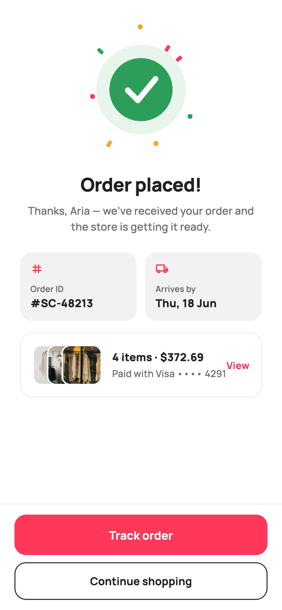
Checkout ends the moment the payment clears, but the shopper still needs three facts fast: it worked, which order it is, and when the box arrives. This tutorial builds StyleCart's Order Placed screen in Flutter — a 168px painted badge with a green tick inside a confetti burst, two rounded meta cells carrying the order ID and the arrives-by date, a summary card whose product thumbnails overlap by 20px, and a pinned footer that ranks Track order above Continue shopping.
Watch the Flutter UI walkthrough
A short screen recording of Order Placed running, if you'd rather see it before you read the code. The written tutorial below covers everything in it.
Can't see the video? Watch it on YouTube.
What you'll build
- ✓A 168×168 CustomPaint badge: soft green disc, solid green circle, stroked white tick, eight confetti shards fired outward at fixed angles
- ✓A two-up meta row of Order ID and Arrives-by cells sharing width through Expanded
- ✓A summary card with three 56px thumbnails stacked in a Stack at 20px offsets, each ringed in a 2px white border
- ✓An order line pairing '4 items · $372.69' with the masked card that paid for it
- ✓A pinned footer that separates Track order (filled coral) from Continue shopping (outlined ink)
Step-by-step build
Create the file
Add a new file at lib/ecom_order_success/ecom_order_success_screen.dart in your Flutter project.
Register the bundled fonts
No external packages — this is pure Flutter. It does bundle its design font (Manrope), so drop the font file into fonts/ and declare it in pubspec.yaml:
flutter:
  fonts:
    - family: Manrope
      fonts:
- asset: fonts/Manrope-Regular.ttfBuild it, piece by piece
Here's how the screen goes together. Each block below is a real slice of the code with a plain-English explanation — paste them in order, or grab the whole file from the next section.
Tokens, three callbacks, and the thumbnail manifest
import 'dart:math' as math;

import 'package:flutter/material.dart';

/// StyleCart — Order Placed.
///
/// The celebratory confirmation after a successful checkout: a painted success
/// check inside a burst of confetti, the order ID + estimated arrival, a compact
/// summary card with stacked item thumbnails, and two CTAs — track the order or
/// keep shopping.
///
/// Self-contained per CONVENTIONS.md: pure Flutter, bundled Manrope, inline
/// Airbnb-style tokens, own light theme + SafeArea, bundled webp. The check and
/// confetti are CustomPainters (no emoji glyph, no network). Exposes callbacks
/// only.
class EcomOrderSuccessScreen extends StatelessWidget {
  const EcomOrderSuccessScreen({
    super.key,
    this.onTrack,
    this.onContinue,
    this.onViewOrder,
  });

  final VoidCallback? onTrack;
  final VoidCallback? onContinue;
  final VoidCallback? onViewOrder;

  static const String _font = 'Manrope';
  static const Color _canvas = Color(0xFFFFFFFF);
  static const Color _ink = Color(0xFF222222);
  static const Color _muted = Color(0xFF6A6A6A);
  static const Color _brand = Color(0xFFFF385C);
  static const Color _surface = Color(0xFFF2F2F2);
  static const Color _imageBg = Color(0xFFF5F5F5);
  static const Color _hairline = Color(0xFFEBEBEB);

  static const String _dir = 'lib/screens/ecommerce/ecom_order_success/images';

  static const List<String> _thumbs = <String>['p01.webp', 'p02.webp', 'p03.webp'];
`EcomOrderSuccessScreen` is a `StatelessWidget` exposing `onTrack`, `onContinue` and `onViewOrder` and nothing else — the confirmation is a terminal state, so there is nothing on it to mutate. Note that `_brand` `#FF385C` coral is declared here but the success badge is painted green inside `_SuccessBurstPainter` instead; the shop's identity colour marks actions, while completion gets the colour people already read as 'done'. `_thumbs` lists three webp filenames and `_dir` points at a bundled asset folder, so the card renders offline with no network call and no placeholder flicker. `dart:math` is imported as `math` purely for the confetti's `cos`/`sin`.
A scrolling body above a footer that never moves
  @override
  Widget build(BuildContext context) {
    return Theme(
      data: ThemeData.light(useMaterial3: true),
      child: Scaffold(
        backgroundColor: _canvas,
        body: SafeArea(
          child: Column(
            children: <Widget>[
              Expanded(
                child: ListView(
                  padding: const EdgeInsets.fromLTRB(28, 16, 28, 20),
                  children: <Widget>[
                    const SizedBox(height: 24),
                    Center(
                      child: SizedBox(
                        width: 168,
                        height: 168,
                        child: CustomPaint(painter: _SuccessBurstPainter()),
                      ),
                    ),
                    const SizedBox(height: 28),
                    const Text(
                      'Order placed!',
                      textAlign: TextAlign.center,
                      style: TextStyle(
                        fontFamily: _font,
                        fontSize: 26,
                        fontWeight: FontWeight.w800,
                        letterSpacing: -0.5,
                        color: _ink,
                      ),
                    ),
                    const SizedBox(height: 8),
                    const Text(
                      'Thanks, Aria — we’ve received your order and the '
                      'store is getting it ready.',
                      textAlign: TextAlign.center,
                      style: TextStyle(
                        fontFamily: _font,
                        fontSize: 14.5,
                        fontWeight: FontWeight.w500,
                        height: 1.5,
                        color: _muted,
                      ),
                    ),
                    const SizedBox(height: 24),
                    _metaRow(),
                    const SizedBox(height: 16),
                    _summaryCard(),
                  ],
                ),
              ),
              _actions(),
            ],
          ),
        ),
      ),
    );
  }
`build` wraps everything in `Theme(data: ThemeData.light(useMaterial3: true))` so the screen keeps its own light palette even if the host app runs dark — a confirmation dropped into an unknown theme should not gamble on contrast. The `SafeArea` holds a `Column` whose first child is `Expanded(child: ListView(...))` and whose second is `_actions()`: the celebratory content scrolls when a small phone runs out of room, while the buttons stay welded to the bottom. Padding of `fromLTRB(28, 16, 28, 20)` gives generous 28px side gutters, and the headline is 26px `w800` at `letterSpacing: -0.5` with the thank-you line beneath it at 14.5px, `height: 1.5`.
Order ID and arrival date as equal cells
  Widget _metaRow() {
    return Row(
      children: <Widget>[
        Expanded(
          child: _metaCell('Order ID', '#SC-48213', Icons.tag_rounded),
        ),
        const SizedBox(width: 12),
        Expanded(
          child: _metaCell(
              'Arrives by', 'Thu, 18 Jun', Icons.local_shipping_outlined),
        ),
      ],
    );
  }

  Widget _metaCell(String label, String value, IconData icon) {
    return Container(
      padding: const EdgeInsets.symmetric(horizontal: 14, vertical: 14),
      decoration: BoxDecoration(
        color: _surface,
        borderRadius: BorderRadius.circular(16),
      ),
      child: Column(
        crossAxisAlignment: CrossAxisAlignment.start,
        children: <Widget>[
          Icon(icon, size: 18, color: _brand),
          const SizedBox(height: 10),
          Text(
            label,
            style: const TextStyle(
              fontFamily: _font,
              fontSize: 11.5,
              fontWeight: FontWeight.w600,
              letterSpacing: 0.2,
              color: _muted,
            ),
          ),
          const SizedBox(height: 2),
          Text(
            value,
            style: const TextStyle(
              fontFamily: _font,
              fontSize: 15,
              fontWeight: FontWeight.w800,
              color: _ink,
            ),
          ),
        ],
      ),
    );
  }
`_metaRow` puts two `_metaCell` calls in `Expanded` wrappers with a 12px gap, so each takes exactly half the width no matter how long '#SC-48213' or 'Thu, 18 Jun' turns out to be. Inside a cell the stack is icon, label, value: an 18px `Icons.tag_rounded` or `Icons.local_shipping_outlined` tinted `_brand`, then the label at 11.5px `w600` with `letterSpacing: 0.2` in `_muted`, then the value at 15px `w800` in `_ink`, separated by only 2px. That tight pairing is what makes label and value read as one unit. The `_surface` `#F2F2F2` fill with `BorderRadius.circular(16)` needs no border — the tint alone separates the cells from white.
Overlapping thumbnails and the receipt line
  Widget _summaryCard() {
    return Container(
      padding: const EdgeInsets.all(16),
      decoration: BoxDecoration(
        color: _canvas,
        borderRadius: BorderRadius.circular(16),
        border: Border.all(color: _hairline),
      ),
      child: Row(
        children: <Widget>[
          SizedBox(
            width: 96,
            height: 56,
            child: Stack(
              children: <Widget>[
                for (int i = 0; i < _thumbs.length; i++)
                  Positioned(
                    left: i * 20.0,
                    child: Container(
                      width: 56,
                      height: 56,
                      decoration: BoxDecoration(
                        color: _imageBg,
                        borderRadius: BorderRadius.circular(12),
                        border: Border.all(color: _canvas, width: 2),
                      ),
                      child: ClipRRect(
                        borderRadius: BorderRadius.circular(10),
                        child: Image.asset(
                          '$_dir/${_thumbs[i]}',
                          fit: BoxFit.cover,
                        ),
                      ),
                    ),
                  ),
              ],
            ),
          ),
          const SizedBox(width: 14),
          const Expanded(
            child: Column(
              crossAxisAlignment: CrossAxisAlignment.start,
              children: <Widget>[
                Text(
                  '4 items · \$372.69',
                  style: TextStyle(
                    fontFamily: _font,
                    fontSize: 15,
                    fontWeight: FontWeight.w800,
                    color: _ink,
                  ),
                ),
                SizedBox(height: 3),
                Text(
                  'Paid with Visa •••• 4291',
                  style: TextStyle(
                    fontFamily: _font,
                    fontSize: 13,
                    fontWeight: FontWeight.w500,
                    color: _muted,
                  ),
                ),
              ],
            ),
          ),
          GestureDetector(
            onTap: onViewOrder,
            child: const Text(
              'View',
              style: TextStyle(
                fontFamily: _font,
                fontSize: 13.5,
                fontWeight: FontWeight.w700,
                color: _brand,
              ),
            ),
          ),
        ],
      ),
    );
  }
The summary card is white with a `_hairline` border rather than a tint, so it sits visually below the two filled meta cells. The thumbnail cluster is a fixed `SizedBox(width: 96, height: 56)` holding a `Stack`; a `for` loop positions each 56px tile at `left: i * 20.0`, so three tiles overlap into 96px instead of 168px. Each tile carries `Border.all(color: _canvas, width: 2)` at radius 12 with the image clipped at radius 10 — the white ring is what separates one thumbnail from the one behind it. Beside them, '4 items · \$372.69' and 'Paid with Visa •••• 4291' answer what was bought and what paid for it, and a `GestureDetector` turns 'View' into a coral text link to the full order.
Two exits, ranked by what happens next
  Widget _actions() {
    return Container(
      decoration: const BoxDecoration(
        color: _canvas,
        border: Border(top: BorderSide(color: _hairline)),
      ),
      child: SafeArea(
        top: false,
        child: Padding(
          padding: const EdgeInsets.fromLTRB(20, 14, 20, 14),
          child: Column(
            mainAxisSize: MainAxisSize.min,
            children: <Widget>[
              SizedBox(
                height: 56,
                child: FilledButton(
                  onPressed: onTrack,
                  style: FilledButton.styleFrom(
                    backgroundColor: _brand,
                    foregroundColor: _canvas,
                    minimumSize: const Size.fromHeight(56),
                    shape: RoundedRectangleBorder(
                      borderRadius: BorderRadius.circular(16),
                    ),
                  ),
                  child: const Text(
                    'Track order',
                    style: TextStyle(
                      fontFamily: _font,
                      fontSize: 16,
                      fontWeight: FontWeight.w700,
                    ),
                  ),
                ),
              ),
              const SizedBox(height: 10),
              SizedBox(
                height: 52,
                child: OutlinedButton(
                  onPressed: onContinue,
                  style: OutlinedButton.styleFrom(
                    foregroundColor: _ink,
                    side: const BorderSide(color: _ink, width: 1.3),
                    minimumSize: const Size.fromHeight(52),
                    shape: RoundedRectangleBorder(
                      borderRadius: BorderRadius.circular(16),
                    ),
                  ),
                  child: const Text(
                    'Continue shopping',
                    style: TextStyle(
                      fontFamily: _font,
                      fontSize: 15,
                      fontWeight: FontWeight.w700,
                    ),
                  ),
                ),
              ),
            ],
          ),
        ),
      ),
    );
  }
The footer `Container` draws a single top `BorderSide` in `_hairline` and wraps `SafeArea(top: false)` inside itself, so the white extends under the home indicator while the buttons stay clear of it. The `FilledButton` reading 'Track order' is 56px tall in `_brand` coral; the `OutlinedButton` reading 'Continue shopping' is 52px with a 1.3px `_ink` side. The 4px height difference reinforces the fill: tracking is what a shopper does in the next thirty seconds, while more shopping is the slower, optional path — two filled buttons would flatten that. Each button sets both a `SizedBox` height and `minimumSize: Size.fromHeight(...)`, which forces full width without a `double.infinity` wrapper.
Firing the confetti shards
/// Paints a success badge: a soft green disc, a solid green circle, a bold white
/// check, and a scatter of brand/green confetti shards bursting outward.
class _SuccessBurstPainter extends CustomPainter {
  const _SuccessBurstPainter();

  static const Color _green = Color(0xFF2E9E5B);
  static const Color _greenSoft = Color(0xFFE7F4EC);
  static const Color _brand = Color(0xFFFF385C);
  static const Color _amber = Color(0xFFF5A623);

  @override
  void paint(Canvas canvas, Size size) {
    final double w = size.width;
    final Offset c = Offset(w / 2, size.height / 2);
    final double r = w * 0.26;

    // Confetti shards around the badge (deterministic — golden-stable).
    const List<List<double>> shards = <List<double>>[
      <double>[-1.0, 0, 0], // angle(rad), radiusScale, colorIndex
      <double>[0.5, 0, 1],
      <double>[2.1, 0, 2],
      <double>[3.0, 0, 0],
      <double>[3.9, 0, 1],
      <double>[4.7, 0, 2],
      <double>[5.6, 0, 0],
      <double>[1.3, 0, 2],
    ];
    final List<Color> palette = <Color>[_brand, _green, _amber];
    for (int i = 0; i < shards.length; i++) {
      final double ang = shards[i][0];
      final double dist = r * (1.55 + (i % 3) * 0.22);
      final Offset p =
          Offset(c.dx + dist * math.cos(ang), c.dy + dist * math.sin(ang));
      final Paint sp = Paint()..color = palette[shards[i][2].toInt()];
      canvas.save();
      canvas.translate(p.dx, p.dy);
      canvas.rotate(ang);
      if (i.isEven) {
        canvas.drawRRect(
          RRect.fromRectAndRadius(
            Rect.fromCenter(center: Offset.zero, width: 9, height: 5),
            const Radius.circular(1.5),
          ),
          sp,
        );
      } else {
        canvas.drawCircle(Offset.zero, 3.4, sp);
      }
      canvas.restore();
    }
`_SuccessBurstPainter` draws the confetti first, so the badge later covers any shard that strays inward. Eight shards are hard-coded as `[angle, radiusScale, colorIndex]` triples — deterministic rather than `Random`, so the screenshot is identical on every run and in golden tests. The middle value is 0 in every row and unused: distance actually comes from `r * (1.55 + (i % 3) * 0.22)`, which fans the shards into three concentric bands. For each one the canvas is saved, translated to the point and rotated by that same angle, so a shard leans the way it flew. Even indices draw a 9×5 `RRect` with a 1.5 radius, odd ones a 3.4px circle, and the colour cycles coral, green, amber.
The badge and the stroked tick
    // Badge.
    canvas.drawCircle(c, r * 1.42, Paint()..color = _greenSoft);
    canvas.drawCircle(c, r, Paint()..color = _green);

    // Check mark.
    final Path check = Path()
      ..moveTo(c.dx - r * 0.42, c.dy + r * 0.02)
      ..lineTo(c.dx - r * 0.1, c.dy + r * 0.34)
      ..lineTo(c.dx + r * 0.46, c.dy - r * 0.34);
    canvas.drawPath(
      check,
      Paint()
        ..style = PaintingStyle.stroke
        ..strokeWidth = r * 0.18
        ..strokeCap = StrokeCap.round
        ..strokeJoin = StrokeJoin.round
        ..color = const Color(0xFFFFFFFF),
    );
  }

  @override
  bool shouldRepaint(_SuccessBurstPainter oldDelegate) => false;
}
With `r = w * 0.26`, the badge is two concentric circles: `_greenSoft` `#E7F4EC` at `r * 1.42` and solid `_green` `#2E9E5B` at `r`, which produces a halo without a blur or a shadow layer. The tick is a three-point `Path` — down-left, to the elbow, up-right — stroked in white at `r * 0.18` with `StrokeCap.round` and `StrokeJoin.round`, so the corner is a soft V rather than a mitred spike. Drawing it as a stroked path instead of filling a glyph means the thickness scales with the badge. Every coordinate is derived from `r`, so changing the 168px `SizedBox` rescales the whole thing, and `shouldRepaint` returns `false` because none of it depends on state.
Full code
The complete, ready-to-paste source. Free to use in your projects — one click copies it all.
import 'dart:math' as math;

import 'package:flutter/material.dart';

/// StyleCart — Order Placed.
///
/// The celebratory confirmation after a successful checkout: a painted success
/// check inside a burst of confetti, the order ID + estimated arrival, a compact
/// summary card with stacked item thumbnails, and two CTAs — track the order or
/// keep shopping.
///
/// Self-contained per CONVENTIONS.md: pure Flutter, bundled Manrope, inline
/// Airbnb-style tokens, own light theme + SafeArea, bundled webp. The check and
/// confetti are CustomPainters (no emoji glyph, no network). Exposes callbacks
/// only.
class EcomOrderSuccessScreen extends StatelessWidget {
  const EcomOrderSuccessScreen({
    super.key,
    this.onTrack,
    this.onContinue,
    this.onViewOrder,
  });

  final VoidCallback? onTrack;
  final VoidCallback? onContinue;
  final VoidCallback? onViewOrder;

  static const String _font = 'Manrope';
  static const Color _canvas = Color(0xFFFFFFFF);
  static const Color _ink = Color(0xFF222222);
  static const Color _muted = Color(0xFF6A6A6A);
  static const Color _brand = Color(0xFFFF385C);
  static const Color _surface = Color(0xFFF2F2F2);
  static const Color _imageBg = Color(0xFFF5F5F5);
  static const Color _hairline = Color(0xFFEBEBEB);

  static const String _dir = 'lib/screens/ecommerce/ecom_order_success/images';

  static const List<String> _thumbs = <String>['p01.webp', 'p02.webp', 'p03.webp'];

  @override
  Widget build(BuildContext context) {
    return Theme(
      data: ThemeData.light(useMaterial3: true),
      child: Scaffold(
        backgroundColor: _canvas,
        body: SafeArea(
          child: Column(
            children: <Widget>[
              Expanded(
                child: ListView(
                  padding: const EdgeInsets.fromLTRB(28, 16, 28, 20),
                  children: <Widget>[
                    const SizedBox(height: 24),
                    Center(
                      child: SizedBox(
                        width: 168,
                        height: 168,
                        child: CustomPaint(painter: _SuccessBurstPainter()),
                      ),
                    ),
                    const SizedBox(height: 28),
                    const Text(
                      'Order placed!',
                      textAlign: TextAlign.center,
                      style: TextStyle(
                        fontFamily: _font,
                        fontSize: 26,
                        fontWeight: FontWeight.w800,
                        letterSpacing: -0.5,
                        color: _ink,
                      ),
                    ),
                    const SizedBox(height: 8),
                    const Text(
                      'Thanks, Aria — we’ve received your order and the '
                      'store is getting it ready.',
                      textAlign: TextAlign.center,
                      style: TextStyle(
                        fontFamily: _font,
                        fontSize: 14.5,
                        fontWeight: FontWeight.w500,
                        height: 1.5,
                        color: _muted,
                      ),
                    ),
                    const SizedBox(height: 24),
                    _metaRow(),
                    const SizedBox(height: 16),
                    _summaryCard(),
                  ],
                ),
              ),
              _actions(),
            ],
          ),
        ),
      ),
    );
  }

  Widget _metaRow() {
    return Row(
      children: <Widget>[
        Expanded(
          child: _metaCell('Order ID', '#SC-48213', Icons.tag_rounded),
        ),
        const SizedBox(width: 12),
        Expanded(
          child: _metaCell(
              'Arrives by', 'Thu, 18 Jun', Icons.local_shipping_outlined),
        ),
      ],
    );
  }

  Widget _metaCell(String label, String value, IconData icon) {
    return Container(
      padding: const EdgeInsets.symmetric(horizontal: 14, vertical: 14),
      decoration: BoxDecoration(
        color: _surface,
        borderRadius: BorderRadius.circular(16),
      ),
      child: Column(
        crossAxisAlignment: CrossAxisAlignment.start,
        children: <Widget>[
          Icon(icon, size: 18, color: _brand),
          const SizedBox(height: 10),
          Text(
            label,
            style: const TextStyle(
              fontFamily: _font,
              fontSize: 11.5,
              fontWeight: FontWeight.w600,
              letterSpacing: 0.2,
              color: _muted,
            ),
          ),
          const SizedBox(height: 2),
          Text(
            value,
            style: const TextStyle(
              fontFamily: _font,
              fontSize: 15,
              fontWeight: FontWeight.w800,
              color: _ink,
            ),
          ),
        ],
      ),
    );
  }

  Widget _summaryCard() {
    return Container(
      padding: const EdgeInsets.all(16),
      decoration: BoxDecoration(
        color: _canvas,
        borderRadius: BorderRadius.circular(16),
        border: Border.all(color: _hairline),
      ),
      child: Row(
        children: <Widget>[
          SizedBox(
            width: 96,
            height: 56,
            child: Stack(
              children: <Widget>[
                for (int i = 0; i < _thumbs.length; i++)
                  Positioned(
                    left: i * 20.0,
                    child: Container(
                      width: 56,
                      height: 56,
                      decoration: BoxDecoration(
                        color: _imageBg,
                        borderRadius: BorderRadius.circular(12),
                        border: Border.all(color: _canvas, width: 2),
                      ),
                      child: ClipRRect(
                        borderRadius: BorderRadius.circular(10),
                        child: Image.asset(
                          '$_dir/${_thumbs[i]}',
                          fit: BoxFit.cover,
                        ),
                      ),
                    ),
                  ),
              ],
            ),
          ),
          const SizedBox(width: 14),
          const Expanded(
            child: Column(
              crossAxisAlignment: CrossAxisAlignment.start,
              children: <Widget>[
                Text(
                  '4 items · \$372.69',
                  style: TextStyle(
                    fontFamily: _font,
                    fontSize: 15,
                    fontWeight: FontWeight.w800,
                    color: _ink,
                  ),
                ),
                SizedBox(height: 3),
                Text(
                  'Paid with Visa •••• 4291',
                  style: TextStyle(
                    fontFamily: _font,
                    fontSize: 13,
                    fontWeight: FontWeight.w500,
                    color: _muted,
                  ),
                ),
              ],
            ),
          ),
          GestureDetector(
            onTap: onViewOrder,
            child: const Text(
              'View',
              style: TextStyle(
                fontFamily: _font,
                fontSize: 13.5,
                fontWeight: FontWeight.w700,
                color: _brand,
              ),
            ),
          ),
        ],
      ),
    );
  }

  Widget _actions() {
    return Container(
      decoration: const BoxDecoration(
        color: _canvas,
        border: Border(top: BorderSide(color: _hairline)),
      ),
      child: SafeArea(
        top: false,
        child: Padding(
          padding: const EdgeInsets.fromLTRB(20, 14, 20, 14),
          child: Column(
            mainAxisSize: MainAxisSize.min,
            children: <Widget>[
              SizedBox(
                height: 56,
                child: FilledButton(
                  onPressed: onTrack,
                  style: FilledButton.styleFrom(
                    backgroundColor: _brand,
                    foregroundColor: _canvas,
                    minimumSize: const Size.fromHeight(56),
                    shape: RoundedRectangleBorder(
                      borderRadius: BorderRadius.circular(16),
                    ),
                  ),
                  child: const Text(
                    'Track order',
                    style: TextStyle(
                      fontFamily: _font,
                      fontSize: 16,
                      fontWeight: FontWeight.w700,
                    ),
                  ),
                ),
              ),
              const SizedBox(height: 10),
              SizedBox(
                height: 52,
                child: OutlinedButton(
                  onPressed: onContinue,
                  style: OutlinedButton.styleFrom(
                    foregroundColor: _ink,
                    side: const BorderSide(color: _ink, width: 1.3),
                    minimumSize: const Size.fromHeight(52),
                    shape: RoundedRectangleBorder(
                      borderRadius: BorderRadius.circular(16),
                    ),
                  ),
                  child: const Text(
                    'Continue shopping',
                    style: TextStyle(
                      fontFamily: _font,
                      fontSize: 15,
                      fontWeight: FontWeight.w700,
                    ),
                  ),
                ),
              ),
            ],
          ),
        ),
      ),
    );
  }
}

/// Paints a success badge: a soft green disc, a solid green circle, a bold white
/// check, and a scatter of brand/green confetti shards bursting outward.
class _SuccessBurstPainter extends CustomPainter {
  const _SuccessBurstPainter();

  static const Color _green = Color(0xFF2E9E5B);
  static const Color _greenSoft = Color(0xFFE7F4EC);
  static const Color _brand = Color(0xFFFF385C);
  static const Color _amber = Color(0xFFF5A623);

  @override
  void paint(Canvas canvas, Size size) {
    final double w = size.width;
    final Offset c = Offset(w / 2, size.height / 2);
    final double r = w * 0.26;

    // Confetti shards around the badge (deterministic — golden-stable).
    const List<List<double>> shards = <List<double>>[
      <double>[-1.0, 0, 0], // angle(rad), radiusScale, colorIndex
      <double>[0.5, 0, 1],
      <double>[2.1, 0, 2],
      <double>[3.0, 0, 0],
      <double>[3.9, 0, 1],
      <double>[4.7, 0, 2],
      <double>[5.6, 0, 0],
      <double>[1.3, 0, 2],
    ];
    final List<Color> palette = <Color>[_brand, _green, _amber];
    for (int i = 0; i < shards.length; i++) {
      final double ang = shards[i][0];
      final double dist = r * (1.55 + (i % 3) * 0.22);
      final Offset p =
          Offset(c.dx + dist * math.cos(ang), c.dy + dist * math.sin(ang));
      final Paint sp = Paint()..color = palette[shards[i][2].toInt()];
      canvas.save();
      canvas.translate(p.dx, p.dy);
      canvas.rotate(ang);
      if (i.isEven) {
        canvas.drawRRect(
          RRect.fromRectAndRadius(
            Rect.fromCenter(center: Offset.zero, width: 9, height: 5),
            const Radius.circular(1.5),
          ),
          sp,
        );
      } else {
        canvas.drawCircle(Offset.zero, 3.4, sp);
      }
      canvas.restore();
    }

    // Badge.
    canvas.drawCircle(c, r * 1.42, Paint()..color = _greenSoft);
    canvas.drawCircle(c, r, Paint()..color = _green);

    // Check mark.
    final Path check = Path()
      ..moveTo(c.dx - r * 0.42, c.dy + r * 0.02)
      ..lineTo(c.dx - r * 0.1, c.dy + r * 0.34)
      ..lineTo(c.dx + r * 0.46, c.dy - r * 0.34);
    canvas.drawPath(
      check,
      Paint()
        ..style = PaintingStyle.stroke
        ..strokeWidth = r * 0.18
        ..strokeCap = StrokeCap.round
        ..strokeJoin = StrokeJoin.round
        ..color = const Color(0xFFFFFFFF),
    );
  }

  @override
  bool shouldRepaint(_SuccessBurstPainter oldDelegate) => false;
}
Plus bundled 8 binary assets (fonts/images). The CLI and MCP install those for you automatically.
Two faster ways to add it
Copy-paste works, but you can skip it entirely.
1. FlutterKit CLI
One command drops this screen — and its fonts — straight into your project.
$ flutterkit add ecom-order-success2. AI agent (MCP)
Connect FlutterKit's MCP server in Claude or Cursor and just ask your agent to install ecom-order-success — it fetches and writes the files for you.
FAQ
Can I use this order success screen in a commercial app?
Yes. FlutterKit is free — there is no paid tier behind this page, no attribution line to keep, and no sign-up. Copy the Dart from this page, add it with the CLI, or pull it through MCP, and ship it in a real store.
What packages and fonts does it need?
No packages at all — the badge, the confetti and every card are plain `material.dart` widgets and a `CustomPainter`. The only dependency is the Manrope font family, declared in your `pubspec.yaml` fonts section. Swap `_font` for your own family and the layout is unchanged.
How do I plug in real order data?
Every string is a literal in one of three builders. Add parameters for the order ID, the arrival date, the item count and total, and the masked card, then pass them into `_metaCell` and the summary card. The three thumbnails come from `_thumbs` — replace those asset paths with `Image.network` URLs from your order payload and keep the loop as it is.
The confetti looks random — can I change the burst?
It only looks random. Edit the `shards` list: each row is an angle in radians plus a colour index into `[brand, green, amber]`. Add rows for a denser burst, and adjust the `1.55 + (i % 3) * 0.22` multiplier to push the shards further out. Keeping the values fixed rather than using `Random` is what makes the screen stable in golden tests.
Which Flutter version does this require?
Flutter 3.22 or newer is the safe target — the constructor uses super parameters (`super.key`) and Material 3 is enabled through `ThemeData.light(useMaterial3: true)`. On an older SDK, expand the constructor to the `{Key? key, ...}) : super(key: key)` form; there are no `withValues` calls to convert here.


