How to Build an Order Delivered Screen in Flutter (Full Code + Preview)
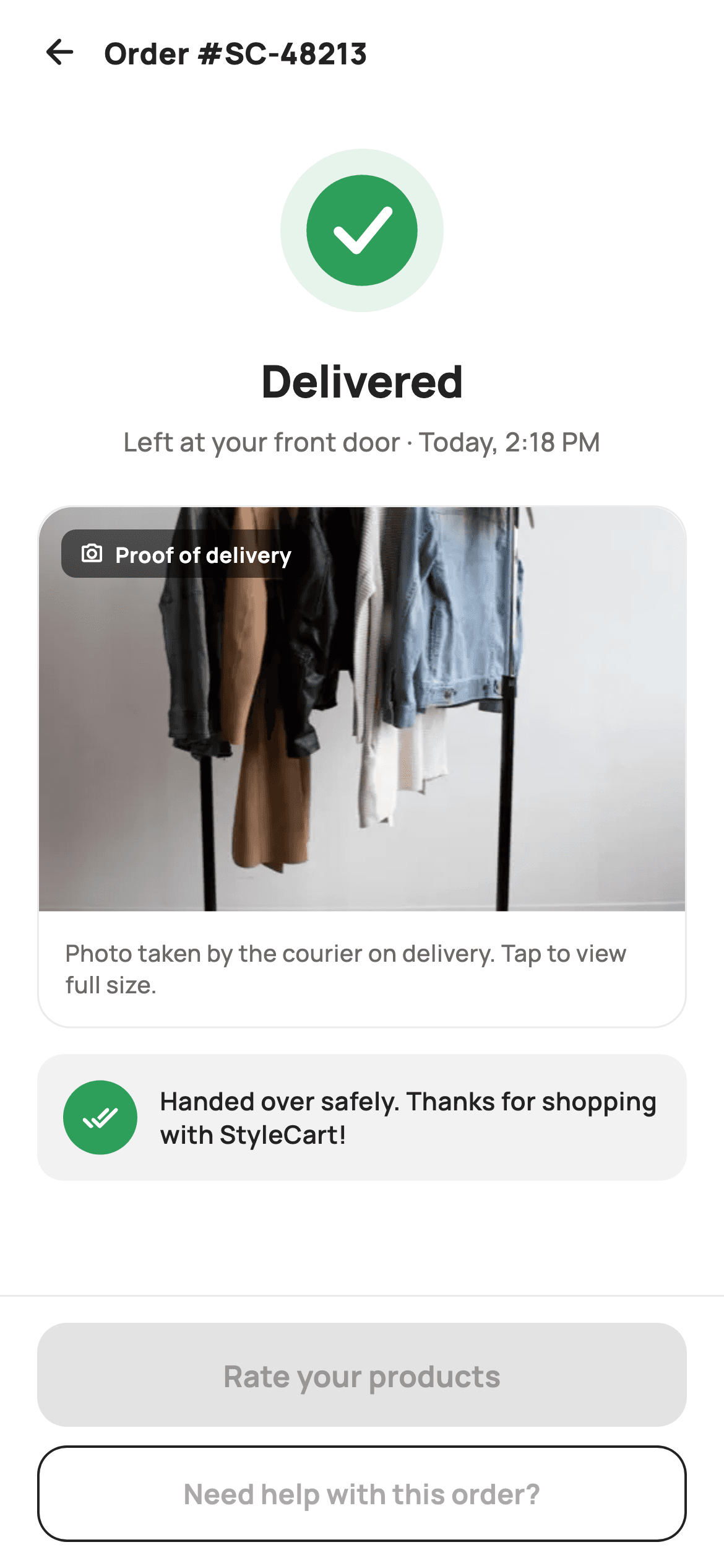
Tracking ends the moment a parcel actually lands, and the app still owes the shopper proof: where it was left, at what time, and what it looked like sitting there. This tutorial builds StyleCart's delivered screen in Flutter — a painted check drawn from two circles and a three-point path, a 'Left at your front door · Today, 2:18 PM' line, a tappable proof-of-delivery photo card with a translucent camera badge, a courier note tile, and a pinned bar that ranks rating the products above asking for help.
Watch the Flutter UI walkthrough
A short screen recording of Order Delivered running, if you'd rather see it before you read the code. The written tutorial below covers everything in it.
Can't see the video? Watch it on YouTube.
What you'll build
- ✓An 88px success check painted from a soft disc, a solid green circle and a stroked tick path
- ✓A tappable proof-of-delivery card that reserves its height at 16:10 before the photo decodes
- ✓A translucent camera badge floated over the photo at 55% black
- ✓A courier-note tile whose green done-all disc echoes the painted check above it
- ✓A pinned action bar where a 56px filled button outranks a 52px outlined one
Step-by-step build
Create the file
Add a new file at lib/ecom_order_delivered/ecom_order_delivered_screen.dart in your Flutter project.
Register the bundled fonts
No external packages — this is pure Flutter. It does bundle its design font (Manrope), so drop the font file into fonts/ and declare it in pubspec.yaml:
flutter:
  fonts:
    - family: Manrope
      fonts:
- asset: fonts/Manrope-Regular.ttfBuild it, piece by piece
Here's how the screen goes together. Each block below is a real slice of the code with a plain-English explanation — paste them in order, or grab the whole file from the next section.
Callbacks only, and a palette that separates status from action
import 'package:flutter/material.dart';

/// StyleCart — Delivered.
///
/// The delivery-confirmed view: a painted success check, the delivered time and
/// place, a proof-of-delivery photo card, a courier note, and CTAs to rate the
/// products or get help with the order.
///
/// Self-contained per CONVENTIONS.md: pure Flutter, bundled Manrope, inline
/// Airbnb-style tokens, own light theme + SafeArea, bundled webp. The check is a
/// CustomPainter (no emoji glyph, no network). Exposes callbacks only.
class EcomOrderDeliveredScreen extends StatelessWidget {
  const EcomOrderDeliveredScreen({
    super.key,
    this.onBack,
    this.onRate,
    this.onHelp,
    this.onViewPhoto,
  });

  final VoidCallback? onBack;
  final VoidCallback? onRate;
  final VoidCallback? onHelp;
  final VoidCallback? onViewPhoto;

  static const String _font = 'Manrope';
  static const Color _canvas = Color(0xFFFFFFFF);
  static const Color _ink = Color(0xFF222222);
  static const Color _muted = Color(0xFF6A6A6A);
  static const Color _brand = Color(0xFFFF385C);
  static const Color _surface = Color(0xFFF2F2F2);
  static const Color _imageBg = Color(0xFFF5F5F5);
  static const Color _success = Color(0xFF2E9E5B);
  static const Color _hairline = Color(0xFFEBEBEB);

  static const String _dir = 'lib/screens/ecommerce/ecom_order_delivered/images';
The screen is a `StatelessWidget` exposing four nullable callbacks — `onBack`, `onRate`, `onHelp`, `onViewPhoto` — because a delivery that already happened has nothing left to mutate. Note that `_brand` (`0xFFFF385C`) and `_success` (`0xFF2E9E5B`) are kept apart on purpose: green is the status colour and never appears on a button, coral is the action colour and never appears on the check. Two greys are also distinguished — `_surface` `0xFFF2F2F2` for the note tile and a lighter `_imageBg` `0xFFF5F5F5` that sits behind the photo. `_dir` holds the asset folder as one constant so the image path is composed in a single place.
Header, scrolling body, pinned bar
  @override
  Widget build(BuildContext context) {
    return Theme(
      data: ThemeData.light(useMaterial3: true),
      child: Scaffold(
        backgroundColor: _canvas,
        body: SafeArea(
          child: Column(
            children: <Widget>[
              _header(),
              Expanded(
                child: ListView(
                  padding: const EdgeInsets.fromLTRB(20, 8, 20, 24),
                  children: <Widget>[
                    const SizedBox(height: 12),
                    Center(
                      child: SizedBox(
                        width: 88,
                        height: 88,
                        child: CustomPaint(painter: _CheckPainter()),
                      ),
                    ),
                    const SizedBox(height: 20),
                    const Text(
                      'Delivered',
                      textAlign: TextAlign.center,
                      style: TextStyle(
                        fontFamily: _font,
                        fontSize: 24,
                        fontWeight: FontWeight.w800,
                        letterSpacing: -0.4,
                        color: _ink,
                      ),
                    ),
                    const SizedBox(height: 6),
                    const Text(
                      'Left at your front door · Today, 2:18 PM',
                      textAlign: TextAlign.center,
                      style: TextStyle(
                        fontFamily: _font,
                        fontSize: 14,
                        fontWeight: FontWeight.w500,
                        color: _muted,
                      ),
                    ),
                    const SizedBox(height: 24),
                    _photoCard(),
                    const SizedBox(height: 14),
                    _courierNote(),
                  ],
                ),
              ),
              _actions(),
            ],
          ),
        ),
      ),
    );
  }
`build` wraps everything in `Theme(data: ThemeData.light(useMaterial3: true))`, so the confirmation renders the same off a dark host app. The `Column` is three parts: `_header()`, an `Expanded` `ListView` and `_actions()` — putting the bar outside the list is what pins it while the proof card scrolls. Inside, the check is a fixed 88×88 `SizedBox` around `CustomPaint`, then 20px, then 'Delivered' at 24px `w800` with `letterSpacing: -0.4`. Only 6px separates that from the muted 14px 'Left at your front door · Today, 2:18 PM', against 24px before the photo card — tight spacing groups the headline and its detail as one statement.
A header that labels the order, not the screen
  Widget _header() {
    return Padding(
      padding: const EdgeInsets.fromLTRB(8, 4, 20, 8),
      child: Row(
        children: <Widget>[
          IconButton(
            onPressed: onBack,
            icon: const Icon(Icons.arrow_back_rounded, size: 22, color: _ink),
          ),
          const Text(
            'Order #SC-48213',
            style: TextStyle(
              fontFamily: _font,
              fontSize: 16,
              fontWeight: FontWeight.w800,
              color: _ink,
            ),
          ),
        ],
      ),
    );
  }
The bar is a plain `Row` of an `IconButton` and a `Text` reading 'Order #SC-48213' at 16px `w800`. The title sits immediately beside the arrow rather than centred, so it reads as the identity of the thing you are looking at — a shopper who arrived from a notification needs the order number more than the word 'Delivered' repeated, since the 24px headline says that a few pixels below. Padding is `fromLTRB(8, 4, 20, 8)`: only 8px on the left because `IconButton` already carries its own 48px hit target, while the right keeps the body's 20px gutter.
The proof-of-delivery photo card
  Widget _photoCard() {
    return GestureDetector(
      onTap: onViewPhoto,
      child: Container(
        decoration: BoxDecoration(
          color: _canvas,
          borderRadius: BorderRadius.circular(18),
          border: Border.all(color: _hairline),
        ),
        child: Column(
          crossAxisAlignment: CrossAxisAlignment.start,
          children: <Widget>[
            ClipRRect(
              borderRadius:
                  const BorderRadius.vertical(top: Radius.circular(18)),
              child: AspectRatio(
                aspectRatio: 16 / 10,
                child: Stack(
                  fit: StackFit.expand,
                  children: <Widget>[
                    Container(
                      color: _imageBg,
                      child: Image.asset('$_dir/p21.webp', fit: BoxFit.cover),
                    ),
                    Positioned(
                      left: 12,
                      top: 12,
                      child: Container(
                        padding: const EdgeInsets.symmetric(
                            horizontal: 10, vertical: 5),
                        decoration: BoxDecoration(
                          color: const Color(0xFF000000).withValues(alpha: 0.55),
                          borderRadius: BorderRadius.circular(8),
                        ),
                        child: const Row(
                          mainAxisSize: MainAxisSize.min,
                          children: <Widget>[
                            Icon(Icons.photo_camera_outlined,
                                size: 13, color: _canvas),
                            SizedBox(width: 6),
                            Text(
                              'Proof of delivery',
                              style: TextStyle(
                                fontFamily: _font,
                                fontSize: 11.5,
                                fontWeight: FontWeight.w700,
                                color: _canvas,
                              ),
                            ),
                          ],
                        ),
                      ),
                    ),
                  ],
                ),
              ),
            ),
            const Padding(
              padding: EdgeInsets.all(14),
              child: Text(
                'Photo taken by the courier on delivery. Tap to view full size.',
                style: TextStyle(
                  fontFamily: _font,
                  fontSize: 12.5,
                  fontWeight: FontWeight.w500,
                  height: 1.35,
                  color: _muted,
                ),
              ),
            ),
          ],
        ),
      ),
    );
  }
The `GestureDetector` wraps the entire `Container`, not just the image, so the 'Tap to view full size' caption is itself tappable — a caption that invites a tap and then ignores it is a small betrayal. `ClipRRect` uses `BorderRadius.vertical(top: Radius.circular(18))` so only the top corners round and the photo meets the caption block on a straight edge. `AspectRatio(16 / 10)` fixes the card's height before the asset decodes, which stops the list from jumping. Inside the `Stack`, an `_imageBg` container sits under `Image.asset(..., fit: BoxFit.cover)` as a grey plate. The badge is pinned at `left: 12, top: 12` on black at `withValues(alpha: 0.55)`, with `MainAxisSize.min` making the pill hug its camera icon and label.
The courier note tile
  Widget _courierNote() {
    return Container(
      padding: const EdgeInsets.all(14),
      decoration: BoxDecoration(
        color: _surface,
        borderRadius: BorderRadius.circular(14),
      ),
      child: Row(
        children: <Widget>[
          Container(
            width: 40,
            height: 40,
            decoration: const BoxDecoration(
              color: _success,
              shape: BoxShape.circle,
            ),
            child: const Icon(Icons.done_all_rounded, size: 20, color: _canvas),
          ),
          const SizedBox(width: 12),
          const Expanded(
            child: Text(
              'Handed over safely. Thanks for shopping with StyleCart!',
              style: TextStyle(
                fontFamily: _font,
                fontSize: 13.5,
                fontWeight: FontWeight.w600,
                height: 1.35,
                color: _ink,
              ),
            ),
          ),
        ],
      ),
    );
  }
A soft `_surface` tile at radius 14 carries a 40×40 `_success` circle holding `Icons.done_all_rounded` in white. The double-tick glyph is the point — a single check means sent, a double check means received, which is exactly the distinction this screen is making. Reusing `_success` ties the disc visually back to the painted badge at the top, so the two green marks read as one confirmation rather than two unrelated ornaments. The message sits in an `Expanded` so it wraps against the fixed circle, and it is set in `_ink` at `w600`, not `_muted` — this is a sentence from the courier, not metadata.
Two actions, ranked by both fill and height
  Widget _actions() {
    return Container(
      decoration: const BoxDecoration(
        color: _canvas,
        border: Border(top: BorderSide(color: _hairline)),
      ),
      child: SafeArea(
        top: false,
        child: Padding(
          padding: const EdgeInsets.fromLTRB(20, 14, 20, 14),
          child: Column(
            mainAxisSize: MainAxisSize.min,
            children: <Widget>[
              SizedBox(
                height: 56,
                child: FilledButton(
                  onPressed: onRate,
                  style: FilledButton.styleFrom(
                    backgroundColor: _brand,
                    foregroundColor: _canvas,
                    minimumSize: const Size.fromHeight(56),
                    shape: RoundedRectangleBorder(
                      borderRadius: BorderRadius.circular(16),
                    ),
                  ),
                  child: const Text(
                    'Rate your products',
                    style: TextStyle(
                      fontFamily: _font,
                      fontSize: 16,
                      fontWeight: FontWeight.w700,
                    ),
                  ),
                ),
              ),
              const SizedBox(height: 10),
              SizedBox(
                height: 52,
                child: OutlinedButton(
                  onPressed: onHelp,
                  style: OutlinedButton.styleFrom(
                    foregroundColor: _ink,
                    side: const BorderSide(color: _ink, width: 1.3),
                    minimumSize: const Size.fromHeight(52),
                    shape: RoundedRectangleBorder(
                      borderRadius: BorderRadius.circular(16),
                    ),
                  ),
                  child: const Text(
                    'Need help with this order?',
                    style: TextStyle(
                      fontFamily: _font,
                      fontSize: 15,
                      fontWeight: FontWeight.w700,
                    ),
                  ),
                ),
              ),
            ],
          ),
        ),
      ),
    );
  }
The bar is a `Container` with a single top `BorderSide` hairline, and `SafeArea(top: false)` lives *inside* it so the white background runs under the home indicator while the buttons stay clear of it. 'Rate your products' is a 56px `FilledButton` in `_brand`; 'Need help with this order?' is a 52px `OutlinedButton` with a 1.3px `_ink` border. The 4px height drop plus fill-versus-outline ranks them twice over, which matters because most deliveries go fine and rating is the outcome worth nudging. Both set `minimumSize: Size.fromHeight(...)` matching their `SizedBox`, giving full width without a `double.infinity` wrapper, and both round at 16 to sit in the same family as the card's 18.
Painting the success check
/// Paints a success check: a soft green disc, a solid green circle and a bold
/// white check mark.
class _CheckPainter extends CustomPainter {
  const _CheckPainter();

  static const Color _green = Color(0xFF2E9E5B);
  static const Color _greenSoft = Color(0xFFE7F4EC);

  @override
  void paint(Canvas canvas, Size size) {
    final Offset c = Offset(size.width / 2, size.height / 2);
    final double r = size.width * 0.34;
    canvas.drawCircle(c, size.width / 2, Paint()..color = _greenSoft);
    canvas.drawCircle(c, r, Paint()..color = _green);
    final Path check = Path()
      ..moveTo(c.dx - r * 0.42, c.dy + r * 0.02)
      ..lineTo(c.dx - r * 0.1, c.dy + r * 0.34)
      ..lineTo(c.dx + r * 0.46, c.dy - r * 0.34);
    canvas.drawPath(
      check,
      Paint()
        ..style = PaintingStyle.stroke
        ..strokeWidth = r * 0.18
        ..strokeCap = StrokeCap.round
        ..strokeJoin = StrokeJoin.round
        ..color = const Color(0xFFFFFFFF),
    );
  }

  @override
  bool shouldRepaint(_CheckPainter oldDelegate) => false;
}
`_CheckPainter` draws three things. A soft `0xFFE7F4EC` disc fills the whole 88px box, then a solid green circle at `r = size.width * 0.34` sits inside it, leaving a wide halo that reads as a glow without any blur or shadow. The tick is a `Path` of three points, each expressed as a fraction of `r`: it starts at `(-0.42r, +0.02r)`, turns at `(-0.1r, +0.34r)` and finishes high at `(+0.46r, -0.34r)`, so the long arm climbs well above the short one's start — that asymmetry is what makes a check look drawn rather than folded. `strokeWidth = r * 0.18` keeps the weight proportional at any size, `StrokeCap.round` with `StrokeJoin.round` softens the tips and elbow, and `shouldRepaint` returns `false` since nothing here depends on state.
Full code
The complete, ready-to-paste source. Free to use in your projects — one click copies it all.
import 'package:flutter/material.dart';

/// StyleCart — Delivered.
///
/// The delivery-confirmed view: a painted success check, the delivered time and
/// place, a proof-of-delivery photo card, a courier note, and CTAs to rate the
/// products or get help with the order.
///
/// Self-contained per CONVENTIONS.md: pure Flutter, bundled Manrope, inline
/// Airbnb-style tokens, own light theme + SafeArea, bundled webp. The check is a
/// CustomPainter (no emoji glyph, no network). Exposes callbacks only.
class EcomOrderDeliveredScreen extends StatelessWidget {
  const EcomOrderDeliveredScreen({
    super.key,
    this.onBack,
    this.onRate,
    this.onHelp,
    this.onViewPhoto,
  });

  final VoidCallback? onBack;
  final VoidCallback? onRate;
  final VoidCallback? onHelp;
  final VoidCallback? onViewPhoto;

  static const String _font = 'Manrope';
  static const Color _canvas = Color(0xFFFFFFFF);
  static const Color _ink = Color(0xFF222222);
  static const Color _muted = Color(0xFF6A6A6A);
  static const Color _brand = Color(0xFFFF385C);
  static const Color _surface = Color(0xFFF2F2F2);
  static const Color _imageBg = Color(0xFFF5F5F5);
  static const Color _success = Color(0xFF2E9E5B);
  static const Color _hairline = Color(0xFFEBEBEB);

  static const String _dir = 'lib/screens/ecommerce/ecom_order_delivered/images';

  @override
  Widget build(BuildContext context) {
    return Theme(
      data: ThemeData.light(useMaterial3: true),
      child: Scaffold(
        backgroundColor: _canvas,
        body: SafeArea(
          child: Column(
            children: <Widget>[
              _header(),
              Expanded(
                child: ListView(
                  padding: const EdgeInsets.fromLTRB(20, 8, 20, 24),
                  children: <Widget>[
                    const SizedBox(height: 12),
                    Center(
                      child: SizedBox(
                        width: 88,
                        height: 88,
                        child: CustomPaint(painter: _CheckPainter()),
                      ),
                    ),
                    const SizedBox(height: 20),
                    const Text(
                      'Delivered',
                      textAlign: TextAlign.center,
                      style: TextStyle(
                        fontFamily: _font,
                        fontSize: 24,
                        fontWeight: FontWeight.w800,
                        letterSpacing: -0.4,
                        color: _ink,
                      ),
                    ),
                    const SizedBox(height: 6),
                    const Text(
                      'Left at your front door · Today, 2:18 PM',
                      textAlign: TextAlign.center,
                      style: TextStyle(
                        fontFamily: _font,
                        fontSize: 14,
                        fontWeight: FontWeight.w500,
                        color: _muted,
                      ),
                    ),
                    const SizedBox(height: 24),
                    _photoCard(),
                    const SizedBox(height: 14),
                    _courierNote(),
                  ],
                ),
              ),
              _actions(),
            ],
          ),
        ),
      ),
    );
  }

  Widget _header() {
    return Padding(
      padding: const EdgeInsets.fromLTRB(8, 4, 20, 8),
      child: Row(
        children: <Widget>[
          IconButton(
            onPressed: onBack,
            icon: const Icon(Icons.arrow_back_rounded, size: 22, color: _ink),
          ),
          const Text(
            'Order #SC-48213',
            style: TextStyle(
              fontFamily: _font,
              fontSize: 16,
              fontWeight: FontWeight.w800,
              color: _ink,
            ),
          ),
        ],
      ),
    );
  }

  Widget _photoCard() {
    return GestureDetector(
      onTap: onViewPhoto,
      child: Container(
        decoration: BoxDecoration(
          color: _canvas,
          borderRadius: BorderRadius.circular(18),
          border: Border.all(color: _hairline),
        ),
        child: Column(
          crossAxisAlignment: CrossAxisAlignment.start,
          children: <Widget>[
            ClipRRect(
              borderRadius:
                  const BorderRadius.vertical(top: Radius.circular(18)),
              child: AspectRatio(
                aspectRatio: 16 / 10,
                child: Stack(
                  fit: StackFit.expand,
                  children: <Widget>[
                    Container(
                      color: _imageBg,
                      child: Image.asset('$_dir/p21.webp', fit: BoxFit.cover),
                    ),
                    Positioned(
                      left: 12,
                      top: 12,
                      child: Container(
                        padding: const EdgeInsets.symmetric(
                            horizontal: 10, vertical: 5),
                        decoration: BoxDecoration(
                          color: const Color(0xFF000000).withValues(alpha: 0.55),
                          borderRadius: BorderRadius.circular(8),
                        ),
                        child: const Row(
                          mainAxisSize: MainAxisSize.min,
                          children: <Widget>[
                            Icon(Icons.photo_camera_outlined,
                                size: 13, color: _canvas),
                            SizedBox(width: 6),
                            Text(
                              'Proof of delivery',
                              style: TextStyle(
                                fontFamily: _font,
                                fontSize: 11.5,
                                fontWeight: FontWeight.w700,
                                color: _canvas,
                              ),
                            ),
                          ],
                        ),
                      ),
                    ),
                  ],
                ),
              ),
            ),
            const Padding(
              padding: EdgeInsets.all(14),
              child: Text(
                'Photo taken by the courier on delivery. Tap to view full size.',
                style: TextStyle(
                  fontFamily: _font,
                  fontSize: 12.5,
                  fontWeight: FontWeight.w500,
                  height: 1.35,
                  color: _muted,
                ),
              ),
            ),
          ],
        ),
      ),
    );
  }

  Widget _courierNote() {
    return Container(
      padding: const EdgeInsets.all(14),
      decoration: BoxDecoration(
        color: _surface,
        borderRadius: BorderRadius.circular(14),
      ),
      child: Row(
        children: <Widget>[
          Container(
            width: 40,
            height: 40,
            decoration: const BoxDecoration(
              color: _success,
              shape: BoxShape.circle,
            ),
            child: const Icon(Icons.done_all_rounded, size: 20, color: _canvas),
          ),
          const SizedBox(width: 12),
          const Expanded(
            child: Text(
              'Handed over safely. Thanks for shopping with StyleCart!',
              style: TextStyle(
                fontFamily: _font,
                fontSize: 13.5,
                fontWeight: FontWeight.w600,
                height: 1.35,
                color: _ink,
              ),
            ),
          ),
        ],
      ),
    );
  }

  Widget _actions() {
    return Container(
      decoration: const BoxDecoration(
        color: _canvas,
        border: Border(top: BorderSide(color: _hairline)),
      ),
      child: SafeArea(
        top: false,
        child: Padding(
          padding: const EdgeInsets.fromLTRB(20, 14, 20, 14),
          child: Column(
            mainAxisSize: MainAxisSize.min,
            children: <Widget>[
              SizedBox(
                height: 56,
                child: FilledButton(
                  onPressed: onRate,
                  style: FilledButton.styleFrom(
                    backgroundColor: _brand,
                    foregroundColor: _canvas,
                    minimumSize: const Size.fromHeight(56),
                    shape: RoundedRectangleBorder(
                      borderRadius: BorderRadius.circular(16),
                    ),
                  ),
                  child: const Text(
                    'Rate your products',
                    style: TextStyle(
                      fontFamily: _font,
                      fontSize: 16,
                      fontWeight: FontWeight.w700,
                    ),
                  ),
                ),
              ),
              const SizedBox(height: 10),
              SizedBox(
                height: 52,
                child: OutlinedButton(
                  onPressed: onHelp,
                  style: OutlinedButton.styleFrom(
                    foregroundColor: _ink,
                    side: const BorderSide(color: _ink, width: 1.3),
                    minimumSize: const Size.fromHeight(52),
                    shape: RoundedRectangleBorder(
                      borderRadius: BorderRadius.circular(16),
                    ),
                  ),
                  child: const Text(
                    'Need help with this order?',
                    style: TextStyle(
                      fontFamily: _font,
                      fontSize: 15,
                      fontWeight: FontWeight.w700,
                    ),
                  ),
                ),
              ),
            ],
          ),
        ),
      ),
    );
  }
}

/// Paints a success check: a soft green disc, a solid green circle and a bold
/// white check mark.
class _CheckPainter extends CustomPainter {
  const _CheckPainter();

  static const Color _green = Color(0xFF2E9E5B);
  static const Color _greenSoft = Color(0xFFE7F4EC);

  @override
  void paint(Canvas canvas, Size size) {
    final Offset c = Offset(size.width / 2, size.height / 2);
    final double r = size.width * 0.34;
    canvas.drawCircle(c, size.width / 2, Paint()..color = _greenSoft);
    canvas.drawCircle(c, r, Paint()..color = _green);
    final Path check = Path()
      ..moveTo(c.dx - r * 0.42, c.dy + r * 0.02)
      ..lineTo(c.dx - r * 0.1, c.dy + r * 0.34)
      ..lineTo(c.dx + r * 0.46, c.dy - r * 0.34);
    canvas.drawPath(
      check,
      Paint()
        ..style = PaintingStyle.stroke
        ..strokeWidth = r * 0.18
        ..strokeCap = StrokeCap.round
        ..strokeJoin = StrokeJoin.round
        ..color = const Color(0xFFFFFFFF),
    );
  }

  @override
  bool shouldRepaint(_CheckPainter oldDelegate) => false;
}
Plus bundled 6 binary assets (fonts/images). The CLI and MCP install those for you automatically.
Two faster ways to add it
Copy-paste works, but you can skip it entirely.
1. FlutterKit CLI
One command drops this screen — and its fonts — straight into your project.
$ flutterkit add ecom-order-delivered2. AI agent (MCP)
Connect FlutterKit's MCP server in Claude or Cursor and just ask your agent to install ecom-order-delivered — it fetches and writes the files for you.
FAQ
Is this order delivered screen free to use commercially?
Yes — free, with nothing paid behind it. Copy the Dart from this page, install it via CLI, or pull it through MCP, and ship it in a real shopping app. No sign-up, no licence key, no attribution line required.
What packages and fonts does it need?
No packages at all — it is pure `flutter/material`. It does expect the Manrope family declared in `pubspec.yaml`, and one bundled image at `$_dir/p21.webp`. Drop the `fontFamily: _font` lines to fall back to the system face, and see the next answer for replacing the photo.
How do I show the courier's real delivery photo instead of the bundled asset?
Swap `Image.asset('$_dir/p21.webp', ...)` for `Image.network(url, fit: BoxFit.cover)` and pass the URL into the constructor. The `_imageBg` container already sits behind it in the `Stack`, so it doubles as the placeholder plate while the photo loads, and the `AspectRatio(16 / 10)` keeps the card's height stable whatever the photo's true dimensions are.
Can I reuse the check painter on other confirmation screens?
Yes — `_CheckPainter` declares its own `_green` and `_greenSoft` rather than reading the screen's constants, so it lifts out as a standalone file. Every coordinate is a fraction of the incoming `size`, so changing the 88×88 `SizedBox` to 120 or 56 rescales the disc, the circle and the tick's stroke weight together.
Which Flutter version does this need?
Flutter 3.22 or newer, because the photo badge uses `Color.withValues(alpha: 0.55)` and the constructor uses `super.key`. On an older SDK swap that call for `withOpacity(0.55)` and expand the constructor to the `{Key? key, ...}) : super(key: key)` form.


