How to Build a Style Quiz Chip Selector in Flutter (Full Code + Preview)
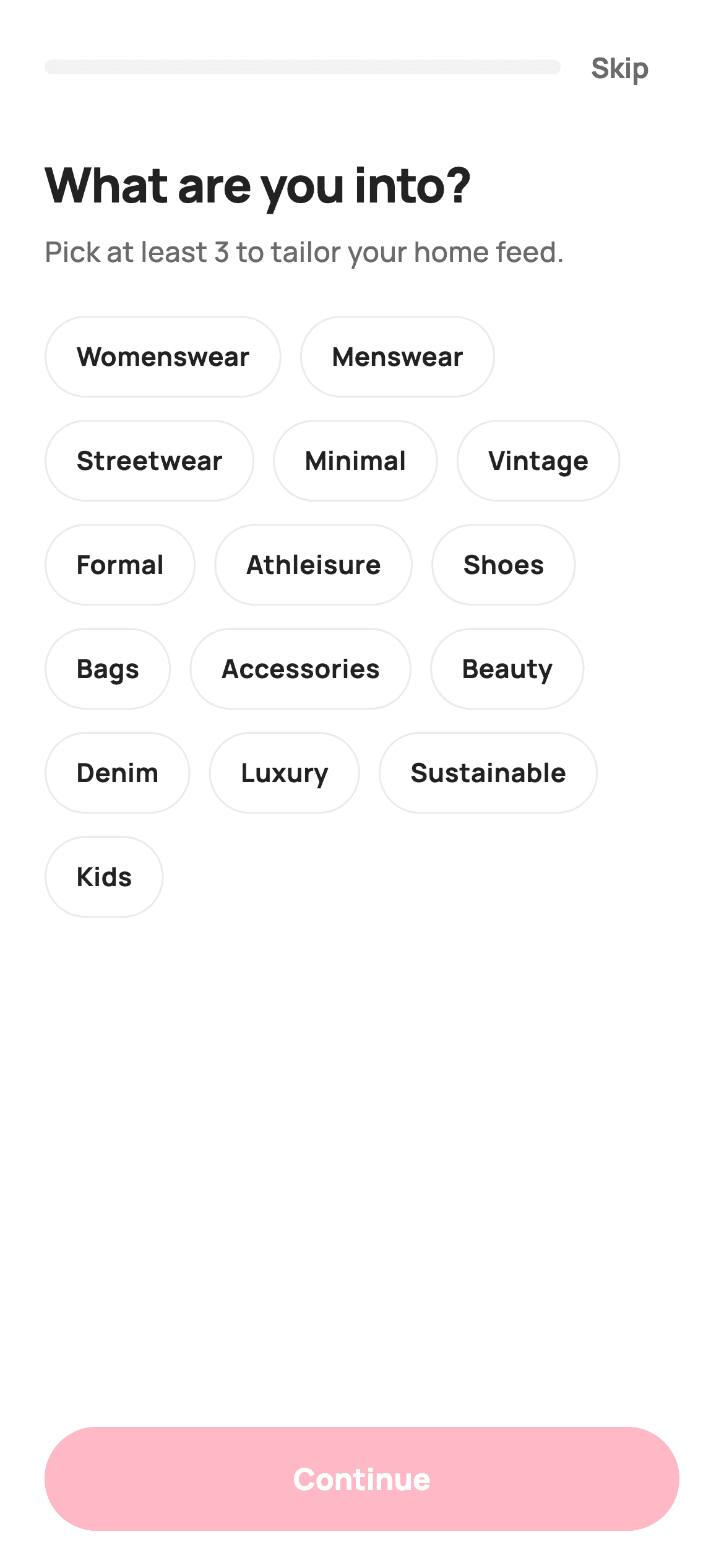
Personalisation onboarding lives or dies on how quickly someone can tap through it. This tutorial builds a style quiz in Flutter: fifteen tags laid out in a `Wrap` so they flow to any screen width, a `Set<String>` holding the selections, a painted progress bar that fills toward a goal of three, and a Continue button that shows a live count. The `_toggle` method is a nice trick — it uses the return value of `Set.remove` to add or remove in a single expression.
Watch the Flutter UI walkthrough
A short screen recording of Style Quiz running, if you'd rather see it before you read the code. The written tutorial below covers everything in it.
Can't see the video? Watch it on YouTube.
What you'll build
- ✓A flowing tag grid built with `Wrap` — no fixed columns, no overflow at any width
- ✓A `Set<String>` as the selection model, with `_toggle` written as one `remove`-or-`add` expression
- ✓A `CustomPainter` progress bar that fills toward a target of three picks
- ✓Chips that animate their fill, border and check icon with `AnimatedContainer`
- ✓A Continue button that reports its count — 'Continue (4)' — and disables at zero
- ✓A subtitle that rewrites itself once the goal is reached
Step-by-step build
Create the file
Add a new file at lib/ecom_onboarding_style_quiz/ecom_onboarding_style_quiz_screen.dart in your Flutter project.
Register the bundled fonts
No external packages — this is pure Flutter. It does bundle its design font (Manrope), so drop the font file into fonts/ and declare it in pubspec.yaml:
flutter:
  fonts:
    - family: Manrope
      fonts:
- asset: fonts/Manrope-Regular.ttfBuild it, piece by piece
Here's how the screen goes together. Each block below is a real slice of the code with a plain-English explanation — paste them in order, or grab the whole file from the next section.
Fifteen tags, a Set, and a one-line toggle
class _EcomOnboardingStyleQuizScreenState
    extends State<EcomOnboardingStyleQuizScreen> {
  static const String _font = 'Manrope';
  static const Color _canvas = Color(0xFFFFFFFF);
  static const Color _ink = Color(0xFF222222);
  static const Color _muted = Color(0xFF6A6A6A);
  static const Color _brand = Color(0xFFFF385C);
  static const Color _surface = Color(0xFFF2F2F2);
  static const Color _hairline = Color(0xFFEBEBEB);

  static const int _goal = 3;
  static const List<String> _tags = <String>[
    'Womenswear', 'Menswear', 'Streetwear', 'Minimal', 'Vintage',
    'Formal', 'Athleisure', 'Shoes', 'Bags', 'Accessories',
    'Beauty', 'Denim', 'Luxury', 'Sustainable', 'Kids',
  ];

  final Set<String> _selected = <String>{};

  void _toggle(String tag) {
    setState(() {
      if (!_selected.remove(tag)) {
        _selected.add(tag);
      }
    });
  }
`_tags` is a flat `const List<String>` — no ids, no categories, because the tag *is* the value handed back through `onContinue`. Selections live in a `final Set<String> _selected`, which gives O(1) membership tests for `contains` inside the builder and rules out duplicates by construction. `_toggle` is the elegant bit: `if (!_selected.remove(tag)) _selected.add(tag);`. `Set.remove` returns whether the element was there, so a single call both removes an existing tag and tells you to add it when it wasn't — no `contains`-then-branch.
Deriving progress, readiness and copy from one count
  @override
  Widget build(BuildContext context) {
    final int count = _selected.length;
    final double progress = (count / _goal).clamp(0.0, 1.0);
    final bool ready = count >= 1;
Three lines at the top of `build` derive everything the UI needs from the selection count: `progress` is `(count / _goal).clamp(0.0, 1.0)` so the bar can't overfill past three picks, and `ready` is `count >= 1`. Note the gap between them — the *goal* is three, but the button unlocks at one. That's a deliberate product choice: three is the recommendation, one is the requirement, so nobody gets trapped on the screen. Computing all of this in `build` rather than storing it means it can never fall out of sync with `_selected`.
Progress bar and Skip in one row
    return Theme(
      data: ThemeData.light(useMaterial3: true),
      child: Scaffold(
        backgroundColor: _canvas,
        body: SafeArea(
          child: Padding(
            padding: const EdgeInsets.fromLTRB(24, 12, 24, 20),
            child: Column(
              crossAxisAlignment: CrossAxisAlignment.stretch,
              children: <Widget>[
                Row(
                  children: <Widget>[
                    Expanded(
                      child: ClipRRect(
                        borderRadius: BorderRadius.circular(99),
                        child: SizedBox(
                          height: 8,
                          child: CustomPaint(
                            painter: _ProgressPainter(
                              progress: progress,
                              track: _surface,
                              fill: _brand,
                            ),
                          ),
                        ),
                      ),
                    ),
                    TextButton(
                      onPressed: widget.onSkip,
                      style: TextButton.styleFrom(
                        foregroundColor: _muted,
                        textStyle: const TextStyle(
                          fontFamily: _font,
                          fontSize: 15,
                          fontWeight: FontWeight.w700,
                        ),
                      ),
                      child: const Text('Skip'),
                    ),
                  ],
                ),
The top row pairs an `Expanded` progress bar with a Skip `TextButton`, so the bar takes all the space Skip doesn't. The bar is a `CustomPaint` in an 8px `SizedBox` wrapped in `ClipRRect(borderRadius: 99)` — the painter itself only draws square rectangles, and the clip is what rounds both the track and the fill in one step, which is far simpler than painting rounded rects. `CrossAxisAlignment.stretch` on the outer `Column` is what makes both buttons full-width later without any `SizedBox(width: double.infinity)`.
Copy that responds, and a Wrap that flows
                const SizedBox(height: 20),
                const Text(
                  'What are you into?',
                  style: TextStyle(
                    fontFamily: _font,
                    fontSize: 26,
                    fontWeight: FontWeight.w800,
                    letterSpacing: -0.5,
                    color: _ink,
                  ),
                ),
                const SizedBox(height: 8),
                Text(
                  count >= _goal
                      ? 'Great taste — tap Continue to personalise your feed.'
                      : 'Pick at least $_goal to tailor your home feed.',
                  style: const TextStyle(
                    fontFamily: _font,
                    fontSize: 15,
                    height: 1.4,
                    fontWeight: FontWeight.w500,
                    color: _muted,
                  ),
                ),
                const SizedBox(height: 24),
                Expanded(
                  child: SingleChildScrollView(
                    child: Wrap(
                      spacing: 10,
                      runSpacing: 12,
                      children: _tags.map((String tag) {
                        final bool on = _selected.contains(tag);
                        return _ChoiceChip(
                          label: tag,
                          selected: on,
                          onTap: () => _toggle(tag),
                        );
                      }).toList(),
                    ),
                  ),
                ),
The subtitle swaps once the goal is met — 'Pick at least 3…' becomes 'Great taste — tap Continue…' — so the screen acknowledges progress instead of nagging. The tags use `Wrap` with `spacing: 10` (horizontal) and `runSpacing: 12` (between rows), which lets chips of different widths flow onto as many lines as they need at any screen size; a `GridView` would force equal-width cells and break long labels like 'Accessories'. It sits inside `Expanded` + `SingleChildScrollView`, so the chip area scrolls on short devices while the header and button stay put.
A Continue button that counts
                const SizedBox(height: 12),
                SizedBox(
                  height: 56,
                  child: FilledButton(
                    onPressed: ready
                        ? () => widget.onContinue?.call(_selected.toList())
                        : null,
                    style: FilledButton.styleFrom(
                      backgroundColor: _brand,
                      foregroundColor: _canvas,
                      disabledBackgroundColor: _brand.withValues(alpha: 0.35),
                      disabledForegroundColor: _canvas,
                      shape: const StadiumBorder(),
                      textStyle: const TextStyle(
                        fontFamily: _font,
                        fontSize: 16,
                        fontWeight: FontWeight.w800,
                      ),
                    ),
                    child: Text(ready ? 'Continue ($count)' : 'Continue'),
                  ),
                ),
`onPressed` is a conditional expression rather than a guarded callback: when `ready` is false it's literally `null`, which is what makes `FilledButton` render its disabled state and ignore taps. `disabledBackgroundColor: _brand.withValues(alpha: 0.35)` keeps the disabled button recognisably brand-coloured rather than grey, so it reads as 'not yet' instead of 'broken'. The label carries the count — `'Continue ($count)'` — and on tap it calls `widget.onContinue?.call(_selected.toList())`, converting the `Set` to a `List` at the boundary so callers get a stable, ordered value.
The animated choice chip and the progress painter
/// A selectable style pill — brand fill + check when selected, outline when not.
class _ChoiceChip extends StatelessWidget {
  const _ChoiceChip({
    required this.label,
    required this.selected,
    required this.onTap,
  });

  final String label;
  final bool selected;
  final VoidCallback onTap;

  @override
  Widget build(BuildContext context) {
    const String font = _EcomOnboardingStyleQuizScreenState._font;
    const Color brand = _EcomOnboardingStyleQuizScreenState._brand;
    const Color ink = _EcomOnboardingStyleQuizScreenState._ink;
    const Color canvas = _EcomOnboardingStyleQuizScreenState._canvas;
    const Color hairline = _EcomOnboardingStyleQuizScreenState._hairline;
    return GestureDetector(
      onTap: onTap,
      child: AnimatedContainer(
        duration: const Duration(milliseconds: 150),
        padding: const EdgeInsets.symmetric(horizontal: 16, vertical: 11),
        decoration: BoxDecoration(
          color: selected ? brand : canvas,
          borderRadius: BorderRadius.circular(99),
          border: Border.all(color: selected ? brand : hairline),
        ),
        child: Row(
          mainAxisSize: MainAxisSize.min,
          children: <Widget>[
            if (selected) ...<Widget>[
              const Icon(Icons.check_rounded, size: 16, color: canvas),
              const SizedBox(width: 6),
            ],
            Text(
              label,
              style: TextStyle(
                fontFamily: font,
                fontSize: 14,
                fontWeight: FontWeight.w700,
                color: selected ? canvas : ink,
              ),
            ),
          ],
        ),
      ),
    );
  }
}

/// Paints a rounded progress track with a brand fill. Pure vector.
class _ProgressPainter extends CustomPainter {
  const _ProgressPainter({
    required this.progress,
    required this.track,
    required this.fill,
  });

  final double progress;
  final Color track;
  final Color fill;

  @override
  void paint(Canvas c, Size size) {
    final Paint t = Paint()..color = track;
    c.drawRect(Offset.zero & size, t);
    final Paint f = Paint()..color = fill;
    c.drawRect(
      Rect.fromLTWH(0, 0, size.width * progress.clamp(0.0, 1.0), size.height),
      f,
    );
  }

  @override
  bool shouldRepaint(_ProgressPainter oldDelegate) =>
      oldDelegate.progress != progress;
}
`_ChoiceChip` is stateless — it's told whether it's `selected` rather than remembering it — and wraps its decoration in an `AnimatedContainer` with a 150ms duration, so the fill and border tween rather than snap. The check icon is spliced in with `if (selected) ...<Widget>[Icon, SizedBox]`, and because the `Row` uses `MainAxisSize.min` the chip physically widens to accommodate it, which is the satisfying part of the interaction. `_ProgressPainter` is nine lines: fill the whole box with the track colour, then draw a second rect `size.width * progress` wide on top. `shouldRepaint` compares only `progress`, so the bar repaints solely when the count changes.
Full code
The complete, ready-to-paste source. Free to use in your projects — one click copies it all.
import 'package:flutter/material.dart';

/// StyleCart — Style Quiz.
///
/// Personalizes the feed by letting the shopper pick favourite categories and
/// styles from a chip grid. Self-contained per CONVENTIONS.md: pure Flutter,
/// bundled Manrope, inline Airbnb-style tokens, own light theme + SafeArea. The
/// progress indicator is a painted bar (no asset, no emoji glyph). Exposes
/// callbacks only — the gallery wires nav.
class EcomOnboardingStyleQuizScreen extends StatefulWidget {
  const EcomOnboardingStyleQuizScreen({
    super.key,
    this.onContinue,
    this.onSkip,
  });

  /// Continue with the chosen style tags.
  final ValueChanged<List<String>>? onContinue;

  /// Skip personalisation.
  final VoidCallback? onSkip;

  @override
  State<EcomOnboardingStyleQuizScreen> createState() =>
      _EcomOnboardingStyleQuizScreenState();
}

class _EcomOnboardingStyleQuizScreenState
    extends State<EcomOnboardingStyleQuizScreen> {
  static const String _font = 'Manrope';
  static const Color _canvas = Color(0xFFFFFFFF);
  static const Color _ink = Color(0xFF222222);
  static const Color _muted = Color(0xFF6A6A6A);
  static const Color _brand = Color(0xFFFF385C);
  static const Color _surface = Color(0xFFF2F2F2);
  static const Color _hairline = Color(0xFFEBEBEB);

  static const int _goal = 3;
  static const List<String> _tags = <String>[
    'Womenswear', 'Menswear', 'Streetwear', 'Minimal', 'Vintage',
    'Formal', 'Athleisure', 'Shoes', 'Bags', 'Accessories',
    'Beauty', 'Denim', 'Luxury', 'Sustainable', 'Kids',
  ];

  final Set<String> _selected = <String>{};

  void _toggle(String tag) {
    setState(() {
      if (!_selected.remove(tag)) {
        _selected.add(tag);
      }
    });
  }

  @override
  Widget build(BuildContext context) {
    final int count = _selected.length;
    final double progress = (count / _goal).clamp(0.0, 1.0);
    final bool ready = count >= 1;

    return Theme(
      data: ThemeData.light(useMaterial3: true),
      child: Scaffold(
        backgroundColor: _canvas,
        body: SafeArea(
          child: Padding(
            padding: const EdgeInsets.fromLTRB(24, 12, 24, 20),
            child: Column(
              crossAxisAlignment: CrossAxisAlignment.stretch,
              children: <Widget>[
                Row(
                  children: <Widget>[
                    Expanded(
                      child: ClipRRect(
                        borderRadius: BorderRadius.circular(99),
                        child: SizedBox(
                          height: 8,
                          child: CustomPaint(
                            painter: _ProgressPainter(
                              progress: progress,
                              track: _surface,
                              fill: _brand,
                            ),
                          ),
                        ),
                      ),
                    ),
                    TextButton(
                      onPressed: widget.onSkip,
                      style: TextButton.styleFrom(
                        foregroundColor: _muted,
                        textStyle: const TextStyle(
                          fontFamily: _font,
                          fontSize: 15,
                          fontWeight: FontWeight.w700,
                        ),
                      ),
                      child: const Text('Skip'),
                    ),
                  ],
                ),
                const SizedBox(height: 20),
                const Text(
                  'What are you into?',
                  style: TextStyle(
                    fontFamily: _font,
                    fontSize: 26,
                    fontWeight: FontWeight.w800,
                    letterSpacing: -0.5,
                    color: _ink,
                  ),
                ),
                const SizedBox(height: 8),
                Text(
                  count >= _goal
                      ? 'Great taste — tap Continue to personalise your feed.'
                      : 'Pick at least $_goal to tailor your home feed.',
                  style: const TextStyle(
                    fontFamily: _font,
                    fontSize: 15,
                    height: 1.4,
                    fontWeight: FontWeight.w500,
                    color: _muted,
                  ),
                ),
                const SizedBox(height: 24),
                Expanded(
                  child: SingleChildScrollView(
                    child: Wrap(
                      spacing: 10,
                      runSpacing: 12,
                      children: _tags.map((String tag) {
                        final bool on = _selected.contains(tag);
                        return _ChoiceChip(
                          label: tag,
                          selected: on,
                          onTap: () => _toggle(tag),
                        );
                      }).toList(),
                    ),
                  ),
                ),
                const SizedBox(height: 12),
                SizedBox(
                  height: 56,
                  child: FilledButton(
                    onPressed: ready
                        ? () => widget.onContinue?.call(_selected.toList())
                        : null,
                    style: FilledButton.styleFrom(
                      backgroundColor: _brand,
                      foregroundColor: _canvas,
                      disabledBackgroundColor: _brand.withValues(alpha: 0.35),
                      disabledForegroundColor: _canvas,
                      shape: const StadiumBorder(),
                      textStyle: const TextStyle(
                        fontFamily: _font,
                        fontSize: 16,
                        fontWeight: FontWeight.w800,
                      ),
                    ),
                    child: Text(ready ? 'Continue ($count)' : 'Continue'),
                  ),
                ),
              ],
            ),
          ),
        ),
      ),
    );
  }
}

/// A selectable style pill — brand fill + check when selected, outline when not.
class _ChoiceChip extends StatelessWidget {
  const _ChoiceChip({
    required this.label,
    required this.selected,
    required this.onTap,
  });

  final String label;
  final bool selected;
  final VoidCallback onTap;

  @override
  Widget build(BuildContext context) {
    const String font = _EcomOnboardingStyleQuizScreenState._font;
    const Color brand = _EcomOnboardingStyleQuizScreenState._brand;
    const Color ink = _EcomOnboardingStyleQuizScreenState._ink;
    const Color canvas = _EcomOnboardingStyleQuizScreenState._canvas;
    const Color hairline = _EcomOnboardingStyleQuizScreenState._hairline;
    return GestureDetector(
      onTap: onTap,
      child: AnimatedContainer(
        duration: const Duration(milliseconds: 150),
        padding: const EdgeInsets.symmetric(horizontal: 16, vertical: 11),
        decoration: BoxDecoration(
          color: selected ? brand : canvas,
          borderRadius: BorderRadius.circular(99),
          border: Border.all(color: selected ? brand : hairline),
        ),
        child: Row(
          mainAxisSize: MainAxisSize.min,
          children: <Widget>[
            if (selected) ...<Widget>[
              const Icon(Icons.check_rounded, size: 16, color: canvas),
              const SizedBox(width: 6),
            ],
            Text(
              label,
              style: TextStyle(
                fontFamily: font,
                fontSize: 14,
                fontWeight: FontWeight.w700,
                color: selected ? canvas : ink,
              ),
            ),
          ],
        ),
      ),
    );
  }
}

/// Paints a rounded progress track with a brand fill. Pure vector.
class _ProgressPainter extends CustomPainter {
  const _ProgressPainter({
    required this.progress,
    required this.track,
    required this.fill,
  });

  final double progress;
  final Color track;
  final Color fill;

  @override
  void paint(Canvas c, Size size) {
    final Paint t = Paint()..color = track;
    c.drawRect(Offset.zero & size, t);
    final Paint f = Paint()..color = fill;
    c.drawRect(
      Rect.fromLTWH(0, 0, size.width * progress.clamp(0.0, 1.0), size.height),
      f,
    );
  }

  @override
  bool shouldRepaint(_ProgressPainter oldDelegate) =>
      oldDelegate.progress != progress;
}
Plus bundled 5 binary assets (fonts/images). The CLI and MCP install those for you automatically.
Two faster ways to add it
Copy-paste works, but you can skip it entirely.
1. FlutterKit CLI
One command drops this screen — and its fonts — straight into your project.
$ flutterkit add ecom-onboarding-style-quiz2. AI agent (MCP)
Connect FlutterKit's MCP server in Claude or Cursor and just ask your agent to install ecom-onboarding-style-quiz — it fetches and writes the files for you.
FAQ
Is this style quiz screen free to use?
Yes. The full Dart source on this page is free for personal and commercial apps. Copy it from the code block, install it with the FlutterKit CLI (flutterkit add ecom-onboarding-style-quiz), or add it via an AI agent over MCP.
How do I get the selected tags out?
onContinue is a ValueChanged<List<String>>, so the button already hands you the picks: onContinue: (tags) => saveProfile(tags). The Set is converted to a List at that boundary, so callers never deal with set semantics.
Why Wrap instead of GridView for the chips?
Chip widths vary with label length — 'Kids' and 'Sustainable' are very different sizes. Wrap lets each chip take its natural width and flows to a new line when it runs out of room, at any screen size. A GridView would force uniform cells and either truncate the long labels or waste space on the short ones.
How do I change the recommended number of picks?
Change the _goal constant. It drives the progress bar's denominator and the subtitle copy at once. The separate ready check (count >= 1) controls when Continue unlocks, so you can require fewer picks than you recommend.
Which Flutter version does it target?
Flutter 3.27+ on Dart 3. The only API that needs a recent SDK is withValues(alpha: 0.35) on the disabled button colour — change that one call to withOpacity(0.35) and the quiz compiles on considerably older versions, since Wrap, Set and CustomPainter have all been stable for years.


