How to Build an E-commerce Splash Screen in Flutter (Full Code + Preview)
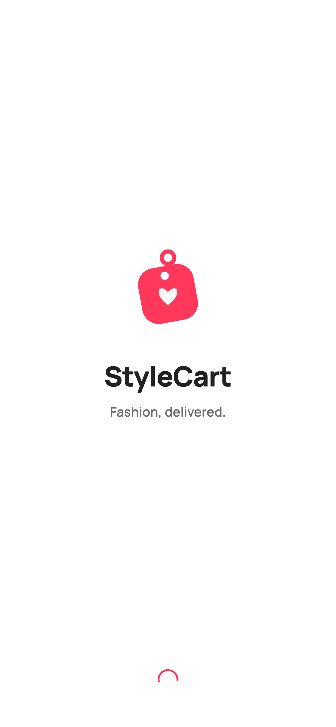
A shopping app's splash screen has about 700 milliseconds to look expensive. This one spends them on a single fade-and-rise entrance: a heart price-tag logo, the 'StyleCart' wordmark, a one-line tagline, and a small red spinner at the bottom. The logo is not an image or an emoji — it is drawn with a CustomPainter, so it stays razor-sharp at any size and adds zero bytes to your asset bundle. By the end you'll have the full animation, the vector brand mark, and a tap-anywhere-to-continue gesture, in pure Flutter.
Watch the Flutter UI walkthrough
A short screen recording of Splash running, if you'd rather see it before you read the code. The written tutorial below covers everything in it.
Can't see the video? Watch it on YouTube.
What you'll build
- ✓A 720ms entrance where the brand group fades in while sliding up 16 logical pixels
- ✓A heart price-tag logo painted entirely with Canvas — rotated tag tile, punched string hole, ring, and a bezier heart
- ✓A tap-anywhere `GestureDetector` with `HitTestBehavior.opaque` so the whole screen advances the flow
- ✓A locked design-token block (Manrope, #FF385C brand red, #222222 ink) you can retheme in one place
- ✓A screen that forces its own light theme so it renders identically no matter what the host app's theme is
Step-by-step build
Create the file
Add a new file at lib/ecom_onboarding_splash/ecom_onboarding_splash_screen.dart in your Flutter project.
Register the bundled fonts
No external packages — this is pure Flutter. It does bundle its design font (Manrope), so drop the font file into fonts/ and declare it in pubspec.yaml:
flutter:
  fonts:
    - family: Manrope
      fonts:
- asset: fonts/Manrope-Regular.ttfBuild it, piece by piece
Here's how the screen goes together. Each block below is a real slice of the code with a plain-English explanation — paste them in order, or grab the whole file from the next section.
The widget, the callback, and the ticker
class EcomOnboardingSplashScreen extends StatefulWidget {
  const EcomOnboardingSplashScreen({super.key, this.onContinue});

  /// Tap-to-advance / auto-advance callback used by the gallery to chain the
  /// onboarding flow. Exposed as a callback only — the host app wires nav.
  final VoidCallback? onContinue;

  @override
  State<EcomOnboardingSplashScreen> createState() =>
      _EcomOnboardingSplashScreenState();
}

class _EcomOnboardingSplashScreenState extends State<EcomOnboardingSplashScreen>
    with SingleTickerProviderStateMixin {
  // ── Locked Airbnb-style tokens (inline per screen) ──────────────────────────
  static const String _font = 'Manrope';
  static const Color _canvas = Color(0xFFFFFFFF);
  static const Color _ink = Color(0xFF222222);
  static const Color _muted = Color(0xFF6A6A6A);
  static const Color _brand = Color(0xFFFF385C);

  late final AnimationController _controller;
  late final Animation<double> _fade;
  late final Animation<double> _rise;
`EcomOnboardingSplashScreen` is a `StatefulWidget` because it drives an animation, and its only input is an optional `onContinue` callback — the screen deliberately never calls `Navigator` itself, so the host app decides what 'continue' means. The state class mixes in `SingleTickerProviderStateMixin`, which supplies the single `vsync` ticker one `AnimationController` needs. Below that sit the design tokens as `static const`: `_font = 'Manrope'`, `_canvas` white, `_ink` (#222222) for the wordmark, `_muted` (#6A6A6A) for the tagline, and `_brand` (#FF385C) — the one red accent the whole screen is allowed to use.
Wiring the fade-and-rise entrance
  @override
  void initState() {
    super.initState();
    _controller = AnimationController(
      vsync: this,
      duration: const Duration(milliseconds: 720),
    );
    _fade = CurvedAnimation(parent: _controller, curve: Curves.easeOut);
    _rise = Tween<double>(begin: 16, end: 0).animate(
      CurvedAnimation(parent: _controller, curve: Curves.easeOutCubic),
    );
    _controller.forward();
  }

  @override
  void dispose() {
    _controller.dispose();
    super.dispose();
  }
`initState` builds a 720ms `AnimationController` and derives two animations from it. `_fade` is a `CurvedAnimation` on `Curves.easeOut`, so opacity runs 0 → 1 and decelerates at the end. `_rise` is a `Tween<double>(begin: 16, end: 0)` on `Curves.easeOutCubic` — it produces a pixel offset that starts 16px low and settles at zero, which is what makes the logo group glide up into place. `_controller.forward()` fires immediately on mount, and `dispose()` tears the controller down so the ticker doesn't leak.
Theme, tap target, and the Spacer layout
  @override
  Widget build(BuildContext context) {
    return Theme(
      data: ThemeData.light(useMaterial3: true),
      child: Scaffold(
        backgroundColor: _canvas,
        body: GestureDetector(
          onTap: widget.onContinue,
          behavior: HitTestBehavior.opaque,
          child: SafeArea(
            child: SizedBox.expand(
              child: Column(
                children: <Widget>[
                  const Spacer(),
The build wraps everything in a local `Theme` with `ThemeData.light(useMaterial3: true)` — that forces a light rendering even if the parent app is in dark mode, which matters for a screen pushed as a standalone route. Inside, the `Scaffold` is painted `_canvas` white and its body is a `GestureDetector` whose `onTap` fires `widget.onContinue`. `HitTestBehavior.opaque` is the important flag: without it, taps on the empty white areas would fall through and only the logo would be tappable. `SizedBox.expand` forces the `Column` to fill the `SafeArea`, and the first `Spacer()` starts the vertical balancing act.
Animating the brand group
                  FadeTransition(
                    opacity: _fade,
                    child: AnimatedBuilder(
                      animation: _rise,
                      builder: (BuildContext context, Widget? child) {
                        return Transform.translate(
                          offset: Offset(0, _rise.value),
                          child: child,
                        );
                      },
                      child: Column(
                        children: const <Widget>[
                          SizedBox(
                            width: 96,
                            height: 96,
                            child: CustomPaint(
                              painter: _HeartTagPainter(
                                tag: _brand,
                                heart: _canvas,
                              ),
                            ),
                          ),
                          SizedBox(height: 28),
                          Text(
                            'StyleCart',
                            style: TextStyle(
                              fontFamily: _font,
                              fontSize: 32,
                              fontWeight: FontWeight.w800,
                              letterSpacing: -0.5,
                              color: _ink,
                            ),
                          ),
                          SizedBox(height: 8),
                          Text(
                            'Fashion, delivered.',
                            style: TextStyle(
                              fontFamily: _font,
                              fontSize: 15,
                              fontWeight: FontWeight.w500,
                              letterSpacing: 0.2,
                              color: _muted,
                            ),
                          ),
                        ],
                      ),
                    ),
                  ),
                  const Spacer(),
`FadeTransition` reads `_fade` directly, and the vertical slide is done with an `AnimatedBuilder` on `_rise` that wraps the content in `Transform.translate(offset: Offset(0, _rise.value))`. Note the `child:` is passed *outside* the builder — that's the standard optimisation, so the brand `Column` is built once and only the transform rebuilds each frame. The group itself is a 96×96 `CustomPaint` running `_HeartTagPainter`, 28px of gap, the 'StyleCart' wordmark at 32px `w800` with `letterSpacing: -0.5` (tight tracking is what makes a wordmark read as a logo), and the 'Fashion, delivered.' tagline at 15px `w500` in `_muted`.
The loading spinner and bottom spacing
                  FadeTransition(
                    opacity: _fade,
                    child: const SizedBox(
                      width: 22,
                      height: 22,
                      child: CircularProgressIndicator(
                        strokeWidth: 2.2,
                        valueColor: AlwaysStoppedAnimation<Color>(_brand),
                      ),
                    ),
                  ),
                  const SizedBox(height: 44),
                ],
              ),
            ),
          ),
        ),
      ),
    );
  }
}
A second `Spacer()` pushes the loader group to the bottom, and because both spacers have the default flex of 1, the brand group lands dead-centre in the remaining space. The loader is a `CircularProgressIndicator` boxed into a `SizedBox(width: 22, height: 22)` — sizing the box rather than the indicator is how you shrink it, since the indicator itself has no size parameter. `strokeWidth: 2.2` thins the ring to match the delicate type, and `AlwaysStoppedAnimation<Color>(_brand)` locks it to the brand red instead of letting it cycle. A fixed `SizedBox(height: 44)` keeps it clear of the home indicator.
Painting the heart price-tag by hand
class _HeartTagPainter extends CustomPainter {
  const _HeartTagPainter({required this.tag, required this.heart});

  final Color tag;
  final Color heart;

  @override
  void paint(Canvas canvas, Size size) {
    final double s = size.shortestSide;
    final Offset center = Offset(size.width / 2, size.height / 2);

    // ── Hang-tag string ring (above the tile) ──────────────────────────────
    final Paint ring = Paint()
      ..style = PaintingStyle.stroke
      ..strokeWidth = s * 0.05
      ..color = tag;
    canvas.drawCircle(
      Offset(center.dx, center.dy - s * 0.40),
      s * 0.075,
      ring,
    );

    // ── Tag tile (rounded square, slightly rotated) ────────────────────────
    canvas.save();
    canvas.translate(center.dx, center.dy + s * 0.04);
    canvas.rotate(-0.18);
    final double half = s * 0.34;
    final RRect tile = RRect.fromRectAndRadius(
      Rect.fromCenter(center: Offset.zero, width: half * 2, height: half * 2),
      Radius.circular(s * 0.20),
    );
    canvas.drawRRect(tile, Paint()..color = tag);

    // Punched string-hole near the top of the tile.
    canvas.drawCircle(
      Offset(0, -half * 0.66),
      s * 0.05,
      Paint()..color = heart,
    );
    canvas.restore();

    // ── White heart, centered upright on the tile ──────────────────────────
    canvas.drawPath(
      _heartPath(Offset(center.dx, center.dy + s * 0.07), s * 0.30),
      Paint()
        ..color = heart
        ..isAntiAlias = true,
    );
  }

  /// A clean symmetric heart: bottom tip at [c] + 0.35·sz, two lobes above.
  Path _heartPath(Offset c, double sz) {
    final Path path = Path();
    path.moveTo(c.dx, c.dy + sz * 0.35);
    path.cubicTo(
      c.dx - sz * 0.62, c.dy - sz * 0.10,
      c.dx - sz * 0.36, c.dy - sz * 0.58,
      c.dx, c.dy - sz * 0.18,
    );
    path.cubicTo(
      c.dx + sz * 0.36, c.dy - sz * 0.58,
      c.dx + sz * 0.62, c.dy - sz * 0.10,
      c.dx, c.dy + sz * 0.35,
    );
    path.close();
    return path;
  }

  @override
  bool shouldRepaint(_HeartTagPainter oldDelegate) =>
      oldDelegate.tag != tag || oldDelegate.heart != heart;
}
`_HeartTagPainter` draws the whole mark in three passes, and every dimension is expressed as a fraction of `s = size.shortestSide`, so the logo scales perfectly if you change that 96×96 box. First a stroked `drawCircle` places the hang-tag ring above centre. Then `canvas.save()` / `translate` / `rotate(-0.18)` tilts the coordinate space by about 10 degrees so the tag tile — an `RRect` with a generous `s * 0.20` corner radius — sits at a jaunty angle, with a white `drawCircle` punching the string hole through it, before `restore()` un-tilts the canvas. Finally the heart is drawn upright on top via `_heartPath`, which is two mirrored `cubicTo` curves running from the bottom tip up and around each lobe. `shouldRepaint` returns true only when a colour actually changes, so the painter never redraws needlessly.
Full code
The complete, ready-to-paste source. Free to use in your projects — one click copies it all.
import 'package:flutter/material.dart';

/// StyleCart — Splash.
///
/// The branded launch screen for the StyleCart e-commerce app (Airbnb-style
/// design system: clean white canvas, single Rausch-red brand accent, rounded
/// Manrope type). Self-contained per CONVENTIONS.md — pure Flutter, the exact
/// design font (Manrope) is bundled under `fonts/`, design tokens are declared
/// inline, and the screen forces its own light theme + SafeArea so it renders
/// standalone when pushed as a route.
///
/// The brand mark — a heart price-tag — is drawn entirely with a
/// [CustomPainter] (no image asset, no emoji glyph), so it renders crisply at
/// any size and inside the golden-screenshot harness.
class EcomOnboardingSplashScreen extends StatefulWidget {
  const EcomOnboardingSplashScreen({super.key, this.onContinue});

  /// Tap-to-advance / auto-advance callback used by the gallery to chain the
  /// onboarding flow. Exposed as a callback only — the host app wires nav.
  final VoidCallback? onContinue;

  @override
  State<EcomOnboardingSplashScreen> createState() =>
      _EcomOnboardingSplashScreenState();
}

class _EcomOnboardingSplashScreenState extends State<EcomOnboardingSplashScreen>
    with SingleTickerProviderStateMixin {
  // ── Locked Airbnb-style tokens (inline per screen) ──────────────────────────
  static const String _font = 'Manrope';
  static const Color _canvas = Color(0xFFFFFFFF);
  static const Color _ink = Color(0xFF222222);
  static const Color _muted = Color(0xFF6A6A6A);
  static const Color _brand = Color(0xFFFF385C);

  late final AnimationController _controller;
  late final Animation<double> _fade;
  late final Animation<double> _rise;

  @override
  void initState() {
    super.initState();
    _controller = AnimationController(
      vsync: this,
      duration: const Duration(milliseconds: 720),
    );
    _fade = CurvedAnimation(parent: _controller, curve: Curves.easeOut);
    _rise = Tween<double>(begin: 16, end: 0).animate(
      CurvedAnimation(parent: _controller, curve: Curves.easeOutCubic),
    );
    _controller.forward();
  }

  @override
  void dispose() {
    _controller.dispose();
    super.dispose();
  }

  @override
  Widget build(BuildContext context) {
    return Theme(
      data: ThemeData.light(useMaterial3: true),
      child: Scaffold(
        backgroundColor: _canvas,
        body: GestureDetector(
          onTap: widget.onContinue,
          behavior: HitTestBehavior.opaque,
          child: SafeArea(
            child: SizedBox.expand(
              child: Column(
                children: <Widget>[
                  const Spacer(),
                  FadeTransition(
                    opacity: _fade,
                    child: AnimatedBuilder(
                      animation: _rise,
                      builder: (BuildContext context, Widget? child) {
                        return Transform.translate(
                          offset: Offset(0, _rise.value),
                          child: child,
                        );
                      },
                      child: Column(
                        children: const <Widget>[
                          SizedBox(
                            width: 96,
                            height: 96,
                            child: CustomPaint(
                              painter: _HeartTagPainter(
                                tag: _brand,
                                heart: _canvas,
                              ),
                            ),
                          ),
                          SizedBox(height: 28),
                          Text(
                            'StyleCart',
                            style: TextStyle(
                              fontFamily: _font,
                              fontSize: 32,
                              fontWeight: FontWeight.w800,
                              letterSpacing: -0.5,
                              color: _ink,
                            ),
                          ),
                          SizedBox(height: 8),
                          Text(
                            'Fashion, delivered.',
                            style: TextStyle(
                              fontFamily: _font,
                              fontSize: 15,
                              fontWeight: FontWeight.w500,
                              letterSpacing: 0.2,
                              color: _muted,
                            ),
                          ),
                        ],
                      ),
                    ),
                  ),
                  const Spacer(),
                  FadeTransition(
                    opacity: _fade,
                    child: const SizedBox(
                      width: 22,
                      height: 22,
                      child: CircularProgressIndicator(
                        strokeWidth: 2.2,
                        valueColor: AlwaysStoppedAnimation<Color>(_brand),
                      ),
                    ),
                  ),
                  const SizedBox(height: 44),
                ],
              ),
            ),
          ),
        ),
      ),
    );
  }
}

/// Paints the StyleCart brand mark: a rounded price-tag tile (brand red, tilted
/// like a hang-tag) with a punched string-hole, topped by a small ring, and a
/// white heart centered in the tile. Pure vector — no glyphs, no assets.
class _HeartTagPainter extends CustomPainter {
  const _HeartTagPainter({required this.tag, required this.heart});

  final Color tag;
  final Color heart;

  @override
  void paint(Canvas canvas, Size size) {
    final double s = size.shortestSide;
    final Offset center = Offset(size.width / 2, size.height / 2);

    // ── Hang-tag string ring (above the tile) ──────────────────────────────
    final Paint ring = Paint()
      ..style = PaintingStyle.stroke
      ..strokeWidth = s * 0.05
      ..color = tag;
    canvas.drawCircle(
      Offset(center.dx, center.dy - s * 0.40),
      s * 0.075,
      ring,
    );

    // ── Tag tile (rounded square, slightly rotated) ────────────────────────
    canvas.save();
    canvas.translate(center.dx, center.dy + s * 0.04);
    canvas.rotate(-0.18);
    final double half = s * 0.34;
    final RRect tile = RRect.fromRectAndRadius(
      Rect.fromCenter(center: Offset.zero, width: half * 2, height: half * 2),
      Radius.circular(s * 0.20),
    );
    canvas.drawRRect(tile, Paint()..color = tag);

    // Punched string-hole near the top of the tile.
    canvas.drawCircle(
      Offset(0, -half * 0.66),
      s * 0.05,
      Paint()..color = heart,
    );
    canvas.restore();

    // ── White heart, centered upright on the tile ──────────────────────────
    canvas.drawPath(
      _heartPath(Offset(center.dx, center.dy + s * 0.07), s * 0.30),
      Paint()
        ..color = heart
        ..isAntiAlias = true,
    );
  }

  /// A clean symmetric heart: bottom tip at [c] + 0.35·sz, two lobes above.
  Path _heartPath(Offset c, double sz) {
    final Path path = Path();
    path.moveTo(c.dx, c.dy + sz * 0.35);
    path.cubicTo(
      c.dx - sz * 0.62, c.dy - sz * 0.10,
      c.dx - sz * 0.36, c.dy - sz * 0.58,
      c.dx, c.dy - sz * 0.18,
    );
    path.cubicTo(
      c.dx + sz * 0.36, c.dy - sz * 0.58,
      c.dx + sz * 0.62, c.dy - sz * 0.10,
      c.dx, c.dy + sz * 0.35,
    );
    path.close();
    return path;
  }

  @override
  bool shouldRepaint(_HeartTagPainter oldDelegate) =>
      oldDelegate.tag != tag || oldDelegate.heart != heart;
}
Plus bundled 5 binary assets (fonts/images). The CLI and MCP install those for you automatically.
Two faster ways to add it
Copy-paste works, but you can skip it entirely.
1. FlutterKit CLI
One command drops this screen — and its fonts — straight into your project.
$ flutterkit add ecom-onboarding-splash2. AI agent (MCP)
Connect FlutterKit's MCP server in Claude or Cursor and just ask your agent to install ecom-onboarding-splash — it fetches and writes the files for you.
FAQ
Is this Flutter splash screen free to use?
Yes. The complete Dart source on this page is free to copy into personal or commercial projects. You can paste it in, install it with the FlutterKit CLI (flutterkit add ecom-onboarding-splash), or let an AI agent add it for you over MCP.
Does it need any packages or assets?
No packages — it's pure Flutter on the material library, and the brand mark is vector-painted rather than an image, so there's no logo asset to ship. The only thing to register is the bundled Manrope font family in pubspec.yaml, as shown in the dependencies step. The CLI and MCP install those font files for you.
Is this the same as a native launch screen?
No, and you usually want both. The native launch screen (configured in Xcode/Android's launch theme) covers the moment before Flutter starts; this is a Flutter route that runs after the engine is up, which is why it can animate. A common pattern is a plain-colour native launcher that hands off to this screen.
Which Flutter version does it target?
It uses super parameters in the constructor and Material 3 via ThemeData.light(useMaterial3: true), so it targets Flutter 3.10+ with Dart 3. On an older SDK, rewrite `const EcomOnboardingSplashScreen({super.key, ...})` as an explicit `Key? key` constructor and it compiles.


