How to Build a Get Started Auth Gateway Screen in Flutter (Full Code + Preview)
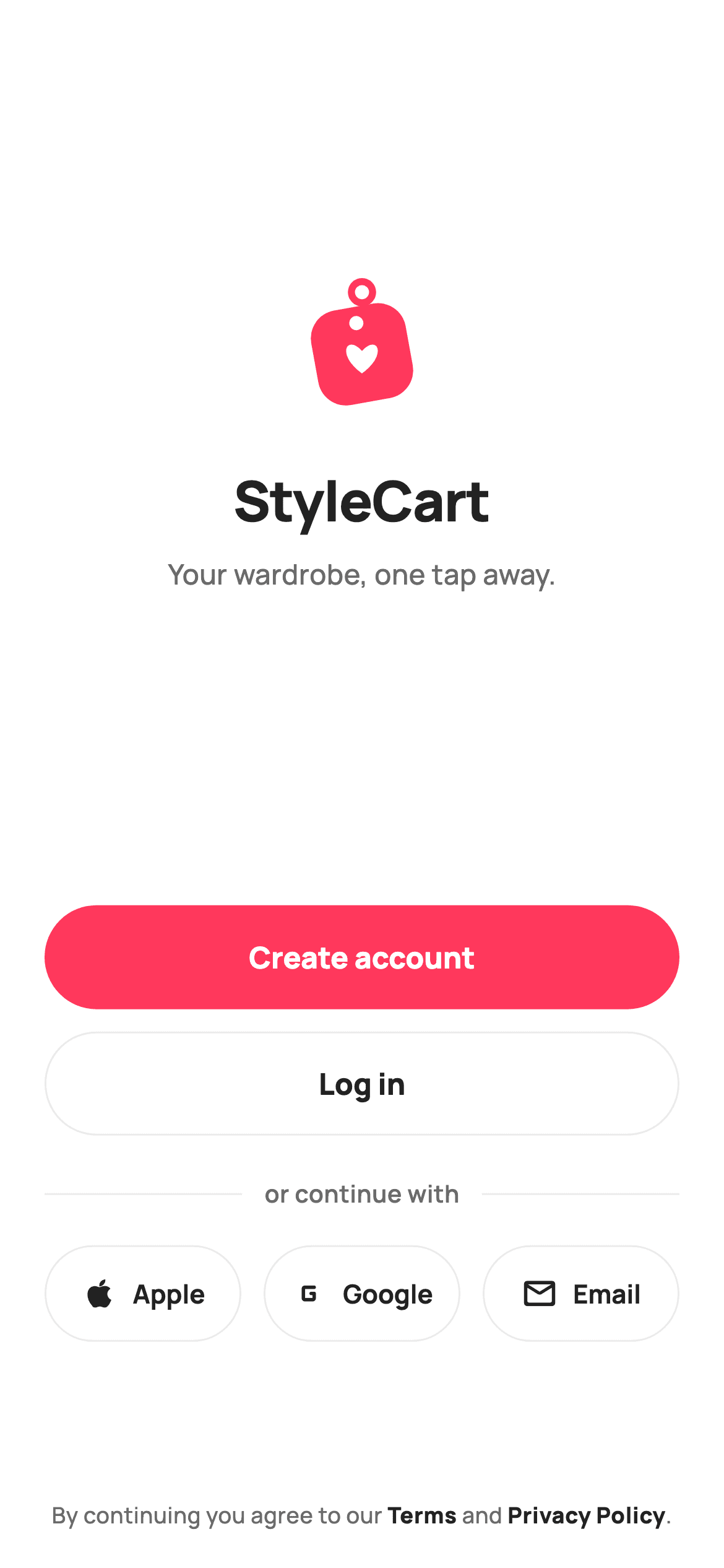
The screen between onboarding and signing up has to offer choices without looking like a menu. This tutorial builds StyleCart's Get Started gateway in Flutter — a painted heart-on-a-price-tag brand mark, a primary Create account pill above an outlined Log in, a divider reading 'or continue with', three equal-width provider buttons, and a terms line with only the legal names emphasised. The mark is drawn with cubic Bézier curves, and weighted Spacers do all the vertical positioning.
Watch the Flutter UI walkthrough
A short screen recording of Get Started running, if you'd rather see it before you read the code. The written tutorial below covers everything in it.
Can't see the video? Watch it on YouTube.
What you'll build
- ✓A brand mark drawn as a rotated price tag with a Bézier heart on top — no logo asset
- ✓Clear CTA hierarchy from one filled pill and one outlined pill of identical size
- ✓A centred 'or continue with' rule built from two Expanded dividers around a label
- ✓Three provider buttons that split the row evenly, each reporting its own provider string
Step-by-step build
Create the file
Add a new file at lib/ecom_onboarding_get_started/ecom_onboarding_get_started_screen.dart in your Flutter project.
Register the bundled fonts
No external packages — this is pure Flutter. It does bundle its design font (Manrope), so drop the font file into fonts/ and declare it in pubspec.yaml:
flutter:
  fonts:
    - family: Manrope
      fonts:
- asset: fonts/Manrope-Regular.ttfBuild it, piece by piece
Here's how the screen goes together. Each block below is a real slice of the code with a plain-English explanation — paste them in order, or grab the whole file from the next section.
The gateway's three callbacks
import 'package:flutter/material.dart';

/// StyleCart — Get Started.
///
/// The auth gateway after onboarding: brand hero, primary "Create account",
/// secondary "Log in", and a "continue with" social/email row, with a terms
/// line. Self-contained per CONVENTIONS.md: pure Flutter, bundled Manrope,
/// inline Airbnb-style tokens, own light theme + SafeArea. The brand mark is a
/// painted heart price-tag (no asset, no emoji glyph). Exposes callbacks only.
class EcomOnboardingGetStartedScreen extends StatelessWidget {
  const EcomOnboardingGetStartedScreen({
    super.key,
    this.onCreateAccount,
    this.onLogin,
    this.onContinueWith,
  });

  /// Primary CTA — go to Create Account.
  final VoidCallback? onCreateAccount;

  /// Secondary CTA — go to Log In.
  final VoidCallback? onLogin;

  /// A "continue with" provider was tapped (e.g. 'apple', 'google', 'email').
  final ValueChanged<String>? onContinueWith;

  static const String _font = 'Manrope';
  static const Color _canvas = Color(0xFFFFFFFF);
  static const Color _ink = Color(0xFF222222);
  static const Color _muted = Color(0xFF6A6A6A);
  static const Color _brand = Color(0xFFFF385C);
  static const Color _hairline = Color(0xFFEBEBEB);
The screen is stateless — it makes no decisions, it only routes. `onCreateAccount` and `onLogin` are plain VoidCallbacks, but `onContinueWith` is a `ValueChanged<String>` that receives 'apple', 'google' or 'email'. Passing a provider string rather than exposing three separate callbacks means adding a fourth provider later needs no new constructor field, and the host handles them in one switch. The palette is the five-token StyleCart set, with `_hairline` (#EBEBEB) doing quiet but important work as the border on every outlined control.
Positioning the hero with weighted Spacers
  @override
  Widget build(BuildContext context) {
    return Theme(
      data: ThemeData.light(useMaterial3: true),
      child: Scaffold(
        backgroundColor: _canvas,
        body: SafeArea(
          child: Padding(
            padding: const EdgeInsets.fromLTRB(24, 24, 24, 20),
            child: Column(
              crossAxisAlignment: CrossAxisAlignment.stretch,
              children: <Widget>[
                const Spacer(flex: 3),
                Center(
                  child: Column(
                    children: const <Widget>[
                      SizedBox(
                        width: 76,
                        height: 76,
                        child: CustomPaint(
                          painter: _HeartTagPainter(tag: _brand, heart: _canvas),
                        ),
                      ),
                      SizedBox(height: 22),
                      Text(
                        'StyleCart',
                        style: TextStyle(
                          fontFamily: _font,
                          fontSize: 30,
                          fontWeight: FontWeight.w800,
                          letterSpacing: -0.5,
                          color: _ink,
                        ),
                      ),
                      SizedBox(height: 8),
                      Text(
                        'Your wardrobe, one tap away.',
                        style: TextStyle(
                          fontFamily: _font,
                          fontSize: 15,
                          fontWeight: FontWeight.w500,
                          color: _muted,
                        ),
                      ),
                    ],
                  ),
                ),
                const Spacer(flex: 4),
The Column uses `CrossAxisAlignment.stretch`, which is why the buttons below get full width without asking for it. The vertical composition is handled entirely by three Spacers with different flex weights — `flex: 3` above the brand group and `flex: 4` below it park the logo slightly above centre, which reads better than dead-centre because the eye expects optical rather than mathematical balance. The hero itself is a 76px CustomPaint, the wordmark at 30px w800 with `-0.5` letterSpacing, and a tagline in muted 15px. Because the painter is `const` with its colours passed in, Flutter can skip rebuilding that subtree entirely.
Two buttons, one hierarchy
                SizedBox(
                  height: 56,
                  child: FilledButton(
                    onPressed: onCreateAccount,
                    style: FilledButton.styleFrom(
                      backgroundColor: _brand,
                      foregroundColor: _canvas,
                      shape: const StadiumBorder(),
                      textStyle: const TextStyle(
                        fontFamily: _font,
                        fontSize: 16,
                        fontWeight: FontWeight.w800,
                      ),
                    ),
                    child: const Text('Create account'),
                  ),
                ),
                const SizedBox(height: 12),
                SizedBox(
                  height: 56,
                  child: OutlinedButton(
                    onPressed: onLogin,
                    style: OutlinedButton.styleFrom(
                      foregroundColor: _ink,
                      side: const BorderSide(color: _hairline),
                      shape: const StadiumBorder(),
                      textStyle: const TextStyle(
                        fontFamily: _font,
                        fontSize: 16,
                        fontWeight: FontWeight.w800,
                      ),
                    ),
                    child: const Text('Log in'),
                  ),
                ),
                const SizedBox(height: 22),
Both CTAs are 56px tall with a `StadiumBorder()`, so they're identical in size and shape — the entire hierarchy comes from fill. 'Create account' is a FilledButton in solid brand coral; 'Log in' is an OutlinedButton with ink text and a `_hairline` border so faint it barely reads as a box. That's the right split for a gateway: new users are the growth path and get the visual weight, while returning users already know where to look and don't need the emphasis. Making them the same size means neither feels like a downgrade.
The 'or continue with' rule
                Row(
                  children: const <Widget>[
                    Expanded(child: Divider(color: _hairline, height: 1)),
                    Padding(
                      padding: EdgeInsets.symmetric(horizontal: 12),
                      child: Text(
                        'or continue with',
                        style: TextStyle(
                          fontFamily: _font,
                          fontSize: 13,
                          fontWeight: FontWeight.w600,
                          color: _muted,
                        ),
                      ),
                    ),
                    Expanded(child: Divider(color: _hairline, height: 1)),
                  ],
                ),
                const SizedBox(height: 18),
                Row(
                  children: <Widget>[
                    _SocialButton(
                      icon: Icons.apple,
                      label: 'Apple',
                      onTap: () => onContinueWith?.call('apple'),
                    ),
                    const SizedBox(width: 12),
                    _SocialButton(
                      icon: Icons.g_mobiledata_rounded,
                      label: 'Google',
                      onTap: () => onContinueWith?.call('google'),
                    ),
                    const SizedBox(width: 12),
                    _SocialButton(
                      icon: Icons.mail_outline_rounded,
                      label: 'Email',
                      onTap: () => onContinueWith?.call('email'),
                    ),
                  ],
                ),
The divider is a Row of an `Expanded` Divider, a padded label, and a second `Expanded` Divider. Because both dividers are Expanded, they split the leftover width equally and the label stays centred at any screen size — no fixed widths to recalculate. Each Divider sets `height: 1` so it occupies exactly its own thickness and contributes no vertical space of its own. Below it, three `_SocialButton`s are separated by 12px gaps, and each one's `onTap` closure calls `onContinueWith` with its provider name, so the row's three buttons funnel into a single handler.
The terms line and the provider button
                const Spacer(flex: 2),
                Text.rich(
                  TextSpan(
                    text: 'By continuing you agree to our ',
                    style: const TextStyle(
                      fontFamily: _font,
                      fontSize: 12,
                      height: 1.5,
                      fontWeight: FontWeight.w500,
                      color: _muted,
                    ),
                    children: const <TextSpan>[
                      TextSpan(
                        text: 'Terms',
                        style: TextStyle(
                          fontWeight: FontWeight.w800,
                          color: _ink,
                        ),
                      ),
                      TextSpan(text: ' and '),
                      TextSpan(
                        text: 'Privacy Policy',
                        style: TextStyle(
                          fontWeight: FontWeight.w800,
                          color: _ink,
                        ),
                      ),
                      TextSpan(text: '.'),
                    ],
                  ),
                  textAlign: TextAlign.center,
                ),
              ],
            ),
          ),
        ),
      ),
    );
  }
}

/// A compact outlined "continue with provider" pill.
class _SocialButton extends StatelessWidget {
  const _SocialButton({
    required this.icon,
    required this.label,
    required this.onTap,
  });

  final IconData icon;
  final String label;
  final VoidCallback onTap;

  @override
  Widget build(BuildContext context) {
    return Expanded(
      child: SizedBox(
        height: 52,
        child: OutlinedButton.icon(
          onPressed: onTap,
          icon: Icon(icon, size: 20,
              color: EcomOnboardingGetStartedScreen._ink),
          label: Text(label),
          style: OutlinedButton.styleFrom(
            foregroundColor: EcomOnboardingGetStartedScreen._ink,
            side: const BorderSide(color: EcomOnboardingGetStartedScreen._hairline),
            shape: const StadiumBorder(),
            padding: const EdgeInsets.symmetric(horizontal: 8),
            textStyle: const TextStyle(
              fontFamily: EcomOnboardingGetStartedScreen._font,
              fontSize: 14,
              fontWeight: FontWeight.w700,
            ),
          ),
        ),
      ),
    );
  }
}
The legal line uses `Text.rich` with a base TextSpan and four children, so 'Terms' and 'Privacy Policy' render in ink at w800 while the connecting words stay muted — one paragraph that wraps as a block, rather than a Row of Texts that would break awkwardly. Note the spans carry no tap recognisers as written, so you'd add a `TapGestureRecognizer` to each to make them open. `_SocialButton` returns an `Expanded` from its own build method, which is what makes the three buttons divide the row evenly without the parent wrapping each one. It uses `OutlinedButton.icon` with 8px horizontal padding — tight, because three labelled buttons on one row have very little width each.
Painting the heart price-tag mark
/// Paints the StyleCart heart price-tag brand mark. Pure vector.
class _HeartTagPainter extends CustomPainter {
  const _HeartTagPainter({required this.tag, required this.heart});

  final Color tag;
  final Color heart;

  @override
  void paint(Canvas canvas, Size size) {
    final double s = size.shortestSide;
    final Offset center = Offset(size.width / 2, size.height / 2);

    final Paint ring = Paint()
      ..style = PaintingStyle.stroke
      ..strokeWidth = s * 0.05
      ..color = tag;
    canvas.drawCircle(Offset(center.dx, center.dy - s * 0.40), s * 0.075, ring);

    canvas.save();
    canvas.translate(center.dx, center.dy + s * 0.04);
    canvas.rotate(-0.18);
    final double half = s * 0.34;
    final RRect tile = RRect.fromRectAndRadius(
      Rect.fromCenter(center: Offset.zero, width: half * 2, height: half * 2),
      Radius.circular(s * 0.20),
    );
    canvas.drawRRect(tile, Paint()..color = tag);
    canvas.drawCircle(Offset(0, -half * 0.66), s * 0.05, Paint()..color = heart);
    canvas.restore();

    canvas.drawPath(
      _heartPath(Offset(center.dx, center.dy + s * 0.07), s * 0.30),
      Paint()
        ..color = heart
        ..isAntiAlias = true,
    );
  }

  Path _heartPath(Offset c, double sz) {
    final Path path = Path();
    path.moveTo(c.dx, c.dy + sz * 0.35);
    path.cubicTo(c.dx - sz * 0.62, c.dy - sz * 0.10, c.dx - sz * 0.36,
        c.dy - sz * 0.58, c.dx, c.dy - sz * 0.18);
    path.cubicTo(c.dx + sz * 0.36, c.dy - sz * 0.58, c.dx + sz * 0.62,
        c.dy - sz * 0.10, c.dx, c.dy + sz * 0.35);
    path.close();
    return path;
  }

  @override
  bool shouldRepaint(_HeartTagPainter oldDelegate) =>
      oldDelegate.tag != tag || oldDelegate.heart != heart;
}
The mark is built in three passes. First a small stroked circle above centre — the tag's hole. Then the tag body: `canvas.save()`, translate to the centre, `rotate(-0.18)` radians for a casual tilt, draw a heavily rounded square (radius 20% of the shortest side, so it's a squircle rather than a card), then `restore()` to undo the transform. Working in local coordinates around `Offset.zero` like this is far simpler than computing rotated corners by hand. Finally the heart, drawn *outside* the rotation so it sits upright on the tilted tag. `_heartPath` builds it from two mirrored `cubicTo` curves that sweep out from the bottom point, up and around each lobe, and meet at the top notch — the standard way to draw a heart with two Béziers rather than arcs.
Full code
The complete, ready-to-paste source. Free to use in your projects — one click copies it all.
import 'package:flutter/material.dart';

/// StyleCart — Get Started.
///
/// The auth gateway after onboarding: brand hero, primary "Create account",
/// secondary "Log in", and a "continue with" social/email row, with a terms
/// line. Self-contained per CONVENTIONS.md: pure Flutter, bundled Manrope,
/// inline Airbnb-style tokens, own light theme + SafeArea. The brand mark is a
/// painted heart price-tag (no asset, no emoji glyph). Exposes callbacks only.
class EcomOnboardingGetStartedScreen extends StatelessWidget {
  const EcomOnboardingGetStartedScreen({
    super.key,
    this.onCreateAccount,
    this.onLogin,
    this.onContinueWith,
  });

  /// Primary CTA — go to Create Account.
  final VoidCallback? onCreateAccount;

  /// Secondary CTA — go to Log In.
  final VoidCallback? onLogin;

  /// A "continue with" provider was tapped (e.g. 'apple', 'google', 'email').
  final ValueChanged<String>? onContinueWith;

  static const String _font = 'Manrope';
  static const Color _canvas = Color(0xFFFFFFFF);
  static const Color _ink = Color(0xFF222222);
  static const Color _muted = Color(0xFF6A6A6A);
  static const Color _brand = Color(0xFFFF385C);
  static const Color _hairline = Color(0xFFEBEBEB);

  @override
  Widget build(BuildContext context) {
    return Theme(
      data: ThemeData.light(useMaterial3: true),
      child: Scaffold(
        backgroundColor: _canvas,
        body: SafeArea(
          child: Padding(
            padding: const EdgeInsets.fromLTRB(24, 24, 24, 20),
            child: Column(
              crossAxisAlignment: CrossAxisAlignment.stretch,
              children: <Widget>[
                const Spacer(flex: 3),
                Center(
                  child: Column(
                    children: const <Widget>[
                      SizedBox(
                        width: 76,
                        height: 76,
                        child: CustomPaint(
                          painter: _HeartTagPainter(tag: _brand, heart: _canvas),
                        ),
                      ),
                      SizedBox(height: 22),
                      Text(
                        'StyleCart',
                        style: TextStyle(
                          fontFamily: _font,
                          fontSize: 30,
                          fontWeight: FontWeight.w800,
                          letterSpacing: -0.5,
                          color: _ink,
                        ),
                      ),
                      SizedBox(height: 8),
                      Text(
                        'Your wardrobe, one tap away.',
                        style: TextStyle(
                          fontFamily: _font,
                          fontSize: 15,
                          fontWeight: FontWeight.w500,
                          color: _muted,
                        ),
                      ),
                    ],
                  ),
                ),
                const Spacer(flex: 4),
                SizedBox(
                  height: 56,
                  child: FilledButton(
                    onPressed: onCreateAccount,
                    style: FilledButton.styleFrom(
                      backgroundColor: _brand,
                      foregroundColor: _canvas,
                      shape: const StadiumBorder(),
                      textStyle: const TextStyle(
                        fontFamily: _font,
                        fontSize: 16,
                        fontWeight: FontWeight.w800,
                      ),
                    ),
                    child: const Text('Create account'),
                  ),
                ),
                const SizedBox(height: 12),
                SizedBox(
                  height: 56,
                  child: OutlinedButton(
                    onPressed: onLogin,
                    style: OutlinedButton.styleFrom(
                      foregroundColor: _ink,
                      side: const BorderSide(color: _hairline),
                      shape: const StadiumBorder(),
                      textStyle: const TextStyle(
                        fontFamily: _font,
                        fontSize: 16,
                        fontWeight: FontWeight.w800,
                      ),
                    ),
                    child: const Text('Log in'),
                  ),
                ),
                const SizedBox(height: 22),
                Row(
                  children: const <Widget>[
                    Expanded(child: Divider(color: _hairline, height: 1)),
                    Padding(
                      padding: EdgeInsets.symmetric(horizontal: 12),
                      child: Text(
                        'or continue with',
                        style: TextStyle(
                          fontFamily: _font,
                          fontSize: 13,
                          fontWeight: FontWeight.w600,
                          color: _muted,
                        ),
                      ),
                    ),
                    Expanded(child: Divider(color: _hairline, height: 1)),
                  ],
                ),
                const SizedBox(height: 18),
                Row(
                  children: <Widget>[
                    _SocialButton(
                      icon: Icons.apple,
                      label: 'Apple',
                      onTap: () => onContinueWith?.call('apple'),
                    ),
                    const SizedBox(width: 12),
                    _SocialButton(
                      icon: Icons.g_mobiledata_rounded,
                      label: 'Google',
                      onTap: () => onContinueWith?.call('google'),
                    ),
                    const SizedBox(width: 12),
                    _SocialButton(
                      icon: Icons.mail_outline_rounded,
                      label: 'Email',
                      onTap: () => onContinueWith?.call('email'),
                    ),
                  ],
                ),
                const Spacer(flex: 2),
                Text.rich(
                  TextSpan(
                    text: 'By continuing you agree to our ',
                    style: const TextStyle(
                      fontFamily: _font,
                      fontSize: 12,
                      height: 1.5,
                      fontWeight: FontWeight.w500,
                      color: _muted,
                    ),
                    children: const <TextSpan>[
                      TextSpan(
                        text: 'Terms',
                        style: TextStyle(
                          fontWeight: FontWeight.w800,
                          color: _ink,
                        ),
                      ),
                      TextSpan(text: ' and '),
                      TextSpan(
                        text: 'Privacy Policy',
                        style: TextStyle(
                          fontWeight: FontWeight.w800,
                          color: _ink,
                        ),
                      ),
                      TextSpan(text: '.'),
                    ],
                  ),
                  textAlign: TextAlign.center,
                ),
              ],
            ),
          ),
        ),
      ),
    );
  }
}

/// A compact outlined "continue with provider" pill.
class _SocialButton extends StatelessWidget {
  const _SocialButton({
    required this.icon,
    required this.label,
    required this.onTap,
  });

  final IconData icon;
  final String label;
  final VoidCallback onTap;

  @override
  Widget build(BuildContext context) {
    return Expanded(
      child: SizedBox(
        height: 52,
        child: OutlinedButton.icon(
          onPressed: onTap,
          icon: Icon(icon, size: 20,
              color: EcomOnboardingGetStartedScreen._ink),
          label: Text(label),
          style: OutlinedButton.styleFrom(
            foregroundColor: EcomOnboardingGetStartedScreen._ink,
            side: const BorderSide(color: EcomOnboardingGetStartedScreen._hairline),
            shape: const StadiumBorder(),
            padding: const EdgeInsets.symmetric(horizontal: 8),
            textStyle: const TextStyle(
              fontFamily: EcomOnboardingGetStartedScreen._font,
              fontSize: 14,
              fontWeight: FontWeight.w700,
            ),
          ),
        ),
      ),
    );
  }
}

/// Paints the StyleCart heart price-tag brand mark. Pure vector.
class _HeartTagPainter extends CustomPainter {
  const _HeartTagPainter({required this.tag, required this.heart});

  final Color tag;
  final Color heart;

  @override
  void paint(Canvas canvas, Size size) {
    final double s = size.shortestSide;
    final Offset center = Offset(size.width / 2, size.height / 2);

    final Paint ring = Paint()
      ..style = PaintingStyle.stroke
      ..strokeWidth = s * 0.05
      ..color = tag;
    canvas.drawCircle(Offset(center.dx, center.dy - s * 0.40), s * 0.075, ring);

    canvas.save();
    canvas.translate(center.dx, center.dy + s * 0.04);
    canvas.rotate(-0.18);
    final double half = s * 0.34;
    final RRect tile = RRect.fromRectAndRadius(
      Rect.fromCenter(center: Offset.zero, width: half * 2, height: half * 2),
      Radius.circular(s * 0.20),
    );
    canvas.drawRRect(tile, Paint()..color = tag);
    canvas.drawCircle(Offset(0, -half * 0.66), s * 0.05, Paint()..color = heart);
    canvas.restore();

    canvas.drawPath(
      _heartPath(Offset(center.dx, center.dy + s * 0.07), s * 0.30),
      Paint()
        ..color = heart
        ..isAntiAlias = true,
    );
  }

  Path _heartPath(Offset c, double sz) {
    final Path path = Path();
    path.moveTo(c.dx, c.dy + sz * 0.35);
    path.cubicTo(c.dx - sz * 0.62, c.dy - sz * 0.10, c.dx - sz * 0.36,
        c.dy - sz * 0.58, c.dx, c.dy - sz * 0.18);
    path.cubicTo(c.dx + sz * 0.36, c.dy - sz * 0.58, c.dx + sz * 0.62,
        c.dy - sz * 0.10, c.dx, c.dy + sz * 0.35);
    path.close();
    return path;
  }

  @override
  bool shouldRepaint(_HeartTagPainter oldDelegate) =>
      oldDelegate.tag != tag || oldDelegate.heart != heart;
}
Plus bundled 5 binary assets (fonts/images). The CLI and MCP install those for you automatically.
Two faster ways to add it
Copy-paste works, but you can skip it entirely.
1. FlutterKit CLI
One command drops this screen — and its fonts — straight into your project.
$ flutterkit add ecom-onboarding-get-started2. AI agent (MCP)
Connect FlutterKit's MCP server in Claude or Cursor and just ask your agent to install ecom-onboarding-get-started — it fetches and writes the files for you.
FAQ
Is this Flutter get started screen free to use?
Yes. The complete Dart source on this page is free for personal and commercial projects. Copy it directly, install it with the FlutterKit CLI (flutterkit add ecom-onboarding-get-started), or have an AI agent add it for you over MCP.
How do I make the Terms and Privacy Policy links tappable?
The spans are styled but inert. Import `package:flutter/gestures.dart` (part of Flutter, no dependency) and attach a `TapGestureRecognizer` to each emphasised TextSpan, pointing at your route or url launcher. Create the recognisers in a StatefulWidget's initState and dispose them, since a recogniser created inline in build leaks on every rebuild.
Can I swap the Apple and Google icons for real brand logos?
Yes, and you should — `Icons.apple` is passable but `Icons.g_mobiledata_rounded` is not Google's mark, and both platforms have brand guidelines for sign-in buttons. `_SocialButton` takes an IconData, so widen it to accept a Widget instead and pass your own asset or painter. Apple also requires Sign in with Apple to be offered wherever third-party sign-in is, if you ship on iOS.
Which Flutter version does it target?
It uses super parameters and Material 3 with no Color.withValues calls, so any Dart 3 SDK compiles it — Flutter 3.10+, and it matches the rest of this kit at 3.22+. The only bundled asset is the Manrope font, registered in pubspec.yaml as shown in step 2; the brand mark is painted rather than loaded.


