How to Build a Shop Top Brands Onboarding Screen in Flutter (Full Code + Preview)
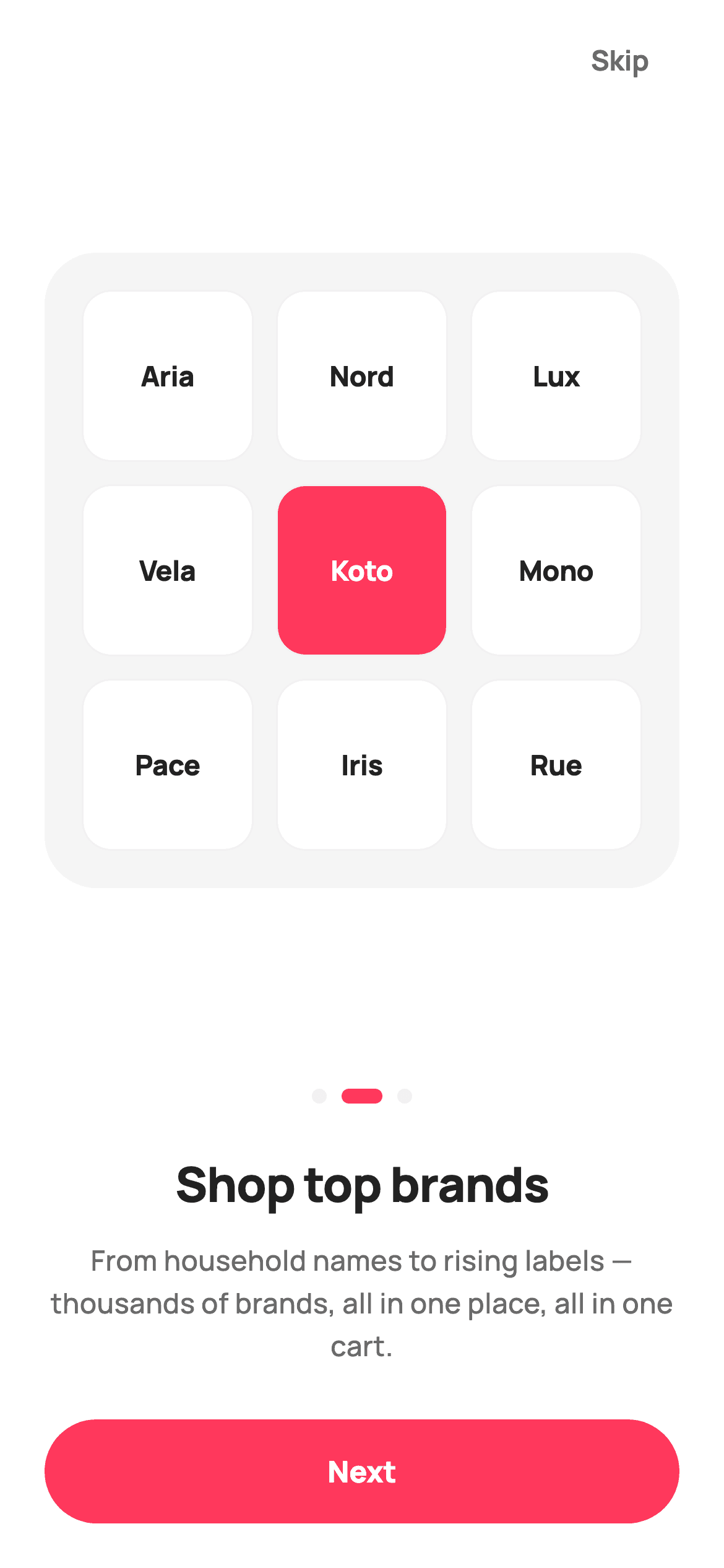
Onboarding art is usually the first thing to go stale, because it ships as a PNG somebody has to re-export whenever the palette changes. This tutorial builds StyleCart's second onboarding page in Flutter with a hero made of widgets instead: a 3x3 grid of brand monogram tiles inside a rounded square, one of which is filled coral to break the pattern. It also covers the page-indicator dots, where the active one animates into an elongated pill.
Watch the Flutter UI walkthrough
A short screen recording of Shop top brands running, if you'd rather see it before you read the code. The written tutorial below covers everything in it.
Can't see the video? Watch it on YouTube.
What you'll build
- ✓A 3x3 brand collage built from a GridView.count with no image assets
- ✓One featured tile inverted to solid coral to stop the grid reading as wallpaper
- ✓Page dots where the active one animates from an 8px circle to a 22px pill
- ✓A square hero that flexes with the screen while the copy and button stay fixed
Step-by-step build
Create the file
Add a new file at lib/ecom_onboarding_2/ecom_onboarding_2_screen.dart in your Flutter project.
Register the bundled fonts
No external packages — this is pure Flutter. It does bundle its design font (Manrope), so drop the font file into fonts/ and declare it in pubspec.yaml:
flutter:
  fonts:
    - family: Manrope
      fonts:
- asset: fonts/Manrope-Regular.ttfBuild it, piece by piece
Here's how the screen goes together. Each block below is a real slice of the code with a plain-English explanation — paste them in order, or grab the whole file from the next section.
Nine brand names and a stateless page
import 'package:flutter/material.dart';

/// StyleCart — Onboarding 2 of 3 · "Shop top brands".
///
/// Second onboarding page. Self-contained per CONVENTIONS.md: pure Flutter,
/// bundled Manrope, inline Airbnb-style tokens, own light theme + SafeArea. The
/// hero is a painted-tile brand collage (monogram tiles — real font letters, no
/// emoji glyph, no image asset). Exposes callbacks only; the gallery wires nav.
class EcomOnboardingTwoScreen extends StatelessWidget {
  const EcomOnboardingTwoScreen({super.key, this.onContinue, this.onSkip});

  final VoidCallback? onContinue;
  final VoidCallback? onSkip;

  static const String _font = 'Manrope';
  static const Color _canvas = Color(0xFFFFFFFF);
  static const Color _ink = Color(0xFF222222);
  static const Color _muted = Color(0xFF6A6A6A);
  static const Color _brand = Color(0xFFFF385C);
  static const Color _surface = Color(0xFFF2F2F2);
  static const Color _imageBg = Color(0xFFF5F5F5);

  static const List<String> _brands = <String>[
    'Aria', 'Nord', 'Lux', 'Vela', 'Koto', 'Mono', 'Pace', 'Iris', 'Rue',
  ];
The screen is a `StatelessWidget` with `onContinue` and `onSkip`, so it holds no page index and knows nothing about the other two onboarding steps — the host app or PageView drives navigation. The content is a `static const List<String>` of nine short brand names, chosen at that length deliberately: they have to fit a third of the hero's width at 15px without truncating. The palette separates `_surface` (#F2F2F2, tile borders and inactive dots) from `_imageBg` (#F5F5F5, the hero backdrop), a barely perceptible difference that stops the tile borders disappearing into the panel behind them.
One flexible child, everything else fixed
  @override
  Widget build(BuildContext context) {
    return Theme(
      data: ThemeData.light(useMaterial3: true),
      child: Scaffold(
        backgroundColor: _canvas,
        body: SafeArea(
          child: Padding(
            padding: const EdgeInsets.fromLTRB(24, 8, 24, 24),
            child: Column(
              crossAxisAlignment: CrossAxisAlignment.stretch,
              children: <Widget>[
                Align(
                  alignment: Alignment.centerRight,
                  child: TextButton(
                    onPressed: onSkip,
                    style: TextButton.styleFrom(
                      foregroundColor: _muted,
                      textStyle: const TextStyle(
                        fontFamily: _font,
                        fontSize: 15,
                        fontWeight: FontWeight.w700,
                      ),
                    ),
                    child: const Text('Skip'),
                  ),
                ),
                Expanded(
                  child: Center(
                    child: AspectRatio(
                      aspectRatio: 1,
                      child: Container(
                        padding: const EdgeInsets.all(20),
                        decoration: BoxDecoration(
                          color: _imageBg,
                          borderRadius: BorderRadius.circular(28),
                        ),
                        child: GridView.count(
                          physics: const NeverScrollableScrollPhysics(),
                          crossAxisCount: 3,
                          mainAxisSpacing: 12,
                          crossAxisSpacing: 12,
                          children: List<Widget>.generate(_brands.length, (int i) {
                            final bool featured = i == 4;
                            return _BrandTile(
                              label: _brands[i],
                              bg: featured ? _brand : _canvas,
                              fg: featured ? _canvas : _ink,
                              border: _surface,
                              font: _font,
                            );
                          }),
                        ),
                      ),
                    ),
                  ),
                ),
                const SizedBox(height: 28),
                const _Dots(index: 1, brand: _brand, faint: _surface),
                const SizedBox(height: 24),
The Column sets `crossAxisAlignment: CrossAxisAlignment.stretch`, which is why the Next button spans the full width with no `SizedBox(width: double.infinity)`. Only the hero is `Expanded`, so on a short device the artwork shrinks while the headline, body and button keep their exact sizes — text never scales down and the button never scrolls away. Inside, `AspectRatio(aspectRatio: 1)` keeps the collage square whatever height it is given, and the `GridView.count` sets `NeverScrollableScrollPhysics()` because the nine tiles always fit exactly and any scroll would be an accident. Skip sits top-right in an `Align`, present but unweighted.
Breaking the pattern with one featured tile
                        child: GridView.count(
                          physics: const NeverScrollableScrollPhysics(),
                          crossAxisCount: 3,
                          mainAxisSpacing: 12,
                          crossAxisSpacing: 12,
                          children: List<Widget>.generate(_brands.length, (int i) {
                            final bool featured = i == 4;
                            return _BrandTile(
                              label: _brands[i],
                              bg: featured ? _brand : _canvas,
                              fg: featured ? _canvas : _ink,
                              border: _surface,
                              font: _font,
                            );
                          }),
                        ),
                      ),
                    ),
                  ),
                ),
`List<Widget>.generate` builds the nine tiles, and `final bool featured = i == 4` singles out index 4 — the exact centre of a 3x3 grid. That tile receives `bg: _brand` and `fg: _canvas` while the other eight get white on ink. The reason is compositional: nine identical tiles read as texture and the eye slides off, whereas one inverted cell gives the collage a focal point and turns it into an image of a brand marketplace. Note that the tile takes all four colours as parameters rather than reading constants, which is what makes `_BrandTile` reusable across the other onboarding pages.
Dots, copy and a single next action
                const SizedBox(height: 28),
                const _Dots(index: 1, brand: _brand, faint: _surface),
                const SizedBox(height: 24),
                const Text(
                  'Shop top brands',
                  textAlign: TextAlign.center,
                  style: TextStyle(
                    fontFamily: _font,
                    fontSize: 26,
                    fontWeight: FontWeight.w800,
                    letterSpacing: -0.5,
                    color: _ink,
                  ),
                ),
                const SizedBox(height: 12),
                const Text(
                  'From household names to rising labels — thousands '
                  'of brands, all in one place, all in one cart.',
                  textAlign: TextAlign.center,
                  style: TextStyle(
                    fontFamily: _font,
                    fontSize: 15,
                    height: 1.5,
                    fontWeight: FontWeight.w500,
                    color: _muted,
                  ),
                ),
                const SizedBox(height: 28),
                SizedBox(
                  height: 56,
                  child: FilledButton(
                    onPressed: onContinue,
                    style: FilledButton.styleFrom(
                      backgroundColor: _brand,
                      foregroundColor: _canvas,
                      shape: const StadiumBorder(),
                      textStyle: const TextStyle(
                        fontFamily: _font,
                        fontSize: 16,
                        fontWeight: FontWeight.w800,
                      ),
                    ),
                    child: const Text('Next'),
                  ),
                ),
              ],
            ),
          ),
        ),
      ),
    );
  }
Below the hero the page settles into a fixed rhythm: 28px gap, the page dots, 24px gap, a 26px `w800` headline at `letterSpacing: -0.5`, 12px gap, two lines of 15px body at `height: 1.5`, then a 28px gap before the button. Those gaps are identical across all three onboarding pages, which is what makes the sequence feel like one screen changing rather than three separate designs. The body copy is worth reading as copy — it promises 'thousands of brands, all in one place, all in one cart', a concrete benefit rather than a slogan. The Next button is a 56px `FilledButton` with `shape: const StadiumBorder()`, the pill StyleCart uses for every primary action.
The monogram tile
/// A single rounded brand-monogram tile (real font letters, not an emoji glyph).
class _BrandTile extends StatelessWidget {
  const _BrandTile({
    required this.label,
    required this.bg,
    required this.fg,
    required this.border,
    required this.font,
  });

  final String label;
  final Color bg;
  final Color fg;
  final Color border;
  final String font;

  @override
  Widget build(BuildContext context) {
    return Container(
      alignment: Alignment.center,
      decoration: BoxDecoration(
        color: bg,
        borderRadius: BorderRadius.circular(16),
        border: Border.all(color: border),
      ),
      child: Text(
        label,
        style: TextStyle(
          fontFamily: font,
          fontSize: 15,
          fontWeight: FontWeight.w800,
          letterSpacing: -0.2,
          color: fg,
        ),
      ),
    );
  }
}
`_BrandTile` is deliberately tiny — a `Container` with `alignment: Alignment.center`, a 16px radius, a 1px border and a Text child at 15px `w800` with `letterSpacing: -0.2`. There is no `width` or `height` anywhere, because the GridView already assigns the cell size; hard-coding dimensions here would fight it. The tile renders real font letters rather than an emoji or an icon, which matters for two practical reasons: text renders identically in golden tests where emoji do not, and a brand name in Manrope actually looks like a logotype where a generic glyph would not.
Dots where the active one grows into a pill
/// Painted onboarding page dots — active dot is an elongated brand pill.
class _Dots extends StatelessWidget {
  const _Dots({required this.index, required this.brand, required this.faint});

  final int index;
  final Color brand;
  final Color faint;

  @override
  Widget build(BuildContext context) {
    return Row(
      mainAxisAlignment: MainAxisAlignment.center,
      children: List<Widget>.generate(3, (int i) {
        final bool active = i == index;
        return AnimatedContainer(
          duration: const Duration(milliseconds: 200),
          margin: const EdgeInsets.symmetric(horizontal: 4),
          width: active ? 22 : 8,
          height: 8,
          decoration: BoxDecoration(
            color: active ? brand : faint,
            borderRadius: BorderRadius.circular(4),
          ),
        );
      }),
    );
  }
}
`_Dots` generates three indicators and compares each index against the active one. The active dot is not just recoloured — its `width` goes from 8 to 22 while the height stays at 8, turning a circle into a pill. Because the widget is an `AnimatedContainer` with a 200ms duration, that width change tweens automatically when the index changes, with no `AnimationController` and no `TickerProvider` needed. Combining a size change with the colour change is what makes the indicator readable at a glance and to anyone who cannot separate coral from grey. The 4px radius on an 8px-tall box gives a perfect capsule in both states.
Full code
The complete, ready-to-paste source. Free to use in your projects — one click copies it all.
import 'package:flutter/material.dart';

/// StyleCart — Onboarding 2 of 3 · "Shop top brands".
///
/// Second onboarding page. Self-contained per CONVENTIONS.md: pure Flutter,
/// bundled Manrope, inline Airbnb-style tokens, own light theme + SafeArea. The
/// hero is a painted-tile brand collage (monogram tiles — real font letters, no
/// emoji glyph, no image asset). Exposes callbacks only; the gallery wires nav.
class EcomOnboardingTwoScreen extends StatelessWidget {
  const EcomOnboardingTwoScreen({super.key, this.onContinue, this.onSkip});

  final VoidCallback? onContinue;
  final VoidCallback? onSkip;

  static const String _font = 'Manrope';
  static const Color _canvas = Color(0xFFFFFFFF);
  static const Color _ink = Color(0xFF222222);
  static const Color _muted = Color(0xFF6A6A6A);
  static const Color _brand = Color(0xFFFF385C);
  static const Color _surface = Color(0xFFF2F2F2);
  static const Color _imageBg = Color(0xFFF5F5F5);

  static const List<String> _brands = <String>[
    'Aria', 'Nord', 'Lux', 'Vela', 'Koto', 'Mono', 'Pace', 'Iris', 'Rue',
  ];

  @override
  Widget build(BuildContext context) {
    return Theme(
      data: ThemeData.light(useMaterial3: true),
      child: Scaffold(
        backgroundColor: _canvas,
        body: SafeArea(
          child: Padding(
            padding: const EdgeInsets.fromLTRB(24, 8, 24, 24),
            child: Column(
              crossAxisAlignment: CrossAxisAlignment.stretch,
              children: <Widget>[
                Align(
                  alignment: Alignment.centerRight,
                  child: TextButton(
                    onPressed: onSkip,
                    style: TextButton.styleFrom(
                      foregroundColor: _muted,
                      textStyle: const TextStyle(
                        fontFamily: _font,
                        fontSize: 15,
                        fontWeight: FontWeight.w700,
                      ),
                    ),
                    child: const Text('Skip'),
                  ),
                ),
                Expanded(
                  child: Center(
                    child: AspectRatio(
                      aspectRatio: 1,
                      child: Container(
                        padding: const EdgeInsets.all(20),
                        decoration: BoxDecoration(
                          color: _imageBg,
                          borderRadius: BorderRadius.circular(28),
                        ),
                        child: GridView.count(
                          physics: const NeverScrollableScrollPhysics(),
                          crossAxisCount: 3,
                          mainAxisSpacing: 12,
                          crossAxisSpacing: 12,
                          children: List<Widget>.generate(_brands.length, (int i) {
                            final bool featured = i == 4;
                            return _BrandTile(
                              label: _brands[i],
                              bg: featured ? _brand : _canvas,
                              fg: featured ? _canvas : _ink,
                              border: _surface,
                              font: _font,
                            );
                          }),
                        ),
                      ),
                    ),
                  ),
                ),
                const SizedBox(height: 28),
                const _Dots(index: 1, brand: _brand, faint: _surface),
                const SizedBox(height: 24),
                const Text(
                  'Shop top brands',
                  textAlign: TextAlign.center,
                  style: TextStyle(
                    fontFamily: _font,
                    fontSize: 26,
                    fontWeight: FontWeight.w800,
                    letterSpacing: -0.5,
                    color: _ink,
                  ),
                ),
                const SizedBox(height: 12),
                const Text(
                  'From household names to rising labels — thousands '
                  'of brands, all in one place, all in one cart.',
                  textAlign: TextAlign.center,
                  style: TextStyle(
                    fontFamily: _font,
                    fontSize: 15,
                    height: 1.5,
                    fontWeight: FontWeight.w500,
                    color: _muted,
                  ),
                ),
                const SizedBox(height: 28),
                SizedBox(
                  height: 56,
                  child: FilledButton(
                    onPressed: onContinue,
                    style: FilledButton.styleFrom(
                      backgroundColor: _brand,
                      foregroundColor: _canvas,
                      shape: const StadiumBorder(),
                      textStyle: const TextStyle(
                        fontFamily: _font,
                        fontSize: 16,
                        fontWeight: FontWeight.w800,
                      ),
                    ),
                    child: const Text('Next'),
                  ),
                ),
              ],
            ),
          ),
        ),
      ),
    );
  }
}

/// A single rounded brand-monogram tile (real font letters, not an emoji glyph).
class _BrandTile extends StatelessWidget {
  const _BrandTile({
    required this.label,
    required this.bg,
    required this.fg,
    required this.border,
    required this.font,
  });

  final String label;
  final Color bg;
  final Color fg;
  final Color border;
  final String font;

  @override
  Widget build(BuildContext context) {
    return Container(
      alignment: Alignment.center,
      decoration: BoxDecoration(
        color: bg,
        borderRadius: BorderRadius.circular(16),
        border: Border.all(color: border),
      ),
      child: Text(
        label,
        style: TextStyle(
          fontFamily: font,
          fontSize: 15,
          fontWeight: FontWeight.w800,
          letterSpacing: -0.2,
          color: fg,
        ),
      ),
    );
  }
}

/// Painted onboarding page dots — active dot is an elongated brand pill.
class _Dots extends StatelessWidget {
  const _Dots({required this.index, required this.brand, required this.faint});

  final int index;
  final Color brand;
  final Color faint;

  @override
  Widget build(BuildContext context) {
    return Row(
      mainAxisAlignment: MainAxisAlignment.center,
      children: List<Widget>.generate(3, (int i) {
        final bool active = i == index;
        return AnimatedContainer(
          duration: const Duration(milliseconds: 200),
          margin: const EdgeInsets.symmetric(horizontal: 4),
          width: active ? 22 : 8,
          height: 8,
          decoration: BoxDecoration(
            color: active ? brand : faint,
            borderRadius: BorderRadius.circular(4),
          ),
        );
      }),
    );
  }
}
Plus bundled 5 binary assets (fonts/images). The CLI and MCP install those for you automatically.
Two faster ways to add it
Copy-paste works, but you can skip it entirely.
1. FlutterKit CLI
One command drops this screen — and its fonts — straight into your project.
$ flutterkit add ecom-onboarding-22. AI agent (MCP)
Connect FlutterKit's MCP server in Claude or Cursor and just ask your agent to install ecom-onboarding-2 — it fetches and writes the files for you.
FAQ
Is this onboarding screen free to use commercially?
Yes. There is no paid FlutterKit — every screen is free. Take this onboarding page from the code block, the CLI, or MCP in your AI editor, and ship it in a commercial app with no licence, key or credit line.
How do I wire this into a three-page onboarding flow?
Put the three screens in a `PageView` and pass `onContinue` a callback that calls `controller.nextPage(...)`, with `onSkip` jumping straight to your home route. `_Dots` takes its index as a parameter, so each page hard-codes its own — or you can lift the indicator out of the pages and drive it from the PageController.
Does the hero collage use any image assets?
No. It is nine `Container`s with text in them, arranged by a `GridView.count`. There is nothing to export from a design tool and nothing to re-render at 2x and 3x — changing the brand list or the palette updates the artwork immediately.
Why does the active dot animate without an AnimationController?
Because it is an `AnimatedContainer`. That widget tweens any change to its own properties — here `width` and `color` — over the duration you give it, using an internal controller. You only need an explicit `AnimationController` when you must drive, pause or sequence the animation yourself.
Which Flutter version does this need?
Flutter 3.10 or newer — this file uses Dart 3's `super.key` shorthand but no `Color.withValues`, so any modern SDK compiles it. On something older, expand the constructor to `const EcomOnboardingTwoScreen({Key? key, this.onContinue, this.onSkip}) : super(key: key);`.


