How to Build a Shopping App Onboarding Screen in Flutter (Full Code + Preview)
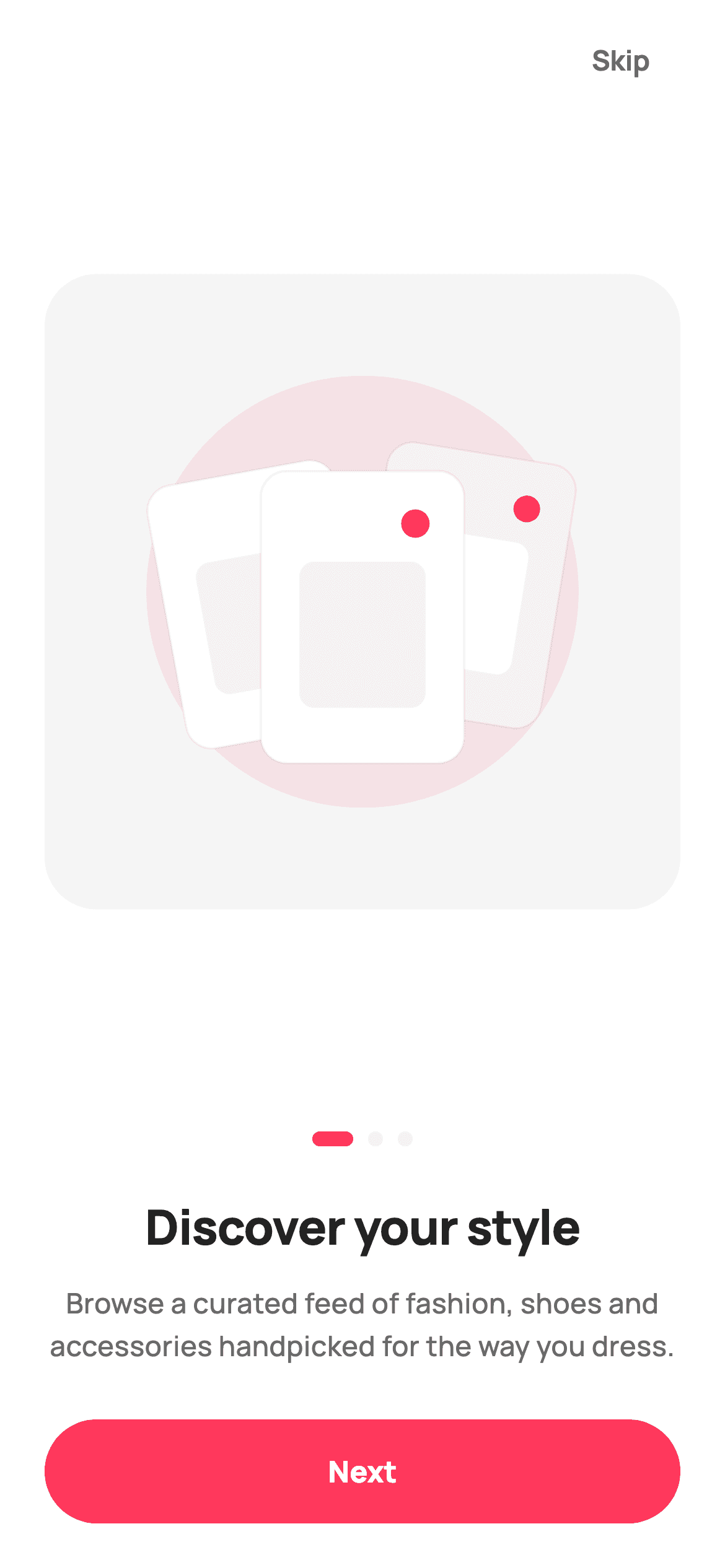
First-run screens sell the app before the app can. This tutorial builds page one of StyleCart's three-step onboarding in Flutter — a square hero panel holding a vector garment collage painted with CustomPainter, an animated page-dot indicator whose active dot stretches into a pill, a headline and supporting line, and a coral 'Next' button. There's no illustration file to ship and no carousel package to add: the whole hero is drawn with canvas primitives, so it stays crisp at every screen size.
Watch the Flutter UI walkthrough
A short screen recording of Discover Your Style running, if you'd rather see it before you read the code. The written tutorial below covers everything in it.
Can't see the video? Watch it on YouTube.
What you'll build
- ✓A square, self-sizing hero panel that keeps its proportions on both short and tall phones
- ✓A fashion collage of three tilted garment cards drawn entirely with canvas rotations — zero image assets
- ✓An animated dots indicator where the active step morphs from a circle into a 22px pill
- ✓A skip-and-continue layout with the callbacks left open so you can wire it to a PageView
Step-by-step build
Create the file
Add a new file at lib/ecom_onboarding_1/ecom_onboarding_1_screen.dart in your Flutter project.
Register the bundled fonts
No external packages — this is pure Flutter. It does bundle its design font (Manrope), so drop the font file into fonts/ and declare it in pubspec.yaml:
flutter:
  fonts:
    - family: Manrope
      fonts:
- asset: fonts/Manrope-Regular.ttfBuild it, piece by piece
Here's how the screen goes together. Each block below is a real slice of the code with a plain-English explanation — paste them in order, or grab the whole file from the next section.
The page widget and its palette
import 'package:flutter/material.dart';

/// StyleCart — Onboarding 1 of 3 · "Discover your style".
///
/// First page of the onboarding pager. Self-contained per CONVENTIONS.md: pure
/// Flutter, bundled Manrope font, inline Airbnb-style tokens, own light theme +
/// SafeArea. The hero illustration is a [CustomPainter] garment collage (no
/// image asset, no emoji glyph) so it renders crisply at any size and in the
/// golden-screenshot harness. Exposes callbacks only — the gallery wires nav.
class EcomOnboardingOneScreen extends StatelessWidget {
  const EcomOnboardingOneScreen({super.key, this.onContinue, this.onSkip});

  /// Advance to the next onboarding page.
  final VoidCallback? onContinue;

  /// Skip straight to Get Started.
  final VoidCallback? onSkip;

  static const String _font = 'Manrope';
  static const Color _canvas = Color(0xFFFFFFFF);
  static const Color _ink = Color(0xFF222222);
  static const Color _muted = Color(0xFF6A6A6A);
  static const Color _brand = Color(0xFFFF385C);
  static const Color _surface = Color(0xFFF2F2F2);
  static const Color _imageBg = Color(0xFFF5F5F5);
EcomOnboardingOneScreen is a StatelessWidget — this is one page of a pager, so the page index lives in the parent, not here. It takes just two callbacks: `onContinue` to advance and `onSkip` to jump past onboarding entirely, both nullable so the screen renders standalone with nothing wired. The six static const colours are the shared StyleCart tokens: `_brand` (#FF385C) for the CTA and accents, `_surface` (#F2F2F2) for the inactive dots and the collage's secondary fill, and `_imageBg` (#F5F5F5) as the hero panel's backdrop, one shade off the white canvas so the panel reads as a distinct surface.
The skip action and the self-sizing hero
  @override
  Widget build(BuildContext context) {
    return Theme(
      data: ThemeData.light(useMaterial3: true),
      child: Scaffold(
        backgroundColor: _canvas,
        body: SafeArea(
          child: Padding(
            padding: const EdgeInsets.fromLTRB(24, 8, 24, 24),
            child: Column(
              crossAxisAlignment: CrossAxisAlignment.stretch,
              children: <Widget>[
                Align(
                  alignment: Alignment.centerRight,
                  child: TextButton(
                    onPressed: onSkip,
                    style: TextButton.styleFrom(
                      foregroundColor: _muted,
                      textStyle: const TextStyle(
                        fontFamily: _font,
                        fontSize: 15,
                        fontWeight: FontWeight.w700,
                      ),
                    ),
                    child: const Text('Skip'),
                  ),
                ),
                Expanded(
                  child: Center(
                    child: AspectRatio(
                      aspectRatio: 1,
                      child: DecoratedBox(
                        decoration: BoxDecoration(
                          color: _imageBg,
                          borderRadius: BorderRadius.circular(28),
                        ),
                        child: const CustomPaint(
                          painter: _StyleCollagePainter(
                            brand: _brand,
                            surface: _surface,
                            canvas: _canvas,
                            ink: _ink,
                          ),
                        ),
                      ),
                    ),
                  ),
                ),
The screen wraps itself in `Theme(data: ThemeData.light(useMaterial3: true))` so it renders identically regardless of the host app's theme, then lays everything out in one Column with `CrossAxisAlignment.stretch` — which is why the button later gets full width without asking. The Skip button is pulled to the right by an `Align(alignment: Alignment.centerRight)`. Then comes the responsive trick: `Expanded` gives the hero all the height left over after the fixed text and button, and inside it `Center` + `AspectRatio(aspectRatio: 1)` forces a perfect square that shrinks to fit rather than overflowing. The square is a DecoratedBox with a 28px radius holding the CustomPaint collage, and because the painter is `const` with its colours passed in, Flutter can skip rebuilding it entirely.
Dots, headline, and the Next button
                const SizedBox(height: 28),
                const _Dots(index: 0, brand: _brand, faint: _surface),
                const SizedBox(height: 24),
                const Text(
                  'Discover your style',
                  textAlign: TextAlign.center,
                  style: TextStyle(
                    fontFamily: _font,
                    fontSize: 26,
                    fontWeight: FontWeight.w800,
                    letterSpacing: -0.5,
                    color: _ink,
                  ),
                ),
                const SizedBox(height: 12),
                const Text(
                  'Browse a curated feed of fashion, shoes and '
                  'accessories handpicked for the way you dress.',
                  textAlign: TextAlign.center,
                  style: TextStyle(
                    fontFamily: _font,
                    fontSize: 15,
                    height: 1.5,
                    fontWeight: FontWeight.w500,
                    color: _muted,
                  ),
                ),
                const SizedBox(height: 28),
                SizedBox(
                  height: 56,
                  child: FilledButton(
                    onPressed: onContinue,
                    style: FilledButton.styleFrom(
                      backgroundColor: _brand,
                      foregroundColor: _canvas,
                      shape: const StadiumBorder(),
                      textStyle: const TextStyle(
                        fontFamily: _font,
                        fontSize: 16,
                        fontWeight: FontWeight.w800,
                      ),
                    ),
                    child: const Text('Next'),
                  ),
                ),
              ],
            ),
          ),
        ),
      ),
    );
  }
}
Below the hero, the content is a fixed vertical rhythm: 28px, dots, 24px, headline, 12px, body, 28px, button. The headline is 26px w800 with `-0.5` letterSpacing — tightening the tracking on large bold text is what stops it looking loose. The body copy is written as two adjacent string literals that Dart concatenates at compile time, a neat way to keep a long sentence inside the line limit without a runtime `+`. It sets `height: 1.5` for comfortable multi-line reading. The CTA is a 56px-tall FilledButton in the brand coral with a `StadiumBorder()`, giving the fully-rounded pill; it inherits full width from the Column's stretch alignment.
The animated page-dot indicator
/// Painted onboarding page dots — active dot is an elongated brand pill.
class _Dots extends StatelessWidget {
  const _Dots({required this.index, required this.brand, required this.faint});

  final int index;
  final Color brand;
  final Color faint;

  @override
  Widget build(BuildContext context) {
    return Row(
      mainAxisAlignment: MainAxisAlignment.center,
      children: List<Widget>.generate(3, (int i) {
        final bool active = i == index;
        return AnimatedContainer(
          duration: const Duration(milliseconds: 200),
          margin: const EdgeInsets.symmetric(horizontal: 4),
          width: active ? 22 : 8,
          height: 8,
          decoration: BoxDecoration(
            color: active ? brand : faint,
            borderRadius: BorderRadius.circular(4),
          ),
        );
      }),
    );
  }
}
_Dots is a tiny reusable widget that takes the active `index` and two colours. `List<Widget>.generate(3, ...)` builds the three dots, and each one is an AnimatedContainer rather than a plain Container — that single choice is what makes the indicator animate. Because `width` is `active ? 22 : 8` while `height` stays 8, and `color` swaps between brand and faint, AnimatedContainer implicitly tweens both over 200ms when the index changes: the dot visibly grows into a pill instead of snapping. The 4px radius on an 8px-tall box gives fully rounded ends at either width.
Painting the garment collage
/// A tasteful fashion collage: three tilted "garment" cards with small
/// heart-tag accents over a soft backdrop. Pure vector — no glyphs, no assets.
class _StyleCollagePainter extends CustomPainter {
  const _StyleCollagePainter({
    required this.brand,
    required this.surface,
    required this.canvas,
    required this.ink,
  });

  final Color brand;
  final Color surface;
  final Color canvas;
  final Color ink;

  @override
  void paint(Canvas c, Size size) {
    final double w = size.width;
    final double h = size.height;
    final Offset center = Offset(w / 2, h / 2);

    // Soft brand halo behind the cards.
    c.drawCircle(
      center,
      w * 0.34,
      Paint()..color = brand.withValues(alpha: 0.10),
    );

    // Three tilted garment cards.
    _card(c, center + Offset(-w * 0.16, h * 0.02), w * 0.30, h * 0.42, -0.18,
        canvas, surface, brand);
    _card(c, center + Offset(w * 0.16, -h * 0.01), w * 0.30, h * 0.42, 0.16,
        surface, canvas, brand);
    _card(c, center + Offset(0, h * 0.04), w * 0.32, h * 0.46, 0.0, canvas,
        surface, brand);
  }
_StyleCollagePainter takes its four colours through the constructor instead of hard-coding them, which is what lets it be declared `const` at the call site. paint() first lays down a soft halo — a circle at 34% of the width filled with the brand at 10% opacity — then calls the private `_card()` helper three times. The offsets and sizes are all fractions of `w` and `h`, so the composition scales with the box: one card shifted left and rotated -0.18 radians, one shifted right rotated +0.16, and a slightly larger unrotated card in front. Note the middle call swaps the fill and stripe colours, so the three cards alternate light-on-grey and grey-on-light rather than looking identical.
Drawing and rotating a single card
  void _card(Canvas c, Offset at, double cw, double ch, double rot, Color fill,
      Color stripe, Color accent) {
    c.save();
    c.translate(at.dx, at.dy);
    c.rotate(rot);
    final RRect r = RRect.fromRectAndRadius(
      Rect.fromCenter(center: Offset.zero, width: cw, height: ch),
      const Radius.circular(14),
    );
    c.drawRRect(r, Paint()..color = fill);
    c.drawRRect(
      r,
      Paint()
        ..style = PaintingStyle.stroke
        ..strokeWidth = 1.2
        ..color = ink.withValues(alpha: 0.06),
    );
    // A stripe block (the "garment").
    c.drawRRect(
      RRect.fromRectAndRadius(
        Rect.fromCenter(
            center: Offset(0, ch * 0.06), width: cw * 0.62, height: ch * 0.5),
        const Radius.circular(8),
      ),
      Paint()..color = stripe,
    );
    // A small heart-tag accent dot.
    c.drawCircle(Offset(cw * 0.26, -ch * 0.32), cw * 0.07, Paint()..color = accent);
    c.restore();
  }

  @override
  bool shouldRepaint(_StyleCollagePainter oldDelegate) => false;
}
_card() shows the standard canvas transform pattern: `c.save()`, then `translate` to the card's centre and `rotate` by the given angle, draw everything around `Offset.zero`, then `c.restore()` to undo both. Working in local coordinates like this is far simpler than computing rotated corner positions by hand. Each card is an RRect with a 14px radius, filled and then stroked with `ink` at 6% opacity for a barely-there edge, with a smaller rounded rect inset as the 'garment' block and a small brand-coloured circle in the corner as the tag accent. Because the painter's output never varies, `shouldRepaint` returns false and Flutter reuses the raster.
Full code
The complete, ready-to-paste source. Free to use in your projects — one click copies it all.
import 'package:flutter/material.dart';

/// StyleCart — Onboarding 1 of 3 · "Discover your style".
///
/// First page of the onboarding pager. Self-contained per CONVENTIONS.md: pure
/// Flutter, bundled Manrope font, inline Airbnb-style tokens, own light theme +
/// SafeArea. The hero illustration is a [CustomPainter] garment collage (no
/// image asset, no emoji glyph) so it renders crisply at any size and in the
/// golden-screenshot harness. Exposes callbacks only — the gallery wires nav.
class EcomOnboardingOneScreen extends StatelessWidget {
  const EcomOnboardingOneScreen({super.key, this.onContinue, this.onSkip});

  /// Advance to the next onboarding page.
  final VoidCallback? onContinue;

  /// Skip straight to Get Started.
  final VoidCallback? onSkip;

  static const String _font = 'Manrope';
  static const Color _canvas = Color(0xFFFFFFFF);
  static const Color _ink = Color(0xFF222222);
  static const Color _muted = Color(0xFF6A6A6A);
  static const Color _brand = Color(0xFFFF385C);
  static const Color _surface = Color(0xFFF2F2F2);
  static const Color _imageBg = Color(0xFFF5F5F5);

  @override
  Widget build(BuildContext context) {
    return Theme(
      data: ThemeData.light(useMaterial3: true),
      child: Scaffold(
        backgroundColor: _canvas,
        body: SafeArea(
          child: Padding(
            padding: const EdgeInsets.fromLTRB(24, 8, 24, 24),
            child: Column(
              crossAxisAlignment: CrossAxisAlignment.stretch,
              children: <Widget>[
                Align(
                  alignment: Alignment.centerRight,
                  child: TextButton(
                    onPressed: onSkip,
                    style: TextButton.styleFrom(
                      foregroundColor: _muted,
                      textStyle: const TextStyle(
                        fontFamily: _font,
                        fontSize: 15,
                        fontWeight: FontWeight.w700,
                      ),
                    ),
                    child: const Text('Skip'),
                  ),
                ),
                Expanded(
                  child: Center(
                    child: AspectRatio(
                      aspectRatio: 1,
                      child: DecoratedBox(
                        decoration: BoxDecoration(
                          color: _imageBg,
                          borderRadius: BorderRadius.circular(28),
                        ),
                        child: const CustomPaint(
                          painter: _StyleCollagePainter(
                            brand: _brand,
                            surface: _surface,
                            canvas: _canvas,
                            ink: _ink,
                          ),
                        ),
                      ),
                    ),
                  ),
                ),
                const SizedBox(height: 28),
                const _Dots(index: 0, brand: _brand, faint: _surface),
                const SizedBox(height: 24),
                const Text(
                  'Discover your style',
                  textAlign: TextAlign.center,
                  style: TextStyle(
                    fontFamily: _font,
                    fontSize: 26,
                    fontWeight: FontWeight.w800,
                    letterSpacing: -0.5,
                    color: _ink,
                  ),
                ),
                const SizedBox(height: 12),
                const Text(
                  'Browse a curated feed of fashion, shoes and '
                  'accessories handpicked for the way you dress.',
                  textAlign: TextAlign.center,
                  style: TextStyle(
                    fontFamily: _font,
                    fontSize: 15,
                    height: 1.5,
                    fontWeight: FontWeight.w500,
                    color: _muted,
                  ),
                ),
                const SizedBox(height: 28),
                SizedBox(
                  height: 56,
                  child: FilledButton(
                    onPressed: onContinue,
                    style: FilledButton.styleFrom(
                      backgroundColor: _brand,
                      foregroundColor: _canvas,
                      shape: const StadiumBorder(),
                      textStyle: const TextStyle(
                        fontFamily: _font,
                        fontSize: 16,
                        fontWeight: FontWeight.w800,
                      ),
                    ),
                    child: const Text('Next'),
                  ),
                ),
              ],
            ),
          ),
        ),
      ),
    );
  }
}

/// Painted onboarding page dots — active dot is an elongated brand pill.
class _Dots extends StatelessWidget {
  const _Dots({required this.index, required this.brand, required this.faint});

  final int index;
  final Color brand;
  final Color faint;

  @override
  Widget build(BuildContext context) {
    return Row(
      mainAxisAlignment: MainAxisAlignment.center,
      children: List<Widget>.generate(3, (int i) {
        final bool active = i == index;
        return AnimatedContainer(
          duration: const Duration(milliseconds: 200),
          margin: const EdgeInsets.symmetric(horizontal: 4),
          width: active ? 22 : 8,
          height: 8,
          decoration: BoxDecoration(
            color: active ? brand : faint,
            borderRadius: BorderRadius.circular(4),
          ),
        );
      }),
    );
  }
}

/// A tasteful fashion collage: three tilted "garment" cards with small
/// heart-tag accents over a soft backdrop. Pure vector — no glyphs, no assets.
class _StyleCollagePainter extends CustomPainter {
  const _StyleCollagePainter({
    required this.brand,
    required this.surface,
    required this.canvas,
    required this.ink,
  });

  final Color brand;
  final Color surface;
  final Color canvas;
  final Color ink;

  @override
  void paint(Canvas c, Size size) {
    final double w = size.width;
    final double h = size.height;
    final Offset center = Offset(w / 2, h / 2);

    // Soft brand halo behind the cards.
    c.drawCircle(
      center,
      w * 0.34,
      Paint()..color = brand.withValues(alpha: 0.10),
    );

    // Three tilted garment cards.
    _card(c, center + Offset(-w * 0.16, h * 0.02), w * 0.30, h * 0.42, -0.18,
        canvas, surface, brand);
    _card(c, center + Offset(w * 0.16, -h * 0.01), w * 0.30, h * 0.42, 0.16,
        surface, canvas, brand);
    _card(c, center + Offset(0, h * 0.04), w * 0.32, h * 0.46, 0.0, canvas,
        surface, brand);
  }

  void _card(Canvas c, Offset at, double cw, double ch, double rot, Color fill,
      Color stripe, Color accent) {
    c.save();
    c.translate(at.dx, at.dy);
    c.rotate(rot);
    final RRect r = RRect.fromRectAndRadius(
      Rect.fromCenter(center: Offset.zero, width: cw, height: ch),
      const Radius.circular(14),
    );
    c.drawRRect(r, Paint()..color = fill);
    c.drawRRect(
      r,
      Paint()
        ..style = PaintingStyle.stroke
        ..strokeWidth = 1.2
        ..color = ink.withValues(alpha: 0.06),
    );
    // A stripe block (the "garment").
    c.drawRRect(
      RRect.fromRectAndRadius(
        Rect.fromCenter(
            center: Offset(0, ch * 0.06), width: cw * 0.62, height: ch * 0.5),
        const Radius.circular(8),
      ),
      Paint()..color = stripe,
    );
    // A small heart-tag accent dot.
    c.drawCircle(Offset(cw * 0.26, -ch * 0.32), cw * 0.07, Paint()..color = accent);
    c.restore();
  }

  @override
  bool shouldRepaint(_StyleCollagePainter oldDelegate) => false;
}
Plus bundled 5 binary assets (fonts/images). The CLI and MCP install those for you automatically.
Two faster ways to add it
Copy-paste works, but you can skip it entirely.
1. FlutterKit CLI
One command drops this screen — and its fonts — straight into your project.
$ flutterkit add ecom-onboarding-12. AI agent (MCP)
Connect FlutterKit's MCP server in Claude or Cursor and just ask your agent to install ecom-onboarding-1 — it fetches and writes the files for you.
FAQ
Is this Flutter onboarding screen free to use?
Yes. The complete Dart source on this page is free to use in personal or commercial projects. Copy it straight from the page, install it with the FlutterKit CLI (flutterkit add ecom-onboarding-1), or have an AI agent add it for you over MCP.
How do I turn this into a full three-page onboarding flow?
Put this screen and its two siblings inside a PageView, and let the pager own the current index. Wire `onContinue` to `controller.nextPage(...)` and `onSkip` to your post-onboarding route. The `_Dots` widget already takes an `index` argument, so pass the pager's page to it on each page and the pill will animate across as the user swipes.
Does it need any external packages or an illustration file?
No to both. It's pure Flutter on the material library, and the hero art is drawn at runtime by _StyleCollagePainter rather than loaded from a PNG or SVG — so there's no image to export and nothing to re-render for different pixel densities. The only bundled asset is the Manrope font, registered in pubspec.yaml as shown in step 2.
Which Flutter version does it target?
It uses Color.withValues() and super parameters, so Flutter 3.22+ (Dart 3). On an older SDK, change the two withValues(alpha: ...) calls inside the painter to withOpacity(...) and it compiles unchanged.


