How to Build a Plus Checkout Screen in Flutter (Full Code + Preview)
Subscription checkouts fail when the shopper can't see what they'll actually pay and when. This tutorial walks through StyleCart's Plus membership confirmation screen in Flutter: a dark gradient plan card with a 7-day trial badge, a saved-card picker with painter-drawn Visa and Mastercard marks, an auto-renew switch, and an order summary where a trial credit brings 'Due today' to $0.00 while spelling out the July charge. A terms checkbox gates the confirm bar, so nobody starts a trial without agreeing to recurring billing. You leave with one self-contained file, callbacks only.
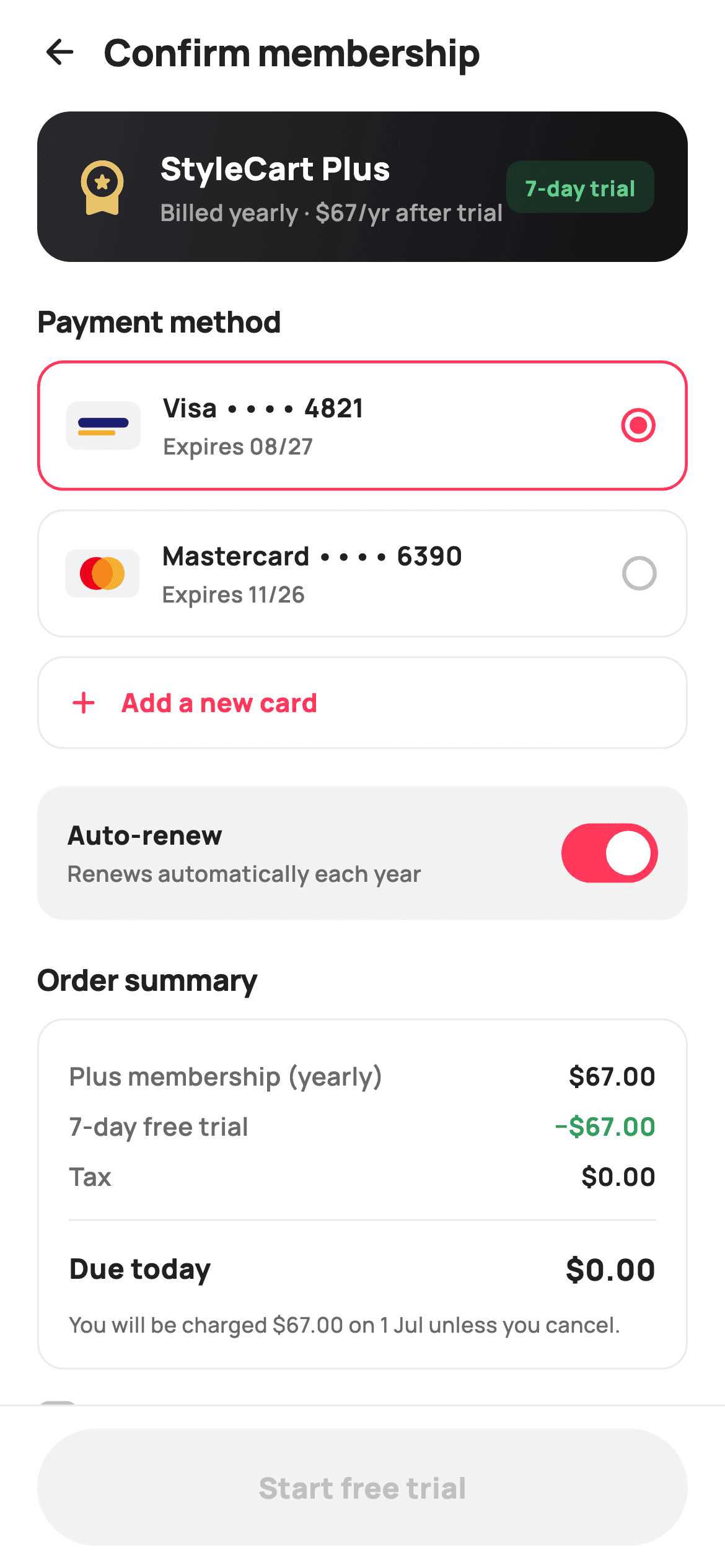
What you'll build
- ✓A dark gradient plan card (#2A2A2E to #111114) with a gold premium icon and a green 7-day trial pill
- ✓Saved-card radio rows with Visa and Mastercard brand marks painted on canvas, no image assets
- ✓A trial-aware order summary where a −$67.00 credit lands 'Due today' at $0.00, followed by a next-charge disclosure
- ✓A custom terms checkbox whose whole row is tappable via HitTestBehavior.opaque
- ✓A pinned confirm bar that stays grey and inert until the checkbox is ticked
Step-by-step build
Create the file
Add a new file at lib/ecom_membership_checkout/ecom_membership_checkout_screen.dart in your Flutter project.
Register the bundled fonts
No external packages — this is pure Flutter. It does bundle its design font (Manrope), so drop the font file into fonts/ and declare it in pubspec.yaml:
flutter:
  fonts:
    - family: Manrope
      fonts:
- asset: fonts/Manrope-Regular.ttfBuild it, piece by piece
Here's how the screen goes together. Each block below is a real slice of the code with a plain-English explanation — paste them in order, or grab the whole file from the next section.
Three booleans-worth of state and a palette with jobs
import 'package:flutter/material.dart';

/// StyleCart — Plus checkout.
///
/// Confirms a membership subscription: a selected-plan summary card with a
/// billing-cadence line and trial note, a payment-method selector (saved cards
/// + add new, painted card brand marks), an auto-renew toggle, an order
/// breakdown (plan / trial credit / tax / total), a terms checkbox, and a
/// pinned confirm-subscription bar.
///
/// Self-contained per CONVENTIONS.md: pure Flutter, bundled Manrope, inline
/// Airbnb-style tokens, own light theme + SafeArea. Painter-only graphics
/// (card brand marks). Exposes callbacks only.
class EcomMembershipCheckoutScreen extends StatefulWidget {
  const EcomMembershipCheckoutScreen({super.key, this.onBack, this.onConfirm});

  final VoidCallback? onBack;
  final VoidCallback? onConfirm;

  @override
  State<EcomMembershipCheckoutScreen> createState() =>
      _EcomMembershipCheckoutScreenState();
}

class _EcomMembershipCheckoutScreenState
    extends State<EcomMembershipCheckoutScreen> {
  static const String _font = 'Manrope';
  static const Color _canvas = Color(0xFFFFFFFF);
  static const Color _ink = Color(0xFF222222);
  static const Color _muted = Color(0xFF6A6A6A);
  static const Color _faint = Color(0xFFC1C1C1);
  static const Color _brand = Color(0xFFFF385C);
  static const Color _surface = Color(0xFFF2F2F2);
  static const Color _hairline = Color(0xFFEBEBEB);
  static const Color _success = Color(0xFF2E9E5B);

  static const List<_Card> _cards = <_Card>[
    _Card('visa', 'Visa', '4821', '08/27'),
    _Card('mc', 'Mastercard', '6390', '11/26'),
  ];

  int _card = 0;
  bool _autoRenew = true;
  bool _agree = false;
Everything mutable on this screen fits in three fields: `_card` (the selected saved-card index, starting at 0), `_autoRenew` (defaulting to `true`, the sensible default for a subscription), and `_agree` (defaulting to `false`, because consent must be given, never assumed). The two saved cards are a `static const List<_Card>` of brand/name/last4/expiry records — swap in your own wallet data without touching a single widget. The palette assigns each colour one job: `_brand` coral `#FF385C` marks anything selectable or tappable, `_success` green `#2E9E5B` is reserved for money in the shopper's favour, and three greys (`_ink` #222222, `_muted` #6A6A6A, `_faint` #C1C1C1) form the text hierarchy.
A scroll region between a fixed header and a pinned bar
  @override
  Widget build(BuildContext context) {
    return Theme(
      data: ThemeData.light(useMaterial3: true),
      child: Scaffold(
        backgroundColor: _canvas,
        body: SafeArea(
          child: Column(
            children: <Widget>[
              _header(),
              Expanded(
                child: ListView(
                  padding: const EdgeInsets.fromLTRB(20, 4, 20, 20),
                  children: <Widget>[
                    _planSummary(),
                    const SizedBox(height: 20),
                    _sectionTitle('Payment method'),
                    const SizedBox(height: 10),
                    for (int i = 0; i < _cards.length; i++) _cardRow(i),
                    _addCardRow(),
                    const SizedBox(height: 20),
                    _autoRenewRow(),
                    const SizedBox(height: 20),
                    _sectionTitle('Order summary'),
                    const SizedBox(height: 10),
                    _summaryCard(),
                    const SizedBox(height: 16),
                    _agreeRow(),
                  ],
                ),
              ),
              _bottomBar(),
            ],
          ),
        ),
      ),
    );
  }
The build wraps everything in `Theme(data: ThemeData.light(useMaterial3: true))` so the screen carries its own light theme wherever you drop it. Inside `SafeArea`, a `Column` puts `_header()` and `_bottomBar()` outside the scroll and gives the middle to an `Expanded` `ListView` — the confirm button must never scroll out of reach on a screen whose whole purpose is confirming. Card rows are emitted with a collection-for over `_cards`, so a third card is one list entry away. Notice the section order: plan first, payment second, auto-renew, then totals, then consent — it mirrors the order in which a shopper actually decides.
The dark plan card that anchors a white page
  Widget _header() {
    return Padding(
      padding: const EdgeInsets.fromLTRB(8, 4, 20, 4),
      child: Row(
        children: <Widget>[
          IconButton(
            onPressed: widget.onBack,
            icon: const Icon(Icons.arrow_back_rounded, size: 22, color: _ink),
          ),
          const Text(
            'Confirm membership',
            style: TextStyle(
              fontFamily: _font,
              fontSize: 20,
              fontWeight: FontWeight.w800,
              letterSpacing: -0.3,
              color: _ink,
            ),
          ),
        ],
      ),
    );
  }

  Widget _planSummary() {
    return Container(
      padding: const EdgeInsets.all(18),
      decoration: BoxDecoration(
        borderRadius: BorderRadius.circular(18),
        gradient: const LinearGradient(
          begin: Alignment.topLeft,
          end: Alignment.bottomRight,
          colors: <Color>[Color(0xFF2A2A2E), Color(0xFF111114)],
        ),
      ),
      child: Row(
        children: <Widget>[
          const Icon(Icons.workspace_premium_rounded,
              size: 34, color: Color(0xFFE9C46A)),
          const SizedBox(width: 14),
          Expanded(
            child: Column(
              crossAxisAlignment: CrossAxisAlignment.start,
              children: const <Widget>[
                Text(
                  'StyleCart Plus',
                  style: TextStyle(
                    fontFamily: _font,
                    fontSize: 17,
                    fontWeight: FontWeight.w800,
                    color: Colors.white,
                  ),
                ),
                SizedBox(height: 3),
                Text(
                  'Billed yearly · \$67/yr after trial',
                  style: TextStyle(
                    fontFamily: _font,
                    fontSize: 12.5,
                    fontWeight: FontWeight.w600,
                    color: Colors.white60,
                  ),
                ),
              ],
            ),
          ),
          Container(
            padding: const EdgeInsets.symmetric(horizontal: 10, vertical: 6),
            decoration: BoxDecoration(
              color: _success.withValues(alpha: 0.20),
              borderRadius: BorderRadius.circular(8),
            ),
            child: const Text(
              '7-day trial',
              style: TextStyle(
                fontFamily: _font,
                fontSize: 11.5,
                fontWeight: FontWeight.w800,
                color: Color(0xFF5FD08A),
              ),
            ),
          ),
        ],
      ),
    );
  }
The header is just a back arrow and 'Confirm membership' at 20px `w800` with `letterSpacing: -0.3` — no actions, no clutter. Below it, `_planSummary()` is the one dark element on an otherwise white canvas: an 18px-radius container with a diagonal gradient from `#2A2A2E` to `#111114`, which makes the thing being bought impossible to miss. A gold `Icons.workspace_premium_rounded` at 34px (`#E9C46A`) says 'premium' without an asset, the plan name sits at 17px white, and the cadence line 'Billed yearly · $67/yr after trial' runs in `Colors.white60` so price context is present but subordinate. The trial pill is the subtle bit: its background is `_success.withValues(alpha: 0.20)` but its text is a lighter `#5FD08A` — on a near-black card the light theme's green would sink, so the chip gets its own brightened shade.
Card rows that select, and an add-row that acts
  Widget _cardRow(int i) {
    final _Card c = _cards[i];
    final bool selected = _card == i;
    return GestureDetector(
      onTap: () => setState(() => _card = i),
      child: Container(
        margin: const EdgeInsets.only(bottom: 10),
        padding: const EdgeInsets.all(14),
        decoration: BoxDecoration(
          color: _canvas,
          borderRadius: BorderRadius.circular(14),
          border: Border.all(
            color: selected ? _brand : _hairline,
            width: selected ? 1.6 : 1,
          ),
        ),
        child: Row(
          children: <Widget>[
            CustomPaint(
              size: const Size(40, 26),
              painter: _CardMarkPainter(c.brand),
            ),
            const SizedBox(width: 12),
            Expanded(
              child: Column(
                crossAxisAlignment: CrossAxisAlignment.start,
                children: <Widget>[
                  Text(
                    '${c.name} •••• ${c.last4}',
                    style: const TextStyle(
                      fontFamily: _font,
                      fontSize: 14,
                      fontWeight: FontWeight.w700,
                      color: _ink,
                    ),
                  ),
                  const SizedBox(height: 2),
                  Text(
                    'Expires ${c.exp}',
                    style: const TextStyle(
                      fontFamily: _font,
                      fontSize: 12,
                      fontWeight: FontWeight.w600,
                      color: _muted,
                    ),
                  ),
                ],
              ),
            ),
            Icon(
              selected
                  ? Icons.radio_button_checked_rounded
                  : Icons.radio_button_unchecked_rounded,
              size: 22,
              color: selected ? _brand : _faint,
            ),
          ],
        ),
      ),
    );
  }

  Widget _addCardRow() {
    return GestureDetector(
      onTap: () {},
      child: Container(
        padding: const EdgeInsets.all(14),
        decoration: BoxDecoration(
          borderRadius: BorderRadius.circular(14),
          border: Border.all(color: _hairline),
        ),
        child: Row(
          children: const <Widget>[
            Icon(Icons.add_rounded, size: 20, color: _brand),
            SizedBox(width: 10),
            Text(
              'Add a new card',
              style: TextStyle(
                fontFamily: _font,
                fontSize: 14,
                fontWeight: FontWeight.w800,
                color: _brand,
              ),
            ),
          ],
        ),
      ),
    );
  }
`_cardRow(i)` computes `selected = _card == i` and lets that one boolean drive three signals at once: the border flips from `_hairline` at 1px to `_brand` at 1.6px, the trailing icon swaps `radio_button_unchecked_rounded` for `radio_button_checked_rounded`, and both take the coral colour. Changing border width as well as colour means selection still reads if the coral is hard to distinguish. Each row leads with a `CustomPaint` sized 40×26 running `_CardMarkPainter`, then 'Visa •••• 4821' at 14px `w700` over 'Expires 08/27' in muted 12px. `_addCardRow()` reuses the same 14px padding and 14px radius so it aligns with the rows above, but keeps only the hairline border and renders a coral plus icon with coral `w800` text — visually a row, semantically a button.
Auto-renew styled as a setting, not a choice
  Widget _autoRenewRow() {
    return Container(
      padding: const EdgeInsets.fromLTRB(16, 12, 12, 12),
      decoration: BoxDecoration(
        color: _surface,
        borderRadius: BorderRadius.circular(14),
      ),
      child: Row(
        children: <Widget>[
          const Expanded(
            child: Column(
              crossAxisAlignment: CrossAxisAlignment.start,
              children: <Widget>[
                Text(
                  'Auto-renew',
                  style: TextStyle(
                    fontFamily: _font,
                    fontSize: 14,
                    fontWeight: FontWeight.w800,
                    color: _ink,
                  ),
                ),
                SizedBox(height: 2),
                Text(
                  'Renews automatically each year',
                  style: TextStyle(
                    fontFamily: _font,
                    fontSize: 12,
                    fontWeight: FontWeight.w600,
                    color: _muted,
                  ),
                ),
              ],
            ),
          ),
          Switch(
            value: _autoRenew,
            activeThumbColor: Colors.white,
            activeTrackColor: _brand,
            onChanged: (bool v) => setState(() => _autoRenew = v),
          ),
        ],
      ),
    );
  }
The auto-renew row deliberately looks different from the card rows: a filled `_surface` grey (#F2F2F2) container with no border, versus white cards with borders. That contrast tells the eye this is a preference, not another option competing with the payment methods. The stock `Switch` gets `activeTrackColor: _brand` and a white `activeThumbColor` so the on-state matches the screen's selection colour, and `onChanged` is a one-line `setState`. The label follows the same two-line pattern used elsewhere — 'Auto-renew' at 14px `w800` ink over 'Renews automatically each year' at 12px muted — so a shopper who reads only bold text still gets the gist.
Summary math the shopper can audit
  Widget _summaryCard() {
    return Container(
      padding: const EdgeInsets.all(16),
      decoration: BoxDecoration(
        color: _canvas,
        borderRadius: BorderRadius.circular(14),
        border: Border.all(color: _hairline),
      ),
      child: Column(
        children: <Widget>[
          _summaryLine('Plus membership (yearly)', '\$67.00', false),
          _summaryLine('7-day free trial', '−\$67.00', false,
              valueColor: _success),
          _summaryLine('Tax', '\$0.00', false),
          const Padding(
            padding: EdgeInsets.symmetric(vertical: 10),
            child: Divider(height: 1, color: _hairline),
          ),
          _summaryLine('Due today', '\$0.00', true),
          const SizedBox(height: 6),
          const Align(
            alignment: Alignment.centerLeft,
            child: Text(
              'You will be charged \$67.00 on 1 Jul unless you cancel.',
              style: TextStyle(
                fontFamily: _font,
                fontSize: 11.5,
                fontWeight: FontWeight.w500,
                color: _muted,
              ),
            ),
          ),
        ],
      ),
    );
  }

  Widget _summaryLine(String label, String value, bool bold,
      {Color? valueColor}) {
    return Padding(
      padding: const EdgeInsets.symmetric(vertical: 4),
      child: Row(
        children: <Widget>[
          Text(
            label,
            style: TextStyle(
              fontFamily: _font,
              fontSize: bold ? 15 : 13.5,
              fontWeight: bold ? FontWeight.w800 : FontWeight.w600,
              color: bold ? _ink : _muted,
            ),
          ),
          const Spacer(),
          Text(
            value,
            style: TextStyle(
              fontFamily: _font,
              fontSize: bold ? 16 : 13.5,
              fontWeight: bold ? FontWeight.w800 : FontWeight.w700,
              color: valueColor ?? _ink,
            ),
          ),
        ],
      ),
    );
  }
`_summaryCard()` refuses to just print $0.00. It shows the working: 'Plus membership (yearly)' at $67.00, then '7-day free trial' at '−$67.00' passed with `valueColor: _success` so the credit is visibly in the shopper's favour, then tax, a hairline `Divider` inside 10px of vertical padding, and finally 'Due today — $0.00' with `bold: true`. The `_summaryLine` helper makes that last line louder by scaling the flag into everything: 15/16px `w800` ink instead of 13.5px muted, with a `Spacer` pushing label and value to opposite edges. The closing 11.5px note — 'You will be charged $67.00 on 1 Jul unless you cancel.' — is the line that pre-empts a chargeback: date, amount, and the exit, in one sentence.
A checkbox that gates the confirm bar
  Widget _agreeRow() {
    return GestureDetector(
      onTap: () => setState(() => _agree = !_agree),
      behavior: HitTestBehavior.opaque,
      child: Row(
        crossAxisAlignment: CrossAxisAlignment.start,
        children: <Widget>[
          Container(
            width: 22,
            height: 22,
            margin: const EdgeInsets.only(top: 1),
            decoration: BoxDecoration(
              borderRadius: BorderRadius.circular(6),
              border: Border.all(color: _agree ? _brand : _faint, width: 2),
              color: _agree ? _brand : Colors.transparent,
            ),
            child: _agree
                ? const Icon(Icons.check_rounded, size: 15, color: Colors.white)
                : null,
          ),
          const SizedBox(width: 10),
          const Expanded(
            child: Text(
              'I agree to the membership terms and the recurring billing '
              'authorisation.',
              style: TextStyle(
                fontFamily: _font,
                fontSize: 12.5,
                fontWeight: FontWeight.w600,
                height: 1.4,
                color: _muted,
              ),
            ),
          ),
        ],
      ),
    );
  }

  Widget _bottomBar() {
    final bool enabled = _agree;
    return Container(
      height: 88,
      decoration: const BoxDecoration(
        color: _canvas,
        border: Border(top: BorderSide(color: _hairline)),
      ),
      padding: const EdgeInsets.fromLTRB(20, 12, 20, 12),
      child: GestureDetector(
        onTap: enabled ? widget.onConfirm : null,
        child: Container(
          height: 56,
          alignment: Alignment.center,
          decoration: BoxDecoration(
            color: enabled ? _brand : _surface,
            borderRadius: BorderRadius.circular(9999),
          ),
          child: Text(
            'Start free trial',
            style: TextStyle(
              fontFamily: _font,
              fontSize: 15.5,
              fontWeight: FontWeight.w800,
              color: enabled ? Colors.white : _faint,
            ),
          ),
        ),
      ),
    );
  }
}
`_agreeRow()` builds its own checkbox: a 22×22 container with a 6px radius and 2px border that fills `_brand` and shows a white 15px `check_rounded` when `_agree` is true. Wrapping the whole row in a `GestureDetector` with `HitTestBehavior.opaque` makes the terms sentence itself a tap target — nobody should have to hit a 22px square with a thumb. `_bottomBar()` then derives `final bool enabled = _agree` and lets it drive everything: `onTap` becomes `null` when unticked, the 56px-tall pill (`BorderRadius.circular(9999)`) drops from coral to `_surface`, and 'Start free trial' fades to `_faint` — unmistakably inert, not merely quiet. The bar itself is a fixed 88px with a top `_hairline` border, sitting outside the ListView so it never scrolls away.
Painting Visa and Mastercard without a logo file
class _Card {
  const _Card(this.brand, this.name, this.last4, this.exp);
  final String brand;
  final String name;
  final String last4;
  final String exp;
}

/// A painted card-brand mark: Visa wordmark plate, or Mastercard's two
/// overlapping discs. Kept generic and font-free.
class _CardMarkPainter extends CustomPainter {
  _CardMarkPainter(this.brand);
  final String brand;

  @override
  void paint(Canvas canvas, Size size) {
    final RRect plate = RRect.fromRectAndRadius(
      Offset.zero & size,
      const Radius.circular(6),
    );
    canvas.drawRRect(plate, Paint()..color = const Color(0xFFF2F2F2));

    if (brand == 'mc') {
      final double r = size.height * 0.34;
      final double cy = size.height / 2;
      canvas.drawCircle(Offset(size.width * 0.42, cy), r,
          Paint()..color = const Color(0xFFEB001B));
      canvas.drawCircle(
        Offset(size.width * 0.58, cy),
        r,
        Paint()..color = const Color(0xFFF79E1B).withValues(alpha: 0.85),
      );
    } else {
      // Visa: a blue bar with a gold underline accent.
      canvas.drawRRect(
        RRect.fromRectAndRadius(
          Rect.fromLTWH(size.width * 0.16, size.height * 0.34,
              size.width * 0.68, size.height * 0.20),
          const Radius.circular(3),
        ),
        Paint()..color = const Color(0xFF1A1F71),
      );
      canvas.drawRRect(
        RRect.fromRectAndRadius(
          Rect.fromLTWH(size.width * 0.16, size.height * 0.60,
              size.width * 0.50, size.height * 0.10),
          const Radius.circular(3),
        ),
        Paint()..color = const Color(0xFFF7B600),
      );
    }
  }

  @override
  bool shouldRepaint(_CardMarkPainter old) => old.brand != brand;
}
`_Card` is a four-string const value class — brand key, display name, last4, expiry. `_CardMarkPainter` first lays a `#F2F2F2` plate with a 6px corner radius, then branches on the brand string. For 'mc' it draws two overlapping discs at 42% and 58% of the width, radius `height * 0.34`: solid red `#EB001B`, then orange `#F79E1B` at `withValues(alpha: 0.85)` so the overlap zone darkens the way the real interlocking mark does. Anything else gets the Visa treatment: a navy `#1A1F71` bar spanning 68% of the width with a shorter gold `#F7B600` underline — evocative shapes rather than trademark reproductions, which is exactly what a template should ship. All coordinates are size fractions, and `shouldRepaint` compares `brand` so rebuilds are free unless the card actually changes.
Full code
The complete, ready-to-paste source. Free to use in your projects — one click copies it all.
import 'package:flutter/material.dart';

/// StyleCart — Plus checkout.
///
/// Confirms a membership subscription: a selected-plan summary card with a
/// billing-cadence line and trial note, a payment-method selector (saved cards
/// + add new, painted card brand marks), an auto-renew toggle, an order
/// breakdown (plan / trial credit / tax / total), a terms checkbox, and a
/// pinned confirm-subscription bar.
///
/// Self-contained per CONVENTIONS.md: pure Flutter, bundled Manrope, inline
/// Airbnb-style tokens, own light theme + SafeArea. Painter-only graphics
/// (card brand marks). Exposes callbacks only.
class EcomMembershipCheckoutScreen extends StatefulWidget {
  const EcomMembershipCheckoutScreen({super.key, this.onBack, this.onConfirm});

  final VoidCallback? onBack;
  final VoidCallback? onConfirm;

  @override
  State<EcomMembershipCheckoutScreen> createState() =>
      _EcomMembershipCheckoutScreenState();
}

class _EcomMembershipCheckoutScreenState
    extends State<EcomMembershipCheckoutScreen> {
  static const String _font = 'Manrope';
  static const Color _canvas = Color(0xFFFFFFFF);
  static const Color _ink = Color(0xFF222222);
  static const Color _muted = Color(0xFF6A6A6A);
  static const Color _faint = Color(0xFFC1C1C1);
  static const Color _brand = Color(0xFFFF385C);
  static const Color _surface = Color(0xFFF2F2F2);
  static const Color _hairline = Color(0xFFEBEBEB);
  static const Color _success = Color(0xFF2E9E5B);

  static const List<_Card> _cards = <_Card>[
    _Card('visa', 'Visa', '4821', '08/27'),
    _Card('mc', 'Mastercard', '6390', '11/26'),
  ];

  int _card = 0;
  bool _autoRenew = true;
  bool _agree = false;

  @override
  Widget build(BuildContext context) {
    return Theme(
      data: ThemeData.light(useMaterial3: true),
      child: Scaffold(
        backgroundColor: _canvas,
        body: SafeArea(
          child: Column(
            children: <Widget>[
              _header(),
              Expanded(
                child: ListView(
                  padding: const EdgeInsets.fromLTRB(20, 4, 20, 20),
                  children: <Widget>[
                    _planSummary(),
                    const SizedBox(height: 20),
                    _sectionTitle('Payment method'),
                    const SizedBox(height: 10),
                    for (int i = 0; i < _cards.length; i++) _cardRow(i),
                    _addCardRow(),
                    const SizedBox(height: 20),
                    _autoRenewRow(),
                    const SizedBox(height: 20),
                    _sectionTitle('Order summary'),
                    const SizedBox(height: 10),
                    _summaryCard(),
                    const SizedBox(height: 16),
                    _agreeRow(),
                  ],
                ),
              ),
              _bottomBar(),
            ],
          ),
        ),
      ),
    );
  }

  Widget _header() {
    return Padding(
      padding: const EdgeInsets.fromLTRB(8, 4, 20, 4),
      child: Row(
        children: <Widget>[
          IconButton(
            onPressed: widget.onBack,
            icon: const Icon(Icons.arrow_back_rounded, size: 22, color: _ink),
          ),
          const Text(
            'Confirm membership',
            style: TextStyle(
              fontFamily: _font,
              fontSize: 20,
              fontWeight: FontWeight.w800,
              letterSpacing: -0.3,
              color: _ink,
            ),
          ),
        ],
      ),
    );
  }

  Widget _planSummary() {
    return Container(
      padding: const EdgeInsets.all(18),
      decoration: BoxDecoration(
        borderRadius: BorderRadius.circular(18),
        gradient: const LinearGradient(
          begin: Alignment.topLeft,
          end: Alignment.bottomRight,
          colors: <Color>[Color(0xFF2A2A2E), Color(0xFF111114)],
        ),
      ),
      child: Row(
        children: <Widget>[
          const Icon(Icons.workspace_premium_rounded,
              size: 34, color: Color(0xFFE9C46A)),
          const SizedBox(width: 14),
          Expanded(
            child: Column(
              crossAxisAlignment: CrossAxisAlignment.start,
              children: const <Widget>[
                Text(
                  'StyleCart Plus',
                  style: TextStyle(
                    fontFamily: _font,
                    fontSize: 17,
                    fontWeight: FontWeight.w800,
                    color: Colors.white,
                  ),
                ),
                SizedBox(height: 3),
                Text(
                  'Billed yearly · \$67/yr after trial',
                  style: TextStyle(
                    fontFamily: _font,
                    fontSize: 12.5,
                    fontWeight: FontWeight.w600,
                    color: Colors.white60,
                  ),
                ),
              ],
            ),
          ),
          Container(
            padding: const EdgeInsets.symmetric(horizontal: 10, vertical: 6),
            decoration: BoxDecoration(
              color: _success.withValues(alpha: 0.20),
              borderRadius: BorderRadius.circular(8),
            ),
            child: const Text(
              '7-day trial',
              style: TextStyle(
                fontFamily: _font,
                fontSize: 11.5,
                fontWeight: FontWeight.w800,
                color: Color(0xFF5FD08A),
              ),
            ),
          ),
        ],
      ),
    );
  }

  Widget _sectionTitle(String t) {
    return Text(
      t,
      style: const TextStyle(
        fontFamily: _font,
        fontSize: 16,
        fontWeight: FontWeight.w800,
        letterSpacing: -0.2,
        color: _ink,
      ),
    );
  }

  Widget _cardRow(int i) {
    final _Card c = _cards[i];
    final bool selected = _card == i;
    return GestureDetector(
      onTap: () => setState(() => _card = i),
      child: Container(
        margin: const EdgeInsets.only(bottom: 10),
        padding: const EdgeInsets.all(14),
        decoration: BoxDecoration(
          color: _canvas,
          borderRadius: BorderRadius.circular(14),
          border: Border.all(
            color: selected ? _brand : _hairline,
            width: selected ? 1.6 : 1,
          ),
        ),
        child: Row(
          children: <Widget>[
            CustomPaint(
              size: const Size(40, 26),
              painter: _CardMarkPainter(c.brand),
            ),
            const SizedBox(width: 12),
            Expanded(
              child: Column(
                crossAxisAlignment: CrossAxisAlignment.start,
                children: <Widget>[
                  Text(
                    '${c.name} •••• ${c.last4}',
                    style: const TextStyle(
                      fontFamily: _font,
                      fontSize: 14,
                      fontWeight: FontWeight.w700,
                      color: _ink,
                    ),
                  ),
                  const SizedBox(height: 2),
                  Text(
                    'Expires ${c.exp}',
                    style: const TextStyle(
                      fontFamily: _font,
                      fontSize: 12,
                      fontWeight: FontWeight.w600,
                      color: _muted,
                    ),
                  ),
                ],
              ),
            ),
            Icon(
              selected
                  ? Icons.radio_button_checked_rounded
                  : Icons.radio_button_unchecked_rounded,
              size: 22,
              color: selected ? _brand : _faint,
            ),
          ],
        ),
      ),
    );
  }

  Widget _addCardRow() {
    return GestureDetector(
      onTap: () {},
      child: Container(
        padding: const EdgeInsets.all(14),
        decoration: BoxDecoration(
          borderRadius: BorderRadius.circular(14),
          border: Border.all(color: _hairline),
        ),
        child: Row(
          children: const <Widget>[
            Icon(Icons.add_rounded, size: 20, color: _brand),
            SizedBox(width: 10),
            Text(
              'Add a new card',
              style: TextStyle(
                fontFamily: _font,
                fontSize: 14,
                fontWeight: FontWeight.w800,
                color: _brand,
              ),
            ),
          ],
        ),
      ),
    );
  }

  Widget _autoRenewRow() {
    return Container(
      padding: const EdgeInsets.fromLTRB(16, 12, 12, 12),
      decoration: BoxDecoration(
        color: _surface,
        borderRadius: BorderRadius.circular(14),
      ),
      child: Row(
        children: <Widget>[
          const Expanded(
            child: Column(
              crossAxisAlignment: CrossAxisAlignment.start,
              children: <Widget>[
                Text(
                  'Auto-renew',
                  style: TextStyle(
                    fontFamily: _font,
                    fontSize: 14,
                    fontWeight: FontWeight.w800,
                    color: _ink,
                  ),
                ),
                SizedBox(height: 2),
                Text(
                  'Renews automatically each year',
                  style: TextStyle(
                    fontFamily: _font,
                    fontSize: 12,
                    fontWeight: FontWeight.w600,
                    color: _muted,
                  ),
                ),
              ],
            ),
          ),
          Switch(
            value: _autoRenew,
            activeThumbColor: Colors.white,
            activeTrackColor: _brand,
            onChanged: (bool v) => setState(() => _autoRenew = v),
          ),
        ],
      ),
    );
  }

  Widget _summaryCard() {
    return Container(
      padding: const EdgeInsets.all(16),
      decoration: BoxDecoration(
        color: _canvas,
        borderRadius: BorderRadius.circular(14),
        border: Border.all(color: _hairline),
      ),
      child: Column(
        children: <Widget>[
          _summaryLine('Plus membership (yearly)', '\$67.00', false),
          _summaryLine('7-day free trial', '−\$67.00', false,
              valueColor: _success),
          _summaryLine('Tax', '\$0.00', false),
          const Padding(
            padding: EdgeInsets.symmetric(vertical: 10),
            child: Divider(height: 1, color: _hairline),
          ),
          _summaryLine('Due today', '\$0.00', true),
          const SizedBox(height: 6),
          const Align(
            alignment: Alignment.centerLeft,
            child: Text(
              'You will be charged \$67.00 on 1 Jul unless you cancel.',
              style: TextStyle(
                fontFamily: _font,
                fontSize: 11.5,
                fontWeight: FontWeight.w500,
                color: _muted,
              ),
            ),
          ),
        ],
      ),
    );
  }

  Widget _summaryLine(String label, String value, bool bold,
      {Color? valueColor}) {
    return Padding(
      padding: const EdgeInsets.symmetric(vertical: 4),
      child: Row(
        children: <Widget>[
          Text(
            label,
            style: TextStyle(
              fontFamily: _font,
              fontSize: bold ? 15 : 13.5,
              fontWeight: bold ? FontWeight.w800 : FontWeight.w600,
              color: bold ? _ink : _muted,
            ),
          ),
          const Spacer(),
          Text(
            value,
            style: TextStyle(
              fontFamily: _font,
              fontSize: bold ? 16 : 13.5,
              fontWeight: bold ? FontWeight.w800 : FontWeight.w700,
              color: valueColor ?? _ink,
            ),
          ),
        ],
      ),
    );
  }

  Widget _agreeRow() {
    return GestureDetector(
      onTap: () => setState(() => _agree = !_agree),
      behavior: HitTestBehavior.opaque,
      child: Row(
        crossAxisAlignment: CrossAxisAlignment.start,
        children: <Widget>[
          Container(
            width: 22,
            height: 22,
            margin: const EdgeInsets.only(top: 1),
            decoration: BoxDecoration(
              borderRadius: BorderRadius.circular(6),
              border: Border.all(color: _agree ? _brand : _faint, width: 2),
              color: _agree ? _brand : Colors.transparent,
            ),
            child: _agree
                ? const Icon(Icons.check_rounded, size: 15, color: Colors.white)
                : null,
          ),
          const SizedBox(width: 10),
          const Expanded(
            child: Text(
              'I agree to the membership terms and the recurring billing '
              'authorisation.',
              style: TextStyle(
                fontFamily: _font,
                fontSize: 12.5,
                fontWeight: FontWeight.w600,
                height: 1.4,
                color: _muted,
              ),
            ),
          ),
        ],
      ),
    );
  }

  Widget _bottomBar() {
    final bool enabled = _agree;
    return Container(
      height: 88,
      decoration: const BoxDecoration(
        color: _canvas,
        border: Border(top: BorderSide(color: _hairline)),
      ),
      padding: const EdgeInsets.fromLTRB(20, 12, 20, 12),
      child: GestureDetector(
        onTap: enabled ? widget.onConfirm : null,
        child: Container(
          height: 56,
          alignment: Alignment.center,
          decoration: BoxDecoration(
            color: enabled ? _brand : _surface,
            borderRadius: BorderRadius.circular(9999),
          ),
          child: Text(
            'Start free trial',
            style: TextStyle(
              fontFamily: _font,
              fontSize: 15.5,
              fontWeight: FontWeight.w800,
              color: enabled ? Colors.white : _faint,
            ),
          ),
        ),
      ),
    );
  }
}

class _Card {
  const _Card(this.brand, this.name, this.last4, this.exp);
  final String brand;
  final String name;
  final String last4;
  final String exp;
}

/// A painted card-brand mark: Visa wordmark plate, or Mastercard's two
/// overlapping discs. Kept generic and font-free.
class _CardMarkPainter extends CustomPainter {
  _CardMarkPainter(this.brand);
  final String brand;

  @override
  void paint(Canvas canvas, Size size) {
    final RRect plate = RRect.fromRectAndRadius(
      Offset.zero & size,
      const Radius.circular(6),
    );
    canvas.drawRRect(plate, Paint()..color = const Color(0xFFF2F2F2));

    if (brand == 'mc') {
      final double r = size.height * 0.34;
      final double cy = size.height / 2;
      canvas.drawCircle(Offset(size.width * 0.42, cy), r,
          Paint()..color = const Color(0xFFEB001B));
      canvas.drawCircle(
        Offset(size.width * 0.58, cy),
        r,
        Paint()..color = const Color(0xFFF79E1B).withValues(alpha: 0.85),
      );
    } else {
      // Visa: a blue bar with a gold underline accent.
      canvas.drawRRect(
        RRect.fromRectAndRadius(
          Rect.fromLTWH(size.width * 0.16, size.height * 0.34,
              size.width * 0.68, size.height * 0.20),
          const Radius.circular(3),
        ),
        Paint()..color = const Color(0xFF1A1F71),
      );
      canvas.drawRRect(
        RRect.fromRectAndRadius(
          Rect.fromLTWH(size.width * 0.16, size.height * 0.60,
              size.width * 0.50, size.height * 0.10),
          const Radius.circular(3),
        ),
        Paint()..color = const Color(0xFFF7B600),
      );
    }
  }

  @override
  bool shouldRepaint(_CardMarkPainter old) => old.brand != brand;
}
Plus bundled 5 binary assets (fonts/images). The CLI and MCP install those for you automatically.
Two faster ways to add it
Copy-paste works, but you can skip it entirely.
1. FlutterKit CLI
One command drops this screen — and its fonts — straight into your project.
$ flutterkit add ecom-membership-checkout2. AI agent (MCP)
Connect FlutterKit's MCP server in Claude or Cursor and just ask your agent to install ecom-membership-checkout — it fetches and writes the files for you.
FAQ
Can I use this membership checkout screen in a commercial app?
Yes. FlutterKit screens are free, commercial use included — no licence key, no attribution line, no upgrade tier hiding behind it. Copy the code from this page, install it via the CLI command, or pull it through MCP and ship it.
Does this screen depend on any packages or icon fonts?
No third-party packages at all — the import list is `package:flutter/material.dart` and nothing else. Even the Visa and Mastercard marks are drawn with a `CustomPainter` instead of an SVG or image asset. The only bundled extra is the Manrope font family (five weights ship alongside the file), referenced through the `_font` constant.
What Flutter version do I need?
Flutter 3.22 or newer. The trial pill and the Mastercard disc both call `Color.withValues(alpha: ...)`, and the constructor uses `super.key`. On an older SDK, replace each `withValues(alpha: x)` with `withOpacity(x)` and expand the constructor to the `{Key? key} : super(key: key)` form.
How do I plug in real saved cards or support other brands?
Replace the `static const List<_Card>` with data from your wallet API — each entry is just brand, name, last4 and expiry, and the rows regenerate from the list. For a new brand, add a branch to `_CardMarkPainter.paint`: today it draws Mastercard when `brand == 'mc'` and falls back to the Visa mark for everything else, so an Amex entry currently renders as Visa until you paint one.
Why is the confirm button a GestureDetector instead of a FilledButton?
Because the disabled state needs to look like this screen, not like Material's default grey. With a plain container, `enabled ? _brand : _surface` and `enabled ? Colors.white : _faint` keep the pill in the house palette in both states, and setting `onTap` to `null` while `_agree` is false makes the gating logic one readable line. Swap in a `FilledButton` if you want ink ripples — wire `onPressed: enabled ? widget.onConfirm : null` and restyle via `ButtonStyle`.


