How to Build a New Arrivals Product Grid in Flutter (Full Code + Preview)
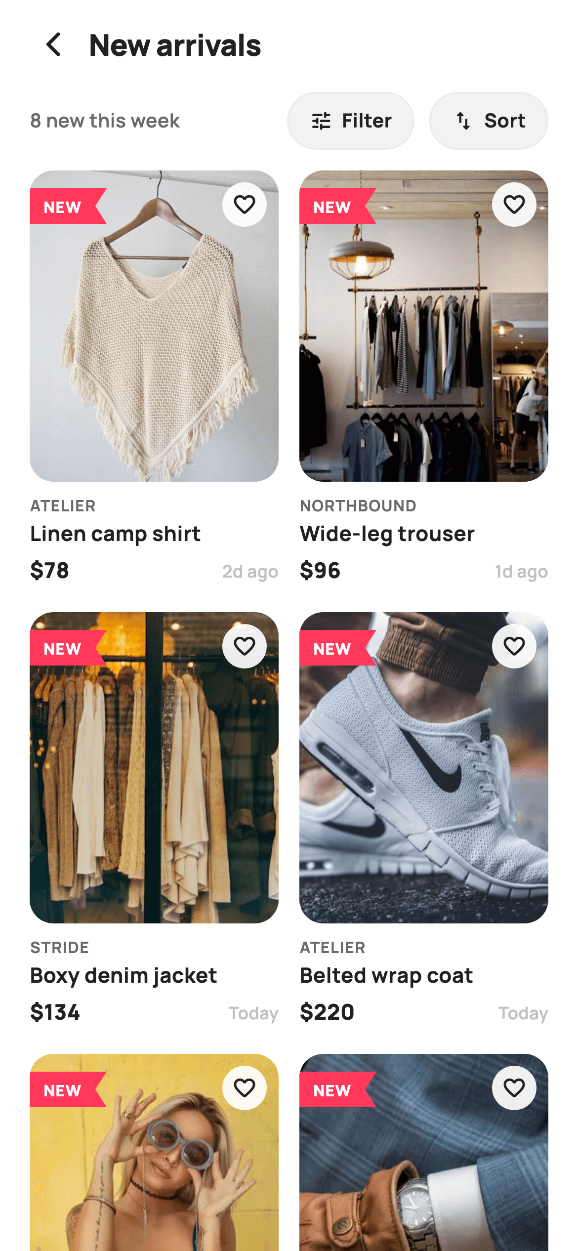
A new-arrivals page has one job the rest of the catalogue doesn't: proving the freshness. This tutorial builds it in Flutter as a two-column product grid where every card carries a painted red pennant badge and a relative age ('Today', '2d ago'), under a bar showing the week's count with Filter and Sort pills. The pennant is a five-point `Path` with a notched tail — a shape no Material widget gives you, and about ten lines of `CustomPainter` to draw.
Watch the Flutter UI walkthrough
A short screen recording of New Arrivals running, if you'd rather see it before you read the code. The written tutorial below covers everything in it.
Can't see the video? Watch it on YouTube.
What you'll build
- ✓A two-column `GridView.builder` with a tall 0.60 aspect ratio for portrait product shots
- ✓A painted pennant 'NEW' badge with a notched tail — no image asset
- ✓Product photos layered in a `Stack` over a placeholder colour so nothing flashes white
- ✓Filter and Sort pills sharing one small builder, with the count pushed left by a `Spacer`
- ✓A relative-age label per card in the faintest grey of the palette
- ✓A translucent circular wishlist button floating over the photo
Step-by-step build
Create the file
Add a new file at lib/ecom_home_new_arrivals/ecom_home_new_arrivals_screen.dart in your Flutter project.
Register the bundled fonts
No external packages — this is pure Flutter. It does bundle its design font (Manrope), so drop the font file into fonts/ and declare it in pubspec.yaml:
flutter:
  fonts:
    - family: Manrope
      fonts:
- asset: fonts/Manrope-Regular.ttfBuild it, piece by piece
Here's how the screen goes together. Each block below is a real slice of the code with a plain-English explanation — paste them in order, or grab the whole file from the next section.
Products as a seven-field const list
class EcomHomeNewArrivalsScreen extends StatelessWidget {
  const EcomHomeNewArrivalsScreen({
    super.key,
    this.onBack,
    this.onProduct,
    this.onFilter,
    this.onSort,
  });

  final VoidCallback? onBack;
  final ValueChanged<String>? onProduct;
  final VoidCallback? onFilter;
  final VoidCallback? onSort;

  static const String _font = 'Manrope';
  static const Color _canvas = Color(0xFFFFFFFF);
  static const Color _ink = Color(0xFF222222);
  static const Color _muted = Color(0xFF6A6A6A);
  static const Color _faint = Color(0xFFC1C1C1);
  static const Color _surface = Color(0xFFF2F2F2);
  static const Color _imageBg = Color(0xFFF5F5F5);
  static const Color _hairline = Color(0xFFEBEBEB);

  static const String _dir =
      'lib/screens/ecommerce/ecom_home_new_arrivals/images';

  static const List<_P> _items = <_P>[
    _P('Linen camp shirt', 'Atelier', 78, 0, 4.8, 'p01.webp', '2d ago'),
    _P('Wide-leg trouser', 'Northbound', 96, 0, 4.6, 'p02.webp', '1d ago'),
    _P('Boxy denim jacket', 'Stride', 134, 0, 4.9, 'p03.webp', 'Today'),
    _P('Belted wrap coat', 'Atelier', 220, 0, 4.7, 'p04.webp', 'Today'),
    _P('Pleated maxi dress', 'Aria', 142, 0, 4.8, 'p05.webp', '3d ago'),
    _P('Ribbed turtleneck', 'Maison', 58, 0, 4.5, 'p06.webp', '2d ago'),
    _P('Structured tote', 'Maison', 168, 0, 4.9, 'p07.webp', '1d ago'),
    _P('Retro court shoe', 'Stride', 110, 0, 4.7, 'p08.webp', 'Today'),
  ];
`_P` carries title, brand, price, `was` (the pre-discount price), rating, asset filename and `when`. Every item here has `was: 0` — new arrivals aren't discounted — which is the honest way to keep one product model shared across catalogue screens: the field exists, and this screen simply never renders it. `_dir` holds the asset folder once so each row stores only 'p01.webp'; the card interpolates `'$_dir/${p.asset}'` at build time. `when` is a pre-formatted relative string rather than a `DateTime`, so the card needs no date maths.
Header, filter bar, grid
  @override
  Widget build(BuildContext context) {
    return Theme(
      data: ThemeData.light(useMaterial3: true),
      child: Scaffold(
        backgroundColor: _canvas,
        body: SafeArea(
          child: Column(
            children: <Widget>[
              _header(),
              _filterBar(),
              Expanded(
                child: GridView.builder(
                  padding: const EdgeInsets.fromLTRB(20, 14, 20, 24),
                  gridDelegate:
                      const SliverGridDelegateWithFixedCrossAxisCount(
                    crossAxisCount: 2,
                    mainAxisSpacing: 18,
                    crossAxisSpacing: 14,
                    childAspectRatio: 0.60,
                  ),
                  itemCount: _items.length,
                  itemBuilder: (BuildContext context, int i) =>
                      _card(_items[i]),
                ),
              ),
            ],
          ),
        ),
      ),
    );
  }
The `Column` pins the header and filter bar above an `Expanded` `GridView.builder`, so the count and pills stay fixed while the products scroll. The delegate is `SliverGridDelegateWithFixedCrossAxisCount` with `crossAxisCount: 2` and `childAspectRatio: 0.60` — a cell 40% taller than it is wide, which is what fashion photography needs; a square ratio would crop garments badly. `mainAxisSpacing: 18` is larger than `crossAxisSpacing: 14` on purpose, because each card's text block sits below its photo and needs more vertical separation from the next row than columns need from each other.
The count line and reusable pills
  Widget _filterBar() {
    return Padding(
      padding: const EdgeInsets.fromLTRB(20, 2, 20, 0),
      child: Row(
        children: <Widget>[
          Text(
            '${_items.length} new this week',
            style: const TextStyle(
              fontFamily: _font,
              fontSize: 13,
              fontWeight: FontWeight.w600,
              color: _muted,
            ),
          ),
          const Spacer(),
          _pill('Filter', Icons.tune_rounded, onFilter),
          const SizedBox(width: 10),
          _pill('Sort', Icons.swap_vert_rounded, onSort),
        ],
      ),
    );
  }

  Widget _pill(String label, IconData icon, VoidCallback? onTap) {
    return GestureDetector(
      onTap: onTap,
      child: Container(
        padding: const EdgeInsets.symmetric(horizontal: 14, vertical: 9),
        decoration: BoxDecoration(
          color: _surface,
          borderRadius: BorderRadius.circular(99),
          border: Border.all(color: _hairline),
        ),
        child: Row(
          children: <Widget>[
            Icon(icon, size: 16, color: _ink),
            const SizedBox(width: 6),
            Text(
              label,
              style: const TextStyle(
                fontFamily: _font,
                fontSize: 13,
                fontWeight: FontWeight.w700,
                color: _ink,
              ),
            ),
          ],
        ),
      ),
    );
  }
`_filterBar` puts '8 new this week' on the left and pushes the two pills right with a single `Spacer()`. The count is interpolated from `_items.length`, so it can't drift from what's actually rendered. `_pill` is a four-line builder taking a label, icon and callback, which is why Filter and Sort are guaranteed identical — a fully rounded (99 radius) `_surface` container with a `_hairline` border. Both delegate straight to `onFilter` / `onSort` callbacks, since the actual filter and sort UIs are separate screens.
The product card's layered image stack
  Widget _card(_P p) {
    return GestureDetector(
      onTap: () => onProduct?.call(p.title),
      child: Column(
        crossAxisAlignment: CrossAxisAlignment.start,
        children: <Widget>[
          Expanded(
            child: ClipRRect(
              borderRadius: BorderRadius.circular(16),
              child: Stack(
                fit: StackFit.expand,
                children: <Widget>[
                  Container(color: _imageBg),
                  Image.asset('$_dir/${p.asset}', fit: BoxFit.cover),
                  Positioned(
                    left: 0,
                    top: 12,
                    child: SizedBox(
                      width: 52,
                      height: 24,
                      child: CustomPaint(
                        painter: const _NewBadgePainter(),
                        child: const Center(
                          child: Padding(
                            padding: EdgeInsets.only(right: 8),
                            child: Text(
                              'NEW',
                              style: TextStyle(
                                fontFamily: _font,
                                fontSize: 10.5,
                                fontWeight: FontWeight.w800,
                                letterSpacing: 0.5,
                                color: _canvas,
                              ),
                            ),
                          ),
                        ),
                      ),
                    ),
                  ),
                  Positioned(
                    right: 8,
                    top: 8,
                    child: Container(
                      width: 30,
                      height: 30,
                      decoration: BoxDecoration(
                        color: _canvas.withValues(alpha: 0.92),
                        shape: BoxShape.circle,
                      ),
                      child: const Icon(Icons.favorite_border_rounded,
                          size: 17, color: _ink),
                    ),
                  ),
                ],
              ),
            ),
          ),
The photo area is `Expanded` inside the card `Column`, so it absorbs whatever height the text doesn't use — meaning a longer title never overflows the cell, it just shortens the image. Inside `ClipRRect(16)` sits a `Stack` with `fit: StackFit.expand` and four layers in order: a `_imageBg` placeholder colour so the cell is never blank while the asset decodes, the `Image.asset` at `BoxFit.cover`, the pennant `Positioned` at `left: 0` so it bleeds flush to the card's edge, and the wishlist circle at `_canvas.withValues(alpha: 0.92)` — near-opaque white so the heart stays legible over any photo.
Brand, title, price and age
          const SizedBox(height: 8),
          Text(
            p.brand.toUpperCase(),
            style: const TextStyle(
              fontFamily: _font,
              fontSize: 10.5,
              fontWeight: FontWeight.w700,
              letterSpacing: 0.6,
              color: _muted,
            ),
          ),
          const SizedBox(height: 2),
          Text(
            p.title,
            maxLines: 1,
            overflow: TextOverflow.ellipsis,
            style: const TextStyle(
              fontFamily: _font,
              fontSize: 14,
              fontWeight: FontWeight.w700,
              color: _ink,
            ),
          ),
          const SizedBox(height: 4),
          Row(
            children: <Widget>[
              Text(
                '\$${p.price}',
                style: const TextStyle(
                  fontFamily: _font,
                  fontSize: 14.5,
                  fontWeight: FontWeight.w800,
                  color: _ink,
                ),
              ),
              const Spacer(),
              Text(
                p.when,
                style: const TextStyle(
                  fontFamily: _font,
                  fontSize: 11.5,
                  fontWeight: FontWeight.w600,
                  color: _faint,
                ),
              ),
            ],
          ),
        ],
      ),
    );
  }
The text block is a deliberate typographic hierarchy: the brand is 10.5px uppercase with `letterSpacing: 0.6` in muted grey, the title 14px `w700` in ink, and the price 14.5px `w800`. Uppercasing plus wide tracking is what lets a tiny brand line read as a label rather than as shrunken body text. `maxLines: 1` with `overflow: TextOverflow.ellipsis` on the title is essential in a fixed-ratio grid cell — a two-line wrap would push the price row past the cell bounds. The age sits after a `Spacer()` in `_faint` (#C1C1C1), the lightest grey in the palette, so it's present without competing with the price.
Painting the pennant badge
/// Paints a small brand-red pennant tag with a notched tail.
class _NewBadgePainter extends CustomPainter {
  const _NewBadgePainter();

  @override
  void paint(Canvas canvas, Size size) {
    final Paint p = Paint()..color = const Color(0xFFFF385C);
    final double notch = size.height * 0.32;
    final Path path = Path()
      ..moveTo(0, 0)
      ..lineTo(size.width, 0)
      ..lineTo(size.width - notch, size.height / 2)
      ..lineTo(size.width, size.height)
      ..lineTo(0, size.height)
      ..close();
    canvas.drawPath(path, p);
  }

  @override
  bool shouldRepaint(_NewBadgePainter oldDelegate) => false;
}
Ten lines produce a shape no built-in widget offers. The `Path` walks five points: top-left, top-right, then *inward* to `size.width - notch` at the vertical midpoint, back out to the bottom-right, then bottom-left before `close()`. That middle point is what cuts the V-shaped notch into the tail — the classic ribbon end. `notch` is `size.height * 0.32`, so the notch scales with the badge rather than being a fixed pixel value. The 'NEW' text is passed as `CustomPaint`'s `child` (painters draw *behind* their child), and it carries `EdgeInsets.only(right: 8)` so the label stays optically centred in the remaining space rather than drifting into the notch.
Full code
The complete, ready-to-paste source. Free to use in your projects — one click copies it all.
import 'package:flutter/material.dart';

/// StyleCart — New Arrivals.
///
/// The freshest drops in a two-column product grid, each flagged with a painted
/// "NEW" pennant badge, under a sticky Filter + Sort bar with a result count.
///
/// Self-contained per CONVENTIONS.md: pure Flutter, bundled Manrope, inline
/// Airbnb-style tokens, own light theme + SafeArea, bundled webp photos. The
/// pennant is a CustomPainter (no emoji glyph). Exposes callbacks only.
class EcomHomeNewArrivalsScreen extends StatelessWidget {
  const EcomHomeNewArrivalsScreen({
    super.key,
    this.onBack,
    this.onProduct,
    this.onFilter,
    this.onSort,
  });

  final VoidCallback? onBack;
  final ValueChanged<String>? onProduct;
  final VoidCallback? onFilter;
  final VoidCallback? onSort;

  static const String _font = 'Manrope';
  static const Color _canvas = Color(0xFFFFFFFF);
  static const Color _ink = Color(0xFF222222);
  static const Color _muted = Color(0xFF6A6A6A);
  static const Color _faint = Color(0xFFC1C1C1);
  static const Color _surface = Color(0xFFF2F2F2);
  static const Color _imageBg = Color(0xFFF5F5F5);
  static const Color _hairline = Color(0xFFEBEBEB);

  static const String _dir =
      'lib/screens/ecommerce/ecom_home_new_arrivals/images';

  static const List<_P> _items = <_P>[
    _P('Linen camp shirt', 'Atelier', 78, 0, 4.8, 'p01.webp', '2d ago'),
    _P('Wide-leg trouser', 'Northbound', 96, 0, 4.6, 'p02.webp', '1d ago'),
    _P('Boxy denim jacket', 'Stride', 134, 0, 4.9, 'p03.webp', 'Today'),
    _P('Belted wrap coat', 'Atelier', 220, 0, 4.7, 'p04.webp', 'Today'),
    _P('Pleated maxi dress', 'Aria', 142, 0, 4.8, 'p05.webp', '3d ago'),
    _P('Ribbed turtleneck', 'Maison', 58, 0, 4.5, 'p06.webp', '2d ago'),
    _P('Structured tote', 'Maison', 168, 0, 4.9, 'p07.webp', '1d ago'),
    _P('Retro court shoe', 'Stride', 110, 0, 4.7, 'p08.webp', 'Today'),
  ];

  @override
  Widget build(BuildContext context) {
    return Theme(
      data: ThemeData.light(useMaterial3: true),
      child: Scaffold(
        backgroundColor: _canvas,
        body: SafeArea(
          child: Column(
            children: <Widget>[
              _header(),
              _filterBar(),
              Expanded(
                child: GridView.builder(
                  padding: const EdgeInsets.fromLTRB(20, 14, 20, 24),
                  gridDelegate:
                      const SliverGridDelegateWithFixedCrossAxisCount(
                    crossAxisCount: 2,
                    mainAxisSpacing: 18,
                    crossAxisSpacing: 14,
                    childAspectRatio: 0.60,
                  ),
                  itemCount: _items.length,
                  itemBuilder: (BuildContext context, int i) =>
                      _card(_items[i]),
                ),
              ),
            ],
          ),
        ),
      ),
    );
  }

  Widget _header() {
    return Padding(
      padding: const EdgeInsets.fromLTRB(12, 6, 20, 6),
      child: Row(
        children: <Widget>[
          IconButton(
            onPressed: onBack,
            icon: const Icon(Icons.arrow_back_ios_new_rounded,
                size: 20, color: _ink),
          ),
          const Expanded(
            child: Text(
              'New arrivals',
              style: TextStyle(
                fontFamily: _font,
                fontSize: 20,
                fontWeight: FontWeight.w800,
                letterSpacing: -0.3,
                color: _ink,
              ),
            ),
          ),
        ],
      ),
    );
  }

  Widget _filterBar() {
    return Padding(
      padding: const EdgeInsets.fromLTRB(20, 2, 20, 0),
      child: Row(
        children: <Widget>[
          Text(
            '${_items.length} new this week',
            style: const TextStyle(
              fontFamily: _font,
              fontSize: 13,
              fontWeight: FontWeight.w600,
              color: _muted,
            ),
          ),
          const Spacer(),
          _pill('Filter', Icons.tune_rounded, onFilter),
          const SizedBox(width: 10),
          _pill('Sort', Icons.swap_vert_rounded, onSort),
        ],
      ),
    );
  }

  Widget _pill(String label, IconData icon, VoidCallback? onTap) {
    return GestureDetector(
      onTap: onTap,
      child: Container(
        padding: const EdgeInsets.symmetric(horizontal: 14, vertical: 9),
        decoration: BoxDecoration(
          color: _surface,
          borderRadius: BorderRadius.circular(99),
          border: Border.all(color: _hairline),
        ),
        child: Row(
          children: <Widget>[
            Icon(icon, size: 16, color: _ink),
            const SizedBox(width: 6),
            Text(
              label,
              style: const TextStyle(
                fontFamily: _font,
                fontSize: 13,
                fontWeight: FontWeight.w700,
                color: _ink,
              ),
            ),
          ],
        ),
      ),
    );
  }

  Widget _card(_P p) {
    return GestureDetector(
      onTap: () => onProduct?.call(p.title),
      child: Column(
        crossAxisAlignment: CrossAxisAlignment.start,
        children: <Widget>[
          Expanded(
            child: ClipRRect(
              borderRadius: BorderRadius.circular(16),
              child: Stack(
                fit: StackFit.expand,
                children: <Widget>[
                  Container(color: _imageBg),
                  Image.asset('$_dir/${p.asset}', fit: BoxFit.cover),
                  Positioned(
                    left: 0,
                    top: 12,
                    child: SizedBox(
                      width: 52,
                      height: 24,
                      child: CustomPaint(
                        painter: const _NewBadgePainter(),
                        child: const Center(
                          child: Padding(
                            padding: EdgeInsets.only(right: 8),
                            child: Text(
                              'NEW',
                              style: TextStyle(
                                fontFamily: _font,
                                fontSize: 10.5,
                                fontWeight: FontWeight.w800,
                                letterSpacing: 0.5,
                                color: _canvas,
                              ),
                            ),
                          ),
                        ),
                      ),
                    ),
                  ),
                  Positioned(
                    right: 8,
                    top: 8,
                    child: Container(
                      width: 30,
                      height: 30,
                      decoration: BoxDecoration(
                        color: _canvas.withValues(alpha: 0.92),
                        shape: BoxShape.circle,
                      ),
                      child: const Icon(Icons.favorite_border_rounded,
                          size: 17, color: _ink),
                    ),
                  ),
                ],
              ),
            ),
          ),
          const SizedBox(height: 8),
          Text(
            p.brand.toUpperCase(),
            style: const TextStyle(
              fontFamily: _font,
              fontSize: 10.5,
              fontWeight: FontWeight.w700,
              letterSpacing: 0.6,
              color: _muted,
            ),
          ),
          const SizedBox(height: 2),
          Text(
            p.title,
            maxLines: 1,
            overflow: TextOverflow.ellipsis,
            style: const TextStyle(
              fontFamily: _font,
              fontSize: 14,
              fontWeight: FontWeight.w700,
              color: _ink,
            ),
          ),
          const SizedBox(height: 4),
          Row(
            children: <Widget>[
              Text(
                '\$${p.price}',
                style: const TextStyle(
                  fontFamily: _font,
                  fontSize: 14.5,
                  fontWeight: FontWeight.w800,
                  color: _ink,
                ),
              ),
              const Spacer(),
              Text(
                p.when,
                style: const TextStyle(
                  fontFamily: _font,
                  fontSize: 11.5,
                  fontWeight: FontWeight.w600,
                  color: _faint,
                ),
              ),
            ],
          ),
        ],
      ),
    );
  }
}

class _P {
  const _P(this.title, this.brand, this.price, this.was, this.rating,
      this.asset, this.when);
  final String title;
  final String brand;
  final int price;
  final int was;
  final double rating;
  final String asset;
  final String when;
}

/// Paints a small brand-red pennant tag with a notched tail.
class _NewBadgePainter extends CustomPainter {
  const _NewBadgePainter();

  @override
  void paint(Canvas canvas, Size size) {
    final Paint p = Paint()..color = const Color(0xFFFF385C);
    final double notch = size.height * 0.32;
    final Path path = Path()
      ..moveTo(0, 0)
      ..lineTo(size.width, 0)
      ..lineTo(size.width - notch, size.height / 2)
      ..lineTo(size.width, size.height)
      ..lineTo(0, size.height)
      ..close();
    canvas.drawPath(path, p);
  }

  @override
  bool shouldRepaint(_NewBadgePainter oldDelegate) => false;
}
Plus bundled 13 binary assets (fonts/images). The CLI and MCP install those for you automatically.
Two faster ways to add it
Copy-paste works, but you can skip it entirely.
1. FlutterKit CLI
One command drops this screen — and its fonts — straight into your project.
$ flutterkit add ecom-home-new-arrivals2. AI agent (MCP)
Connect FlutterKit's MCP server in Claude or Cursor and just ask your agent to install ecom-home-new-arrivals — it fetches and writes the files for you.
FAQ
Is this new arrivals grid free to use?
Yes. The complete Dart source on this page is free for personal and commercial apps. Copy it from the code block, install it with the FlutterKit CLI (flutterkit add ecom-home-new-arrivals), or add it via an AI agent over MCP.
Does it need a package for the NEW badge?
No. _NewBadgePainter is about ten lines of CustomPainter drawing a five-point Path. There are no third-party dependencies in this screen — just the bundled Manrope font and the product photos, both installed by the CLI and MCP.
How do I use network images instead of bundled ones?
Replace Image.asset with Image.network (or CachedNetworkImage) inside the Stack. Keep the Container(color: _imageBg) layer beneath it — that's what stops the cell flashing white while a remote image loads.
Why is childAspectRatio 0.60?
It makes each grid cell 40% taller than it is wide, which suits full-length garment photography plus a four-line text block. Raise it toward 0.75 for squarer product shots; if you lower it further, keep maxLines: 1 on the title or the text will overflow the cell.
Which Flutter version does it target?
It uses Color.withValues(alpha:), super parameters and Material 3, so it targets Flutter 3.27+ (Dart 3). On an older SDK, swap the single withValues(alpha: 0.92) for withOpacity(0.92).


