How to Build a Shop Hub Launchpad Grid in Flutter (Full Code + Preview)
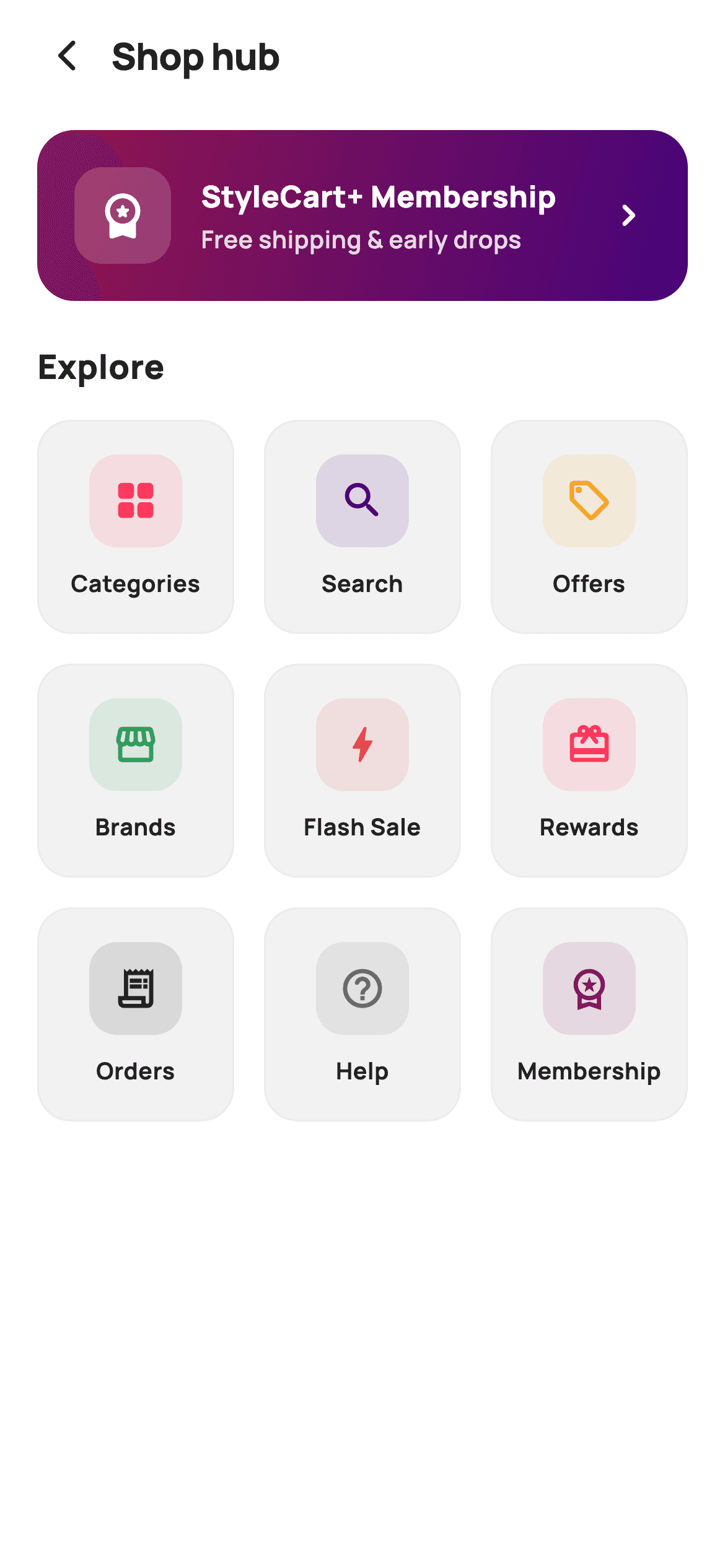
Once a shopping app has more than a few destinations, you need one screen that shows all of them at once. This tutorial builds that launchpad in Flutter: a purple-to-magenta membership banner on top, then a 3-column grid of nine tinted icon tiles for Categories, Search, Offers, Brands, Flash Sale, Rewards, Orders, Help and Membership. Every tile routes through a single `ValueChanged<String>` callback keyed by an id, so the whole grid needs one handler rather than nine.
Watch the Flutter UI walkthrough
A short screen recording of Shop Hub running, if you'd rather see it before you read the code. The written tutorial below covers everything in it.
Can't see the video? Watch it on YouTube.
What you'll build
- ✓A 3-column launchpad grid nested inside a `ListView` with `shrinkWrap` and locked physics
- ✓One `ValueChanged<String>` callback keyed by tile id — nine destinations, one handler
- ✓Per-tile tint colours at 12% alpha behind full-strength icons
- ✓A gradient membership banner with a translucent white icon tile
- ✓`childAspectRatio: 0.92` for tiles that are slightly taller than wide
- ✓Single-line ellipsised labels so 'Flash Sale' and 'Membership' never break the grid
Step-by-step build
Create the file
Add a new file at lib/ecom_home_hub/ecom_home_hub_screen.dart in your Flutter project.
Register the bundled fonts
No external packages — this is pure Flutter. It does bundle its design font (Manrope), so drop the font file into fonts/ and declare it in pubspec.yaml:
flutter:
  fonts:
    - family: Manrope
      fonts:
- asset: fonts/Manrope-Regular.ttfBuild it, piece by piece
Here's how the screen goes together. Each block below is a real slice of the code with a plain-English explanation — paste them in order, or grab the whole file from the next section.
Nine tiles, each carrying its own routing key
class EcomHomeHubScreen extends StatelessWidget {
  const EcomHomeHubScreen({
    super.key,
    this.onBack,
    this.onItem,
    this.onMembership,
  });

  final VoidCallback? onBack;

  /// A hub tile tapped (passes its key).
  final ValueChanged<String>? onItem;
  final VoidCallback? onMembership;

  static const String _font = 'Manrope';
  static const Color _canvas = Color(0xFFFFFFFF);
  static const Color _ink = Color(0xFF222222);
  static const Color _surface = Color(0xFFF2F2F2);
  static const Color _hairline = Color(0xFFEBEBEB);

  static const List<_Tile> _tiles = <_Tile>[
    _Tile('categories', 'Categories', Icons.grid_view_rounded, Color(0xFFFF385C)),
    _Tile('search', 'Search', Icons.search_rounded, Color(0xFF460479)),
    _Tile('offers', 'Offers', Icons.local_offer_outlined, Color(0xFFF5A623)),
    _Tile('brands', 'Brands', Icons.storefront_outlined, Color(0xFF2E9E5B)),
    _Tile('flash', 'Flash Sale', Icons.bolt_rounded, Color(0xFFE5484D)),
    _Tile('rewards', 'Rewards', Icons.card_giftcard_rounded, Color(0xFFFF385C)),
    _Tile('orders', 'Orders', Icons.receipt_long_outlined, Color(0xFF222222)),
    _Tile('help', 'Help', Icons.help_outline_rounded, Color(0xFF6A6A6A)),
    _Tile('membership', 'Membership', Icons.workspace_premium_outlined,
        Color(0xFF92174D)),
  ];
The `_Tile` model's first field is a `key` string — 'categories', 'search', 'offers' — and it exists purely for routing. That's what lets the whole grid share one `ValueChanged<String>? onItem` callback: the host app switches on the key instead of the screen exposing nine separate callbacks. The tint colours are written as literal `Color(0xFF...)` values rather than referencing the token constants, because these are per-destination identity colours (deep purple for Search, green for Brands, red for Flash Sale) rather than reusable palette entries. 'Orders' and 'Help' deliberately reuse ink and grey — not every destination needs a colour.
Banner above, grid below
  @override
  Widget build(BuildContext context) {
    return Theme(
      data: ThemeData.light(useMaterial3: true),
      child: Scaffold(
        backgroundColor: _canvas,
        body: SafeArea(
          child: Column(
            crossAxisAlignment: CrossAxisAlignment.start,
            children: <Widget>[
              _header(),
              Expanded(
                child: ListView(
                  padding: const EdgeInsets.fromLTRB(20, 6, 20, 24),
                  children: <Widget>[
                    _membershipBanner(),
                    const SizedBox(height: 22),
                    const Text(
                      'Explore',
                      style: TextStyle(
                        fontFamily: _font,
                        fontSize: 18,
                        fontWeight: FontWeight.w800,
                        color: _ink,
                      ),
                    ),
                    const SizedBox(height: 16),
                    GridView.count(
                      crossAxisCount: 3,
                      shrinkWrap: true,
                      physics: const NeverScrollableScrollPhysics(),
                      mainAxisSpacing: 16,
                      crossAxisSpacing: 16,
                      childAspectRatio: 0.92,
                      children: _tiles
                          .map((_Tile t) => _tileWidget(t))
                          .toList(),
                    ),
                  ],
                ),
              ),
            ],
          ),
        ),
      ),
    );
  }
`Theme(data: ThemeData.light(useMaterial3: true))` forces the screen's own light theme so it renders correctly wherever it's pushed. Inside the `Expanded` `ListView` come the membership banner, an 'Explore' heading, and the grid. `GridView.count` nested in a `ListView` needs both properties on lines 74–75: `shrinkWrap: true` so it sizes to its nine children instead of demanding unbounded height, and `NeverScrollableScrollPhysics` so it doesn't compete with the parent for scroll gestures. `childAspectRatio: 0.92` makes each cell slightly taller than wide — just enough room for a 50px badge, a 10px gap and a line of text.
A left-aligned header, not a centred one
  Widget _header() {
    return Padding(
      padding: const EdgeInsets.fromLTRB(12, 6, 20, 10),
      child: Row(
        children: <Widget>[
          IconButton(
            onPressed: onBack,
            icon: const Icon(Icons.arrow_back_ios_new_rounded,
                size: 20, color: _ink),
          ),
          const Text(
            'Shop hub',
            style: TextStyle(
              fontFamily: _font,
              fontSize: 20,
              fontWeight: FontWeight.w800,
              letterSpacing: -0.3,
              color: _ink,
            ),
          ),
        ],
      ),
    );
  }
This app bar is a `Row` with the back `IconButton` followed directly by the title — no `Expanded`, no trailing spacer, so 'Shop hub' sits flush left next to the arrow rather than centred. That's the right call for a browse screen: a centred title implies a detail view you drilled into, while a left-aligned 20px `w800` title reads as a section heading. `letterSpacing: -0.3` tightens the heavy weight so it doesn't look loose at display size.
The gradient membership banner
  Widget _membershipBanner() {
    return GestureDetector(
      onTap: onMembership,
      child: Container(
        padding: const EdgeInsets.all(20),
        decoration: BoxDecoration(
          borderRadius: BorderRadius.circular(20),
          gradient: const LinearGradient(
            begin: Alignment.topLeft,
            end: Alignment.bottomRight,
            colors: <Color>[Color(0xFF92174D), Color(0xFF460479)],
          ),
        ),
        child: Row(
          children: <Widget>[
            Container(
              width: 52,
              height: 52,
              decoration: BoxDecoration(
                color: _canvas.withValues(alpha: 0.18),
                borderRadius: BorderRadius.circular(15),
              ),
              child: const Icon(Icons.workspace_premium_rounded,
                  color: _canvas, size: 28),
            ),
            const SizedBox(width: 16),
            const Expanded(
              child: Column(
                crossAxisAlignment: CrossAxisAlignment.start,
                children: <Widget>[
                  Text(
                    'StyleCart+ Membership',
                    style: TextStyle(
                      fontFamily: _font,
                      fontSize: 16,
                      fontWeight: FontWeight.w800,
                      color: _canvas,
                    ),
                  ),
                  SizedBox(height: 3),
                  Text(
                    'Free shipping & early drops',
                    style: TextStyle(
                      fontFamily: _font,
                      fontSize: 13,
                      fontWeight: FontWeight.w600,
                      color: Color(0xFFE6D7E4),
                    ),
                  ),
                ],
              ),
            ),
            const Icon(Icons.chevron_right_rounded, color: _canvas, size: 24),
          ],
        ),
      ),
    );
  }
A 20px-radius `Container` with a `topLeft`→`bottomRight` gradient from #92174D to #460479 — magenta into deep purple, the two 'premium' colours that also appear as tile tints, so the banner and grid feel related. The 52px icon tile is `_canvas.withValues(alpha: 0.18)`: translucent white over the gradient rather than a solid, so the gradient shows through and the tile sits *in* the banner instead of on it. The subtitle uses #E6D7E4, a desaturated pink-grey rather than plain white70, which keeps it legible across both ends of the gradient. The text `Column` is `Expanded` so the chevron stays pinned right.
The tinted launchpad tile
  Widget _tileWidget(_Tile t) {
    return GestureDetector(
      onTap: () => onItem?.call(t.key),
      child: Container(
        decoration: BoxDecoration(
          color: _surface,
          borderRadius: BorderRadius.circular(18),
          border: Border.all(color: _hairline),
        ),
        child: Column(
          mainAxisAlignment: MainAxisAlignment.center,
          children: <Widget>[
            Container(
              width: 50,
              height: 50,
              decoration: BoxDecoration(
                color: t.tint.withValues(alpha: 0.12),
                borderRadius: BorderRadius.circular(15),
              ),
              child: Icon(t.icon, color: t.tint, size: 25),
            ),
            const SizedBox(height: 10),
            Padding(
              padding: const EdgeInsets.symmetric(horizontal: 4),
              child: Text(
                t.label,
                textAlign: TextAlign.center,
                maxLines: 1,
                overflow: TextOverflow.ellipsis,
                style: const TextStyle(
                  fontFamily: _font,
                  fontSize: 12.5,
                  fontWeight: FontWeight.w700,
                  color: _ink,
                ),
              ),
            ),
          ],
        ),
      ),
    );
  }
}

class _Tile {
  const _Tile(this.key, this.label, this.icon, this.tint);
  final String key;
  final String label;
  final IconData icon;
  final Color tint;
}
Each tile is a `_surface` container with a `_hairline` border and an 18px radius, holding a centred `Column`. The badge is a 50px rounded square at `t.tint.withValues(alpha: 0.12)` behind a full-strength `t.tint` icon — 12% is lower than the usual 16–18% tint because this palette runs on a white canvas, where the same alpha reads much stronger than it would on a dark one. The label is capped with `maxLines: 1` and `overflow: TextOverflow.ellipsis`, which matters in a fixed-height grid cell: without it, 'Membership' wrapping to two lines would push the tile past its aspect ratio and overflow. Tapping calls `onItem?.call(t.key)` — the whole routing surface in one line.
Full code
The complete, ready-to-paste source. Free to use in your projects — one click copies it all.
import 'package:flutter/material.dart';

/// StyleCart — Shop Hub.
///
/// A launchpad grid of every shopping entry point (Categories, Search, Offers,
/// Brands, Flash Sale, Rewards, Orders, Help, Membership) rendered as tinted
/// icon badges, plus a highlighted membership banner.
///
/// Self-contained per CONVENTIONS.md: pure Flutter, bundled Manrope, inline
/// Airbnb-style tokens, own light theme + SafeArea. No assets — badges are tinted
/// containers with Material icons (no emoji glyphs). Exposes callbacks only.
class EcomHomeHubScreen extends StatelessWidget {
  const EcomHomeHubScreen({
    super.key,
    this.onBack,
    this.onItem,
    this.onMembership,
  });

  final VoidCallback? onBack;

  /// A hub tile tapped (passes its key).
  final ValueChanged<String>? onItem;
  final VoidCallback? onMembership;

  static const String _font = 'Manrope';
  static const Color _canvas = Color(0xFFFFFFFF);
  static const Color _ink = Color(0xFF222222);
  static const Color _surface = Color(0xFFF2F2F2);
  static const Color _hairline = Color(0xFFEBEBEB);

  static const List<_Tile> _tiles = <_Tile>[
    _Tile('categories', 'Categories', Icons.grid_view_rounded, Color(0xFFFF385C)),
    _Tile('search', 'Search', Icons.search_rounded, Color(0xFF460479)),
    _Tile('offers', 'Offers', Icons.local_offer_outlined, Color(0xFFF5A623)),
    _Tile('brands', 'Brands', Icons.storefront_outlined, Color(0xFF2E9E5B)),
    _Tile('flash', 'Flash Sale', Icons.bolt_rounded, Color(0xFFE5484D)),
    _Tile('rewards', 'Rewards', Icons.card_giftcard_rounded, Color(0xFFFF385C)),
    _Tile('orders', 'Orders', Icons.receipt_long_outlined, Color(0xFF222222)),
    _Tile('help', 'Help', Icons.help_outline_rounded, Color(0xFF6A6A6A)),
    _Tile('membership', 'Membership', Icons.workspace_premium_outlined,
        Color(0xFF92174D)),
  ];

  @override
  Widget build(BuildContext context) {
    return Theme(
      data: ThemeData.light(useMaterial3: true),
      child: Scaffold(
        backgroundColor: _canvas,
        body: SafeArea(
          child: Column(
            crossAxisAlignment: CrossAxisAlignment.start,
            children: <Widget>[
              _header(),
              Expanded(
                child: ListView(
                  padding: const EdgeInsets.fromLTRB(20, 6, 20, 24),
                  children: <Widget>[
                    _membershipBanner(),
                    const SizedBox(height: 22),
                    const Text(
                      'Explore',
                      style: TextStyle(
                        fontFamily: _font,
                        fontSize: 18,
                        fontWeight: FontWeight.w800,
                        color: _ink,
                      ),
                    ),
                    const SizedBox(height: 16),
                    GridView.count(
                      crossAxisCount: 3,
                      shrinkWrap: true,
                      physics: const NeverScrollableScrollPhysics(),
                      mainAxisSpacing: 16,
                      crossAxisSpacing: 16,
                      childAspectRatio: 0.92,
                      children: _tiles
                          .map((_Tile t) => _tileWidget(t))
                          .toList(),
                    ),
                  ],
                ),
              ),
            ],
          ),
        ),
      ),
    );
  }

  Widget _header() {
    return Padding(
      padding: const EdgeInsets.fromLTRB(12, 6, 20, 10),
      child: Row(
        children: <Widget>[
          IconButton(
            onPressed: onBack,
            icon: const Icon(Icons.arrow_back_ios_new_rounded,
                size: 20, color: _ink),
          ),
          const Text(
            'Shop hub',
            style: TextStyle(
              fontFamily: _font,
              fontSize: 20,
              fontWeight: FontWeight.w800,
              letterSpacing: -0.3,
              color: _ink,
            ),
          ),
        ],
      ),
    );
  }

  Widget _membershipBanner() {
    return GestureDetector(
      onTap: onMembership,
      child: Container(
        padding: const EdgeInsets.all(20),
        decoration: BoxDecoration(
          borderRadius: BorderRadius.circular(20),
          gradient: const LinearGradient(
            begin: Alignment.topLeft,
            end: Alignment.bottomRight,
            colors: <Color>[Color(0xFF92174D), Color(0xFF460479)],
          ),
        ),
        child: Row(
          children: <Widget>[
            Container(
              width: 52,
              height: 52,
              decoration: BoxDecoration(
                color: _canvas.withValues(alpha: 0.18),
                borderRadius: BorderRadius.circular(15),
              ),
              child: const Icon(Icons.workspace_premium_rounded,
                  color: _canvas, size: 28),
            ),
            const SizedBox(width: 16),
            const Expanded(
              child: Column(
                crossAxisAlignment: CrossAxisAlignment.start,
                children: <Widget>[
                  Text(
                    'StyleCart+ Membership',
                    style: TextStyle(
                      fontFamily: _font,
                      fontSize: 16,
                      fontWeight: FontWeight.w800,
                      color: _canvas,
                    ),
                  ),
                  SizedBox(height: 3),
                  Text(
                    'Free shipping & early drops',
                    style: TextStyle(
                      fontFamily: _font,
                      fontSize: 13,
                      fontWeight: FontWeight.w600,
                      color: Color(0xFFE6D7E4),
                    ),
                  ),
                ],
              ),
            ),
            const Icon(Icons.chevron_right_rounded, color: _canvas, size: 24),
          ],
        ),
      ),
    );
  }

  Widget _tileWidget(_Tile t) {
    return GestureDetector(
      onTap: () => onItem?.call(t.key),
      child: Container(
        decoration: BoxDecoration(
          color: _surface,
          borderRadius: BorderRadius.circular(18),
          border: Border.all(color: _hairline),
        ),
        child: Column(
          mainAxisAlignment: MainAxisAlignment.center,
          children: <Widget>[
            Container(
              width: 50,
              height: 50,
              decoration: BoxDecoration(
                color: t.tint.withValues(alpha: 0.12),
                borderRadius: BorderRadius.circular(15),
              ),
              child: Icon(t.icon, color: t.tint, size: 25),
            ),
            const SizedBox(height: 10),
            Padding(
              padding: const EdgeInsets.symmetric(horizontal: 4),
              child: Text(
                t.label,
                textAlign: TextAlign.center,
                maxLines: 1,
                overflow: TextOverflow.ellipsis,
                style: const TextStyle(
                  fontFamily: _font,
                  fontSize: 12.5,
                  fontWeight: FontWeight.w700,
                  color: _ink,
                ),
              ),
            ),
          ],
        ),
      ),
    );
  }
}

class _Tile {
  const _Tile(this.key, this.label, this.icon, this.tint);
  final String key;
  final String label;
  final IconData icon;
  final Color tint;
}
Plus bundled 5 binary assets (fonts/images). The CLI and MCP install those for you automatically.
Two faster ways to add it
Copy-paste works, but you can skip it entirely.
1. FlutterKit CLI
One command drops this screen — and its fonts — straight into your project.
$ flutterkit add ecom-home-hub2. AI agent (MCP)
Connect FlutterKit's MCP server in Claude or Cursor and just ask your agent to install ecom-home-hub — it fetches and writes the files for you.
FAQ
Is this shop hub screen free to use?
Yes. The complete Dart source on this page is free for personal and commercial apps. Copy it from the code block, install it with the FlutterKit CLI (flutterkit add ecom-home-hub), or add it through an AI agent over MCP.
How do I route the nine tiles?
Pass one onItem handler and switch on the key: onItem: (k) { switch (k) { case 'categories': …; case 'search': …; } }. Adding a tenth destination means adding one _Tile entry with a new key and one case — the grid code doesn't change.
Why does the grid need shrinkWrap and NeverScrollableScrollPhysics?
Without shrinkWrap the GridView requests infinite height inside the ListView and throws a layout error. Without NeverScrollableScrollPhysics it captures drag gestures and fights the parent, so the page would scroll as two independent surfaces instead of one.
How do I fit more or fewer tiles per row?
Change crossAxisCount, then re-tune childAspectRatio — with 4 columns the cells get narrower, so you'll want a smaller ratio (taller cells) to keep the badge and label comfortable. Keep maxLines: 1 on the label whatever you choose.
Which Flutter version does it target?
It uses Color.withValues(alpha:), super parameters and Material 3, so it targets Flutter 3.27+ (Dart 3). On an older SDK, swap the two withValues(alpha: x) calls for withOpacity(x).


