How to Build a Curated Collection Page in Flutter (Full Code + Preview)
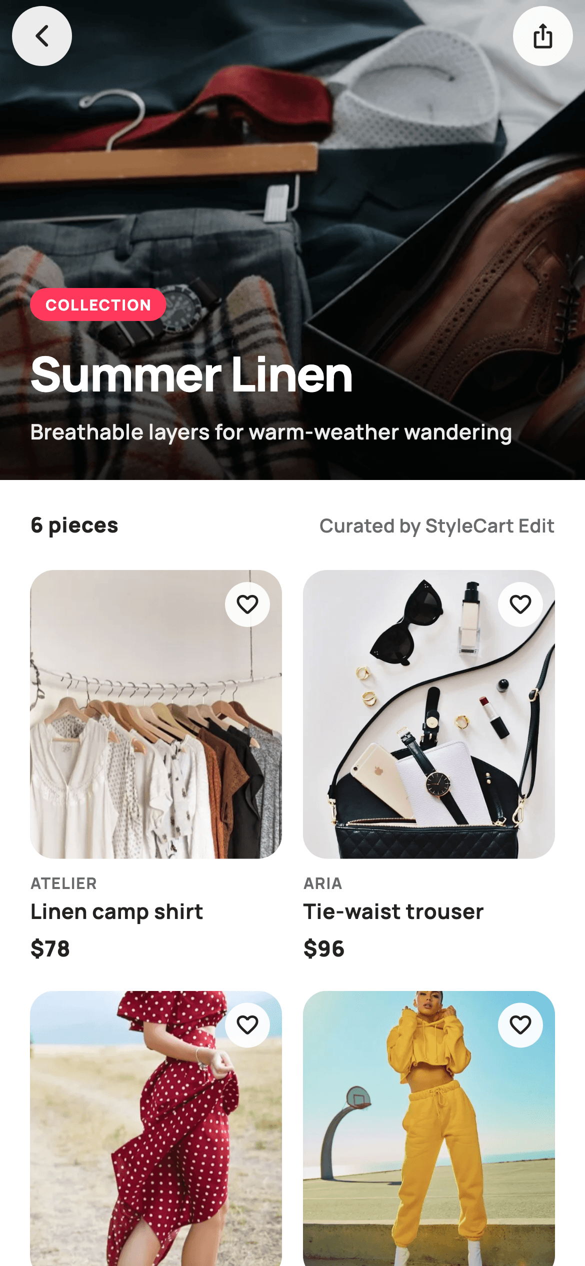
A collection page sells a point of view rather than a discount, and the layout has to reflect that. This tutorial builds StyleCart's Summer Linen edit in Flutter: a 320px editorial hero carrying a coral COLLECTION pill, a 32px title and a curator's tagline, then a meta row crediting the editor, then a six-item grid where each card has a wishlist heart and a single clean price. No sale badges, no strikethroughs — the restraint is the design.
Watch the Flutter UI walkthrough
A short screen recording of Collection running, if you'd rather see it before you read the code. The written tutorial below covers everything in it.
Can't see the video? Watch it on YouTube.
What you'll build
- ✓An editorial hero with a category pill, title and tagline stacked over a photo
- ✓A meta row pairing the piece count with a curator credit using Spacer
- ✓Floating back and share buttons balanced with spaceBetween over the scroll
- ✓Product cards with a wishlist heart and a single price, no discount styling
Step-by-step build
Create the file
Add a new file at lib/ecom_home_collection/ecom_home_collection_screen.dart in your Flutter project.
Register the bundled fonts
No external packages — this is pure Flutter. It does bundle its design font (Manrope), so drop the font file into fonts/ and declare it in pubspec.yaml:
flutter:
  fonts:
    - family: Manrope
      fonts:
- asset: fonts/Manrope-Regular.ttfBuild it, piece by piece
Here's how the screen goes together. Each block below is a real slice of the code with a plain-English explanation — paste them in order, or grab the whole file from the next section.
Editorial copy in, product data const
import 'package:flutter/material.dart';

/// StyleCart — Collection.
///
/// A curated, editorially-styled drop ("Summer Linen") led by a full-bleed hero
/// photo with title overlay and curator note, followed by a two-column product
/// grid of the pieces in the edit.
///
/// Self-contained per CONVENTIONS.md: pure Flutter, bundled Manrope, inline
/// Airbnb-style tokens, own light theme + SafeArea, bundled webp photos. No
/// emoji glyphs. Exposes callbacks only.
class EcomHomeCollectionScreen extends StatelessWidget {
  const EcomHomeCollectionScreen({
    super.key,
    this.title = 'Summer Linen',
    this.tagline = 'Breathable layers for warm-weather wandering',
    this.onBack,
    this.onShare,
    this.onProduct,
  });

  final String title;
  final String tagline;
  final VoidCallback? onBack;
  final VoidCallback? onShare;
  final ValueChanged<String>? onProduct;

  static const String _font = 'Manrope';
  static const Color _canvas = Color(0xFFFFFFFF);
  static const Color _ink = Color(0xFF222222);
  static const Color _muted = Color(0xFF6A6A6A);
  static const Color _brand = Color(0xFFFF385C);
  static const Color _imageBg = Color(0xFFF5F5F5);

  static const String _dir =
      'lib/screens/ecommerce/ecom_home_collection/images';

  static const List<_C> _items = <_C>[
    _C('Linen camp shirt', 'Atelier', 78, 'p12.webp'),
    _C('Tie-waist trouser', 'Aria', 96, 'p13.webp'),
    _C('Gauze midi dress', 'Aria', 128, 'p14.webp'),
    _C('Relaxed overshirt', 'Northbound', 88, 'p15.webp'),
    _C('Woven sun tote', 'Maison', 64, 'p16.webp'),
    _C('Espadrille flats', 'Stride', 72, 'p17.webp'),
  ];
`title` and `tagline` are constructor parameters with defaults, so one widget renders every edit the merchandising team publishes. The six pieces live in a `static const List<_C>` of records carrying a title, brand, price and image filename — and notably no `was` price, unlike a sale page. That omission is the design: a curated collection sells taste, and putting a strikethrough on every card would reframe it as a clearance rail. `onProduct` is a `ValueChanged<String>`, so tapping a card reports which item was chosen and the host app routes from there.
Hero, meta row and a nested grid
  @override
  Widget build(BuildContext context) {
    return Theme(
      data: ThemeData.light(useMaterial3: true),
      child: Scaffold(
        backgroundColor: _canvas,
        body: Stack(
          children: <Widget>[
            ListView(
              padding: EdgeInsets.zero,
              children: <Widget>[
                _hero(),
                Padding(
                  padding: const EdgeInsets.fromLTRB(20, 20, 20, 4),
                  child: Row(
                    children: <Widget>[
                      Text(
                        '${_items.length} pieces',
                        style: const TextStyle(
                          fontFamily: _font,
                          fontSize: 14,
                          fontWeight: FontWeight.w800,
                          color: _ink,
                        ),
                      ),
                      const Spacer(),
                      const Text(
                        'Curated by StyleCart Edit',
                        style: TextStyle(
                          fontFamily: _font,
                          fontSize: 12.5,
                          fontWeight: FontWeight.w600,
                          color: _muted,
                        ),
                      ),
                    ],
                  ),
                ),
                GridView.builder(
                  padding: const EdgeInsets.fromLTRB(20, 16, 20, 28),
                  shrinkWrap: true,
                  physics: const NeverScrollableScrollPhysics(),
                  gridDelegate:
                      const SliverGridDelegateWithFixedCrossAxisCount(
                    crossAxisCount: 2,
                    mainAxisSpacing: 18,
                    crossAxisSpacing: 14,
                    childAspectRatio: 0.64,
                  ),
                  itemCount: _items.length,
                  itemBuilder: (BuildContext context, int i) =>
                      _card(_items[i]),
                ),
              ],
            ),
            SafeArea(
              child: Padding(
                padding: const EdgeInsets.symmetric(horizontal: 8, vertical: 4),
                child: Row(
                  mainAxisAlignment: MainAxisAlignment.spaceBetween,
                  children: <Widget>[
                    _circleButton(Icons.arrow_back_ios_new_rounded, onBack),
                    _circleButton(Icons.ios_share_rounded, onShare),
                  ],
                ),
              ),
            ),
          ],
        ),
      ),
    );
  }
The `ListView` sets `padding: EdgeInsets.zero` so the hero runs edge to edge under the status bar with no inherited inset. The meta row uses a `Spacer()` between the piece count and 'Curated by StyleCart Edit', pushing them to opposite ends without a fixed width. That credit line is what turns a grid into an edit — attribution is the signal that a human chose these together. The grid nests inside the ListView with the required pair `shrinkWrap: true` and `NeverScrollableScrollPhysics()`, sizing to its content and handing all scrolling to the parent, at `childAspectRatio: 0.64` for a portrait fashion crop.
Two floating controls, balanced
  Widget _circleButton(IconData icon, VoidCallback? onTap) {
    return GestureDetector(
      onTap: onTap,
      child: Container(
        width: 40,
        height: 40,
        decoration: BoxDecoration(
          color: _canvas.withValues(alpha: 0.92),
          shape: BoxShape.circle,
        ),
        child: Icon(icon, size: 18, color: _ink),
      ),
    );
  }
`_circleButton` builds a 40px disc at `_canvas.withValues(alpha: 0.92)` holding an 18px icon. The near-opaque white background is doing real work — a bare dark icon would disappear against a pale area of the hero photo, and this keeps contrast guaranteed whatever image loads. The two buttons sit in a Row with `mainAxisAlignment: MainAxisAlignment.spaceBetween` inside a `SafeArea`, so back goes hard left and share hard right with no width calculation. Share belongs on a collection specifically because a curated edit is the kind of thing people send to a friend.
The editorial hero
  Widget _hero() {
    return SizedBox(
      height: 320,
      child: Stack(
        fit: StackFit.expand,
        children: <Widget>[
          Container(color: _imageBg),
          Image.asset('$_dir/p11.webp', fit: BoxFit.cover),
          const DecoratedBox(
            decoration: BoxDecoration(
              gradient: LinearGradient(
                begin: Alignment.topCenter,
                end: Alignment.bottomCenter,
                colors: <Color>[Color(0x33000000), Color(0xCC000000)],
                stops: <double>[0.4, 1.0],
              ),
            ),
          ),
          Align(
            alignment: Alignment.bottomLeft,
            child: Padding(
              padding: const EdgeInsets.fromLTRB(20, 0, 20, 22),
              child: Column(
                mainAxisSize: MainAxisSize.min,
                crossAxisAlignment: CrossAxisAlignment.start,
                children: <Widget>[
                  Container(
                    padding: const EdgeInsets.symmetric(
                        horizontal: 10, vertical: 4),
                    decoration: BoxDecoration(
                      color: _brand,
                      borderRadius: BorderRadius.circular(99),
                    ),
                    child: const Text(
                      'COLLECTION',
                      style: TextStyle(
                        fontFamily: _font,
                        fontSize: 10,
                        fontWeight: FontWeight.w800,
                        letterSpacing: 0.8,
                        color: _canvas,
                      ),
                    ),
                  ),
                  const SizedBox(height: 12),
                  Text(
                    title,
                    style: const TextStyle(
                      fontFamily: _font,
                      fontSize: 32,
                      fontWeight: FontWeight.w800,
                      letterSpacing: -0.8,
                      color: _canvas,
                    ),
                  ),
                  const SizedBox(height: 6),
                  Text(
                    tagline,
                    style: TextStyle(
                      fontFamily: _font,
                      fontSize: 14,
                      fontWeight: FontWeight.w600,
                      color: _canvas.withValues(alpha: 0.92),
                    ),
                  ),
                ],
              ),
            ),
          ),
        ],
      ),
    );
  }
A 320px `Stack` with `fit: StackFit.expand` layers a placeholder colour, the photo at `BoxFit.cover`, a gradient scrim and the text block. The scrim runs `Color(0x33000000)` to `Color(0xCC000000)` with `stops: <double>[0.4, 1.0]`, so the darkening is concentrated in the lower 60% where the type sits rather than flattening the whole photograph. The copy stacks three tiers: a solid coral 'COLLECTION' pill at `BorderRadius.circular(99)`, the 32px title at `letterSpacing: -0.8`, and the tagline at 92% white. Tight negative tracking on large bold type is what stops a display heading looking loose, and it is applied consistently across StyleCart's headlines.
Cards that sell taste, not urgency
  Widget _card(_C c) {
    return GestureDetector(
      onTap: () => onProduct?.call(c.title),
      child: Column(
        crossAxisAlignment: CrossAxisAlignment.start,
        children: <Widget>[
          Expanded(
            child: ClipRRect(
              borderRadius: BorderRadius.circular(16),
              child: Stack(
                fit: StackFit.expand,
                children: <Widget>[
                  Container(color: _imageBg),
                  Image.asset('$_dir/${c.asset}', fit: BoxFit.cover),
                  Positioned(
                    right: 8,
                    top: 8,
                    child: Container(
                      width: 30,
                      height: 30,
                      decoration: BoxDecoration(
                        color: _canvas.withValues(alpha: 0.92),
                        shape: BoxShape.circle,
                      ),
                      child: const Icon(Icons.favorite_border_rounded,
                          size: 17, color: _ink),
                    ),
                  ),
                ],
              ),
            ),
          ),
          const SizedBox(height: 8),
          Text(
            c.brand.toUpperCase(),
            style: const TextStyle(
              fontFamily: _font,
              fontSize: 10.5,
              fontWeight: FontWeight.w700,
              letterSpacing: 0.6,
              color: _muted,
            ),
          ),
          const SizedBox(height: 2),
          Text(
            c.title,
            maxLines: 1,
            overflow: TextOverflow.ellipsis,
            style: const TextStyle(
              fontFamily: _font,
              fontSize: 14,
              fontWeight: FontWeight.w700,
              color: _ink,
            ),
          ),
          const SizedBox(height: 4),
          Text(
            '\$${c.price}',
            style: const TextStyle(
              fontFamily: _font,
              fontSize: 14.5,
              fontWeight: FontWeight.w800,
              color: _ink,
            ),
          ),
        ],
      ),
    );
  }
Each card wraps its image in `Expanded`, letting the photo absorb whatever height the three text lines below do not claim — that is what makes a fixed `childAspectRatio` behave when titles vary. The `ClipRRect` at 16px rounds the photo without needing a rounded image asset. The only overlay is a 30px wishlist heart at top-right on the same 92%-white disc used by the floating buttons, so the affordance reads consistently across the screen. Below it the hierarchy is brand caption, product title capped with `maxLines: 1` and `TextOverflow.ellipsis`, then a single price in `_ink` — not coral. Reserving the brand colour for genuine promotions is what keeps it meaningful when a real sale does appear.
Full code
The complete, ready-to-paste source. Free to use in your projects — one click copies it all.
import 'package:flutter/material.dart';

/// StyleCart — Collection.
///
/// A curated, editorially-styled drop ("Summer Linen") led by a full-bleed hero
/// photo with title overlay and curator note, followed by a two-column product
/// grid of the pieces in the edit.
///
/// Self-contained per CONVENTIONS.md: pure Flutter, bundled Manrope, inline
/// Airbnb-style tokens, own light theme + SafeArea, bundled webp photos. No
/// emoji glyphs. Exposes callbacks only.
class EcomHomeCollectionScreen extends StatelessWidget {
  const EcomHomeCollectionScreen({
    super.key,
    this.title = 'Summer Linen',
    this.tagline = 'Breathable layers for warm-weather wandering',
    this.onBack,
    this.onShare,
    this.onProduct,
  });

  final String title;
  final String tagline;
  final VoidCallback? onBack;
  final VoidCallback? onShare;
  final ValueChanged<String>? onProduct;

  static const String _font = 'Manrope';
  static const Color _canvas = Color(0xFFFFFFFF);
  static const Color _ink = Color(0xFF222222);
  static const Color _muted = Color(0xFF6A6A6A);
  static const Color _brand = Color(0xFFFF385C);
  static const Color _imageBg = Color(0xFFF5F5F5);

  static const String _dir =
      'lib/screens/ecommerce/ecom_home_collection/images';

  static const List<_C> _items = <_C>[
    _C('Linen camp shirt', 'Atelier', 78, 'p12.webp'),
    _C('Tie-waist trouser', 'Aria', 96, 'p13.webp'),
    _C('Gauze midi dress', 'Aria', 128, 'p14.webp'),
    _C('Relaxed overshirt', 'Northbound', 88, 'p15.webp'),
    _C('Woven sun tote', 'Maison', 64, 'p16.webp'),
    _C('Espadrille flats', 'Stride', 72, 'p17.webp'),
  ];

  @override
  Widget build(BuildContext context) {
    return Theme(
      data: ThemeData.light(useMaterial3: true),
      child: Scaffold(
        backgroundColor: _canvas,
        body: Stack(
          children: <Widget>[
            ListView(
              padding: EdgeInsets.zero,
              children: <Widget>[
                _hero(),
                Padding(
                  padding: const EdgeInsets.fromLTRB(20, 20, 20, 4),
                  child: Row(
                    children: <Widget>[
                      Text(
                        '${_items.length} pieces',
                        style: const TextStyle(
                          fontFamily: _font,
                          fontSize: 14,
                          fontWeight: FontWeight.w800,
                          color: _ink,
                        ),
                      ),
                      const Spacer(),
                      const Text(
                        'Curated by StyleCart Edit',
                        style: TextStyle(
                          fontFamily: _font,
                          fontSize: 12.5,
                          fontWeight: FontWeight.w600,
                          color: _muted,
                        ),
                      ),
                    ],
                  ),
                ),
                GridView.builder(
                  padding: const EdgeInsets.fromLTRB(20, 16, 20, 28),
                  shrinkWrap: true,
                  physics: const NeverScrollableScrollPhysics(),
                  gridDelegate:
                      const SliverGridDelegateWithFixedCrossAxisCount(
                    crossAxisCount: 2,
                    mainAxisSpacing: 18,
                    crossAxisSpacing: 14,
                    childAspectRatio: 0.64,
                  ),
                  itemCount: _items.length,
                  itemBuilder: (BuildContext context, int i) =>
                      _card(_items[i]),
                ),
              ],
            ),
            SafeArea(
              child: Padding(
                padding: const EdgeInsets.symmetric(horizontal: 8, vertical: 4),
                child: Row(
                  mainAxisAlignment: MainAxisAlignment.spaceBetween,
                  children: <Widget>[
                    _circleButton(Icons.arrow_back_ios_new_rounded, onBack),
                    _circleButton(Icons.ios_share_rounded, onShare),
                  ],
                ),
              ),
            ),
          ],
        ),
      ),
    );
  }

  Widget _circleButton(IconData icon, VoidCallback? onTap) {
    return GestureDetector(
      onTap: onTap,
      child: Container(
        width: 40,
        height: 40,
        decoration: BoxDecoration(
          color: _canvas.withValues(alpha: 0.92),
          shape: BoxShape.circle,
        ),
        child: Icon(icon, size: 18, color: _ink),
      ),
    );
  }

  Widget _hero() {
    return SizedBox(
      height: 320,
      child: Stack(
        fit: StackFit.expand,
        children: <Widget>[
          Container(color: _imageBg),
          Image.asset('$_dir/p11.webp', fit: BoxFit.cover),
          const DecoratedBox(
            decoration: BoxDecoration(
              gradient: LinearGradient(
                begin: Alignment.topCenter,
                end: Alignment.bottomCenter,
                colors: <Color>[Color(0x33000000), Color(0xCC000000)],
                stops: <double>[0.4, 1.0],
              ),
            ),
          ),
          Align(
            alignment: Alignment.bottomLeft,
            child: Padding(
              padding: const EdgeInsets.fromLTRB(20, 0, 20, 22),
              child: Column(
                mainAxisSize: MainAxisSize.min,
                crossAxisAlignment: CrossAxisAlignment.start,
                children: <Widget>[
                  Container(
                    padding: const EdgeInsets.symmetric(
                        horizontal: 10, vertical: 4),
                    decoration: BoxDecoration(
                      color: _brand,
                      borderRadius: BorderRadius.circular(99),
                    ),
                    child: const Text(
                      'COLLECTION',
                      style: TextStyle(
                        fontFamily: _font,
                        fontSize: 10,
                        fontWeight: FontWeight.w800,
                        letterSpacing: 0.8,
                        color: _canvas,
                      ),
                    ),
                  ),
                  const SizedBox(height: 12),
                  Text(
                    title,
                    style: const TextStyle(
                      fontFamily: _font,
                      fontSize: 32,
                      fontWeight: FontWeight.w800,
                      letterSpacing: -0.8,
                      color: _canvas,
                    ),
                  ),
                  const SizedBox(height: 6),
                  Text(
                    tagline,
                    style: TextStyle(
                      fontFamily: _font,
                      fontSize: 14,
                      fontWeight: FontWeight.w600,
                      color: _canvas.withValues(alpha: 0.92),
                    ),
                  ),
                ],
              ),
            ),
          ),
        ],
      ),
    );
  }

  Widget _card(_C c) {
    return GestureDetector(
      onTap: () => onProduct?.call(c.title),
      child: Column(
        crossAxisAlignment: CrossAxisAlignment.start,
        children: <Widget>[
          Expanded(
            child: ClipRRect(
              borderRadius: BorderRadius.circular(16),
              child: Stack(
                fit: StackFit.expand,
                children: <Widget>[
                  Container(color: _imageBg),
                  Image.asset('$_dir/${c.asset}', fit: BoxFit.cover),
                  Positioned(
                    right: 8,
                    top: 8,
                    child: Container(
                      width: 30,
                      height: 30,
                      decoration: BoxDecoration(
                        color: _canvas.withValues(alpha: 0.92),
                        shape: BoxShape.circle,
                      ),
                      child: const Icon(Icons.favorite_border_rounded,
                          size: 17, color: _ink),
                    ),
                  ),
                ],
              ),
            ),
          ),
          const SizedBox(height: 8),
          Text(
            c.brand.toUpperCase(),
            style: const TextStyle(
              fontFamily: _font,
              fontSize: 10.5,
              fontWeight: FontWeight.w700,
              letterSpacing: 0.6,
              color: _muted,
            ),
          ),
          const SizedBox(height: 2),
          Text(
            c.title,
            maxLines: 1,
            overflow: TextOverflow.ellipsis,
            style: const TextStyle(
              fontFamily: _font,
              fontSize: 14,
              fontWeight: FontWeight.w700,
              color: _ink,
            ),
          ),
          const SizedBox(height: 4),
          Text(
            '\$${c.price}',
            style: const TextStyle(
              fontFamily: _font,
              fontSize: 14.5,
              fontWeight: FontWeight.w800,
              color: _ink,
            ),
          ),
        ],
      ),
    );
  }
}

class _C {
  const _C(this.title, this.brand, this.price, this.asset);
  final String title;
  final String brand;
  final int price;
  final String asset;
}
Plus bundled 12 binary assets (fonts/images). The CLI and MCP install those for you automatically.
Two faster ways to add it
Copy-paste works, but you can skip it entirely.
1. FlutterKit CLI
One command drops this screen — and its fonts — straight into your project.
$ flutterkit add ecom-home-collection2. AI agent (MCP)
Connect FlutterKit's MCP server in Claude or Cursor and just ask your agent to install ecom-home-collection — it fetches and writes the files for you.
FAQ
Is this collection page free for commercial use?
Yes, free in every sense — no tiers, no trial. Lift the collection page off this page, pull it with the CLI, or let your AI editor install it over MCP, then ship it in a paying storefront without attributing anything.
How do I load a different collection into this screen?
Pass `title` and `tagline` into the constructor, and lift `_items` out of the class into a parameter of type `List<_C>`. The grid already sizes off list length and the meta row reads `_items.length`, so a four-piece or twelve-piece edit renders correctly with no other change.
Why is there no discount badge on the cards?
Because a curated collection is not a sale. The data model deliberately has no `was` price, so there is no strikethrough and the price stays in neutral ink rather than brand coral. Keeping the accent colour for real promotions is what makes it register when one appears.
Does the wishlist heart do anything?
Not yet — it is the affordance only, since the screen is stateless. To make it work, convert to a `StatefulWidget` with a `Set<String>` of saved titles, swap the icon between `favorite_border_rounded` and `favorite_rounded` based on membership, and wrap it in a `GestureDetector` that toggles inside `setState`.
Which Flutter version does this need?
Flutter 3.22 or newer, because the hero tagline, floating buttons and wishlist disc all use `Color.withValues(alpha: 0.92)`. On an older SDK use `withOpacity(...)` and expand the constructor to the `{Key? key, ...} : super(key: key)` form.


