How to Build a Promo Campaign Landing Page in Flutter (Full Code + Preview)
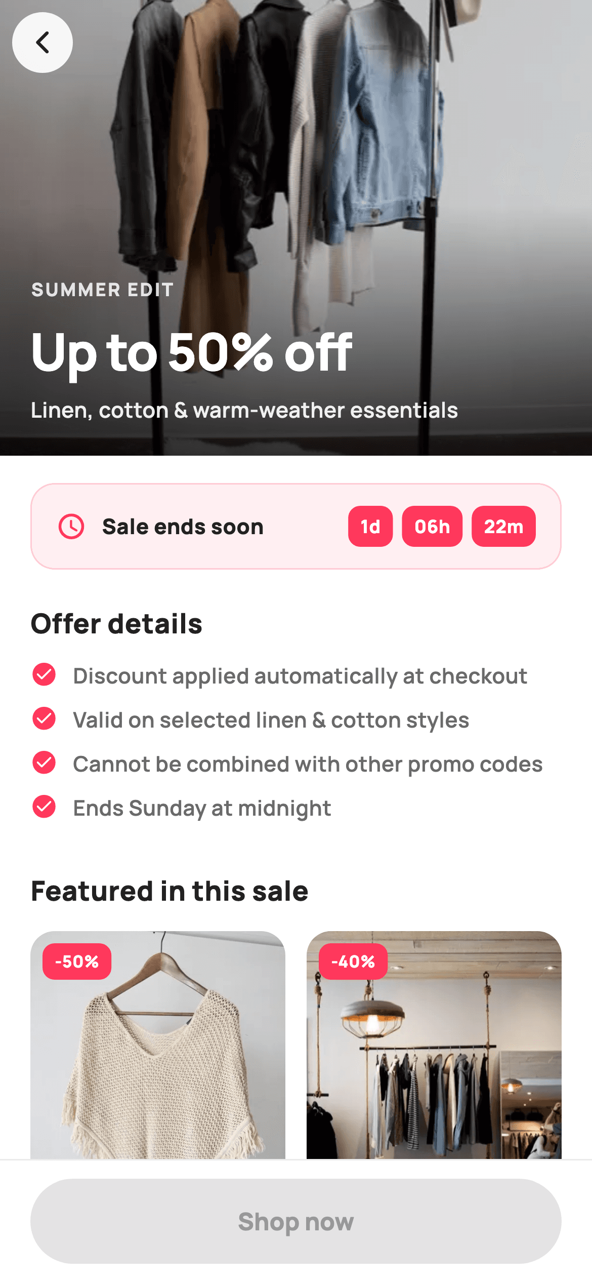
Tapping a home-screen promo banner has to land somewhere that closes the sale. This tutorial builds StyleCart's campaign page in Flutter: a 300px hero photo darkened by a two-stop gradient so white headline text stays readable over any image, a countdown strip, four plain-language terms, and a product grid whose discount badges are calculated from the prices rather than typed. A floating circular back button and a pinned Shop now bar sit above the scroll in a Stack.
Watch the Flutter UI walkthrough
A short screen recording of Promo Banner running, if you'd rather see it before you read the code. The written tutorial below covers everything in it.
Can't see the video? Watch it on YouTube.
What you'll build
- ✓A full-bleed hero with a gradient scrim that guarantees legible text over any photo
- ✓Discount percentages computed from was-and-now prices instead of hard-coded
- ✓A non-scrolling GridView nested inside a ListView with shrinkWrap
- ✓A floating back button and pinned CTA layered over the content with a Stack
Step-by-step build
Create the file
Add a new file at lib/ecom_home_banner_detail/ecom_home_banner_detail_screen.dart in your Flutter project.
Register the bundled fonts
No external packages — this is pure Flutter. It does bundle its design font (Manrope), so drop the font file into fonts/ and declare it in pubspec.yaml:
flutter:
  fonts:
    - family: Manrope
      fonts:
- asset: fonts/Manrope-Regular.ttfBuild it, piece by piece
Here's how the screen goes together. Each block below is a real slice of the code with a plain-English explanation — paste them in order, or grab the whole file from the next section.
Campaign copy as parameters, content as const data
import 'package:flutter/material.dart';

/// StyleCart — Promo Banner Detail.
///
/// The campaign landing behind a home hero banner: full-bleed promo photo with
/// headline + discount, a countdown/validity strip, the offer's terms, a grid of
/// featured pieces, and a pinned "Shop now" CTA.
///
/// Self-contained per CONVENTIONS.md: pure Flutter, bundled Manrope, inline
/// Airbnb-style tokens, own light theme + SafeArea, bundled webp photos. No
/// emoji glyphs. Exposes callbacks only.
class EcomHomeBannerDetailScreen extends StatelessWidget {
  const EcomHomeBannerDetailScreen({
    super.key,
    this.title = 'Summer Edit',
    this.headline = 'Up to 50% off',
    this.subhead = 'Linen, cotton & warm-weather essentials',
    this.onBack,
    this.onShopNow,
    this.onProduct,
  });

  final String title;
  final String headline;
  final String subhead;
  final VoidCallback? onBack;
  final VoidCallback? onShopNow;
  final ValueChanged<String>? onProduct;

  static const String _font = 'Manrope';
  static const Color _canvas = Color(0xFFFFFFFF);
  static const Color _ink = Color(0xFF222222);
  static const Color _muted = Color(0xFF6A6A6A);
  static const Color _brand = Color(0xFFFF385C);
  static const Color _imageBg = Color(0xFFF5F5F5);
  static const Color _hairline = Color(0xFFEBEBEB);

  static const String _dir =
      'lib/screens/ecommerce/ecom_home_banner_detail/images';

  static const List<String> _terms = <String>[
    'Discount applied automatically at checkout',
    'Valid on selected linen & cotton styles',
    'Cannot be combined with other promo codes',
    'Ends Sunday at midnight',
  ];

  static const List<_F> _featured = <_F>[
    _F('Linen camp shirt', 'Atelier', 39, 78, 'p01.webp'),
    _F('Wide-leg trouser', 'Northbound', 58, 96, 'p02.webp'),
    _F('Boxy denim jacket', 'Stride', 94, 134, 'p03.webp'),
    _F('Belted wrap coat', 'Atelier', 132, 220, 'p04.webp'),
  ];
The three pieces of campaign copy — `title`, `headline` and `subhead` — are constructor parameters with defaults, so the same screen can render a Summer Edit or a Black Friday drop without touching the widget. Everything else is `static const` data: `_terms` as four strings, and `_featured` as a list of `_F` records pairing a title, brand, current price, original price and image filename. Keeping `was` alongside `price` is the decision that pays off later — the discount badge is derived from both rather than being a third field somebody has to remember to update.
Three layers in a Stack
  @override
  Widget build(BuildContext context) {
    return Theme(
      data: ThemeData.light(useMaterial3: true),
      child: Scaffold(
        backgroundColor: _canvas,
        body: Stack(
          children: <Widget>[
            ListView(
              padding: const EdgeInsets.only(bottom: 96),
              children: <Widget>[
                _hero(),
                _countdownStrip(),
                Padding(
                  padding: const EdgeInsets.fromLTRB(20, 22, 20, 0),
                  child: Column(
                    crossAxisAlignment: CrossAxisAlignment.start,
                    children: <Widget>[
                      const Text(
                        'Offer details',
                        style: TextStyle(
                          fontFamily: _font,
                          fontSize: 18,
                          fontWeight: FontWeight.w800,
                          color: _ink,
                        ),
                      ),
                      const SizedBox(height: 12),
                      ..._terms.map(_term),
                    ],
                  ),
                ),
                const Padding(
                  padding: EdgeInsets.fromLTRB(20, 22, 20, 0),
                  child: Text(
                    'Featured in this sale',
                    style: TextStyle(
                      fontFamily: _font,
                      fontSize: 18,
                      fontWeight: FontWeight.w800,
                      color: _ink,
                    ),
                  ),
                ),
                GridView.builder(
                  padding: const EdgeInsets.fromLTRB(20, 14, 20, 8),
                  shrinkWrap: true,
                  physics: const NeverScrollableScrollPhysics(),
                  gridDelegate:
                      const SliverGridDelegateWithFixedCrossAxisCount(
                    crossAxisCount: 2,
                    mainAxisSpacing: 18,
                    crossAxisSpacing: 14,
                    childAspectRatio: 0.62,
                  ),
                  itemCount: _featured.length,
                  itemBuilder: (BuildContext context, int i) =>
                      _card(_featured[i]),
                ),
              ],
            ),
            SafeArea(
              child: Padding(
                padding: const EdgeInsets.all(8),
                child: Align(
                  alignment: Alignment.topLeft,
                  child: GestureDetector(
                    onTap: onBack,
                    child: Container(
                      width: 40,
                      height: 40,
                      decoration: BoxDecoration(
                        color: _canvas.withValues(alpha: 0.92),
                        shape: BoxShape.circle,
                      ),
                      child: const Icon(Icons.arrow_back_ios_new_rounded,
                          size: 18, color: _ink),
                    ),
                  ),
                ),
              ),
            ),
            Align(
              alignment: Alignment.bottomCenter,
              child: _pinnedCta(),
            ),
          ],
        ),
      ),
    );
  }
The body is a `Stack` of scrolling content, a floating back button and a pinned CTA. The `ListView` carries `padding: const EdgeInsets.only(bottom: 96)`, which reserves room so the last grid row is not hidden behind the CTA bar overlaying it — the fix for the classic 'I can't reach the bottom item' bug when a bar floats over a list. The terms are spread in with `..._terms.map(_term)`, passing the builder as a tear-off. The grid uses `shrinkWrap: true` with `NeverScrollableScrollPhysics()`, the required pair for nesting a GridView inside a ListView: shrinkWrap makes it size to its content, and disabling its physics hands all scrolling to the parent so the two do not fight.
A hero that stays readable over any photo
  Widget _hero() {
    return SizedBox(
      height: 300,
      child: Stack(
        fit: StackFit.expand,
        children: <Widget>[
          Container(color: _imageBg),
          Image.asset('$_dir/p21.webp', fit: BoxFit.cover),
          const DecoratedBox(
            decoration: BoxDecoration(
              gradient: LinearGradient(
                begin: Alignment.topCenter,
                end: Alignment.bottomCenter,
                colors: <Color>[Color(0x22000000), Color(0xCC000000)],
                stops: <double>[0.45, 1.0],
              ),
            ),
          ),
          Align(
            alignment: Alignment.bottomLeft,
            child: Padding(
              padding: const EdgeInsets.fromLTRB(20, 0, 20, 20),
              child: Column(
                mainAxisSize: MainAxisSize.min,
                crossAxisAlignment: CrossAxisAlignment.start,
                children: <Widget>[
                  Text(
                    title.toUpperCase(),
                    style: TextStyle(
                      fontFamily: _font,
                      fontSize: 12,
                      fontWeight: FontWeight.w800,
                      letterSpacing: 1.2,
                      color: _canvas.withValues(alpha: 0.85),
                    ),
                  ),
                  const SizedBox(height: 8),
                  Text(
                    headline,
                    style: const TextStyle(
                      fontFamily: _font,
                      fontSize: 34,
                      fontWeight: FontWeight.w800,
                      letterSpacing: -0.8,
                      color: _canvas,
                    ),
                  ),
                  const SizedBox(height: 4),
                  Text(
                    subhead,
                    style: TextStyle(
                      fontFamily: _font,
                      fontSize: 14,
                      fontWeight: FontWeight.w600,
                      color: _canvas.withValues(alpha: 0.92),
                    ),
                  ),
                ],
              ),
            ),
          ),
        ],
      ),
    );
  }
The hero is a 300px `Stack` with `fit: StackFit.expand` layering four things: a `_imageBg` placeholder that shows while the asset decodes, the photo at `BoxFit.cover`, a gradient scrim, and the text. The scrim is the important part — a `LinearGradient` from `Color(0x22000000)` to `Color(0xCC000000)` with `stops: <double>[0.45, 1.0]`, so the top 45% is barely touched and the darkening ramps up only where the text sits. That guarantees white type stays legible whatever photo the marketing team supplies, without dimming the whole image. The copy is a three-tier block: a tracked-out 12px eyebrow, a 34px headline at `letterSpacing: -0.8`, and a 14px subhead at 92% white.
The urgency strip
  Widget _countdownStrip() {
    return Container(
      margin: const EdgeInsets.fromLTRB(20, 18, 20, 0),
      padding: const EdgeInsets.symmetric(horizontal: 16, vertical: 14),
      decoration: BoxDecoration(
        color: _brand.withValues(alpha: 0.08),
        borderRadius: BorderRadius.circular(16),
        border: Border.all(color: _brand.withValues(alpha: 0.20)),
      ),
      child: Row(
        children: <Widget>[
          const Icon(Icons.schedule_rounded, size: 20, color: _brand),
          const SizedBox(width: 10),
          const Expanded(
            child: Text(
              'Sale ends soon',
              style: TextStyle(
                fontFamily: _font,
                fontSize: 14,
                fontWeight: FontWeight.w800,
                color: _ink,
              ),
            ),
          ),
          Row(
            children: const <Widget>[
              _Pillbox('1d'),
              SizedBox(width: 6),
              _Pillbox('06h'),
              SizedBox(width: 6),
              _Pillbox('22m'),
            ],
          ),
        ],
      ),
    );
  }
`_countdownStrip` is styled entirely from one colour at two alphas: a fill of `_brand.withValues(alpha: 0.08)` and a border at `alpha: 0.20`. Deriving both from the brand hue is what makes it read as a soft branded panel rather than an outlined control competing with the Shop now button below. The time units are three `_Pillbox` widgets — small solid-coral chips showing '1d', '06h', '22m'. Splitting the remaining time into separate boxes rather than one string is a deliberately more urgent presentation, and because `_Pillbox` is its own const-constructible widget, wiring it to a real ticking `Timer` later means changing only what you pass in.
Terms written to be read
  Widget _term(String t) {
    return Padding(
      padding: const EdgeInsets.only(bottom: 10),
      child: Row(
        crossAxisAlignment: CrossAxisAlignment.start,
        children: <Widget>[
          const Icon(Icons.check_circle_rounded, size: 18, color: _brand),
          const SizedBox(width: 10),
          Expanded(
            child: Text(
              t,
              style: const TextStyle(
                fontFamily: _font,
                fontSize: 14,
                fontWeight: FontWeight.w600,
                height: 1.35,
                color: _muted,
              ),
            ),
          ),
        ],
      ),
    );
  }
`_term` renders each condition as a check icon beside `Expanded` text with `crossAxisAlignment: CrossAxisAlignment.start`, so a term that wraps keeps its icon level with the first line instead of floating into the middle of the paragraph. The choice worth copying is upstream of the code: these are four short sentences at 14px in `_muted`, not a grey wall of legal text. 'Ends Sunday at midnight' and 'Cannot be combined with other promo codes' are the two facts that actually cause abandoned carts, and putting them above the product grid means nobody discovers them at checkout.
Product cards with a calculated discount
  Widget _card(_F f) {
    return GestureDetector(
      onTap: () => onProduct?.call(f.title),
      child: Column(
        crossAxisAlignment: CrossAxisAlignment.start,
        children: <Widget>[
          Expanded(
            child: ClipRRect(
              borderRadius: BorderRadius.circular(16),
              child: Stack(
                fit: StackFit.expand,
                children: <Widget>[
                  Container(color: _imageBg),
                  Image.asset('$_dir/${f.asset}', fit: BoxFit.cover),
                  Positioned(
                    left: 8,
                    top: 8,
                    child: Container(
                      padding: const EdgeInsets.symmetric(
                          horizontal: 8, vertical: 4),
                      decoration: BoxDecoration(
                        color: _brand,
                        borderRadius: BorderRadius.circular(8),
                      ),
                      child: Text(
                        '-${(100 * (f.was - f.price) / f.was).round()}%',
                        style: const TextStyle(
                          fontFamily: _font,
                          fontSize: 11,
                          fontWeight: FontWeight.w800,
                          color: _canvas,
                        ),
                      ),
                    ),
                  ),
                ],
              ),
            ),
          ),
          const SizedBox(height: 8),
          Text(
            f.brand.toUpperCase(),
            style: const TextStyle(
              fontFamily: _font,
              fontSize: 10.5,
              fontWeight: FontWeight.w700,
              letterSpacing: 0.6,
              color: _muted,
            ),
          ),
          const SizedBox(height: 2),
          Text(
            f.title,
            maxLines: 1,
            overflow: TextOverflow.ellipsis,
            style: const TextStyle(
              fontFamily: _font,
              fontSize: 14,
              fontWeight: FontWeight.w700,
              color: _ink,
            ),
          ),
          const SizedBox(height: 4),
          Row(
            children: <Widget>[
              Text(
                '\$${f.price}',
                style: const TextStyle(
                  fontFamily: _font,
                  fontSize: 14.5,
                  fontWeight: FontWeight.w800,
                  color: _brand,
                ),
              ),
              const SizedBox(width: 6),
              Text(
                '\$${f.was}',
                style: const TextStyle(
                  fontFamily: _font,
                  fontSize: 12,
                  fontWeight: FontWeight.w600,
                  color: Color(0xFFC1C1C1),
                  decoration: TextDecoration.lineThrough,
                ),
              ),
            ],
          ),
        ],
      ),
    );
  }
Each card is a Column whose image is wrapped in `Expanded` — that is what makes the grid's `childAspectRatio: 0.62` work, letting the photo absorb whatever height the text below does not use. The badge is the piece to steal: `'-${(100 * (f.was - f.price) / f.was).round()}%'` computes the discount from the two prices at build time, so it can never disagree with what is displayed underneath. Below, the brand is a tracked-out 10.5px caption, the title is capped with `maxLines: 1` and `TextOverflow.ellipsis`, and the price pair puts the current price in coral `w800` beside the original in `_faint` grey with `decoration: TextDecoration.lineThrough`.
The floating controls
  Widget _pinnedCta() {
    return Container(
      decoration: const BoxDecoration(
        color: _canvas,
        border: Border(top: BorderSide(color: _hairline)),
      ),
      child: SafeArea(
        top: false,
        child: Padding(
          padding: const EdgeInsets.fromLTRB(20, 12, 20, 12),
          child: SizedBox(
            height: 56,
            width: double.infinity,
            child: FilledButton(
              onPressed: onShopNow,
              style: FilledButton.styleFrom(
                backgroundColor: _brand,
                foregroundColor: _canvas,
                shape: const StadiumBorder(),
                textStyle: const TextStyle(
                  fontFamily: _font,
                  fontSize: 16,
                  fontWeight: FontWeight.w800,
                ),
              ),
              child: const Text('Shop now'),
            ),
          ),
        ),
      ),
    );
  }
The back button is a 40px circle at `_canvas.withValues(alpha: 0.92)` — a near-opaque white disc rather than a bare icon, because a plain dark arrow would vanish against a light patch of hero photo. The CTA bar at the bottom is a Container with a top hairline wrapping `SafeArea(top: false)`, placing the SafeArea inside so the white background extends under the home indicator while the button stays above it. Because both sit in the Stack rather than in the ListView, they hold position while the campaign scrolls, and the button's `StadiumBorder` gives the pill shape StyleCart uses for every primary action.
Full code
The complete, ready-to-paste source. Free to use in your projects — one click copies it all.
import 'package:flutter/material.dart';
/// StyleCart — Promo Banner Detail.
///
/// The campaign landing behind a home hero banner: full-bleed promo photo with
/// headline + discount, a countdown/validity strip, the offer's terms, a grid of
/// featured pieces, and a pinned "Shop now" CTA.
///
/// Self-contained per CONVENTIONS.md: pure Flutter, bundled Manrope, inline
/// Airbnb-style tokens, own light theme + SafeArea, bundled webp photos. No
/// emoji glyphs. Exposes callbacks only.
class EcomHomeBannerDetailScreen extends StatelessWidget {
const EcomHomeBannerDetailScreen({
super.key,
this.title = 'Summer Edit',
this.headline = 'Up to 50% off',
this.subhead = 'Linen, cotton & warm-weather essentials',
this.onBack,
this.onShopNow,
this.onProduct,
});
final String title;
final String headline;
final String subhead;
final VoidCallback? onBack;
final VoidCallback? onShopNow;
final ValueChanged<String>? onProduct;
static const String _font = 'Manrope';
static const Color _canvas = Color(0xFFFFFFFF);
static const Color _ink = Color(0xFF222222);
static const Color _muted = Color(0xFF6A6A6A);
static const Color _brand = Color(0xFFFF385C);
static const Color _imageBg = Color(0xFFF5F5F5);
static const Color _hairline = Color(0xFFEBEBEB);
static const String _dir =
'lib/screens/ecommerce/ecom_home_banner_detail/images';
static const List<String> _terms = <String>[
'Discount applied automatically at checkout',
'Valid on selected linen & cotton styles',
'Cannot be combined with other promo codes',
'Ends Sunday at midnight',
];
static const List<_F> _featured = <_F>[
_F('Linen camp shirt', 'Atelier', 39, 78, 'p01.webp'),
_F('Wide-leg trouser', 'Northbound', 58, 96, 'p02.webp'),
_F('Boxy denim jacket', 'Stride', 94, 134, 'p03.webp'),
_F('Belted wrap coat', 'Atelier', 132, 220, 'p04.webp'),
];
@override
Widget build(BuildContext context) {
return Theme(
data: ThemeData.light(useMaterial3: true),
child: Scaffold(
backgroundColor: _canvas,
body: Stack(
children: <Widget>[
ListView(
padding: const EdgeInsets.only(bottom: 96),
children: <Widget>[
_hero(),
_countdownStrip(),
Padding(
padding: const EdgeInsets.fromLTRB(20, 22, 20, 0),
child: Column(
crossAxisAlignment: CrossAxisAlignment.start,
children: <Widget>[
const Text(
'Offer details',
style: TextStyle(
fontFamily: _font,
fontSize: 18,
fontWeight: FontWeight.w800,
color: _ink,
),
),
const SizedBox(height: 12),
..._terms.map(_term),
],
),
),
const Padding(
padding: EdgeInsets.fromLTRB(20, 22, 20, 0),
child: Text(
'Featured in this sale',
style: TextStyle(
fontFamily: _font,
fontSize: 18,
fontWeight: FontWeight.w800,
color: _ink,
),
),
),
GridView.builder(
padding: const EdgeInsets.fromLTRB(20, 14, 20, 8),
shrinkWrap: true,
physics: const NeverScrollableScrollPhysics(),
gridDelegate:
const SliverGridDelegateWithFixedCrossAxisCount(
crossAxisCount: 2,
mainAxisSpacing: 18,
crossAxisSpacing: 14,
childAspectRatio: 0.62,
),
itemCount: _featured.length,
itemBuilder: (BuildContext context, int i) =>
_card(_featured[i]),
),
],
),
SafeArea(
child: Padding(
padding: const EdgeInsets.all(8),
child: Align(
alignment: Alignment.topLeft,
child: GestureDetector(
onTap: onBack,
child: Container(
width: 40,
height: 40,
decoration: BoxDecoration(
color: _canvas.withValues(alpha: 0.92),
shape: BoxShape.circle,
),
child: const Icon(Icons.arrow_back_ios_new_rounded,
size: 18, color: _ink),
),
),
),
),
),
Align(
alignment: Alignment.bottomCenter,
child: _pinnedCta(),
),
],
),
),
);
}
Widget _hero() {
return SizedBox(
height: 300,
child: Stack(
fit: StackFit.expand,
children: <Widget>[
Container(color: _imageBg),
Image.asset('$_dir/p21.webp', fit: BoxFit.cover),
const DecoratedBox(
decoration: BoxDecoration(
gradient: LinearGradient(
begin: Alignment.topCenter,
end: Alignment.bottomCenter,
colors: <Color>[Color(0x22000000), Color(0xCC000000)],
stops: <double>[0.45, 1.0],
),
),
),
Align(
alignment: Alignment.bottomLeft,
child: Padding(
padding: const EdgeInsets.fromLTRB(20, 0, 20, 20),
child: Column(
mainAxisSize: MainAxisSize.min,
crossAxisAlignment: CrossAxisAlignment.start,
children: <Widget>[
Text(
title.toUpperCase(),
style: TextStyle(
fontFamily: _font,
fontSize: 12,
fontWeight: FontWeight.w800,
letterSpacing: 1.2,
color: _canvas.withValues(alpha: 0.85),
),
),
const SizedBox(height: 8),
Text(
headline,
style: const TextStyle(
fontFamily: _font,
fontSize: 34,
fontWeight: FontWeight.w800,
letterSpacing: -0.8,
color: _canvas,
),
),
const SizedBox(height: 4),
Text(
subhead,
style: TextStyle(
fontFamily: _font,
fontSize: 14,
fontWeight: FontWeight.w600,
color: _canvas.withValues(alpha: 0.92),
),
),
],
),
),
),
],
),
);
}
Widget _countdownStrip() {
return Container(
margin: const EdgeInsets.fromLTRB(20, 18, 20, 0),
padding: const EdgeInsets.symmetric(horizontal: 16, vertical: 14),
decoration: BoxDecoration(
color: _brand.withValues(alpha: 0.08),
borderRadius: BorderRadius.circular(16),
border: Border.all(color: _brand.withValues(alpha: 0.20)),
),
child: Row(
children: <Widget>[
const Icon(Icons.schedule_rounded, size: 20, color: _brand),
const SizedBox(width: 10),
const Expanded(
child: Text(
'Sale ends soon',
style: TextStyle(
fontFamily: _font,
fontSize: 14,
fontWeight: FontWeight.w800,
color: _ink,
),
),
),
Row(
children: const <Widget>[
_Pillbox('1d'),
SizedBox(width: 6),
_Pillbox('06h'),
SizedBox(width: 6),
_Pillbox('22m'),
],
),
],
),
);
}
Widget _term(String t) {
return Padding(
padding: const EdgeInsets.only(bottom: 10),
child: Row(
crossAxisAlignment: CrossAxisAlignment.start,
children: <Widget>[
const Icon(Icons.check_circle_rounded, size: 18, color: _brand),
const SizedBox(width: 10),
Expanded(
child: Text(
t,
style: const TextStyle(
fontFamily: _font,
fontSize: 14,
fontWeight: FontWeight.w600,
height: 1.35,
color: _muted,
),
),
),
],
),
);
}
Widget _card(_F f) {
return GestureDetector(
onTap: () => onProduct?.call(f.title),
child: Column(
crossAxisAlignment: CrossAxisAlignment.start,
children: <Widget>[
Expanded(
child: ClipRRect(
borderRadius: BorderRadius.circular(16),
child: Stack(
fit: StackFit.expand,
children: <Widget>[
Container(color: _imageBg),
Image.asset('$_dir/${f.asset}', fit: BoxFit.cover),
Positioned(
left: 8,
top: 8,
child: Container(
padding: const EdgeInsets.symmetric(
horizontal: 8, vertical: 4),
decoration: BoxDecoration(
color: _brand,
borderRadius: BorderRadius.circular(8),
),
child: Text(
'-${(100 * (f.was - f.price) / f.was).round()}%',
style: const TextStyle(
fontFamily: _font,
fontSize: 11,
fontWeight: FontWeight.w800,
color: _canvas,
),
),
),
),
],
),
),
),
const SizedBox(height: 8),
Text(
f.brand.toUpperCase(),
style: const TextStyle(
fontFamily: _font,
fontSize: 10.5,
fontWeight: FontWeight.w700,
letterSpacing: 0.6,
color: _muted,
),
),
const SizedBox(height: 2),
Text(
f.title,
maxLines: 1,
overflow: TextOverflow.ellipsis,
style: const TextStyle(
fontFamily: _font,
fontSize: 14,
fontWeight: FontWeight.w700,
color: _ink,
),
),
const SizedBox(height: 4),
Row(
children: <Widget>[
Text(
'\$${f.price}',
style: const TextStyle(
fontFamily: _font,
fontSize: 14.5,
fontWeight: FontWeight.w800,
color: _brand,
),
),
const SizedBox(width: 6),
Text(
'\$${f.was}',
style: const TextStyle(
fontFamily: _font,
fontSize: 12,
fontWeight: FontWeight.w600,
color: Color(0xFFC1C1C1),
decoration: TextDecoration.lineThrough,
),
),
],
),
],
),
);
}
Widget _pinnedCta() {
return Container(
decoration: const BoxDecoration(
color: _canvas,
border: Border(top: BorderSide(color: _hairline)),
),
child: SafeArea(
top: false,
child: Padding(
padding: const EdgeInsets.fromLTRB(20, 12, 20, 12),
child: SizedBox(
height: 56,
width: double.infinity,
child: FilledButton(
onPressed: onShopNow,
style: FilledButton.styleFrom(
backgroundColor: _brand,
foregroundColor: _canvas,
shape: const StadiumBorder(),
textStyle: const TextStyle(
fontFamily: _font,
fontSize: 16,
fontWeight: FontWeight.w800,
),
),
child: const Text('Shop now'),
),
),
),
),
);
}
}
class _F {
const _F(this.title, this.brand, this.price, this.was, this.asset);
final String title;
final String brand;
final int price;
final int was;
final String asset;
}
class _Pillbox extends StatelessWidget {
const _Pillbox(this.value);
final String value;
@override
Widget build(BuildContext context) {
return Container(
padding: const EdgeInsets.symmetric(horizontal: 8, vertical: 5),
decoration: BoxDecoration(
color: const Color(0xFFFF385C),
borderRadius: BorderRadius.circular(8),
),
child: Text(
value,
style: const TextStyle(
fontFamily: 'Manrope',
fontSize: 12,
fontWeight: FontWeight.w800,
color: Color(0xFFFFFFFF),
),
),
);
}
}
Plus bundled 10 binary assets (fonts/images). The CLI and MCP install those for you automatically.
Two faster ways to add it
Copy-paste works, but you can skip it entirely.
1. FlutterKit CLI
One command drops this screen — and its fonts — straight into your project.
$ flutterkit add ecom-home-banner-detail2. AI agent (MCP)
Connect FlutterKit's MCP server in Claude or Cursor and just ask your agent to install ecom-home-banner-detail — it fetches and writes the files for you.
FAQ
Is this promo campaign screen free to use commercially?
Yes. Every FlutterKit screen is free with no paid tier behind it. Take the campaign page from this page, the CLI, or MCP, and put it in a production storefront — no account to create, no licence to buy, nothing to credit.
Why does the grid need shrinkWrap and NeverScrollableScrollPhysics?
Because it is nested inside a ListView. `shrinkWrap: true` makes the grid size itself to its content instead of demanding infinite height, and `NeverScrollableScrollPhysics()` stops it competing with the parent for drags. Omit either and you get an unbounded-height error or two scroll views fighting.
How do I make the countdown actually count down?
Convert the screen to a `StatefulWidget`, hold an end `DateTime`, and run a one-second `Timer.periodic` that calls `setState`. Format the remaining duration into the three strings you pass to `_Pillbox` — the widget already takes its value as a parameter, so nothing else changes. Cancel the timer in `dispose`.
Does it need any packages? What about the images?
No packages — just `package:flutter/material.dart`. The screen does use bundled webp photos loaded with `Image.asset`, so declare that folder under `assets:` in your pubspec. The Manrope font ships with the screen and goes in the `fonts:` block.
Which Flutter version does this need?
Flutter 3.22 or newer, because the hero text, countdown strip and floating buttons all use `Color.withValues(alpha: ...)`. On an older SDK swap those for `withOpacity(...)` and expand the constructor to the `{Key? key, ...} : super(key: key)` form.


