How to Build an Upcoming Drops Screen in Flutter (Full Code + Preview)
Limited drops sell out in minutes, so the screen that comes before a launch has one job: turn interest into a reminder. This tutorial builds StyleCart's upcoming-drops screen in Flutter — a scrolling feed of full-bleed 3:2 hero cards, each layering artwork under a dark gradient scrim, a frosted countdown chip like 'Drops in 2d 14h', an uppercase brand label with a large title, and a Remind me pill that flips from pink to green 'Reminded' with a single Set<int> toggle. Everything is pure Flutter with the bundled Manrope font.
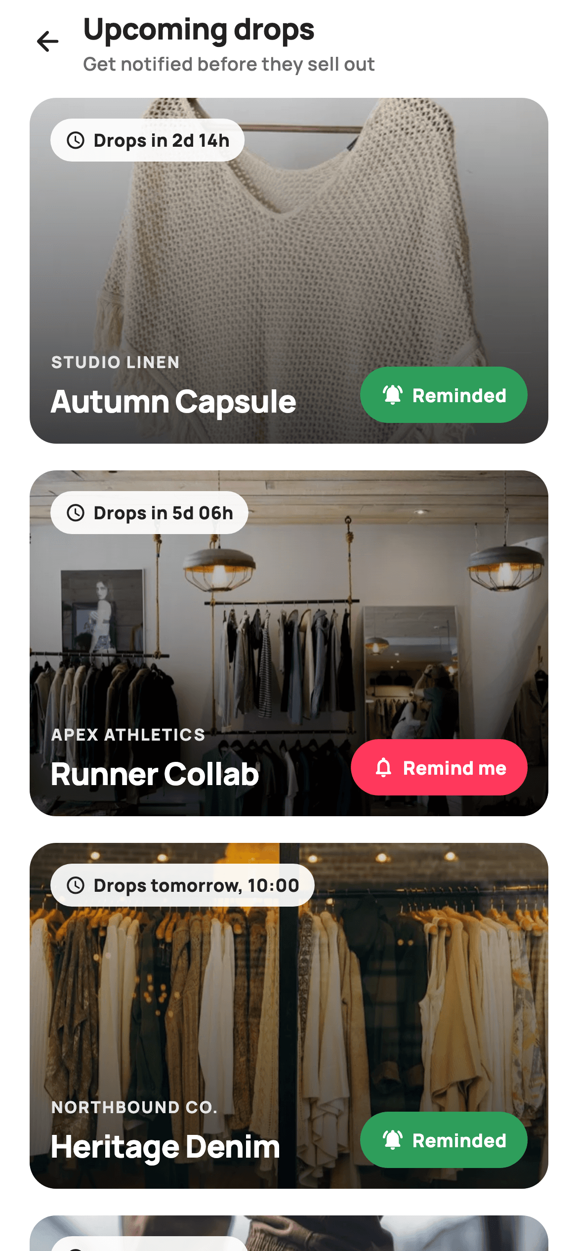
What you'll build
- ✓Full-bleed 3:2 hero cards clipped to an 18px radius, with drop artwork under a black gradient scrim that runs 8% to 72% opacity
- ✓A translucent white countdown pill (92% alpha) pinned to each card's top-left with a schedule icon and per-drop countdown text
- ✓A Remind me toggle backed by one Set<int> — pink #FF385C off, green #2E9E5B on, swapping both bell icon and label in the same tap
- ✓A bottom text block that keeps an uppercase letter-spaced brand line and a 21px title readable over any photo
- ✓A tiny immutable _Drop model holding image key, title, brand and countdown copy for four scheduled launches
Step-by-step build
Create the file
Add a new file at lib/ecom_flash_upcoming/ecom_flash_upcoming_screen.dart in your Flutter project.
Register the bundled fonts
No external packages — this is pure Flutter. It does bundle its design font (Manrope), so drop the font file into fonts/ and declare it in pubspec.yaml:
flutter:
  fonts:
    - family: Manrope
      fonts:
- asset: fonts/Manrope-Regular.ttfBuild it, piece by piece
Here's how the screen goes together. Each block below is a real slice of the code with a plain-English explanation — paste them in order, or grab the whole file from the next section.
Tokens, four drops, and a Set for reminders
import 'package:flutter/material.dart';

/// StyleCart — Upcoming Drops.
///
/// Scheduled launches as full-bleed hero cards: each shows the drop artwork, a
/// countdown chip, a teaser line and a "Remind me" toggle that flips to a
/// reminded state.
///
/// Self-contained per CONVENTIONS.md: pure Flutter, bundled Manrope, inline
/// Airbnb-style tokens, own light theme + SafeArea. Bundled hero webp; chrome
/// is painted/icon only. Exposes callbacks only.
class EcomFlashUpcomingScreen extends StatefulWidget {
  const EcomFlashUpcomingScreen({super.key, this.onBack});

  final VoidCallback? onBack;

  @override
  State<EcomFlashUpcomingScreen> createState() =>
      _EcomFlashUpcomingScreenState();
}

class _EcomFlashUpcomingScreenState extends State<EcomFlashUpcomingScreen> {
  static const String _dir =
      'lib/screens/ecommerce/ecom_flash_upcoming/images';
  static const String _font = 'Manrope';
  static const Color _canvas = Color(0xFFFFFFFF);
  static const Color _ink = Color(0xFF222222);
  static const Color _muted = Color(0xFF6A6A6A);
  static const Color _brand = Color(0xFFFF385C);
  static const Color _success = Color(0xFF2E9E5B);

  static const List<_Drop> _drops = <_Drop>[
    _Drop('p01', 'Autumn Capsule', 'Studio Linen', 'Drops in 2d 14h'),
    _Drop('p02', 'Runner Collab', 'Apex Athletics', 'Drops in 5d 06h'),
    _Drop('p03', 'Heritage Denim', 'Northbound Co.', 'Drops tomorrow, 10:00'),
    _Drop('p04', 'Limited Totes', 'Maison Carry', 'Drops in 8d 02h'),
  ];

  late final Set<int> _reminded = <int>{0, 2};
The widget is stateful for exactly one reason: the reminder toggles. The palette is five constants — white `_canvas`, near-black `_ink` at `#222222`, grey `_muted`, the brand pink `#FF385C` and a green `_success` at `#2E9E5B` — and the pink/green pair exists purely so the reminder pill can change meaning, not just shade. The four launches are a `static const List<_Drop>`, each carrying an image key, title, brand and a pre-formatted countdown string ('Drops in 2d 14h', 'Drops tomorrow, 10:00'), so the card builder never does date maths. Reminder state is `late final Set<int> _reminded = <int>{0, 2}` — a set of list indices rather than a flag on each drop. Seeding it with 0 and 2 means the demo opens with both pill states visible, and keeping state outside the data model means `_drops` can stay `const`.
A lazy list inside a local light theme
  @override
  Widget build(BuildContext context) {
    return Theme(
      data: ThemeData.light(useMaterial3: true),
      child: Scaffold(
        backgroundColor: _canvas,
        body: SafeArea(
          child: Column(
            children: <Widget>[
              _header(),
              Expanded(
                child: ListView.builder(
                  padding: const EdgeInsets.fromLTRB(20, 8, 20, 28),
                  itemCount: _drops.length,
                  itemBuilder: (BuildContext _, int i) => _dropCard(_drops[i], i),
                ),
              ),
            ],
          ),
        ),
      ),
    );
  }
`build` wraps everything in `Theme(data: ThemeData.light(useMaterial3: true))`, so the screen keeps its white canvas even when dropped into a dark-themed app — a self-containment habit rather than a styling flourish. The body is a `Column` of the header plus an `Expanded` `ListView.builder`. With only four drops a plain `ListView` would work, but `.builder` costs nothing and keeps the pattern correct when the list comes from an API with twenty launches. The padding `fromLTRB(20, 8, 20, 28)` gives cards a 20px gutter, tucks the first card 8px under the header, and leaves 28px of breathing room past the last card so the scroll doesn't end flush against the screen edge.
A header that sets expectations in two lines
  Widget _header() {
    return Padding(
      padding: const EdgeInsets.fromLTRB(8, 4, 20, 6),
      child: Row(
        children: <Widget>[
          IconButton(
            onPressed: widget.onBack,
            icon: const Icon(Icons.arrow_back_rounded, size: 22, color: _ink),
          ),
          const Expanded(
            child: Column(
              crossAxisAlignment: CrossAxisAlignment.start,
              children: <Widget>[
                Text(
                  'Upcoming drops',
                  style: TextStyle(
                    fontFamily: _font,
                    fontSize: 20,
                    fontWeight: FontWeight.w800,
                    letterSpacing: -0.3,
                    color: _ink,
                  ),
                ),
                Text(
                  'Get notified before they sell out',
                  style: TextStyle(
                    fontFamily: _font,
                    fontSize: 12.5,
                    fontWeight: FontWeight.w600,
                    color: _muted,
                  ),
                ),
              ],
            ),
          ),
        ],
      ),
    );
  }
The header is a `Row` of a back `IconButton` and an `Expanded` two-line `Column`: 'Upcoming drops' at 20px `w800` with `letterSpacing: -0.3`, then 'Get notified before they sell out' at 12.5px in `_muted` grey. That subline is doing quiet conversion work — it tells the reader what the Remind me pills are for before they've seen one. The asymmetric padding `fromLTRB(8, 4, 20, 6)` is deliberate: the `IconButton` carries its own touch-target whitespace, so only 8px is needed on the left to make the arrow's visual position line up with the 20px gutter the cards use below.
The card shell: aspect ratio, clip, and scrim
  Widget _dropCard(_Drop d, int i) {
    final bool on = _reminded.contains(i);
    return Container(
      margin: const EdgeInsets.only(bottom: 18),
      child: ClipRRect(
        borderRadius: BorderRadius.circular(18),
        child: Stack(
          children: <Widget>[
            AspectRatio(
              aspectRatio: 3 / 2,
              child: Container(
                color: const Color(0xFFF5F5F5),
                child: Image.asset('$_dir/${d.img}.webp', fit: BoxFit.cover),
              ),
            ),
            Positioned.fill(
              child: DecoratedBox(
                decoration: BoxDecoration(
                  gradient: LinearGradient(
                    begin: Alignment.topCenter,
                    end: Alignment.bottomCenter,
                    colors: <Color>[
                      Colors.black.withValues(alpha: 0.08),
                      Colors.black.withValues(alpha: 0.72),
                    ],
                  ),
                ),
              ),
            ),
`_dropCard` starts by resolving `final bool on = _reminded.contains(i)` once, so the three places that depend on reminder state read one local instead of querying the set repeatedly. The card itself is a `ClipRRect` at radius 18 around a `Stack`. Layer one is an `AspectRatio(aspectRatio: 3 / 2)` holding the webp via `Image.asset` with `BoxFit.cover`, sitting on an `#F5F5F5` container so a slow-loading image shows a neutral grey instead of a white flash. Layer two is the scrim: a `Positioned.fill` `LinearGradient` from `Colors.black.withValues(alpha: 0.08)` at the top down to `0.72` at the bottom. The near-transparent top keeps the artwork vivid where nothing sits on it; the heavy bottom is what lets white text survive any photo.
The countdown chip
            Positioned(
              left: 14,
              top: 14,
              child: Container(
                padding:
                    const EdgeInsets.symmetric(horizontal: 10, vertical: 6),
                decoration: BoxDecoration(
                  color: Colors.white.withValues(alpha: 0.92),
                  borderRadius: BorderRadius.circular(9999),
                ),
                child: Row(
                  mainAxisSize: MainAxisSize.min,
                  children: <Widget>[
                    const Icon(Icons.schedule_rounded, size: 14, color: _ink),
                    const SizedBox(width: 5),
                    Text(
                      d.countdown,
                      style: const TextStyle(
                        fontFamily: _font,
                        fontSize: 12,
                        fontWeight: FontWeight.w800,
                        color: _ink,
                      ),
                    ),
                  ],
                ),
              ),
            ),
The countdown lives in a pill `Positioned` at `left: 14, top: 14` — a `Container` with `Colors.white.withValues(alpha: 0.92)` and a `BorderRadius.circular(9999)` stadium shape. It sits at the top of the card, over the lightest part of the gradient, which is why it needs its own background at all: white text would vanish there, so instead the chip goes light and its content goes dark `_ink`. Inside, `mainAxisSize: MainAxisSize.min` shrink-wraps a 14px `Icons.schedule_rounded` and the drop's countdown string at 12px `w800`, with a 5px gap. Because the countdown is just `d.countdown`, formats can vary per drop — relative for far-off launches, 'Drops tomorrow, 10:00' when a concrete time is more useful.
Brand and title over the dark end of the scrim
            Positioned(
              left: 14,
              right: 14,
              bottom: 14,
              child: Row(
                crossAxisAlignment: CrossAxisAlignment.end,
                children: <Widget>[
                  Expanded(
                    child: Column(
                      crossAxisAlignment: CrossAxisAlignment.start,
                      children: <Widget>[
                        Text(
                          d.brand.toUpperCase(),
                          style: const TextStyle(
                            fontFamily: _font,
                            fontSize: 11,
                            fontWeight: FontWeight.w800,
                            letterSpacing: 1.0,
                            color: Color(0xFFE6E6E6),
                          ),
                        ),
                        const SizedBox(height: 3),
                        Text(
                          d.title,
                          style: const TextStyle(
                            fontFamily: _font,
                            fontSize: 21,
                            fontWeight: FontWeight.w800,
                            letterSpacing: -0.4,
                            color: _canvas,
                          ),
                        ),
                      ],
                    ),
                  ),
                  const SizedBox(width: 12),
The bottom overlay is `Positioned` with `left: 14, right: 14, bottom: 14` and a `Row` aligned `CrossAxisAlignment.end`, so however tall the text stack gets, the pill beside it stays glued to the baseline. The text `Column` sits in an `Expanded`, which is what stops a long title like 'Heritage Denim' from colliding with the toggle — it wraps inside its own share of the row. The brand renders as `d.brand.toUpperCase()` at 11px with `letterSpacing: 1.0` in `#E6E6E6`, a slightly dimmed white that lets the pure-white 21px `w800` title (tightened to `letterSpacing: -0.4`) own the hierarchy. Wide-tracked small caps above a tight large title is the classic editorial pairing, done here with two `TextStyle`s.
The Remind me toggle: one set, two identities
                  GestureDetector(
                    onTap: () => setState(() {
                      if (!_reminded.add(i)) _reminded.remove(i);
                    }),
                    child: Container(
                      padding: const EdgeInsets.symmetric(
                          horizontal: 14, vertical: 10),
                      decoration: BoxDecoration(
                        color: on ? _success : _brand,
                        borderRadius: BorderRadius.circular(9999),
                      ),
                      child: Row(
                        mainAxisSize: MainAxisSize.min,
                        children: <Widget>[
                          Icon(
                            on
                                ? Icons.notifications_active_rounded
                                : Icons.notifications_none_rounded,
                            size: 16,
                            color: _canvas,
                          ),
                          const SizedBox(width: 5),
                          Text(
                            on ? 'Reminded' : 'Remind me',
                            style: const TextStyle(
                              fontFamily: _font,
                              fontSize: 12.5,
                              fontWeight: FontWeight.w800,
                              color: _canvas,
                            ),
                          ),
                        ],
                      ),
                    ),
                  ),
                ],
              ),
            ),
The toggle is a `GestureDetector` whose entire `onTap` is `setState(() { if (!_reminded.add(i)) _reminded.remove(i); })`. That one-liner leans on `Set.add` returning `false` when the element already exists — add succeeds for a new reminder, and when it fails the index is removed instead. No boolean fields, no copyWith, one line. The pill re-renders from the `on` flag in three coordinated ways: fill colour flips `_brand` pink to `_success` green, the icon swaps `Icons.notifications_none_rounded` for the filled `notifications_active_rounded`, and the 12.5px `w800` label changes 'Remind me' to 'Reminded'. Changing colour, glyph and verb together is what makes the state legible at a glance — any one alone could be missed against four different photos.
The _Drop model
class _Drop {
  const _Drop(this.img, this.title, this.brand, this.countdown);
  final String img;
  final String title;
  final String brand;
  final String countdown;
}
`_Drop` is seven lines: a `const` constructor and four final strings — `img`, `title`, `brand`, `countdown`. Notably `img` is just a key ('p01'); the card builder assembles the full path as `'$_dir/${d.img}.webp'`, so the asset directory is stated once in `_dir` and a restructure touches one constant. Everything a card renders is a string, which makes the swap to real backend data a straight field mapping — format your launch timestamp into `countdown` server-side or in a repository layer, and the widget tree needs no changes.
Full code
The complete, ready-to-paste source. Free to use in your projects — one click copies it all.
import 'package:flutter/material.dart';

/// StyleCart — Upcoming Drops.
///
/// Scheduled launches as full-bleed hero cards: each shows the drop artwork, a
/// countdown chip, a teaser line and a "Remind me" toggle that flips to a
/// reminded state.
///
/// Self-contained per CONVENTIONS.md: pure Flutter, bundled Manrope, inline
/// Airbnb-style tokens, own light theme + SafeArea. Bundled hero webp; chrome
/// is painted/icon only. Exposes callbacks only.
class EcomFlashUpcomingScreen extends StatefulWidget {
  const EcomFlashUpcomingScreen({super.key, this.onBack});

  final VoidCallback? onBack;

  @override
  State<EcomFlashUpcomingScreen> createState() =>
      _EcomFlashUpcomingScreenState();
}

class _EcomFlashUpcomingScreenState extends State<EcomFlashUpcomingScreen> {
  static const String _dir =
      'lib/screens/ecommerce/ecom_flash_upcoming/images';
  static const String _font = 'Manrope';
  static const Color _canvas = Color(0xFFFFFFFF);
  static const Color _ink = Color(0xFF222222);
  static const Color _muted = Color(0xFF6A6A6A);
  static const Color _brand = Color(0xFFFF385C);
  static const Color _success = Color(0xFF2E9E5B);

  static const List<_Drop> _drops = <_Drop>[
    _Drop('p01', 'Autumn Capsule', 'Studio Linen', 'Drops in 2d 14h'),
    _Drop('p02', 'Runner Collab', 'Apex Athletics', 'Drops in 5d 06h'),
    _Drop('p03', 'Heritage Denim', 'Northbound Co.', 'Drops tomorrow, 10:00'),
    _Drop('p04', 'Limited Totes', 'Maison Carry', 'Drops in 8d 02h'),
  ];

  late final Set<int> _reminded = <int>{0, 2};

  @override
  Widget build(BuildContext context) {
    return Theme(
      data: ThemeData.light(useMaterial3: true),
      child: Scaffold(
        backgroundColor: _canvas,
        body: SafeArea(
          child: Column(
            children: <Widget>[
              _header(),
              Expanded(
                child: ListView.builder(
                  padding: const EdgeInsets.fromLTRB(20, 8, 20, 28),
                  itemCount: _drops.length,
                  itemBuilder: (BuildContext _, int i) => _dropCard(_drops[i], i),
                ),
              ),
            ],
          ),
        ),
      ),
    );
  }

  Widget _header() {
    return Padding(
      padding: const EdgeInsets.fromLTRB(8, 4, 20, 6),
      child: Row(
        children: <Widget>[
          IconButton(
            onPressed: widget.onBack,
            icon: const Icon(Icons.arrow_back_rounded, size: 22, color: _ink),
          ),
          const Expanded(
            child: Column(
              crossAxisAlignment: CrossAxisAlignment.start,
              children: <Widget>[
                Text(
                  'Upcoming drops',
                  style: TextStyle(
                    fontFamily: _font,
                    fontSize: 20,
                    fontWeight: FontWeight.w800,
                    letterSpacing: -0.3,
                    color: _ink,
                  ),
                ),
                Text(
                  'Get notified before they sell out',
                  style: TextStyle(
                    fontFamily: _font,
                    fontSize: 12.5,
                    fontWeight: FontWeight.w600,
                    color: _muted,
                  ),
                ),
              ],
            ),
          ),
        ],
      ),
    );
  }

  Widget _dropCard(_Drop d, int i) {
    final bool on = _reminded.contains(i);
    return Container(
      margin: const EdgeInsets.only(bottom: 18),
      child: ClipRRect(
        borderRadius: BorderRadius.circular(18),
        child: Stack(
          children: <Widget>[
            AspectRatio(
              aspectRatio: 3 / 2,
              child: Container(
                color: const Color(0xFFF5F5F5),
                child: Image.asset('$_dir/${d.img}.webp', fit: BoxFit.cover),
              ),
            ),
            Positioned.fill(
              child: DecoratedBox(
                decoration: BoxDecoration(
                  gradient: LinearGradient(
                    begin: Alignment.topCenter,
                    end: Alignment.bottomCenter,
                    colors: <Color>[
                      Colors.black.withValues(alpha: 0.08),
                      Colors.black.withValues(alpha: 0.72),
                    ],
                  ),
                ),
              ),
            ),
            Positioned(
              left: 14,
              top: 14,
              child: Container(
                padding:
                    const EdgeInsets.symmetric(horizontal: 10, vertical: 6),
                decoration: BoxDecoration(
                  color: Colors.white.withValues(alpha: 0.92),
                  borderRadius: BorderRadius.circular(9999),
                ),
                child: Row(
                  mainAxisSize: MainAxisSize.min,
                  children: <Widget>[
                    const Icon(Icons.schedule_rounded, size: 14, color: _ink),
                    const SizedBox(width: 5),
                    Text(
                      d.countdown,
                      style: const TextStyle(
                        fontFamily: _font,
                        fontSize: 12,
                        fontWeight: FontWeight.w800,
                        color: _ink,
                      ),
                    ),
                  ],
                ),
              ),
            ),
            Positioned(
              left: 14,
              right: 14,
              bottom: 14,
              child: Row(
                crossAxisAlignment: CrossAxisAlignment.end,
                children: <Widget>[
                  Expanded(
                    child: Column(
                      crossAxisAlignment: CrossAxisAlignment.start,
                      children: <Widget>[
                        Text(
                          d.brand.toUpperCase(),
                          style: const TextStyle(
                            fontFamily: _font,
                            fontSize: 11,
                            fontWeight: FontWeight.w800,
                            letterSpacing: 1.0,
                            color: Color(0xFFE6E6E6),
                          ),
                        ),
                        const SizedBox(height: 3),
                        Text(
                          d.title,
                          style: const TextStyle(
                            fontFamily: _font,
                            fontSize: 21,
                            fontWeight: FontWeight.w800,
                            letterSpacing: -0.4,
                            color: _canvas,
                          ),
                        ),
                      ],
                    ),
                  ),
                  const SizedBox(width: 12),
                  GestureDetector(
                    onTap: () => setState(() {
                      if (!_reminded.add(i)) _reminded.remove(i);
                    }),
                    child: Container(
                      padding: const EdgeInsets.symmetric(
                          horizontal: 14, vertical: 10),
                      decoration: BoxDecoration(
                        color: on ? _success : _brand,
                        borderRadius: BorderRadius.circular(9999),
                      ),
                      child: Row(
                        mainAxisSize: MainAxisSize.min,
                        children: <Widget>[
                          Icon(
                            on
                                ? Icons.notifications_active_rounded
                                : Icons.notifications_none_rounded,
                            size: 16,
                            color: _canvas,
                          ),
                          const SizedBox(width: 5),
                          Text(
                            on ? 'Reminded' : 'Remind me',
                            style: const TextStyle(
                              fontFamily: _font,
                              fontSize: 12.5,
                              fontWeight: FontWeight.w800,
                              color: _canvas,
                            ),
                          ),
                        ],
                      ),
                    ),
                  ),
                ],
              ),
            ),
          ],
        ),
      ),
    );
  }
}

class _Drop {
  const _Drop(this.img, this.title, this.brand, this.countdown);
  final String img;
  final String title;
  final String brand;
  final String countdown;
}
Plus bundled 9 binary assets (fonts/images). The CLI and MCP install those for you automatically.
Two faster ways to add it
Copy-paste works, but you can skip it entirely.
1. FlutterKit CLI
One command drops this screen — and its fonts — straight into your project.
$ flutterkit add ecom-flash-upcoming2. AI agent (MCP)
Connect FlutterKit's MCP server in Claude or Cursor and just ask your agent to install ecom-flash-upcoming — it fetches and writes the files for you.
FAQ
Can I use this upcoming drops screen in a commercial app?
Yes. FlutterKit screens are free, commercial use included — ship it in a client project or your own store app. There's no licence key to manage and no attribution requirement; grab the code from this page, the CLI, or MCP and it's yours.
Does this screen depend on any packages?
No — the imports begin and end with `package:flutter/material.dart`. The gradient scrim, stadium pills and toggle are all framework widgets. The only bundled extras are the Manrope font files (Regular through ExtraBold) and four webp hero images, both referenced through pubspec assets.
How do I make the countdowns tick in real time?
The code ships pre-formatted strings like 'Drops in 2d 14h' so the layout stays deterministic. To make them live, store a `DateTime launchAt` on `_Drop` instead, start a `Timer.periodic(const Duration(minutes: 1), ...)` in `initState`, format the remaining duration in a helper, and cancel the timer in `dispose`. Minute-level updates are enough — a chip showing days and hours doesn't need to tick every second.
Why is reminder state a Set<int> instead of a flag on each drop?
Because it lets `_drops` stay `static const`. If each `_Drop` carried a mutable `isReminded`, the list could no longer be compile-time constant and toggling would mean rebuilding model objects. A set of indices keeps ephemeral UI state in one place, makes the toggle a one-line add-or-remove, and maps cleanly onto a persisted list of reminded product IDs later.
What Flutter version do I need?
You need Flutter 3.22 or later, since `Color.withValues(alpha: ...)` appears in the gradient scrim and both pills, and the constructor uses `super.key`. Older SDKs can substitute `withOpacity(x)` wherever `withValues(alpha: x)` occurs and write the constructor long-hand as `{Key? key} : super(key: key)`.


