How to Build a Flash Sale Screen in Flutter (Full Code + Preview)
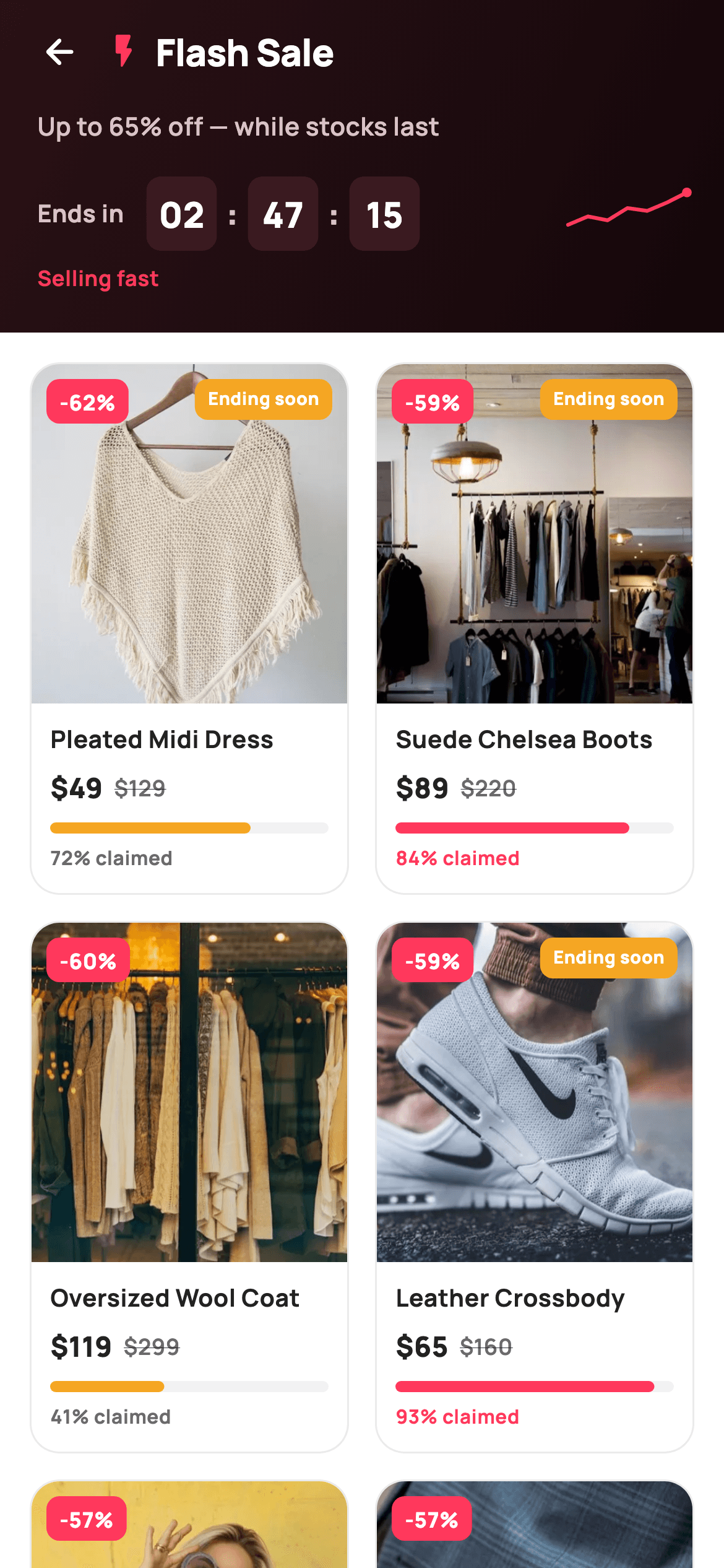
Flash sales live or die on urgency: if the shopper cannot feel time and stock running out, the discount is just a price. This tutorial builds StyleCart's flash-sale screen in Flutter — a dark gradient hero with painted HH:MM:SS countdown boxes and a momentum sparkline, above a two-column deal grid where every card carries a discount badge, struck-through pricing and a painted sold-stock bar that changes colour past 80% claimed. It is a single stateless widget with two callbacks, no packages, and every graphic drawn with CustomPainter.
Watch the Flutter UI walkthrough
A short screen recording of Flash Sale running, if you'd rather see it before you read the code. The written tutorial below covers everything in it.
Can't see the video? Watch it on YouTube.
What you'll build
- ✓A dark gradient sale hero with an HH:MM:SS countdown built from painted time boxes
- ✓A hand-drawn momentum sparkline with an end dot, backing a 'Selling fast' cue
- ✓A two-column SliverGrid of deal cards with corner '-62%' badges and amber 'Ending soon' flags
- ✓Struck-through was-pricing next to the sale price on every card
- ✓A CustomPainter stock bar and '% claimed' label that switch from amber to brand coral at 80% sold
Step-by-step build
Create the file
Add a new file at lib/ecom_flash_sale/ecom_flash_sale_screen.dart in your Flutter project.
Register the bundled fonts
No external packages — this is pure Flutter. It does bundle its design font (Manrope), so drop the font file into fonts/ and declare it in pubspec.yaml:
flutter:
  fonts:
    - family: Manrope
      fonts:
- asset: fonts/Manrope-Regular.ttfBuild it, piece by piece
Here's how the screen goes together. Each block below is a real slice of the code with a plain-English explanation — paste them in order, or grab the whole file from the next section.
Six deals as const data, and a coral-on-dark palette
import 'package:flutter/material.dart';

/// StyleCart — Flash Sale.
///
/// A live-countdown sale: a dark hero with a painted HH:MM:SS timer and a
/// momentum sparkline, then a two-column deal grid where each card carries a
/// discount badge, an "ending soon" flag, struck pricing and a painted
/// "sold %" stock bar.
///
/// Self-contained per CONVENTIONS.md: pure Flutter, bundled Manrope, inline
/// Airbnb-style tokens, own light theme + SafeArea. Painters for timer boxes,
/// sparkline and sold bars; bundled product webp. Exposes callbacks only.
class EcomFlashSaleScreen extends StatelessWidget {
  const EcomFlashSaleScreen({
    super.key,
    this.onBack,
    this.onProduct,
  });

  final VoidCallback? onBack;
  final ValueChanged<int>? onProduct;

  static const String _dir = 'lib/screens/ecommerce/ecom_flash_sale/images';
  static const String _font = 'Manrope';
  static const Color _canvas = Color(0xFFFFFFFF);
  static const Color _ink = Color(0xFF222222);
  static const Color _muted = Color(0xFF6A6A6A);
  static const Color _brand = Color(0xFFFF385C);
  static const Color _imageBg = Color(0xFFF5F5F5);
  static const Color _warn = Color(0xFFF5A623);

  static const List<_Deal> _deals = <_Deal>[
    _Deal('p01', 'Pleated Midi Dress', 49, 129, 62, 72, true),
    _Deal('p02', 'Suede Chelsea Boots', 89, 220, 59, 84, true),
    _Deal('p03', 'Oversized Wool Coat', 119, 299, 60, 41, false),
    _Deal('p04', 'Leather Crossbody', 65, 160, 59, 93, true),
    _Deal('p05', 'Ribbed Knit Sweater', 34, 79, 57, 38, false),
    _Deal('p06', 'High-Rise Slim Jeans', 42, 98, 57, 66, false),
  ];
`EcomFlashSaleScreen` is a `StatelessWidget` exposing just `onBack` and `onProduct` (a `ValueChanged<int>` carrying the tapped card's index), so the host app decides what a product tap means. The palette pairs `_brand` `#FF385C` — the Airbnb-style coral that marks everything urgent — with `_warn` amber `#F5A623` for secondary pressure cues. The six products live in a `static const List<_Deal>` where each record packs image id, title, sale price, original price, discount percent, percent sold and an `endingSoon` flag; positional const constructors keep the whole dataset compile-time and trivially swappable for API data.
A sliver scaffold: hero above a two-column grid
  @override
  Widget build(BuildContext context) {
    return Theme(
      data: ThemeData.light(useMaterial3: true),
      child: Scaffold(
        backgroundColor: _canvas,
        body: SafeArea(
          child: CustomScrollView(
            slivers: <Widget>[
              SliverToBoxAdapter(child: _hero()),
              SliverPadding(
                padding: const EdgeInsets.fromLTRB(16, 16, 16, 28),
                sliver: SliverGrid(
                  gridDelegate:
                      const SliverGridDelegateWithFixedCrossAxisCount(
                    crossAxisCount: 2,
                    mainAxisSpacing: 14,
                    crossAxisSpacing: 14,
                    childAspectRatio: 0.60,
                  ),
                  delegate: SliverChildBuilderDelegate(
                    (BuildContext _, int i) => _card(_deals[i], i),
                    childCount: _deals.length,
                  ),
                ),
              ),
            ],
          ),
        ),
      ),
    );
  }
The body is a `CustomScrollView` so the dark hero (a `SliverToBoxAdapter`) and the deal grid scroll as one surface instead of the hero staying pinned. `SliverGridDelegateWithFixedCrossAxisCount` fixes two columns with 14px gaps, and the unusual `childAspectRatio: 0.60` makes each cell almost twice as tall as it is wide — room for a portrait product photo plus title, prices and the stock bar. Wrapping everything in `Theme(data: ThemeData.light(useMaterial3: true))` keeps the screen self-contained regardless of the host app's theme.
The dark countdown hero
  Widget _hero() {
    return Container(
      decoration: const BoxDecoration(
        gradient: LinearGradient(
          begin: Alignment.topLeft,
          end: Alignment.bottomRight,
          colors: <Color>[Color(0xFF2A1116), Color(0xFF14070A)],
        ),
      ),
      padding: const EdgeInsets.fromLTRB(8, 4, 20, 22),
      child: Column(
        crossAxisAlignment: CrossAxisAlignment.start,
        children: <Widget>[
          Row(
            children: <Widget>[
              IconButton(
                onPressed: onBack,
                icon: const Icon(Icons.arrow_back_rounded,
                    size: 22, color: _canvas),
              ),
              const Icon(Icons.flash_on_rounded, size: 22, color: _brand),
              const SizedBox(width: 6),
              const Text(
                'Flash Sale',
                style: TextStyle(
                  fontFamily: _font,
                  fontSize: 20,
                  fontWeight: FontWeight.w800,
                  letterSpacing: -0.3,
                  color: _canvas,
                ),
              ),
            ],
          ),
          const SizedBox(height: 6),
          const Padding(
            padding: EdgeInsets.only(left: 12),
            child: Text(
              'Up to 65% off — while stocks last',
              style: TextStyle(
                fontFamily: _font,
                fontSize: 13.5,
                fontWeight: FontWeight.w600,
                color: Color(0xFFD9C2C7),
              ),
            ),
          ),
          const SizedBox(height: 18),
          Padding(
            padding: const EdgeInsets.only(left: 12),
            child: Row(
              children: <Widget>[
                const Text(
                  'Ends in',
                  style: TextStyle(
                    fontFamily: _font,
                    fontSize: 13,
                    fontWeight: FontWeight.w700,
                    color: Color(0xFFD9C2C7),
                  ),
                ),
                const SizedBox(width: 12),
                _timeBox('02'),
                _colon(),
                _timeBox('47'),
                _colon(),
                _timeBox('15'),
                const Spacer(),
                SizedBox(
                  width: 64,
                  height: 30,
                  child: CustomPaint(painter: _SparkPainter()),
                ),
              ],
            ),
          ),
          const Padding(
            padding: EdgeInsets.only(left: 12, top: 6),
            child: Text(
              'Selling fast',
              style: TextStyle(
                fontFamily: _font,
                fontSize: 11.5,
                fontWeight: FontWeight.w700,
                color: _brand,
              ),
            ),
          ),
        ],
      ),
    );
  }
The hero's `LinearGradient` runs top-left to bottom-right between two near-black maroons (`#2A1116` → `#14070A`), so the coral flash icon and white 'Flash Sale' title get maximum contrast while staying on-brand. Supporting copy uses `#D9C2C7`, a desaturated pink that reads as 'muted' against the maroon the way grey would on white. The countdown row lays `_timeBox('02')`, `_colon()`, `_timeBox('47')`, `_colon()`, `_timeBox('15')` after an 'Ends in' label, then a `Spacer()` pushes a 64×30 `CustomPaint(painter: _SparkPainter())` to the right edge; the tiny coral 'Selling fast' line beneath ties the sparkline to its meaning.
Painted-look time boxes and colons
  Widget _timeBox(String v) {
    return Container(
      width: 38,
      height: 40,
      alignment: Alignment.center,
      decoration: BoxDecoration(
        color: const Color(0xFF3A1A20),
        borderRadius: BorderRadius.circular(8),
      ),
      child: Text(
        v,
        style: const TextStyle(
          fontFamily: _font,
          fontSize: 19,
          fontWeight: FontWeight.w800,
          color: _canvas,
        ),
      ),
    );
  }

  Widget _colon() {
    return const Padding(
      padding: EdgeInsets.symmetric(horizontal: 5),
      child: Text(
        ':',
        style: TextStyle(
          fontFamily: _font,
          fontSize: 18,
          fontWeight: FontWeight.w800,
          color: Color(0xFFD9C2C7),
        ),
      ),
    );
  }
Each `_timeBox` is a fixed 38×40 `Container` filled `#3A1A20` — one step lighter than the gradient — with an 8px corner radius, centring a 19px `w800` digit pair. Fixing the width matters: digits vary in advance width, so an intrinsic-width box would make the timer jitter as seconds change. The `_colon` separators sit outside the boxes in the muted pink at 18px, so the rhythm reads box-colon-box-colon-box like a real digital clock rather than one long string.
Deal card, part one: image stack and urgency badges
  Widget _card(_Deal d, int i) {
    return GestureDetector(
      onTap: () => onProduct?.call(i),
      child: Container(
        decoration: BoxDecoration(
          color: _canvas,
          borderRadius: BorderRadius.circular(16),
          border: Border.all(color: const Color(0xFFEBEBEB)),
        ),
        child: Column(
          crossAxisAlignment: CrossAxisAlignment.start,
          children: <Widget>[
            Expanded(
              child: ClipRRect(
                borderRadius: const BorderRadius.vertical(
                  top: Radius.circular(15),
                ),
                child: Stack(
                  fit: StackFit.expand,
                  children: <Widget>[
                    Container(
                      color: _imageBg,
                      child: Image.asset('$_dir/${d.img}.webp',
                          fit: BoxFit.cover),
                    ),
                    Positioned(
                      left: 8,
                      top: 8,
                      child: Container(
                        padding: const EdgeInsets.symmetric(
                            horizontal: 7, vertical: 4),
                        decoration: BoxDecoration(
                          color: _brand,
                          borderRadius: BorderRadius.circular(7),
                        ),
                        child: Text(
                          '-${d.pct}%',
                          style: const TextStyle(
                            fontFamily: _font,
                            fontSize: 11.5,
                            fontWeight: FontWeight.w800,
                            color: _canvas,
                          ),
                        ),
                      ),
                    ),
                    if (d.endingSoon)
                      Positioned(
                        right: 8,
                        top: 8,
                        child: Container(
                          padding: const EdgeInsets.symmetric(
                              horizontal: 7, vertical: 4),
                          decoration: BoxDecoration(
                            color: _warn,
                            borderRadius: BorderRadius.circular(7),
                          ),
                          child: const Text(
                            'Ending soon',
                            style: TextStyle(
                              fontFamily: _font,
                              fontSize: 9.5,
                              fontWeight: FontWeight.w800,
                              color: _canvas,
                            ),
                          ),
                        ),
                      ),
                  ],
                ),
              ),
            ),
Each card is a `GestureDetector` calling `onProduct?.call(i)` around a white container with a 16px radius and a faint `#EBEBEB` border. The image area is an `Expanded` `ClipRRect` (top corners only, at 15px — one less than the card so the border stays visible) holding a `Stack` with `StackFit.expand`: an `Image.asset` webp over the `#F5F5F5` placeholder colour, a coral `-${d.pct}%` pill `Positioned` top-left, and — only `if (d.endingSoon)` — an amber 'Ending soon' pill top-right at a smaller 9.5px. Splitting the two flags across opposite corners lets a card carry both without them competing.
Deal card, part two: pricing and the stock bar
            Padding(
              padding: const EdgeInsets.fromLTRB(10, 10, 10, 12),
              child: Column(
                crossAxisAlignment: CrossAxisAlignment.start,
                children: <Widget>[
                  Text(
                    d.title,
                    maxLines: 1,
                    overflow: TextOverflow.ellipsis,
                    style: const TextStyle(
                      fontFamily: _font,
                      fontSize: 13,
                      fontWeight: FontWeight.w700,
                      color: _ink,
                    ),
                  ),
                  const SizedBox(height: 6),
                  Row(
                    children: <Widget>[
                      Text(
                        '\$${d.price}',
                        style: const TextStyle(
                          fontFamily: _font,
                          fontSize: 15,
                          fontWeight: FontWeight.w800,
                          color: _ink,
                        ),
                      ),
                      const SizedBox(width: 6),
                      Text(
                        '\$${d.was}',
                        style: const TextStyle(
                          fontFamily: _font,
                          fontSize: 12,
                          fontWeight: FontWeight.w600,
                          decoration: TextDecoration.lineThrough,
                          color: _muted,
                        ),
                      ),
                    ],
                  ),
                  const SizedBox(height: 8),
                  SizedBox(
                    height: 6,
                    child: CustomPaint(
                      painter: _SoldBarPainter(d.sold / 100),
                      size: const Size(double.infinity, 6),
                    ),
                  ),
                  const SizedBox(height: 5),
                  Text(
                    '${d.sold}% claimed',
                    style: TextStyle(
                      fontFamily: _font,
                      fontSize: 10.5,
                      fontWeight: FontWeight.w700,
                      color: d.sold >= 80 ? _brand : _muted,
                    ),
                  ),
                ],
              ),
            ),
          ],
        ),
      ),
    );
  }
}
The footer stacks a one-line ellipsised title, then a price row where `\$${d.price}` at 15px `w800` ink sits beside `\$${d.was}` at 12px with `TextDecoration.lineThrough` in muted grey — size, weight and the strike all rank the sale price without a single extra widget. Below, a 6px-tall `CustomPaint` runs `_SoldBarPainter(d.sold / 100)` full width via `Size(double.infinity, 6)`. The `'${d.sold}% claimed'` caption mirrors the bar's logic in text colour: `d.sold >= 80 ? _brand : _muted`, so a nearly-gone item gets a coral label that agrees with its coral bar.
The _Deal record and the sold-bar painter
class _Deal {
  const _Deal(this.img, this.title, this.price, this.was, this.pct, this.sold,
      this.endingSoon);
  final String img;
  final String title;
  final int price;
  final int was;
  final int pct;
  final int sold;
  final bool endingSoon;
}

/// Horizontal stock "sold %" bar — brand fill on a faint track, warns red when
/// nearly gone.
class _SoldBarPainter extends CustomPainter {
  _SoldBarPainter(this.frac);
  final double frac;

  static const Color _brand = Color(0xFFFF385C);
  static const Color _warn = Color(0xFFF5A623);
  static const Color _track = Color(0xFFF2F2F2);

  @override
  void paint(Canvas canvas, Size size) {
    final RRect track = RRect.fromRectAndRadius(
      Offset.zero & size,
      const Radius.circular(3),
    );
    canvas.drawRRect(track, Paint()..color = _track);
    final double w = (size.width * frac).clamp(4.0, size.width);
    final RRect fill = RRect.fromRectAndRadius(
      Rect.fromLTWH(0, 0, w, size.height),
      const Radius.circular(3),
    );
    canvas.drawRRect(fill, Paint()..color = frac >= 0.8 ? _brand : _warn);
  }

  @override
  bool shouldRepaint(_SoldBarPainter old) => old.frac != frac;
}
`_Deal` is a plain const value class — no methods, just seven finals — which is all a static showcase needs. `_SoldBarPainter` draws two rounded rects: a full-width `#F2F2F2` track, then a fill whose width is `(size.width * frac).clamp(4.0, size.width)` — the 4px floor guarantees even a 1%-sold item shows a visible nub instead of a broken sliver. The fill colour flips at the threshold: coral `_brand` when `frac >= 0.8`, amber `_warn` below it, escalating the cue as stock nears zero. `shouldRepaint` compares `old.frac != frac`, so bars only repaint when their data actually changes.
The momentum sparkline
/// Small upward momentum sparkline for the "selling fast" hero strip.
class _SparkPainter extends CustomPainter {
  const _SparkPainter();

  static const Color _brand = Color(0xFFFF385C);

  @override
  void paint(Canvas canvas, Size size) {
    const List<double> pts = <double>[0.7, 0.55, 0.62, 0.4, 0.45, 0.3, 0.12];
    final Path path = Path();
    for (int i = 0; i < pts.length; i++) {
      final double x = size.width * i / (pts.length - 1);
      final double y = size.height * pts[i];
      if (i == 0) {
        path.moveTo(x, y);
      } else {
        path.lineTo(x, y);
      }
    }
    canvas.drawPath(
      path,
      Paint()
        ..style = PaintingStyle.stroke
        ..strokeWidth = 2
        ..strokeCap = StrokeCap.round
        ..strokeJoin = StrokeJoin.round
        ..color = _brand,
    );
    // end dot
    canvas.drawCircle(
      Offset(size.width, size.height * pts.last),
      2.6,
      Paint()..color = _brand,
    );
  }

  @override
  bool shouldRepaint(_SparkPainter old) => false;
}
`_SparkPainter` hard-codes seven normalised points — `[0.7, 0.55, 0.62, 0.4, 0.45, 0.3, 0.12]` — where smaller y means higher on screen, so the jagged descent paints as a rising trend with one believable dip. The loop maps index `i` to `size.width * i / (pts.length - 1)`, spreading points evenly across whatever box the widget gets. The stroke is 2px coral with `StrokeCap.round` and `StrokeJoin.round` so the vertices stay soft at this tiny 64×30 size, and a 2.6px filled circle at the last point gives the line a 'live' terminal dot. It is const data, so `shouldRepaint` returns `false`.
Full code
The complete, ready-to-paste source. Free to use in your projects — one click copies it all.
import 'package:flutter/material.dart';

/// StyleCart — Flash Sale.
///
/// A live-countdown sale: a dark hero with a painted HH:MM:SS timer and a
/// momentum sparkline, then a two-column deal grid where each card carries a
/// discount badge, an "ending soon" flag, struck pricing and a painted
/// "sold %" stock bar.
///
/// Self-contained per CONVENTIONS.md: pure Flutter, bundled Manrope, inline
/// Airbnb-style tokens, own light theme + SafeArea. Painters for timer boxes,
/// sparkline and sold bars; bundled product webp. Exposes callbacks only.
class EcomFlashSaleScreen extends StatelessWidget {
  const EcomFlashSaleScreen({
    super.key,
    this.onBack,
    this.onProduct,
  });

  final VoidCallback? onBack;
  final ValueChanged<int>? onProduct;

  static const String _dir = 'lib/screens/ecommerce/ecom_flash_sale/images';
  static const String _font = 'Manrope';
  static const Color _canvas = Color(0xFFFFFFFF);
  static const Color _ink = Color(0xFF222222);
  static const Color _muted = Color(0xFF6A6A6A);
  static const Color _brand = Color(0xFFFF385C);
  static const Color _imageBg = Color(0xFFF5F5F5);
  static const Color _warn = Color(0xFFF5A623);

  static const List<_Deal> _deals = <_Deal>[
    _Deal('p01', 'Pleated Midi Dress', 49, 129, 62, 72, true),
    _Deal('p02', 'Suede Chelsea Boots', 89, 220, 59, 84, true),
    _Deal('p03', 'Oversized Wool Coat', 119, 299, 60, 41, false),
    _Deal('p04', 'Leather Crossbody', 65, 160, 59, 93, true),
    _Deal('p05', 'Ribbed Knit Sweater', 34, 79, 57, 38, false),
    _Deal('p06', 'High-Rise Slim Jeans', 42, 98, 57, 66, false),
  ];

  @override
  Widget build(BuildContext context) {
    return Theme(
      data: ThemeData.light(useMaterial3: true),
      child: Scaffold(
        backgroundColor: _canvas,
        body: SafeArea(
          child: CustomScrollView(
            slivers: <Widget>[
              SliverToBoxAdapter(child: _hero()),
              SliverPadding(
                padding: const EdgeInsets.fromLTRB(16, 16, 16, 28),
                sliver: SliverGrid(
                  gridDelegate:
                      const SliverGridDelegateWithFixedCrossAxisCount(
                    crossAxisCount: 2,
                    mainAxisSpacing: 14,
                    crossAxisSpacing: 14,
                    childAspectRatio: 0.60,
                  ),
                  delegate: SliverChildBuilderDelegate(
                    (BuildContext _, int i) => _card(_deals[i], i),
                    childCount: _deals.length,
                  ),
                ),
              ),
            ],
          ),
        ),
      ),
    );
  }

  Widget _hero() {
    return Container(
      decoration: const BoxDecoration(
        gradient: LinearGradient(
          begin: Alignment.topLeft,
          end: Alignment.bottomRight,
          colors: <Color>[Color(0xFF2A1116), Color(0xFF14070A)],
        ),
      ),
      padding: const EdgeInsets.fromLTRB(8, 4, 20, 22),
      child: Column(
        crossAxisAlignment: CrossAxisAlignment.start,
        children: <Widget>[
          Row(
            children: <Widget>[
              IconButton(
                onPressed: onBack,
                icon: const Icon(Icons.arrow_back_rounded,
                    size: 22, color: _canvas),
              ),
              const Icon(Icons.flash_on_rounded, size: 22, color: _brand),
              const SizedBox(width: 6),
              const Text(
                'Flash Sale',
                style: TextStyle(
                  fontFamily: _font,
                  fontSize: 20,
                  fontWeight: FontWeight.w800,
                  letterSpacing: -0.3,
                  color: _canvas,
                ),
              ),
            ],
          ),
          const SizedBox(height: 6),
          const Padding(
            padding: EdgeInsets.only(left: 12),
            child: Text(
              'Up to 65% off — while stocks last',
              style: TextStyle(
                fontFamily: _font,
                fontSize: 13.5,
                fontWeight: FontWeight.w600,
                color: Color(0xFFD9C2C7),
              ),
            ),
          ),
          const SizedBox(height: 18),
          Padding(
            padding: const EdgeInsets.only(left: 12),
            child: Row(
              children: <Widget>[
                const Text(
                  'Ends in',
                  style: TextStyle(
                    fontFamily: _font,
                    fontSize: 13,
                    fontWeight: FontWeight.w700,
                    color: Color(0xFFD9C2C7),
                  ),
                ),
                const SizedBox(width: 12),
                _timeBox('02'),
                _colon(),
                _timeBox('47'),
                _colon(),
                _timeBox('15'),
                const Spacer(),
                SizedBox(
                  width: 64,
                  height: 30,
                  child: CustomPaint(painter: _SparkPainter()),
                ),
              ],
            ),
          ),
          const Padding(
            padding: EdgeInsets.only(left: 12, top: 6),
            child: Text(
              'Selling fast',
              style: TextStyle(
                fontFamily: _font,
                fontSize: 11.5,
                fontWeight: FontWeight.w700,
                color: _brand,
              ),
            ),
          ),
        ],
      ),
    );
  }

  Widget _timeBox(String v) {
    return Container(
      width: 38,
      height: 40,
      alignment: Alignment.center,
      decoration: BoxDecoration(
        color: const Color(0xFF3A1A20),
        borderRadius: BorderRadius.circular(8),
      ),
      child: Text(
        v,
        style: const TextStyle(
          fontFamily: _font,
          fontSize: 19,
          fontWeight: FontWeight.w800,
          color: _canvas,
        ),
      ),
    );
  }

  Widget _colon() {
    return const Padding(
      padding: EdgeInsets.symmetric(horizontal: 5),
      child: Text(
        ':',
        style: TextStyle(
          fontFamily: _font,
          fontSize: 18,
          fontWeight: FontWeight.w800,
          color: Color(0xFFD9C2C7),
        ),
      ),
    );
  }

  Widget _card(_Deal d, int i) {
    return GestureDetector(
      onTap: () => onProduct?.call(i),
      child: Container(
        decoration: BoxDecoration(
          color: _canvas,
          borderRadius: BorderRadius.circular(16),
          border: Border.all(color: const Color(0xFFEBEBEB)),
        ),
        child: Column(
          crossAxisAlignment: CrossAxisAlignment.start,
          children: <Widget>[
            Expanded(
              child: ClipRRect(
                borderRadius: const BorderRadius.vertical(
                  top: Radius.circular(15),
                ),
                child: Stack(
                  fit: StackFit.expand,
                  children: <Widget>[
                    Container(
                      color: _imageBg,
                      child: Image.asset('$_dir/${d.img}.webp',
                          fit: BoxFit.cover),
                    ),
                    Positioned(
                      left: 8,
                      top: 8,
                      child: Container(
                        padding: const EdgeInsets.symmetric(
                            horizontal: 7, vertical: 4),
                        decoration: BoxDecoration(
                          color: _brand,
                          borderRadius: BorderRadius.circular(7),
                        ),
                        child: Text(
                          '-${d.pct}%',
                          style: const TextStyle(
                            fontFamily: _font,
                            fontSize: 11.5,
                            fontWeight: FontWeight.w800,
                            color: _canvas,
                          ),
                        ),
                      ),
                    ),
                    if (d.endingSoon)
                      Positioned(
                        right: 8,
                        top: 8,
                        child: Container(
                          padding: const EdgeInsets.symmetric(
                              horizontal: 7, vertical: 4),
                          decoration: BoxDecoration(
                            color: _warn,
                            borderRadius: BorderRadius.circular(7),
                          ),
                          child: const Text(
                            'Ending soon',
                            style: TextStyle(
                              fontFamily: _font,
                              fontSize: 9.5,
                              fontWeight: FontWeight.w800,
                              color: _canvas,
                            ),
                          ),
                        ),
                      ),
                  ],
                ),
              ),
            ),
            Padding(
              padding: const EdgeInsets.fromLTRB(10, 10, 10, 12),
              child: Column(
                crossAxisAlignment: CrossAxisAlignment.start,
                children: <Widget>[
                  Text(
                    d.title,
                    maxLines: 1,
                    overflow: TextOverflow.ellipsis,
                    style: const TextStyle(
                      fontFamily: _font,
                      fontSize: 13,
                      fontWeight: FontWeight.w700,
                      color: _ink,
                    ),
                  ),
                  const SizedBox(height: 6),
                  Row(
                    children: <Widget>[
                      Text(
                        '\$${d.price}',
                        style: const TextStyle(
                          fontFamily: _font,
                          fontSize: 15,
                          fontWeight: FontWeight.w800,
                          color: _ink,
                        ),
                      ),
                      const SizedBox(width: 6),
                      Text(
                        '\$${d.was}',
                        style: const TextStyle(
                          fontFamily: _font,
                          fontSize: 12,
                          fontWeight: FontWeight.w600,
                          decoration: TextDecoration.lineThrough,
                          color: _muted,
                        ),
                      ),
                    ],
                  ),
                  const SizedBox(height: 8),
                  SizedBox(
                    height: 6,
                    child: CustomPaint(
                      painter: _SoldBarPainter(d.sold / 100),
                      size: const Size(double.infinity, 6),
                    ),
                  ),
                  const SizedBox(height: 5),
                  Text(
                    '${d.sold}% claimed',
                    style: TextStyle(
                      fontFamily: _font,
                      fontSize: 10.5,
                      fontWeight: FontWeight.w700,
                      color: d.sold >= 80 ? _brand : _muted,
                    ),
                  ),
                ],
              ),
            ),
          ],
        ),
      ),
    );
  }
}

class _Deal {
  const _Deal(this.img, this.title, this.price, this.was, this.pct, this.sold,
      this.endingSoon);
  final String img;
  final String title;
  final int price;
  final int was;
  final int pct;
  final int sold;
  final bool endingSoon;
}

/// Horizontal stock "sold %" bar — brand fill on a faint track, warns red when
/// nearly gone.
class _SoldBarPainter extends CustomPainter {
  _SoldBarPainter(this.frac);
  final double frac;

  static const Color _brand = Color(0xFFFF385C);
  static const Color _warn = Color(0xFFF5A623);
  static const Color _track = Color(0xFFF2F2F2);

  @override
  void paint(Canvas canvas, Size size) {
    final RRect track = RRect.fromRectAndRadius(
      Offset.zero & size,
      const Radius.circular(3),
    );
    canvas.drawRRect(track, Paint()..color = _track);
    final double w = (size.width * frac).clamp(4.0, size.width);
    final RRect fill = RRect.fromRectAndRadius(
      Rect.fromLTWH(0, 0, w, size.height),
      const Radius.circular(3),
    );
    canvas.drawRRect(fill, Paint()..color = frac >= 0.8 ? _brand : _warn);
  }

  @override
  bool shouldRepaint(_SoldBarPainter old) => old.frac != frac;
}

/// Small upward momentum sparkline for the "selling fast" hero strip.
class _SparkPainter extends CustomPainter {
  const _SparkPainter();

  static const Color _brand = Color(0xFFFF385C);

  @override
  void paint(Canvas canvas, Size size) {
    const List<double> pts = <double>[0.7, 0.55, 0.62, 0.4, 0.45, 0.3, 0.12];
    final Path path = Path();
    for (int i = 0; i < pts.length; i++) {
      final double x = size.width * i / (pts.length - 1);
      final double y = size.height * pts[i];
      if (i == 0) {
        path.moveTo(x, y);
      } else {
        path.lineTo(x, y);
      }
    }
    canvas.drawPath(
      path,
      Paint()
        ..style = PaintingStyle.stroke
        ..strokeWidth = 2
        ..strokeCap = StrokeCap.round
        ..strokeJoin = StrokeJoin.round
        ..color = _brand,
    );
    // end dot
    canvas.drawCircle(
      Offset(size.width, size.height * pts.last),
      2.6,
      Paint()..color = _brand,
    );
  }

  @override
  bool shouldRepaint(_SparkPainter old) => false;
}
Plus bundled 11 binary assets (fonts/images). The CLI and MCP install those for you automatically.
Two faster ways to add it
Copy-paste works, but you can skip it entirely.
1. FlutterKit CLI
One command drops this screen — and its fonts — straight into your project.
$ flutterkit add ecom-flash-sale2. AI agent (MCP)
Connect FlutterKit's MCP server in Claude or Cursor and just ask your agent to install ecom-flash-sale — it fetches and writes the files for you.
FAQ
Is this Flutter flash sale screen free to use in a commercial app?
Yes. FlutterKit screens are free, commercial use included — you can ship this countdown hero and deal grid in a store app you sell or monetise. Copy the code from this page or install it via the CLI; no attribution or licence fee.
What packages and fonts does this screen need?
No pub packages at all — the countdown boxes, sparkline and stock bars are plain `CustomPainter` and core widgets. The code references the bundled Manrope font family via a `_font` constant and loads six bundled product `.webp` images with `Image.asset`; add the font and images to your `pubspec.yaml` assets, or point `_dir` and `_font` at your own.
Which Flutter version does this code require?
Flutter 3.0 or newer (Dart 2.17+), because the constructor uses the `super.key` super parameter. There is no `Color.withValues` here, so it also compiles on SDKs older than 3.22; on pre-3.0 Flutter, rewrite the constructor as `{Key? key, ...} : super(key: key)`.
How do I make the countdown actually tick down?
The shipped hero renders static strings — `_timeBox('02')`, `('47')`, `('15')` — because the screen is stateless. Wrap it in a `StatefulWidget` holding a sale-end `DateTime`, start a `Timer.periodic(const Duration(seconds: 1), ...)` that calls `setState`, derive the remaining `Duration`, and format each unit with `.toString().padLeft(2, '0')` before passing it into `_timeBox`. Cancel the timer in `dispose`.
Why is the stock bar amber for most items but coral on some?
`_SoldBarPainter` picks its fill with `frac >= 0.8 ? _brand : _warn`: below 80% sold the bar is amber, a background-level pressure cue, and at 80% or above it switches to the coral brand red — the same colour as the discount badge — to escalate 'nearly gone' items. The `% claimed` caption applies the identical `d.sold >= 80` test so text and bar always agree.


