How to Build an Order Processing Interstitial in Flutter (Full Code + Preview)
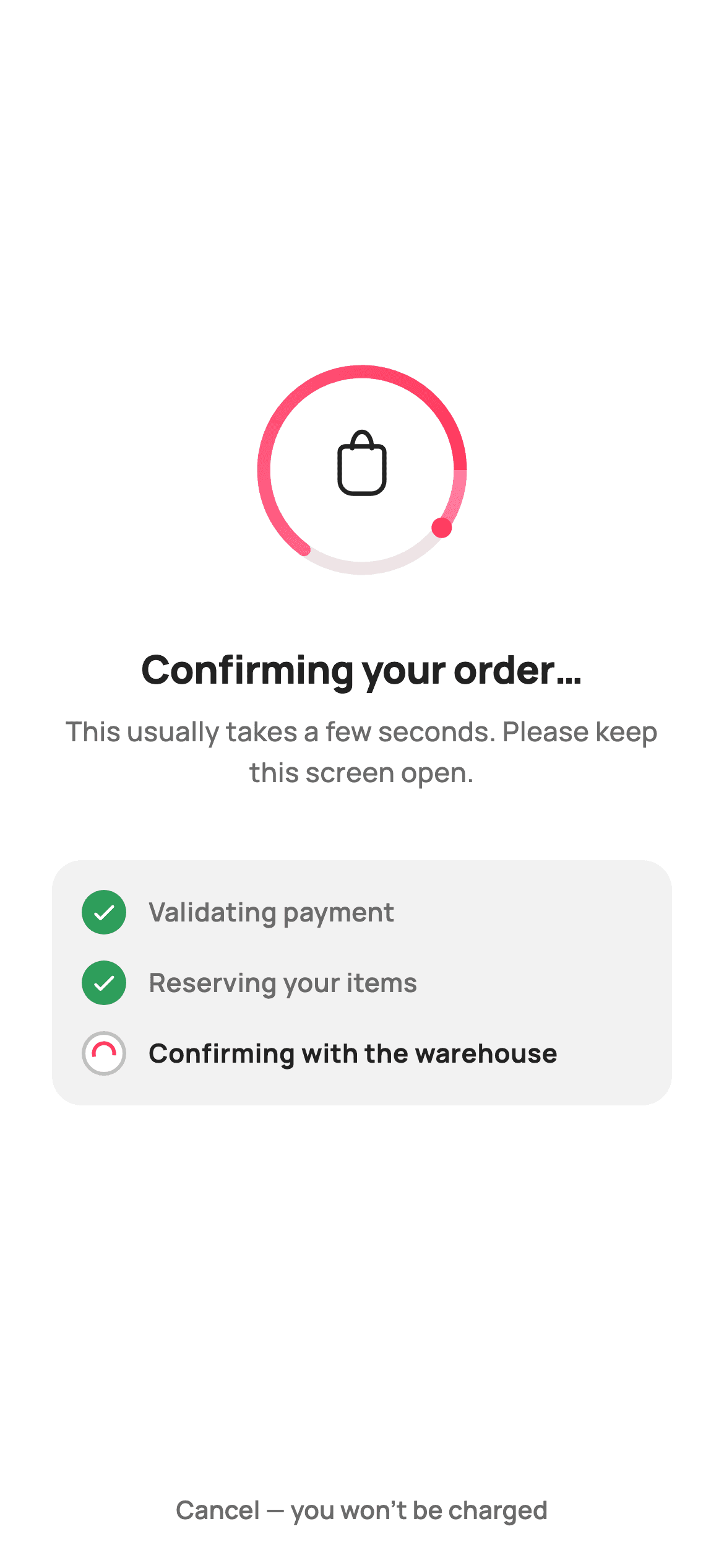
The seconds after Place Order are when a shopper is most likely to press back and double-order. This interstitial holds them: a painted ring sweeping around a shopping-bag glyph, a headline saying what is happening, a three-step checklist showing which part is still running, and a cancel that promises no charge. You'll build the animation with a repeating controller and a CustomPainter, and see how a timer hands control to the order-placed screen once the confirmation finishes.
Watch the Flutter UI walkthrough
A short screen recording of Order Processing running, if you'd rather see it before you read the code. The written tutorial below covers everything in it.
Can't see the video? Watch it on YouTube.
What you'll build
- ✓A painted progress ring: a faint track, a sweeping gradient arc and a leading dot
- ✓A shopping-bag glyph drawn in the centre with a cubic-curve handle
- ✓A step checklist where the running step is heavier than the completed ones
- ✓A repeating AnimationController and a hand-off Timer, both disposed correctly
- ✓A cancel affordance that states no charge has been taken
Step-by-step build
Create the file
Add a new file at lib/ecom_checkout_processing/ecom_checkout_processing_screen.dart in your Flutter project.
Register the bundled fonts
No external packages — this is pure Flutter. It does bundle its design font (Manrope), so drop the font file into fonts/ and declare it in pubspec.yaml:
flutter:
  fonts:
    - family: Manrope
      fonts:
- asset: fonts/Manrope-Regular.ttfBuild it, piece by piece
Here's how the screen goes together. Each block below is a real slice of the code with a plain-English explanation — paste them in order, or grab the whole file from the next section.
Two callbacks and three steps
import 'dart:async';
import 'dart:math' as math;

import 'package:flutter/material.dart';

/// StyleCart — Processing.
///
/// The interstitial after Place Order: an animated painted progress ring, a
/// "Confirming your order…" headline, a short checklist of the steps being
/// run, and a reassuring "don't close this screen" note with a safe cancel.
///
/// Self-contained per CONVENTIONS.md: pure Flutter, bundled Manrope, inline
/// Airbnb-style tokens, own light theme + SafeArea. The ring is a CustomPainter
/// (no emoji glyph, no network). Exposes callbacks only.
class EcomCheckoutProcessingScreen extends StatefulWidget {
  const EcomCheckoutProcessingScreen({
    super.key,
    this.onCancel,
    this.onComplete,
  });

  final VoidCallback? onCancel;

  /// Fired once the (simulated) order confirmation finishes — the host wires
  /// this to the Order Placed screen.
  final VoidCallback? onComplete;

  @override
  State<EcomCheckoutProcessingScreen> createState() =>
      _EcomCheckoutProcessingScreenState();
}

class _EcomCheckoutProcessingScreenState
    extends State<EcomCheckoutProcessingScreen>
    with SingleTickerProviderStateMixin {
  static const String _font = 'Manrope';
  static const Color _canvas = Color(0xFFFFFFFF);
  static const Color _ink = Color(0xFF222222);
  static const Color _muted = Color(0xFF6A6A6A);
  static const Color _faint = Color(0xFFC1C1C1);
  static const Color _brand = Color(0xFFFF385C);
  static const Color _success = Color(0xFF2E9E5B);

  late final AnimationController _c;
  Timer? _advance;

  static const List<_Step> _steps = <_Step>[
    _Step('Validating payment', true),
    _Step('Reserving your items', true),
    _Step('Confirming with the warehouse', false),
  ];
The widget takes `onCancel` and `onComplete` and owns no navigation itself — the host decides what the order-placed screen is. The palette is StyleCart's light set, with `_brand` coral `0xFFFF385C` for motion and `_success` green reserved for finished work. `_steps` is the interesting constant: three `_Step` records where the first two are `true` and the third `false`. The screen shows a checkout mid-flight, not from the beginning, which is what makes it feel like something is genuinely in progress rather than a spinner with captions.
A repeating ring and a hand-off timer
  @override
  void initState() {
    super.initState();
    _c = AnimationController(
      vsync: this,
      duration: const Duration(seconds: 2),
    )..repeat();
    // Simulate the confirmation completing, then hand off to Order Placed.
    _advance = Timer(const Duration(milliseconds: 2800), () {
      if (mounted) widget.onComplete?.call();
    });
  }

  @override
  void dispose() {
    _advance?.cancel();
    _c.dispose();
    super.dispose();
  }
`initState` starts two independent clocks. The `AnimationController` runs `..repeat()` over two seconds and only drives the ring's rotation — it is never used to measure progress, because real confirmation time is unknown. Separately, a `Timer` of 2800ms simulates the backend finishing and calls `widget.onComplete?.call()`, guarded by `if (mounted)` so a user who backs out mid-flight does not trigger navigation from a dead widget. `dispose` cancels the timer *before* disposing the controller; skipping the cancel is the classic leak here, because a pending timer will happily fire into a disposed state.
Repainting only the ring
  @override
  Widget build(BuildContext context) {
    return Theme(
      data: ThemeData.light(useMaterial3: true),
      child: Scaffold(
        backgroundColor: _canvas,
        body: SafeArea(
          child: Padding(
            padding: const EdgeInsets.symmetric(horizontal: 28),
            child: Column(
              children: <Widget>[
                const Spacer(),
                SizedBox(
                  width: 120,
                  height: 120,
                  child: AnimatedBuilder(
                    animation: _c,
                    builder: (BuildContext context, Widget? child) {
                      return CustomPaint(
                        painter: _ProgressRingPainter(_c.value),
                      );
                    },
                  ),
                ),
                const SizedBox(height: 32),
The body is a `Column` inside 28px horizontal padding with `Spacer()` above and below the content, so the group sits optically centred and stays put on tall and short phones alike. The ring is a fixed 120×120 `SizedBox` wrapping an `AnimatedBuilder` that rebuilds only the `CustomPaint` beneath it, passing `_c.value` into `_ProgressRingPainter`. Because the builder is scoped this tightly, the headline, the checklist card and the button are built once and never touched again while the animation runs sixty times a second.
Saying what is happening, and offering a way out
                const Text(
                  'Confirming your order…',
                  textAlign: TextAlign.center,
                  style: TextStyle(
                    fontFamily: _font,
                    fontSize: 21,
                    fontWeight: FontWeight.w800,
                    letterSpacing: -0.3,
                    color: _ink,
                  ),
                ),
                const SizedBox(height: 8),
                const Text(
                  'This usually takes a few seconds. Please keep this '
                  'screen open.',
                  textAlign: TextAlign.center,
                  style: TextStyle(
                    fontFamily: _font,
                    fontSize: 14.5,
                    fontWeight: FontWeight.w500,
                    height: 1.5,
                    color: _muted,
                  ),
                ),
                const SizedBox(height: 36),
                Container(
                  padding: const EdgeInsets.all(16),
                  decoration: BoxDecoration(
                    color: const Color(0xFFF2F2F2),
                    borderRadius: BorderRadius.circular(16),
                  ),
                  child: Column(
                    children: <Widget>[
                      for (int i = 0; i < _steps.length; i++) ...<Widget>[
                        if (i > 0) const SizedBox(height: 14),
                        _stepRow(_steps[i]),
                      ],
                    ],
                  ),
                ),
                const Spacer(),
                TextButton(
                  onPressed: widget.onCancel,
                  child: const Text(
                    'Cancel — you won’t be charged',
                    style: TextStyle(
                      fontFamily: _font,
                      fontSize: 13.5,
                      fontWeight: FontWeight.w600,
                      color: _muted,
                    ),
                  ),
                ),
                const SizedBox(height: 8),
              ],
            ),
          ),
        ),
      ),
    );
  }
The headline is 21px `w800` with `letterSpacing: -0.3` — tightening tracking at large sizes is what stops a heavy weight from looking loose. Under it, a muted line asks the shopper to keep the screen open, which is the actual instruction that prevents a double order. The checklist sits in a `0xFFF2F2F2` card, its rows spaced by a guarded `if (i > 0) const SizedBox(height: 14)` so the 16px card padding stays correct at the bottom. The cancel is a plain `TextButton` reading 'Cancel — you won't be charged': quiet enough not to compete, explicit enough to remove the fear that leaving costs money.
The step row, and why the unfinished one is bolder
  Widget _stepRow(_Step s) {
    return Row(
      children: <Widget>[
        Container(
          width: 24,
          height: 24,
          decoration: BoxDecoration(
            shape: BoxShape.circle,
            color: s.done ? _success : _canvas,
            border: s.done
                ? null
                : Border.all(color: _faint, width: 2),
          ),
          child: s.done
              ? const Icon(Icons.check_rounded, size: 15, color: _canvas)
              : Center(
                  child: SizedBox(
                    width: 11,
                    height: 11,
                    child: CircularProgressIndicator(
                      strokeWidth: 2,
                      valueColor:
                          const AlwaysStoppedAnimation<Color>(_brand),
                    ),
                  ),
                ),
        ),
        const SizedBox(width: 12),
        Text(
          s.label,
          style: TextStyle(
            fontFamily: _font,
            fontSize: 14,
            fontWeight: s.done ? FontWeight.w600 : FontWeight.w700,
            color: s.done ? _muted : _ink,
          ),
        ),
      ],
    );
  }
}

class _Step {
  const _Step(this.label, this.done);
  final String label;
  final bool done;
}
Each row is a 24px circle that is either filled `_success` with a white check, or hollow with a 2px `_faint` border wrapping an 11px `CircularProgressIndicator` in brand coral. Squeezing Material's spinner into an 11px box inside a bordered circle is what makes the active step spin *inside* its own bullet. The text weights are inverted on purpose: done steps are `w600` in muted grey, the pending one is `w700` in full `_ink`. Finished work recedes and the live step is the darkest thing in the card, which is the opposite of a checklist and exactly right for a progress display.
Track, sweeping arc and leading dot
/// Paints a progress ring: a faint track, a sweeping brand arc whose start
/// rotates with [t] (0..1), and a leading dot — a determinate-looking spinner.
class _ProgressRingPainter extends CustomPainter {
  _ProgressRingPainter(this.t);
  final double t;

  @override
  void paint(Canvas canvas, Size size) {
    final Offset c = Offset(size.width / 2, size.height / 2);
    final double r = size.width / 2 - 7;

    // Track.
    canvas.drawCircle(
      c,
      r,
      Paint()
        ..style = PaintingStyle.stroke
        ..strokeWidth = 7
        ..color = const Color(0xFFEFE3E6),
    );

    // Sweeping arc (~270°) starting at the rotating angle.
    final double start = t * 6.28318;
    const double sweep = 4.71; // 270°
    canvas.drawArc(
      Rect.fromCircle(center: c, radius: r),
      start,
      sweep,
      false,
      Paint()
        ..style = PaintingStyle.stroke
        ..strokeWidth = 7
        ..strokeCap = StrokeCap.round
        ..shader = const SweepGradient(
          colors: <Color>[Color(0xFFFF7AA0), Color(0xFFFF385C)],
        ).createShader(Rect.fromCircle(center: c, radius: r)),
    );

    // Leading dot.
    final double end = start + sweep;
    final Offset dot =
        Offset(c.dx + r * math.cos(end), c.dy + r * math.sin(end));
    canvas.drawCircle(dot, 5.5, Paint()..color = const Color(0xFFFF385C));
The painter draws a 7px `0xFFEFE3E6` track circle at `r = size.width / 2 - 7`, inset by the stroke width so the ring never clips the box. Over it goes a 270° arc — `sweep = 4.71` radians — starting at `t * 6.28318`, one full turn per controller cycle. The arc is stroked with a `SweepGradient` shader from `0xFFFF7AA0` to `0xFFFF385C`, so the tail is lighter than the head and the rotation reads as motion even in a still frame. The leading dot is placed with `cos`/`sin` at `start + sweep`, which is why it always sits exactly on the arc's head no matter where the rotation is.
The bag glyph and repaint control
    // Brand bag glyph in the centre.
    final double bw = size.width * 0.20;
    final Rect bag = Rect.fromCenter(
        center: c, width: bw, height: bw * 1.06);
    final RRect bagR = RRect.fromRectAndCorners(
      bag,
      topLeft: const Radius.circular(3),
      topRight: const Radius.circular(3),
      bottomLeft: const Radius.circular(7),
      bottomRight: const Radius.circular(7),
    );
    canvas.drawRRect(
      bagR,
      Paint()
        ..style = PaintingStyle.stroke
        ..strokeWidth = 2.4
        ..color = const Color(0xFF222222),
    );
    final Path handle = Path()
      ..moveTo(c.dx - bw * 0.22, bag.top + 1)
      ..cubicTo(c.dx - bw * 0.22, bag.top - bw * 0.45,
          c.dx + bw * 0.22, bag.top - bw * 0.45, c.dx + bw * 0.22, bag.top + 1);
    canvas.drawPath(
      handle,
      Paint()
        ..style = PaintingStyle.stroke
        ..strokeWidth = 2.4
        ..strokeCap = StrokeCap.round
        ..color = const Color(0xFF222222),
    );
  }

  @override
  bool shouldRepaint(_ProgressRingPainter old) => old.t != t;
}
The centre mark is a shopping bag at 20% of the canvas width, built as an `RRect` with asymmetric corners — 3px at the top, 7px at the bottom — which is what gives it a bag's tapered silhouette rather than a plain box. The handle is a single `cubicTo` whose two control points sit `bw * 0.45` above the bag's top edge, pulling a smooth arc between the two attachment points. Every coordinate derives from `size`, so the glyph scales with whatever box the painter is given. `shouldRepaint` compares `old.t != t`, so the canvas is redrawn on animation frames only.
Full code
The complete, ready-to-paste source. Free to use in your projects — one click copies it all.
import 'dart:async';
import 'dart:math' as math;

import 'package:flutter/material.dart';

/// StyleCart — Processing.
///
/// The interstitial after Place Order: an animated painted progress ring, a
/// "Confirming your order…" headline, a short checklist of the steps being
/// run, and a reassuring "don't close this screen" note with a safe cancel.
///
/// Self-contained per CONVENTIONS.md: pure Flutter, bundled Manrope, inline
/// Airbnb-style tokens, own light theme + SafeArea. The ring is a CustomPainter
/// (no emoji glyph, no network). Exposes callbacks only.
class EcomCheckoutProcessingScreen extends StatefulWidget {
  const EcomCheckoutProcessingScreen({
    super.key,
    this.onCancel,
    this.onComplete,
  });

  final VoidCallback? onCancel;

  /// Fired once the (simulated) order confirmation finishes — the host wires
  /// this to the Order Placed screen.
  final VoidCallback? onComplete;

  @override
  State<EcomCheckoutProcessingScreen> createState() =>
      _EcomCheckoutProcessingScreenState();
}

class _EcomCheckoutProcessingScreenState
    extends State<EcomCheckoutProcessingScreen>
    with SingleTickerProviderStateMixin {
  static const String _font = 'Manrope';
  static const Color _canvas = Color(0xFFFFFFFF);
  static const Color _ink = Color(0xFF222222);
  static const Color _muted = Color(0xFF6A6A6A);
  static const Color _faint = Color(0xFFC1C1C1);
  static const Color _brand = Color(0xFFFF385C);
  static const Color _success = Color(0xFF2E9E5B);

  late final AnimationController _c;
  Timer? _advance;

  static const List<_Step> _steps = <_Step>[
    _Step('Validating payment', true),
    _Step('Reserving your items', true),
    _Step('Confirming with the warehouse', false),
  ];

  @override
  void initState() {
    super.initState();
    _c = AnimationController(
      vsync: this,
      duration: const Duration(seconds: 2),
    )..repeat();
    // Simulate the confirmation completing, then hand off to Order Placed.
    _advance = Timer(const Duration(milliseconds: 2800), () {
      if (mounted) widget.onComplete?.call();
    });
  }

  @override
  void dispose() {
    _advance?.cancel();
    _c.dispose();
    super.dispose();
  }

  @override
  Widget build(BuildContext context) {
    return Theme(
      data: ThemeData.light(useMaterial3: true),
      child: Scaffold(
        backgroundColor: _canvas,
        body: SafeArea(
          child: Padding(
            padding: const EdgeInsets.symmetric(horizontal: 28),
            child: Column(
              children: <Widget>[
                const Spacer(),
                SizedBox(
                  width: 120,
                  height: 120,
                  child: AnimatedBuilder(
                    animation: _c,
                    builder: (BuildContext context, Widget? child) {
                      return CustomPaint(
                        painter: _ProgressRingPainter(_c.value),
                      );
                    },
                  ),
                ),
                const SizedBox(height: 32),
                const Text(
                  'Confirming your order…',
                  textAlign: TextAlign.center,
                  style: TextStyle(
                    fontFamily: _font,
                    fontSize: 21,
                    fontWeight: FontWeight.w800,
                    letterSpacing: -0.3,
                    color: _ink,
                  ),
                ),
                const SizedBox(height: 8),
                const Text(
                  'This usually takes a few seconds. Please keep this '
                  'screen open.',
                  textAlign: TextAlign.center,
                  style: TextStyle(
                    fontFamily: _font,
                    fontSize: 14.5,
                    fontWeight: FontWeight.w500,
                    height: 1.5,
                    color: _muted,
                  ),
                ),
                const SizedBox(height: 36),
                Container(
                  padding: const EdgeInsets.all(16),
                  decoration: BoxDecoration(
                    color: const Color(0xFFF2F2F2),
                    borderRadius: BorderRadius.circular(16),
                  ),
                  child: Column(
                    children: <Widget>[
                      for (int i = 0; i < _steps.length; i++) ...<Widget>[
                        if (i > 0) const SizedBox(height: 14),
                        _stepRow(_steps[i]),
                      ],
                    ],
                  ),
                ),
                const Spacer(),
                TextButton(
                  onPressed: widget.onCancel,
                  child: const Text(
                    'Cancel — you won’t be charged',
                    style: TextStyle(
                      fontFamily: _font,
                      fontSize: 13.5,
                      fontWeight: FontWeight.w600,
                      color: _muted,
                    ),
                  ),
                ),
                const SizedBox(height: 8),
              ],
            ),
          ),
        ),
      ),
    );
  }

  Widget _stepRow(_Step s) {
    return Row(
      children: <Widget>[
        Container(
          width: 24,
          height: 24,
          decoration: BoxDecoration(
            shape: BoxShape.circle,
            color: s.done ? _success : _canvas,
            border: s.done
                ? null
                : Border.all(color: _faint, width: 2),
          ),
          child: s.done
              ? const Icon(Icons.check_rounded, size: 15, color: _canvas)
              : Center(
                  child: SizedBox(
                    width: 11,
                    height: 11,
                    child: CircularProgressIndicator(
                      strokeWidth: 2,
                      valueColor:
                          const AlwaysStoppedAnimation<Color>(_brand),
                    ),
                  ),
                ),
        ),
        const SizedBox(width: 12),
        Text(
          s.label,
          style: TextStyle(
            fontFamily: _font,
            fontSize: 14,
            fontWeight: s.done ? FontWeight.w600 : FontWeight.w700,
            color: s.done ? _muted : _ink,
          ),
        ),
      ],
    );
  }
}

class _Step {
  const _Step(this.label, this.done);
  final String label;
  final bool done;
}

/// Paints a progress ring: a faint track, a sweeping brand arc whose start
/// rotates with [t] (0..1), and a leading dot — a determinate-looking spinner.
class _ProgressRingPainter extends CustomPainter {
  _ProgressRingPainter(this.t);
  final double t;

  @override
  void paint(Canvas canvas, Size size) {
    final Offset c = Offset(size.width / 2, size.height / 2);
    final double r = size.width / 2 - 7;

    // Track.
    canvas.drawCircle(
      c,
      r,
      Paint()
        ..style = PaintingStyle.stroke
        ..strokeWidth = 7
        ..color = const Color(0xFFEFE3E6),
    );

    // Sweeping arc (~270°) starting at the rotating angle.
    final double start = t * 6.28318;
    const double sweep = 4.71; // 270°
    canvas.drawArc(
      Rect.fromCircle(center: c, radius: r),
      start,
      sweep,
      false,
      Paint()
        ..style = PaintingStyle.stroke
        ..strokeWidth = 7
        ..strokeCap = StrokeCap.round
        ..shader = const SweepGradient(
          colors: <Color>[Color(0xFFFF7AA0), Color(0xFFFF385C)],
        ).createShader(Rect.fromCircle(center: c, radius: r)),
    );

    // Leading dot.
    final double end = start + sweep;
    final Offset dot =
        Offset(c.dx + r * math.cos(end), c.dy + r * math.sin(end));
    canvas.drawCircle(dot, 5.5, Paint()..color = const Color(0xFFFF385C));

    // Brand bag glyph in the centre.
    final double bw = size.width * 0.20;
    final Rect bag = Rect.fromCenter(
        center: c, width: bw, height: bw * 1.06);
    final RRect bagR = RRect.fromRectAndCorners(
      bag,
      topLeft: const Radius.circular(3),
      topRight: const Radius.circular(3),
      bottomLeft: const Radius.circular(7),
      bottomRight: const Radius.circular(7),
    );
    canvas.drawRRect(
      bagR,
      Paint()
        ..style = PaintingStyle.stroke
        ..strokeWidth = 2.4
        ..color = const Color(0xFF222222),
    );
    final Path handle = Path()
      ..moveTo(c.dx - bw * 0.22, bag.top + 1)
      ..cubicTo(c.dx - bw * 0.22, bag.top - bw * 0.45,
          c.dx + bw * 0.22, bag.top - bw * 0.45, c.dx + bw * 0.22, bag.top + 1);
    canvas.drawPath(
      handle,
      Paint()
        ..style = PaintingStyle.stroke
        ..strokeWidth = 2.4
        ..strokeCap = StrokeCap.round
        ..color = const Color(0xFF222222),
    );
  }

  @override
  bool shouldRepaint(_ProgressRingPainter old) => old.t != t;
}
Plus bundled 5 binary assets (fonts/images). The CLI and MCP install those for you automatically.
Two faster ways to add it
Copy-paste works, but you can skip it entirely.
1. FlutterKit CLI
One command drops this screen — and its fonts — straight into your project.
$ flutterkit add ecom-checkout-processing2. AI agent (MCP)
Connect FlutterKit's MCP server in Claude or Cursor and just ask your agent to install ecom-checkout-processing — it fetches and writes the files for you.
FAQ
How do I replace the fake 2.8-second delay with a real API call?
Drop the `Timer` in `initState` and start your request there instead, calling `widget.onComplete?.call()` in its `then` — keeping the `if (mounted)` guard. The ring's controller is unrelated to that timing and can keep repeating for as long as the call takes.
How do I make the checklist advance as each step finishes?
Move `_steps` from a `static const` into state as a mutable list and rebuild it inside `setState` as your backend reports progress. The row widget already renders both states from the `done` bool, so nothing below it needs to change.
Why animate a ring that doesn't show real progress?
Because the confirmation has no reliable percentage behind it, and a bar that sits at 80% for eight seconds is worse than no bar at all. The rotating arc communicates that work is happening; the checklist underneath carries the actual detail about which step is running.
Does it need any packages or fonts?
No packages. It imports `dart:async` for the timer and `dart:math` for the dot's trigonometry, both part of the SDK. The Manrope family ships bundled with the screen — register it under `fonts:` in your pubspec.
Which Flutter version does this need?
Flutter 3.22 or newer for the `super.key` constructor form and Material 3 defaults. There are no `withValues` calls in this file, so on an older SDK expanding the constructor to `{Key? key, ...}) : super(key: key)` is the only change needed.


