How to Build a Payment Failed Error Screen in Flutter (Full Code + Preview)
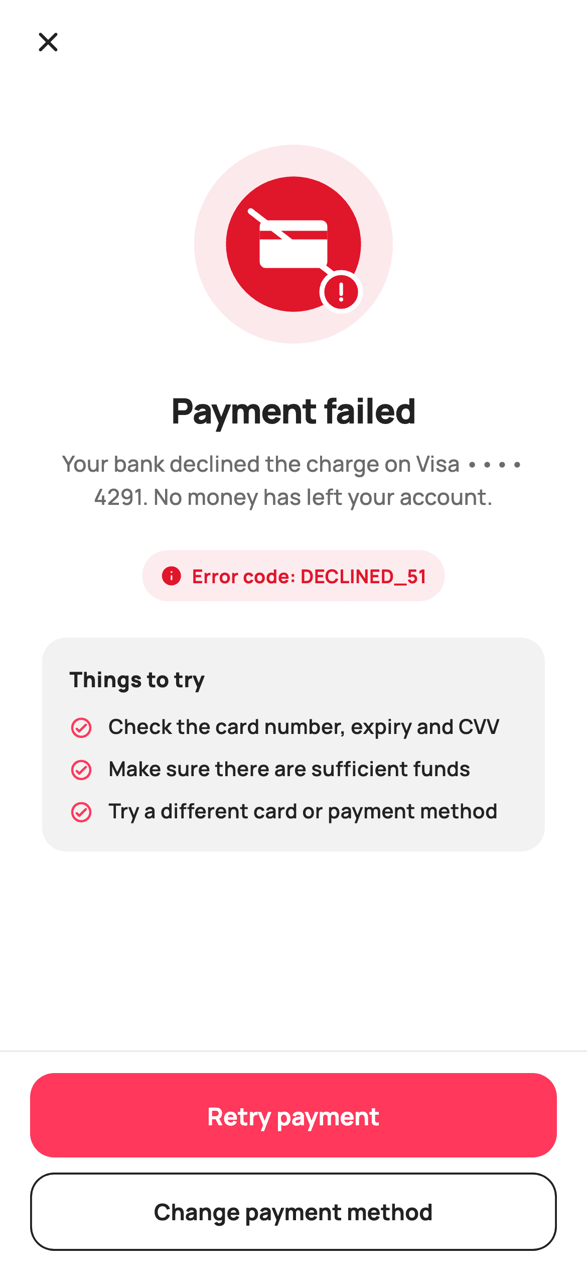
A declined payment is the highest-anxiety moment in a checkout, and the screen has about four seconds to answer 'was I charged?' before the shopper leaves. This tutorial builds StyleCart's payment-failed screen in Flutter: a painted danger badge with a slashed card and a warning dot, copy that names the card and states nothing was taken, a support-friendly error code chip, three things to try, and two ranked recovery actions.
Watch the Flutter UI walkthrough
A short screen recording of Payment Failed running, if you'd rather see it before you read the code. The written tutorial below covers everything in it.
Can't see the video? Watch it on YouTube.
What you'll build
- ✓A danger badge painted with a slashed card glyph and a nested warning dot
- ✓Error copy that names the card and rules out a charge in the same sentence
- ✓A quotable error-code chip built as a tinted pill for support conversations
- ✓Two recovery actions ranked filled-then-outlined rather than presented as equals
Step-by-step build
Create the file
Add a new file at lib/ecom_checkout_failed/ecom_checkout_failed_screen.dart in your Flutter project.
Register the bundled fonts
No external packages — this is pure Flutter. It does bundle its design font (Manrope), so drop the font file into fonts/ and declare it in pubspec.yaml:
flutter:
  fonts:
    - family: Manrope
      fonts:
- asset: fonts/Manrope-Regular.ttfBuild it, piece by piece
Here's how the screen goes together. Each block below is a real slice of the code with a plain-English explanation — paste them in order, or grab the whole file from the next section.
Tips as data, and a stateless error screen
import 'package:flutter/material.dart';

/// StyleCart — Payment Failed.
///
/// The error state after a declined payment: a painted danger badge, a plain
/// reason, a "what to try" list, and two recovery actions — retry the same
/// method or switch methods — over a reassurance that nothing was charged.
///
/// Self-contained per CONVENTIONS.md: pure Flutter, bundled Manrope, inline
/// Airbnb-style tokens, own light theme + SafeArea. The badge is a
/// CustomPainter (no emoji glyph, no network). Exposes callbacks only.
class EcomCheckoutFailedScreen extends StatelessWidget {
  const EcomCheckoutFailedScreen({
    super.key,
    this.onBack,
    this.onRetry,
    this.onChangeMethod,
  });

  final VoidCallback? onBack;
  final VoidCallback? onRetry;
  final VoidCallback? onChangeMethod;

  static const String _font = 'Manrope';
  static const Color _canvas = Color(0xFFFFFFFF);
  static const Color _ink = Color(0xFF222222);
  static const Color _muted = Color(0xFF6A6A6A);
  static const Color _brand = Color(0xFFFF385C);
  static const Color _danger = Color(0xFFE0162B);
  static const Color _surface = Color(0xFFF2F2F2);
  static const Color _hairline = Color(0xFFEBEBEB);

  static const List<String> _tips = <String>[
    'Check the card number, expiry and CVV',
    'Make sure there are sufficient funds',
    'Try a different card or payment method',
  ];
The screen is a `StatelessWidget` with three callbacks — `onBack`, `onRetry`, `onChangeMethod` — because an error page has nothing to mutate; it presents a result and offers exits. The three recovery suggestions live in a `static const List<String> _tips` rather than being written as widgets, which keeps the copy editable in one place. The palette separates `_brand` coral from `_danger` red: coral is the shop's action colour and stays on the retry button, while red is reserved for the badge and the error chip. Using one colour for both would make the primary button look like part of the failure.
Copy that answers the real question first
  @override
  Widget build(BuildContext context) {
    return Theme(
      data: ThemeData.light(useMaterial3: true),
      child: Scaffold(
        backgroundColor: _canvas,
        body: SafeArea(
          child: Column(
            children: <Widget>[
              _header(),
              Expanded(
                child: ListView(
                  padding: const EdgeInsets.fromLTRB(28, 12, 28, 20),
                  children: <Widget>[
                    const SizedBox(height: 28),
                    Center(
                      child: SizedBox(
                        width: 132,
                        height: 132,
                        child: CustomPaint(painter: _DangerBadgePainter()),
                      ),
                    ),
                    const SizedBox(height: 28),
                    const Text(
                      'Payment failed',
                      textAlign: TextAlign.center,
                      style: TextStyle(
                        fontFamily: _font,
                        fontSize: 23,
                        fontWeight: FontWeight.w800,
                        letterSpacing: -0.4,
                        color: _ink,
                      ),
                    ),
                    const SizedBox(height: 8),
                    const Text(
                      'Your bank declined the charge on Visa •••• 4291. '
                      'No money has left your account.',
                      textAlign: TextAlign.center,
                      style: TextStyle(
                        fontFamily: _font,
                        fontSize: 14.5,
                        fontWeight: FontWeight.w500,
                        height: 1.5,
                        color: _muted,
                      ),
                    ),
                    const SizedBox(height: 24),
                    _reasonChip(),
                    const SizedBox(height: 24),
                    _tipsCard(),
                  ],
                ),
              ),
              _actions(),
            ],
          ),
        ),
      ),
    );
  }
The centred body is a `ListView`, so the content scrolls on a small phone rather than overflowing at exactly the moment the shopper is already frustrated. What matters most is the second sentence: 'Your bank declined the charge on Visa •••• 4291. No money has left your account.' Naming the specific card tells the reader which one to check, and ruling out the charge in the same breath answers the question they actually have. A generic 'Something went wrong' leaves them to go and check their bank app instead of retrying. The headline sits at 23px `w800` with `letterSpacing: -0.4`, the body at 14.5px with `height: 1.5` for a comfortable two-line wrap.
A header that is only an exit
  Widget _header() {
    return Padding(
      padding: const EdgeInsets.fromLTRB(8, 4, 20, 4),
      child: Row(
        children: <Widget>[
          IconButton(
            onPressed: onBack,
            icon: const Icon(Icons.close_rounded, size: 22, color: _ink),
          ),
          const Expanded(child: SizedBox()),
        ],
      ),
    );
  }
The header is a close `IconButton` followed by `const Expanded(child: SizedBox())` — deliberately no title. The 23px headline sits a few pixels below, so a bar title would state the same thing twice in the first part of the screen. The empty `Expanded` is there purely to push the icon to the left and reserve the row's width; it costs nothing and is clearer than wrapping the button in an `Align`. A close icon rather than a back arrow is the right glyph because this screen ends a flow rather than sitting inside one.
The error code chip
  Widget _reasonChip() {
    return Center(
      child: Container(
        padding: const EdgeInsets.symmetric(horizontal: 12, vertical: 8),
        decoration: BoxDecoration(
          color: _danger.withValues(alpha: 0.08),
          borderRadius: BorderRadius.circular(20),
        ),
        child: Row(
          mainAxisSize: MainAxisSize.min,
          children: <Widget>[
            const Icon(Icons.info_rounded, size: 15, color: _danger),
            const SizedBox(width: 6),
            Text(
              'Error code: DECLINED_51',
              style: const TextStyle(
                fontFamily: _font,
                fontSize: 12.5,
                fontWeight: FontWeight.w700,
                color: _danger,
              ),
            ),
          ],
        ),
      ),
    );
  }
`_reasonChip` is a small pill at `_danger.withValues(alpha: 0.08)` carrying an info icon and 'Error code: DECLINED_51' in full `_danger`. It exists for one purpose — support. A shopper who cannot resolve the failure will contact someone, and a quotable code turns a vague 'my payment didn't work' into an instantly diagnosable conversation. Sizing it small at 12.5px and centring it under the copy keeps it available without making a technical string the second thing the reader sees. `mainAxisSize: MainAxisSize.min` on the inner Row is what makes the pill hug its text instead of stretching.
The things-to-try card
  Widget _tipsCard() {
    return Container(
      padding: const EdgeInsets.all(18),
      decoration: BoxDecoration(
        color: _surface,
        borderRadius: BorderRadius.circular(16),
      ),
      child: Column(
        crossAxisAlignment: CrossAxisAlignment.start,
        children: <Widget>[
          const Text(
            'Things to try',
            style: TextStyle(
              fontFamily: _font,
              fontSize: 14,
              fontWeight: FontWeight.w800,
              color: _ink,
            ),
          ),
          const SizedBox(height: 12),
          for (int i = 0; i < _tips.length; i++) ...<Widget>[
            if (i > 0) const SizedBox(height: 10),
            Row(
              crossAxisAlignment: CrossAxisAlignment.start,
              children: <Widget>[
                const Padding(
                  padding: EdgeInsets.only(top: 2),
                  child: Icon(Icons.check_circle_outline_rounded,
                      size: 16, color: _brand),
                ),
                const SizedBox(width: 10),
                Expanded(
                  child: Text(
                    _tips[i],
                    style: const TextStyle(
                      fontFamily: _font,
                      fontSize: 13.5,
                      fontWeight: FontWeight.w600,
                      height: 1.35,
                      color: _ink,
                    ),
                  ),
                ),
              ],
            ),
          ],
        ],
      ),
    );
  }
The tips card is a `_surface` panel emitting its rows through a collection-for that spreads two widgets per iteration — `if (i > 0) const SizedBox(height: 10)` then the Row — so the 10px gaps land between items and never after the last one, keeping the card's own 18px padding correct at the bottom. Each row sets `crossAxisAlignment: CrossAxisAlignment.start` with the text in `Expanded`, so a wrapping tip keeps its icon beside the first line rather than floating mid-paragraph, and the icon carries `EdgeInsets.only(top: 2)` as optical correction against the text's cap height. The tips are ordered by likelihood — typo first, funds second, different card last — which doubles as an escalation path.
Two exits, deliberately unequal
  Widget _actions() {
    return Container(
      decoration: const BoxDecoration(
        color: _canvas,
        border: Border(top: BorderSide(color: _hairline)),
      ),
      child: SafeArea(
        top: false,
        child: Padding(
          padding: const EdgeInsets.fromLTRB(20, 14, 20, 14),
          child: Column(
            mainAxisSize: MainAxisSize.min,
            children: <Widget>[
              SizedBox(
                height: 56,
                child: FilledButton(
                  onPressed: onRetry,
                  style: FilledButton.styleFrom(
                    backgroundColor: _brand,
                    foregroundColor: _canvas,
                    minimumSize: const Size.fromHeight(56),
                    shape: RoundedRectangleBorder(
                      borderRadius: BorderRadius.circular(16),
                    ),
                  ),
                  child: const Text(
                    'Retry payment',
                    style: TextStyle(
                      fontFamily: _font,
                      fontSize: 16,
                      fontWeight: FontWeight.w700,
                    ),
                  ),
                ),
              ),
              const SizedBox(height: 10),
              SizedBox(
                height: 52,
                child: OutlinedButton(
                  onPressed: onChangeMethod,
                  style: OutlinedButton.styleFrom(
                    foregroundColor: _ink,
                    side: const BorderSide(color: _ink, width: 1.3),
                    minimumSize: const Size.fromHeight(52),
                    shape: RoundedRectangleBorder(
                      borderRadius: BorderRadius.circular(16),
                    ),
                  ),
                  child: const Text(
                    'Change payment method',
                    style: TextStyle(
                      fontFamily: _font,
                      fontSize: 15,
                      fontWeight: FontWeight.w700,
                    ),
                  ),
                ),
              ),
            ],
          ),
        ),
      ),
    );
  }
The action bar stacks a `FilledButton` reading 'Retry payment' above an `OutlinedButton` reading 'Change payment method'. Retry gets the coral fill because most declines are transient and retrying is the fastest resolution; changing method is a real alternative but a slower one, so it takes an outline. Two filled buttons would force a decision the shopper is not equipped to make. Both use `minimumSize: const Size.fromHeight(...)` alongside their SizedBox height, which guarantees full width without a `double.infinity` wrapper. The bar itself is a Container with a top hairline wrapping `SafeArea(top: false)` — inside the Container, so the white background extends under the home indicator while the buttons stay above it.
Painting the danger badge
/// Paints a danger badge: a soft red disc, a ringed circle and a bold "card
/// with a slash" mark signalling a declined payment.
class _DangerBadgePainter extends CustomPainter {
  @override
  void paint(Canvas canvas, Size size) {
    final double w = size.width;
    final double h = size.height;
    final Offset c = Offset(w / 2, h / 2);

    canvas.drawCircle(c, w / 2, Paint()..color = const Color(0xFFFCE9EC));
    canvas.drawCircle(c, w * 0.34, Paint()..color = const Color(0xFFE0162B));

    // Card glyph.
    final Rect card = Rect.fromCenter(
        center: c, width: w * 0.34, height: w * 0.24);
    final RRect cardR =
        RRect.fromRectAndRadius(card, const Radius.circular(4));
    canvas.drawRRect(cardR, Paint()..color = const Color(0xFFFFFFFF));
    canvas.drawRect(
      Rect.fromLTWH(card.left, card.top + card.height * 0.22,
          card.width, card.height * 0.18),
      Paint()..color = const Color(0xFFE0162B),
    );

    // Slash through the card.
    canvas.drawLine(
      Offset(card.left - 6, card.top - 6),
      Offset(card.right + 6, card.bottom + 6),
      Paint()
        ..color = const Color(0xFFFFFFFF)
        ..strokeWidth = 4
        ..strokeCap = StrokeCap.round,
    );

    // Small warning dot bottom-right.
    final Offset wd = Offset(w * 0.74, h * 0.74);
    canvas.drawCircle(wd, w * 0.11, Paint()..color = const Color(0xFFFFFFFF));
    canvas.drawCircle(wd, w * 0.085, Paint()..color = const Color(0xFFE0162B));
    final Paint bang = Paint()
      ..color = const Color(0xFFFFFFFF)
      ..strokeWidth = 2.4
      ..strokeCap = StrokeCap.round;
    canvas.drawLine(wd.translate(0, -5), wd.translate(0, 1.5), bang);
    canvas.drawCircle(wd.translate(0, 5), 1.4,
        Paint()..color = const Color(0xFFFFFFFF));
  }

  @override
  bool shouldRepaint(_DangerBadgePainter oldDelegate) => false;
`_DangerBadgePainter` layers five elements. A soft `#FCE9EC` disc at full width, then a solid red circle at `w * 0.34`. On top, the card glyph: an `RRect` in white with a red magnetic stripe drawn as a plain `Rect` positioned at 22% down its height. The slash runs corner to corner with a 6px overshoot at each end and `StrokeCap.round` for soft tips — extending past the shape is what makes it read as struck through rather than merely crossed. The warning dot at bottom-right is drawn as two circles, white then slightly smaller red, giving a clean ring with no stroke maths. Its exclamation mark is a `drawLine` plus a 1.4px circle for the point. Every coordinate is a fraction of `size`, so the badge scales to any box, and `shouldRepaint` returns `false` since nothing depends on state.
Full code
The complete, ready-to-paste source. Free to use in your projects — one click copies it all.
import 'package:flutter/material.dart';

/// StyleCart — Payment Failed.
///
/// The error state after a declined payment: a painted danger badge, a plain
/// reason, a "what to try" list, and two recovery actions — retry the same
/// method or switch methods — over a reassurance that nothing was charged.
///
/// Self-contained per CONVENTIONS.md: pure Flutter, bundled Manrope, inline
/// Airbnb-style tokens, own light theme + SafeArea. The badge is a
/// CustomPainter (no emoji glyph, no network). Exposes callbacks only.
class EcomCheckoutFailedScreen extends StatelessWidget {
  const EcomCheckoutFailedScreen({
    super.key,
    this.onBack,
    this.onRetry,
    this.onChangeMethod,
  });

  final VoidCallback? onBack;
  final VoidCallback? onRetry;
  final VoidCallback? onChangeMethod;

  static const String _font = 'Manrope';
  static const Color _canvas = Color(0xFFFFFFFF);
  static const Color _ink = Color(0xFF222222);
  static const Color _muted = Color(0xFF6A6A6A);
  static const Color _brand = Color(0xFFFF385C);
  static const Color _danger = Color(0xFFE0162B);
  static const Color _surface = Color(0xFFF2F2F2);
  static const Color _hairline = Color(0xFFEBEBEB);

  static const List<String> _tips = <String>[
    'Check the card number, expiry and CVV',
    'Make sure there are sufficient funds',
    'Try a different card or payment method',
  ];

  @override
  Widget build(BuildContext context) {
    return Theme(
      data: ThemeData.light(useMaterial3: true),
      child: Scaffold(
        backgroundColor: _canvas,
        body: SafeArea(
          child: Column(
            children: <Widget>[
              _header(),
              Expanded(
                child: ListView(
                  padding: const EdgeInsets.fromLTRB(28, 12, 28, 20),
                  children: <Widget>[
                    const SizedBox(height: 28),
                    Center(
                      child: SizedBox(
                        width: 132,
                        height: 132,
                        child: CustomPaint(painter: _DangerBadgePainter()),
                      ),
                    ),
                    const SizedBox(height: 28),
                    const Text(
                      'Payment failed',
                      textAlign: TextAlign.center,
                      style: TextStyle(
                        fontFamily: _font,
                        fontSize: 23,
                        fontWeight: FontWeight.w800,
                        letterSpacing: -0.4,
                        color: _ink,
                      ),
                    ),
                    const SizedBox(height: 8),
                    const Text(
                      'Your bank declined the charge on Visa •••• 4291. '
                      'No money has left your account.',
                      textAlign: TextAlign.center,
                      style: TextStyle(
                        fontFamily: _font,
                        fontSize: 14.5,
                        fontWeight: FontWeight.w500,
                        height: 1.5,
                        color: _muted,
                      ),
                    ),
                    const SizedBox(height: 24),
                    _reasonChip(),
                    const SizedBox(height: 24),
                    _tipsCard(),
                  ],
                ),
              ),
              _actions(),
            ],
          ),
        ),
      ),
    );
  }

  Widget _header() {
    return Padding(
      padding: const EdgeInsets.fromLTRB(8, 4, 20, 4),
      child: Row(
        children: <Widget>[
          IconButton(
            onPressed: onBack,
            icon: const Icon(Icons.close_rounded, size: 22, color: _ink),
          ),
          const Expanded(child: SizedBox()),
        ],
      ),
    );
  }

  Widget _reasonChip() {
    return Center(
      child: Container(
        padding: const EdgeInsets.symmetric(horizontal: 12, vertical: 8),
        decoration: BoxDecoration(
          color: _danger.withValues(alpha: 0.08),
          borderRadius: BorderRadius.circular(20),
        ),
        child: Row(
          mainAxisSize: MainAxisSize.min,
          children: <Widget>[
            const Icon(Icons.info_rounded, size: 15, color: _danger),
            const SizedBox(width: 6),
            Text(
              'Error code: DECLINED_51',
              style: const TextStyle(
                fontFamily: _font,
                fontSize: 12.5,
                fontWeight: FontWeight.w700,
                color: _danger,
              ),
            ),
          ],
        ),
      ),
    );
  }

  Widget _tipsCard() {
    return Container(
      padding: const EdgeInsets.all(18),
      decoration: BoxDecoration(
        color: _surface,
        borderRadius: BorderRadius.circular(16),
      ),
      child: Column(
        crossAxisAlignment: CrossAxisAlignment.start,
        children: <Widget>[
          const Text(
            'Things to try',
            style: TextStyle(
              fontFamily: _font,
              fontSize: 14,
              fontWeight: FontWeight.w800,
              color: _ink,
            ),
          ),
          const SizedBox(height: 12),
          for (int i = 0; i < _tips.length; i++) ...<Widget>[
            if (i > 0) const SizedBox(height: 10),
            Row(
              crossAxisAlignment: CrossAxisAlignment.start,
              children: <Widget>[
                const Padding(
                  padding: EdgeInsets.only(top: 2),
                  child: Icon(Icons.check_circle_outline_rounded,
                      size: 16, color: _brand),
                ),
                const SizedBox(width: 10),
                Expanded(
                  child: Text(
                    _tips[i],
                    style: const TextStyle(
                      fontFamily: _font,
                      fontSize: 13.5,
                      fontWeight: FontWeight.w600,
                      height: 1.35,
                      color: _ink,
                    ),
                  ),
                ),
              ],
            ),
          ],
        ],
      ),
    );
  }

  Widget _actions() {
    return Container(
      decoration: const BoxDecoration(
        color: _canvas,
        border: Border(top: BorderSide(color: _hairline)),
      ),
      child: SafeArea(
        top: false,
        child: Padding(
          padding: const EdgeInsets.fromLTRB(20, 14, 20, 14),
          child: Column(
            mainAxisSize: MainAxisSize.min,
            children: <Widget>[
              SizedBox(
                height: 56,
                child: FilledButton(
                  onPressed: onRetry,
                  style: FilledButton.styleFrom(
                    backgroundColor: _brand,
                    foregroundColor: _canvas,
                    minimumSize: const Size.fromHeight(56),
                    shape: RoundedRectangleBorder(
                      borderRadius: BorderRadius.circular(16),
                    ),
                  ),
                  child: const Text(
                    'Retry payment',
                    style: TextStyle(
                      fontFamily: _font,
                      fontSize: 16,
                      fontWeight: FontWeight.w700,
                    ),
                  ),
                ),
              ),
              const SizedBox(height: 10),
              SizedBox(
                height: 52,
                child: OutlinedButton(
                  onPressed: onChangeMethod,
                  style: OutlinedButton.styleFrom(
                    foregroundColor: _ink,
                    side: const BorderSide(color: _ink, width: 1.3),
                    minimumSize: const Size.fromHeight(52),
                    shape: RoundedRectangleBorder(
                      borderRadius: BorderRadius.circular(16),
                    ),
                  ),
                  child: const Text(
                    'Change payment method',
                    style: TextStyle(
                      fontFamily: _font,
                      fontSize: 15,
                      fontWeight: FontWeight.w700,
                    ),
                  ),
                ),
              ),
            ],
          ),
        ),
      ),
    );
  }
}

/// Paints a danger badge: a soft red disc, a ringed circle and a bold "card
/// with a slash" mark signalling a declined payment.
class _DangerBadgePainter extends CustomPainter {
  @override
  void paint(Canvas canvas, Size size) {
    final double w = size.width;
    final double h = size.height;
    final Offset c = Offset(w / 2, h / 2);

    canvas.drawCircle(c, w / 2, Paint()..color = const Color(0xFFFCE9EC));
    canvas.drawCircle(c, w * 0.34, Paint()..color = const Color(0xFFE0162B));

    // Card glyph.
    final Rect card = Rect.fromCenter(
        center: c, width: w * 0.34, height: w * 0.24);
    final RRect cardR =
        RRect.fromRectAndRadius(card, const Radius.circular(4));
    canvas.drawRRect(cardR, Paint()..color = const Color(0xFFFFFFFF));
    canvas.drawRect(
      Rect.fromLTWH(card.left, card.top + card.height * 0.22,
          card.width, card.height * 0.18),
      Paint()..color = const Color(0xFFE0162B),
    );

    // Slash through the card.
    canvas.drawLine(
      Offset(card.left - 6, card.top - 6),
      Offset(card.right + 6, card.bottom + 6),
      Paint()
        ..color = const Color(0xFFFFFFFF)
        ..strokeWidth = 4
        ..strokeCap = StrokeCap.round,
    );

    // Small warning dot bottom-right.
    final Offset wd = Offset(w * 0.74, h * 0.74);
    canvas.drawCircle(wd, w * 0.11, Paint()..color = const Color(0xFFFFFFFF));
    canvas.drawCircle(wd, w * 0.085, Paint()..color = const Color(0xFFE0162B));
    final Paint bang = Paint()
      ..color = const Color(0xFFFFFFFF)
      ..strokeWidth = 2.4
      ..strokeCap = StrokeCap.round;
    canvas.drawLine(wd.translate(0, -5), wd.translate(0, 1.5), bang);
    canvas.drawCircle(wd.translate(0, 5), 1.4,
        Paint()..color = const Color(0xFFFFFFFF));
  }

  @override
  bool shouldRepaint(_DangerBadgePainter oldDelegate) => false;
}
Plus bundled 5 binary assets (fonts/images). The CLI and MCP install those for you automatically.
Two faster ways to add it
Copy-paste works, but you can skip it entirely.
1. FlutterKit CLI
One command drops this screen — and its fonts — straight into your project.
$ flutterkit add ecom-checkout-failed2. AI agent (MCP)
Connect FlutterKit's MCP server in Claude or Cursor and just ask your agent to install ecom-checkout-failed — it fetches and writes the files for you.
FAQ
Is this payment failed screen free to use commercially?
Yes — free, with no paid version to graduate to. Copy the error screen and its painter from this page, install via CLI, or pull it through MCP, and use it in a live checkout. No sign-up and no attribution.
How do I show the real decline reason from my payment provider?
Add parameters for the message, the masked card and the error code, then replace the literals in the body copy and `_reasonChip`. Map your provider's codes to plain-language sentences — most gateways return a machine code plus a category, and the category is what belongs in the paragraph.
Why does the error copy mention that no money was taken?
Because that is the question the shopper actually has. A decline often leaves a pending authorisation visible in a banking app, and saying nothing has left the account up front is what keeps someone on the screen to retry instead of leaving to go and check.
Do I need an image or icon pack for the badge?
No. It is a `CustomPainter` drawing circles, rounded rectangles and lines — no asset file, no `flutter_svg`. Because every coordinate is expressed as a fraction of the widget size, it stays sharp at any resolution and scales with whatever box you give it.
Which Flutter version does this need?
Flutter 3.22 or newer, because the error chip uses `Color.withValues(alpha: 0.08)`. On an older SDK swap that for `withOpacity(0.08)` and expand the constructor to the `{Key? key, ...} : super(key: key)` form.


