How to Build a Delivery Options Screen in Flutter (Full Code + Preview)
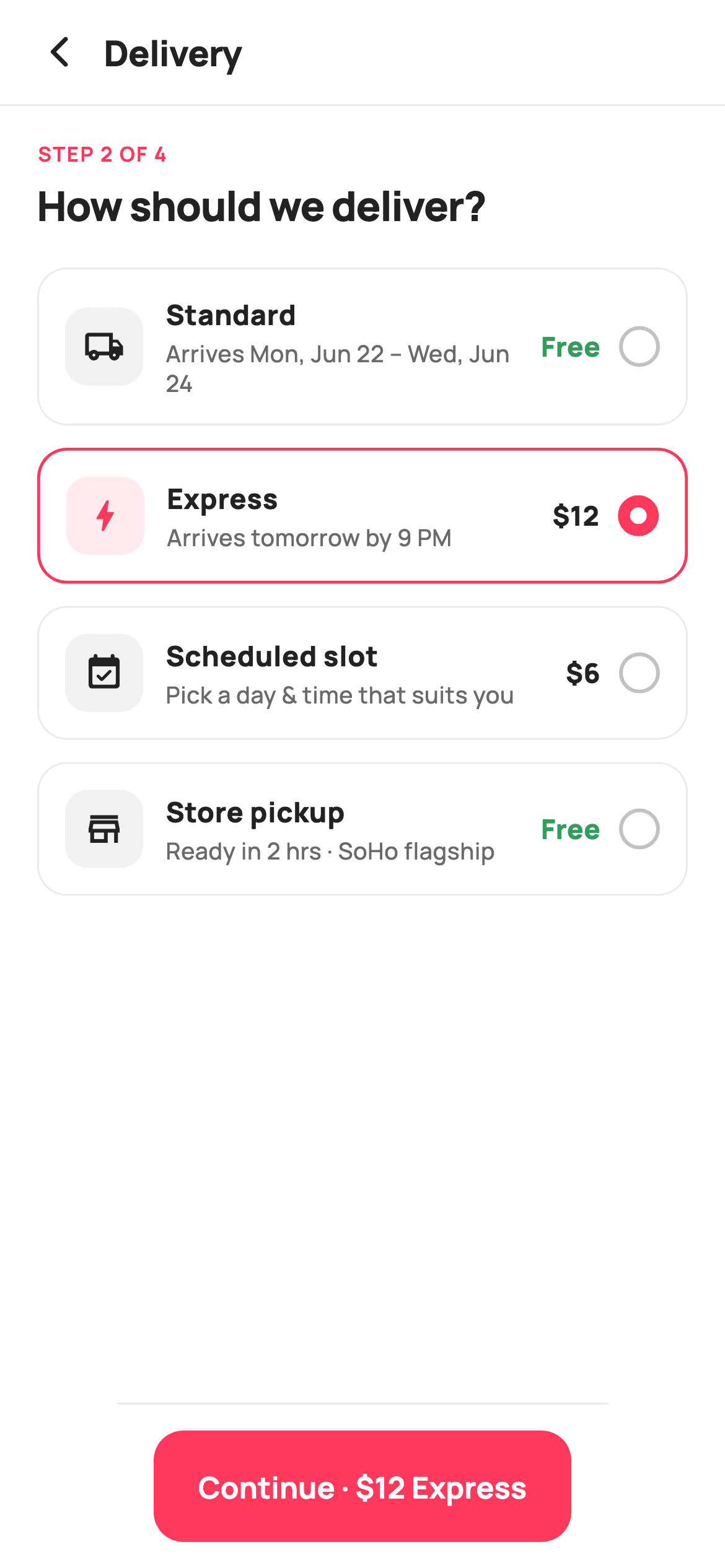
Shipping choice is the last place a checkout loses people, so the options have to be scannable. This tutorial builds StyleCart's delivery step in Flutter — four selectable method cards with an icon tile, an ETA line, a free-or-priced fee and a border-drawn radio, where picking 'Scheduled slot' expands the card to reveal day-and-time chips. A pinned button echoes the chosen method and its cost. You'll learn how AnimatedContainer animates selection, and how one condition makes a card grow inline.
Watch the Flutter UI walkthrough
A short screen recording of Delivery Options running, if you'd rather see it before you read the code. The written tutorial below covers everything in it.
Can't see the video? Watch it on YouTube.
What you'll build
- ✓Four delivery method cards that animate their border colour and thickness as the selection moves
- ✓A radio control built from a Container border alone — no Radio widget, no extra state plumbing
- ✓An inline expanding card where choosing the scheduled option reveals a Wrap of time-slot chips
- ✓A pinned continue button whose label rewrites itself to 'Continue · $12 Express' as the choice changes
Step-by-step build
Create the file
Add a new file at lib/ecom_checkout_delivery_options/ecom_checkout_delivery_options_screen.dart in your Flutter project.
Register the bundled fonts
No external packages — this is pure Flutter. It does bundle its design font (Manrope), so drop the font file into fonts/ and declare it in pubspec.yaml:
flutter:
  fonts:
    - family: Manrope
      fonts:
- asset: fonts/Manrope-Regular.ttfBuild it, piece by piece
Here's how the screen goes together. Each block below is a real slice of the code with a plain-English explanation — paste them in order, or grab the whole file from the next section.
Options, slots, and the two selection indices
import 'package:flutter/material.dart';

/// StyleCart — Delivery Options (checkout step 2).
///
/// A radio list of shipping methods — Standard, Express, Scheduled slot and
/// Store pickup — each with an ETA and a fee. Selecting the scheduled option
/// reveals a row of day/time slot chips. A pinned bar carries the chosen
/// method (and its fee) forward.
///
/// Self-contained per CONVENTIONS.md: pure Flutter, bundled Manrope, inline
/// Airbnb-style tokens, own light theme + SafeArea. No images. Exposes
/// callbacks only.
class EcomCheckoutDeliveryOptionsScreen extends StatefulWidget {
  const EcomCheckoutDeliveryOptionsScreen({
    super.key,
    this.onBack,
    this.onContinue,
  });

  final VoidCallback? onBack;
  final VoidCallback? onContinue;

  @override
  State<EcomCheckoutDeliveryOptionsScreen> createState() =>
      _EcomCheckoutDeliveryOptionsScreenState();
}

class _EcomCheckoutDeliveryOptionsScreenState
    extends State<EcomCheckoutDeliveryOptionsScreen> {
  static const String _font = 'Manrope';
  static const Color _canvas = Color(0xFFFFFFFF);
  static const Color _ink = Color(0xFF222222);
  static const Color _muted = Color(0xFF6A6A6A);
  static const Color _faint = Color(0xFFC1C1C1);
  static const Color _brand = Color(0xFFFF385C);
  static const Color _surface = Color(0xFFF2F2F2);
  static const Color _success = Color(0xFF2E9E5B);
  static const Color _hairline = Color(0xFFEBEBEB);

  static const List<_Opt> _opts = <_Opt>[
    _Opt(Icons.local_shipping_outlined, 'Standard', 'Arrives Mon, Jun 22 – Wed, Jun 24',
        0),
    _Opt(Icons.bolt_rounded, 'Express', 'Arrives tomorrow by 9 PM', 12),
    _Opt(Icons.event_available_rounded, 'Scheduled slot',
        'Pick a day & time that suits you', 6),
    _Opt(Icons.store_mall_directory_outlined, 'Store pickup',
        'Ready in 2 hrs · SoHo flagship', 0),
  ];

  static const List<String> _slots = <String>[
    'Sat · 9–11 AM',
    'Sat · 2–4 PM',
    'Sun · 10–12 PM',
    'Sun · 4–6 PM',
  ];

  int _sel = 1;
  int _slot = 0;
The screen is stateful because two things change: which method is chosen and which slot. `_opts` is a static const list of four `_Opt` records — icon, title, ETA copy and an integer fee where 0 means free. `_slots` is a separate const list of four strings like 'Sat · 9–11 AM'. The state is just two ints: `_sel` starting at 1 (so Express is pre-selected, a common conversion nudge) and `_slot` at 0. Keeping them as plain indices rather than objects means every comparison downstream is a cheap `==` and there's no identity juggling when the lists are rebuilt.
The step label and the option list
  @override
  Widget build(BuildContext context) {
    return Theme(
      data: ThemeData.light(useMaterial3: true),
      child: Scaffold(
        backgroundColor: _canvas,
        body: SafeArea(
          child: Column(
            children: <Widget>[
              _header(),
              const Divider(height: 1, color: _hairline),
              Expanded(
                child: ListView(
                  padding: const EdgeInsets.fromLTRB(20, 18, 20, 20),
                  children: <Widget>[
                    const Text(
                      'STEP 2 OF 4',
                      style: TextStyle(
                        fontFamily: _font,
                        fontSize: 11,
                        fontWeight: FontWeight.w700,
                        letterSpacing: 0.8,
                        color: _brand,
                      ),
                    ),
                    const SizedBox(height: 4),
                    const Text(
                      'How should we deliver?',
                      style: TextStyle(
                        fontFamily: _font,
                        fontSize: 22,
                        fontWeight: FontWeight.w800,
                        letterSpacing: -0.5,
                        color: _ink,
                      ),
                    ),
                    const SizedBox(height: 18),
                    for (int i = 0; i < _opts.length; i++) ...<Widget>[
                      _optCard(_opts[i], i),
                      const SizedBox(height: 12),
                    ],
                  ],
                ),
              ),
              _continueBar(),
            ],
          ),
        ),
      ),
    );
  }
The body follows the same three-part shape as the other checkout steps: header, `Expanded` ListView, pinned bar. Inside the list, 'STEP 2 OF 4' is set in 11px w700 with 0.8 letterSpacing in the brand coral — small, wide-tracked, coloured type is the standard eyebrow treatment and it tells the shopper how much checkout is left. Below it the 22px question 'How should we deliver?' carries `-0.5` letterSpacing to keep the large bold text tight. The four cards are emitted with a collection-for plus spread so each iteration contributes the card and a 12px gap.
The animated option card
  Widget _optCard(_Opt o, int i) {
    final bool active = _sel == i;
    return GestureDetector(
      onTap: () => setState(() => _sel = i),
      child: AnimatedContainer(
        duration: const Duration(milliseconds: 150),
        padding: const EdgeInsets.all(14),
        decoration: BoxDecoration(
          color: _canvas,
          borderRadius: BorderRadius.circular(16),
          border: Border.all(
            color: active ? _brand : _hairline,
            width: active ? 1.6 : 1,
          ),
        ),
        child: Column(
          children: <Widget>[
            Row(
              children: <Widget>[
                Container(
                  width: 42,
                  height: 42,
                  decoration: BoxDecoration(
                    color: active ? _brand.withValues(alpha: 0.10) : _surface,
                    borderRadius: BorderRadius.circular(12),
                  ),
                  child: Icon(o.icon,
                      size: 22, color: active ? _brand : _ink),
                ),
                const SizedBox(width: 12),
                Expanded(
                  child: Column(
                    crossAxisAlignment: CrossAxisAlignment.start,
                    children: <Widget>[
                      Text(
                        o.title,
                        style: const TextStyle(
                          fontFamily: _font,
                          fontSize: 15,
                          fontWeight: FontWeight.w800,
                          color: _ink,
                        ),
                      ),
                      const SizedBox(height: 2),
                      Text(
                        o.eta,
                        style: const TextStyle(
                          fontFamily: _font,
                          fontSize: 12.5,
                          fontWeight: FontWeight.w500,
                          height: 1.3,
                          color: _muted,
                        ),
                      ),
                    ],
                  ),
                ),
                const SizedBox(width: 10),
                Text(
                  o.fee == 0 ? 'Free' : '\$${o.fee}',
                  style: TextStyle(
                    fontFamily: _font,
                    fontSize: 14.5,
                    fontWeight: FontWeight.w800,
                    color: o.fee == 0 ? _success : _ink,
                  ),
                ),
                const SizedBox(width: 10),
                _radio(active),
              ],
            ),
            if (active && o.title == 'Scheduled slot') ...<Widget>[
              const Divider(height: 24, color: _hairline),
              _slotChips(),
            ],
          ],
        ),
      ),
    );
  }
`active` is derived by comparing the card's index to `_sel`, and it drives four things at once. The card is an AnimatedContainer with a 150ms duration, so when the border changes from `_hairline` at 1px to `_brand` at 1.6px the transition is smooth rather than a snap. The 42px icon tile swaps its fill from flat `_surface` to the brand at 10% opacity and tints its icon coral. The fee reads 'Free' in green when `o.fee == 0` and '$12' in ink otherwise, so a free option is visually rewarded. Tapping anywhere on the card — not just the radio — sets `_sel`, which is a much larger touch target than a 22px circle.
The inline expansion and the slot chips
            if (active && o.title == 'Scheduled slot') ...<Widget>[
              const Divider(height: 24, color: _hairline),
              _slotChips(),
            ],
          ],
        ),
      ),
    );
  }

  Widget _slotChips() {
    return Wrap(
      spacing: 8,
      runSpacing: 8,
      children: <Widget>[
        for (int i = 0; i < _slots.length; i++)
          GestureDetector(
            onTap: () => setState(() => _slot = i),
            child: Container(
              padding:
                  const EdgeInsets.symmetric(horizontal: 12, vertical: 9),
              decoration: BoxDecoration(
                color: _slot == i ? _ink : _surface,
                borderRadius: BorderRadius.circular(10),
              ),
              child: Text(
                _slots[i],
                style: TextStyle(
                  fontFamily: _font,
                  fontSize: 12.5,
                  fontWeight: FontWeight.w700,
                  color: _slot == i ? _canvas : _ink,
                ),
              ),
            ),
          ),
      ],
    );
  }
The expansion is a single guarded spread: `if (active && o.title == 'Scheduled slot') ...<Widget>[const Divider(height: 24, color: _hairline), _slotChips()]`. Because it lives inside the same AnimatedContainer, the card's own height change is what animates — no AnimatedSize or ExpansionTile needed. `_slotChips()` is a Wrap with 8px spacing and runSpacing, so the four chips flow onto a second line on narrow phones instead of overflowing. Each chip inverts on selection: `_ink` background with white text when chosen, `_surface` with ink text when not, which is the strongest contrast available without introducing a new colour.
A radio drawn from a border
  Widget _radio(bool active) {
    return Container(
      width: 22,
      height: 22,
      decoration: BoxDecoration(
        shape: BoxShape.circle,
        border: Border.all(
          color: active ? _brand : _faint,
          width: active ? 6.5 : 2,
        ),
      ),
    );
  }
This is a neat trick worth stealing. Instead of a Radio widget, `_radio()` is a 22×22 circular Container with nothing inside it — the dot is produced entirely by the border width. When inactive it draws a 2px `_faint` ring, leaving a hollow circle. When active it draws a 6.5px `_brand` ring, and because the border grows inward on a 22px circle that thick ring nearly closes, reading as a filled dot with a thin white gap. One Container, no children, no theme overrides to fight, and it inherits the parent's colour tokens directly.
A continue bar that names the choice
  Widget _continueBar() {
    final _Opt o = _opts[_sel];
    return Container(
      decoration: const BoxDecoration(
        color: _canvas,
        border: Border(top: BorderSide(color: _hairline)),
      ),
      child: SafeArea(
        top: false,
        child: SizedBox(
          height: 88,
          child: Padding(
            padding: const EdgeInsets.fromLTRB(20, 14, 20, 14),
            child: SizedBox(
              height: 56,
              child: FilledButton(
                onPressed: widget.onContinue,
                style: FilledButton.styleFrom(
                  backgroundColor: _brand,
                  foregroundColor: _canvas,
                  shape: RoundedRectangleBorder(
                    borderRadius: BorderRadius.circular(16),
                  ),
                ),
                child: Text(
                  o.fee == 0
                      ? 'Continue · ${o.title}'
                      : 'Continue · \$${o.fee} ${o.title}',
                  style: const TextStyle(
                    fontFamily: _font,
                    fontSize: 16,
                    fontWeight: FontWeight.w700,
                  ),
                ),
              ),
            ),
          ),
        ),
      ),
    );
  }
}

class _Opt {
  const _Opt(this.icon, this.title, this.eta, this.fee);
  final IconData icon;
  final String title;
  final String eta;
  final int fee;
}
The bar looks up the current option once — `final _Opt o = _opts[_sel]` — then builds its label from it: `'Continue · ${o.title}'` when the method is free, `'Continue · \$${o.fee} ${o.title}'` when it costs. Restating both the method and its price on the button is what stops the classic checkout surprise of an unexpected shipping fee at review. `SafeArea(top: false)` keeps the button clear of the home indicator without padding the top, and the fixed `SizedBox(height: 88)` gives the bar a stable footprint so the list above doesn't reflow as the label changes length. `_Opt` at the bottom is the four-field immutable record backing all of it.
Full code
The complete, ready-to-paste source. Free to use in your projects — one click copies it all.
import 'package:flutter/material.dart';

/// StyleCart — Delivery Options (checkout step 2).
///
/// A radio list of shipping methods — Standard, Express, Scheduled slot and
/// Store pickup — each with an ETA and a fee. Selecting the scheduled option
/// reveals a row of day/time slot chips. A pinned bar carries the chosen
/// method (and its fee) forward.
///
/// Self-contained per CONVENTIONS.md: pure Flutter, bundled Manrope, inline
/// Airbnb-style tokens, own light theme + SafeArea. No images. Exposes
/// callbacks only.
class EcomCheckoutDeliveryOptionsScreen extends StatefulWidget {
  const EcomCheckoutDeliveryOptionsScreen({
    super.key,
    this.onBack,
    this.onContinue,
  });

  final VoidCallback? onBack;
  final VoidCallback? onContinue;

  @override
  State<EcomCheckoutDeliveryOptionsScreen> createState() =>
      _EcomCheckoutDeliveryOptionsScreenState();
}

class _EcomCheckoutDeliveryOptionsScreenState
    extends State<EcomCheckoutDeliveryOptionsScreen> {
  static const String _font = 'Manrope';
  static const Color _canvas = Color(0xFFFFFFFF);
  static const Color _ink = Color(0xFF222222);
  static const Color _muted = Color(0xFF6A6A6A);
  static const Color _faint = Color(0xFFC1C1C1);
  static const Color _brand = Color(0xFFFF385C);
  static const Color _surface = Color(0xFFF2F2F2);
  static const Color _success = Color(0xFF2E9E5B);
  static const Color _hairline = Color(0xFFEBEBEB);

  static const List<_Opt> _opts = <_Opt>[
    _Opt(Icons.local_shipping_outlined, 'Standard', 'Arrives Mon, Jun 22 – Wed, Jun 24',
        0),
    _Opt(Icons.bolt_rounded, 'Express', 'Arrives tomorrow by 9 PM', 12),
    _Opt(Icons.event_available_rounded, 'Scheduled slot',
        'Pick a day & time that suits you', 6),
    _Opt(Icons.store_mall_directory_outlined, 'Store pickup',
        'Ready in 2 hrs · SoHo flagship', 0),
  ];

  static const List<String> _slots = <String>[
    'Sat · 9–11 AM',
    'Sat · 2–4 PM',
    'Sun · 10–12 PM',
    'Sun · 4–6 PM',
  ];

  int _sel = 1;
  int _slot = 0;

  @override
  Widget build(BuildContext context) {
    return Theme(
      data: ThemeData.light(useMaterial3: true),
      child: Scaffold(
        backgroundColor: _canvas,
        body: SafeArea(
          child: Column(
            children: <Widget>[
              _header(),
              const Divider(height: 1, color: _hairline),
              Expanded(
                child: ListView(
                  padding: const EdgeInsets.fromLTRB(20, 18, 20, 20),
                  children: <Widget>[
                    const Text(
                      'STEP 2 OF 4',
                      style: TextStyle(
                        fontFamily: _font,
                        fontSize: 11,
                        fontWeight: FontWeight.w700,
                        letterSpacing: 0.8,
                        color: _brand,
                      ),
                    ),
                    const SizedBox(height: 4),
                    const Text(
                      'How should we deliver?',
                      style: TextStyle(
                        fontFamily: _font,
                        fontSize: 22,
                        fontWeight: FontWeight.w800,
                        letterSpacing: -0.5,
                        color: _ink,
                      ),
                    ),
                    const SizedBox(height: 18),
                    for (int i = 0; i < _opts.length; i++) ...<Widget>[
                      _optCard(_opts[i], i),
                      const SizedBox(height: 12),
                    ],
                  ],
                ),
              ),
              _continueBar(),
            ],
          ),
        ),
      ),
    );
  }

  Widget _header() {
    return Padding(
      padding: const EdgeInsets.fromLTRB(8, 4, 20, 4),
      child: Row(
        children: <Widget>[
          IconButton(
            onPressed: widget.onBack,
            icon: const Icon(Icons.arrow_back_ios_new_rounded,
                size: 20, color: _ink),
          ),
          const Expanded(
            child: Text(
              'Delivery',
              style: TextStyle(
                fontFamily: _font,
                fontSize: 19,
                fontWeight: FontWeight.w800,
                letterSpacing: -0.3,
                color: _ink,
              ),
            ),
          ),
        ],
      ),
    );
  }

  Widget _optCard(_Opt o, int i) {
    final bool active = _sel == i;
    return GestureDetector(
      onTap: () => setState(() => _sel = i),
      child: AnimatedContainer(
        duration: const Duration(milliseconds: 150),
        padding: const EdgeInsets.all(14),
        decoration: BoxDecoration(
          color: _canvas,
          borderRadius: BorderRadius.circular(16),
          border: Border.all(
            color: active ? _brand : _hairline,
            width: active ? 1.6 : 1,
          ),
        ),
        child: Column(
          children: <Widget>[
            Row(
              children: <Widget>[
                Container(
                  width: 42,
                  height: 42,
                  decoration: BoxDecoration(
                    color: active ? _brand.withValues(alpha: 0.10) : _surface,
                    borderRadius: BorderRadius.circular(12),
                  ),
                  child: Icon(o.icon,
                      size: 22, color: active ? _brand : _ink),
                ),
                const SizedBox(width: 12),
                Expanded(
                  child: Column(
                    crossAxisAlignment: CrossAxisAlignment.start,
                    children: <Widget>[
                      Text(
                        o.title,
                        style: const TextStyle(
                          fontFamily: _font,
                          fontSize: 15,
                          fontWeight: FontWeight.w800,
                          color: _ink,
                        ),
                      ),
                      const SizedBox(height: 2),
                      Text(
                        o.eta,
                        style: const TextStyle(
                          fontFamily: _font,
                          fontSize: 12.5,
                          fontWeight: FontWeight.w500,
                          height: 1.3,
                          color: _muted,
                        ),
                      ),
                    ],
                  ),
                ),
                const SizedBox(width: 10),
                Text(
                  o.fee == 0 ? 'Free' : '\$${o.fee}',
                  style: TextStyle(
                    fontFamily: _font,
                    fontSize: 14.5,
                    fontWeight: FontWeight.w800,
                    color: o.fee == 0 ? _success : _ink,
                  ),
                ),
                const SizedBox(width: 10),
                _radio(active),
              ],
            ),
            if (active && o.title == 'Scheduled slot') ...<Widget>[
              const Divider(height: 24, color: _hairline),
              _slotChips(),
            ],
          ],
        ),
      ),
    );
  }

  Widget _slotChips() {
    return Wrap(
      spacing: 8,
      runSpacing: 8,
      children: <Widget>[
        for (int i = 0; i < _slots.length; i++)
          GestureDetector(
            onTap: () => setState(() => _slot = i),
            child: Container(
              padding:
                  const EdgeInsets.symmetric(horizontal: 12, vertical: 9),
              decoration: BoxDecoration(
                color: _slot == i ? _ink : _surface,
                borderRadius: BorderRadius.circular(10),
              ),
              child: Text(
                _slots[i],
                style: TextStyle(
                  fontFamily: _font,
                  fontSize: 12.5,
                  fontWeight: FontWeight.w700,
                  color: _slot == i ? _canvas : _ink,
                ),
              ),
            ),
          ),
      ],
    );
  }

  Widget _radio(bool active) {
    return Container(
      width: 22,
      height: 22,
      decoration: BoxDecoration(
        shape: BoxShape.circle,
        border: Border.all(
          color: active ? _brand : _faint,
          width: active ? 6.5 : 2,
        ),
      ),
    );
  }

  Widget _continueBar() {
    final _Opt o = _opts[_sel];
    return Container(
      decoration: const BoxDecoration(
        color: _canvas,
        border: Border(top: BorderSide(color: _hairline)),
      ),
      child: SafeArea(
        top: false,
        child: SizedBox(
          height: 88,
          child: Padding(
            padding: const EdgeInsets.fromLTRB(20, 14, 20, 14),
            child: SizedBox(
              height: 56,
              child: FilledButton(
                onPressed: widget.onContinue,
                style: FilledButton.styleFrom(
                  backgroundColor: _brand,
                  foregroundColor: _canvas,
                  shape: RoundedRectangleBorder(
                    borderRadius: BorderRadius.circular(16),
                  ),
                ),
                child: Text(
                  o.fee == 0
                      ? 'Continue · ${o.title}'
                      : 'Continue · \$${o.fee} ${o.title}',
                  style: const TextStyle(
                    fontFamily: _font,
                    fontSize: 16,
                    fontWeight: FontWeight.w700,
                  ),
                ),
              ),
            ),
          ),
        ),
      ),
    );
  }
}

class _Opt {
  const _Opt(this.icon, this.title, this.eta, this.fee);
  final IconData icon;
  final String title;
  final String eta;
  final int fee;
}
Plus bundled 5 binary assets (fonts/images). The CLI and MCP install those for you automatically.
Two faster ways to add it
Copy-paste works, but you can skip it entirely.
1. FlutterKit CLI
One command drops this screen — and its fonts — straight into your project.
$ flutterkit add ecom-checkout-delivery-options2. AI agent (MCP)
Connect FlutterKit's MCP server in Claude or Cursor and just ask your agent to install ecom-checkout-delivery-options — it fetches and writes the files for you.
FAQ
Is this Flutter delivery options screen free to use?
Yes. The complete Dart source on this page is free to use in personal or commercial projects. Copy it from the page, install it with the FlutterKit CLI (flutterkit add ecom-checkout-delivery-options), or have an AI agent add it for you over MCP.
How do I pass the selected method and slot to the next step?
Both live in state as plain ints, so read them where `onContinue` is invoked: `_opts[_sel]` gives the method and its fee, and `_slots[_slot]` gives the chosen window. The simplest change is to widen the callback from a VoidCallback to something like `ValueChanged<(String, int, String?)>` and pass the title, fee and — only when the scheduled option is active — the slot string.
Does it need any external packages or images?
No to both. It's pure Flutter on the material library, uses built-in Material icons for the four method glyphs, and ships no images at all. The only bundled asset is the Manrope font, registered in pubspec.yaml as shown in step 2 — the CLI and MCP add those files for you.
Which Flutter version does it target?
It uses Color.withValues() and super parameters, so Flutter 3.22+ (Dart 3). On an older SDK, replace the single withValues(alpha: 0.10) call on the icon tile with withOpacity(0.10) and the rest compiles as written.


