How to Build an Edit Address Screen with a Delete Action in Flutter (Full Code + Preview)
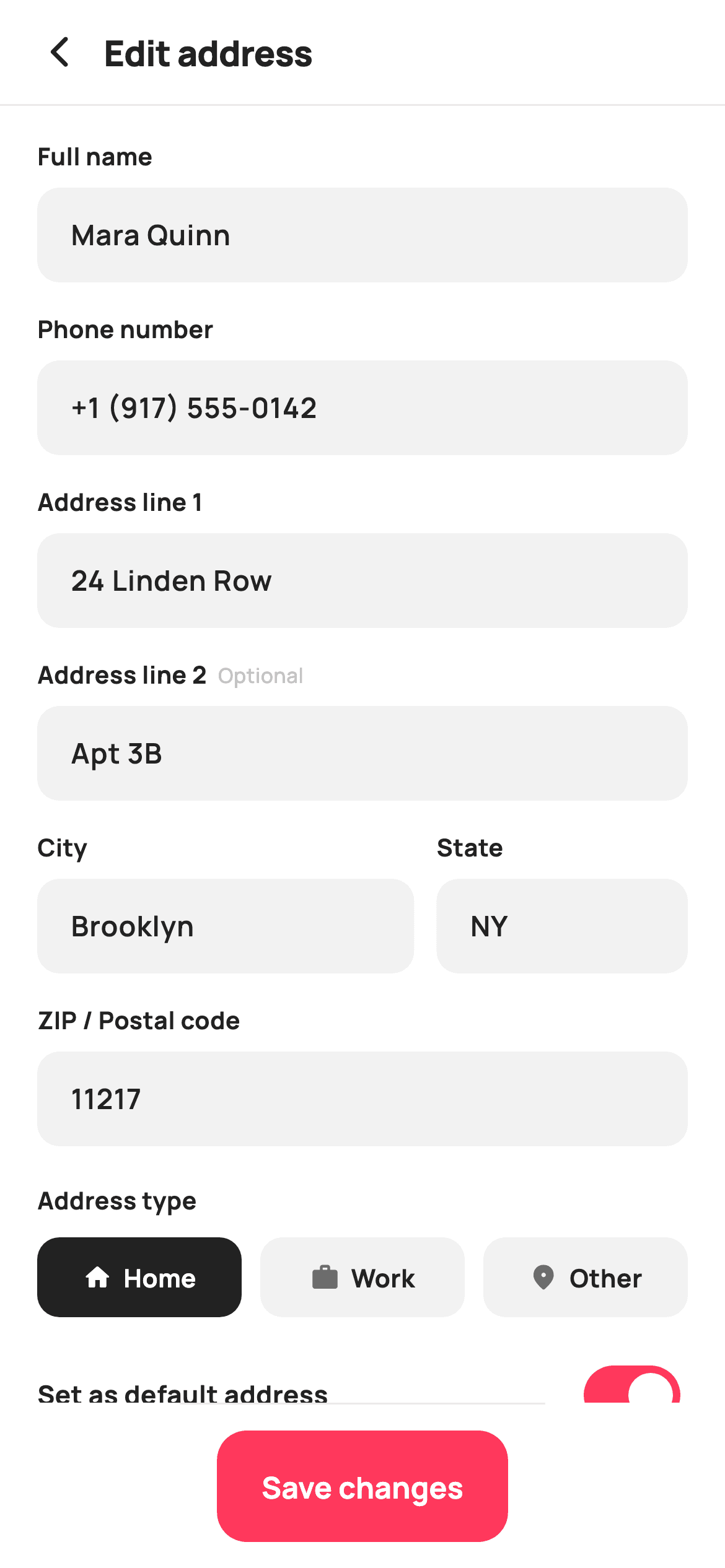
Editing a saved address is not the same job as adding one. The form arrives full, so it needs seven TextEditingControllers seeded in initState, and it needs a way to throw the address away — which introduces the harder design problem of putting a destructive action on the same screen as a save button without either one being pressed by accident. This tutorial builds StyleCart's edit-address screen in Flutter and shows how the three actions are ranked visually.
Watch the Flutter UI walkthrough
A short screen recording of Edit Address running, if you'd rather see it before you read the code. The written tutorial below covers everything in it.
Can't see the video? Watch it on YouTube.
What you'll build
- ✓Seven controllers seeded with saved values in initState and disposed in a loop
- ✓A destructive Delete styled as a red outlined button, deliberately below the fold
- ✓An address-type chip group that inverts to solid ink when selected
- ✓A Save changes bar pinned outside the scroll area with its own SafeArea
Step-by-step build
Create the file
Add a new file at lib/ecom_checkout_address_edit/ecom_checkout_address_edit_screen.dart in your Flutter project.
Register the bundled fonts
No external packages — this is pure Flutter. It does bundle its design font (Manrope), so drop the font file into fonts/ and declare it in pubspec.yaml:
flutter:
  fonts:
    - family: Manrope
      fonts:
- asset: fonts/Manrope-Regular.ttfBuild it, piece by piece
Here's how the screen goes together. Each block below is a real slice of the code with a plain-English explanation — paste them in order, or grab the whole file from the next section.
Seeding seven controllers, and a loop that disposes them
import 'package:flutter/material.dart';

/// StyleCart — Edit Address.
///
/// The add-address form pre-filled from a saved entry, with an Update action
/// and a destructive Delete action (danger styling, confirm-intent copy).
///
/// Self-contained per CONVENTIONS.md: pure Flutter, bundled Manrope, inline
/// Airbnb-style tokens, own light theme + SafeArea. No images. Controllers are
/// created in initState and disposed. Exposes callbacks only.
class EcomCheckoutAddressEditScreen extends StatefulWidget {
  const EcomCheckoutAddressEditScreen({
    super.key,
    this.onBack,
    this.onUpdate,
    this.onDelete,
  });

  final VoidCallback? onBack;
  final VoidCallback? onUpdate;
  final VoidCallback? onDelete;

  @override
  State<EcomCheckoutAddressEditScreen> createState() =>
      _EcomCheckoutAddressEditScreenState();
}

class _EcomCheckoutAddressEditScreenState
    extends State<EcomCheckoutAddressEditScreen> {
  static const String _font = 'Manrope';
  static const Color _canvas = Color(0xFFFFFFFF);
  static const Color _ink = Color(0xFF222222);
  static const Color _muted = Color(0xFF6A6A6A);
  static const Color _faint = Color(0xFFC1C1C1);
  static const Color _brand = Color(0xFFFF385C);
  static const Color _danger = Color(0xFFE0162B);
  static const Color _surface = Color(0xFFF2F2F2);
  static const Color _hairline = Color(0xFFEBEBEB);

  late final TextEditingController _name;
  late final TextEditingController _phone;
  late final TextEditingController _line1;
  late final TextEditingController _line2;
  late final TextEditingController _city;
  late final TextEditingController _state;
  late final TextEditingController _zip;

  static const List<_Type> _types = <_Type>[
    _Type('Home', Icons.home_rounded),
    _Type('Work', Icons.work_rounded),
    _Type('Other', Icons.place_rounded),
  ];

  int _type = 0;
  bool _default = true;

  @override
  void initState() {
    super.initState();
    _name = TextEditingController(text: 'Mara Quinn');
    _phone = TextEditingController(text: '+1 (917) 555‑0142');
    _line1 = TextEditingController(text: '24 Linden Row');
    _line2 = TextEditingController(text: 'Apt 3B');
    _city = TextEditingController(text: 'Brooklyn');
    _state = TextEditingController(text: 'NY');
    _zip = TextEditingController(text: '11217');
  }

  @override
  void dispose() {
    for (final TextEditingController c in <TextEditingController>[
      _name, _phone, _line1, _line2, _city, _state, _zip
    ]) {
      c.dispose();
    }
    super.dispose();
  }
The seven fields are declared `late final` and assigned in `initState` with `TextEditingController(text: '...')` — that is the whole difference between this screen and a blank add-address form, and it is why the controllers cannot be initialised at the declaration site (`widget` is not available until `initState`). `dispose` then walks a list literal of all seven and calls `dispose()` on each. Writing it as a loop rather than seven lines is what stops the classic leak where an eighth field is added later and its disposal is forgotten. The palette introduces `_danger` (#E0162B), used nowhere except the delete button — a colour with exactly one job is a colour nobody presses by accident.
Field order and an unbalanced City/State row
  @override
  Widget build(BuildContext context) {
    return Theme(
      data: ThemeData.light(useMaterial3: true),
      child: Scaffold(
        backgroundColor: _canvas,
        body: SafeArea(
          child: Column(
            children: <Widget>[
              _header(),
              const Divider(height: 1, color: _hairline),
              Expanded(
                child: ListView(
                  padding: const EdgeInsets.fromLTRB(20, 18, 20, 20),
                  children: <Widget>[
                    _field('Full name', _name),
                    _field('Phone number', _phone,
                        keyboard: TextInputType.phone),
                    _field('Address line 1', _line1),
                    _field('Address line 2', _line2, optional: true),
                    Row(
                      crossAxisAlignment: CrossAxisAlignment.start,
                      children: <Widget>[
                        Expanded(flex: 3, child: _field('City', _city)),
                        const SizedBox(width: 12),
                        Expanded(flex: 2, child: _field('State', _state)),
                      ],
                    ),
                    _field('ZIP / Postal code', _zip,
                        keyboard: TextInputType.number),
                    const SizedBox(height: 4),
                    const Text(
                      'Address type',
                      style: TextStyle(
                        fontFamily: _font,
                        fontSize: 13,
                        fontWeight: FontWeight.w700,
                        color: _ink,
                      ),
                    ),
                    const SizedBox(height: 10),
                    _typeChips(),
                    const SizedBox(height: 18),
                    _defaultRow(),
                    const SizedBox(height: 8),
                    _deleteBtn(),
                  ],
                ),
              ),
              _updateBar(),
            ],
          ),
        ),
      ),
    );
  }
The body is a `ListView` with the update bar pinned outside it, so the keyboard can push the fields without the commit button scrolling away. City and State share a Row with `Expanded(flex: 3)` and `Expanded(flex: 2)`, giving City 60% of the width — an even split would waste half a row on a two-letter state code. `crossAxisAlignment: CrossAxisAlignment.start` keeps both labels level if one wraps. Note where the delete button sits: last, after the type chips and the default switch, well below the fields. Putting a destructive action at the end of the scroll rather than in the header means reaching it is a decision, not a slip.
One builder for all seven inputs
  Widget _field(String label, TextEditingController controller,
      {bool optional = false, TextInputType? keyboard}) {
    return Padding(
      padding: const EdgeInsets.only(bottom: 16),
      child: Column(
        crossAxisAlignment: CrossAxisAlignment.start,
        children: <Widget>[
          Row(
            children: <Widget>[
              Text(
                label,
                style: const TextStyle(
                  fontFamily: _font,
                  fontSize: 13,
                  fontWeight: FontWeight.w700,
                  color: _ink,
                ),
              ),
              if (optional) ...<Widget>[
                const SizedBox(width: 6),
                const Text(
                  'Optional',
                  style: TextStyle(
                    fontFamily: _font,
                    fontSize: 11,
                    fontWeight: FontWeight.w500,
                    color: _faint,
                  ),
                ),
              ],
            ],
          ),
          const SizedBox(height: 7),
          TextField(
            controller: controller,
            keyboardType: keyboard,
            style: const TextStyle(
              fontFamily: _font,
              fontSize: 15,
              fontWeight: FontWeight.w600,
              color: _ink,
            ),
            decoration: InputDecoration(
              isDense: true,
              filled: true,
              fillColor: _surface,
              contentPadding:
                  const EdgeInsets.symmetric(horizontal: 14, vertical: 14),
              border: OutlineInputBorder(
                borderRadius: BorderRadius.circular(12),
                borderSide: BorderSide.none,
              ),
              enabledBorder: OutlineInputBorder(
                borderRadius: BorderRadius.circular(12),
                borderSide: BorderSide.none,
              ),
              focusedBorder: OutlineInputBorder(
                borderRadius: BorderRadius.circular(12),
                borderSide: const BorderSide(color: _brand, width: 1.4),
              ),
            ),
          ),
        ],
      ),
    );
  }
`_field` takes a label, a controller and two optional named arguments. The `optional` flag adds a conditional spread contributing a 6px gap and a small `_faint` 'Optional' tag beside the label — marking what can be skipped is more useful than marking what is required, since on an address form everything else is implicitly needed. The look comes from defining three border states on the `InputDecoration`: `border` and `enabledBorder` both `BorderSide.none` over a `filled` `_surface` background, and only `focusedBorder` drawing a 1.4px coral rule. Declaring all three explicitly is the reliable way to stop Material's defaults reappearing in one state you did not override.
Address-type chips that invert on selection
  Widget _typeChips() {
    return Row(
      children: <Widget>[
        for (int i = 0; i < _types.length; i++) ...<Widget>[
          if (i > 0) const SizedBox(width: 10),
          Expanded(child: _chip(_types[i], i)),
        ],
      ],
    );
  }

  Widget _chip(_Type t, int i) {
    final bool active = _type == i;
    return GestureDetector(
      onTap: () => setState(() => _type = i),
      child: Container(
        padding: const EdgeInsets.symmetric(vertical: 12),
        decoration: BoxDecoration(
          color: active ? _ink : _surface,
          borderRadius: BorderRadius.circular(12),
        ),
        child: Row(
          mainAxisAlignment: MainAxisAlignment.center,
          children: <Widget>[
            Icon(t.icon, size: 16, color: active ? _canvas : _muted),
            const SizedBox(width: 6),
            Text(
              t.label,
              style: TextStyle(
                fontFamily: _font,
                fontSize: 13.5,
                fontWeight: FontWeight.w700,
                color: active ? _canvas : _ink,
              ),
            ),
          ],
        ),
      ),
    );
  }
`_typeChips` uses a collection-for that emits two widgets per iteration through a spread — `if (i > 0) const SizedBox(width: 10)` then the chip — so the 10px gaps land between chips and never outside them. Each chip is `Expanded`, dividing the row evenly. `_chip` flips three properties together on `active`: the fill goes from `_surface` to solid `_ink`, and both the icon and label go to `_canvas` white. Inverting to near-black rather than to the coral brand colour is deliberate — the coral is reserved for the Save button, and a selected chip in the same colour would compete with it for the eye.
The default switch and the destructive button
  Widget _defaultRow() {
    return Row(
      children: <Widget>[
        const Expanded(
          child: Text(
            'Set as default address',
            style: TextStyle(
              fontFamily: _font,
              fontSize: 14,
              fontWeight: FontWeight.w700,
              color: _ink,
            ),
          ),
        ),
        Switch(
          value: _default,
          onChanged: (bool v) => setState(() => _default = v),
          activeThumbColor: _canvas,
          activeTrackColor: _brand,
          inactiveThumbColor: _canvas,
          inactiveTrackColor: _faint,
          trackOutlineColor: WidgetStateProperty.all(Colors.transparent),
        ),
      ],
    );
  }

  Widget _deleteBtn() {
    return SizedBox(
      height: 50,
      child: OutlinedButton(
        onPressed: widget.onDelete,
        style: OutlinedButton.styleFrom(
          foregroundColor: _danger,
          side: const BorderSide(color: _danger, width: 1.3),
          shape:
              RoundedRectangleBorder(borderRadius: BorderRadius.circular(14)),
        ),
        child: const Row(
          mainAxisAlignment: MainAxisAlignment.center,
          children: <Widget>[
            Icon(Icons.delete_outline_rounded, size: 18, color: _danger),
            SizedBox(width: 8),
            Text(
              'Delete this address',
              style: TextStyle(
                fontFamily: _font,
                fontSize: 14.5,
                fontWeight: FontWeight.w700,
              ),
            ),
          ],
        ),
      ),
    );
  }
`_defaultRow` restyles Material's `Switch` inline, including `trackOutlineColor: WidgetStateProperty.all(Colors.transparent)` — Material 3 draws an outline around the inactive track by default, and clearing it is what matches the flat StyleCart style. `_deleteBtn` is the piece worth studying: an `OutlinedButton` in `_danger`, not a `FilledButton`. An outlined destructive action reads as available but unweighted, sitting a clear step below the filled Save button in the bar. The label says 'Delete this address' rather than just 'Delete', because a specific object named in the button is far harder to press by mistake than a bare verb.
The pinned Save bar
  Widget _updateBar() {
    return Container(
      decoration: const BoxDecoration(
        color: _canvas,
        border: Border(top: BorderSide(color: _hairline)),
      ),
      child: SafeArea(
        top: false,
        child: SizedBox(
          height: 88,
          child: Padding(
            padding: const EdgeInsets.fromLTRB(20, 14, 20, 14),
            child: SizedBox(
              height: 56,
              child: FilledButton(
                onPressed: widget.onUpdate,
                style: FilledButton.styleFrom(
                  backgroundColor: _brand,
                  foregroundColor: _canvas,
                  shape: RoundedRectangleBorder(
                    borderRadius: BorderRadius.circular(16),
                  ),
                ),
                child: const Text(
                  'Save changes',
                  style: TextStyle(
                    fontFamily: _font,
                    fontSize: 16,
                    fontWeight: FontWeight.w700,
                  ),
                ),
              ),
            ),
          ),
        ),
      ),
    );
  }
The bar is a Container painting `_canvas` with a top hairline, wrapping `SafeArea(top: false)` — inside the Container, not outside, so the white background extends under the home indicator while the button stays above it. Wrapping the Container instead would leave an unpainted strip at the bottom of the screen. Inside sits an 88px box holding a 56px `FilledButton` with a 16px radius. The label reads 'Save changes' rather than 'Save' or 'Add', which is the small wording change that tells the reader this screen is amending something that already exists rather than creating a second copy of it.
Full code
The complete, ready-to-paste source. Free to use in your projects — one click copies it all.
import 'package:flutter/material.dart';

/// StyleCart — Edit Address.
///
/// The add-address form pre-filled from a saved entry, with an Update action
/// and a destructive Delete action (danger styling, confirm-intent copy).
///
/// Self-contained per CONVENTIONS.md: pure Flutter, bundled Manrope, inline
/// Airbnb-style tokens, own light theme + SafeArea. No images. Controllers are
/// created in initState and disposed. Exposes callbacks only.
class EcomCheckoutAddressEditScreen extends StatefulWidget {
  const EcomCheckoutAddressEditScreen({
    super.key,
    this.onBack,
    this.onUpdate,
    this.onDelete,
  });

  final VoidCallback? onBack;
  final VoidCallback? onUpdate;
  final VoidCallback? onDelete;

  @override
  State<EcomCheckoutAddressEditScreen> createState() =>
      _EcomCheckoutAddressEditScreenState();
}

class _EcomCheckoutAddressEditScreenState
    extends State<EcomCheckoutAddressEditScreen> {
  static const String _font = 'Manrope';
  static const Color _canvas = Color(0xFFFFFFFF);
  static const Color _ink = Color(0xFF222222);
  static const Color _muted = Color(0xFF6A6A6A);
  static const Color _faint = Color(0xFFC1C1C1);
  static const Color _brand = Color(0xFFFF385C);
  static const Color _danger = Color(0xFFE0162B);
  static const Color _surface = Color(0xFFF2F2F2);
  static const Color _hairline = Color(0xFFEBEBEB);

  late final TextEditingController _name;
  late final TextEditingController _phone;
  late final TextEditingController _line1;
  late final TextEditingController _line2;
  late final TextEditingController _city;
  late final TextEditingController _state;
  late final TextEditingController _zip;

  static const List<_Type> _types = <_Type>[
    _Type('Home', Icons.home_rounded),
    _Type('Work', Icons.work_rounded),
    _Type('Other', Icons.place_rounded),
  ];

  int _type = 0;
  bool _default = true;

  @override
  void initState() {
    super.initState();
    _name = TextEditingController(text: 'Mara Quinn');
    _phone = TextEditingController(text: '+1 (917) 555‑0142');
    _line1 = TextEditingController(text: '24 Linden Row');
    _line2 = TextEditingController(text: 'Apt 3B');
    _city = TextEditingController(text: 'Brooklyn');
    _state = TextEditingController(text: 'NY');
    _zip = TextEditingController(text: '11217');
  }

  @override
  void dispose() {
    for (final TextEditingController c in <TextEditingController>[
      _name, _phone, _line1, _line2, _city, _state, _zip
    ]) {
      c.dispose();
    }
    super.dispose();
  }

  @override
  Widget build(BuildContext context) {
    return Theme(
      data: ThemeData.light(useMaterial3: true),
      child: Scaffold(
        backgroundColor: _canvas,
        body: SafeArea(
          child: Column(
            children: <Widget>[
              _header(),
              const Divider(height: 1, color: _hairline),
              Expanded(
                child: ListView(
                  padding: const EdgeInsets.fromLTRB(20, 18, 20, 20),
                  children: <Widget>[
                    _field('Full name', _name),
                    _field('Phone number', _phone,
                        keyboard: TextInputType.phone),
                    _field('Address line 1', _line1),
                    _field('Address line 2', _line2, optional: true),
                    Row(
                      crossAxisAlignment: CrossAxisAlignment.start,
                      children: <Widget>[
                        Expanded(flex: 3, child: _field('City', _city)),
                        const SizedBox(width: 12),
                        Expanded(flex: 2, child: _field('State', _state)),
                      ],
                    ),
                    _field('ZIP / Postal code', _zip,
                        keyboard: TextInputType.number),
                    const SizedBox(height: 4),
                    const Text(
                      'Address type',
                      style: TextStyle(
                        fontFamily: _font,
                        fontSize: 13,
                        fontWeight: FontWeight.w700,
                        color: _ink,
                      ),
                    ),
                    const SizedBox(height: 10),
                    _typeChips(),
                    const SizedBox(height: 18),
                    _defaultRow(),
                    const SizedBox(height: 8),
                    _deleteBtn(),
                  ],
                ),
              ),
              _updateBar(),
            ],
          ),
        ),
      ),
    );
  }

  Widget _header() {
    return Padding(
      padding: const EdgeInsets.fromLTRB(8, 4, 20, 4),
      child: Row(
        children: <Widget>[
          IconButton(
            onPressed: widget.onBack,
            icon: const Icon(Icons.arrow_back_ios_new_rounded,
                size: 20, color: _ink),
          ),
          const Expanded(
            child: Text(
              'Edit address',
              style: TextStyle(
                fontFamily: _font,
                fontSize: 19,
                fontWeight: FontWeight.w800,
                letterSpacing: -0.3,
                color: _ink,
              ),
            ),
          ),
        ],
      ),
    );
  }

  Widget _field(String label, TextEditingController controller,
      {bool optional = false, TextInputType? keyboard}) {
    return Padding(
      padding: const EdgeInsets.only(bottom: 16),
      child: Column(
        crossAxisAlignment: CrossAxisAlignment.start,
        children: <Widget>[
          Row(
            children: <Widget>[
              Text(
                label,
                style: const TextStyle(
                  fontFamily: _font,
                  fontSize: 13,
                  fontWeight: FontWeight.w700,
                  color: _ink,
                ),
              ),
              if (optional) ...<Widget>[
                const SizedBox(width: 6),
                const Text(
                  'Optional',
                  style: TextStyle(
                    fontFamily: _font,
                    fontSize: 11,
                    fontWeight: FontWeight.w500,
                    color: _faint,
                  ),
                ),
              ],
            ],
          ),
          const SizedBox(height: 7),
          TextField(
            controller: controller,
            keyboardType: keyboard,
            style: const TextStyle(
              fontFamily: _font,
              fontSize: 15,
              fontWeight: FontWeight.w600,
              color: _ink,
            ),
            decoration: InputDecoration(
              isDense: true,
              filled: true,
              fillColor: _surface,
              contentPadding:
                  const EdgeInsets.symmetric(horizontal: 14, vertical: 14),
              border: OutlineInputBorder(
                borderRadius: BorderRadius.circular(12),
                borderSide: BorderSide.none,
              ),
              enabledBorder: OutlineInputBorder(
                borderRadius: BorderRadius.circular(12),
                borderSide: BorderSide.none,
              ),
              focusedBorder: OutlineInputBorder(
                borderRadius: BorderRadius.circular(12),
                borderSide: const BorderSide(color: _brand, width: 1.4),
              ),
            ),
          ),
        ],
      ),
    );
  }

  Widget _typeChips() {
    return Row(
      children: <Widget>[
        for (int i = 0; i < _types.length; i++) ...<Widget>[
          if (i > 0) const SizedBox(width: 10),
          Expanded(child: _chip(_types[i], i)),
        ],
      ],
    );
  }

  Widget _chip(_Type t, int i) {
    final bool active = _type == i;
    return GestureDetector(
      onTap: () => setState(() => _type = i),
      child: Container(
        padding: const EdgeInsets.symmetric(vertical: 12),
        decoration: BoxDecoration(
          color: active ? _ink : _surface,
          borderRadius: BorderRadius.circular(12),
        ),
        child: Row(
          mainAxisAlignment: MainAxisAlignment.center,
          children: <Widget>[
            Icon(t.icon, size: 16, color: active ? _canvas : _muted),
            const SizedBox(width: 6),
            Text(
              t.label,
              style: TextStyle(
                fontFamily: _font,
                fontSize: 13.5,
                fontWeight: FontWeight.w700,
                color: active ? _canvas : _ink,
              ),
            ),
          ],
        ),
      ),
    );
  }

  Widget _defaultRow() {
    return Row(
      children: <Widget>[
        const Expanded(
          child: Text(
            'Set as default address',
            style: TextStyle(
              fontFamily: _font,
              fontSize: 14,
              fontWeight: FontWeight.w700,
              color: _ink,
            ),
          ),
        ),
        Switch(
          value: _default,
          onChanged: (bool v) => setState(() => _default = v),
          activeThumbColor: _canvas,
          activeTrackColor: _brand,
          inactiveThumbColor: _canvas,
          inactiveTrackColor: _faint,
          trackOutlineColor: WidgetStateProperty.all(Colors.transparent),
        ),
      ],
    );
  }

  Widget _deleteBtn() {
    return SizedBox(
      height: 50,
      child: OutlinedButton(
        onPressed: widget.onDelete,
        style: OutlinedButton.styleFrom(
          foregroundColor: _danger,
          side: const BorderSide(color: _danger, width: 1.3),
          shape:
              RoundedRectangleBorder(borderRadius: BorderRadius.circular(14)),
        ),
        child: const Row(
          mainAxisAlignment: MainAxisAlignment.center,
          children: <Widget>[
            Icon(Icons.delete_outline_rounded, size: 18, color: _danger),
            SizedBox(width: 8),
            Text(
              'Delete this address',
              style: TextStyle(
                fontFamily: _font,
                fontSize: 14.5,
                fontWeight: FontWeight.w700,
              ),
            ),
          ],
        ),
      ),
    );
  }

  Widget _updateBar() {
    return Container(
      decoration: const BoxDecoration(
        color: _canvas,
        border: Border(top: BorderSide(color: _hairline)),
      ),
      child: SafeArea(
        top: false,
        child: SizedBox(
          height: 88,
          child: Padding(
            padding: const EdgeInsets.fromLTRB(20, 14, 20, 14),
            child: SizedBox(
              height: 56,
              child: FilledButton(
                onPressed: widget.onUpdate,
                style: FilledButton.styleFrom(
                  backgroundColor: _brand,
                  foregroundColor: _canvas,
                  shape: RoundedRectangleBorder(
                    borderRadius: BorderRadius.circular(16),
                  ),
                ),
                child: const Text(
                  'Save changes',
                  style: TextStyle(
                    fontFamily: _font,
                    fontSize: 16,
                    fontWeight: FontWeight.w700,
                  ),
                ),
              ),
            ),
          ),
        ),
      ),
    );
  }
}

class _Type {
  const _Type(this.label, this.icon);
  final String label;
  final IconData icon;
}
Plus bundled 5 binary assets (fonts/images). The CLI and MCP install those for you automatically.
Two faster ways to add it
Copy-paste works, but you can skip it entirely.
1. FlutterKit CLI
One command drops this screen — and its fonts — straight into your project.
$ flutterkit add ecom-checkout-address-edit2. AI agent (MCP)
Connect FlutterKit's MCP server in Claude or Cursor and just ask your agent to install ecom-checkout-address-edit — it fetches and writes the files for you.
FAQ
Is this edit address screen free for commercial use?
Yes, permanently free. The edit-address form is fully visible here, installable with one CLI command, and available over MCP. Put it into a commercial checkout with no licence key, no account and nothing to credit in your app.
How do I load a real saved address into the form?
Add an address model as a constructor parameter and seed each controller from it in `initState` — `_name = TextEditingController(text: widget.address.name)`. To read the edits back out, call `_name.text` and the rest inside your `onUpdate` handler.
Should the delete button ask for confirmation?
In production, yes. This screen exposes `onDelete` and stops there, so the host app decides — the usual pattern is to show an `AlertDialog` or a bottom sheet from that callback and only delete on the second confirmation. The outlined red styling and the specific label are the first line of defence, not the only one.
Why are the controllers created in initState rather than at the declaration?
Because seeding them needs `widget`, which is not available until `initState` runs. Declaring them `late final` and assigning there gives you prefilled fields with no nullability, and the matching `dispose` loop releases all seven when the screen closes.
Which Flutter version does this need?
Flutter 3.27 or newer, because the Switch uses `activeThumbColor` and `trackOutlineColor` with `WidgetStateProperty`. On earlier versions use `activeColor` and `MaterialStateProperty`, and expand the constructor to the `{Key? key, ...} : super(key: key)` form.


