How to Build a Delivery Address Picker with a Painted Mini-Map in Flutter (Full Code + Preview)
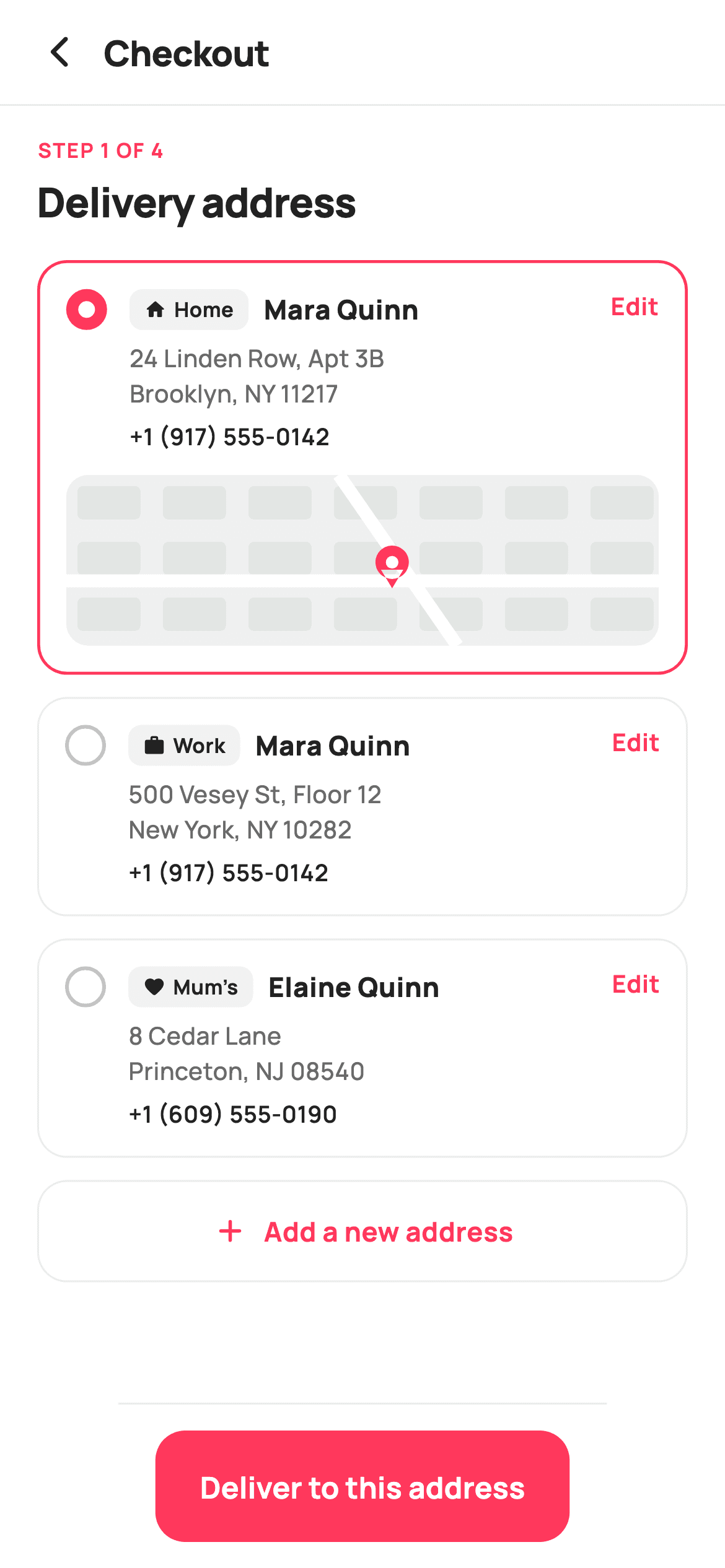
Choosing a delivery address is checkout step one, and the fastest way to build confidence is to show the shopper where the parcel is going. This tutorial builds that screen in Flutter: saved addresses as radio cards with Home / Work tags, and when a card is selected it expands to reveal a painted mini-map — city blocks, two roads and a brand-red pin — drawn entirely on a `Canvas`. No maps SDK, no API key, no network request, and no per-render billing.
Watch the Flutter UI walkthrough
A short screen recording of Delivery Address running, if you'd rather see it before you read the code. The written tutorial below covers everything in it.
Can't see the video? Watch it on YouTube.
What you'll build
- ✓Address cards that expand to reveal a mini-map when selected
- ✓A stylised street map painted with `CustomPainter` — no maps SDK or API key
- ✓A radio built from *border width alone*: 2px ring when off, 6.5px when on
- ✓Home / Work / custom tags rendered as small icon-plus-label pills
- ✓A reusable 'Step 1 of 4' eyebrow label for the rest of the checkout flow
- ✓Nested tap targets: selecting the card versus tapping its Edit link
Step-by-step build
Create the file
Add a new file at lib/ecom_checkout_address_book/ecom_checkout_address_book_screen.dart in your Flutter project.
Register the bundled fonts
No external packages — this is pure Flutter. It does bundle its design font (Manrope), so drop the font file into fonts/ and declare it in pubspec.yaml:
flutter:
  fonts:
    - family: Manrope
      fonts:
- asset: fonts/Manrope-Regular.ttfBuild it, piece by piece
Here's how the screen goes together. Each block below is a real slice of the code with a plain-English explanation — paste them in order, or grab the whole file from the next section.
Addresses split across two lines, plus one int of state
class EcomCheckoutAddressBookScreen extends StatefulWidget {
  const EcomCheckoutAddressBookScreen({
    super.key,
    this.onBack,
    this.onAddAddress,
    this.onEdit,
    this.onContinue,
  });

  final VoidCallback? onBack;
  final VoidCallback? onAddAddress;
  final ValueChanged<String>? onEdit;
  final VoidCallback? onContinue;

  @override
  State<EcomCheckoutAddressBookScreen> createState() =>
      _EcomCheckoutAddressBookScreenState();
}

class _EcomCheckoutAddressBookScreenState
    extends State<EcomCheckoutAddressBookScreen> {
  static const String _font = 'Manrope';
  static const Color _canvas = Color(0xFFFFFFFF);
  static const Color _ink = Color(0xFF222222);
  static const Color _muted = Color(0xFF6A6A6A);
  static const Color _brand = Color(0xFFFF385C);
  static const Color _surface = Color(0xFFF2F2F2);
  static const Color _hairline = Color(0xFFEBEBEB);

  static const List<_Addr> _addrs = <_Addr>[
    _Addr('Home', Icons.home_rounded, 'Mara Quinn',
        '24 Linden Row, Apt 3B', 'Brooklyn, NY 11217', '+1 (917) 555‑0142'),
    _Addr('Work', Icons.work_rounded, 'Mara Quinn',
        '500 Vesey St, Floor 12', 'New York, NY 10282', '+1 (917) 555‑0142'),
    _Addr('Mum’s', Icons.favorite_rounded, 'Elaine Quinn',
        '8 Cedar Lane', 'Princeton, NJ 08540', '+1 (609) 555‑0190'),
  ];

  int _sel = 0;
`_Addr` splits the street into `line1` and `line2` rather than holding one blob, which is what lets the card render them as a controlled two-line block via `'${a.line1}\n${a.line2}'` instead of relying on wrapping. The `tag` field doubles as the card's identity — it's what `onEdit` emits — so 'Home', 'Work' and 'Mum's' are both labels and keys. Note the Unicode non-breaking hyphens in the phone numbers ('555‑0142'), which stop a number breaking across lines. The entire mutable state is `int _sel = 0`.
Step label, cards, add tile
  @override
  Widget build(BuildContext context) {
    return Theme(
      data: ThemeData.light(useMaterial3: true),
      child: Scaffold(
        backgroundColor: _canvas,
        body: SafeArea(
          child: Column(
            children: <Widget>[
              _header(),
              const Divider(height: 1, color: _hairline),
              Expanded(
                child: ListView(
                  padding: const EdgeInsets.fromLTRB(20, 16, 20, 20),
                  children: <Widget>[
                    const _StepLabel(step: 'Step 1 of 4', title: 'Delivery address'),
                    const SizedBox(height: 16),
                    for (int i = 0; i < _addrs.length; i++) ...<Widget>[
                      _card(_addrs[i], i),
                      const SizedBox(height: 12),
                    ],
                    _addTile(),
                  ],
                ),
              ),
              _continueBar(),
            ],
          ),
        ),
      ),
    );
  }
The `ListView` opens with `_StepLabel`, then emits the address cards via a collection-for with a spread — `...<Widget>[_card(...), SizedBox(height: 12)]` — which interleaves a 12px gap after each card without an intermediate list. The 'Add a new address' tile comes last, after the cards, which is the right order: existing addresses are the common case, adding one is the exception. The continue bar sits outside the `Expanded` so it stays pinned while the list scrolls.
The card, and progressive disclosure of the map
  Widget _card(_Addr a, int i) {
    final bool active = _sel == i;
    return GestureDetector(
      onTap: () => setState(() => _sel = i),
      child: AnimatedContainer(
        duration: const Duration(milliseconds: 150),
        padding: const EdgeInsets.all(14),
        decoration: BoxDecoration(
          color: _canvas,
          borderRadius: BorderRadius.circular(16),
          border: Border.all(
            color: active ? _brand : _hairline,
            width: active ? 1.6 : 1,
          ),
        ),
        child: Column(
          children: <Widget>[
            Row(
              crossAxisAlignment: CrossAxisAlignment.start,
              children: <Widget>[
                _radio(active),
                const SizedBox(width: 12),
                Expanded(
                  child: Column(
                    crossAxisAlignment: CrossAxisAlignment.start,
                    children: <Widget>[
                      Row(
                        children: <Widget>[
                          _tag(a.icon, a.tag),
                          const SizedBox(width: 8),
                          Expanded(
                            child: Text(
                              a.name,
                              maxLines: 1,
                              overflow: TextOverflow.ellipsis,
                              style: const TextStyle(
                                fontFamily: _font,
                                fontSize: 14.5,
                                fontWeight: FontWeight.w800,
                                color: _ink,
                              ),
                            ),
                          ),
                        ],
                      ),
                      const SizedBox(height: 6),
                      Text(
                        '${a.line1}\n${a.line2}',
                        style: const TextStyle(
                          fontFamily: _font,
                          fontSize: 13,
                          height: 1.45,
                          fontWeight: FontWeight.w500,
                          color: _muted,
                        ),
                      ),
                      const SizedBox(height: 4),
                      Text(
                        a.phone,
                        style: const TextStyle(
                          fontFamily: _font,
                          fontSize: 12.5,
                          fontWeight: FontWeight.w600,
                          color: _ink,
                        ),
                      ),
                    ],
                  ),
                ),
                GestureDetector(
                  onTap: () => widget.onEdit?.call(a.tag),
                  child: const Padding(
                    padding: EdgeInsets.only(left: 6),
                    child: Text(
                      'Edit',
                      style: TextStyle(
                        fontFamily: _font,
                        fontSize: 13,
                        fontWeight: FontWeight.w700,
                        color: _brand,
                      ),
                    ),
                  ),
                ),
              ],
            ),
            if (active) ...<Widget>[
              const SizedBox(height: 12),
              ClipRRect(
                borderRadius: BorderRadius.circular(12),
                child: SizedBox(
                  height: 92,
                  width: double.infinity,
                  child: CustomPaint(painter: _MiniMapPainter()),
                ),
              ),
            ],
          ],
        ),
      ),
    );
  }
The card is an `AnimatedContainer` with a 150ms duration, so the border tweens between `_hairline` at 1px and `_brand` at 1.6px rather than snapping. Changing width as well as colour makes the selection legible without relying on the pink alone. The map is revealed by `if (active) ...<Widget>[SizedBox, ClipRRect]` — a collection-`if` with a spread, so on unselected cards those widgets are never built at all. Note the two nested tap targets: the outer `GestureDetector` selects the card, while the 'Edit' text has its own `GestureDetector` calling `onEdit`. Because the inner one wins the hit test, tapping Edit doesn't also change the selection.
A radio made of nothing but a border
  Widget _radio(bool active) {
    return Container(
      width: 22,
      height: 22,
      decoration: BoxDecoration(
        shape: BoxShape.circle,
        border: Border.all(
          color: active ? _brand : const Color(0xFFC1C1C1),
          width: active ? 6.5 : 2,
        ),
      ),
    );
  }

  Widget _tag(IconData icon, String label) {
    return Container(
      padding: const EdgeInsets.symmetric(horizontal: 8, vertical: 3),
      decoration: BoxDecoration(
        color: _surface,
        borderRadius: BorderRadius.circular(7),
      ),
      child: Row(
        children: <Widget>[
          Icon(icon, size: 12, color: _ink),
          const SizedBox(width: 4),
          Text(
            label,
            style: const TextStyle(
              fontFamily: _font,
              fontSize: 11,
              fontWeight: FontWeight.w700,
              color: _ink,
            ),
          ),
        ],
      ),
    );
  }
This radio is a single 22px `Container` with no child. The trick is on lines 221–224: the border switches from 2px grey to *6.5px brand*, and because a thick border grows inward on a circle, it swallows the middle and reads as a filled dot with a ring of background left in the centre. One widget, no `Center`, no inner container, no `Radio`. The `_tag` helper beside it is a small `_surface` pill pairing a 12px icon with an 11px `w700` label — deliberately understated so it labels the address rather than competing with the name.
Add tile, continue bar, and the step eyebrow
  Widget _addTile() {
    return GestureDetector(
      onTap: widget.onAddAddress,
      child: Container(
        padding: const EdgeInsets.symmetric(vertical: 16),
        decoration: BoxDecoration(
          borderRadius: BorderRadius.circular(16),
          border: Border.all(color: _hairline),
        ),
        child: const Row(
          mainAxisAlignment: MainAxisAlignment.center,
          children: <Widget>[
            Icon(Icons.add_rounded, size: 20, color: _brand),
            SizedBox(width: 8),
            Text(
              'Add a new address',
              style: TextStyle(
                fontFamily: _font,
                fontSize: 14.5,
                fontWeight: FontWeight.w700,
                color: _brand,
              ),
            ),
          ],
        ),
      ),
    );
  }

  Widget _continueBar() {
    return Container(
      decoration: const BoxDecoration(
        color: _canvas,
        border: Border(top: BorderSide(color: _hairline)),
      ),
      child: SafeArea(
        top: false,
        child: SizedBox(
          height: 88,
          child: Padding(
            padding: const EdgeInsets.fromLTRB(20, 14, 20, 14),
            child: SizedBox(
              height: 56,
              child: FilledButton(
                onPressed: widget.onContinue,
                style: FilledButton.styleFrom(
                  backgroundColor: _brand,
                  foregroundColor: _canvas,
                  shape: RoundedRectangleBorder(
                    borderRadius: BorderRadius.circular(16),
                  ),
                ),
                child: const Text(
                  'Deliver to this address',
                  style: TextStyle(
                    fontFamily: _font,
                    fontSize: 16,
                    fontWeight: FontWeight.w700,
                  ),
                ),
              ),
            ),
          ),
        ),
      ),
    );
  }
}

class _Addr {
  const _Addr(this.tag, this.icon, this.name, this.line1, this.line2,
      this.phone);
  final String tag;
  final IconData icon;
  final String name;
  final String line1;
  final String line2;
  final String phone;
}

/// A small "Step N of M" eyebrow + screen title, reused across checkout steps.
class _StepLabel extends StatelessWidget {
  const _StepLabel({required this.step, required this.title});
  final String step;
  final String title;

  @override
  Widget build(BuildContext context) {
    return Column(
      crossAxisAlignment: CrossAxisAlignment.start,
      children: <Widget>[
        Text(
          step.toUpperCase(),
          style: const TextStyle(
            fontFamily: 'Manrope',
            fontSize: 11,
            fontWeight: FontWeight.w700,
            letterSpacing: 0.8,
            color: Color(0xFFFF385C),
          ),
        ),
        const SizedBox(height: 4),
        Text(
          title,
          style: const TextStyle(
            fontFamily: 'Manrope',
            fontSize: 22,
            fontWeight: FontWeight.w800,
            letterSpacing: -0.5,
            color: Color(0xFF222222),
          ),
        ),
      ],
    );
  }
}
The add tile is the inverse of an address card — border only, no fill, with brand-coloured icon and text centred as a pair — so it reads as an action rather than another selectable option. The continue bar uses the checkout-wide pattern: a top hairline `BorderSide`, `SafeArea(top: false)` so the white fill reaches behind the home indicator, and a 56px `FilledButton` at a 16px radius matching the cards. `_StepLabel` is pulled out as its own widget precisely because steps 2–4 of this flow reuse it: an 11px uppercase brand eyebrow with `letterSpacing: 0.8` above a 22px `w800` title.
Painting the mini-map
/// Paints a stylised street mini-map: a soft block grid, a couple of roads and
/// a brand pin marking the delivery point.
class _MiniMapPainter extends CustomPainter {
  @override
  void paint(Canvas canvas, Size size) {
    final double w = size.width;
    final double h = size.height;

    canvas.drawRect(
      Offset.zero & size,
      Paint()..color = const Color(0xFFEFF1F0),
    );

    // City blocks.
    final Paint block = Paint()..color = const Color(0xFFE3E6E4);
    const double gap = 6;
    for (double y = 6; y < h; y += 30) {
      for (double x = 6; x < w; x += 46) {
        canvas.drawRRect(
          RRect.fromRectAndRadius(
            Rect.fromLTWH(x, y, 40 - gap, 24 - gap),
            const Radius.circular(3),
          ),
          block,
        );
      }
    }

    // Roads — one horizontal, one diagonal.
    final Paint road = Paint()
      ..color = const Color(0xFFFFFFFF)
      ..strokeWidth = 7;
    canvas.drawLine(Offset(0, h * 0.62), Offset(w, h * 0.62), road);
    canvas.drawLine(Offset(w * 0.46, 0), Offset(w * 0.66, h), road);

    // Pin at the crossing.
    final Offset p = Offset(w * 0.55, h * 0.62);
    final Path teardrop = Path()
      ..addOval(Rect.fromCircle(center: p.translate(0, -10), radius: 9))
      ..moveTo(p.dx - 6, p.dy - 6)
      ..lineTo(p.dx, p.dy + 4)
      ..lineTo(p.dx + 6, p.dy - 6)
      ..close();
    canvas.drawPath(teardrop, Paint()..color = const Color(0xFFFF385C));
    canvas.drawCircle(
        p.translate(0, -10), 3.4, Paint()..color = const Color(0xFFFFFFFF));
  }

  @override
  bool shouldRepaint(_MiniMapPainter oldDelegate) => false;
}
Four passes build a convincing street map in about 30 lines. First a flat #EFF1F0 base. Then nested `for` loops step 46px horizontally and 30px vertically, drawing rounded rectangles as city blocks — the 6px `gap` subtracted from each block's size is what leaves the street grid between them. Two 7px white lines follow, one horizontal at 62% height and one diagonal, drawn as roads *over* the blocks. Finally the pin: a `Path` combining `addOval` for the head with a three-point triangle for the tail, filled brand red, topped by a small white circle for the hole. Every position is a fraction of `w` and `h`, so the map fills whatever box it's given.
Full code
The complete, ready-to-paste source. Free to use in your projects — one click copies it all.
import 'package:flutter/material.dart';

/// StyleCart — Delivery Address (checkout step 1).
///
/// The shopper's saved addresses as a radio list with home/work tags and a
/// painted mini-map preview on the selected card, plus an "Add address" tile
/// and a pinned continue bar.
///
/// Self-contained per CONVENTIONS.md: pure Flutter, bundled Manrope, inline
/// Airbnb-style tokens, own light theme + SafeArea. The mini-map is a
/// CustomPainter (no emoji glyph, no network). Exposes callbacks only.
class EcomCheckoutAddressBookScreen extends StatefulWidget {
  const EcomCheckoutAddressBookScreen({
    super.key,
    this.onBack,
    this.onAddAddress,
    this.onEdit,
    this.onContinue,
  });

  final VoidCallback? onBack;
  final VoidCallback? onAddAddress;
  final ValueChanged<String>? onEdit;
  final VoidCallback? onContinue;

  @override
  State<EcomCheckoutAddressBookScreen> createState() =>
      _EcomCheckoutAddressBookScreenState();
}

class _EcomCheckoutAddressBookScreenState
    extends State<EcomCheckoutAddressBookScreen> {
  static const String _font = 'Manrope';
  static const Color _canvas = Color(0xFFFFFFFF);
  static const Color _ink = Color(0xFF222222);
  static const Color _muted = Color(0xFF6A6A6A);
  static const Color _brand = Color(0xFFFF385C);
  static const Color _surface = Color(0xFFF2F2F2);
  static const Color _hairline = Color(0xFFEBEBEB);

  static const List<_Addr> _addrs = <_Addr>[
    _Addr('Home', Icons.home_rounded, 'Mara Quinn',
        '24 Linden Row, Apt 3B', 'Brooklyn, NY 11217', '+1 (917) 555‑0142'),
    _Addr('Work', Icons.work_rounded, 'Mara Quinn',
        '500 Vesey St, Floor 12', 'New York, NY 10282', '+1 (917) 555‑0142'),
    _Addr('Mum’s', Icons.favorite_rounded, 'Elaine Quinn',
        '8 Cedar Lane', 'Princeton, NJ 08540', '+1 (609) 555‑0190'),
  ];

  int _sel = 0;

  @override
  Widget build(BuildContext context) {
    return Theme(
      data: ThemeData.light(useMaterial3: true),
      child: Scaffold(
        backgroundColor: _canvas,
        body: SafeArea(
          child: Column(
            children: <Widget>[
              _header(),
              const Divider(height: 1, color: _hairline),
              Expanded(
                child: ListView(
                  padding: const EdgeInsets.fromLTRB(20, 16, 20, 20),
                  children: <Widget>[
                    const _StepLabel(step: 'Step 1 of 4', title: 'Delivery address'),
                    const SizedBox(height: 16),
                    for (int i = 0; i < _addrs.length; i++) ...<Widget>[
                      _card(_addrs[i], i),
                      const SizedBox(height: 12),
                    ],
                    _addTile(),
                  ],
                ),
              ),
              _continueBar(),
            ],
          ),
        ),
      ),
    );
  }

  Widget _header() {
    return Padding(
      padding: const EdgeInsets.fromLTRB(8, 4, 20, 4),
      child: Row(
        children: <Widget>[
          IconButton(
            onPressed: widget.onBack,
            icon: const Icon(Icons.arrow_back_ios_new_rounded,
                size: 20, color: _ink),
          ),
          const Expanded(
            child: Text(
              'Checkout',
              style: TextStyle(
                fontFamily: _font,
                fontSize: 19,
                fontWeight: FontWeight.w800,
                letterSpacing: -0.3,
                color: _ink,
              ),
            ),
          ),
        ],
      ),
    );
  }

  Widget _card(_Addr a, int i) {
    final bool active = _sel == i;
    return GestureDetector(
      onTap: () => setState(() => _sel = i),
      child: AnimatedContainer(
        duration: const Duration(milliseconds: 150),
        padding: const EdgeInsets.all(14),
        decoration: BoxDecoration(
          color: _canvas,
          borderRadius: BorderRadius.circular(16),
          border: Border.all(
            color: active ? _brand : _hairline,
            width: active ? 1.6 : 1,
          ),
        ),
        child: Column(
          children: <Widget>[
            Row(
              crossAxisAlignment: CrossAxisAlignment.start,
              children: <Widget>[
                _radio(active),
                const SizedBox(width: 12),
                Expanded(
                  child: Column(
                    crossAxisAlignment: CrossAxisAlignment.start,
                    children: <Widget>[
                      Row(
                        children: <Widget>[
                          _tag(a.icon, a.tag),
                          const SizedBox(width: 8),
                          Expanded(
                            child: Text(
                              a.name,
                              maxLines: 1,
                              overflow: TextOverflow.ellipsis,
                              style: const TextStyle(
                                fontFamily: _font,
                                fontSize: 14.5,
                                fontWeight: FontWeight.w800,
                                color: _ink,
                              ),
                            ),
                          ),
                        ],
                      ),
                      const SizedBox(height: 6),
                      Text(
                        '${a.line1}\n${a.line2}',
                        style: const TextStyle(
                          fontFamily: _font,
                          fontSize: 13,
                          height: 1.45,
                          fontWeight: FontWeight.w500,
                          color: _muted,
                        ),
                      ),
                      const SizedBox(height: 4),
                      Text(
                        a.phone,
                        style: const TextStyle(
                          fontFamily: _font,
                          fontSize: 12.5,
                          fontWeight: FontWeight.w600,
                          color: _ink,
                        ),
                      ),
                    ],
                  ),
                ),
                GestureDetector(
                  onTap: () => widget.onEdit?.call(a.tag),
                  child: const Padding(
                    padding: EdgeInsets.only(left: 6),
                    child: Text(
                      'Edit',
                      style: TextStyle(
                        fontFamily: _font,
                        fontSize: 13,
                        fontWeight: FontWeight.w700,
                        color: _brand,
                      ),
                    ),
                  ),
                ),
              ],
            ),
            if (active) ...<Widget>[
              const SizedBox(height: 12),
              ClipRRect(
                borderRadius: BorderRadius.circular(12),
                child: SizedBox(
                  height: 92,
                  width: double.infinity,
                  child: CustomPaint(painter: _MiniMapPainter()),
                ),
              ),
            ],
          ],
        ),
      ),
    );
  }

  Widget _radio(bool active) {
    return Container(
      width: 22,
      height: 22,
      decoration: BoxDecoration(
        shape: BoxShape.circle,
        border: Border.all(
          color: active ? _brand : const Color(0xFFC1C1C1),
          width: active ? 6.5 : 2,
        ),
      ),
    );
  }

  Widget _tag(IconData icon, String label) {
    return Container(
      padding: const EdgeInsets.symmetric(horizontal: 8, vertical: 3),
      decoration: BoxDecoration(
        color: _surface,
        borderRadius: BorderRadius.circular(7),
      ),
      child: Row(
        children: <Widget>[
          Icon(icon, size: 12, color: _ink),
          const SizedBox(width: 4),
          Text(
            label,
            style: const TextStyle(
              fontFamily: _font,
              fontSize: 11,
              fontWeight: FontWeight.w700,
              color: _ink,
            ),
          ),
        ],
      ),
    );
  }

  Widget _addTile() {
    return GestureDetector(
      onTap: widget.onAddAddress,
      child: Container(
        padding: const EdgeInsets.symmetric(vertical: 16),
        decoration: BoxDecoration(
          borderRadius: BorderRadius.circular(16),
          border: Border.all(color: _hairline),
        ),
        child: const Row(
          mainAxisAlignment: MainAxisAlignment.center,
          children: <Widget>[
            Icon(Icons.add_rounded, size: 20, color: _brand),
            SizedBox(width: 8),
            Text(
              'Add a new address',
              style: TextStyle(
                fontFamily: _font,
                fontSize: 14.5,
                fontWeight: FontWeight.w700,
                color: _brand,
              ),
            ),
          ],
        ),
      ),
    );
  }

  Widget _continueBar() {
    return Container(
      decoration: const BoxDecoration(
        color: _canvas,
        border: Border(top: BorderSide(color: _hairline)),
      ),
      child: SafeArea(
        top: false,
        child: SizedBox(
          height: 88,
          child: Padding(
            padding: const EdgeInsets.fromLTRB(20, 14, 20, 14),
            child: SizedBox(
              height: 56,
              child: FilledButton(
                onPressed: widget.onContinue,
                style: FilledButton.styleFrom(
                  backgroundColor: _brand,
                  foregroundColor: _canvas,
                  shape: RoundedRectangleBorder(
                    borderRadius: BorderRadius.circular(16),
                  ),
                ),
                child: const Text(
                  'Deliver to this address',
                  style: TextStyle(
                    fontFamily: _font,
                    fontSize: 16,
                    fontWeight: FontWeight.w700,
                  ),
                ),
              ),
            ),
          ),
        ),
      ),
    );
  }
}

class _Addr {
  const _Addr(this.tag, this.icon, this.name, this.line1, this.line2,
      this.phone);
  final String tag;
  final IconData icon;
  final String name;
  final String line1;
  final String line2;
  final String phone;
}

/// A small "Step N of M" eyebrow + screen title, reused across checkout steps.
class _StepLabel extends StatelessWidget {
  const _StepLabel({required this.step, required this.title});
  final String step;
  final String title;

  @override
  Widget build(BuildContext context) {
    return Column(
      crossAxisAlignment: CrossAxisAlignment.start,
      children: <Widget>[
        Text(
          step.toUpperCase(),
          style: const TextStyle(
            fontFamily: 'Manrope',
            fontSize: 11,
            fontWeight: FontWeight.w700,
            letterSpacing: 0.8,
            color: Color(0xFFFF385C),
          ),
        ),
        const SizedBox(height: 4),
        Text(
          title,
          style: const TextStyle(
            fontFamily: 'Manrope',
            fontSize: 22,
            fontWeight: FontWeight.w800,
            letterSpacing: -0.5,
            color: Color(0xFF222222),
          ),
        ),
      ],
    );
  }
}

/// Paints a stylised street mini-map: a soft block grid, a couple of roads and
/// a brand pin marking the delivery point.
class _MiniMapPainter extends CustomPainter {
  @override
  void paint(Canvas canvas, Size size) {
    final double w = size.width;
    final double h = size.height;

    canvas.drawRect(
      Offset.zero & size,
      Paint()..color = const Color(0xFFEFF1F0),
    );

    // City blocks.
    final Paint block = Paint()..color = const Color(0xFFE3E6E4);
    const double gap = 6;
    for (double y = 6; y < h; y += 30) {
      for (double x = 6; x < w; x += 46) {
        canvas.drawRRect(
          RRect.fromRectAndRadius(
            Rect.fromLTWH(x, y, 40 - gap, 24 - gap),
            const Radius.circular(3),
          ),
          block,
        );
      }
    }

    // Roads — one horizontal, one diagonal.
    final Paint road = Paint()
      ..color = const Color(0xFFFFFFFF)
      ..strokeWidth = 7;
    canvas.drawLine(Offset(0, h * 0.62), Offset(w, h * 0.62), road);
    canvas.drawLine(Offset(w * 0.46, 0), Offset(w * 0.66, h), road);

    // Pin at the crossing.
    final Offset p = Offset(w * 0.55, h * 0.62);
    final Path teardrop = Path()
      ..addOval(Rect.fromCircle(center: p.translate(0, -10), radius: 9))
      ..moveTo(p.dx - 6, p.dy - 6)
      ..lineTo(p.dx, p.dy + 4)
      ..lineTo(p.dx + 6, p.dy - 6)
      ..close();
    canvas.drawPath(teardrop, Paint()..color = const Color(0xFFFF385C));
    canvas.drawCircle(
        p.translate(0, -10), 3.4, Paint()..color = const Color(0xFFFFFFFF));
  }

  @override
  bool shouldRepaint(_MiniMapPainter oldDelegate) => false;
}
Plus bundled 5 binary assets (fonts/images). The CLI and MCP install those for you automatically.
Two faster ways to add it
Copy-paste works, but you can skip it entirely.
1. FlutterKit CLI
One command drops this screen — and its fonts — straight into your project.
$ flutterkit add ecom-checkout-address-book2. AI agent (MCP)
Connect FlutterKit's MCP server in Claude or Cursor and just ask your agent to install ecom-checkout-address-book — it fetches and writes the files for you.
FAQ
Is this address picker free to use?
Yes. The full Dart source on this page is free for personal and commercial apps. Copy it from the code block, install it with the FlutterKit CLI (flutterkit add ecom-checkout-address-book), or add it via an AI agent over MCP.
Is the mini-map a real map?
No — it's a stylised illustration painted on a Canvas. That's deliberate: it costs nothing, needs no API key, works offline, and never bills per render. If you need a real map, swap the CustomPaint for a GoogleMap or MapLibre widget inside the same ClipRRect and keep everything else.
How does the radio work with no inner dot?
It's a circular Container whose border width jumps from 2px to 6.5px when selected. A thick border on a circle grows inward, so it fills most of the 22px and reads as a filled dot with a ring. One widget instead of three.
Why doesn't tapping Edit also select the card?
The Edit link has its own GestureDetector nested inside the card's. Flutter's hit testing gives the gesture to the innermost detector that handles it, so the tap is consumed there and never reaches the card's onTap.
Which Flutter version does it target?
It uses const Row children, FilledButton and Material 3, so target Flutter 3.16+ with Dart 3. There are no withValues calls in this screen, so nothing needs changing on slightly older SDKs.


