How to Build an Add Delivery Address Form in Flutter (Full Code + Preview)
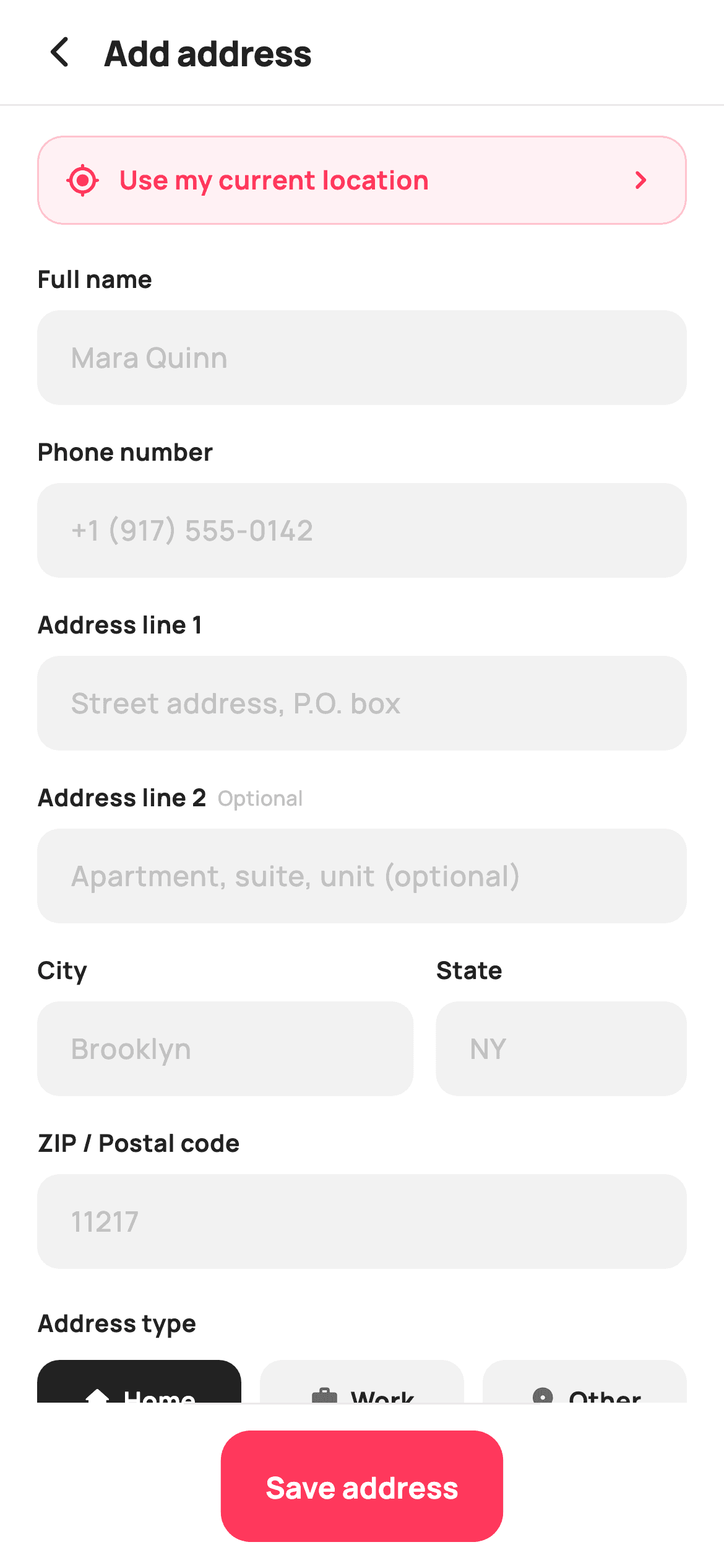
Address forms are where checkouts stall, so every field has to earn its place. This tutorial builds StyleCart's add-address screen in Flutter — a tinted 'use my current location' shortcut above seven inputs, with City and State sharing a row at a 3:2 weight, an Optional marker on the second address line, a three-way Home/Work/Other chip group and a default-address switch restyled to the brand coral. One field builder produces every input on the screen.
Watch the Flutter UI walkthrough
A short screen recording of Add Address running, if you'd rather see it before you read the code. The written tutorial below covers everything in it.
Can't see the video? Watch it on YouTube.
What you'll build
- ✓A reusable field builder taking a label, hint, keyboard type and an optional marker
- ✓A City and State row split 3:2 with flex, so the short state code doesn't claim half the width
- ✓A three-way address-type chip group that inverts to solid ink when selected
- ✓A Material Switch restyled inline to brand colours with its outline removed
Step-by-step build
Create the file
Add a new file at lib/ecom_checkout_address_add/ecom_checkout_address_add_screen.dart in your Flutter project.
Register the bundled fonts
No external packages — this is pure Flutter. It does bundle its design font (Manrope), so drop the font file into fonts/ and declare it in pubspec.yaml:
flutter:
  fonts:
    - family: Manrope
      fonts:
- asset: fonts/Manrope-Regular.ttfBuild it, piece by piece
Here's how the screen goes together. Each block below is a real slice of the code with a plain-English explanation — paste them in order, or grab the whole file from the next section.
Address types and two pieces of state
import 'package:flutter/material.dart';

/// StyleCart — Add Address.
///
/// A full delivery-address form: full name, phone, two address lines, city /
/// state / pincode, an address-type chip group and a default toggle, with a
/// "use my location" shortcut and a pinned save bar.
///
/// Self-contained per CONVENTIONS.md: pure Flutter, bundled Manrope, inline
/// Airbnb-style tokens, own light theme + SafeArea. No images. Exposes
/// callbacks only.
class EcomCheckoutAddressAddScreen extends StatefulWidget {
  const EcomCheckoutAddressAddScreen({
    super.key,
    this.onBack,
    this.onUseLocation,
    this.onSave,
  });

  final VoidCallback? onBack;
  final VoidCallback? onUseLocation;
  final VoidCallback? onSave;

  @override
  State<EcomCheckoutAddressAddScreen> createState() =>
      _EcomCheckoutAddressAddScreenState();
}

class _EcomCheckoutAddressAddScreenState
    extends State<EcomCheckoutAddressAddScreen> {
  static const String _font = 'Manrope';
  static const Color _canvas = Color(0xFFFFFFFF);
  static const Color _ink = Color(0xFF222222);
  static const Color _muted = Color(0xFF6A6A6A);
  static const Color _faint = Color(0xFFC1C1C1);
  static const Color _brand = Color(0xFFFF385C);
  static const Color _surface = Color(0xFFF2F2F2);
  static const Color _hairline = Color(0xFFEBEBEB);

  static const List<_Type> _types = <_Type>[
    _Type('Home', Icons.home_rounded),
    _Type('Work', Icons.work_rounded),
    _Type('Other', Icons.place_rounded),
  ];

  int _type = 0;
  bool _default = true;
The screen is stateful for exactly two values: `int _type` for the selected address category and `bool _default`, pre-set to true because most people adding an address want it used. Everything else — the seven text inputs — is uncontrolled, with no TextEditingControllers at all, which is why the file stays short. `_types` is a static const list of three `_Type` records pairing a label with an icon. The palette adds `_faint` (#C1C1C1) beyond the usual set, used for hint text and the 'Optional' marker so unfilled affordances sit a clear step below real content.
The form's field order
  @override
  Widget build(BuildContext context) {
    return Theme(
      data: ThemeData.light(useMaterial3: true),
      child: Scaffold(
        backgroundColor: _canvas,
        body: SafeArea(
          child: Column(
            children: <Widget>[
              _header('Add address'),
              const Divider(height: 1, color: _hairline),
              Expanded(
                child: ListView(
                  padding: const EdgeInsets.fromLTRB(20, 16, 20, 20),
                  children: <Widget>[
                    _locationBtn(),
                    const SizedBox(height: 20),
                    _field('Full name', 'Mara Quinn'),
                    _field('Phone number', '+1 (917) 555‑0142',
                        keyboard: TextInputType.phone),
                    _field('Address line 1', 'Street address, P.O. box'),
                    _field('Address line 2', 'Apartment, suite, unit (optional)',
                        optional: true),
                    Row(
                      crossAxisAlignment: CrossAxisAlignment.start,
                      children: <Widget>[
                        Expanded(flex: 3, child: _field('City', 'Brooklyn')),
                        const SizedBox(width: 12),
                        Expanded(flex: 2, child: _field('State', 'NY')),
                      ],
                    ),
                    _field('ZIP / Postal code', '11217',
                        keyboard: TextInputType.number),
                    const SizedBox(height: 4),
                    const Text(
                      'Address type',
                      style: TextStyle(
                        fontFamily: _font,
                        fontSize: 13,
                        fontWeight: FontWeight.w700,
                        color: _ink,
                      ),
                    ),
                    const SizedBox(height: 10),
                    _typeChips(),
                    const SizedBox(height: 18),
                    _defaultRow(),
                  ],
                ),
              ),
              _saveBar(),
            ],
          ),
        ),
      ),
    );
  }
The body is a header, a divider, an `Expanded` ListView and a pinned save bar. The field order is the design: location shortcut first so the whole form can be skipped, then name and phone, then the address lines, then City and State, then the postcode. Note the keyboard hints passed per field — `TextInputType.phone` for the number and `TextInputType.number` for the ZIP, which is a small change that measurably speeds up mobile entry. City and State sit in a Row with `Expanded(flex: 3)` and `Expanded(flex: 2)`, giving City 60% of the width; splitting them evenly would waste space on a two-letter state code. `crossAxisAlignment: CrossAxisAlignment.start` on that Row keeps both labels aligned even if one wraps.
The location shortcut
  Widget _header(String title) {
    return Padding(
      padding: const EdgeInsets.fromLTRB(8, 4, 20, 4),
      child: Row(
        children: <Widget>[
          IconButton(
            onPressed: widget.onBack,
            icon: const Icon(Icons.arrow_back_ios_new_rounded,
                size: 20, color: _ink),
          ),
          Expanded(
            child: Text(
              title,
              style: const TextStyle(
                fontFamily: _font,
                fontSize: 19,
                fontWeight: FontWeight.w800,
                letterSpacing: -0.3,
                color: _ink,
              ),
            ),
          ),
        ],
      ),
    );
  }

  Widget _locationBtn() {
    return GestureDetector(
      onTap: widget.onUseLocation,
      child: Container(
        padding: const EdgeInsets.symmetric(horizontal: 14, vertical: 13),
        decoration: BoxDecoration(
          color: _brand.withValues(alpha: 0.07),
          borderRadius: BorderRadius.circular(14),
          border: Border.all(color: _brand.withValues(alpha: 0.25)),
        ),
        child: const Row(
          children: <Widget>[
            Icon(Icons.my_location_rounded, size: 19, color: _brand),
            SizedBox(width: 10),
            Expanded(
              child: Text(
                'Use my current location',
                style: TextStyle(
                  fontFamily: _font,
                  fontSize: 14,
                  fontWeight: FontWeight.w700,
                  color: _brand,
                ),
              ),
            ),
            Icon(Icons.chevron_right_rounded, size: 20, color: _brand),
          ],
        ),
      ),
    );
  }
`_header` is a compact back-and-title Row. Below it, `_locationBtn` is styled as a tinted panel rather than a button: a fill of `_brand.withValues(alpha: 0.07)` with a border at `alpha: 0.25` and coral text throughout. Using two opacities of the same hue for fill and border is what makes it read as a soft brand-coloured surface instead of an outlined control competing with the coral Save button below. Placing it at the very top matters — an autofill shortcut buried under seven fields saves nobody any typing.
One builder for every field
  Widget _field(String label, String hint,
      {bool optional = false, TextInputType? keyboard}) {
    return Padding(
      padding: const EdgeInsets.only(bottom: 16),
      child: Column(
        crossAxisAlignment: CrossAxisAlignment.start,
        children: <Widget>[
          Row(
            children: <Widget>[
              Text(
                label,
                style: const TextStyle(
                  fontFamily: _font,
                  fontSize: 13,
                  fontWeight: FontWeight.w700,
                  color: _ink,
                ),
              ),
              if (optional) ...<Widget>[
                const SizedBox(width: 6),
                const Text(
                  'Optional',
                  style: TextStyle(
                    fontFamily: _font,
                    fontSize: 11,
                    fontWeight: FontWeight.w500,
                    color: _faint,
                  ),
                ),
              ],
            ],
          ),
          const SizedBox(height: 7),
          TextField(
            keyboardType: keyboard,
            style: const TextStyle(
              fontFamily: _font,
              fontSize: 15,
              fontWeight: FontWeight.w600,
              color: _ink,
            ),
            decoration: InputDecoration(
              isDense: true,
              hintText: hint,
              hintStyle: const TextStyle(
                fontFamily: _font,
                fontSize: 15,
                fontWeight: FontWeight.w500,
                color: _faint,
              ),
              filled: true,
              fillColor: _surface,
              contentPadding:
                  const EdgeInsets.symmetric(horizontal: 14, vertical: 14),
              border: OutlineInputBorder(
                borderRadius: BorderRadius.circular(12),
                borderSide: BorderSide.none,
              ),
              enabledBorder: OutlineInputBorder(
                borderRadius: BorderRadius.circular(12),
                borderSide: BorderSide.none,
              ),
              focusedBorder: OutlineInputBorder(
                borderRadius: BorderRadius.circular(12),
                borderSide: const BorderSide(color: _brand, width: 1.4),
              ),
            ),
          ),
        ],
      ),
    );
  }
`_field` produces all seven inputs from a label, a hint and two optional named arguments. The `optional` flag adds a conditional spread contributing both a 6px gap and a small `_faint` 'Optional' tag beside the label — marking what can be skipped is more useful than marking what's required, since everything else is implicitly needed. The TextField's decoration sets `border` and `enabledBorder` to `BorderSide.none` over a `_surface` fill, so the resting field is a soft grey box with no outline, and only `focusedBorder` draws a 1.4px coral rule. Defining three border states rather than fighting Material's defaults is the reliable way to get this look.
The address-type chips
  Widget _typeChips() {
    return Row(
      children: <Widget>[
        for (int i = 0; i < _types.length; i++) ...<Widget>[
          if (i > 0) const SizedBox(width: 10),
          Expanded(child: _chip(_types[i], i)),
        ],
      ],
    );
  }

  Widget _chip(_Type t, int i) {
    final bool active = _type == i;
    return GestureDetector(
      onTap: () => setState(() => _type = i),
      child: Container(
        padding: const EdgeInsets.symmetric(vertical: 12),
        decoration: BoxDecoration(
          color: active ? _ink : _surface,
          borderRadius: BorderRadius.circular(12),
        ),
        child: Row(
          mainAxisAlignment: MainAxisAlignment.center,
          children: <Widget>[
            Icon(t.icon, size: 16, color: active ? _canvas : _muted),
            const SizedBox(width: 6),
            Text(
              t.label,
              style: TextStyle(
                fontFamily: _font,
                fontSize: 13.5,
                fontWeight: FontWeight.w700,
                color: active ? _canvas : _ink,
              ),
            ),
          ],
        ),
      ),
    );
  }
`_typeChips` builds a Row with a nested collection-if inside a collection-for: `if (i > 0) const SizedBox(width: 10)` inserts a gap before every chip except the first, so three chips get exactly two gaps with no trailing space. Each chip is wrapped in `Expanded`, so they split the width evenly regardless of label length. `_chip` inverts on selection — solid `_ink` fill with white icon and text when active, `_surface` with muted icon and ink text when not. Inverting to near-black rather than to the brand coral is deliberate: the coral is reserved for the Save action, so the chips can be emphatic without competing with the primary CTA.
The default switch and save bar
  Widget _defaultRow() {
    return Row(
      children: <Widget>[
        const Expanded(
          child: Column(
            crossAxisAlignment: CrossAxisAlignment.start,
            children: <Widget>[
              Text(
                'Set as default address',
                style: TextStyle(
                  fontFamily: _font,
                  fontSize: 14,
                  fontWeight: FontWeight.w700,
                  color: _ink,
                ),
              ),
              SizedBox(height: 1),
              Text(
                'Use this for future orders',
                style: TextStyle(
                  fontFamily: _font,
                  fontSize: 12,
                  fontWeight: FontWeight.w500,
                  color: _muted,
                ),
              ),
            ],
          ),
        ),
        Switch(
          value: _default,
          onChanged: (bool v) => setState(() => _default = v),
          activeThumbColor: _canvas,
          activeTrackColor: _brand,
          inactiveThumbColor: _canvas,
          inactiveTrackColor: _faint,
          trackOutlineColor: WidgetStateProperty.all(Colors.transparent),
        ),
      ],
    );
  }

  Widget _saveBar() {
    return Container(
      decoration: const BoxDecoration(
        color: _canvas,
        border: Border(top: BorderSide(color: _hairline)),
      ),
      child: SafeArea(
        top: false,
        child: SizedBox(
          height: 88,
          child: Padding(
            padding: const EdgeInsets.fromLTRB(20, 14, 20, 14),
            child: SizedBox(
              height: 56,
              child: FilledButton(
                onPressed: widget.onSave,
                style: FilledButton.styleFrom(
                  backgroundColor: _brand,
                  foregroundColor: _canvas,
                  shape: RoundedRectangleBorder(
                    borderRadius: BorderRadius.circular(16),
                  ),
                ),
                child: const Text(
                  'Save address',
                  style: TextStyle(
                    fontFamily: _font,
                    fontSize: 16,
                    fontWeight: FontWeight.w700,
                  ),
                ),
              ),
            ),
          ),
        ),
      ),
    );
  }
}

class _Type {
  const _Type(this.label, this.icon);
  final String label;
  final IconData icon;
}
`_defaultRow` pairs an `Expanded` two-line label with a Switch restyled inline across five properties — brand coral track when on, `_faint` when off, white thumb in both states, and `trackOutlineColor: WidgetStateProperty.all(Colors.transparent)` to remove the outline Material 3 draws around an inactive track, which otherwise clashes with a flat design. The explanatory subtitle 'Use this for future orders' matters, since 'default' alone is ambiguous. The save bar is a Container with a top hairline wrapped in `SafeArea(top: false)` so it lifts clear of the home indicator, with a fixed 88px height giving it a stable footprint. `_Type` at the bottom is the two-field record.
Full code
The complete, ready-to-paste source. Free to use in your projects — one click copies it all.
import 'package:flutter/material.dart';

/// StyleCart — Add Address.
///
/// A full delivery-address form: full name, phone, two address lines, city /
/// state / pincode, an address-type chip group and a default toggle, with a
/// "use my location" shortcut and a pinned save bar.
///
/// Self-contained per CONVENTIONS.md: pure Flutter, bundled Manrope, inline
/// Airbnb-style tokens, own light theme + SafeArea. No images. Exposes
/// callbacks only.
class EcomCheckoutAddressAddScreen extends StatefulWidget {
  const EcomCheckoutAddressAddScreen({
    super.key,
    this.onBack,
    this.onUseLocation,
    this.onSave,
  });

  final VoidCallback? onBack;
  final VoidCallback? onUseLocation;
  final VoidCallback? onSave;

  @override
  State<EcomCheckoutAddressAddScreen> createState() =>
      _EcomCheckoutAddressAddScreenState();
}

class _EcomCheckoutAddressAddScreenState
    extends State<EcomCheckoutAddressAddScreen> {
  static const String _font = 'Manrope';
  static const Color _canvas = Color(0xFFFFFFFF);
  static const Color _ink = Color(0xFF222222);
  static const Color _muted = Color(0xFF6A6A6A);
  static const Color _faint = Color(0xFFC1C1C1);
  static const Color _brand = Color(0xFFFF385C);
  static const Color _surface = Color(0xFFF2F2F2);
  static const Color _hairline = Color(0xFFEBEBEB);

  static const List<_Type> _types = <_Type>[
    _Type('Home', Icons.home_rounded),
    _Type('Work', Icons.work_rounded),
    _Type('Other', Icons.place_rounded),
  ];

  int _type = 0;
  bool _default = true;

  @override
  Widget build(BuildContext context) {
    return Theme(
      data: ThemeData.light(useMaterial3: true),
      child: Scaffold(
        backgroundColor: _canvas,
        body: SafeArea(
          child: Column(
            children: <Widget>[
              _header('Add address'),
              const Divider(height: 1, color: _hairline),
              Expanded(
                child: ListView(
                  padding: const EdgeInsets.fromLTRB(20, 16, 20, 20),
                  children: <Widget>[
                    _locationBtn(),
                    const SizedBox(height: 20),
                    _field('Full name', 'Mara Quinn'),
                    _field('Phone number', '+1 (917) 555‑0142',
                        keyboard: TextInputType.phone),
                    _field('Address line 1', 'Street address, P.O. box'),
                    _field('Address line 2', 'Apartment, suite, unit (optional)',
                        optional: true),
                    Row(
                      crossAxisAlignment: CrossAxisAlignment.start,
                      children: <Widget>[
                        Expanded(flex: 3, child: _field('City', 'Brooklyn')),
                        const SizedBox(width: 12),
                        Expanded(flex: 2, child: _field('State', 'NY')),
                      ],
                    ),
                    _field('ZIP / Postal code', '11217',
                        keyboard: TextInputType.number),
                    const SizedBox(height: 4),
                    const Text(
                      'Address type',
                      style: TextStyle(
                        fontFamily: _font,
                        fontSize: 13,
                        fontWeight: FontWeight.w700,
                        color: _ink,
                      ),
                    ),
                    const SizedBox(height: 10),
                    _typeChips(),
                    const SizedBox(height: 18),
                    _defaultRow(),
                  ],
                ),
              ),
              _saveBar(),
            ],
          ),
        ),
      ),
    );
  }

  Widget _header(String title) {
    return Padding(
      padding: const EdgeInsets.fromLTRB(8, 4, 20, 4),
      child: Row(
        children: <Widget>[
          IconButton(
            onPressed: widget.onBack,
            icon: const Icon(Icons.arrow_back_ios_new_rounded,
                size: 20, color: _ink),
          ),
          Expanded(
            child: Text(
              title,
              style: const TextStyle(
                fontFamily: _font,
                fontSize: 19,
                fontWeight: FontWeight.w800,
                letterSpacing: -0.3,
                color: _ink,
              ),
            ),
          ),
        ],
      ),
    );
  }

  Widget _locationBtn() {
    return GestureDetector(
      onTap: widget.onUseLocation,
      child: Container(
        padding: const EdgeInsets.symmetric(horizontal: 14, vertical: 13),
        decoration: BoxDecoration(
          color: _brand.withValues(alpha: 0.07),
          borderRadius: BorderRadius.circular(14),
          border: Border.all(color: _brand.withValues(alpha: 0.25)),
        ),
        child: const Row(
          children: <Widget>[
            Icon(Icons.my_location_rounded, size: 19, color: _brand),
            SizedBox(width: 10),
            Expanded(
              child: Text(
                'Use my current location',
                style: TextStyle(
                  fontFamily: _font,
                  fontSize: 14,
                  fontWeight: FontWeight.w700,
                  color: _brand,
                ),
              ),
            ),
            Icon(Icons.chevron_right_rounded, size: 20, color: _brand),
          ],
        ),
      ),
    );
  }

  Widget _field(String label, String hint,
      {bool optional = false, TextInputType? keyboard}) {
    return Padding(
      padding: const EdgeInsets.only(bottom: 16),
      child: Column(
        crossAxisAlignment: CrossAxisAlignment.start,
        children: <Widget>[
          Row(
            children: <Widget>[
              Text(
                label,
                style: const TextStyle(
                  fontFamily: _font,
                  fontSize: 13,
                  fontWeight: FontWeight.w700,
                  color: _ink,
                ),
              ),
              if (optional) ...<Widget>[
                const SizedBox(width: 6),
                const Text(
                  'Optional',
                  style: TextStyle(
                    fontFamily: _font,
                    fontSize: 11,
                    fontWeight: FontWeight.w500,
                    color: _faint,
                  ),
                ),
              ],
            ],
          ),
          const SizedBox(height: 7),
          TextField(
            keyboardType: keyboard,
            style: const TextStyle(
              fontFamily: _font,
              fontSize: 15,
              fontWeight: FontWeight.w600,
              color: _ink,
            ),
            decoration: InputDecoration(
              isDense: true,
              hintText: hint,
              hintStyle: const TextStyle(
                fontFamily: _font,
                fontSize: 15,
                fontWeight: FontWeight.w500,
                color: _faint,
              ),
              filled: true,
              fillColor: _surface,
              contentPadding:
                  const EdgeInsets.symmetric(horizontal: 14, vertical: 14),
              border: OutlineInputBorder(
                borderRadius: BorderRadius.circular(12),
                borderSide: BorderSide.none,
              ),
              enabledBorder: OutlineInputBorder(
                borderRadius: BorderRadius.circular(12),
                borderSide: BorderSide.none,
              ),
              focusedBorder: OutlineInputBorder(
                borderRadius: BorderRadius.circular(12),
                borderSide: const BorderSide(color: _brand, width: 1.4),
              ),
            ),
          ),
        ],
      ),
    );
  }

  Widget _typeChips() {
    return Row(
      children: <Widget>[
        for (int i = 0; i < _types.length; i++) ...<Widget>[
          if (i > 0) const SizedBox(width: 10),
          Expanded(child: _chip(_types[i], i)),
        ],
      ],
    );
  }

  Widget _chip(_Type t, int i) {
    final bool active = _type == i;
    return GestureDetector(
      onTap: () => setState(() => _type = i),
      child: Container(
        padding: const EdgeInsets.symmetric(vertical: 12),
        decoration: BoxDecoration(
          color: active ? _ink : _surface,
          borderRadius: BorderRadius.circular(12),
        ),
        child: Row(
          mainAxisAlignment: MainAxisAlignment.center,
          children: <Widget>[
            Icon(t.icon, size: 16, color: active ? _canvas : _muted),
            const SizedBox(width: 6),
            Text(
              t.label,
              style: TextStyle(
                fontFamily: _font,
                fontSize: 13.5,
                fontWeight: FontWeight.w700,
                color: active ? _canvas : _ink,
              ),
            ),
          ],
        ),
      ),
    );
  }

  Widget _defaultRow() {
    return Row(
      children: <Widget>[
        const Expanded(
          child: Column(
            crossAxisAlignment: CrossAxisAlignment.start,
            children: <Widget>[
              Text(
                'Set as default address',
                style: TextStyle(
                  fontFamily: _font,
                  fontSize: 14,
                  fontWeight: FontWeight.w700,
                  color: _ink,
                ),
              ),
              SizedBox(height: 1),
              Text(
                'Use this for future orders',
                style: TextStyle(
                  fontFamily: _font,
                  fontSize: 12,
                  fontWeight: FontWeight.w500,
                  color: _muted,
                ),
              ),
            ],
          ),
        ),
        Switch(
          value: _default,
          onChanged: (bool v) => setState(() => _default = v),
          activeThumbColor: _canvas,
          activeTrackColor: _brand,
          inactiveThumbColor: _canvas,
          inactiveTrackColor: _faint,
          trackOutlineColor: WidgetStateProperty.all(Colors.transparent),
        ),
      ],
    );
  }

  Widget _saveBar() {
    return Container(
      decoration: const BoxDecoration(
        color: _canvas,
        border: Border(top: BorderSide(color: _hairline)),
      ),
      child: SafeArea(
        top: false,
        child: SizedBox(
          height: 88,
          child: Padding(
            padding: const EdgeInsets.fromLTRB(20, 14, 20, 14),
            child: SizedBox(
              height: 56,
              child: FilledButton(
                onPressed: widget.onSave,
                style: FilledButton.styleFrom(
                  backgroundColor: _brand,
                  foregroundColor: _canvas,
                  shape: RoundedRectangleBorder(
                    borderRadius: BorderRadius.circular(16),
                  ),
                ),
                child: const Text(
                  'Save address',
                  style: TextStyle(
                    fontFamily: _font,
                    fontSize: 16,
                    fontWeight: FontWeight.w700,
                  ),
                ),
              ),
            ),
          ),
        ),
      ),
    );
  }
}

class _Type {
  const _Type(this.label, this.icon);
  final String label;
  final IconData icon;
}
Plus bundled 5 binary assets (fonts/images). The CLI and MCP install those for you automatically.
Two faster ways to add it
Copy-paste works, but you can skip it entirely.
1. FlutterKit CLI
One command drops this screen — and its fonts — straight into your project.
$ flutterkit add ecom-checkout-address-add2. AI agent (MCP)
Connect FlutterKit's MCP server in Claude or Cursor and just ask your agent to install ecom-checkout-address-add — it fetches and writes the files for you.
FAQ
Is this Flutter address form free to use?
Yes. The complete Dart source on this page is free for personal and commercial projects. Copy it directly, install it with the FlutterKit CLI (flutterkit add ecom-checkout-address-add), or have an AI agent add it for you over MCP.
How do I read the entered values — there are no controllers?
As written the fields are uncontrolled, which keeps the demo self-contained but means nothing is captured. Add a `TextEditingController` parameter to `_field` and create one per input in the State, disposing them all in `dispose()`. If you also want validation, wrap the ListView in a `Form`, swap TextField for TextFormField and give each a `validator` — the rest of the styling carries over unchanged.
Should I add autofill hints?
Yes, and it's a genuine win here. Pass `autofillHints` on each field — `AutofillHints.name`, `telephoneNumber`, `streetAddressLine1`, `addressCity`, `addressState`, `postalCode` — and wrap the form in an `AutofillGroup`. It's all built into Flutter with no dependency, and it lets the platform fill an entire address in one tap.
Which Flutter version does it target?
The Switch uses `activeThumbColor`, which replaced `activeColor` in Flutter 3.31 — on an earlier SDK use `activeColor` instead. It also uses Color.withValues() (3.22+) and `WidgetStateProperty`, which replaced MaterialStateProperty in 3.19. The only bundled asset is the Manrope font, registered in pubspec.yaml as shown in step 2; there are no images.


